Organizing Information
Fiorella Falconi
The Project:
Bring to the Department of Labor (DOL) a more straightforward structure that facilitates access to information for users (employees or employers) and improve the look & feel of the entire web.
The Problem:
The websites related to a government agencies are visited by many people who enter to seek information and make requests. In addition, government agencies are managed as a monopoly in their field, so if users cannot interact with them, this means a significant problem in their lives. Users looking for information on the Department of Labor web end up getting lost on the web trying to call centrals that are busy and do not answer their questions.
The Hypothesis:
Users do not find the information on the web, so they look for contact DOL, but the information that they look for is on the web.
To find out which were the points of most interests to usersand which were the most recurring needs were made:
Initial review of the website.
Research the DOL's forums and social networks.
Current DOL website usability test with task inspired by the information found in the research. We set up Useberry for the tests.
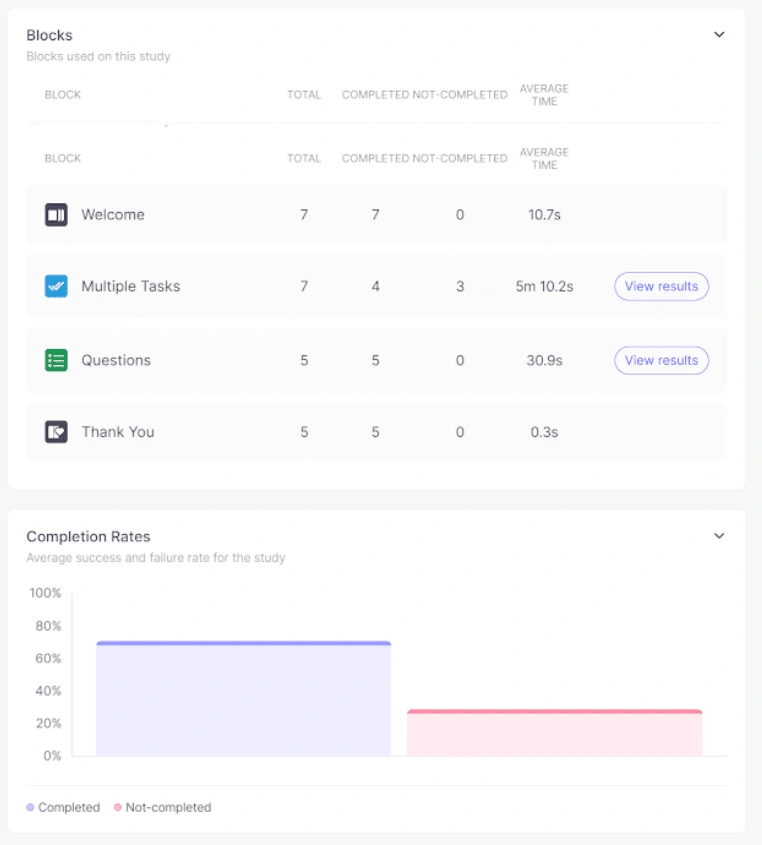
Useberry results
Pain points
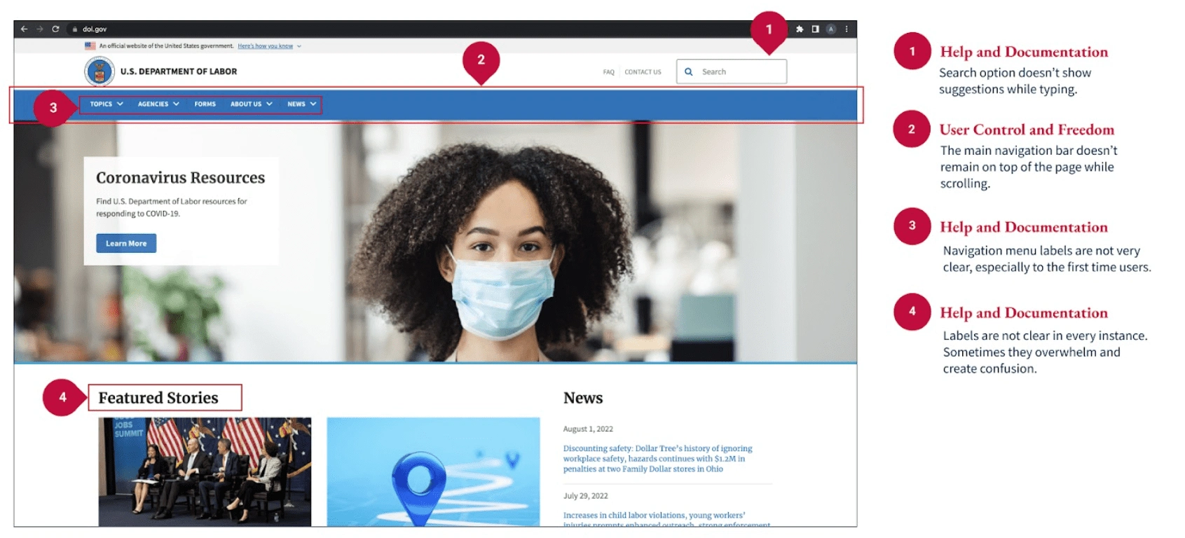
The website information is hard to recognize and understand for first-time users.
The navigation menu and labels are not descriptive enough to quickly find what users are searching for.
Too many links listed make it overwhelming to use the website.
Users don't feel comfortable using the website due to the technical language.
Most searched DOL pages
Contact DOL page.
Unemployment Insurance.
Continuation of Health coverage.
Frequent ask questions.
With the information collected, a user persona was created.
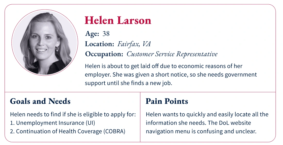
User persona
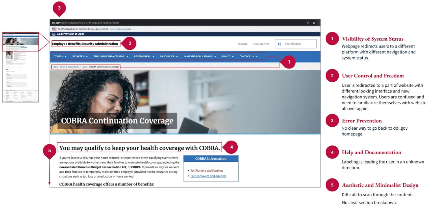
A heuristic evaluation was necessary to show the biggest problems on the website.
Solution
At this point was clear that the hypothesis was correct. The website needs to improve the information architecture, reorganize the home page with the essential information for users and unify the pages using a color palette and the same components throughout the website. To make these improvements, I should analyze the information architecture. I did a virtual card sorting, where I placed all the web pages, allowed the generation of new groups, and changed the names of the pages.
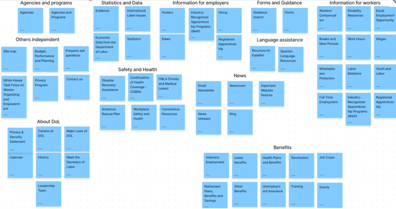
Cardsorting
The best way to have the information organized before starting the wireframes is to create a sitemap based on the card sorting results. The site map has different colors to have clarity in the page levels.
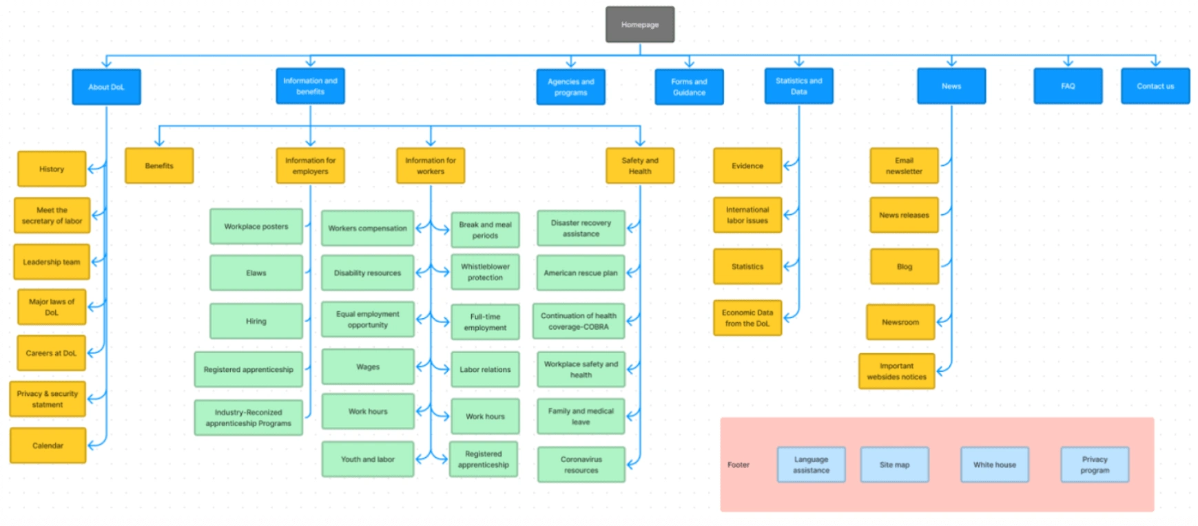
Sitemap
Prototypes
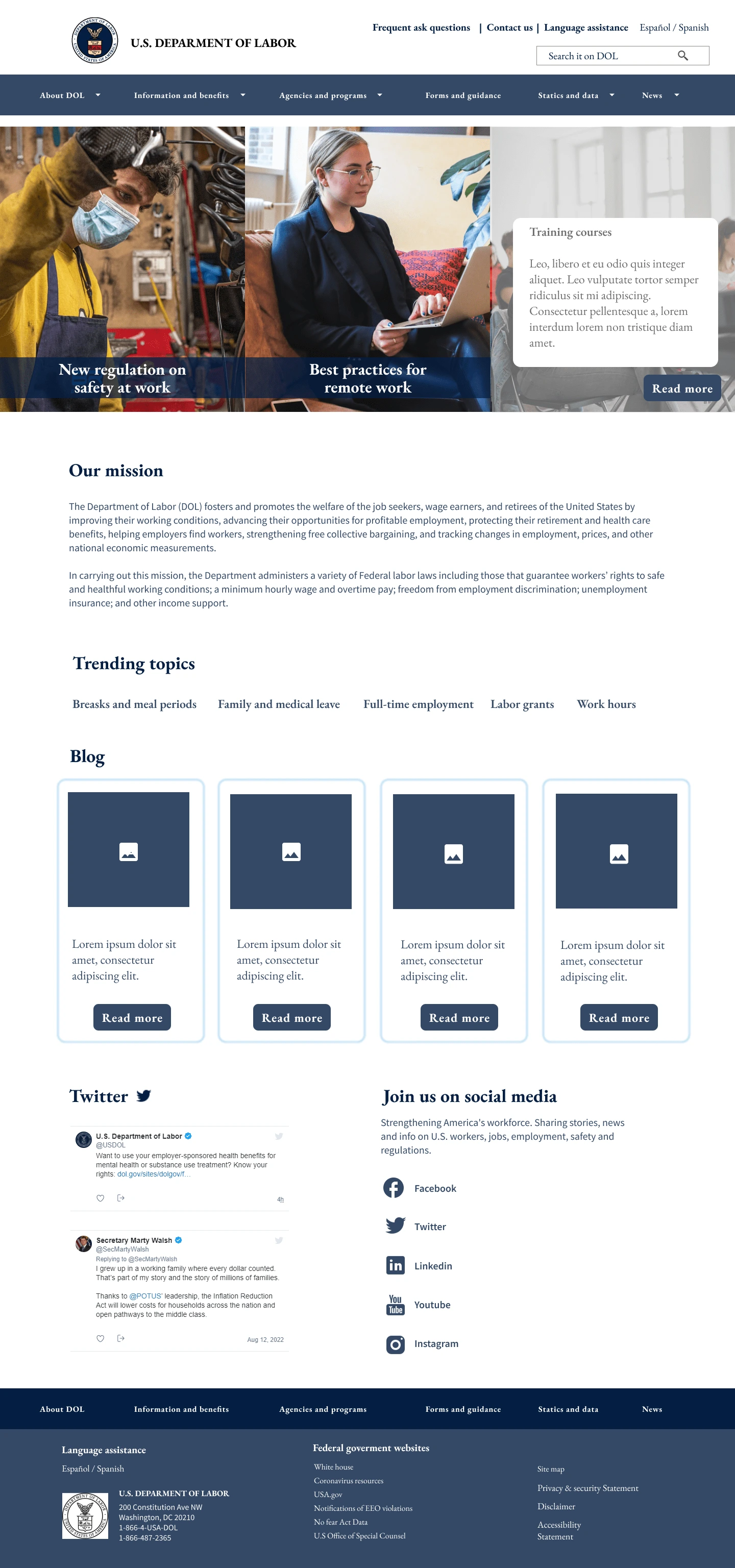
Mid-fidelity wireframes - Desktop
- I used the hero space to display important news with a brief description so that users can get the most current information.
- New main categories were placed in the header with labels that allow the information to be identified internally.
- I used drop-downs to show the options inside to facilitate navigation and search.
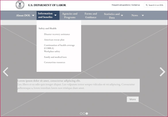
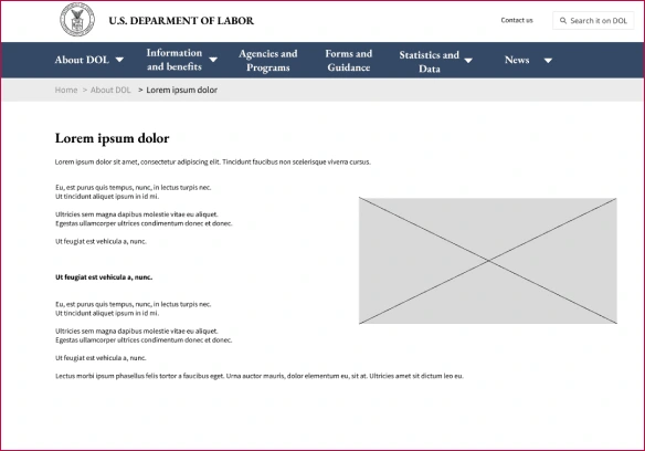
- Internal pages homologated with the homepage and breadcrumbs were placed to facilitate user navigation.
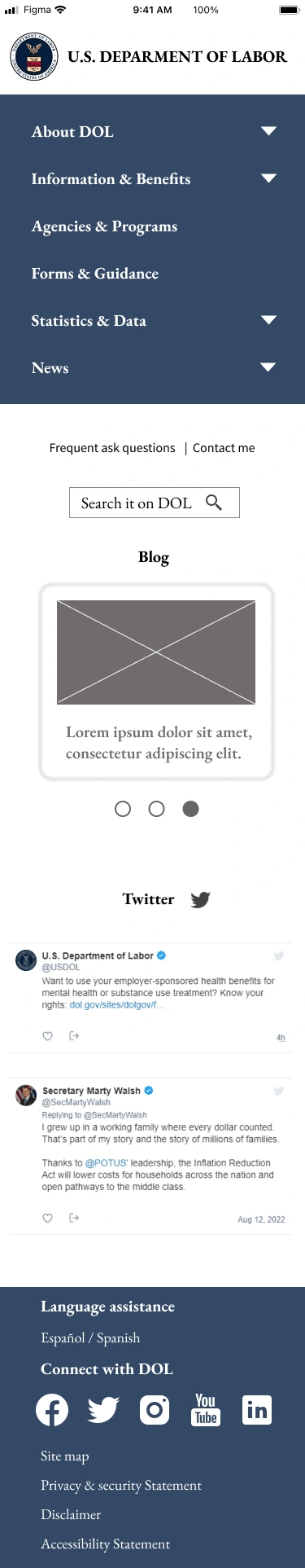
Mid-fidelity wireframes - Mobile
- For the mobile version, I prioritized showing the main categories using a layout more suitable for a cell phone screen. I kept the dropdowns of the desktop version and used the typography to highlight the internal options.
- I locate the search component after the menu so that if the information has not been found, the users can manually search.
-The footer was redesigned to have the social media and the most and the language assistance.
5 second test and findings
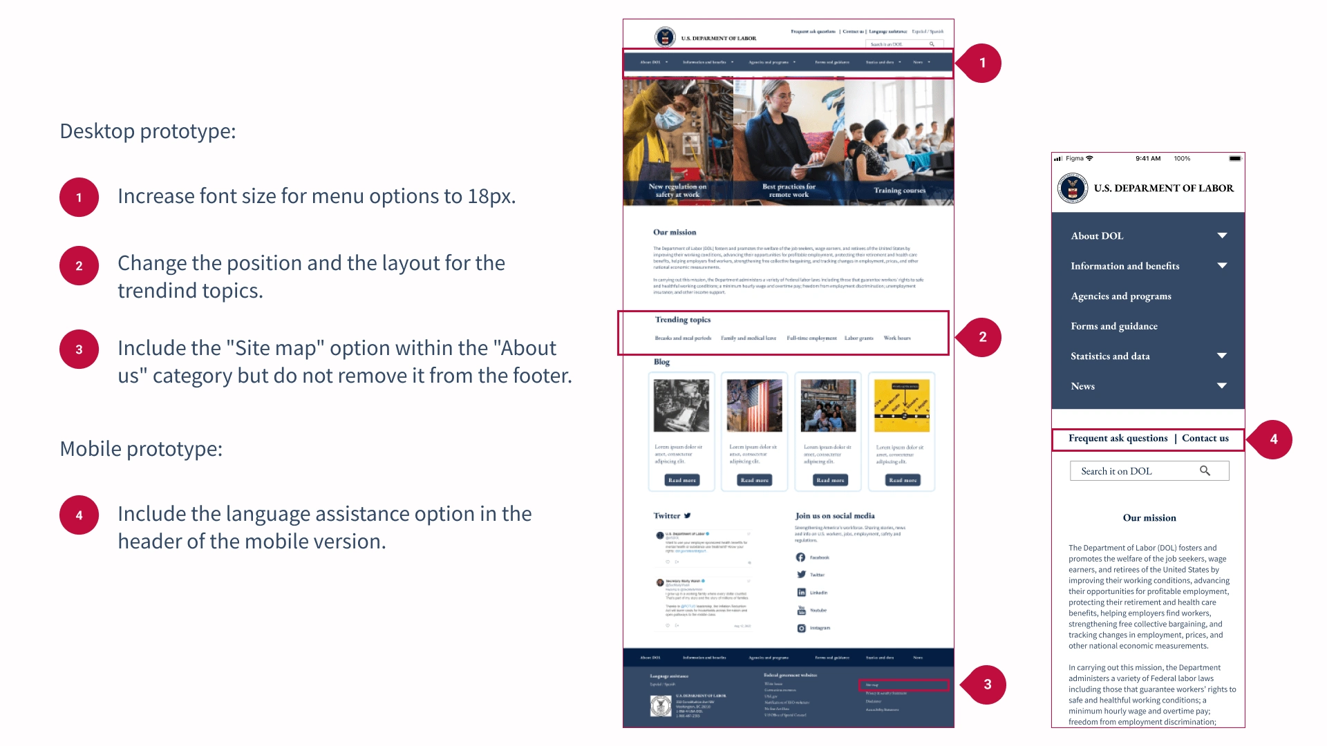
The homepage was shown for 5 seconds to 5 users to verify that the content was understood and the components were easy to identify. The order in which the wireframes were displayed was interleaved to reduce the learning effect.Findings:
Hero image too big.
The options are clear.
Get a better position for language assistance.
FAQ and contact us options too small on the web wireframe.
The layout is pleasant to see.
5 second test
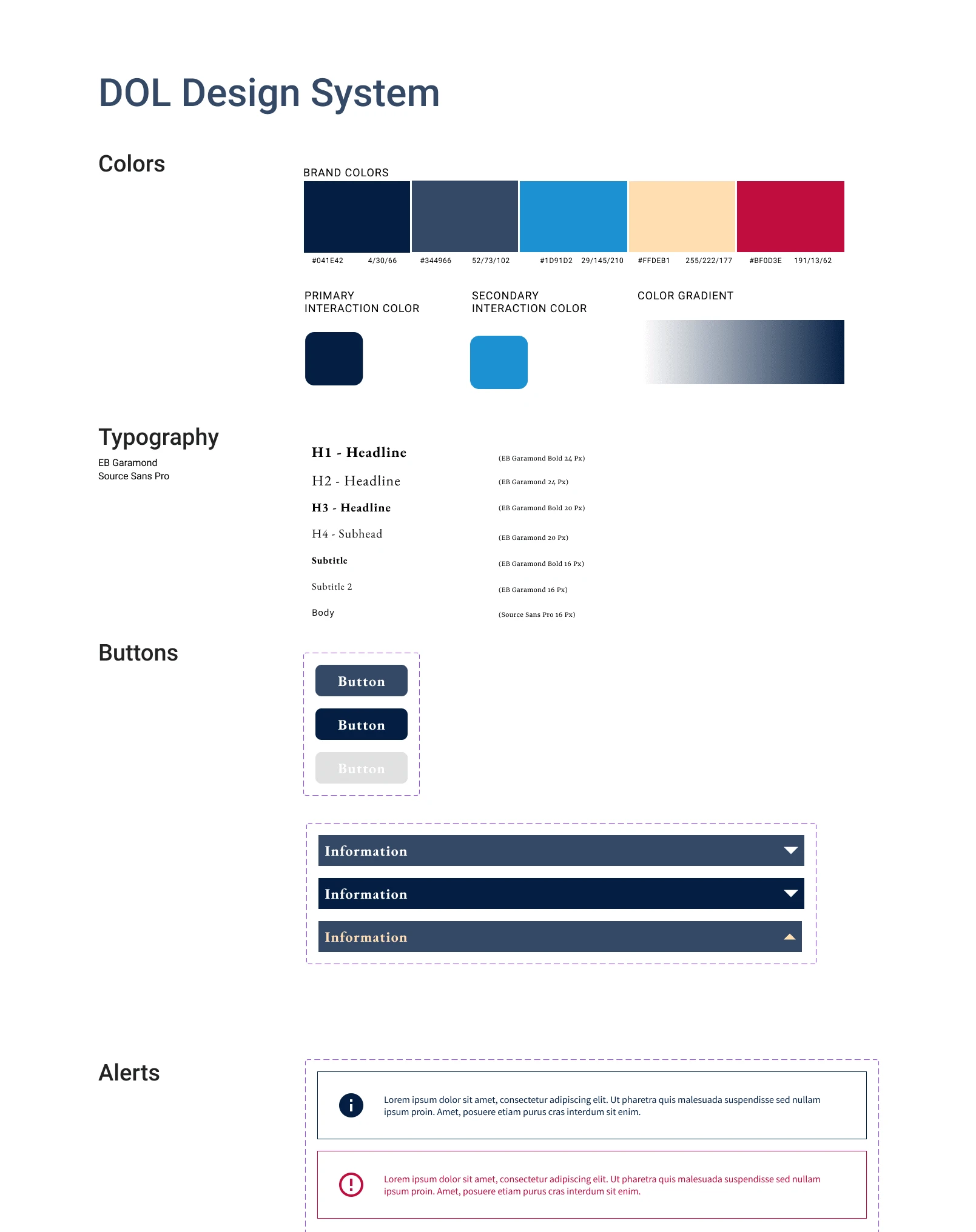
Hi-fidelity wireframes
I divided the hero image into 3 to give the possibility of showing more news at the same time; by hovering over the image, you can see more information.
I placed the language assistance within the header to facilitate access for people looking for the Spanish version.
I modified the size of the fonts for better visualization.
I included the blog section, Twitter, contact us, and fed
Testing
7 users found information in the drop-down menus, and it was intuitive.
4 users had difficulty reading some of the texts.
2 users expected to find the site map in the "About us" category.
7 users mentioned finding consistency in the two versions of the website.
Iteration
Final product
Desktop prototype
Mobile prototype
Conclusiones
Using consistent components helps users easily interact with responsive products.
An agency government site with a formal design gives greater credibility and reflects seriousness.
Tools like card sorting make it possible to understand user associations.
Like this project
Posted Sep 5, 2023
Responsive design for a government agency.
Likes
0
Views
5