Built with Replit
BuddyRise — Chronic Condition Companion App | Built in Replit

Henry Tochukwu
Verified


BuddyRise | A Chronic Condition Companion, Designed and Shipped in 2 Weeks
Role: Product Designer & UX Engineer (solo design, build, ship)
Timeline: 2 weeks, concept to on-device build
Platform: Replit Agent, Mobile App canvas, Expo Go preview, Deployments
Stack: React Native (Expo) · Node/Express · Postgres · Replit Auth · Replit Deployments
The problem
People managing autoimmune and chronic conditions; psoriasis, lupus, RA, IBD live in a data vacuum. Symptoms fluctuate daily. Triggers are invisible until they've already caused a flare. And the tools that exist are either clinical databases that feel like paperwork, or wellness apps that don't take the condition seriously.
The design problem wasn't "build a tracker." It was: how do you get a fatigued person to log honestly, every day, for months and then give them something back that's worth the effort?
Every decision in BuddyRise traces back to that question.
What I shipped
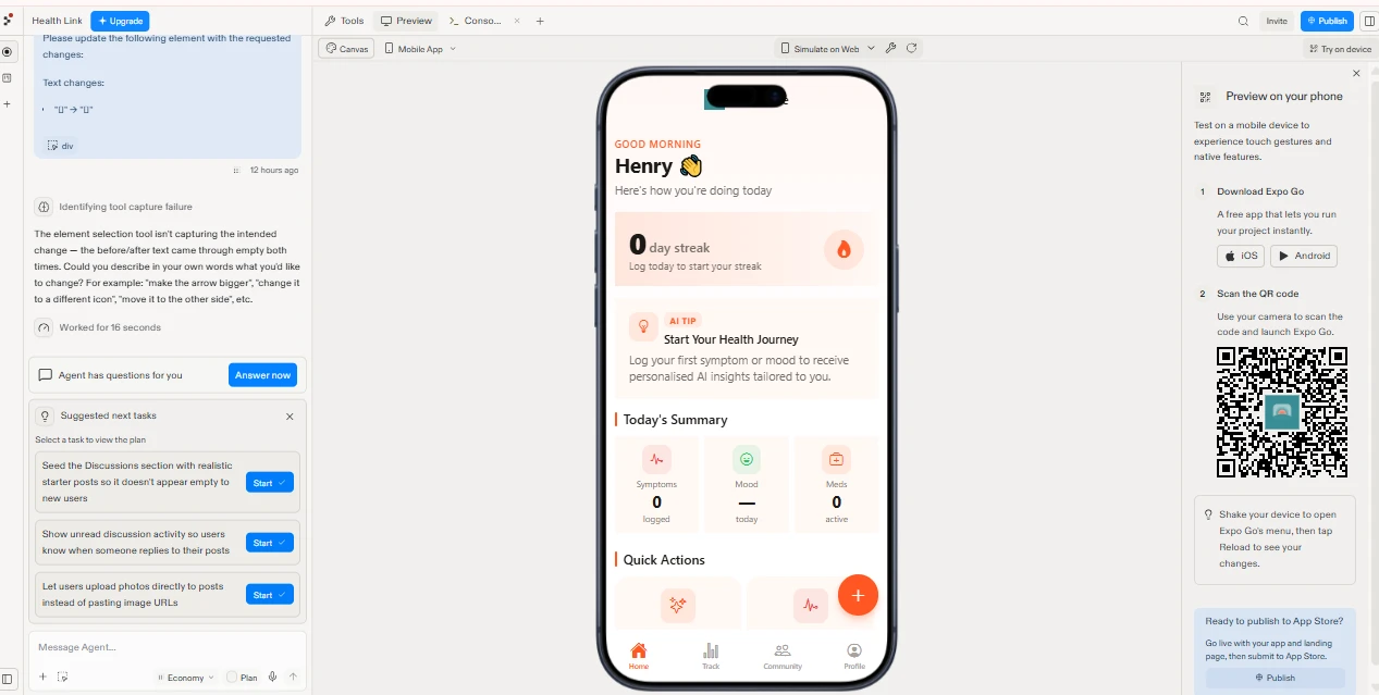
Home — A morning first dashboard. Streak counter, an AI tip card that adapts to what you've logged, and a Today's Summary strip (symptoms / mood / meds) that reads at a glance. Quick Actions sit above the fold so logging is never more than one tap from launch.
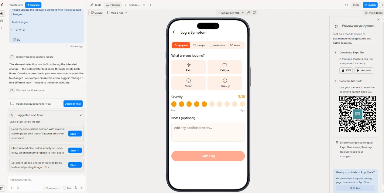
Track (logging) — Segmented entry for Symptom, Lifestyle, Medication, and Photo. Symptom logging uses a four-tile grid (Pain, Fatigue, Mood, Flare-up) and a 10-dot severity scale instead of a slider, tappable with one thumb, no drag precision required. Notes are optional by design; friction kills streaks.
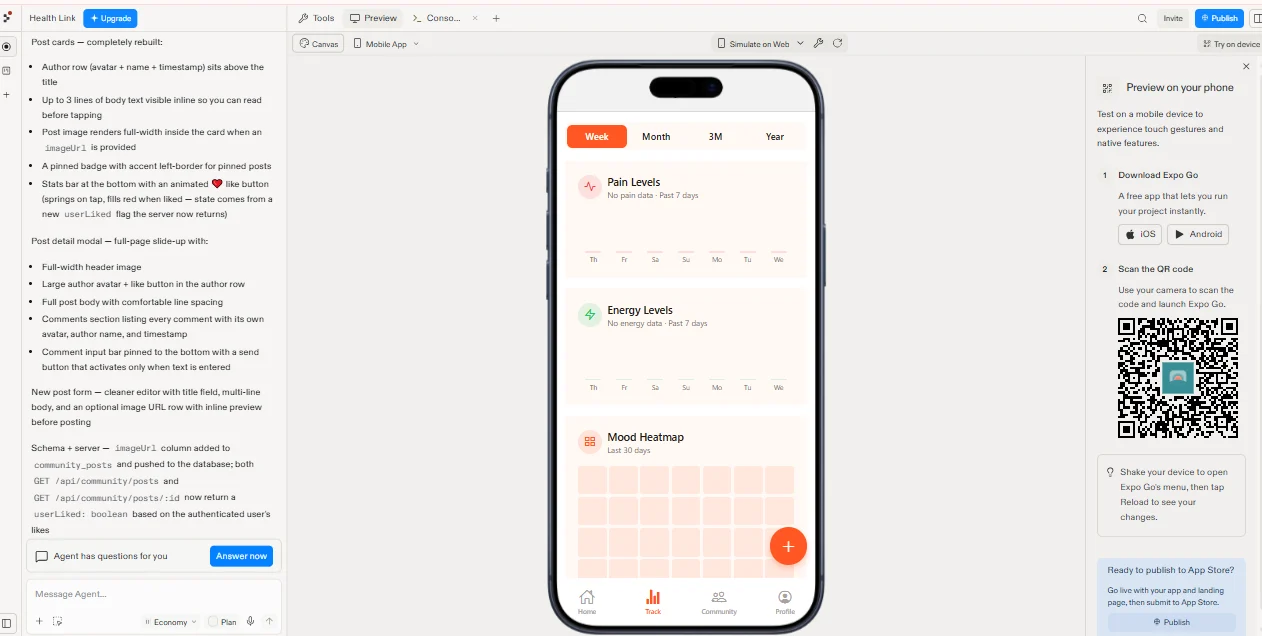
Insights — Pain and energy trends across Week / Month / 3M / Year, plus a 30-day mood heatmap. The heatmap is the piece that earns the logging habit: patterns become visible in about three weeks of data.
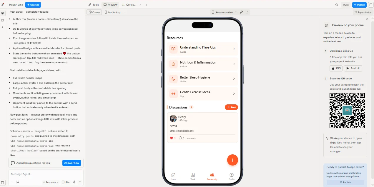
Community — A curated resource library (flare-ups, nutrition and inflammation, sleep hygiene, gentle exercise) sitting above discussions, so a new user with an empty feed still lands on value. Discussion posts carry avatar, timestamp, inline body preview, image support, and a like/comment stats bar.
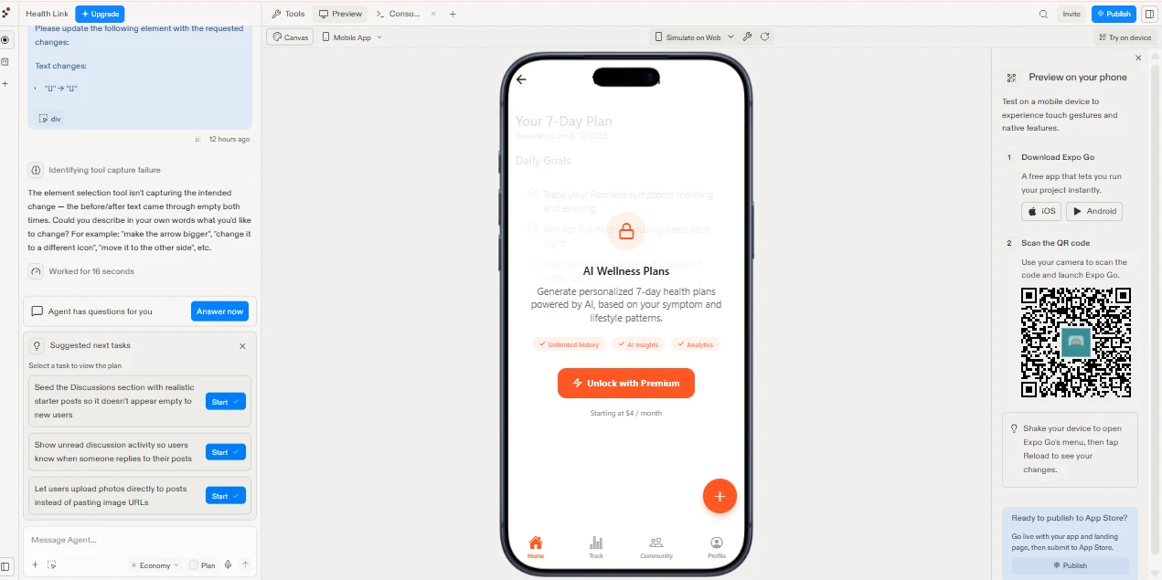
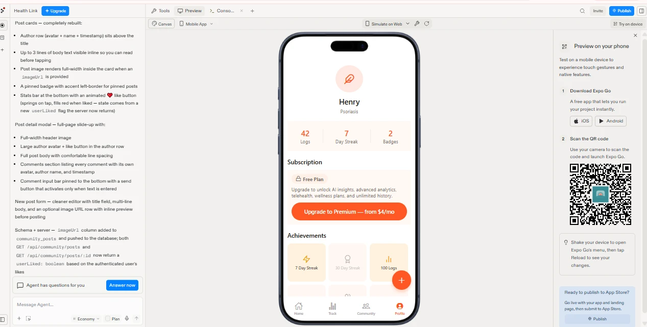
Profile & monetisation — Condition, log/streak/badge stats, achievement tiers, and a Free vs Premium subscription block. AI Wellness Plans are the premium hook: the 7-day plan renders behind a blurred lock state with the real content visible underneath, you can see exactly what you're paying $4/month for.
How I worked in Replit
Days 1–2 — Plan mode before a single prompt
I didn't start by asking the Agent to build an app. I started in Plan mode, working the brief into a spec the Agent could execute against: data model first, screen inventory second, feature scope third.
Schema-first matters on Replit. If symptom_logs, community_posts, and user_achievements are defined cleanly up front, every later Agent run inherits the correct shape and you avoid the migration churn that eats most vibe-coded builds. I locked the tables, the relationships, and the API surface before touching UI.
Output of day two: an agreed build plan, a schema, and a screen map. Then I let the Agent scaffold.
Days 3–5 — The core loop, built and checkpointed
First Agent run produced auth, navigation, and the logging flow. From there I worked in tight cycles:
Agent for feature-level work (build the insights screen, wire the achievements engine)
Assistant for surgical single-file fixes cheaper, faster, no risk of collateral edits
Checkpoints after every working state, so a bad generation was a rollback, not a rebuild
Console + Preview side by side to catch server errors the moment they surfaced
The element selection tool did the design polish. Rather than describing a spacing problem in prose, I clicked the component and instructed against it directly. Typography scale, card padding, tap target sizing, the severity dot rhythm all tuned by pointing.
One useful failure worth naming: the selection tool couldn't capture a text change where before and after both read as empty, and the Agent flagged it and asked me to describe the change in plain language instead. Knowing when to stop pointing and start writing is half of working well with an agent.
Days 6–8 — Insights, and testing on real hardware
Charts are where AI builders usually produce something technically correct and emotionally useless. I iterated on the empty states specifically, "No pain data · Past 7 days" with the axis still rendered, so a new user sees the shape of what they're about to fill in rather than a blank card.
I ran the build through Simulate on Web for speed, then Try on device via Expo Go for anything touch-dependent. Thumb reach, tap target size, and scroll feel don't survive a desktop preview. The severity scale went from a slider to ten discrete dots after five minutes with the real thing.
Days 9–12 — Community, rebuilt properly
The first pass at community was thin, so I rebuilt post cards end to end: author row above the title, three lines of inline body preview so you can read before tapping, full-width post images, pinned-post treatment, and an animated like button that springs on tap.
That last detail forced a backend change, and it's the one I'd point an engineer at: the like button was optimistic-only, so state broke on refresh. I had the Agent add an
imageUrl column to community_posts and extend both GET /api/community/posts and /api/community/posts/:id to return a userLiked boolean resolved against the authenticated user's likes. Schema, endpoints, and UI updated in one coherent pass.Design decisions have server consequences. Being able to close that loop myself is the whole point of working this way.
Days 13–14 — Monetisation, polish, ship
Paywall placement, upgrade copy, achievement tiers, and the empty-state pass across every screen. I used the Agent's suggested next tasks as a QA checklist rather than a roadmap seeding realistic starter discussions, surfacing unread reply activity, moving from pasted image URLs to direct photo upload. Then Publish.
Three decisions I'd defend
Ten dots, not a slider. Sliders demand precision from hands that may be inflamed or shaking. Discrete tap targets are more accurate, more accessible, and produce cleaner data.
Resources above discussions. Every community product dies at cold start. Putting the curated library first means day-one users get value from an empty feed, and the social layer grows underneath it instead of gating it.
Show the paywall's contents. Blurring the real 7-day plan rather than hiding it converts on specificity. Users upgrade for a thing they can see, not a feature list.
What Replit made possible
Two weeks from brief to installable build, solo, with no handoff loss, because there was no handoff. Design intent went straight into the running product, and product constraints came straight back into the design.
Replit's Agent did the scaffolding. The judgement; what to log, when to ask, where to charge, what to cut was the work.
What I bring to your build
Prototypes that run, not screens that suggest. I design products, wire the logic, test the edge cases, and hand engineering something already validated or ship it myself.
Available for product design, UX engineering, and rapid AI-assisted MVP builds.
Like this project
What the client had to say
Henry is an incredible freelancer. I have worked with Henry on two projects now and he has swiftly resolved all issues well ahead of deadline, all whilst keeping me in the loop on every step of the process. I would recommend Henry to anyone

Lhea Terzaki
Sep 25, 2026, Client
Posted Jul 29, 2026
Health app for autoimmune patients. Symptom logging, trend insights, community, and AI wellness plans, designed and shipped solo in Replit in 2 weeks.
Likes
1
Views
17
Timeline
Sep 17, 2026 - Sep 25, 2026
Clients
BuddyRise