Tokenly Marketing Site Design & Development

Henry Tochukwu


Tokenly website
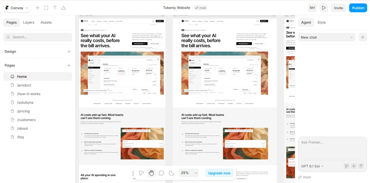
The marketing site for Tokenly, an AI spend-control product. I designed it in Figma, then built it in Framer with custom React code components for the motion and effects.
Role: UI/UX designer, Framer designer & developer
Duration: 2 days of build, Oct 14–15, 2026, plus polish on Nov 1–2
What the site needs to do
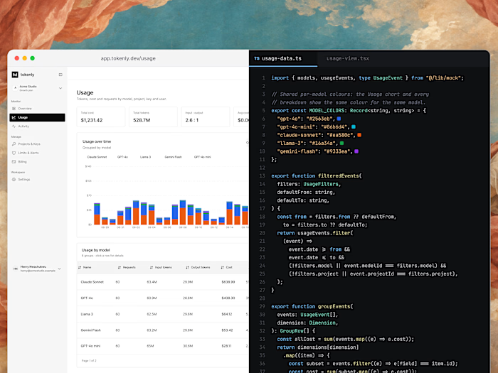
Teams paying several AI providers only find out what they spent when the invoices arrive. The site positions Tokenly as the control layer between a team and its providers: one prepaid balance, budgets and alerts that act before the bill, and one record for engineering and finance.
“See what your AI really costs, before the bill arrives.”
Primary conversion: Free sign-up: “Get started for free”, 14 days, no card needed
Secondary: “Book a demo” and “See how it works” for buyers who want proof first
Audience: Engineering leads, finance & ops, agencies, and founders
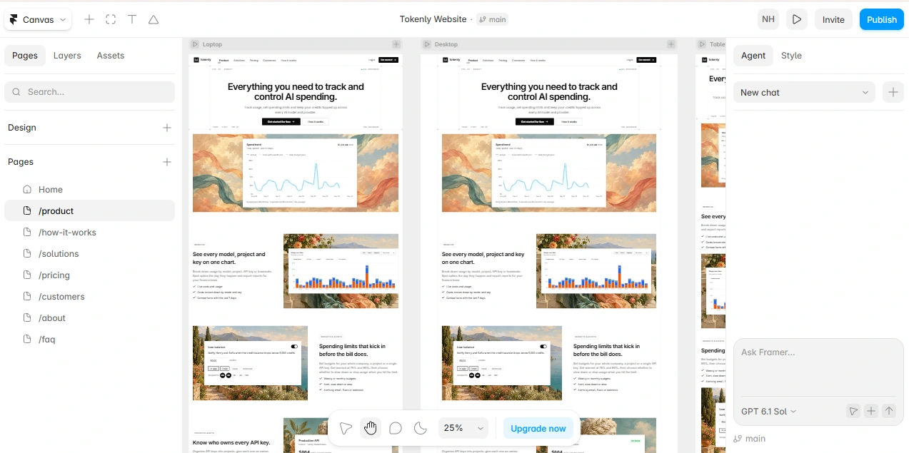
Proof: The product itself: live dashboard widgets sit in every section instead of stock illustrations
Design direction
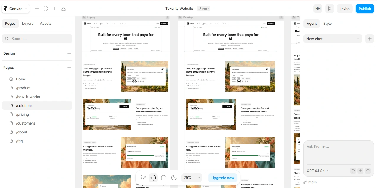
Two ideas carry the whole site. The UI is strictly monochrome so the product reads as calm and precise, while classical paintings behind the product widgets give it warmth and set it apart from the usual dark, neon AI look. Every painting gets the same soft grade so it supports the product rather than competing with it.
Eight pages: Home, Product, How it works, Solutions, Pricing, Customers, About & Contact, FAQ.
Three breakpoints: desktop, tablet and phone, with a 24px gutter and a working mobile menu.
A blueprint hero: hairline grids with “+” markers and small mono labels, used on every page header.
Plain-spoken copy: full sentences, with one primary call to action per section.
The Framer build
I built the pages from the Figma frames, then added interactions natively where Framer handles them well and as code where it doesn’t. Moving repeated visuals into code components also kept the desktop layout under Framer’s publishing size limit.
Hero load-inCount-up metricsAnimated bar & line chartsImage zoom on hoverInvert-on-hover cardsSolutions tabsMonthly / yearly billing toggleFAQ accordionsSticky navMobile menu
Interactions in code
Each one is a small React component or override in the Framer project, with controls exposed in Framer’s properties panel and reduced-motion respected.
Dashboard numbers that count up, then keep ticking
Balance and spend figures count up when they scroll into view, then drift slightly so the dashboard feels live. In the Framer canvas they show the final value so the design stays easy to edit.
Usage bars that rise one by one
The stacked usage chart is drawn as SVG from the product’s real chart geometry. Each day’s column rises in sequence when 30% of the chart is visible.
One tone and a slow zoom for every painting
A single override grades every painting the same way and zooms it gently on hover. Only the image is affected, never the product widget on top of it.
Feature cards that invert on hover
Cards flip from white to black and their icons invert with them, giving a strong hover state while staying inside the black-and-white palette.
The blueprint hero grid
Hairlines with “+” markers where they cross, plus mono corner labels such as “Fig. 01 · AI spend”. It replaced dozens of separate layers with one component that every hero shares.
Like this project
Posted Nov 2, 2026
Marketing site for an AI spend-control product, designed in Figma and built in Framer in two days, with custom React code for motion and live-feeling data.
Likes
1
Views
3
Timeline
Oct 13, 2026 - Nov 1, 2026