Built with Ideogram
Designing Regen AI: One System, Three Surfaces

Henry Tochukwu


Designing Regen AI: One System, Three Surfaces
Role: Product Designer & UX Engineer (solo) ·
Overview
AI image-model sites all sound the same, a wall of generated art and a benchmark chart. Regen AI needed to sell something more specific, an open-weights model that lives in three places at once: an API for builders, MCP for agent workflows, and an app for creators. The design problem wasn't "make it beautiful." It was make a technical distribution strategy legible to two audiences; developers and creative teams on one page.
Goals
Communicate the three-surface product architecture (API / MCP / App) without reading like documentation.
Let the model prove its own quality, outputs as evidence, not decoration.
Build a system that scales across model generations (1.0, 2.0, future releases) without redesign.

Design system in one line
Editorial serif for statements, grotesque sans for utility, navy + orange as a semantic pair, orange means current, navy means established. Generated imagery is the only other color on the page.
Key decisions
1 · The split announcement hero
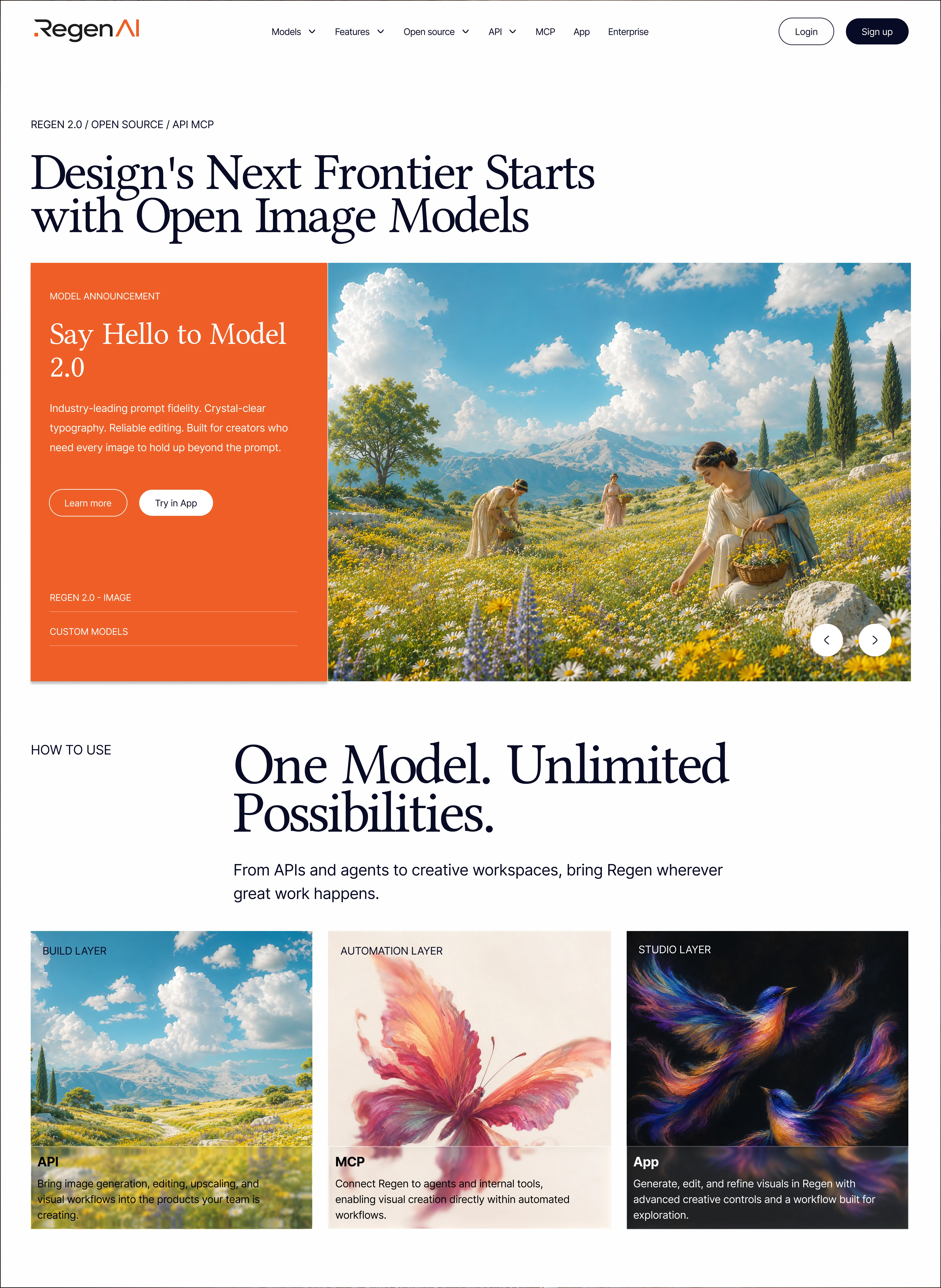
Decision: Separate the permanent page headline ("Design's Next Frontier Starts with Open Image Models") from a swappable announcement card below it, orange panel for copy + CTAs, carousel for model output.
Trade-off: A single full bleed hero would have more immediate visual impact. I traded impact for durability: the headline states the company's thesis and never changes; the card is a campaign slot. Marketing can announce Model 3.0 by swapping one component. The carousel arrows also quietly signal there's more than one flagship image, the model has range.
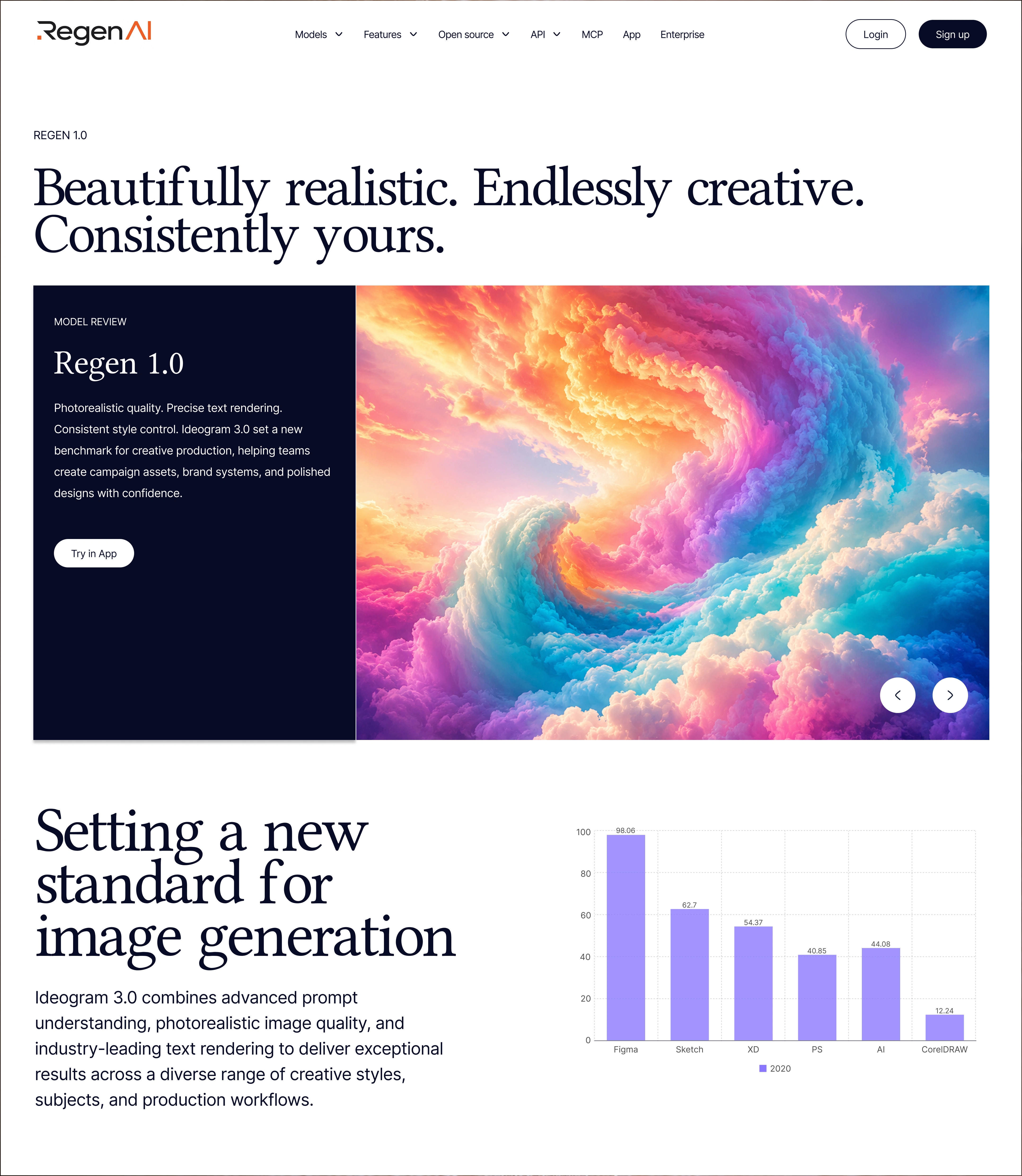
Outcome: One hero pattern now serves both pages. On the 1.0 page, the same card runs in navy, same structure, different semantic color (see decision 5).
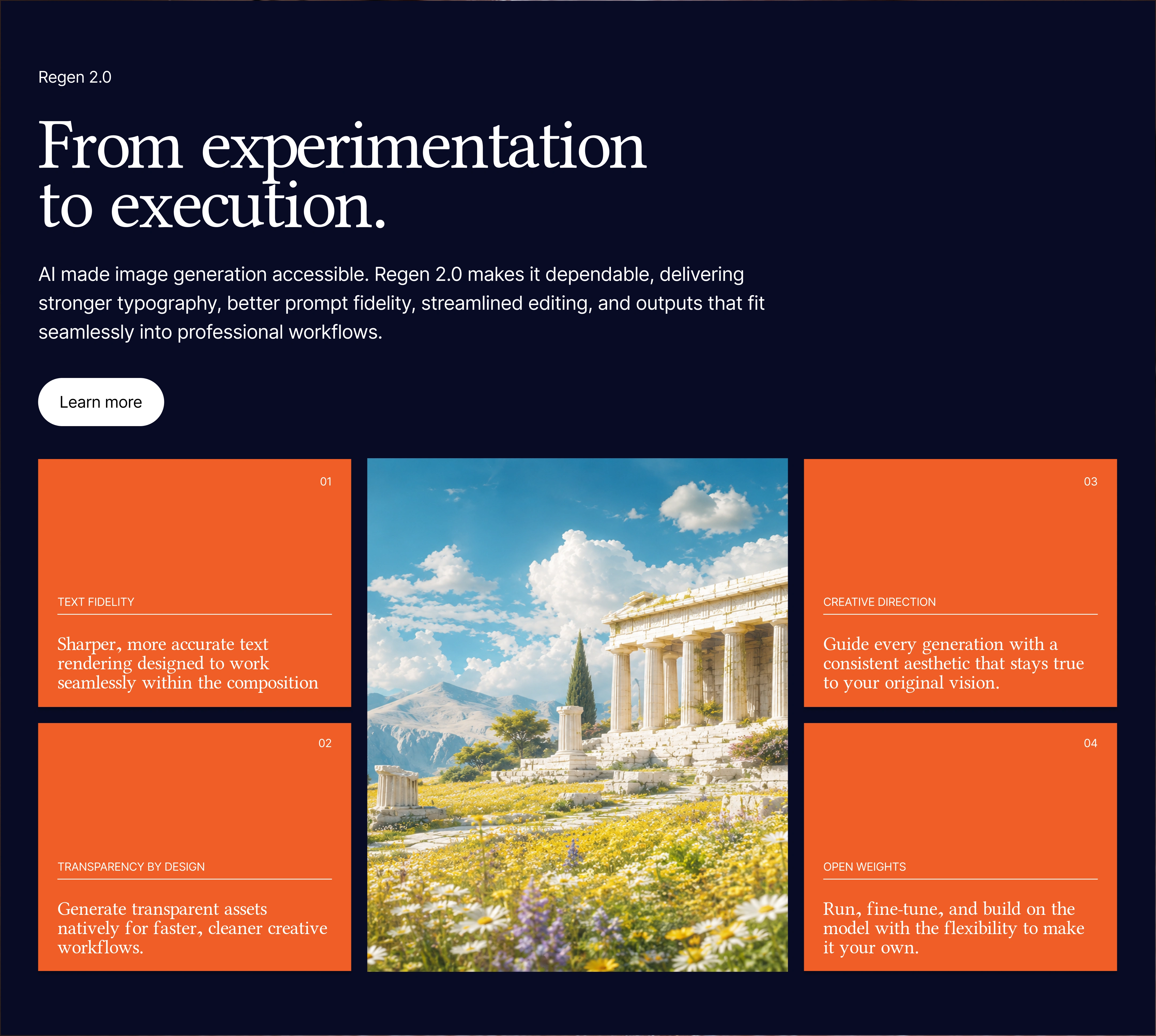
2 · The numbered feature grid ("From experimentation to execution")
Decision: Four orange cards, numbered 01–04, set in serif; Text Fidelity, Transparency by Design, Creative Direction, Open Weights; arranged around a single hero output on a navy field.
Trade-off: Serif inside UI cards breaks a SaaS convention; sans would be safer and more scannable. I chose serif deliberately: the product's headline capability is typographic rendering inside images. A features section about typography set in expressive type is the argument made physically. The numbering imposes a reading order on a grid that would otherwise scan randomly, and capping at four forced ruthless prioritization, Open Weights made the cut over speed claims because it's the differentiator competitors can't copy.
Outcome: The most distinctive section in the system, and the one that carries the brand when screenshotted out of context.
3 · Distribution-layer cards (API / MCP / App)
Decision: Three equal width cards, each labeled by layer (Build / Automation / Studio) with the surface name as the card title, imagery shifting from naturalistic (API) to abstract (App).
Trade-off: Tabs or an interactive switcher would save vertical space and feel more "product-y." I kept all three visible simultaneously because the message is coexistence, this isn't "pick your plan," it's "the same model, everywhere you work." Hiding two options behind tabs would have contradicted the pitch. Cost: a taller page and a legibility risk on text-over-image, mitigated with a dark gradient scrim on each card's lower third.
Outcome: Developers and creative leads each find their entry point within one scroll, no branching navigation required.
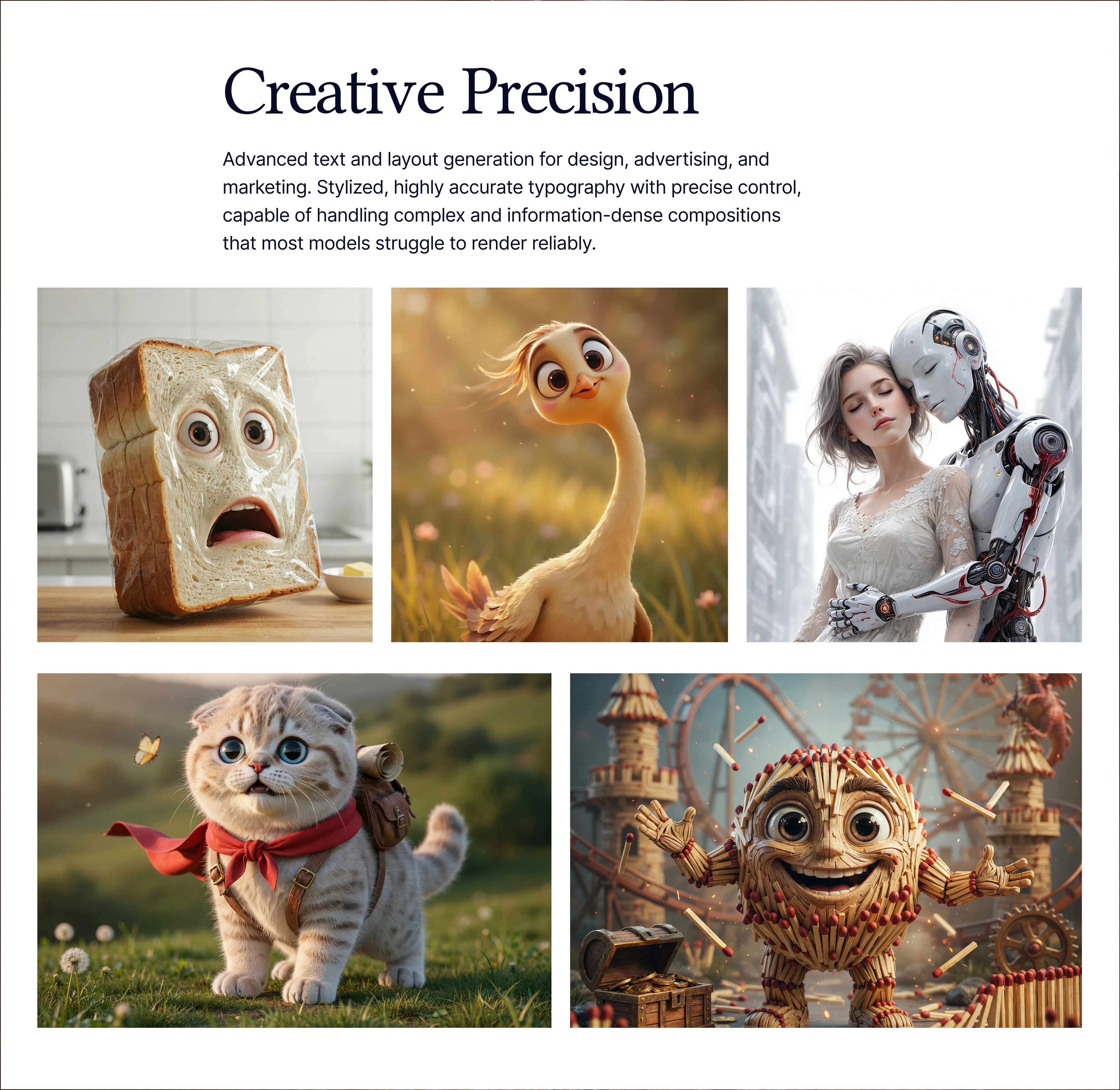
4 · The self-demonstrating gallery ("Ideas need a destination")
Decision: A filterable output gallery (General / Ad Creatives / Photography / Logo / Marketing / Branding) using real generations in a horizontal masonry strip — no captions, no claims.
Trade-off: Curating six category filters is a maintenance commitment; a static "best of" grid is cheaper to keep fresh. But the filters map one-to-one onto commercial use cases, converting "look how pretty" into "this handles your deliverable." I also cropped the strip at the viewport edges intentionally — the bleed implies the library continues beyond what's shown.
Outcome: The section does the work a benchmark chart tries to do, without asking anyone to trust an unlabeled axis. (The 1.0 page's chart is the counter-example — it was inherited and is the first thing I'd cut in a next pass.)

5 · Version semantics through color
Decision: Across both pages, orange = current generation (2.0), navy = previous (1.0). The 1.0 page reuses every component from the home page with the announcement surfaces flipped to navy.
Trade-off: A "legacy" badge would be more explicit. But labeling 1.0 as legacy devalues a model that enterprise customers still run in production. Color does the same work respectfully; 1.0 reads established, not obsolete and the shared component set meant the second page cost a fraction of the first to design.
Outcome: A versioning system, not just two pages. Model 3.0 ships by inheriting orange and pushing 2.0 to navy, zero new components.
Results
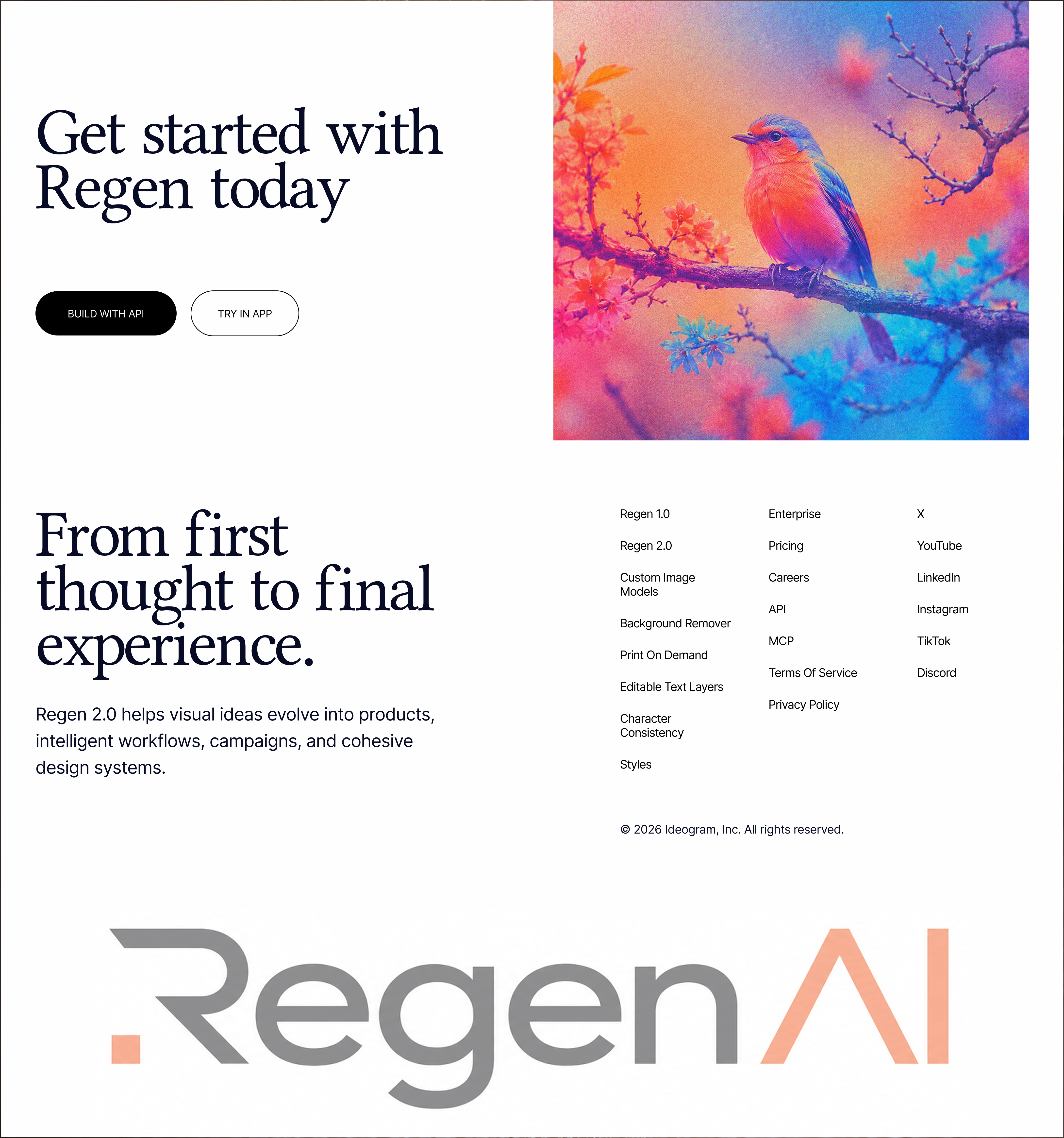
One component system, two pages, N future releases — hero, feature grid, gallery, and CTA all version by color token, not redesign.
Dual-audience routing without a fork — developer path (Build with API → repository, docs, live API request snippet) and creator path (Try in App) coexist on a single scroll.
The product is the imagery — every visual on both pages is model output, which is the only benchmark claim that can't be disputed.
Reflection
The strongest call was refusing the tab pattern in the distribution section, it would have been tidier and wrong. The weakest inherited element is the 1.0 benchmark chart; unlabeled comparative data undermines a page whose entire strategy is "show, don't claim." Next iteration: replace it with a side-by-side text-rendering comparison, the one benchmark this model wins visibly.
Like this project
Posted Jul 12, 2026
A concept marketing site for an open image model, one editorial design system that sells to developers and creatives, and versions by color, not redesign.
Likes
2
Views
52
Timeline
Jun 24, 2026 - Jul 10, 2026