Booking Mobile App Design
Ramsha Q
Booking Mobile App — Effortless Booking, Every Time
The flight booking app was created to solve a common frustration among travelers: the complexity and inefficiency of booking airline tickets. With a focus on seamless user experience, modern UI, and clarity in pricing, the app was designed to guide users from discovery to boarding pass with minimal friction.
This case study outlines the design process, UX strategy, and key decisions behind creating a responsive, intuitive, and visually appealing mobile booking experience.
Objective
To design a mobile flight booking experience that simplifies the reservation process while delivering unmatched ease, speed, and clarity to users. The app needed to offer an effortless, transparent, and modern approach to booking flights, from onboarding through ticket generation.
Target Users
Frequent Flyers: Business travelers who value speed and efficiency.
Leisure Travelers: Users booking occasional trips and seeking deals.
Non-Tech-Savvy Users: Those needing a clean, easy-to-navigate interface.
Tools Used
Figma – UI/UX design and prototyping
Illustrator – Icon and visual asset design
Framer – Animation prototyping
Notion – Documentation, journey mapping
Design Goals
Reduce booking friction with a streamlined interface
Highlight essential details clearly (pricing, stops, class)
Support user trust with transparent design
Maintain visual consistency from onboarding to checkout
Design Process
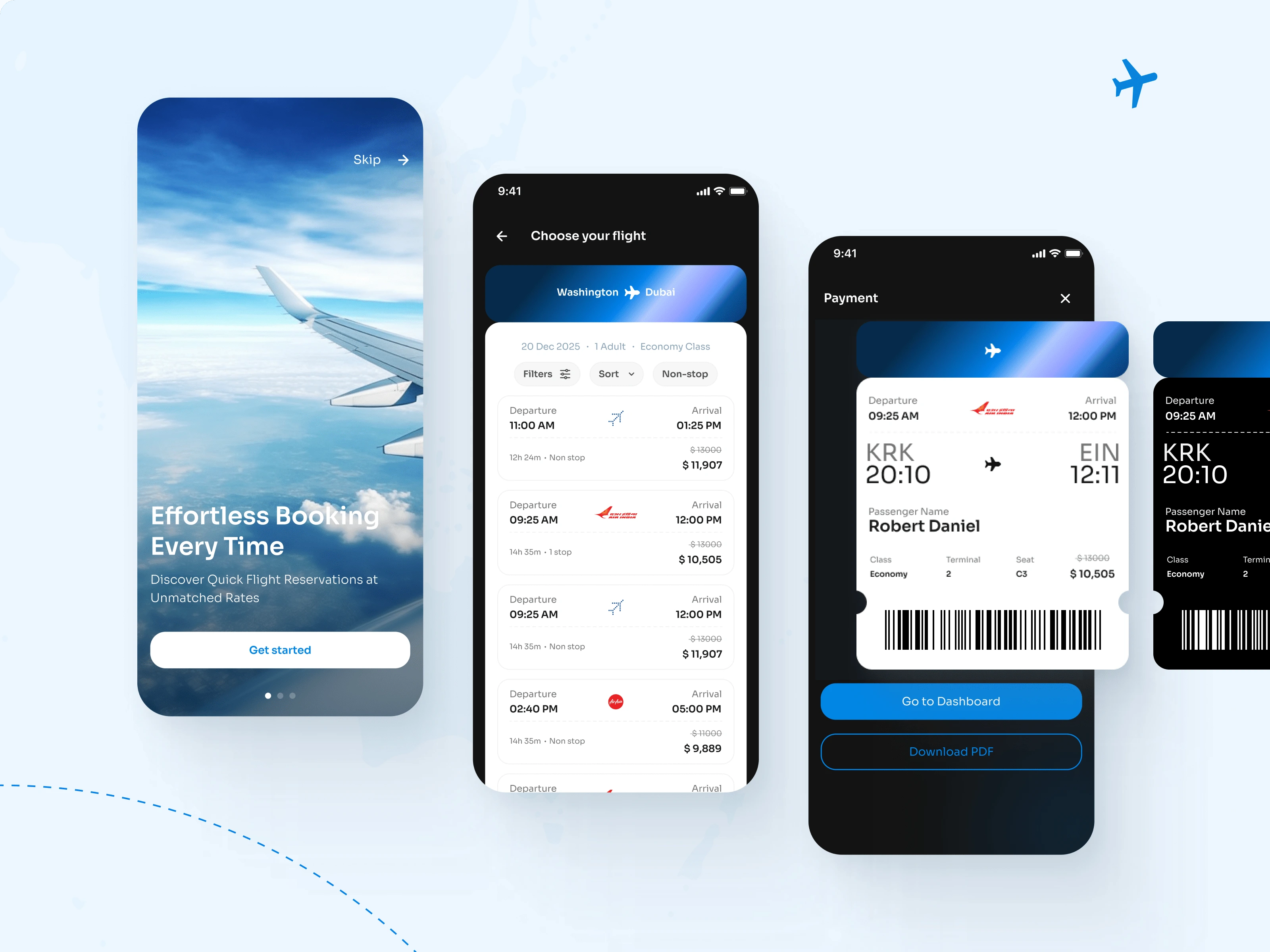
1. Onboarding
The onboarding screen introduces the app's core value: fast, reliable flight reservations. A full-screen image of a plane wing evokes the emotion of travel, while the minimal layout keeps attention on the core message.
Tagline: “Effortless Booking Every Time”
Supporting Text: “Discover Quick Flight Reservations at Unmatched Rates”
Action: A single “Get Started” button with the option to skip onboarding
2. Flight Selection
Once inside the app, users are presented with a streamlined search and filter experience.
Key elements include:
Origin and destination toggle (e.g., Washington to Dubai)
Filters for non-stop flights, departure times, price range, and airlines
Clear pricing with original fares strikethrough and discounted fares highlighted
Travel time and number of stops displayed under each listing
This screen was designed to reduce decision fatigue and highlight the most important information at a glance.
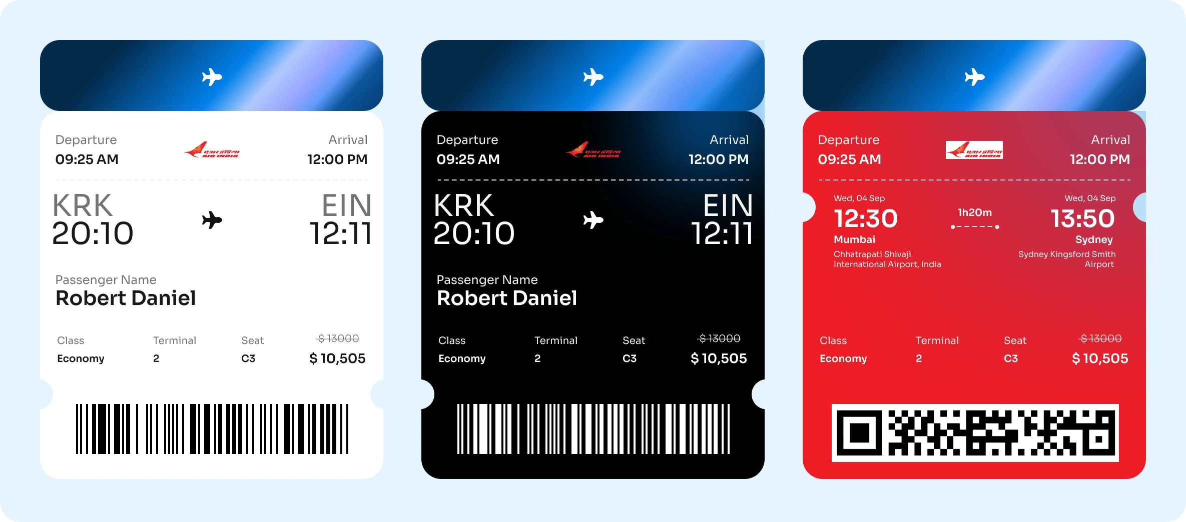
3. Payment and Ticket Confirmation
After selecting a flight, users proceed to the payment screen where a digital boarding pass is generated.
Features include:
Flight information: Airline, terminal, seat number, and timing
Passenger details
Downloadable PDF boarding pass
Option to go to dashboard for trip management
This step focuses on reassurance and clarity. The boarding pass is visually designed to mimic a real one, adding familiarity and ease of use.
Visual Design Strategy
Color Palette: Blue gradients were used to evoke trust, professionalism, and the calmness of flight.
Typography: Clean sans-serif fonts enhance legibility and contribute to a modern aesthetic.
Layout: Card-based structure ensures information is grouped logically and scannable.
Contrast: A mix of light and dark backgrounds helps differentiate content types and maintain focus.
Key Outcomes (Hypothetical)
In usability testing with early adopters:
Users completed flight bookings 40% faster compared to competitor apps
92% of participants rated the UI as intuitive and visually appealing
Majority praised the simplicity of ticket viewing and downloading
Challenges
Designing for multiple price options without overwhelming the user
Balancing detailed flight info with a clean, uncluttered interface
Ensuring post-purchase clarity with minimal steps to view/download tickets
Like this project
Posted Apr 15, 2025
This flight booking app was designed with a mission to simplify the flight reservation process through a modern, user-centric, and visually appealing interface.
Likes
2
Views
76