WorkSteady — Logo & Visual Identity | Nonprofit Branding

Coumba Evelyn


WorkSteady — Logo & Visual Identity | Nonprofit Branding
Building a brand that stands as steady as the future it promises. 💪🧭
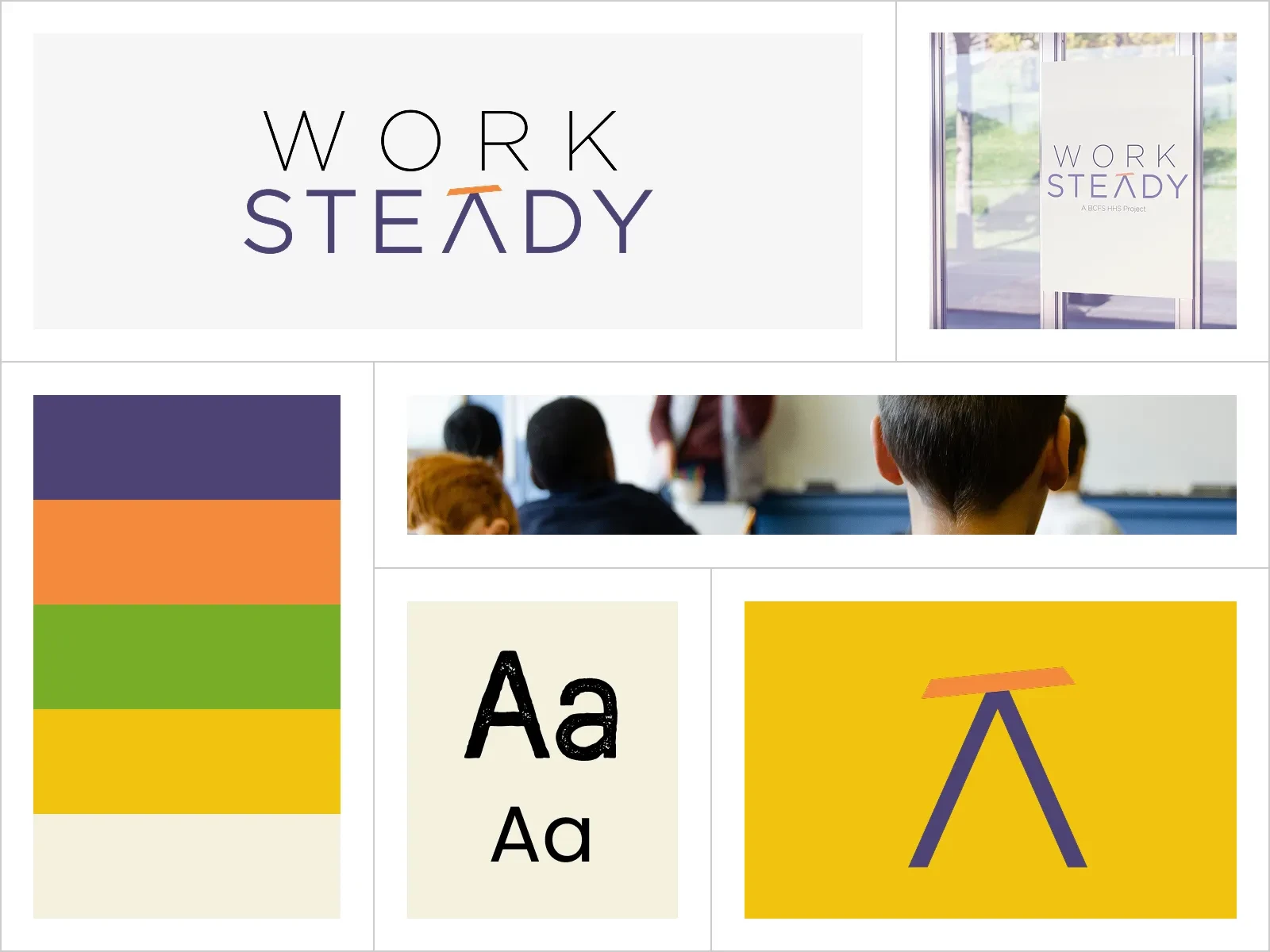
WorkSteady is a complete visual identity for a BCFS Health and Human Services program helping young adults step into the workforce and stand on their own. After digging into key goals with stakeholders, one thing was clear: previous efforts to reach Gen Z hadn't landed, so this brand had to radiate stability, pride, and self-sufficiency, meeting young people on their own terms without a hint of coddling.
From the logo to the full suite of workshop materials for participants and instructors alike, every element was designed to deliver on one message: real, earned stability is within reach. The BCFS stakeholders were over the moon with the work Coumba Win delivered, and today the WorkSteady program is thriving.
Confidence can't be handed out. But the right brand can show someone it's already theirs.
Like this project
Posted Feb 18, 2022
Work Steady Logo designed by Coumba Win.
Likes
0
Views
22