NEPA Lacrosse News Logo & Brand Design
Austyn McFadden

NEPA Lacrosse News is a leading sports media platform dedicated to covering the lacrosse community of Northeastern Pennsylvania. As the brand continued to grow in reach and influence, its visual identity needed to reflect the professionalism, credibility, and regional pride it had earned.
In 2025, the brand identity was redesigned to create a timeless, scalable system rooted in place and purpose, helping position NEPA Lacrosse News as an authoritative voice within the sport.
Client: NEPA Lacrosse News
Industry: Sports media
Location: Pennsylvania
Year: 2025
Services: Brand identity, logo design
Recognition: Logo award winner · Featured in LogoLounge Book 15
Website: nepalacrosse.com
Context and challenge
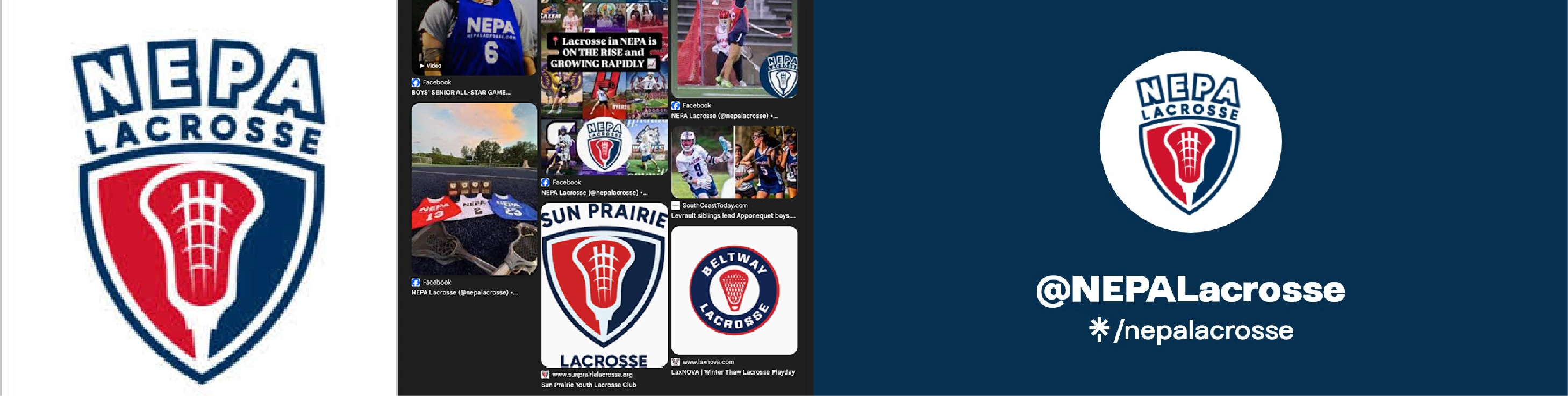
NEPA Lacrosse News had established itself as a trusted source for regional lacrosse coverage, but its existing logo no longer matched the maturity or momentum of the brand. The original mark leaned heavily on traditional sports imagery and visual complexity, which made it difficult to scale, reproduce consistently, and stand out in a crowded digital landscape.
The challenge was to design a modern, distinctive identity that felt authentic to the sport of lacrosse while clearly anchoring the brand in its Northeastern Pennsylvania roots. The new mark needed to feel professional, flexible, and enduring across digital platforms, social media, apparel, and print.
Process and approach
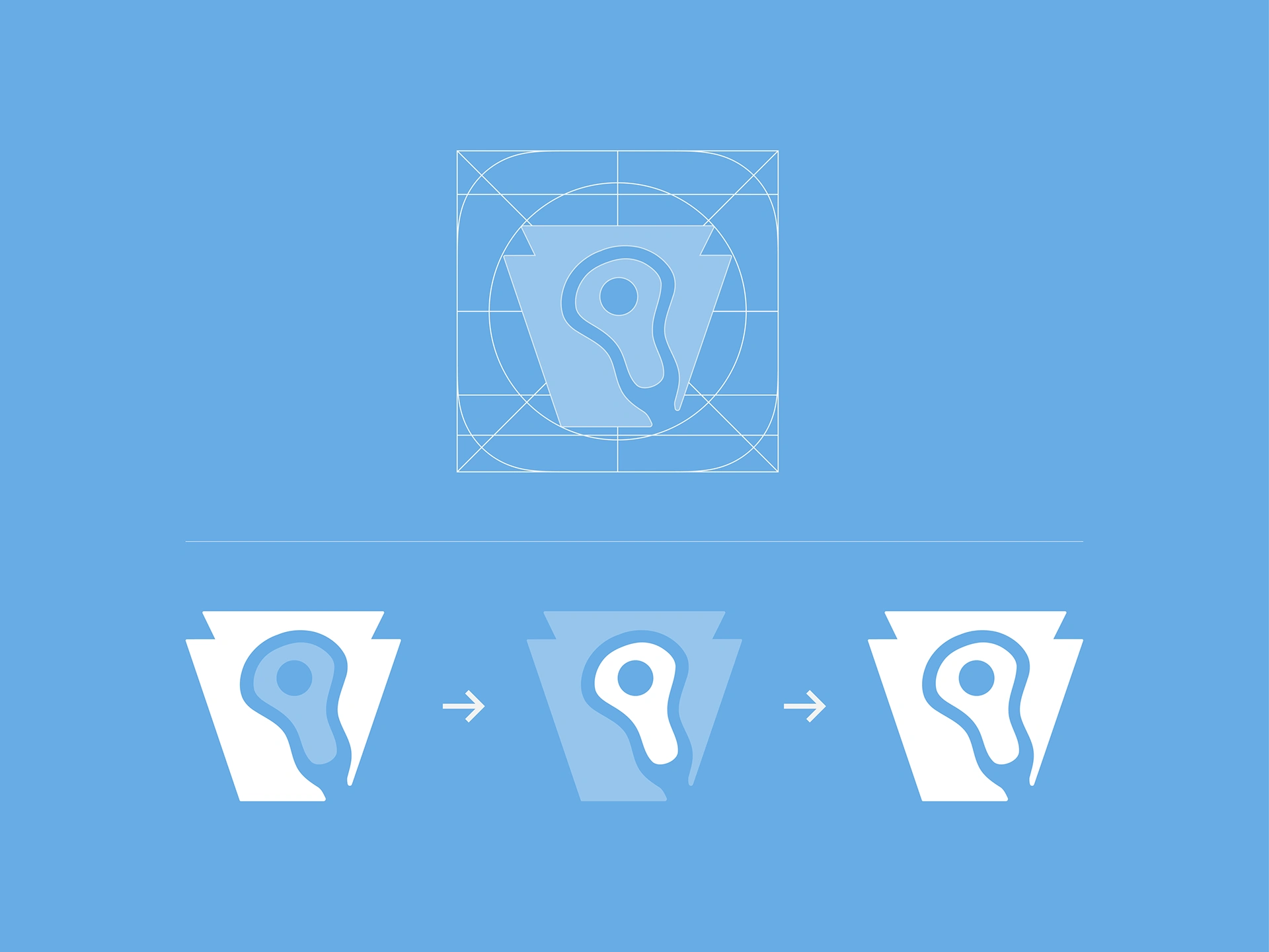
The strategy began with place. Pennsylvania’s iconic keystone, a symbol of strength, stability, and central importance, became the foundation of the identity system. By rooting the logo in this form, the brand immediately connects to its regional heritage in a way that feels intentional rather than ornamental.
From there, the focus shifted to clarity, balance, and longevity. Visual noise was stripped away in favor of strong geometry, thoughtful symbolism, and confident restraint. Every decision was made with scalability in mind, ensuring the identity could perform consistently across a wide range of applications without losing impact.


Solution
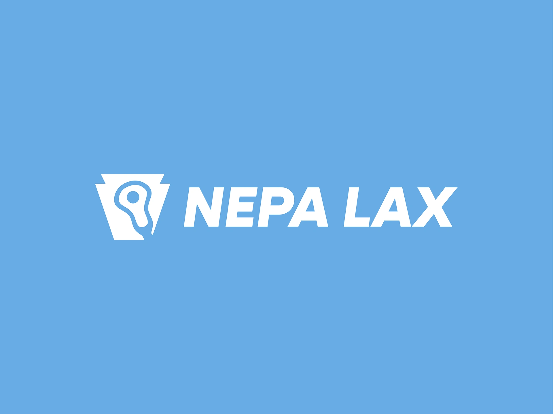
The final mark is built around a simplified keystone structure that grounds the brand in regional identity. Within that form, a streamlined lacrosse head is integrated, balancing tradition with modern design and reinforcing the brand’s connection to the sport.
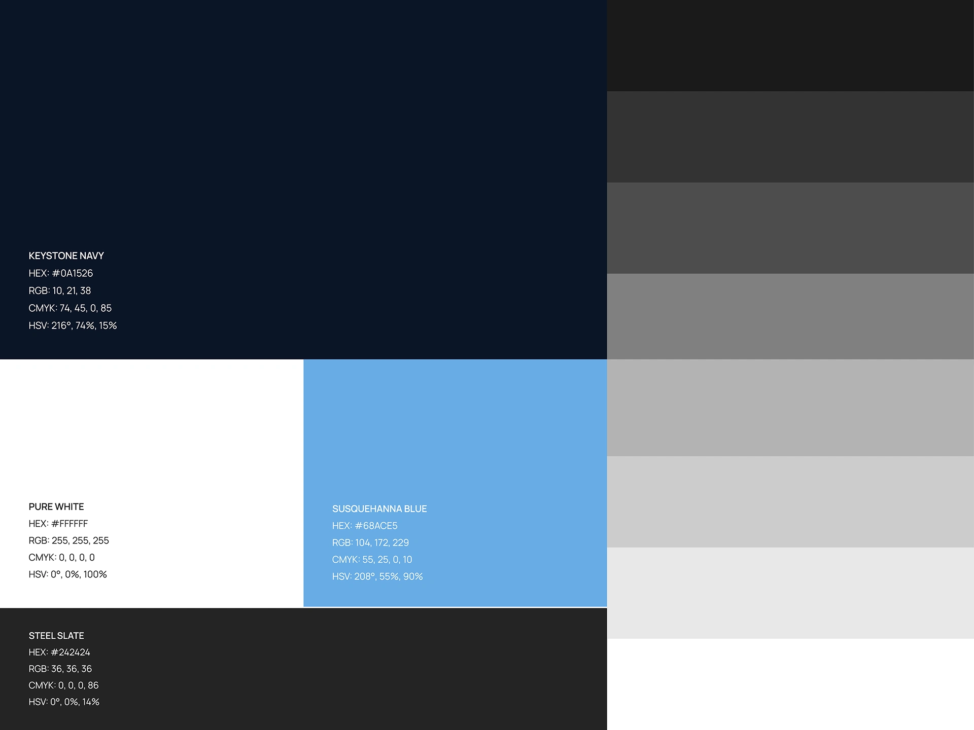
Clean typography and a bold, confident color palette allow the logo to function both as a complete lockup and as a standalone icon. The system was designed to be versatile and durable, maintaining clarity and recognition at any size, from social avatars to apparel and print materials.
Impact
The redesigned identity elevated NEPA Lacrosse News’ visual presence and strengthened its credibility within the lacrosse community. The clarity, symbolism, and versatility of the logo helped position the brand as a polished, authoritative media platform.
The work received industry recognition, including a logo design award and a feature in LogoLounge Book 15, placing the identity among standout branding work from designers worldwide. The project demonstrates how thoughtful, regionally inspired design can create lasting impact and support long-term brand growth.

Like this project
Posted Jan 19, 2026
A regional sports media rebrand focused on logo design, scalability, and a keystone symbol representing Pennsylvania pride.
Likes
1
Views
2
Timeline
Dec 31, 2024 - Dec 30, 2025