SaaS brand refresh: logo refinement and 19-page guidelines

Vincent L. Anderson


A demo built for a specific brief. Not client work: the material shown is sample data, so what is on display is the mechanism.
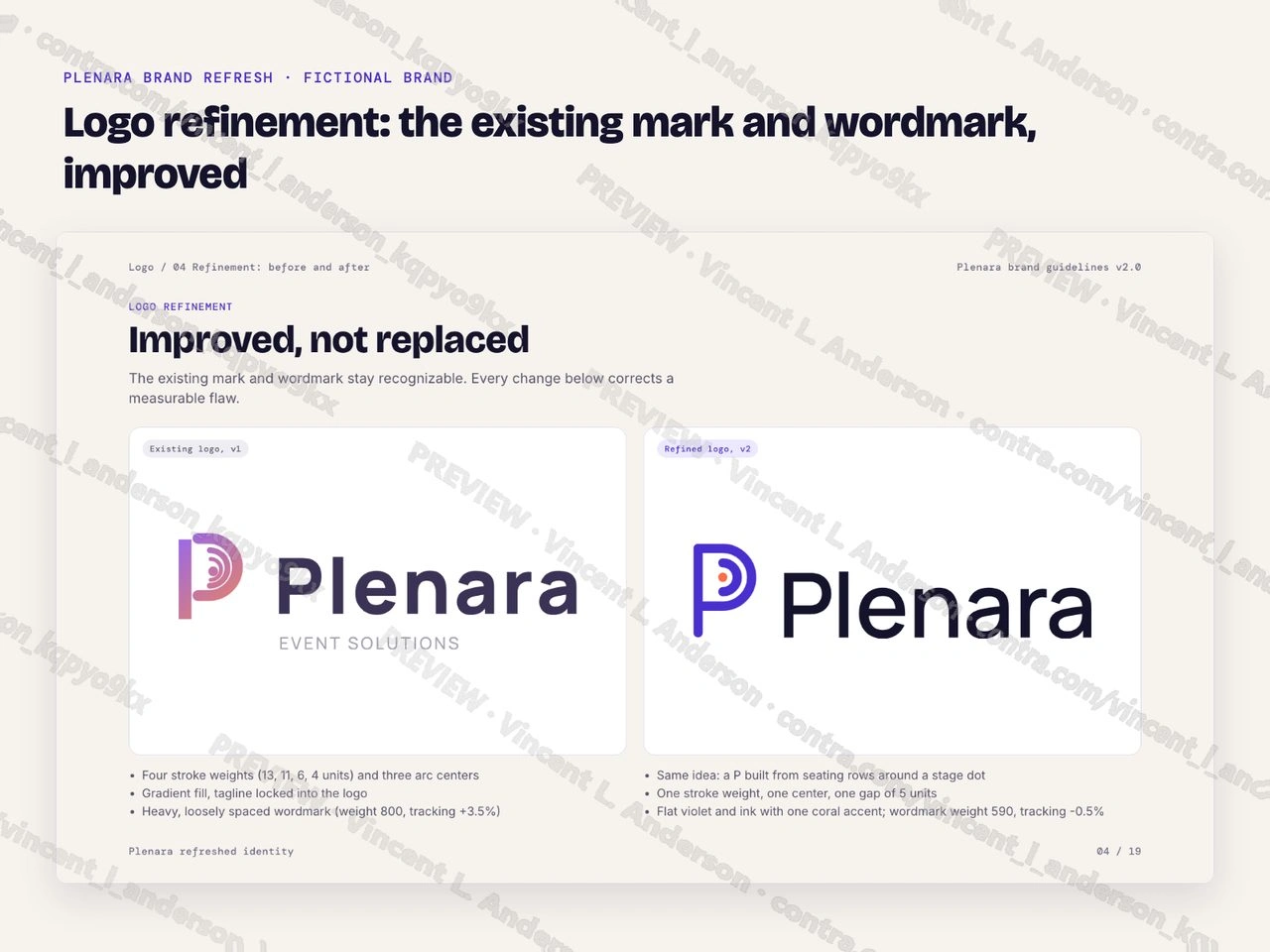
I refined the existing logo of a fictional B2B event-tech SaaS and built a brand system around it. The seating-row P mark keeps its idea and its violet; four stroke weights become one, three arc centers become one, every gap becomes 5 units and the stage dot moves onto the center. The wordmark keeps its letters, moves from weight 800 to 590 to match the mark and gets even spacing. The system adds primary, secondary and UI colors (all 17 checked pairs pass WCAG AA), type for brand, web and product, three graphic devices, three patterns, a 12-icon style and 19 pages of guidelines organized like a Figma guidelines file, shown here as page images. The existing logo was invented for the demo.
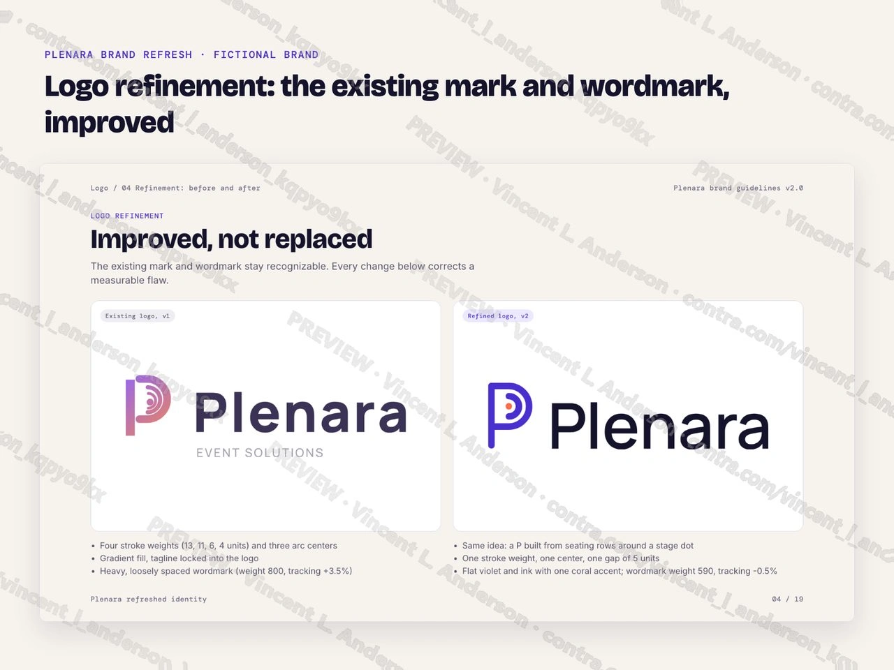
Logo refinement: the existing mark and wordmark, improved
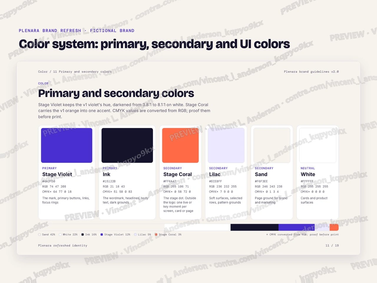
Color system: primary, secondary and UI colors
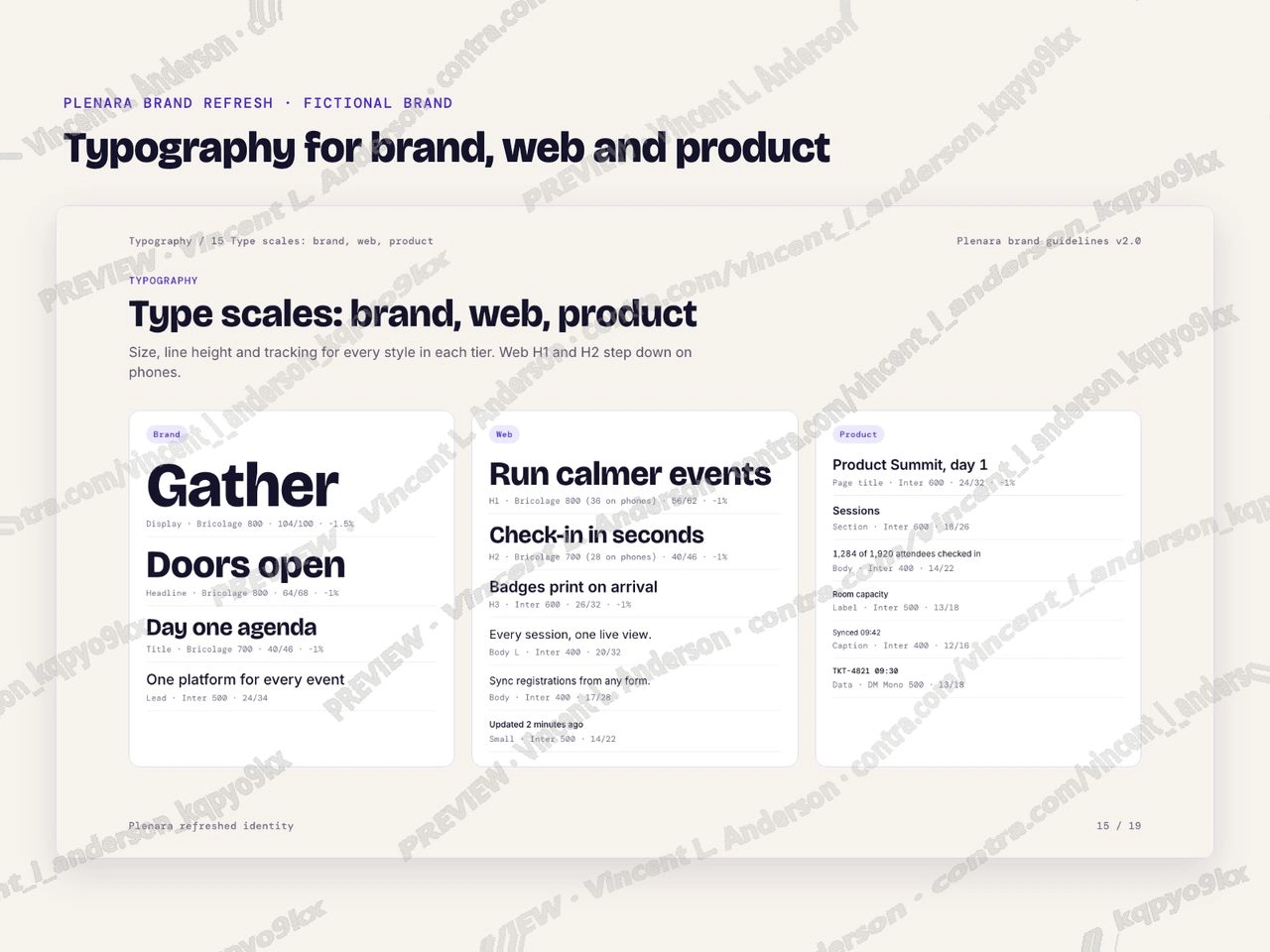
Typography for brand, web and product
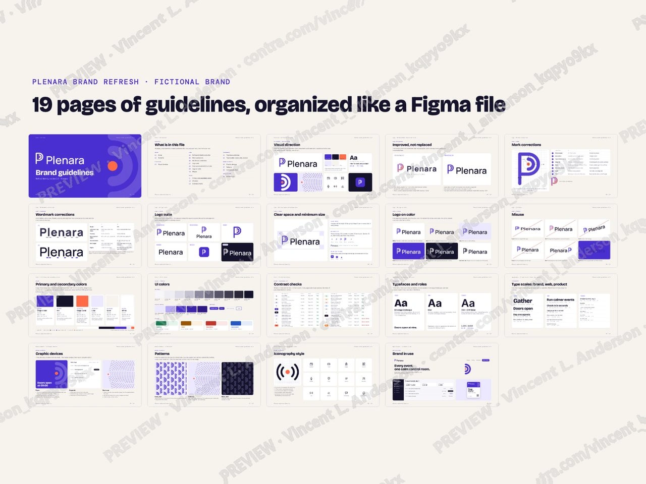
19 pages of guidelines, organized like a Figma file
Like this project
Posted Oct 3, 2026
A fictional B2B event-tech SaaS: its existing logo refined, not replaced, then a brand system around it with color, type, devices, patterns, icons and 19 pages of guidelines.