
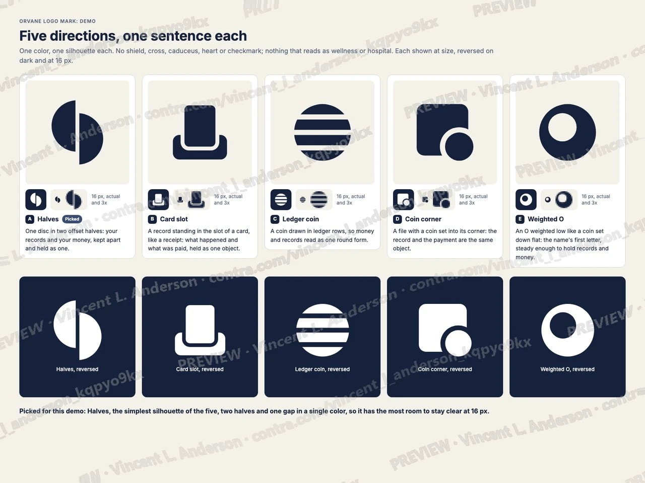
A demo built for a specific brief. Not client work: the material shown is sample data, so what is on display is the mechanism.
I made a logo mark for a fictional consumer health app that keeps medical records and the money spent on care. Five directions, each with one sentence of reasoning, lead to a pick that goes through two rounds of refinement. The final mark is one disc in two offset halves, in a single color, shown positive and reversed on light and dark backgrounds and holding from 1024 px to 16 px with one simplified variant below 24 px, checked on the rendered pixels of every icon. It is shown live as an app icon on home screens, a favicon in browser tabs and an avatar, and it ships as SVG, PDF and PNG in positive, reversed and monochrome, with 13 iOS and 6 Android app icon files, 8 favicon files and a one-page usage sheet.
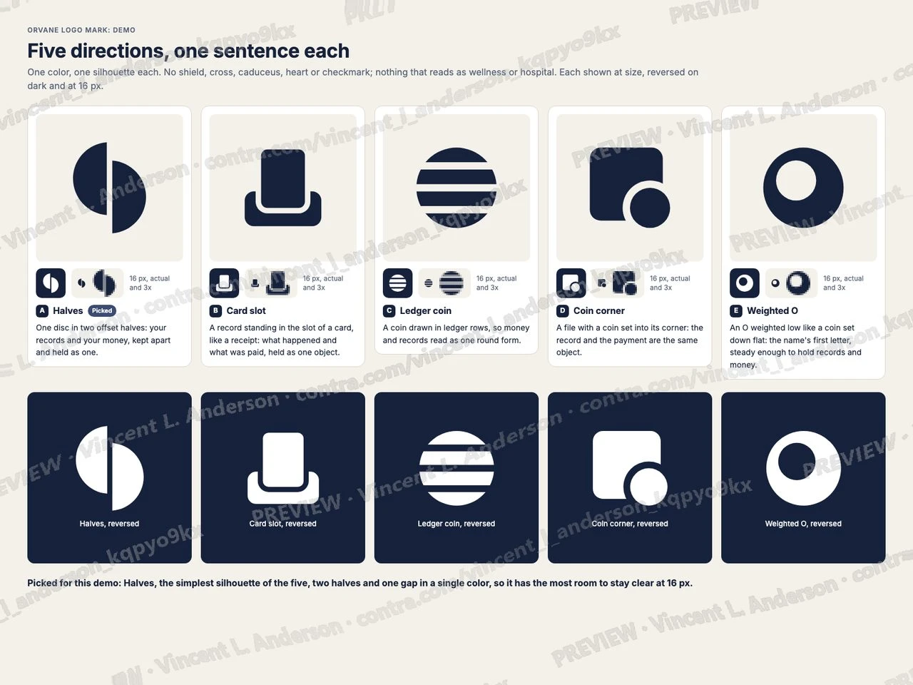
Five directions, each with one sentence of reasoning and a 16 px check
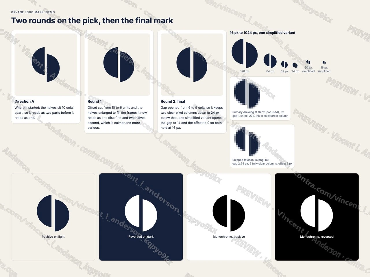
Two refinement rounds, the final mark in one color, and the 16 px simplified variant
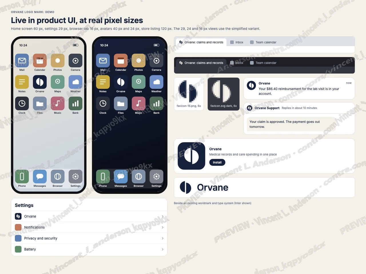
The mark live as an app icon, favicon and avatar on light and dark
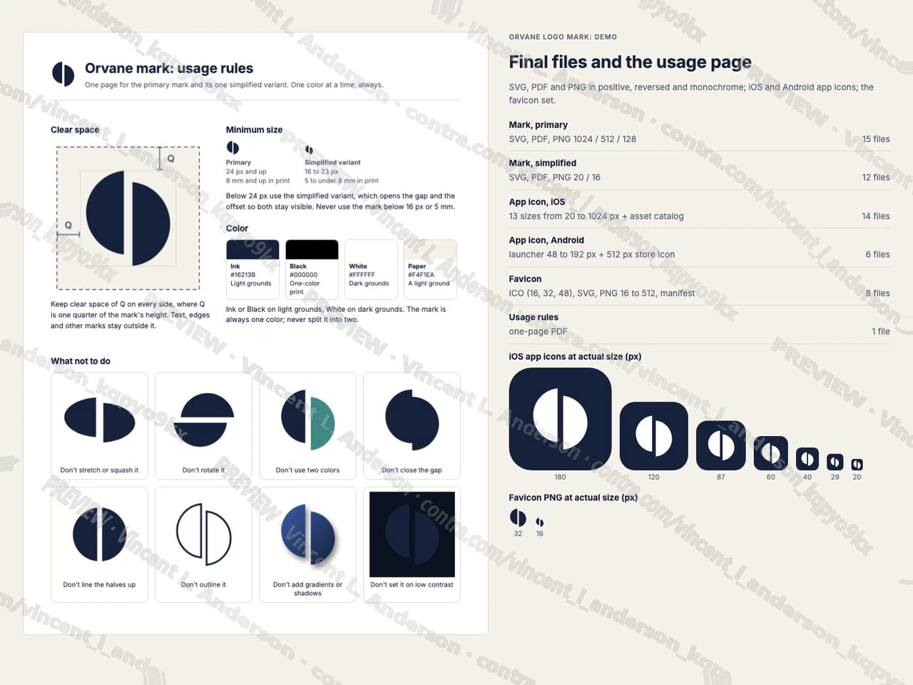
Final files and the one-page usage rules
0 likes · 1 view · Oct 3, 2026
Logo mark for a fictional consumer health app trusted with medical records and money: five directions, two rounds on the pick, one color positive and reversed, 1024 px to 16 px with one simplified variant, app icon and favicon sets, one-page usage rules.

