
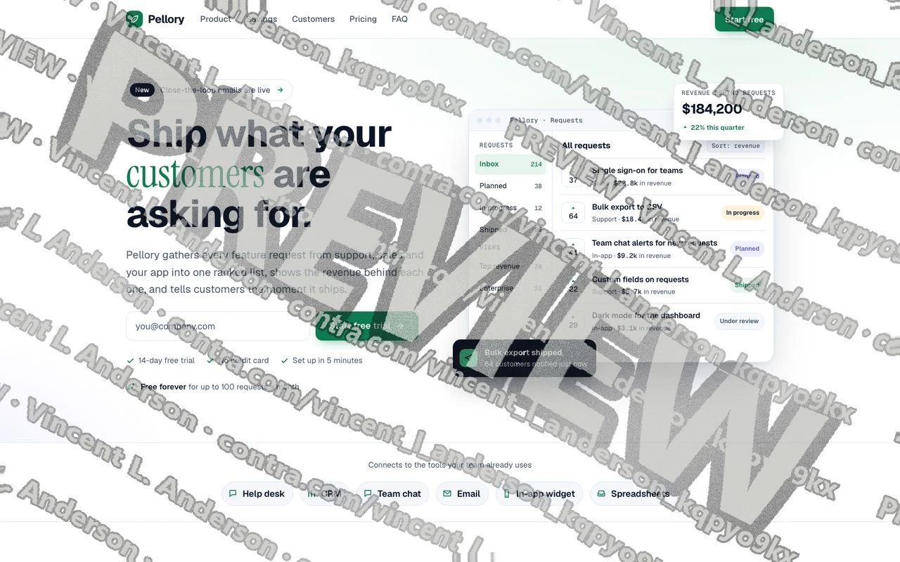
Demo: a landing page concept for Pellory, a placeholder SaaS brand. Built for a landing page brief; not client work.
In motion at phone width: tour tabs, the hours calculator and the billing switch
I designed and built a complete SaaS landing page for Pellory, a fictional brand, for a landing page brief. It opens with an outcome headline, a product screen mock-up and an email-first trial form, then takes the visitor through a three-tab product tour, an hours calculator they drag to their own volume, illustrative customer quotes, pricing with a monthly and annual switch, answers to common objections and a closing sign-up. Each of its 11 sections has one job, and the page carries 8 calls to action. On a 390 px phone the trial button sits on the first screen, and a trial bar follows the reader down the page. A UI kit covers colors, type, button and form states and the product screen components, and all 14 text color pairs meet the 4.5:1 contrast minimum.
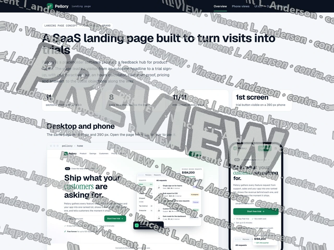
Overview: desktop and phone, and the job of every section
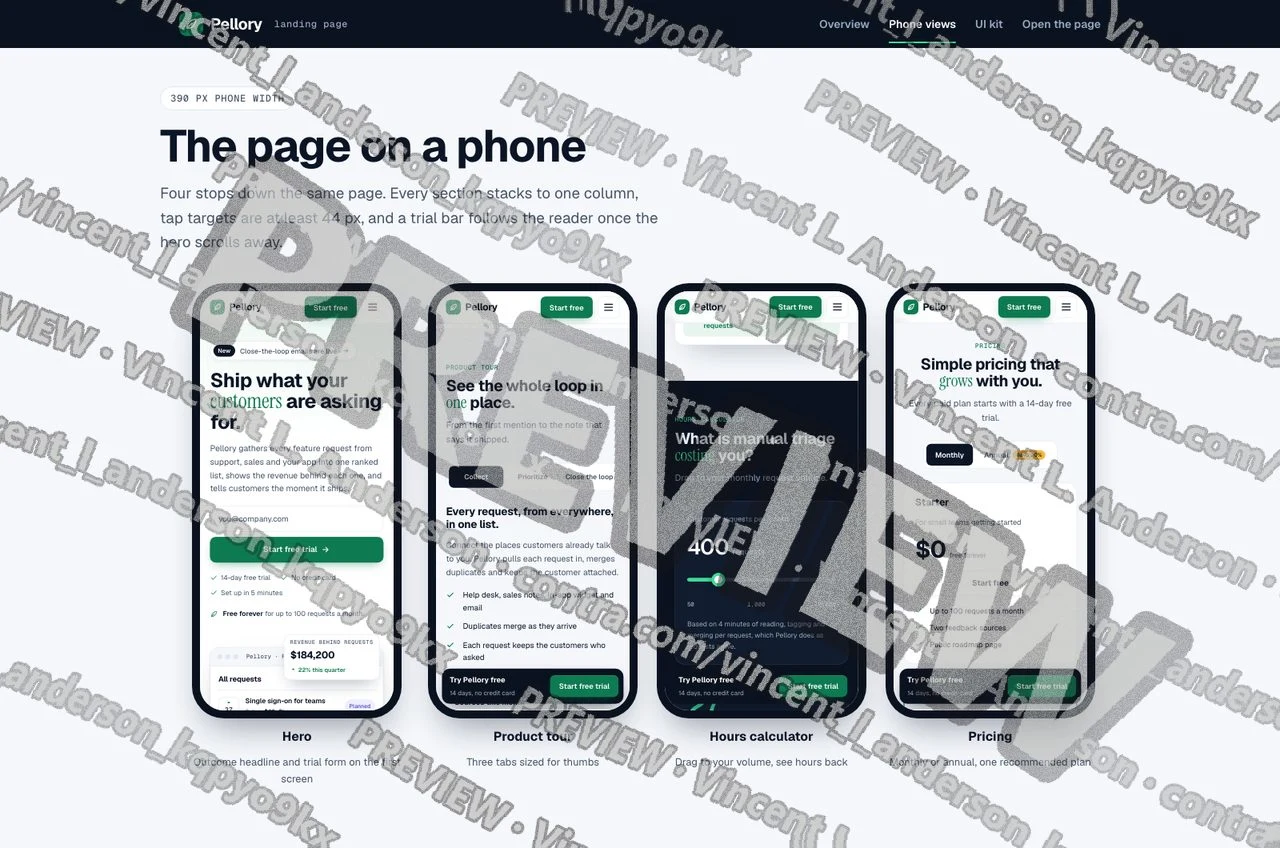
Four stops down the page at 390 px phone width
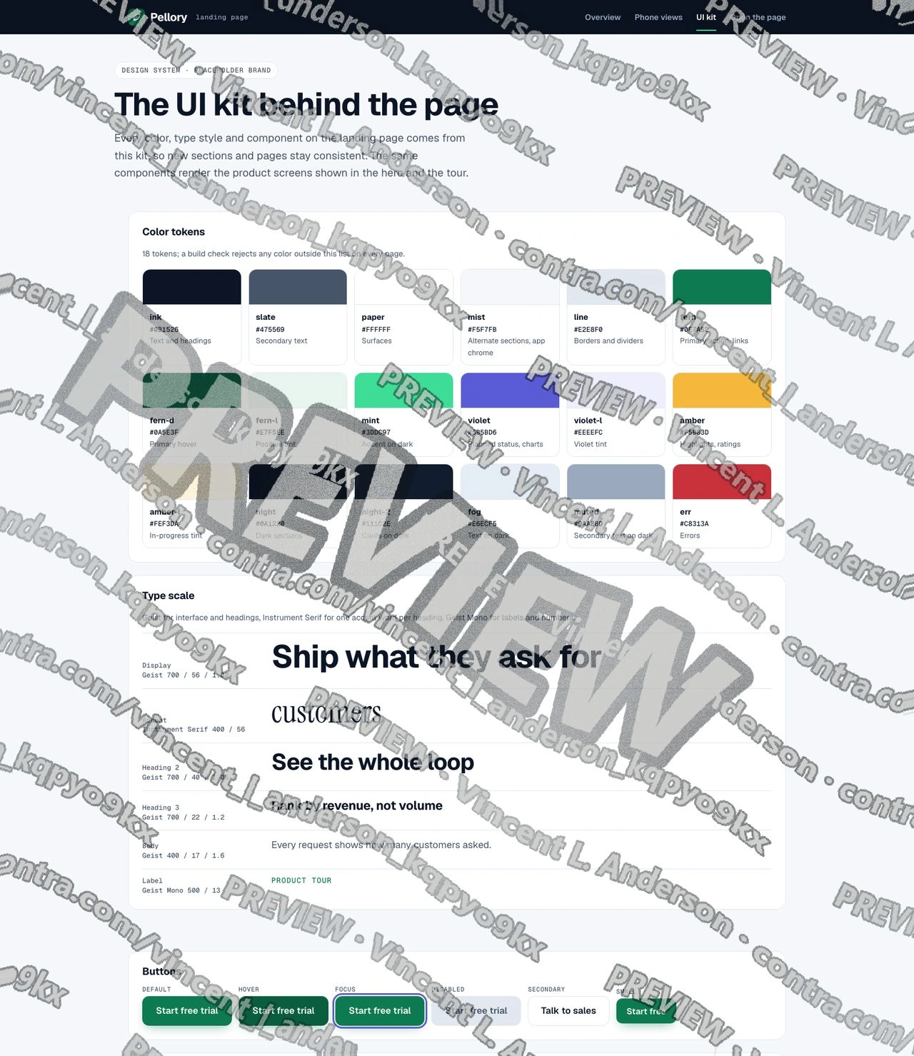
UI kit: color tokens, type scale and button states
0 likes · 2 views · Sep 30, 2026
SaaS landing page for a fictional brand: product screen mock-up, email-first trial sign-up, three-tab tour, hours calculator, pricing switch and FAQ, with a UI kit. Responsive on phone, tablet and desktop.

