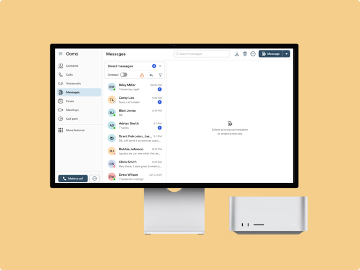
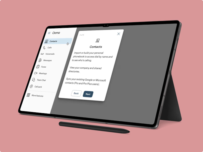
Enhancing Ooma’s Messaging Controls
Challenge
Ooma's messaging platform lacked a way for users to manage their messaging usage effectively. Users were only notified when they exceeded their usage limits through warnings or errors, which often led to frustration. I was tasked with creating a solution that not only informed users of their monthly messaging usage but also allowed them to manage this usage proactively. Additionally, I needed to integrate a new feature that enabled users to manage and toggle auto replies for messages, ensuring that these controls were intuitive and easily accessible.
Results
My design significantly improved the user experience, resulting in a 20% increase in platform usage and higher user satisfaction. The new interface allowed users to manage their messaging effectively and provided clear, actionable insights, all in one place.
Design Process
Competitor Analysis
To kick off the project, I conducted an in-depth analysis of how other companies handle messaging usage notifications and controls. This research helped me identify best practices and gave me a solid foundation to build upon.
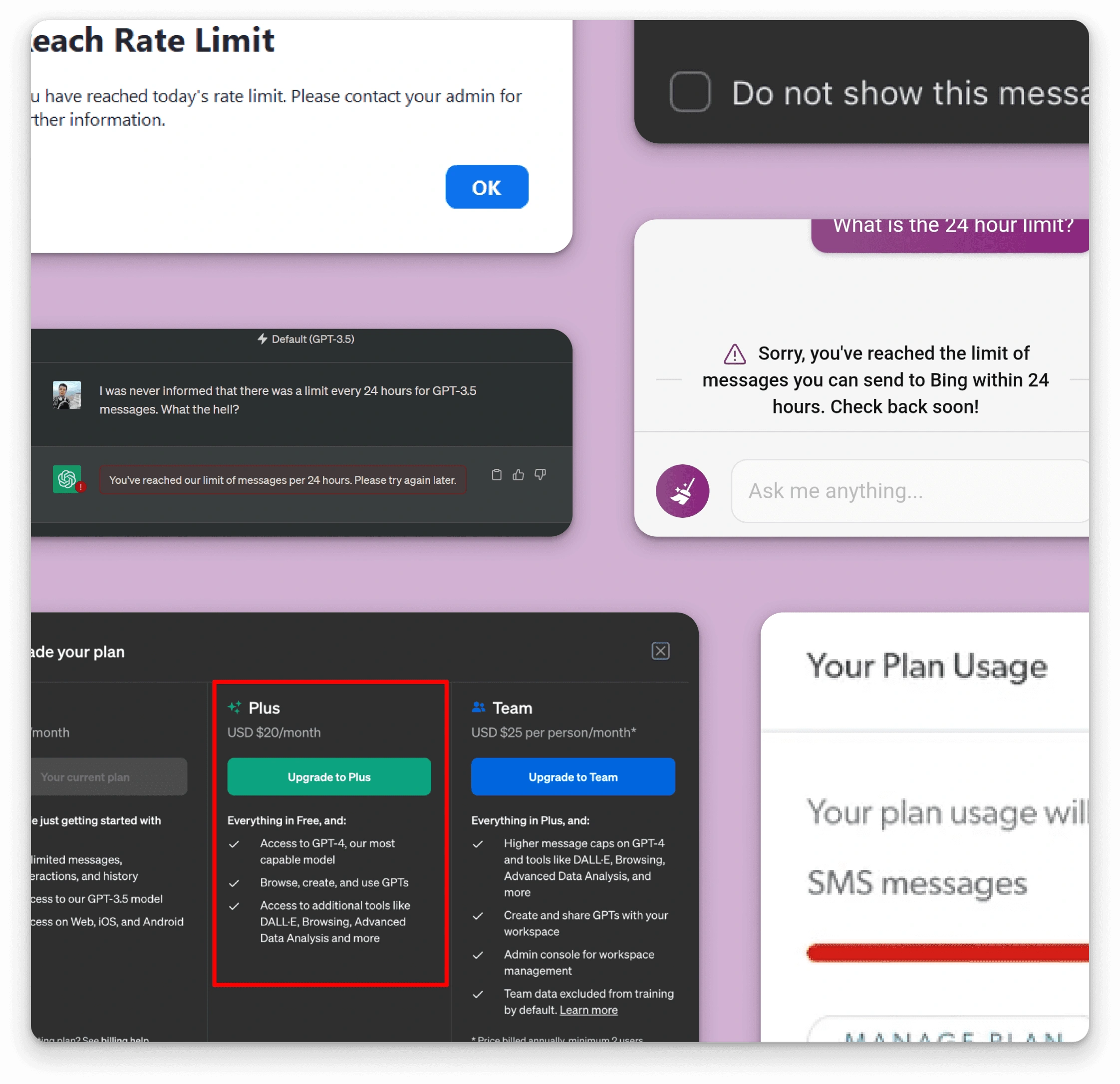
Wireframes and Sketches
I then moved on to creating wireframes and sketches, which allowed me to visually communicate my ideas to the project manager. These low-fidelity designs were crucial in ensuring that everyone was aligned with the direction of the project. Once the wireframes were approved, I began refining the design.
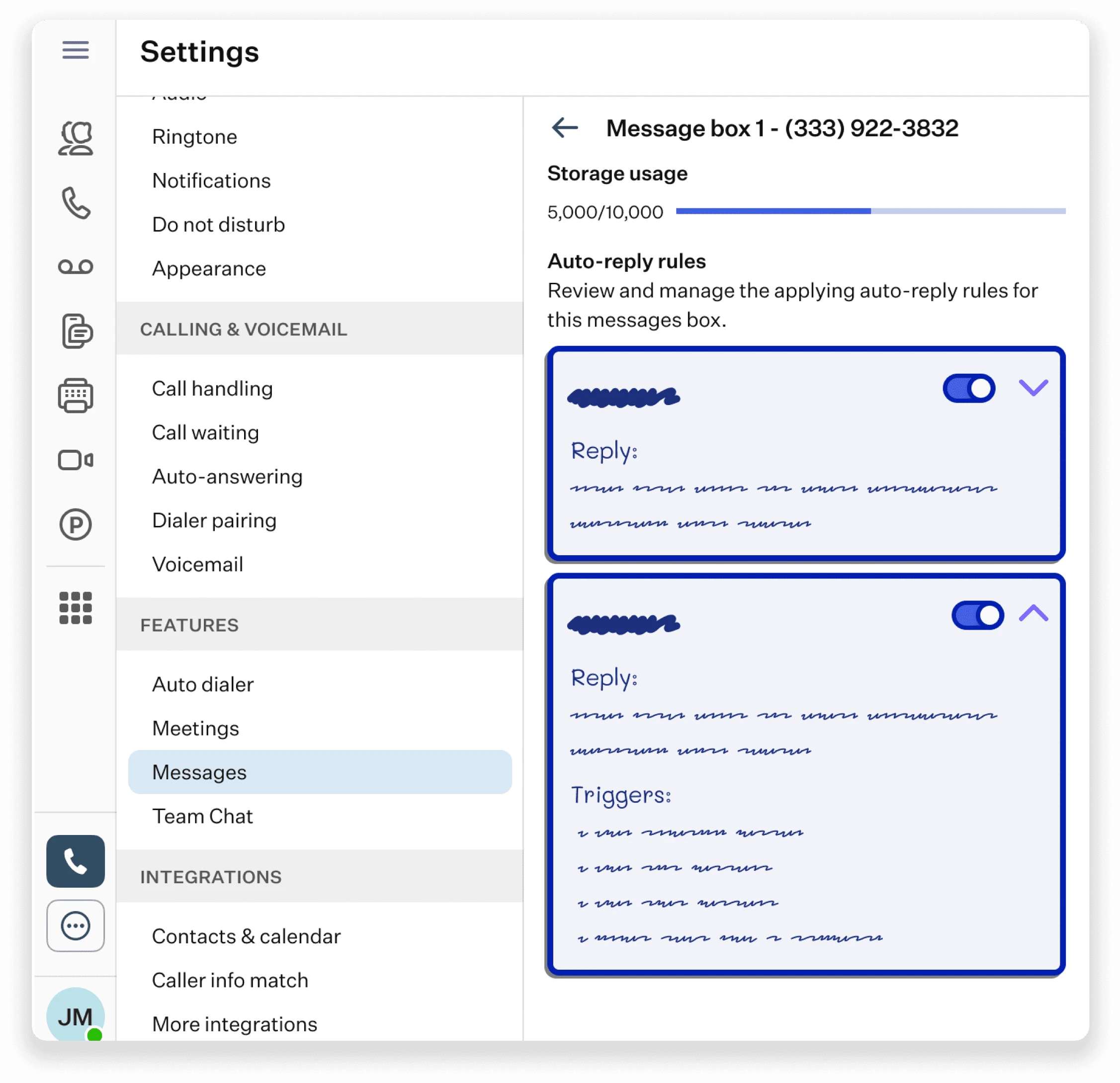
UI Design
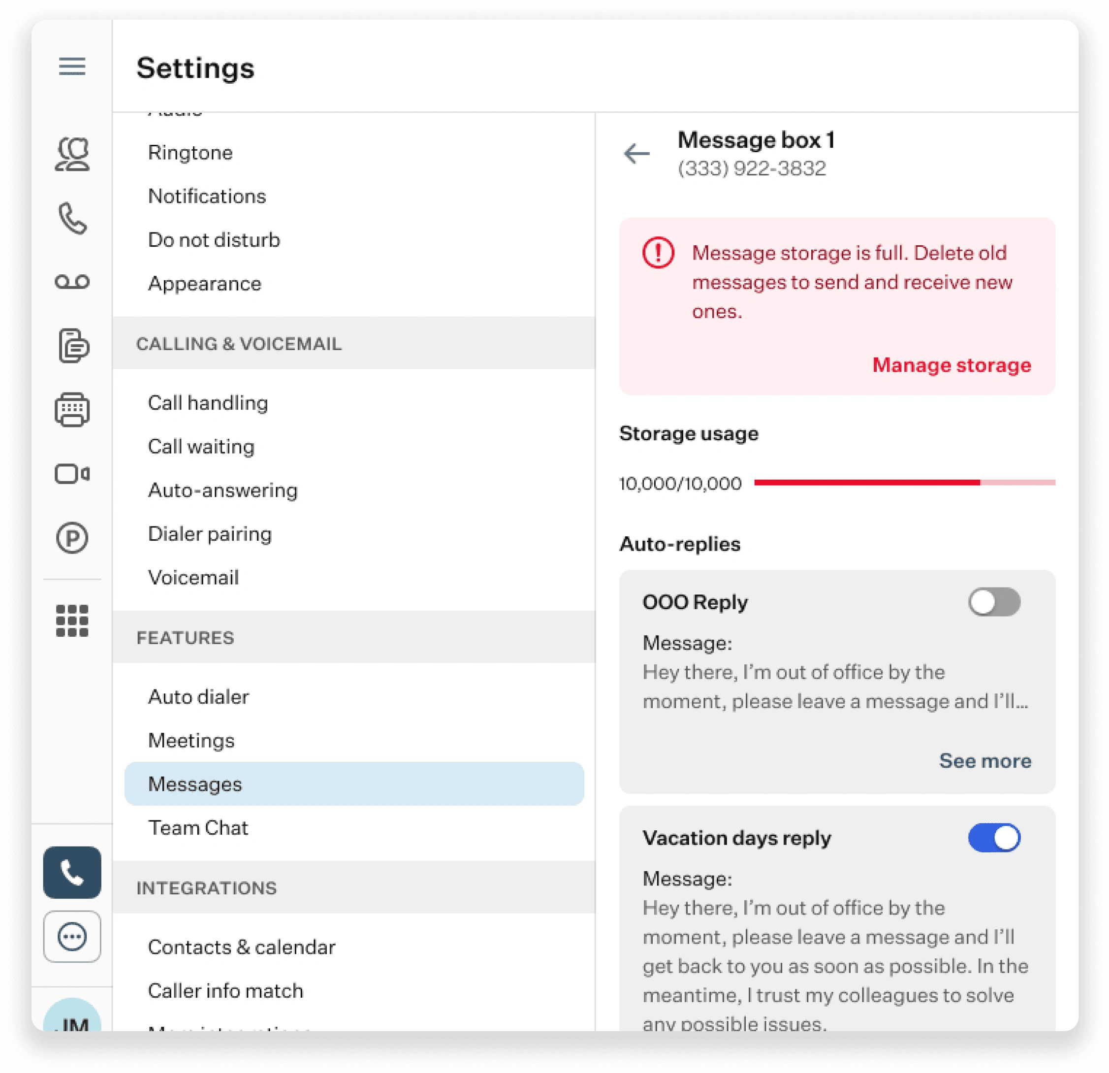
Leveraged Material UI’s component library to develop a clean and user-friendly interface. Implemented progress bars to show messaging usage and integrated snackbars and banners for notifications. The design focused on providing users with a comprehensive view of their usage and the ability to manage auto replies from a single location.
Like this project
Posted Oct 9, 2024
At Ooma, I designed a solution for managing messaging usage and auto-replies, boosting platform usage by 20% and enhancing user satisfaction.

