Optimizing User Guidance for Ooma’s App Modules
Juan Pablo Cabellos Aguilar
Challenge
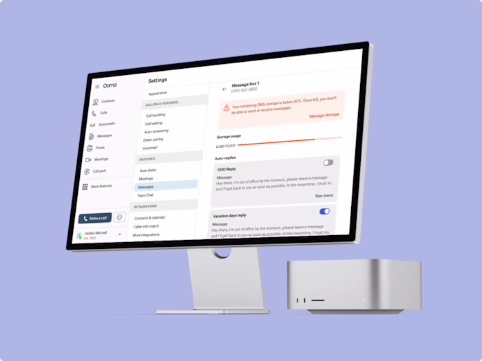
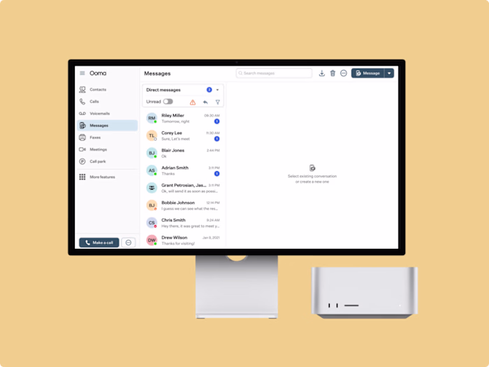
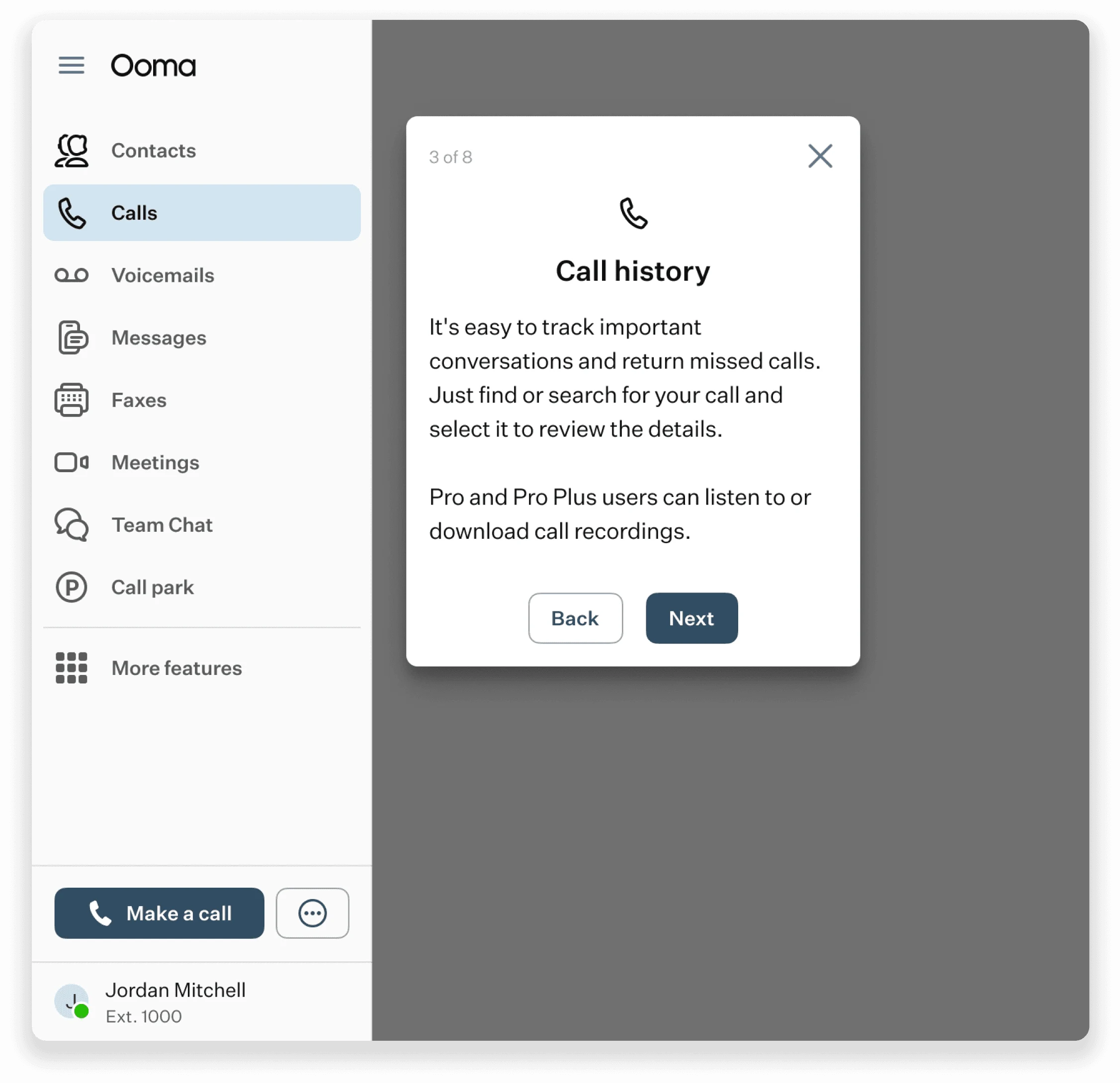
Ooma’s communication app includes multiple modules, like Directory, Calls, Voicemails, Messages, Faxes, and Meetings, each with its own set of features. Users often struggled to understand what they could do in each module, which led to confusion and underutilization. My task was to create an introduction for each module that clearly explained its features and functionality, helping users navigate the app with confidence.
Results
The user guidance system I designed led to a 15% increase in user retention. By providing users with straightforward, step-by-step instructions, I helped them better understand and engage with the app's full range of features.
Design Process
Research & Analysis
I started by looking into how other companies handle tutorials, finding that stepper modals were a popular and effective approach.
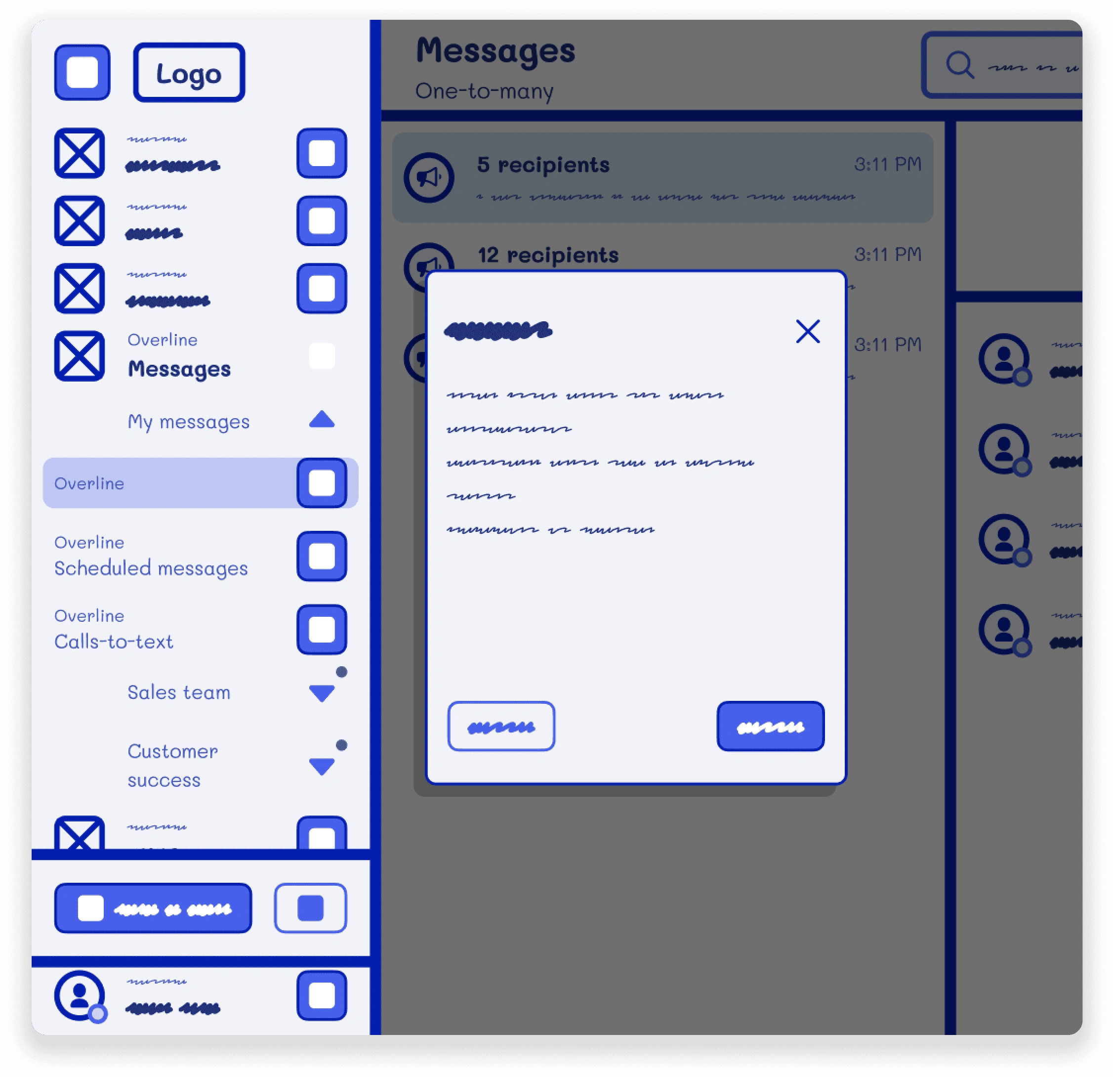
Wireframes and Sketches
I sketched wireframes to show how the tutorial content would be displayed in the app, which helped get approval from project managers.
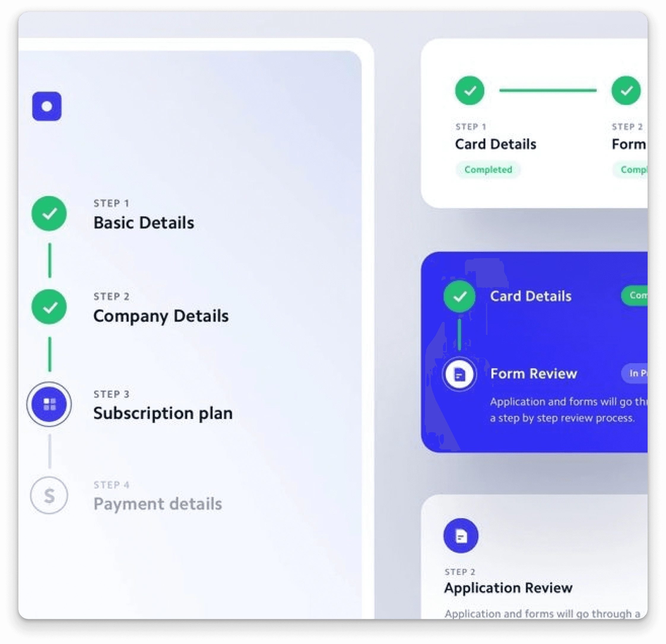
UI Design
Then I created a stepper modal that introduced users to each module, with clear text, images, and navigation buttons. I also included options to skip or revisit the tutorial later, based on user feedback.
Like this project
Posted Oct 9, 2024
At Ooma, I designed module introductions for the communication app, increasing user retention by 15% by clarifying features and enhancing navigation.