Simplifying Navigation in Ooma’s Messaging Module
Juan Pablo Cabellos Aguilar
Challenge
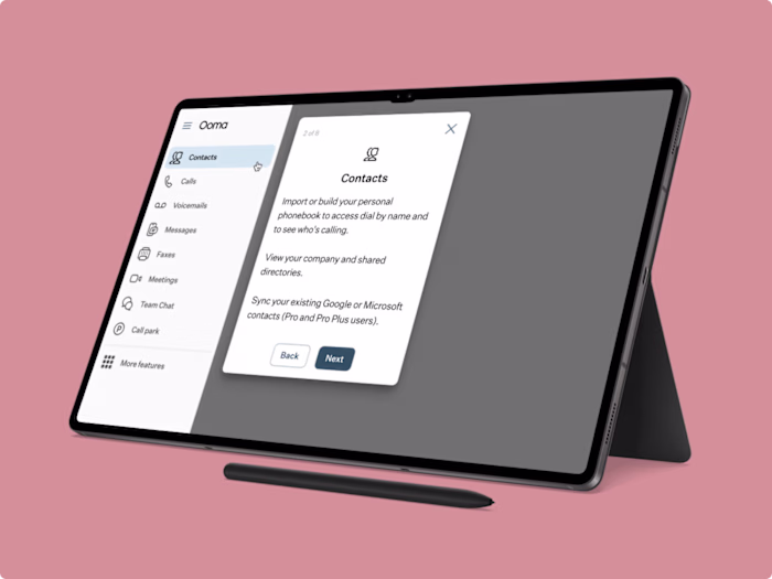
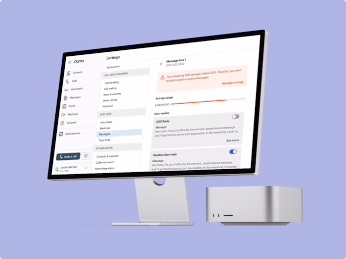
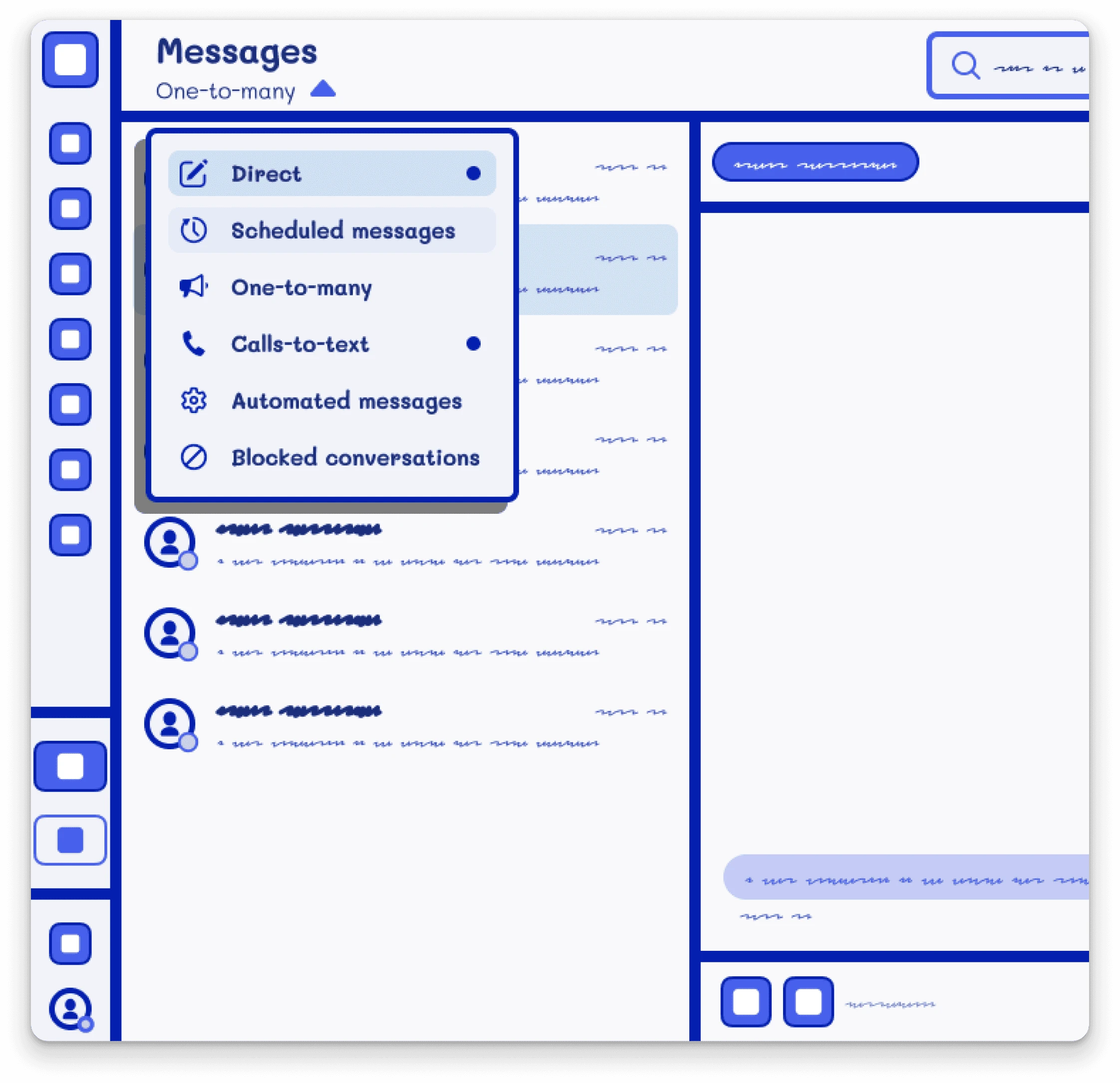
Users often got lost trying to navigate between different message boxes—such as Direct Messages, Scheduled Messages, One-to-Many Messages, and Auto Replies—within Ooma’s messaging module. This confusion led to frustration and inefficiency.
Results
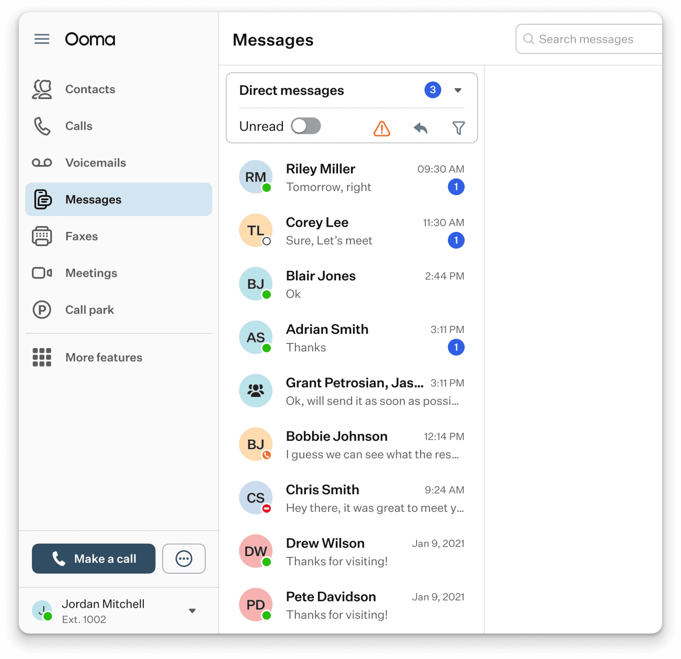
I designed a dropdown navigation for Ooma’s messaging module, simplifying user access to different message boxes like Direct Messages and Auto Replies. This solution increased user satisfaction by 60%, offering a cleaner, more intuitive experience.
Design Process
Research
To kick off the project, I conducted an in-depth analysis of how other companies handle messaging usage notifications and controls. This research helped me identify best practices and gave me a solid foundation to build upon.
Wireframes and Sketches
I created multiple low-fidelity wireframes and sketches, exploring different navigation options like tabs, subcategories, and secondary nav bars. After several iterations, I identified that a dropdown menu would be the most minimalistic and effective solution.
Final Design & Iteration
I designed a dropdown menu at the top of the message boxes, allowing users to easily navigate between different message types. I refined the design based on user feedback to ensure it was intuitive and user-friendly.
Like this project
Posted Oct 9, 2024
I designed a dropdown navigation for Ooma’s messaging module, simplifying access to message boxes and increasing user satisfaction by 60%.