Built with Framer
Interactive web designer portfolio creation

Niks Pisarevs


💻 About my website
Most designer portfolios read the same: a grid of thumbnails and a name. Mine needed to do more, carry a point of view, prove eCommerce credibility, and convert a cold visitor into a "let's chat" email. The problem was signal. How do you look premium and confident without saying "premium" and "confident"?
🔍 The approach
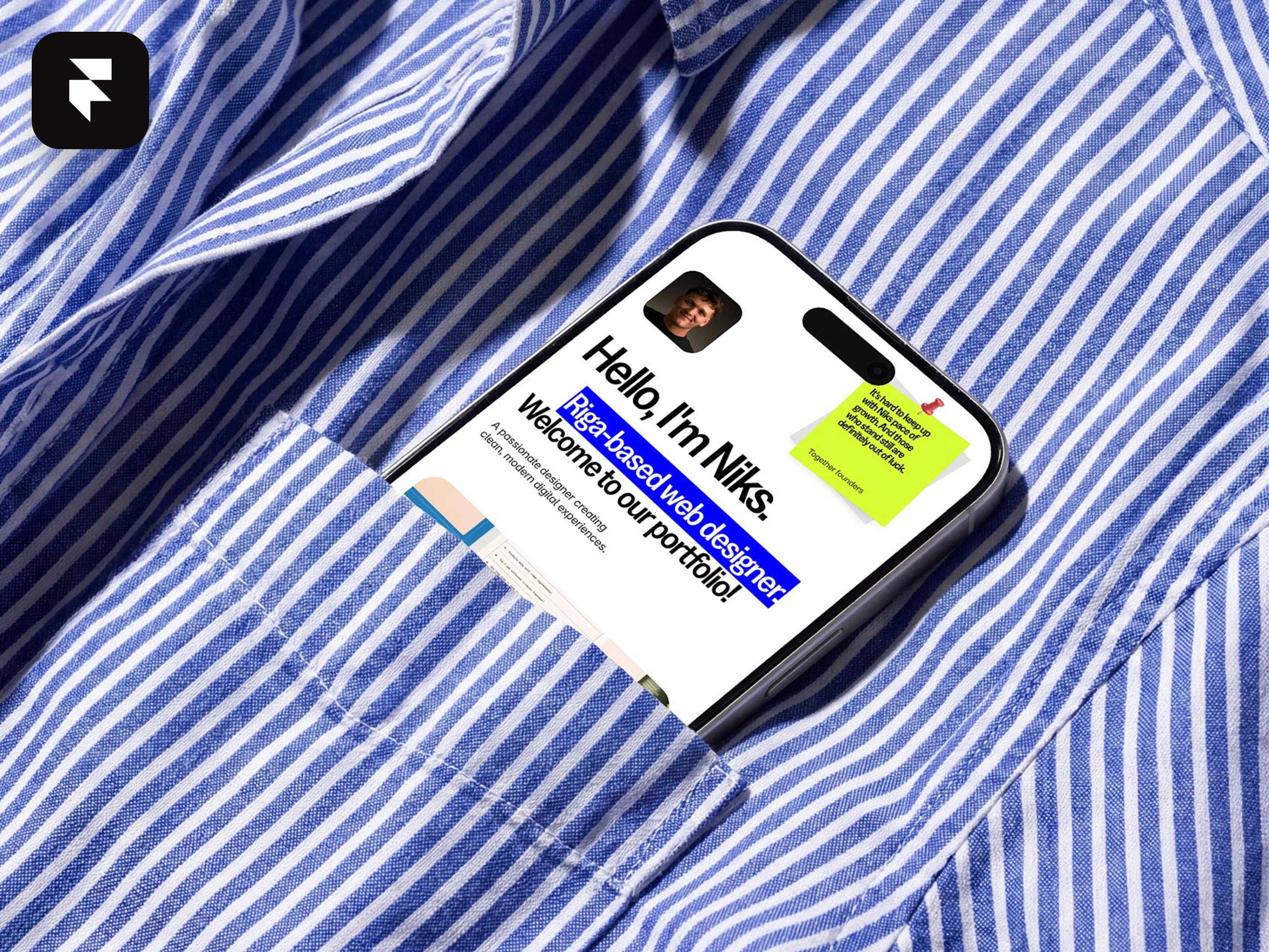
Voice before layout. I wrote the site like I talk — "Hello, I'm Niks. Riga-based web designer." Direct, a little playful, no agency fluff. The copy does the positioning; the design just gets out of its way.
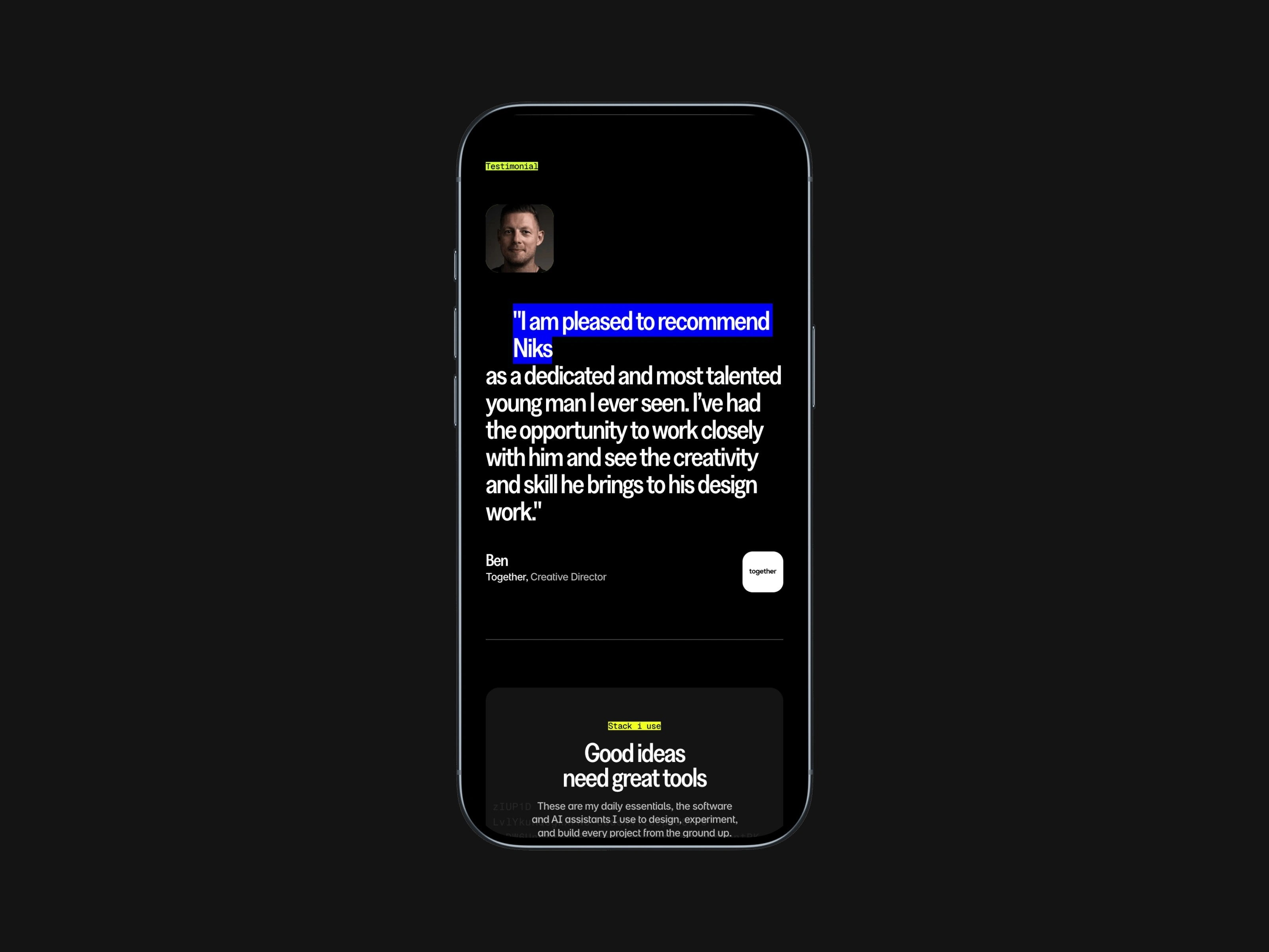
Editorial, not corporate. Oversized type, a raw highlight-on-text treatment, and real mockups shot in context (a phone in a shirt pocket) instead of sterile UI frames. It reads like a magazine spread, not a template.
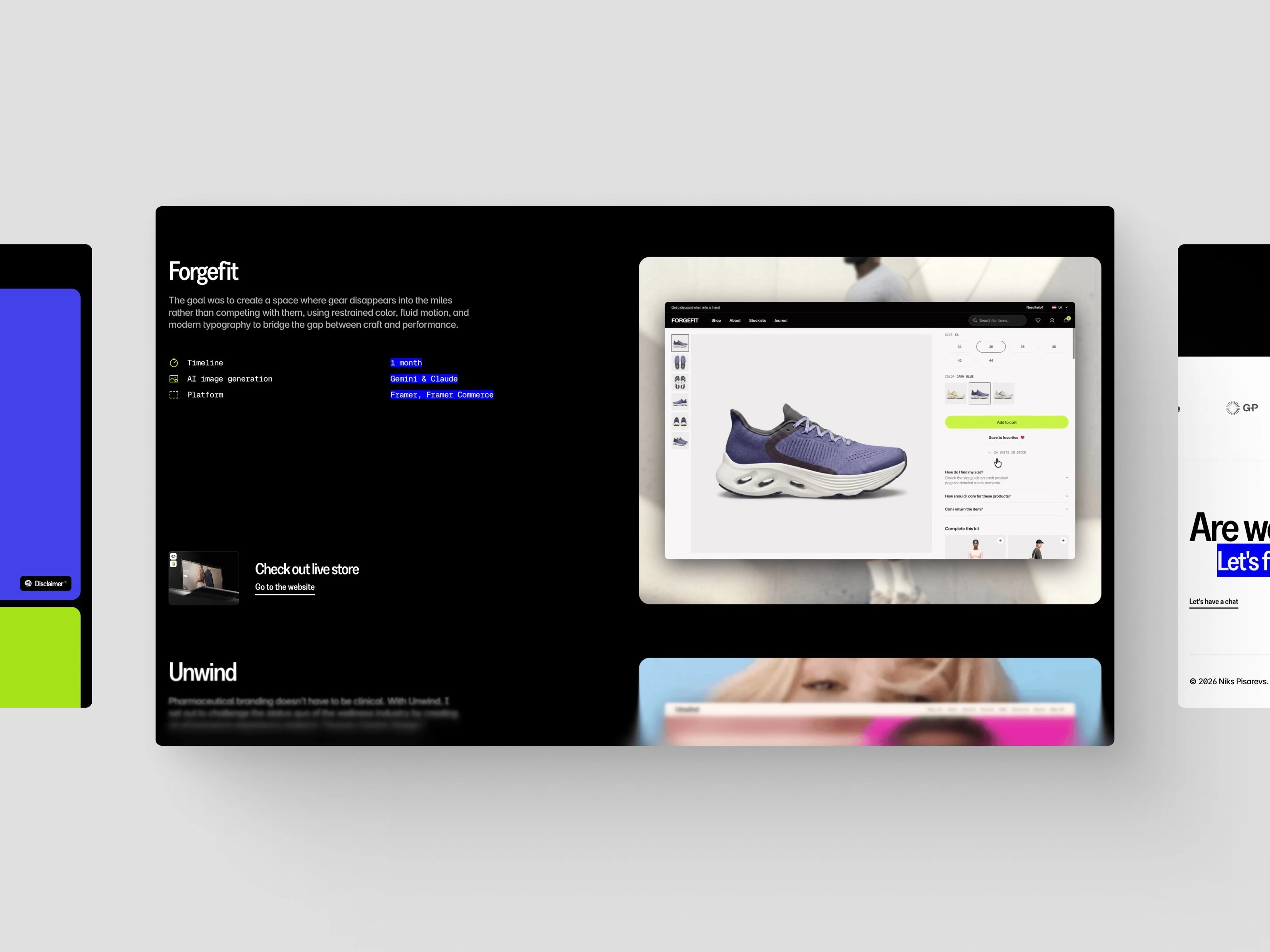
Proof, stacked. Experience timeline, client and sales numbers, live eCommerce projects with their own spec blocks, and two testimonials from Together's founders. Every section answers "why trust him?" before the visitor thinks to ask.
Built in Framer. Fully responsive, animated, and shippable by me alone — the same stack I sell to clients, so the site is its own proof of capability.
🏆 The results
A portfolio that works as a sales tool, not a résumé. It positions me clearly in Framer eCommerce, shows range from SaaS to storefronts, and ends every path at the same place: Are we a match? Let's find out.
Like this project
Posted Jul 21, 2026
Designed a distinctive, conversational web portfolio that reflects my design voice, boosting engagement and personal credibility with clients.
Likes
1
Views
8
Timeline
Jun 1, 2026 - Jul 1, 2026