Brace Finance Branding :: Behance
Farouq Osuolale
THE BRAND
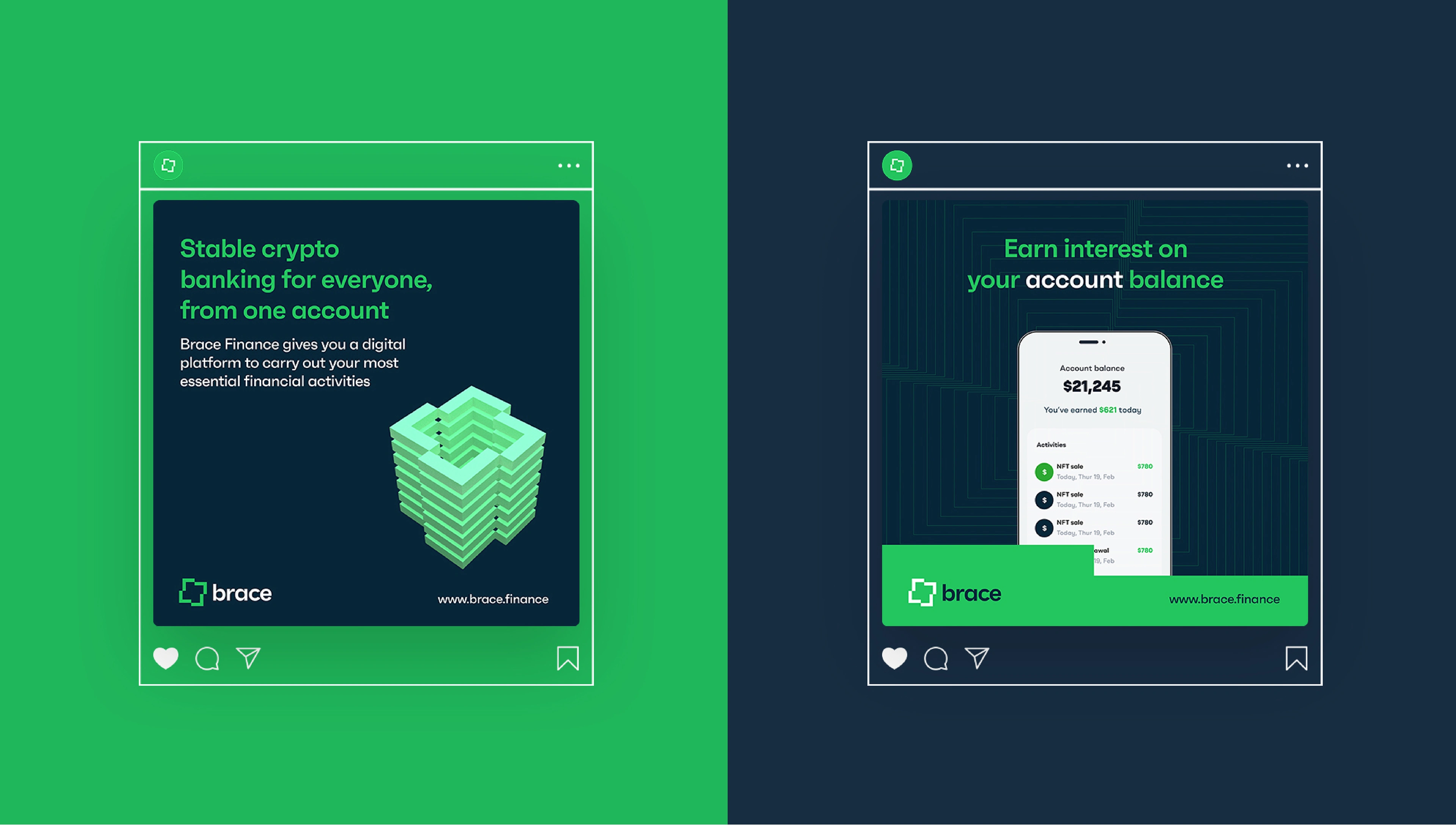
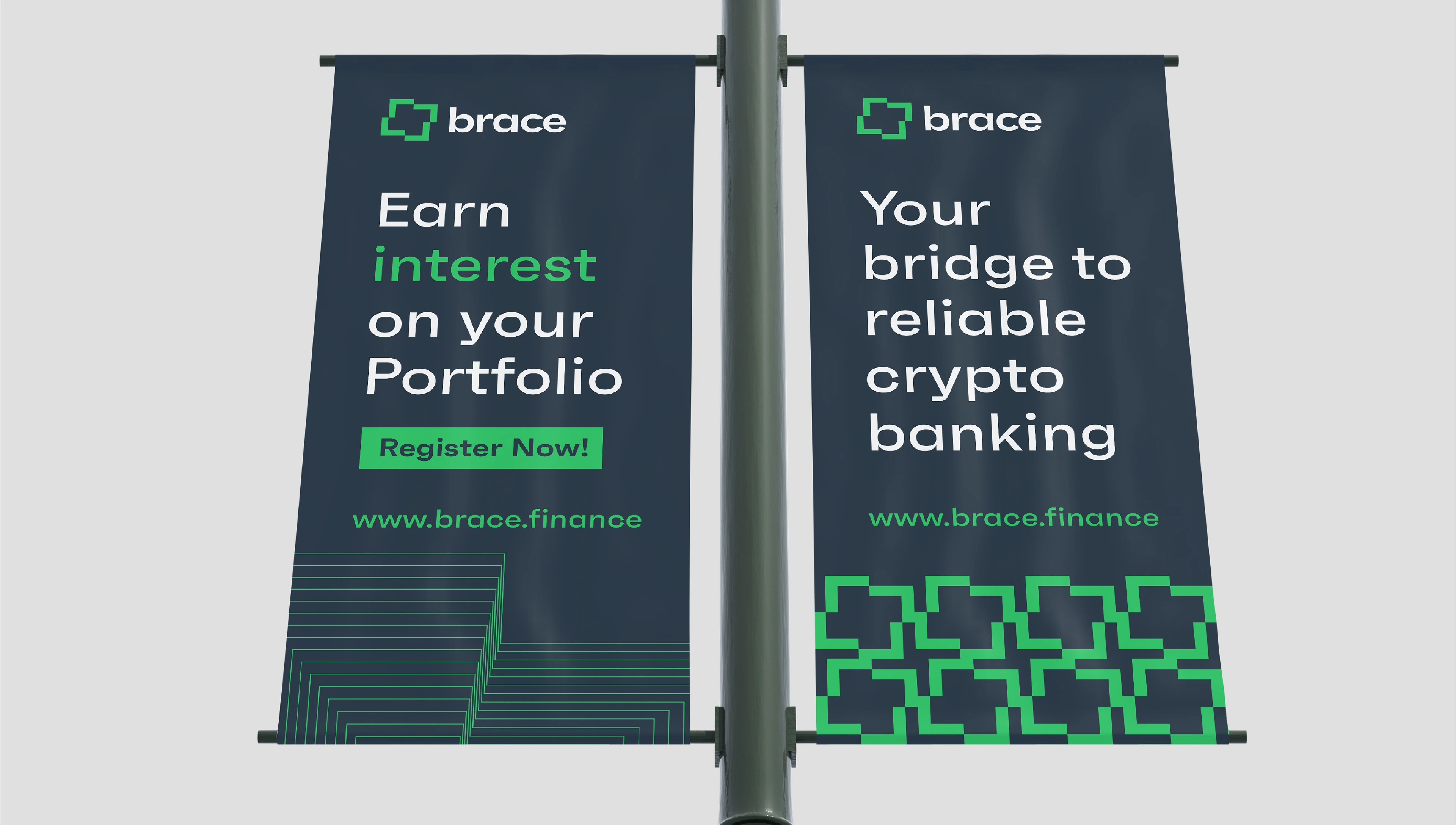
Brace Finance gives every user a digital platform to carry out their most essential financial activities, using both fiat – legal tender such as NGN, USD and cryptocurrencies for their transactions. From one account, the user gets to pay, save, spend, invest and earn interest on their assets.
Brace's simplicity is what makes it the ideal choice for people who want to simplify their financial life, but are not sure where to start.
THE PROBLEM
Brace Finance is associated with innovation and change – a disruptive product for the target audience but Brace's previous logo lacks that touch to portray Brace in that sense. The logo also looks quite similar to that of other brands in the same space.
PROJECT GOALS
1. Discover the traits that defines Brace Finance; discovering who or what Brace really is and what emotions does Brace portray.
2. To develop a unified design language that is unique to Brace finance; one that is easy to identify, memorable and aligns with the Brace’s values.
3. Redesign the old logo & visual language to something more modern and cleaner.
APPROACH
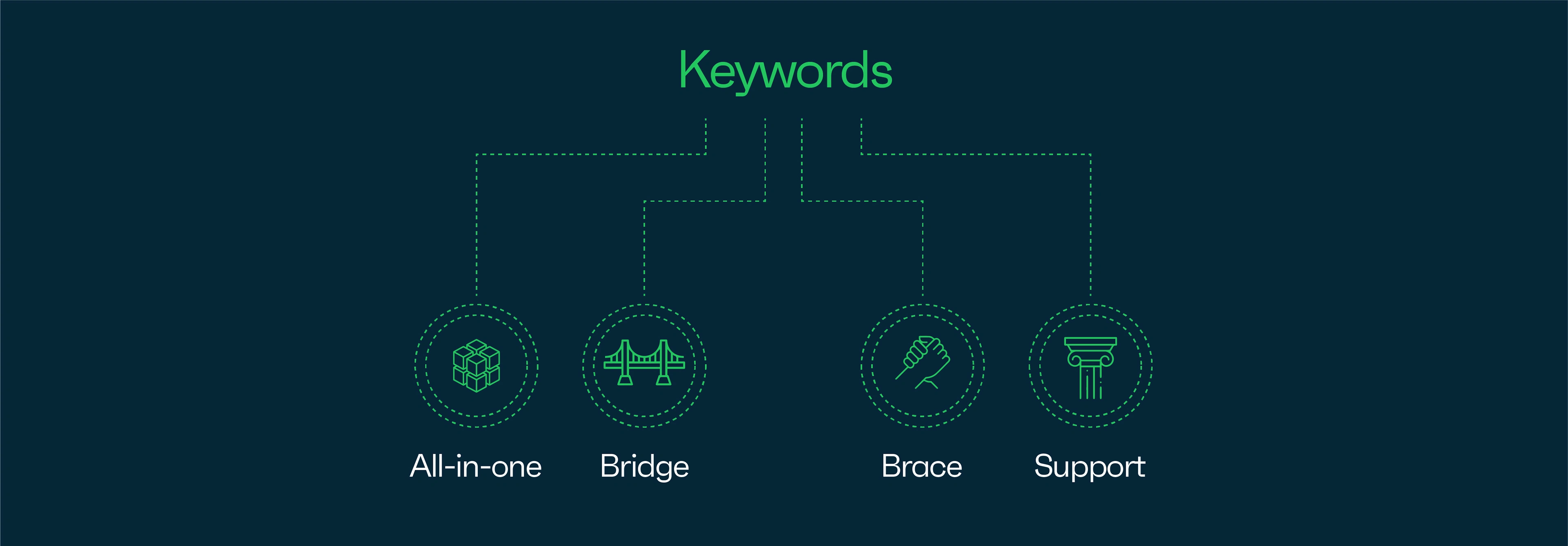
By engaging Brace’s finance stakeholder’s and employee in a brand discovery session, we were able to find out how we can portray Brace Finance as a human. We discovered keywords and values that aligns with Brace’s purpose. Discovering the why behind Brace and the back story gave us a different view to how we should approach the project.
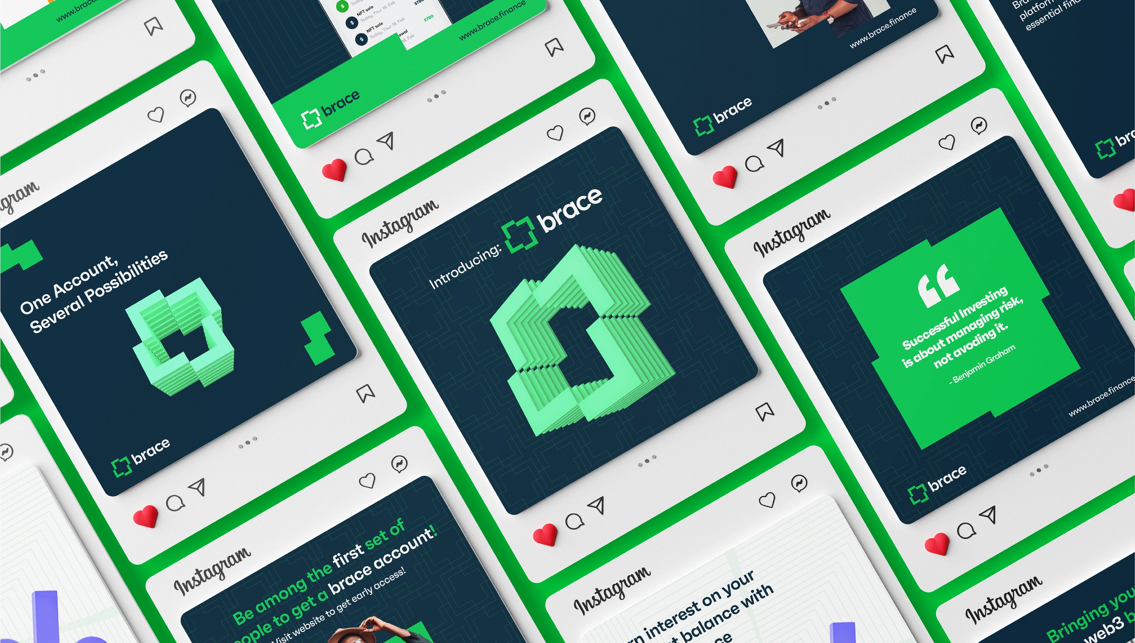
We recorded keywords associated with Brace during our first call; All-in-one, bridge, brace, support are major keywords that we chose to work by. One mantra we held important is; “One Account, Several Possibilities”
BRAND NAME
“Brace” – also means support is chosen to serve as a means of financial support for the user.
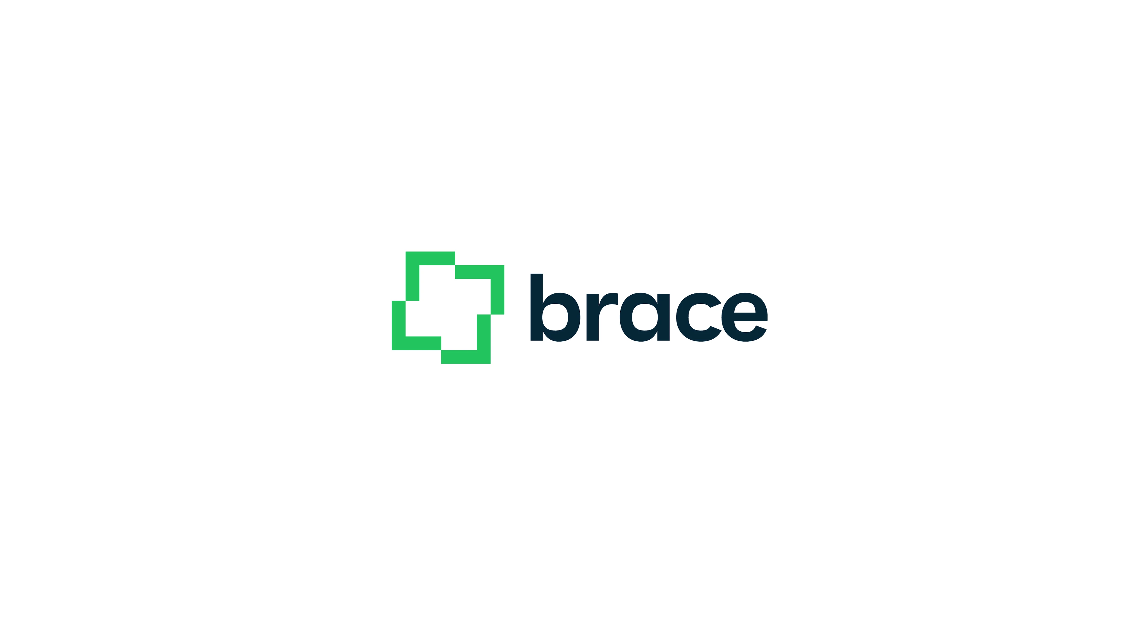
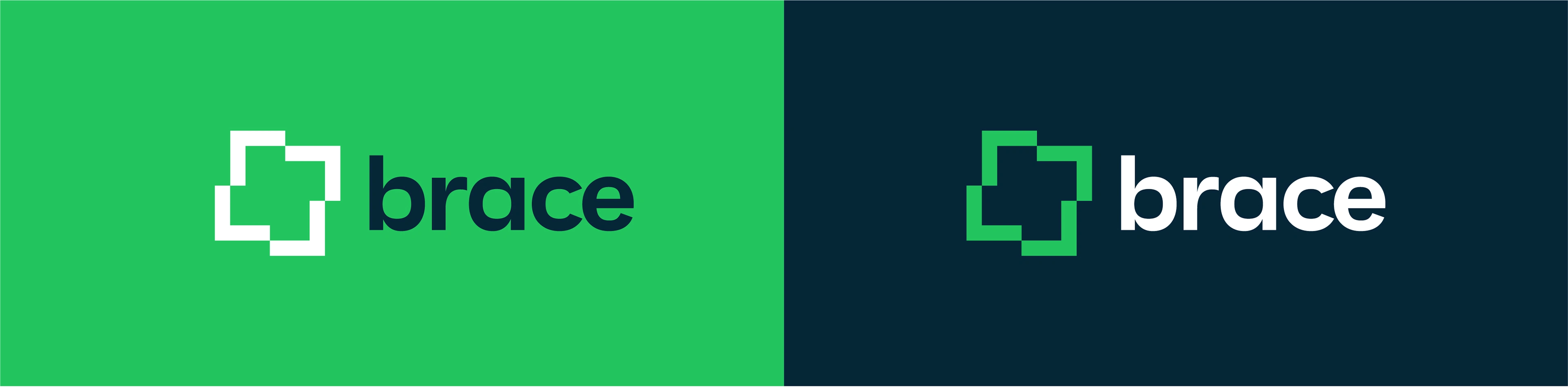
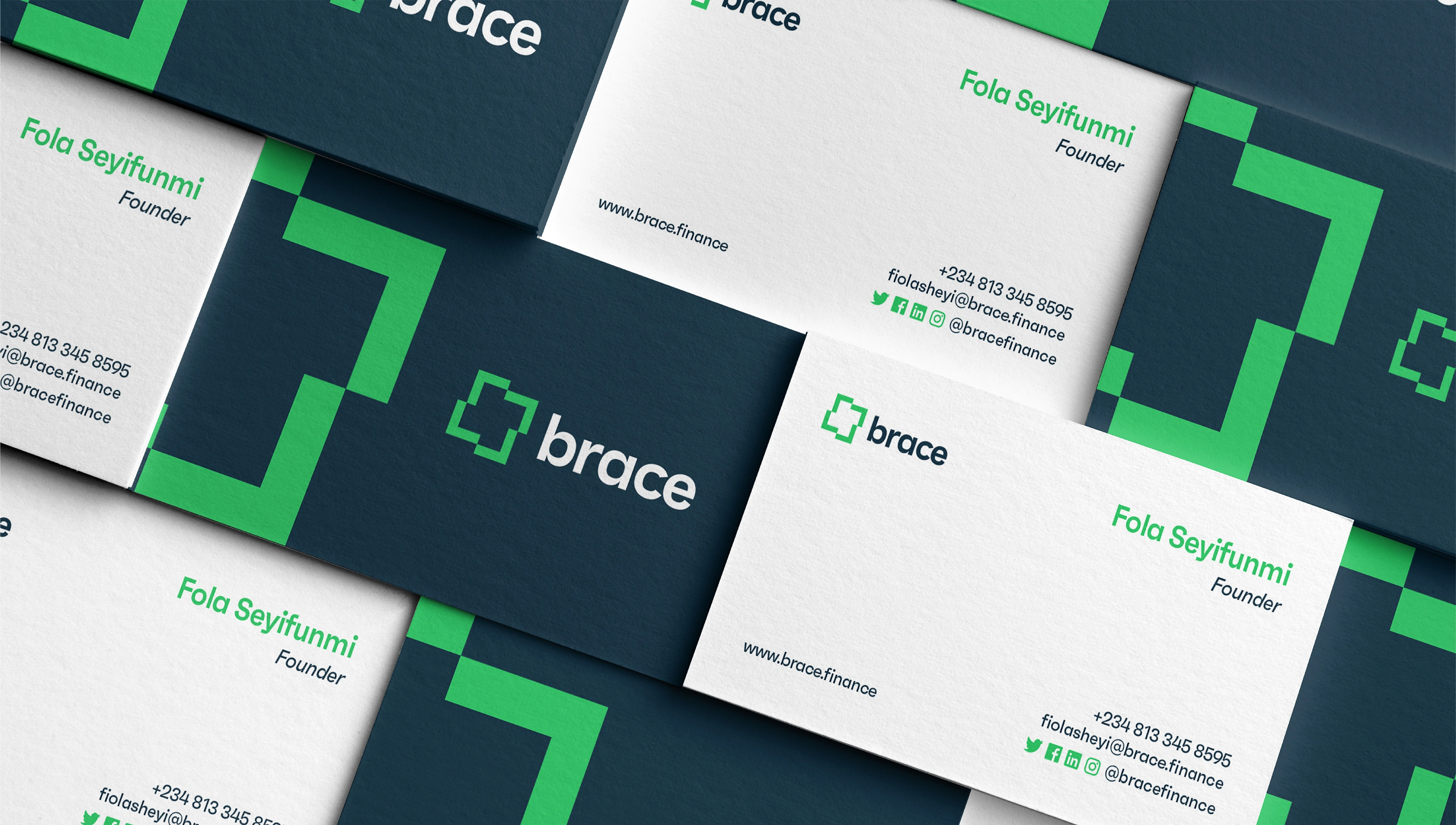
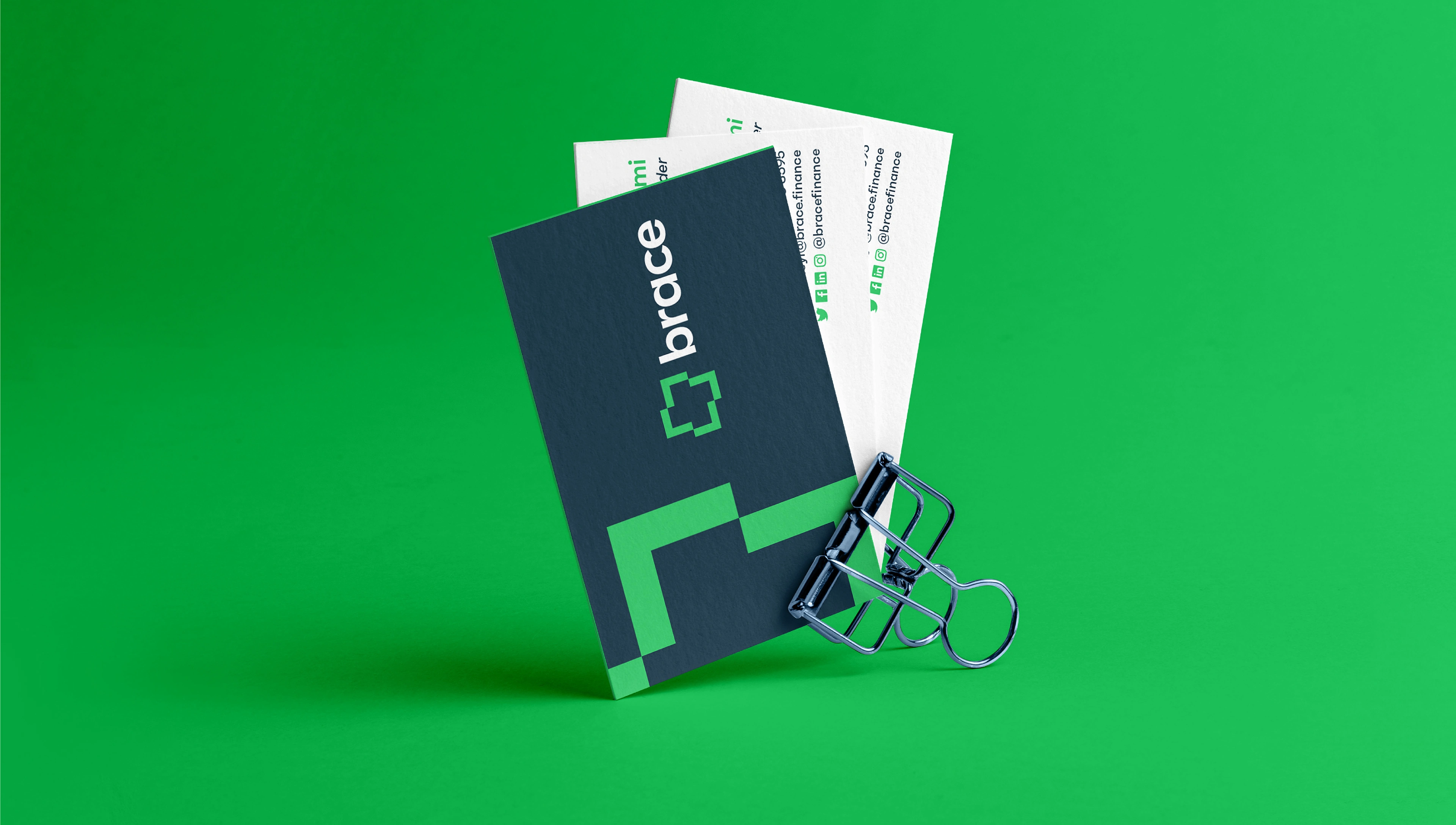
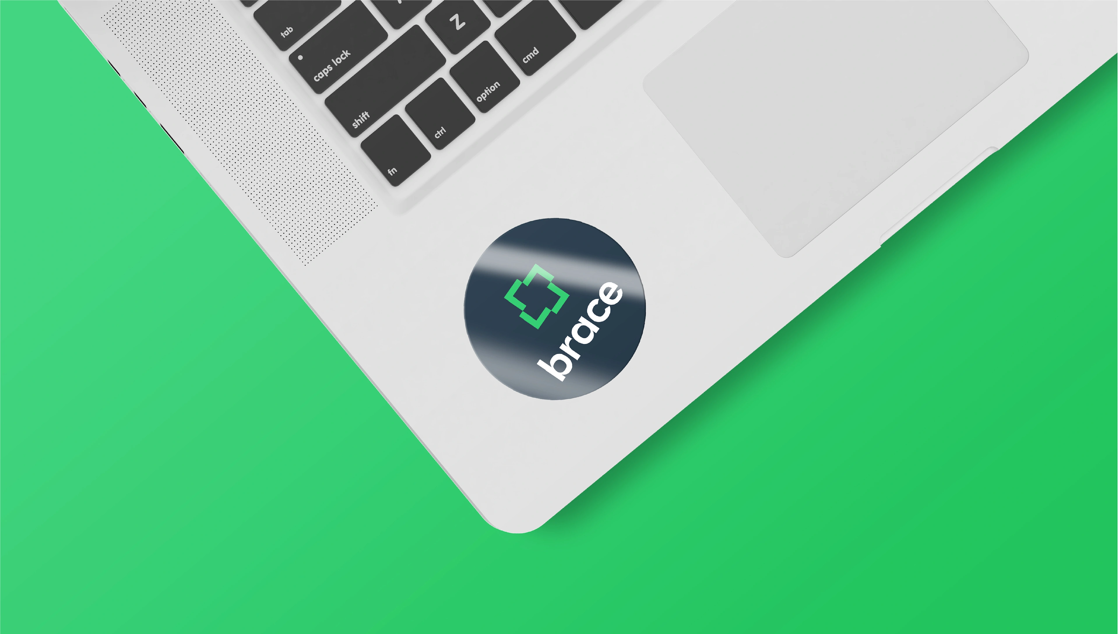
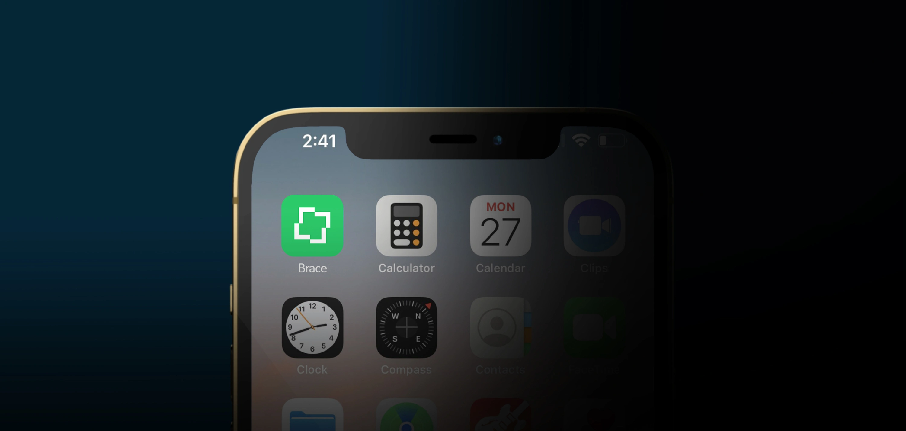
BRAND LOGO
Our go-to concept for Brace logo is an exploration of Brace’s mantra “One Account, Several Possibilities”.
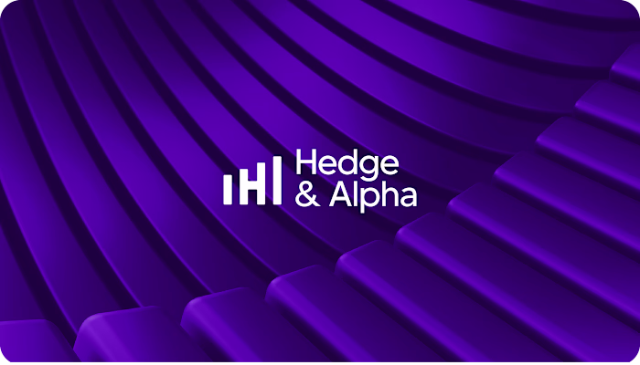
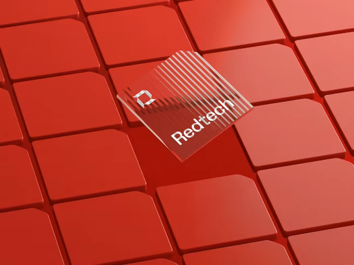
After exploring ways to visually express the keywords – we came up with a concept that is built on a square shape structure. We explored the square shape as it is psychology associated to “Integrity”. Each arm/element of the logo is to represent the “several possibilities” that you can get in one account – “the logo” as a whole. The logo also gives a tiny representation of a bridge I.e crossing from one arm/angle of the logo to another.
With this, we were able to come up with an amazing logo that is concise yet structured combining geometric forms with a modern and reliable sans serif font.

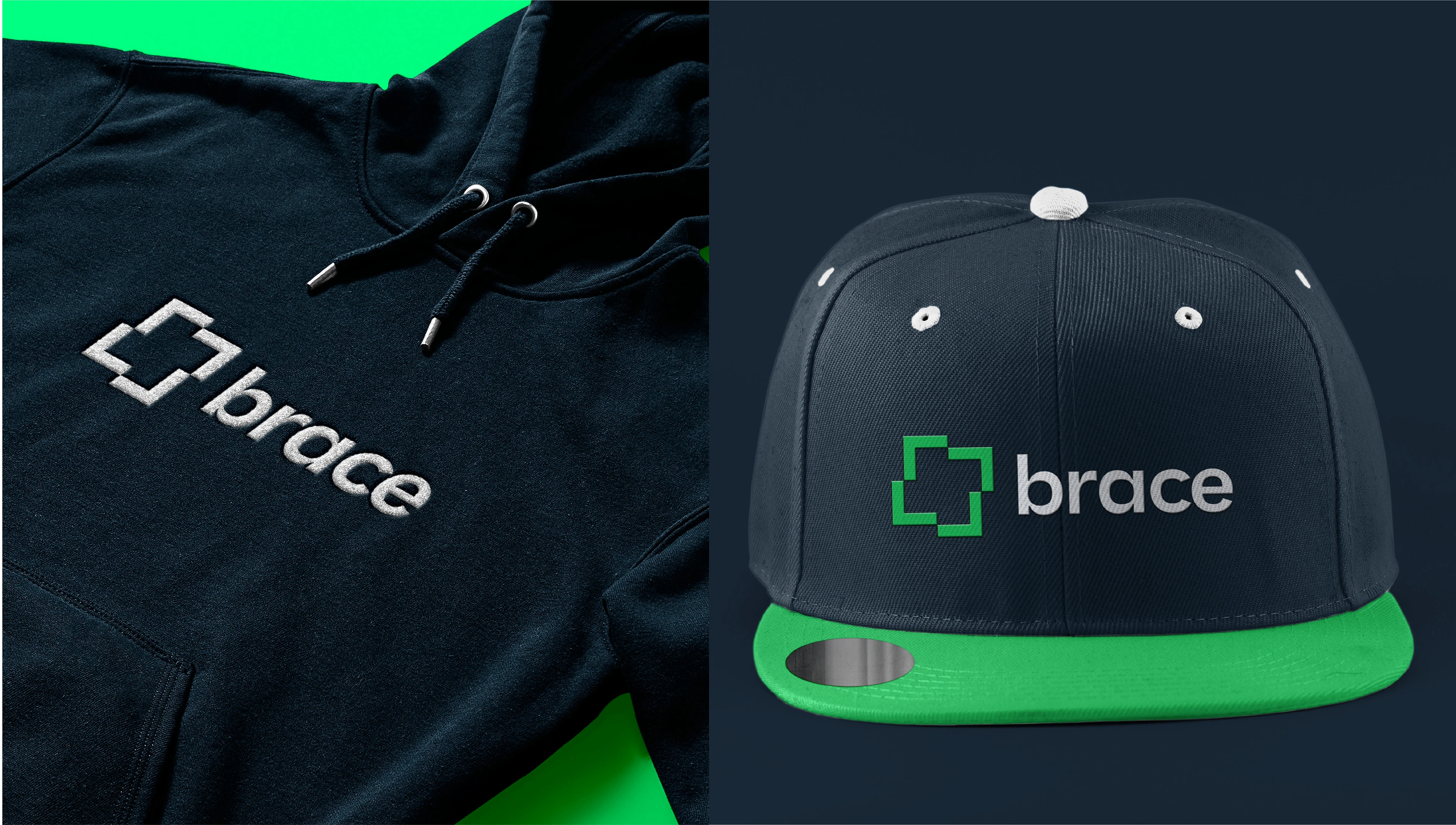
BRAND PERSONALITY
Brace wanted to be seen as youthful, disruptive, dynamic and simple – these are words by which we chose our typography. They also guided us into choosing the best mark for the brand.
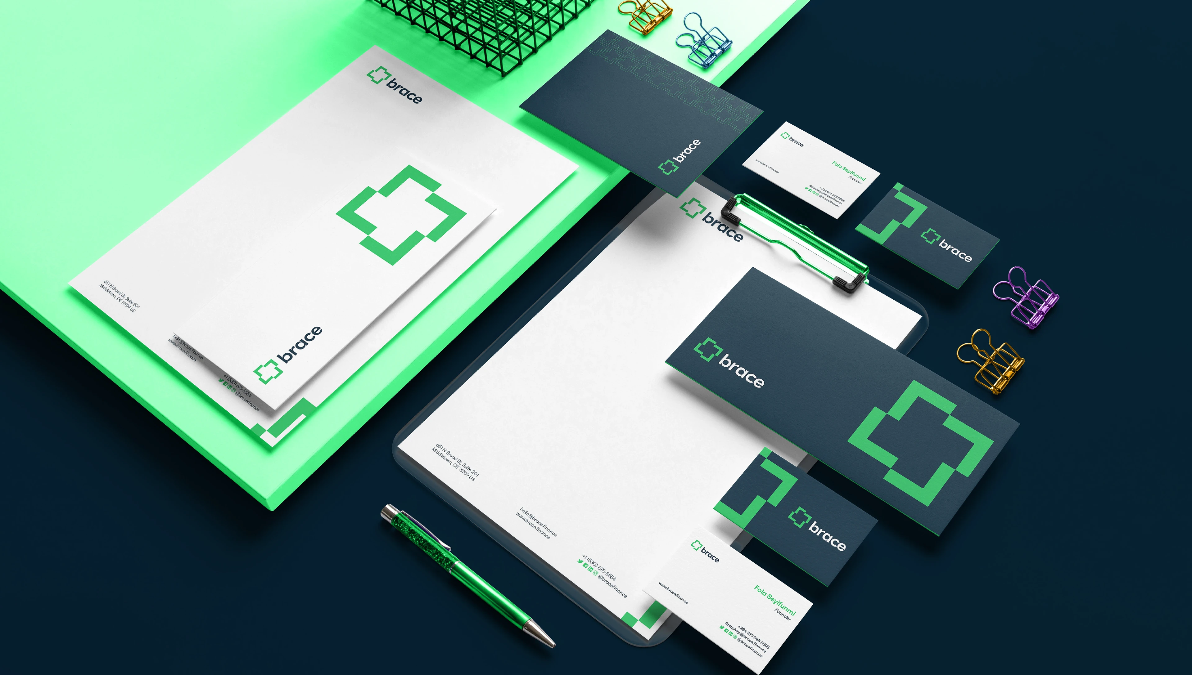
TYPOGRAPHY
“Faktum” is a neo-geometric sans serif typeface that feels modern, professional and disruptive. It is a typeface that ticks all box with what a typeface for a brand should have. Considering web3 typeface styles – Faktum fits well as a typeface that appeals to web2 and web3 visual style.
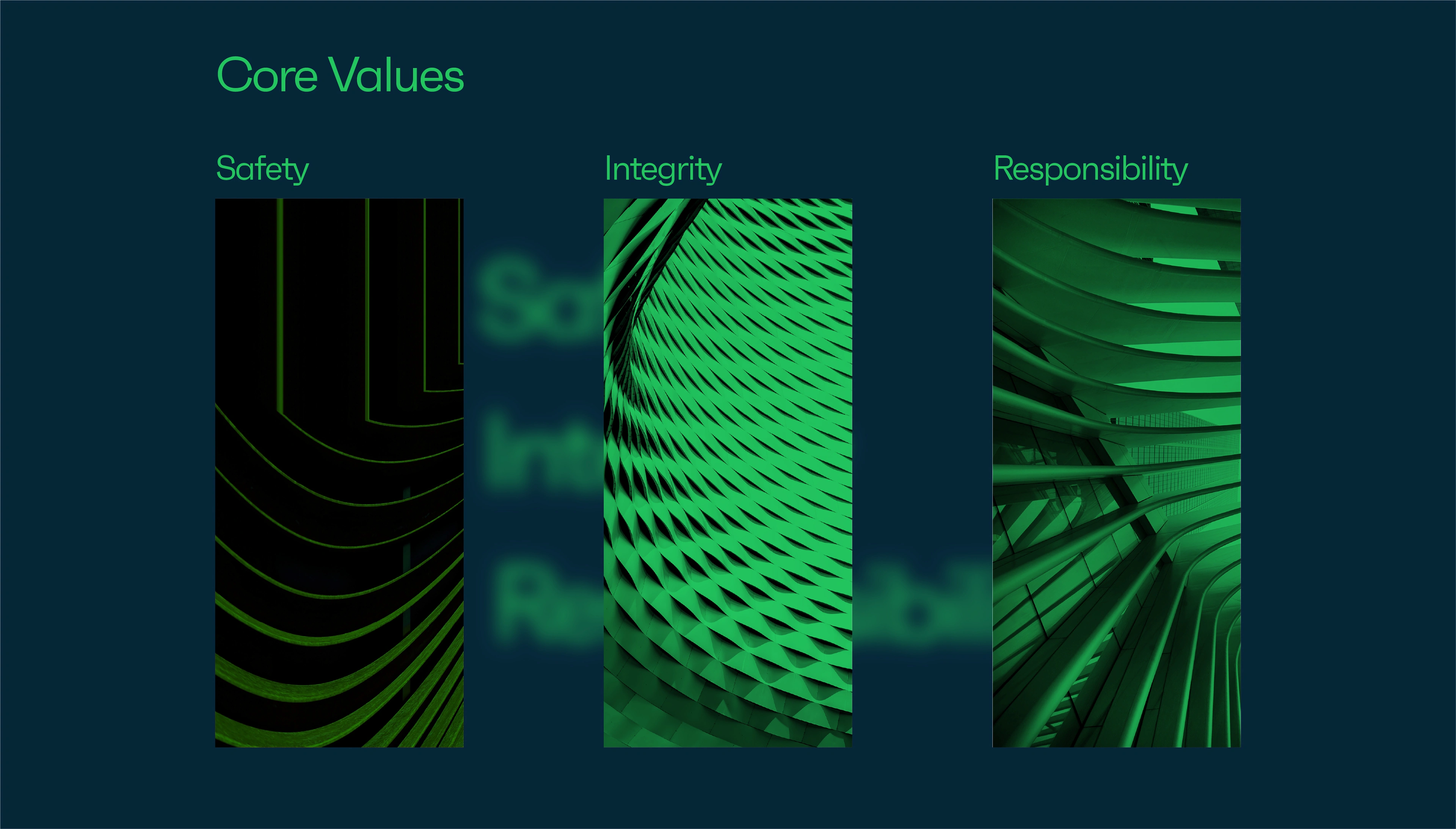
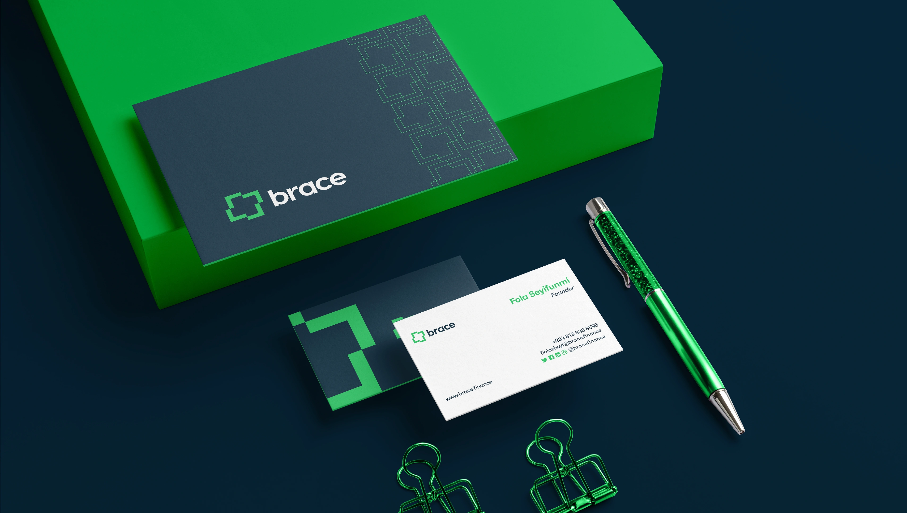
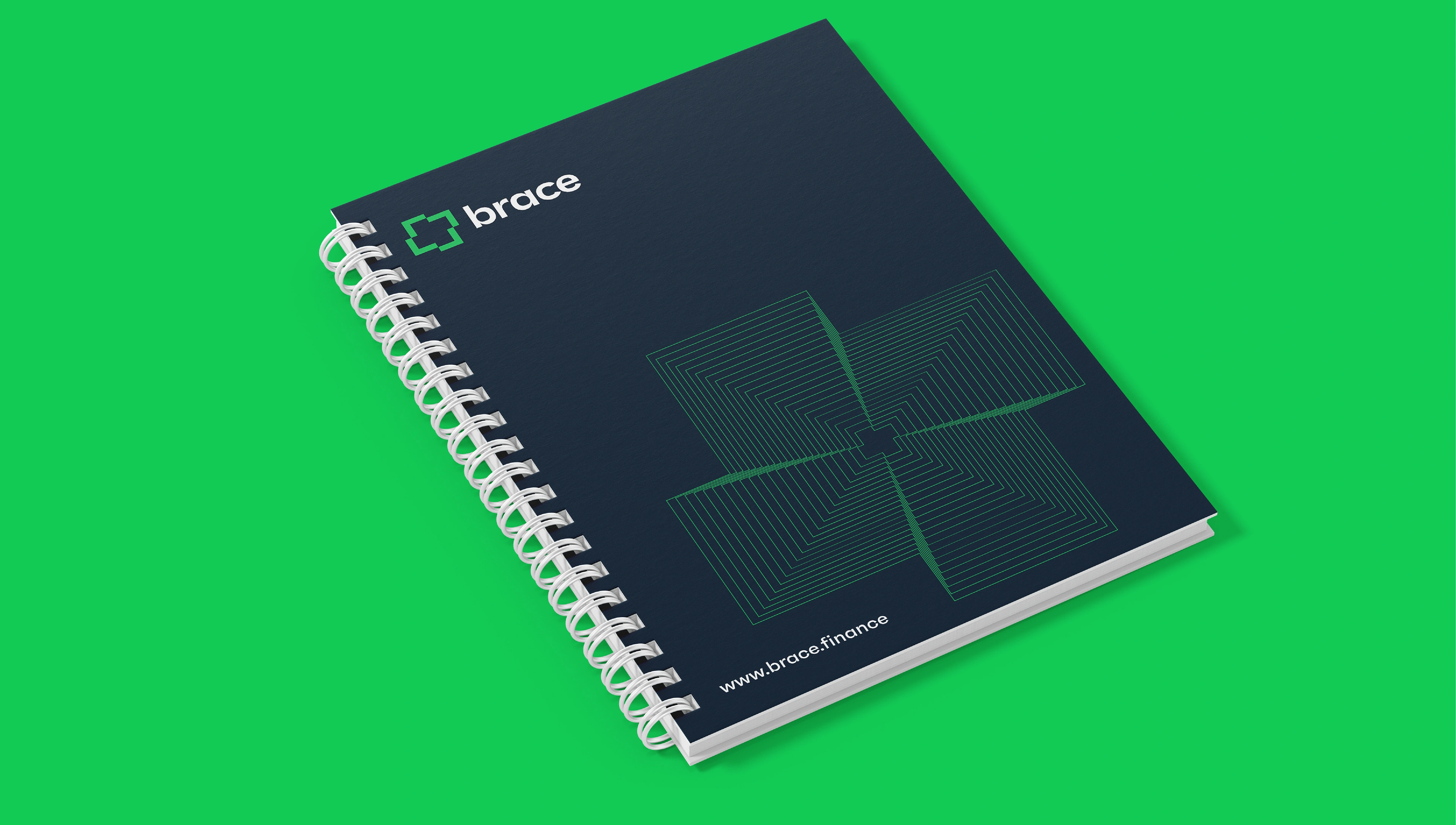
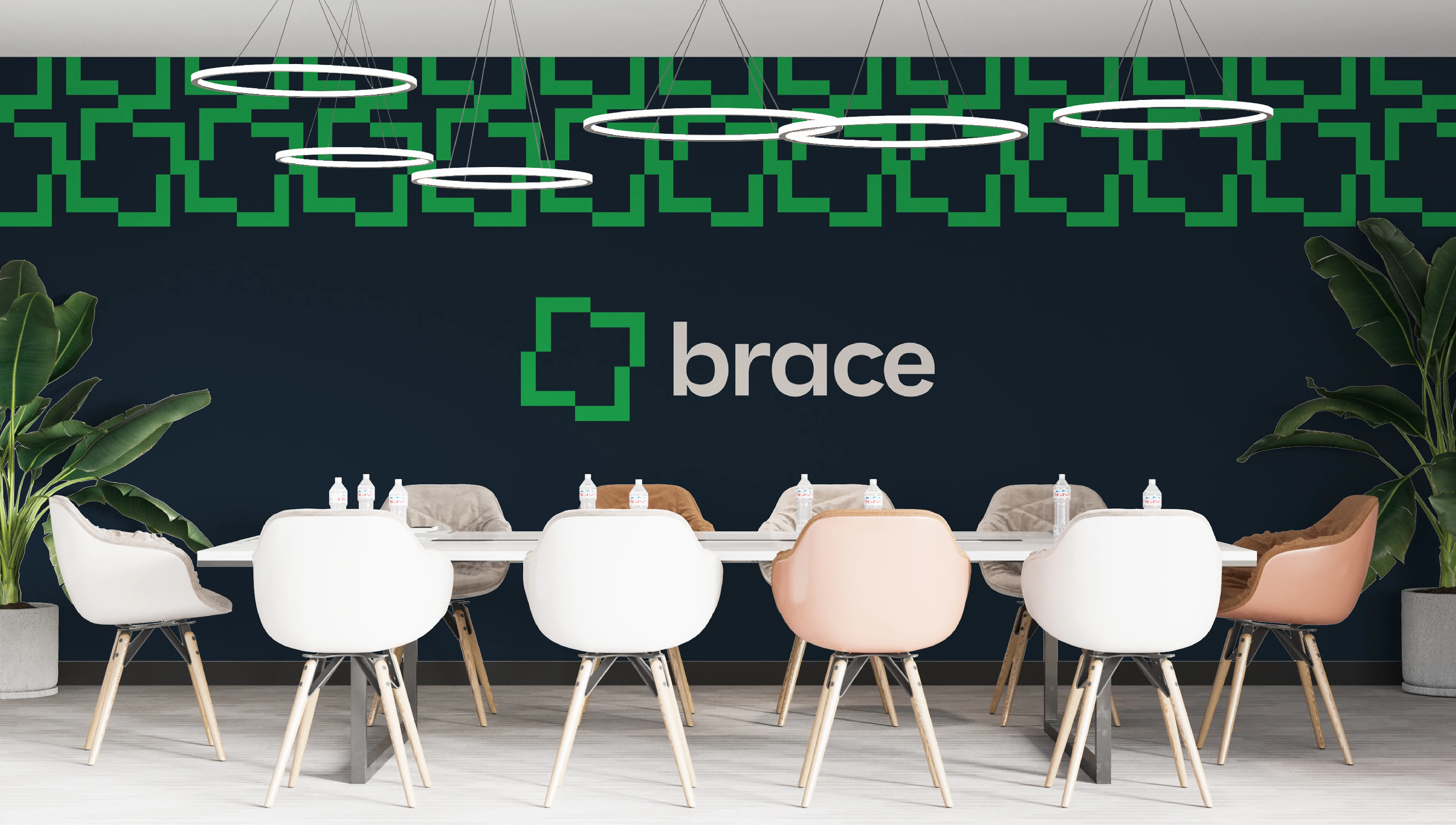
COLOR
We used the brand previous color. We only adjusted the tone to be bearable. The color still aligns with Brace value and it’s different. Other brands use blue, purple and the green was different – this is what we want for Brace so we ended up using it. The Malachite Green and Maastricht Blue are two complementary colour that has a calm feeling attached to it. This we believe aids the brand in being perceived as reliable.
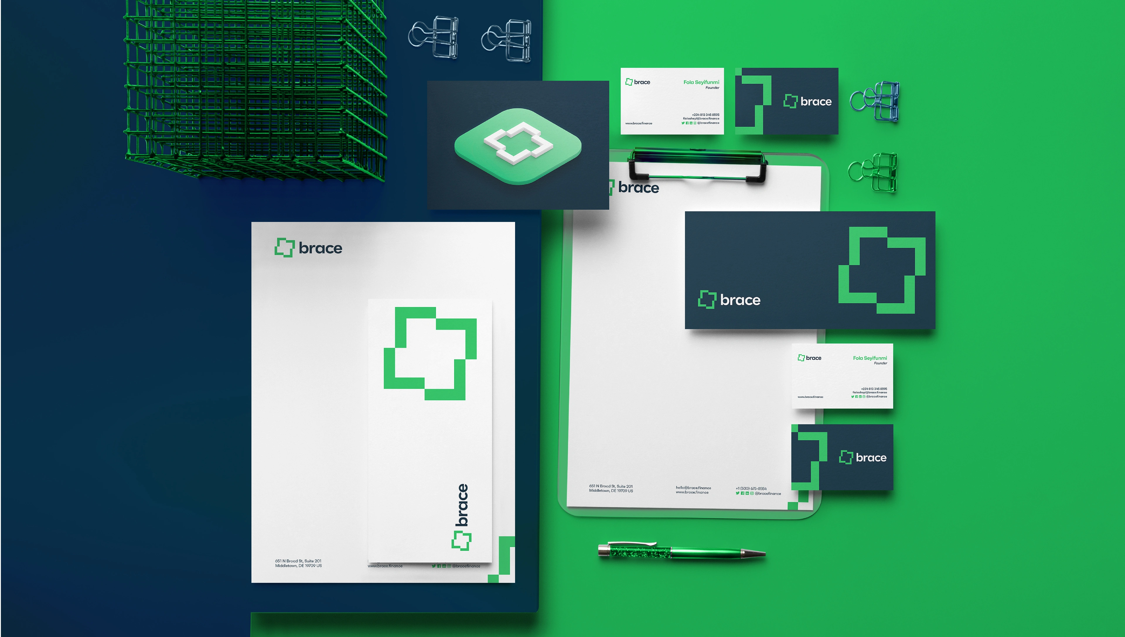
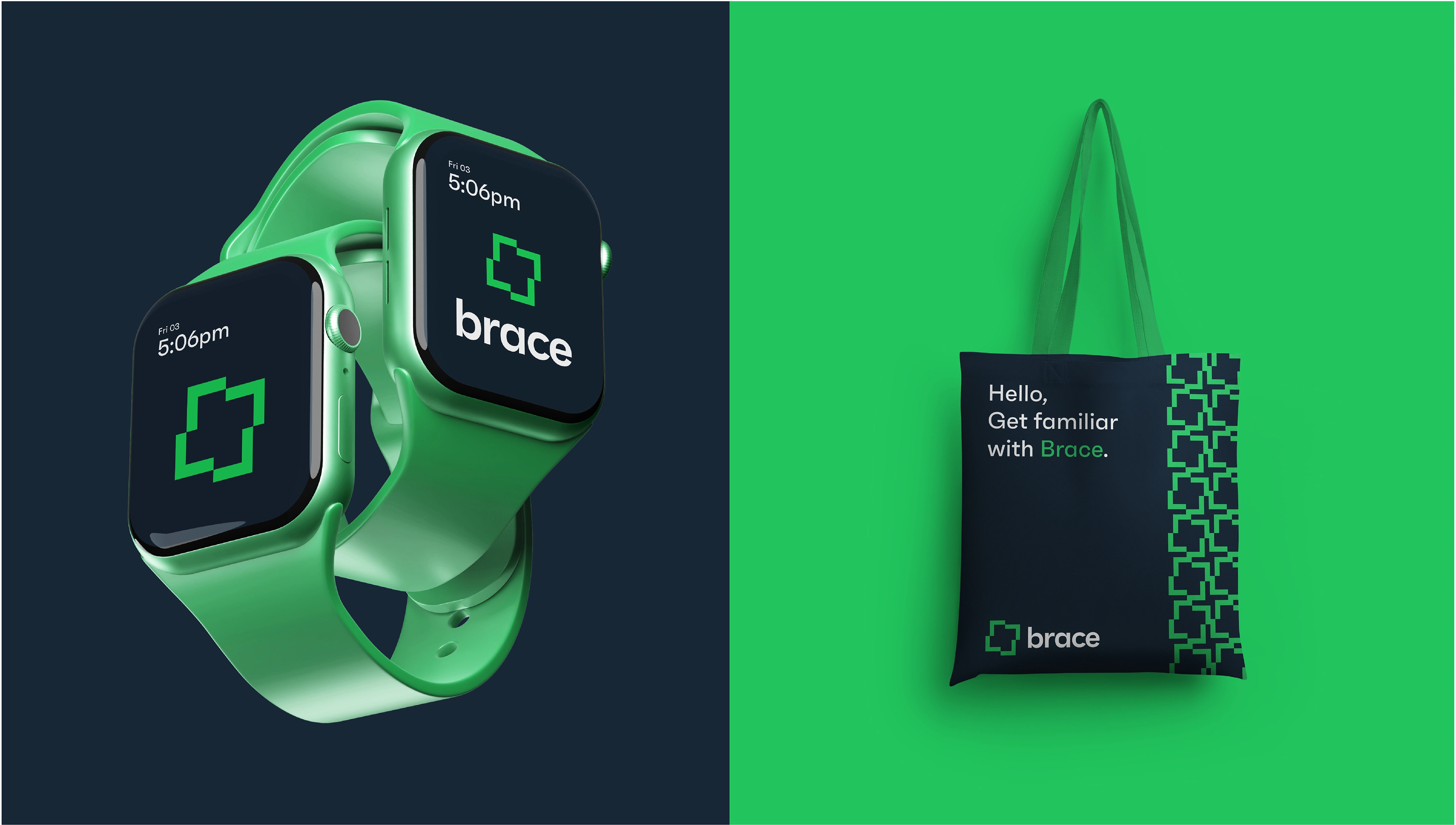
We also created a secondary color system that will complement the primary color at instances in the brand design style.
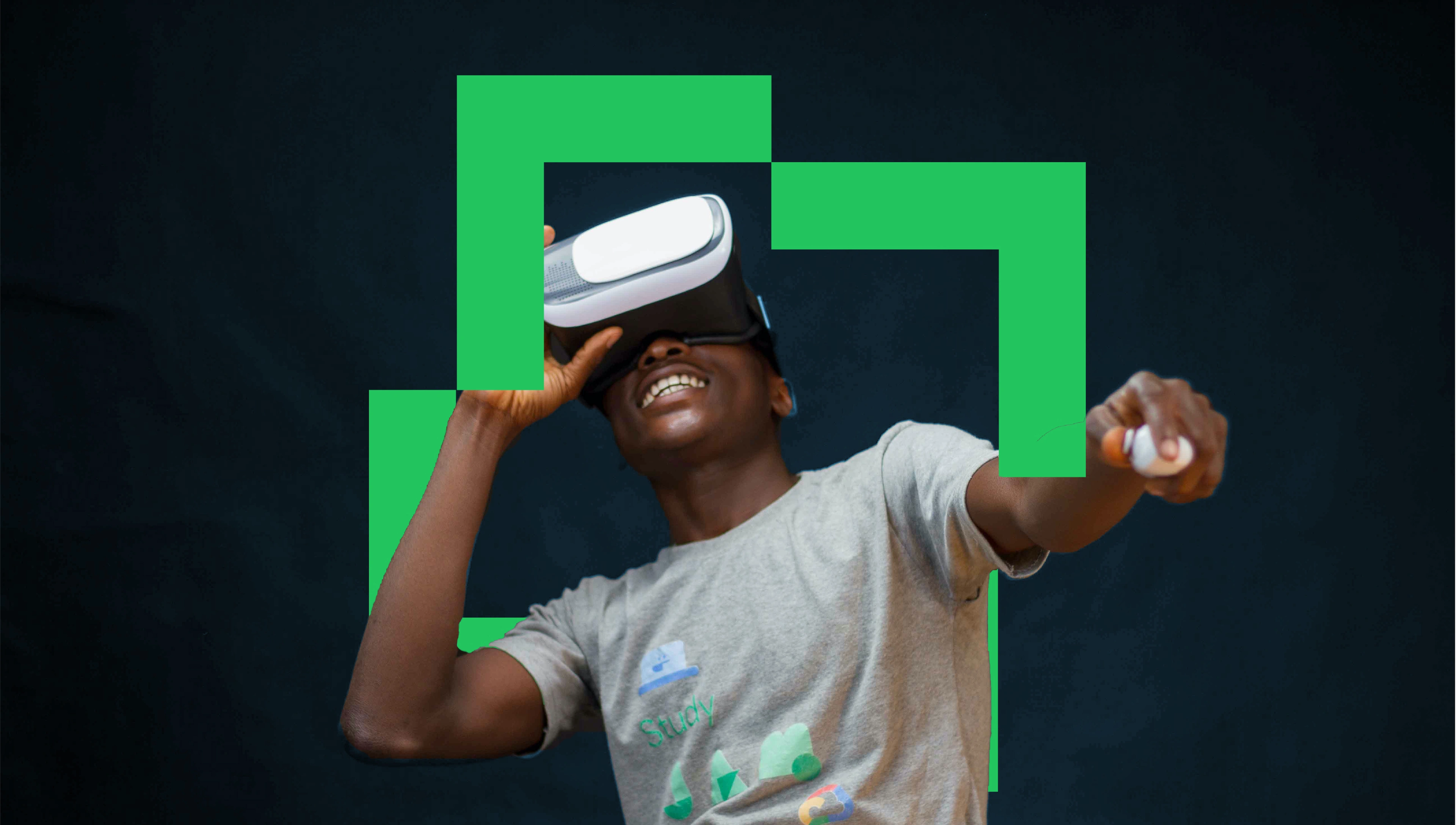
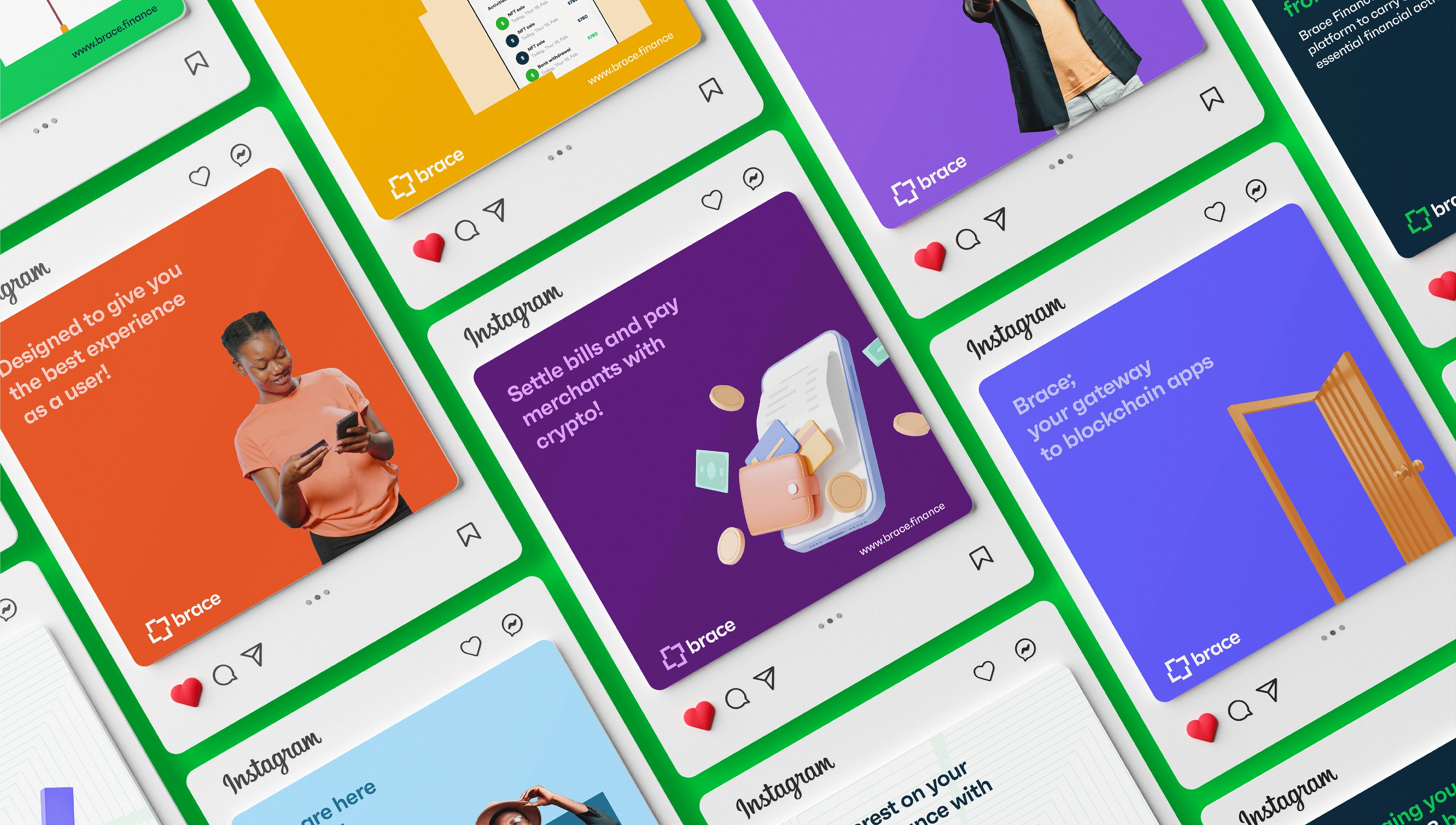
VISUAL LANGUAGE
We have developed the design elements in a minimalist way, while keeping the essentials. We explored both 2D and 3D design directions for the visual language.
CREDITS
Brand Identity Design - Farouq Osuolale
Creative Direction - Farouq Osuolale
Motion & Video - Prince Ekeoma
Like this project
Posted Nov 9, 2024
Brace Finance's initial logo doesn’t align with the value and perception the brand wants its audience to have of them. There was also the issue of it being so …