Farouq Osuolale
Branding & Logo Designer
Ready for work
Farouq is ready for their next project!
Websit Design for HyMobile.
4
1
82
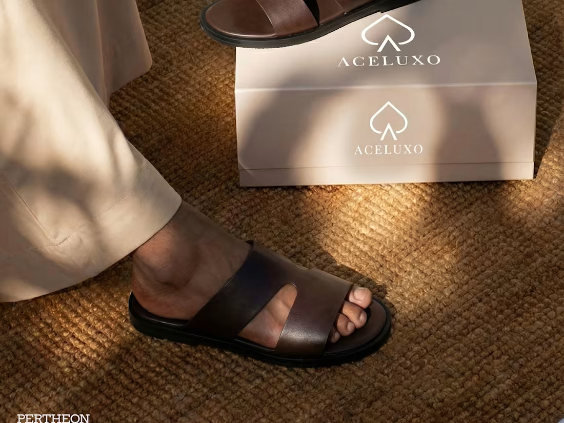
Did something interesting lately. We helped Aceluxo build an entire premium lifestyle photoshoot for their brand, and all we started with were raw phone pictures of the slides.
No studio rentals. No shipping products.
If you need your product visuals upgraded like this, send a DM.
3
1
56
A symbol of elegance, symmetry, and story.
For Scissored by Esse, we created a custom script logo designed to feel fluid, feminine, and timeless. A mark that mirrors itself beautifully from any angle. This unique anagram structure wasn’t just a design choice; it reflects the brand’s philosophy of balance, duality, and artistry.
Every curve carries meaning.
Every line blends personal identity with creative expression.
And in its mirrored form, the logo becomes a reminder that beauty and intention exist from every perspective.
This project is a celebration of craftsmanship and storytelling, the true essence of Scissored by Esse.
#design #fashionhouse #premium #luxurybrand #branding #brandidentity
1
5
48
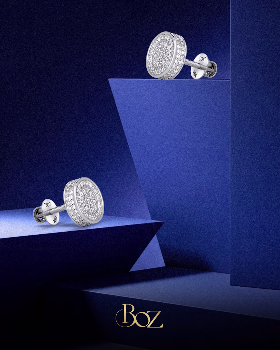
Visuals done for BOZ Jewelry.
22
170
Redtech Branding Video Teaser we did for redtech.
34
240
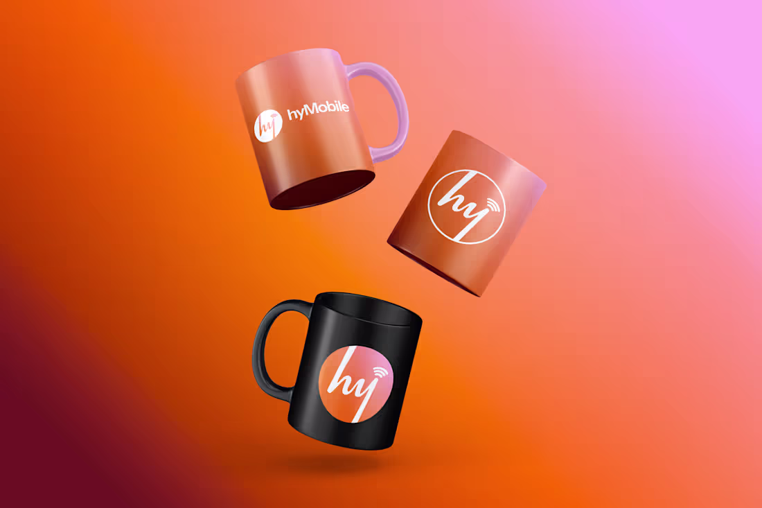
Brand identity design project done for hymobile. From strategy to conceptualization
2
29
219
While working on the BOZ Project, we didn't want BOZ to look like the normal jewelry company. We wanted it to feel different, we wanted it to be unique, we want it's campaigns to resonate with the customers and we did that with the mama necklace here for the mother's day campaign.
34
215
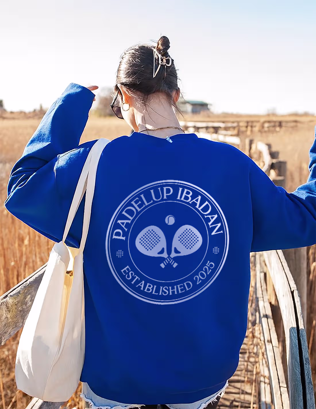
Super excited to be sharing these visuals from a recent project for a padel brand.
4
22
174
Bankys Kitchen Website Design & Development
2
18
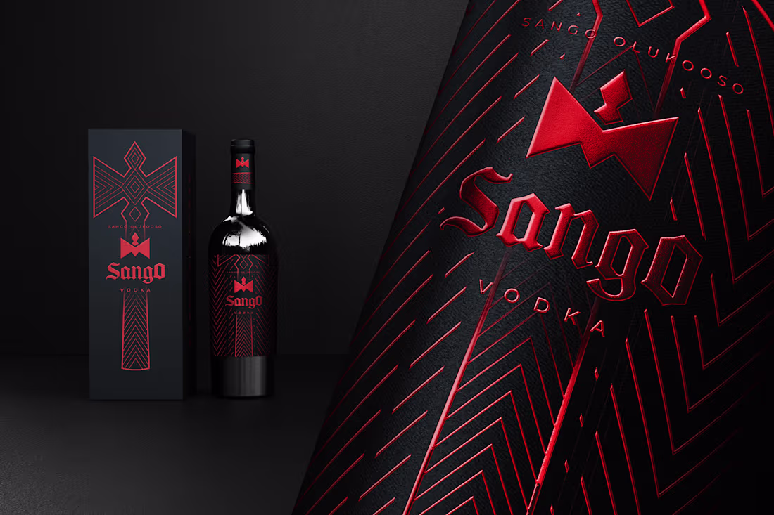
Sango Olukoso, A Rebrand :: Behance
0
2
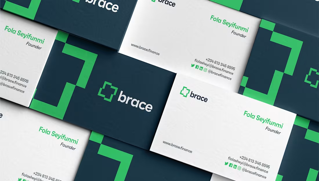
Brace Finance Branding :: Behance
0
5
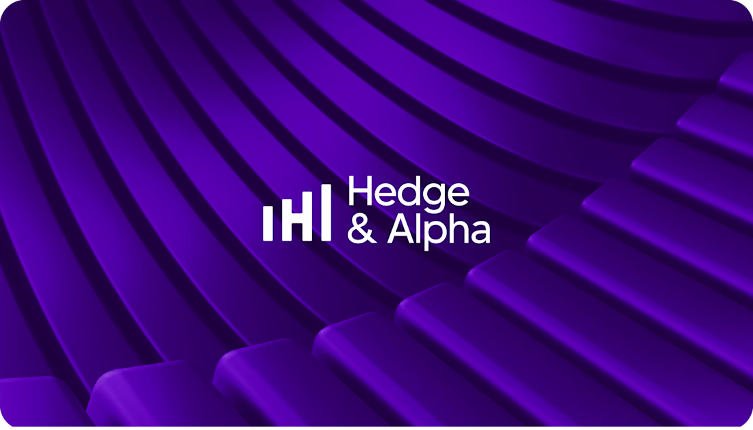
Crafting an Impact: The Hedge & Alpha Branding Story :: Behance
0
4
Redtech | Branding, Motion & 3D
1
3
TOSS AFRQIUE Brand Identity
0
1
Twinku Brand & Visual Identity
0
3