Redtech | Branding, Motion & 3D
Farouq Osuolale
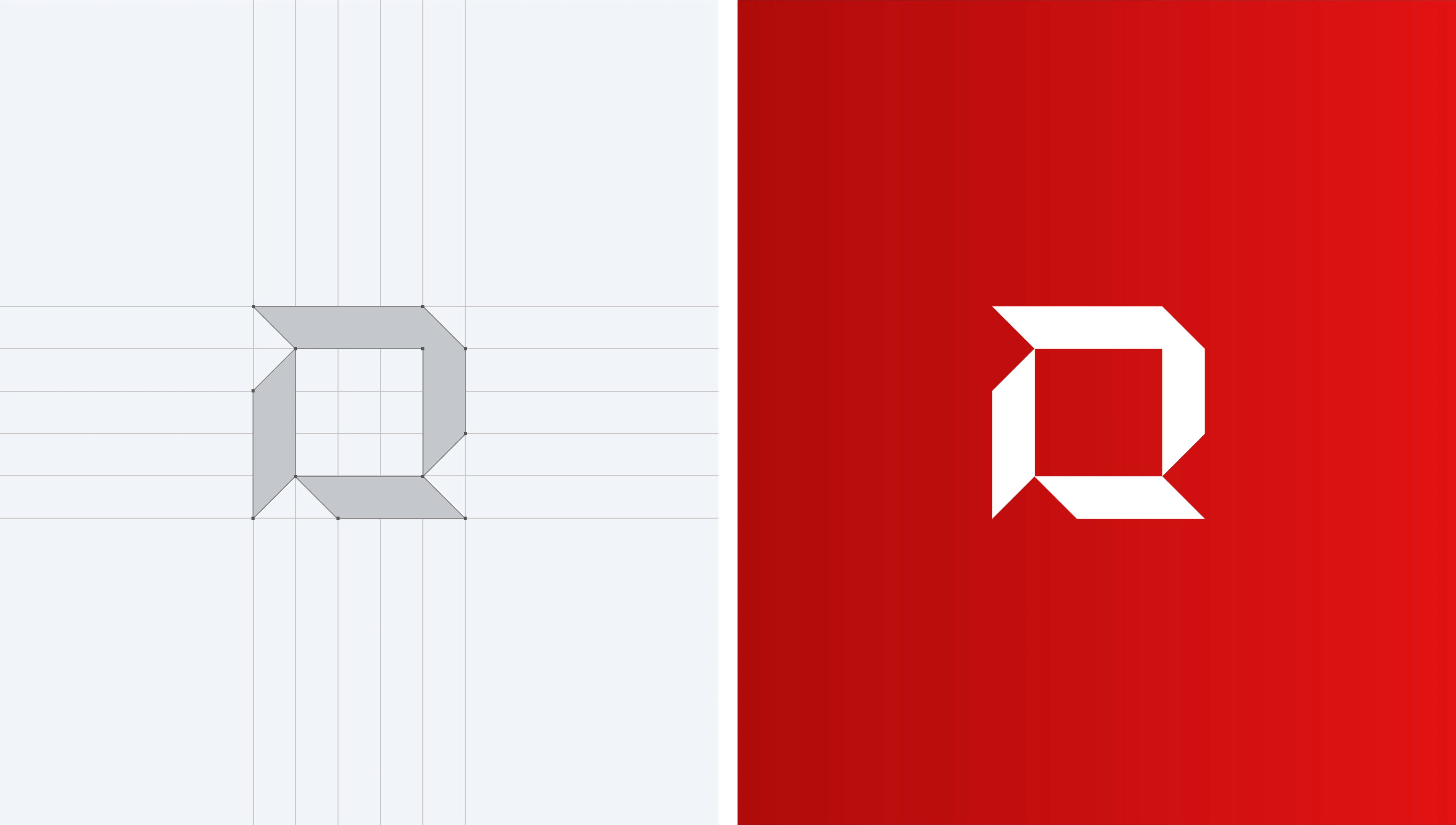
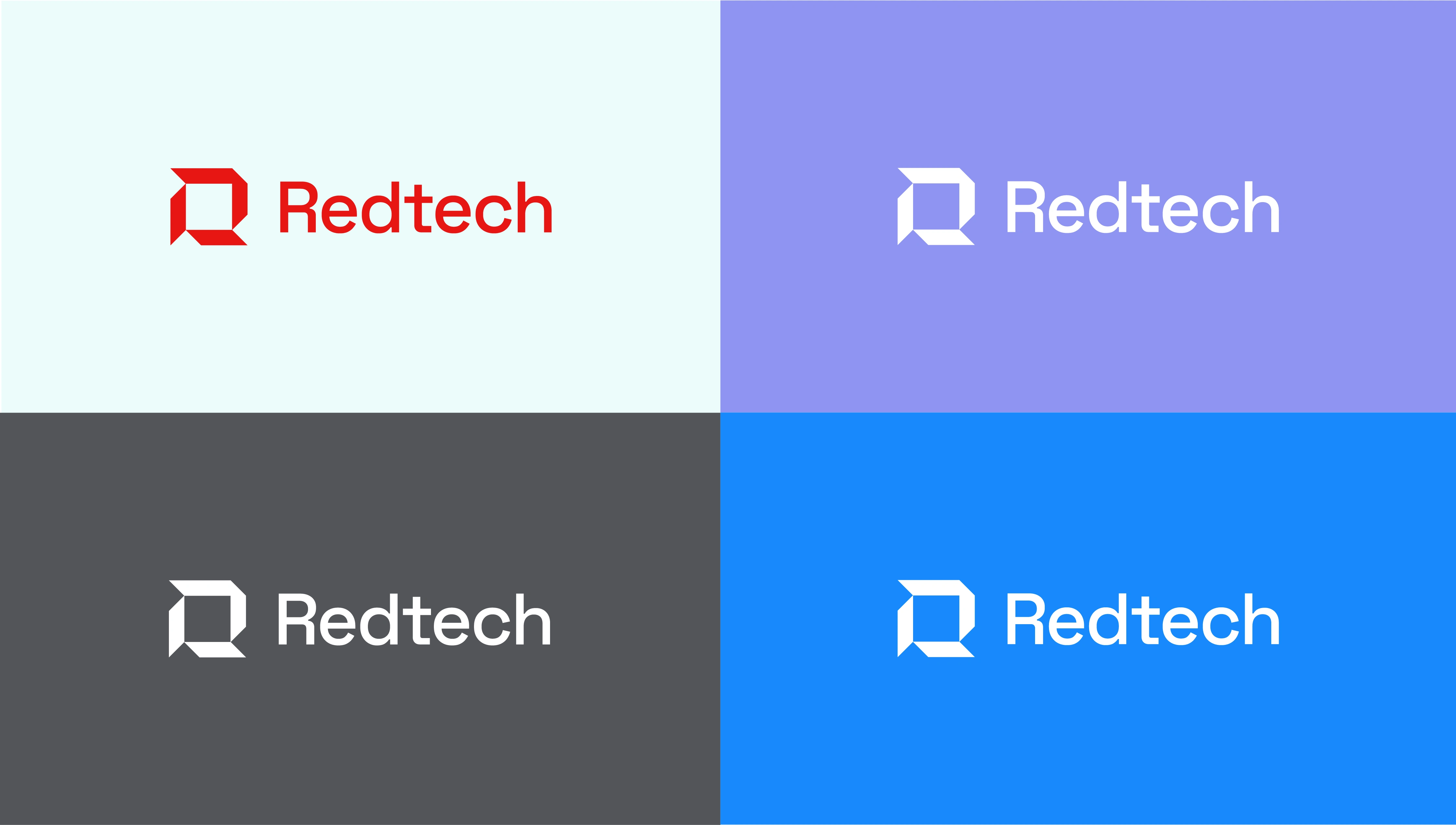
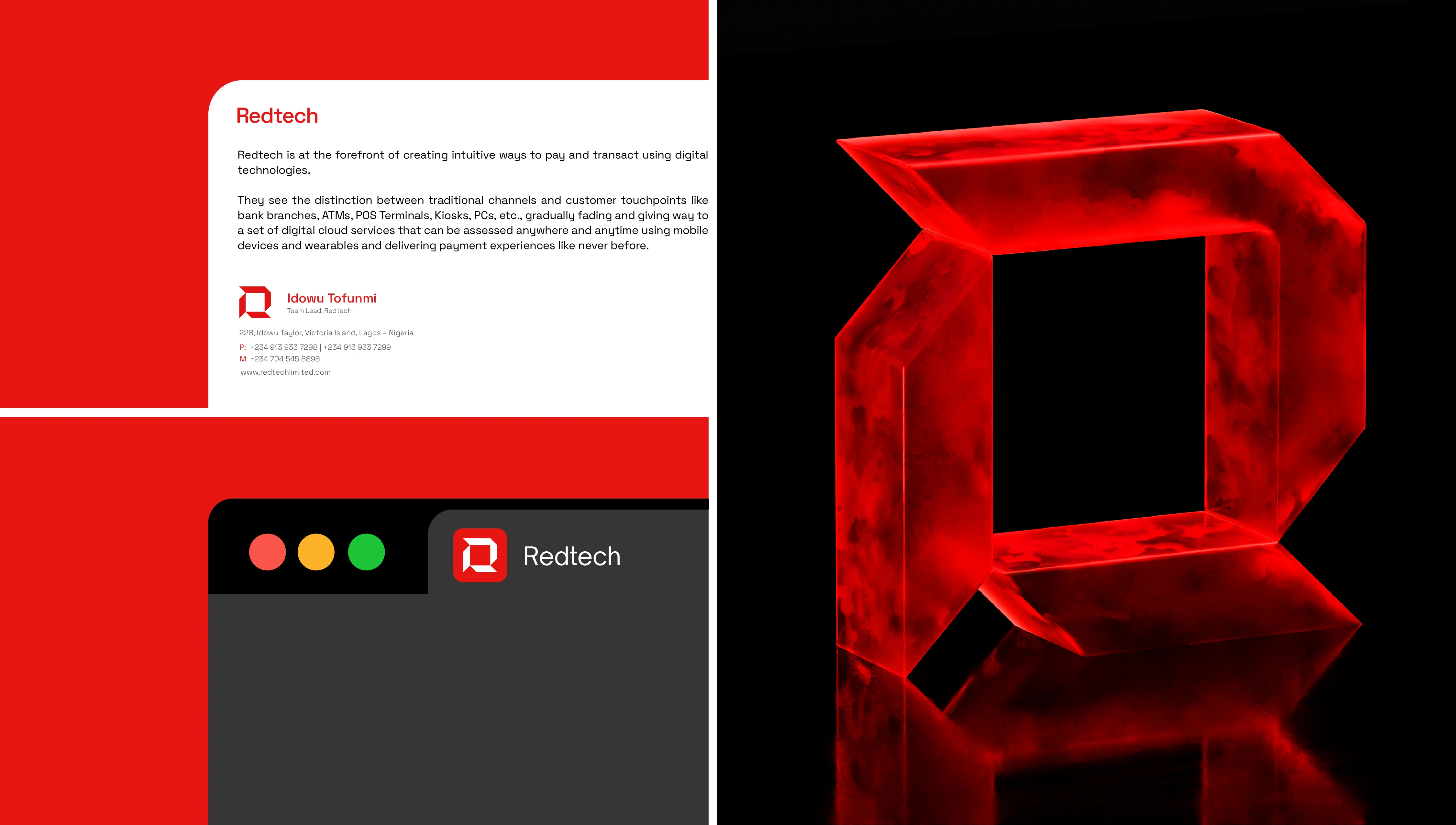
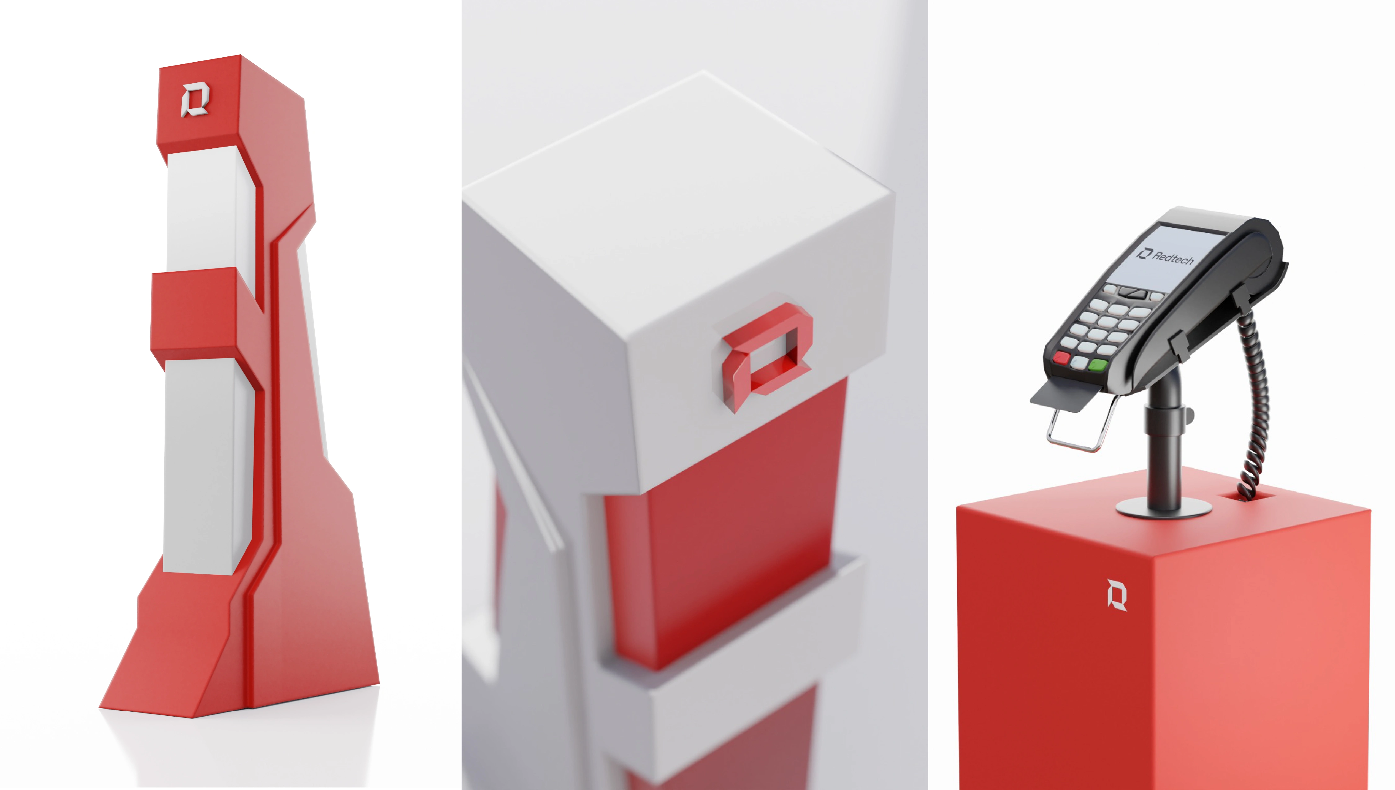
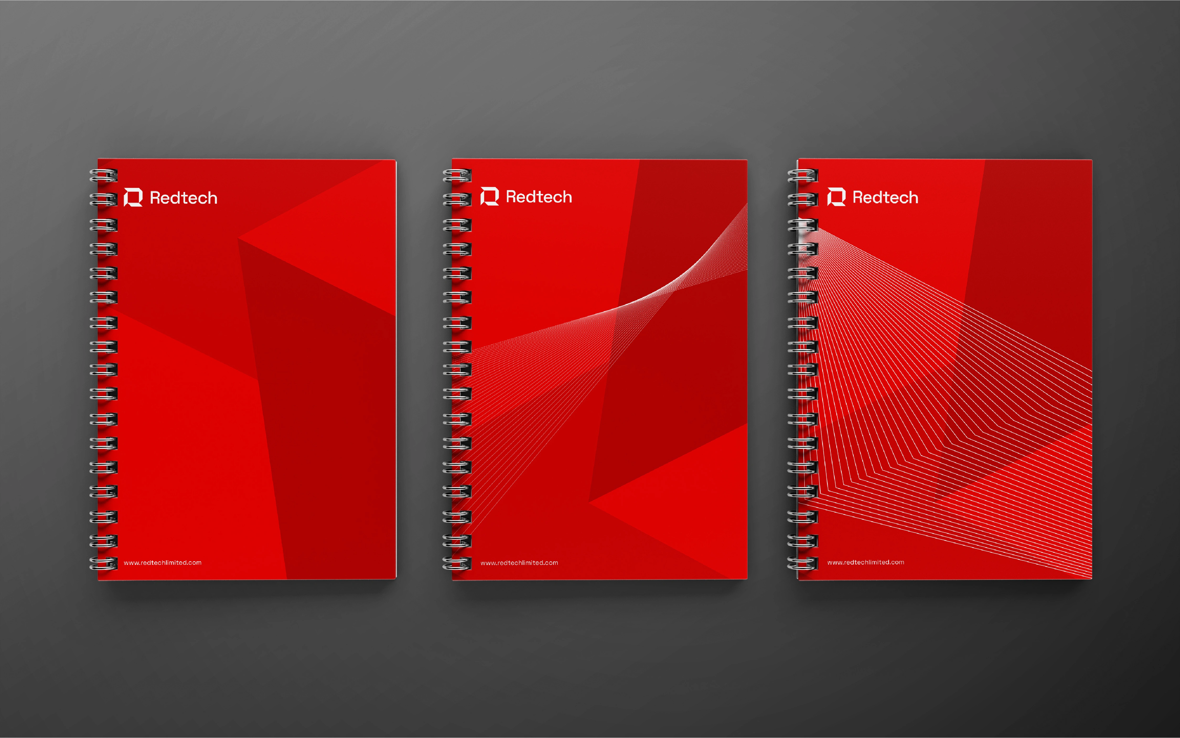
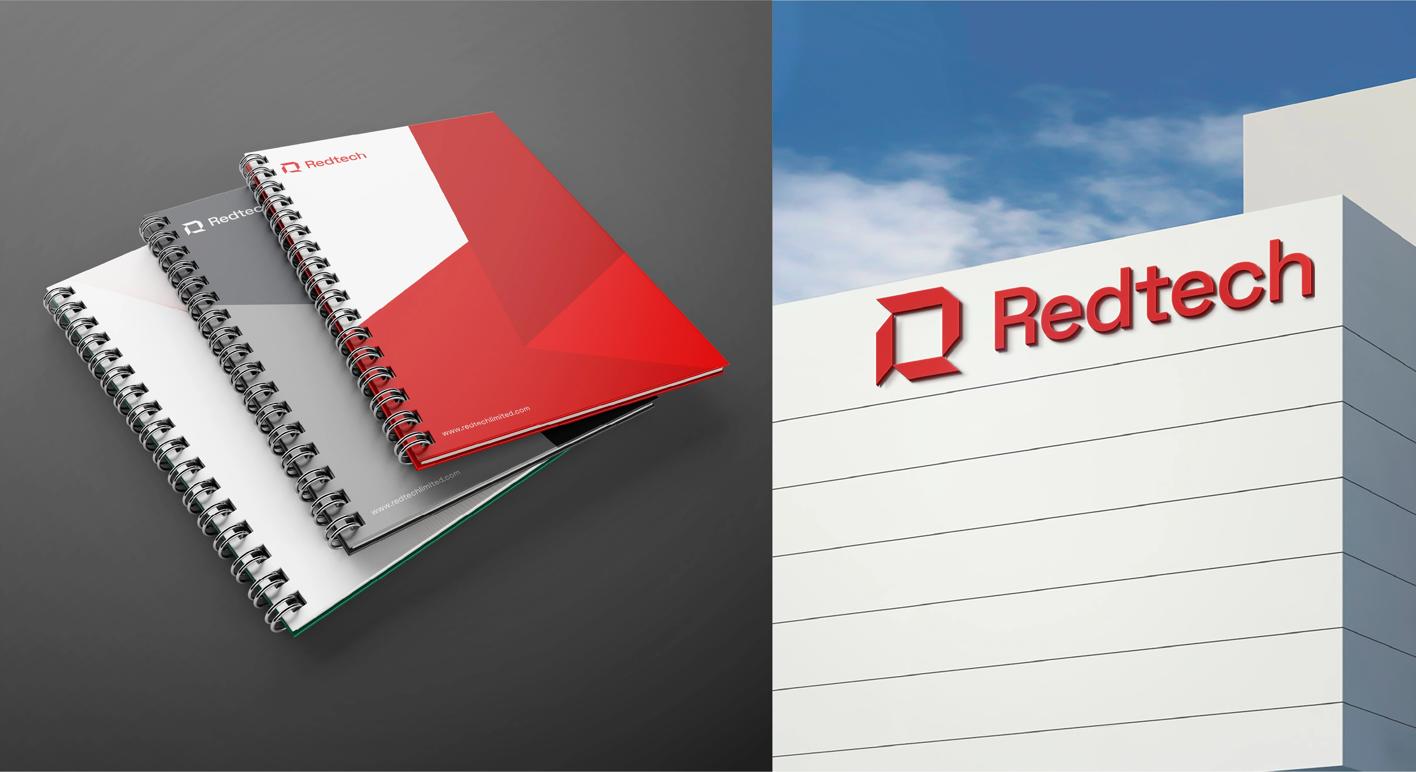
Logo Concept (Carved Stability)
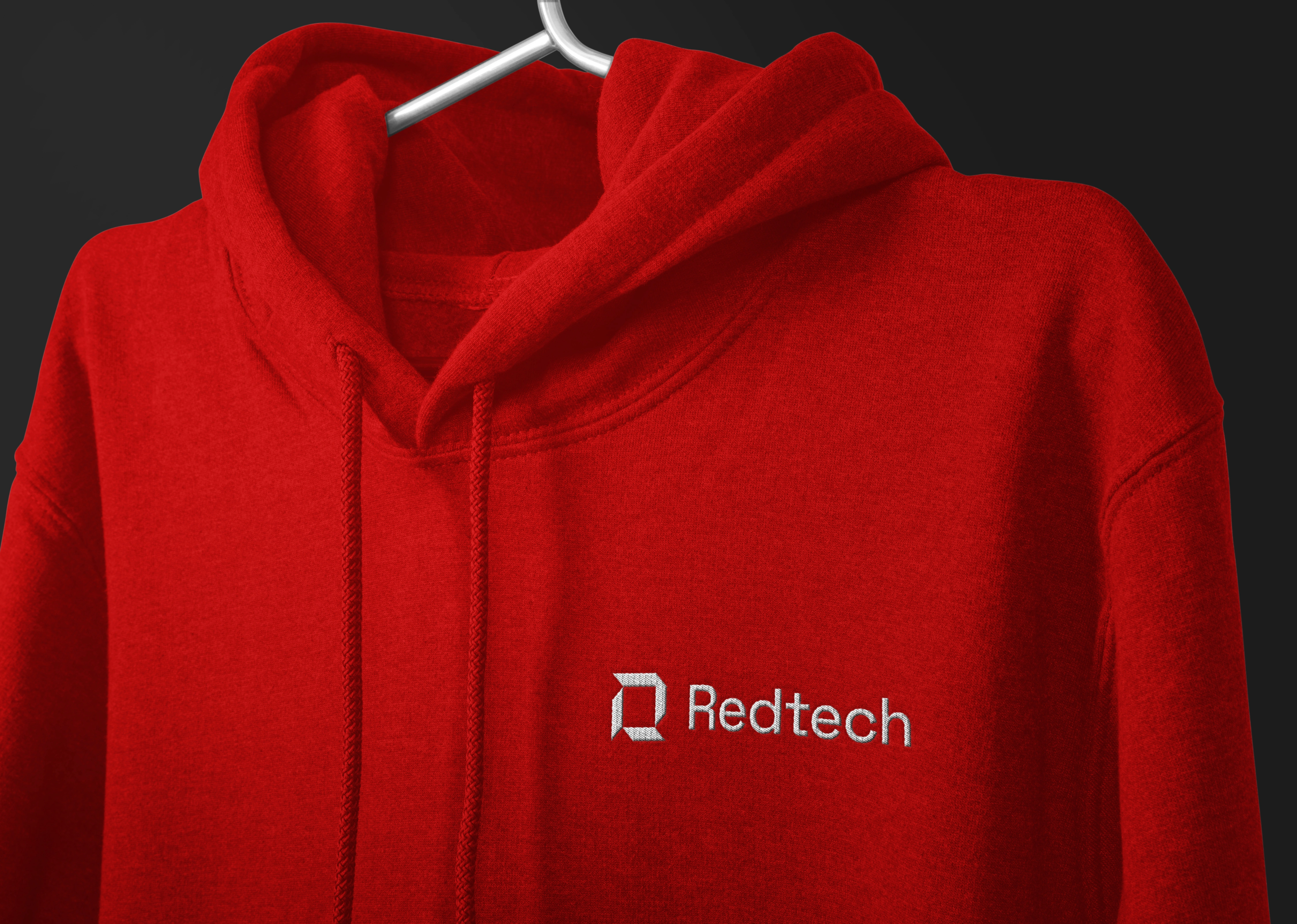
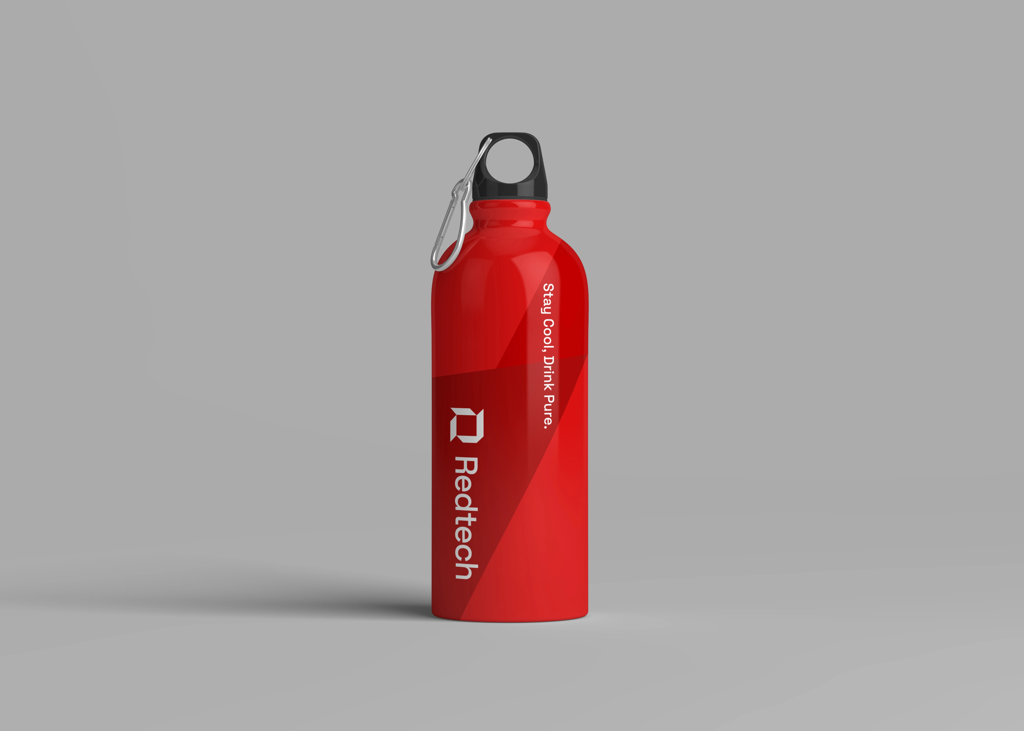
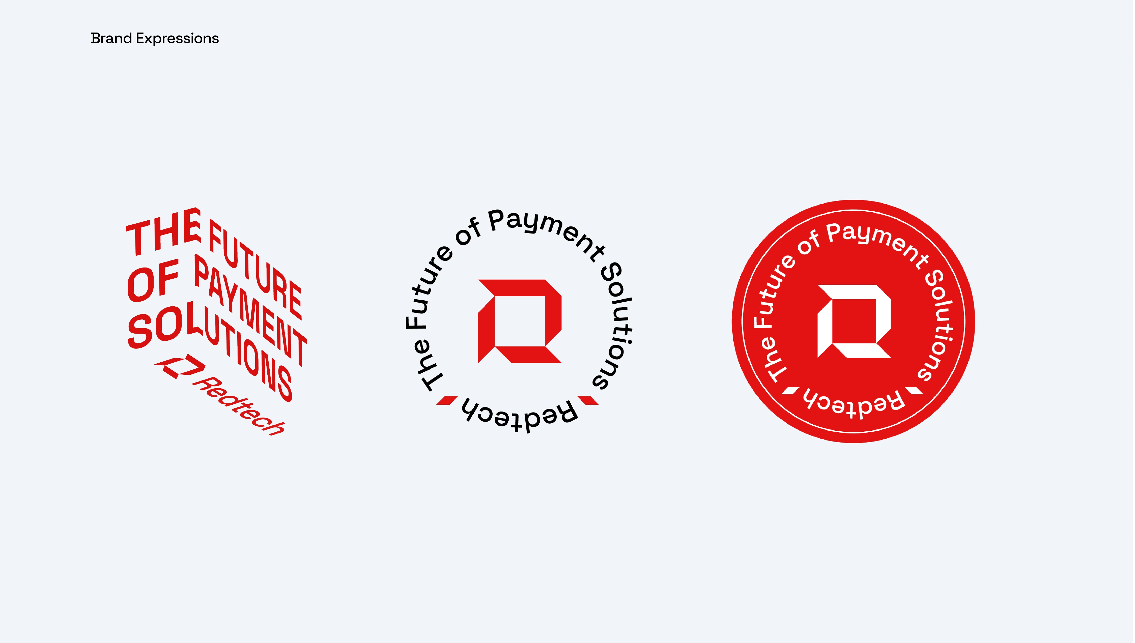
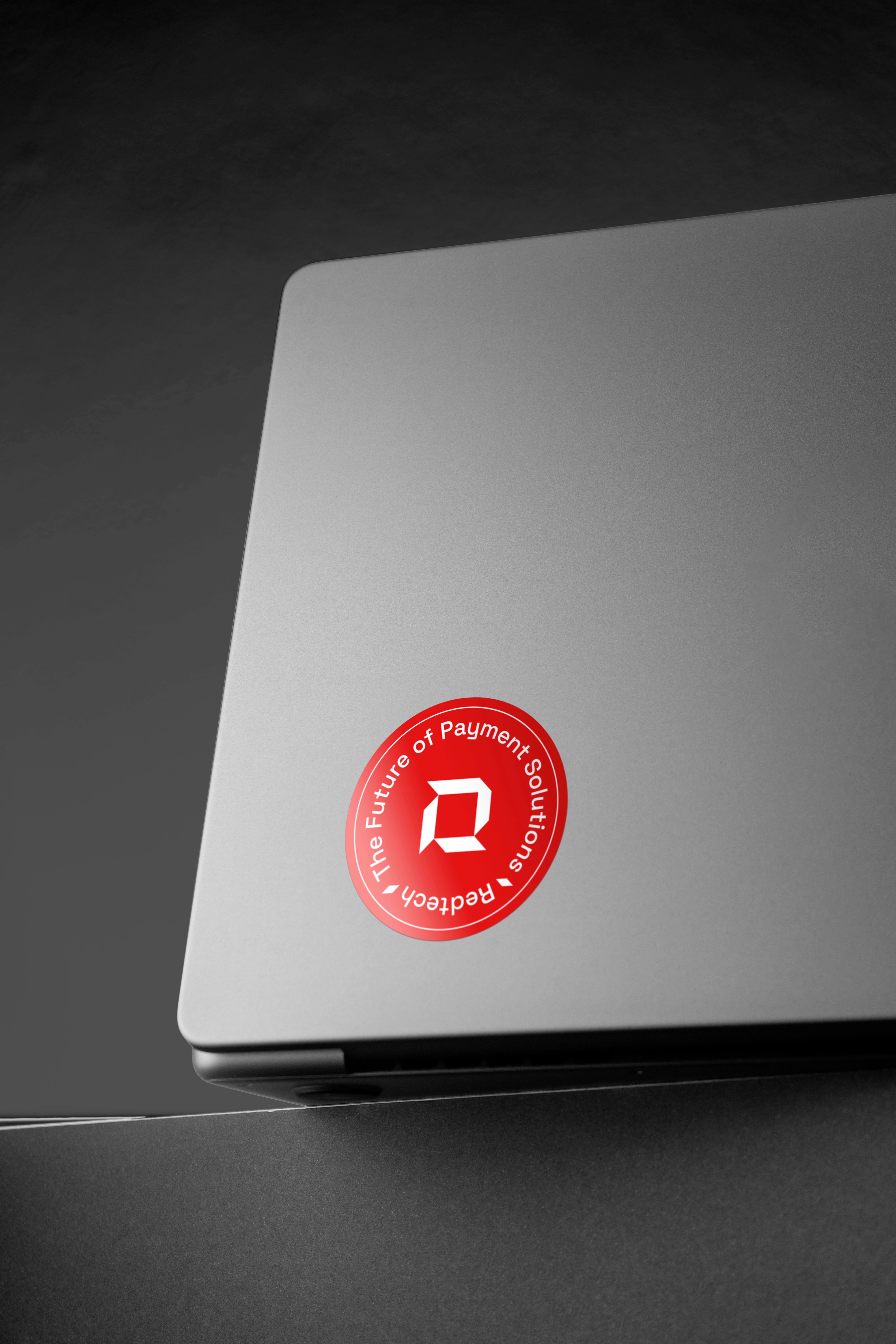
The selected logo concept features a geometric logomark formed by carving the letter “R” out of a square.
Why the Square?
Squares communicate structure, balance, and reliability which are values critical to a payment and infrastructure company like Redtech. It provides visual and psychological grounding for the audience.
Why the “R”?
As the first letter of Redtech, “R” becomes the hero element, anchoring the brand in clarity and recognizability. Its carved, angular nature evokes precision and strength, fitting for a company focused on secure, smart digital systems.
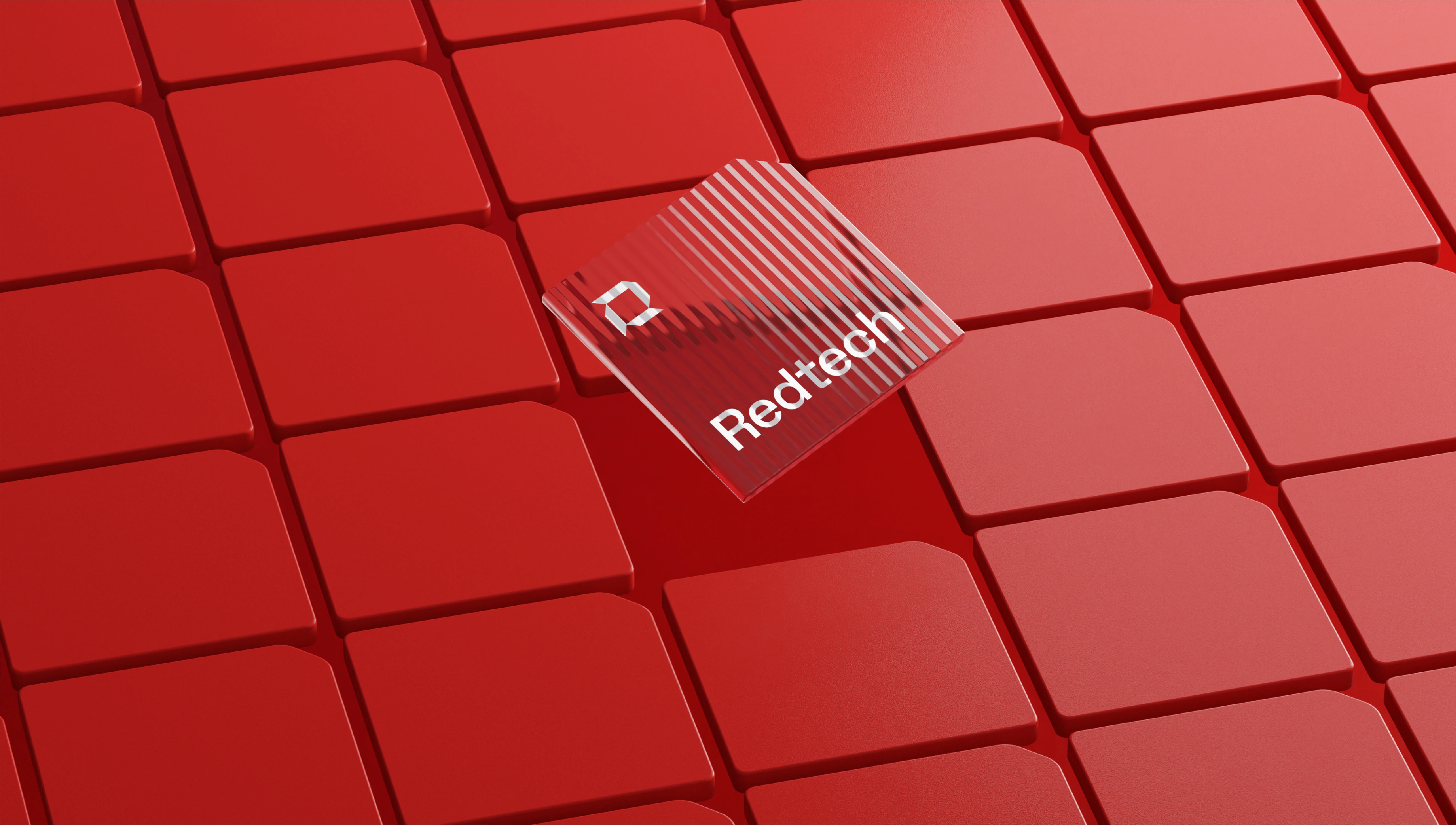
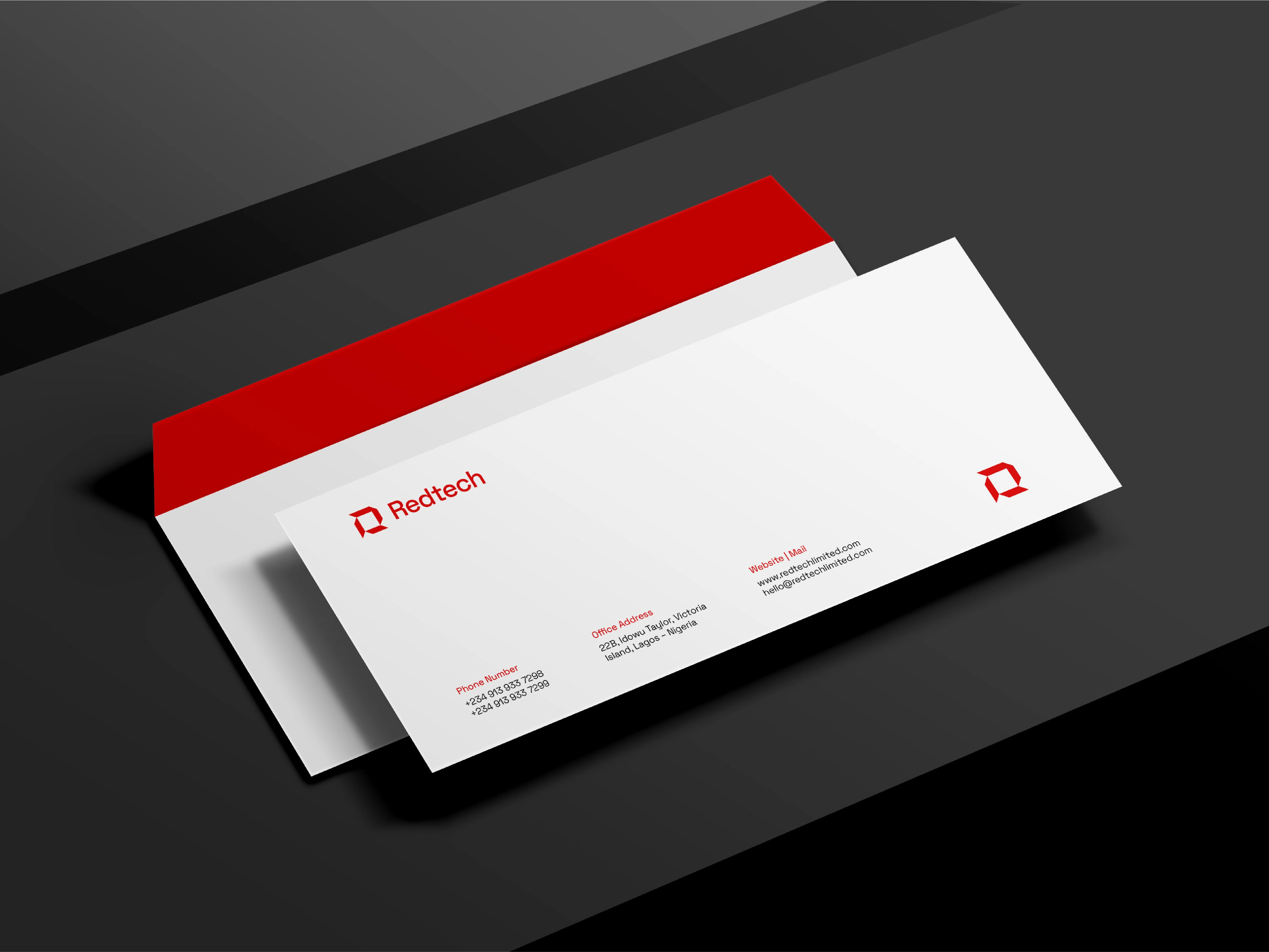
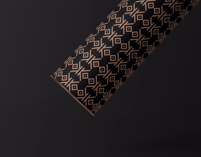
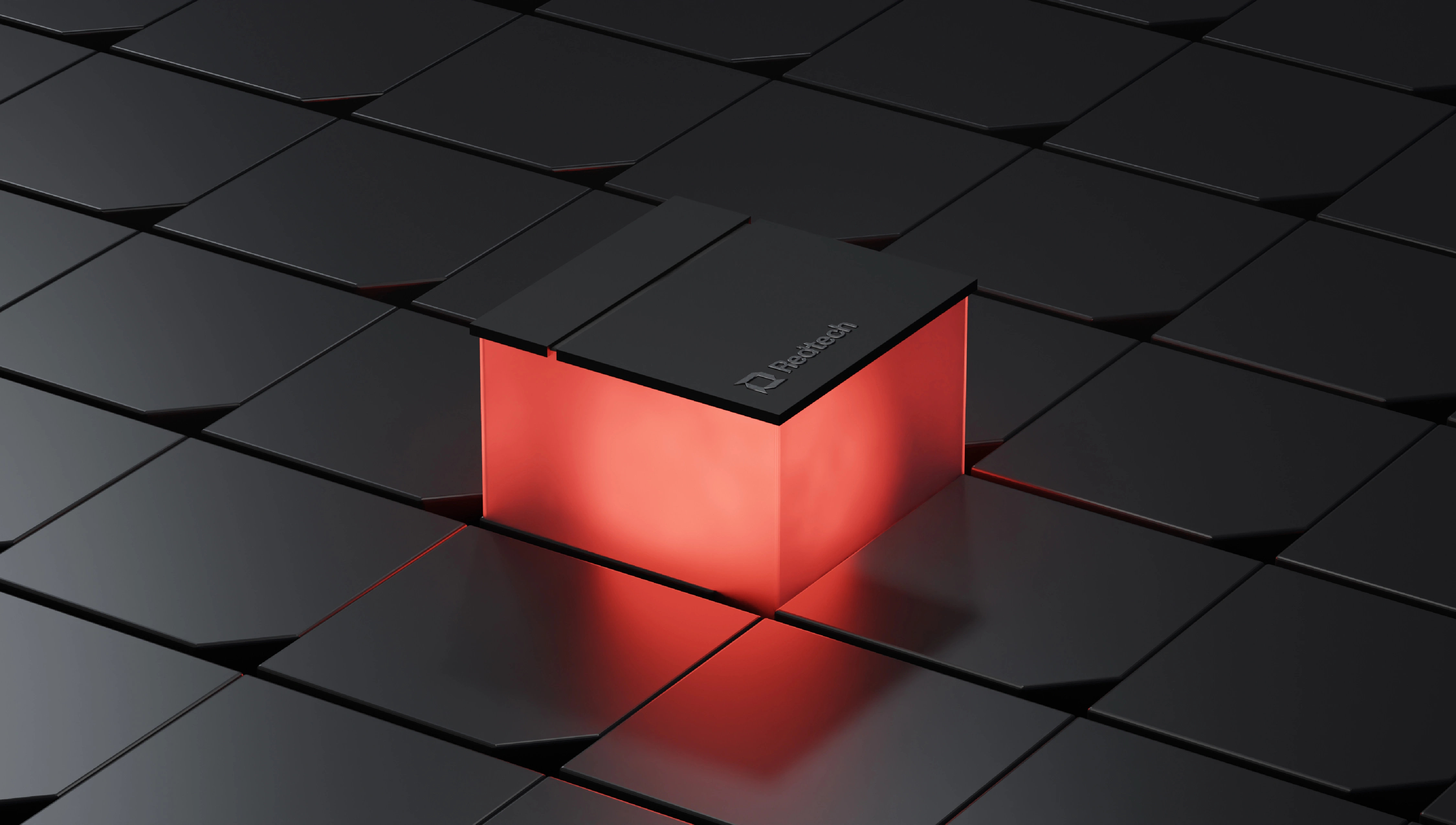
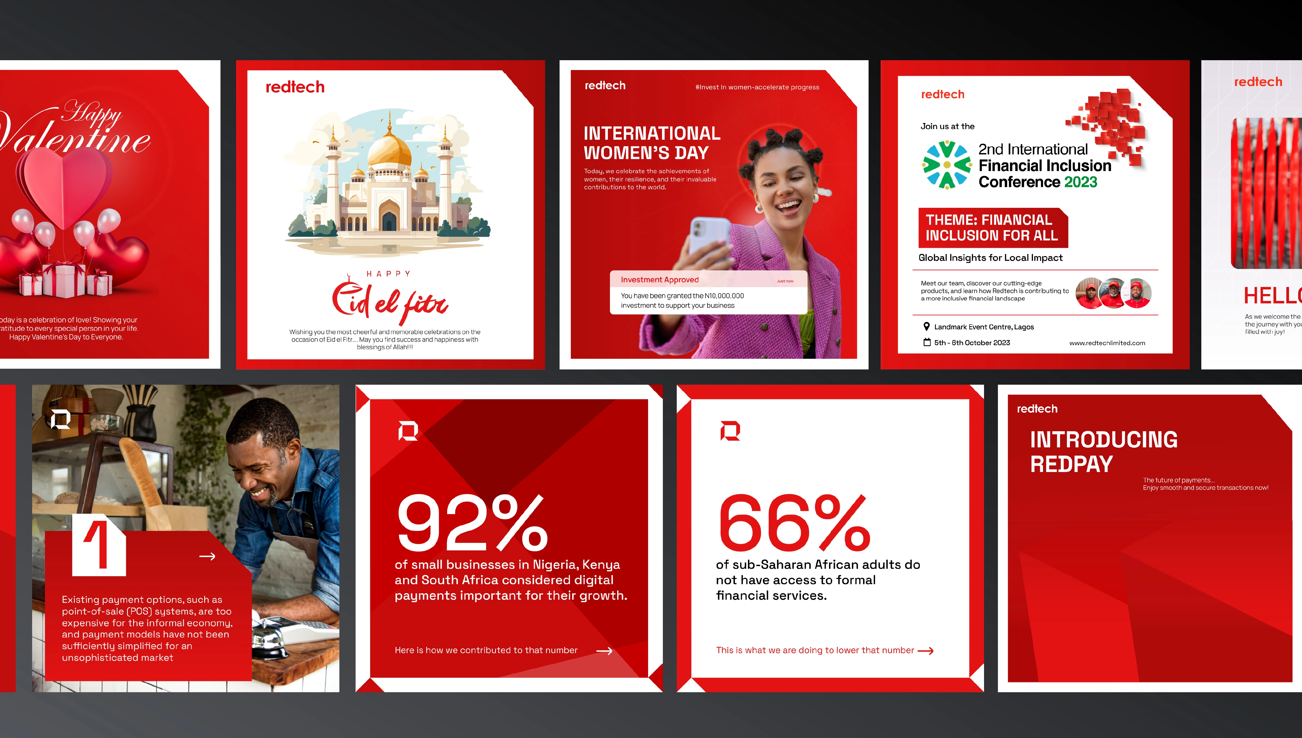
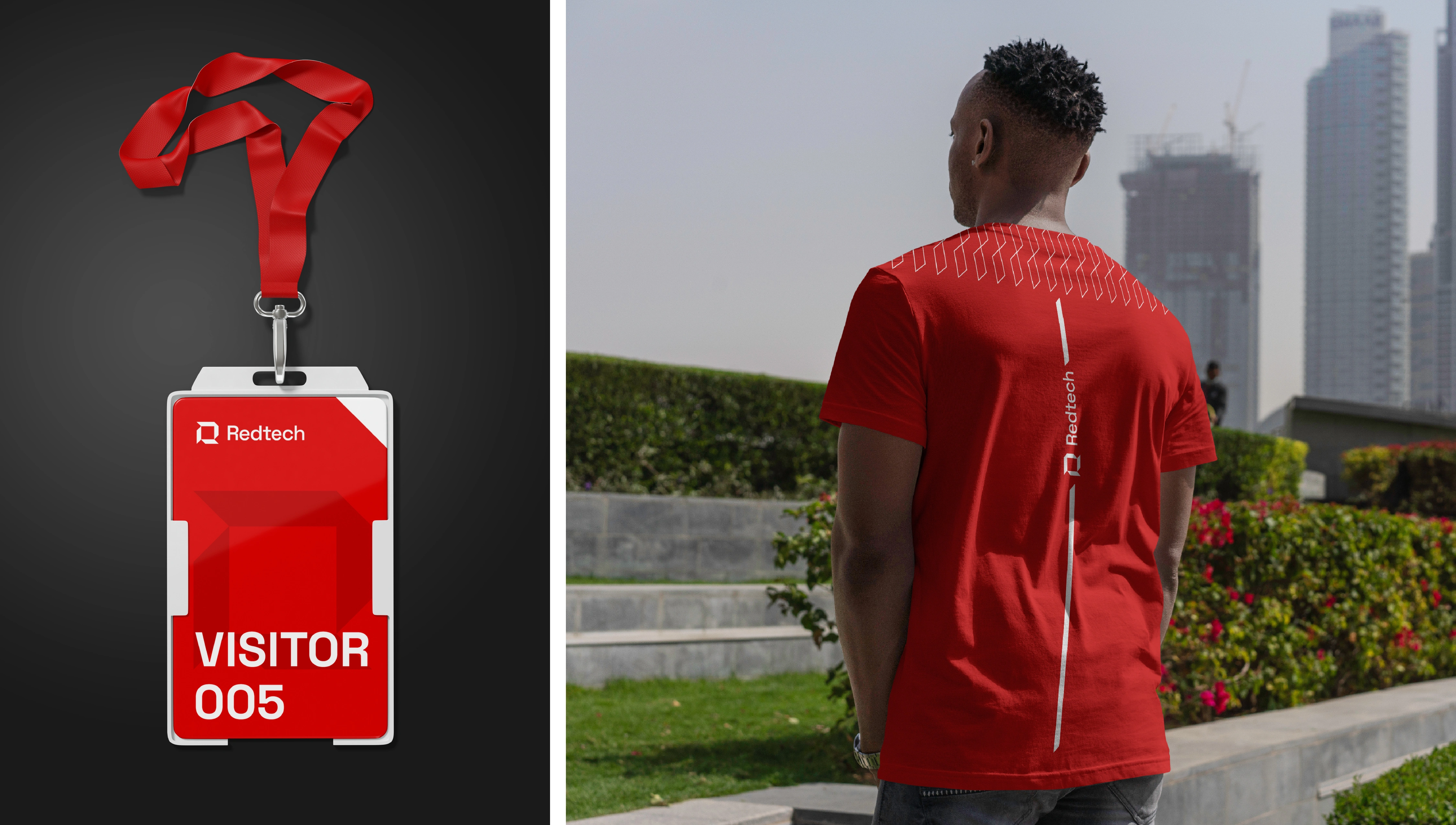
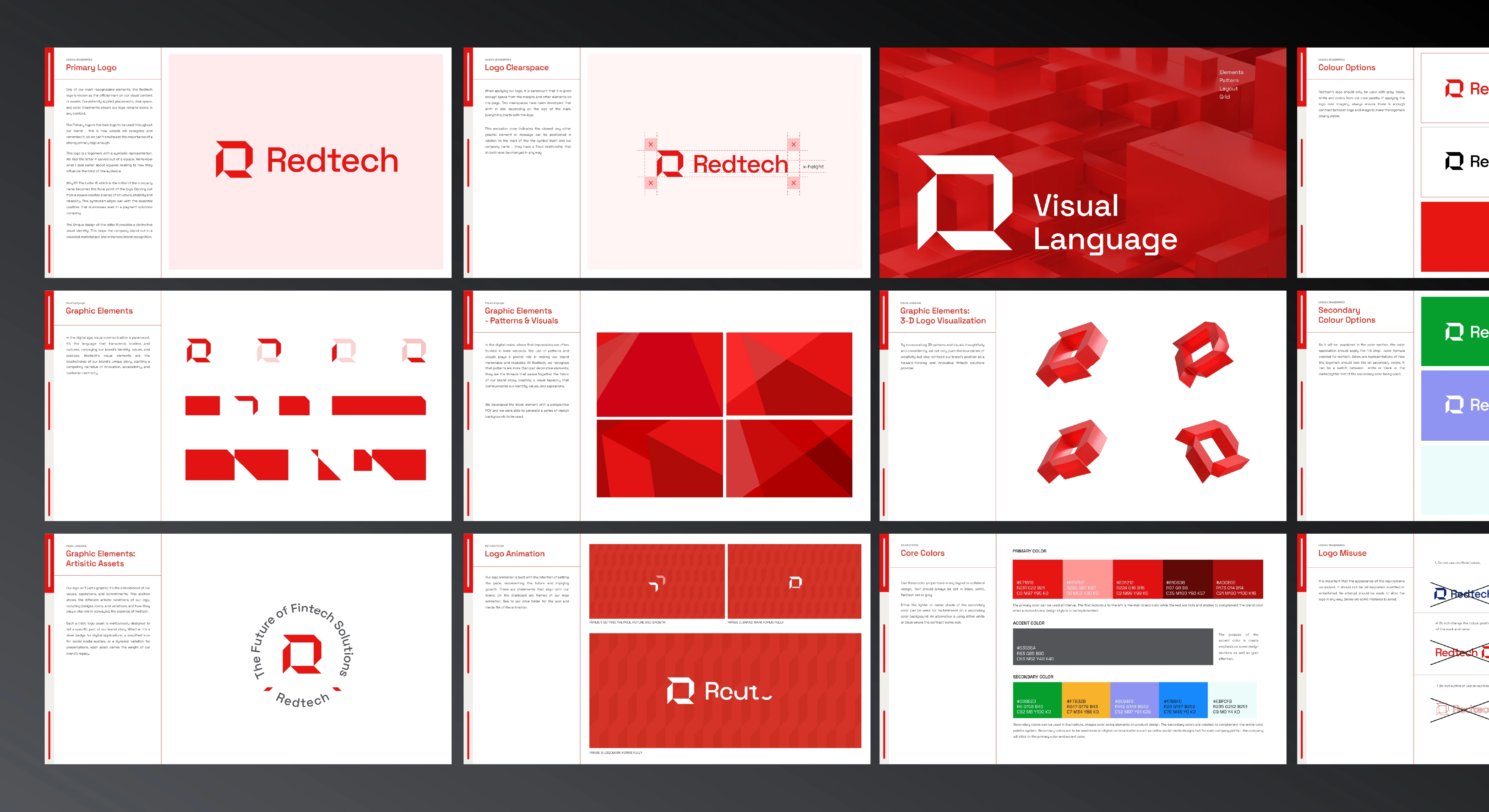
Visual Language – The Block
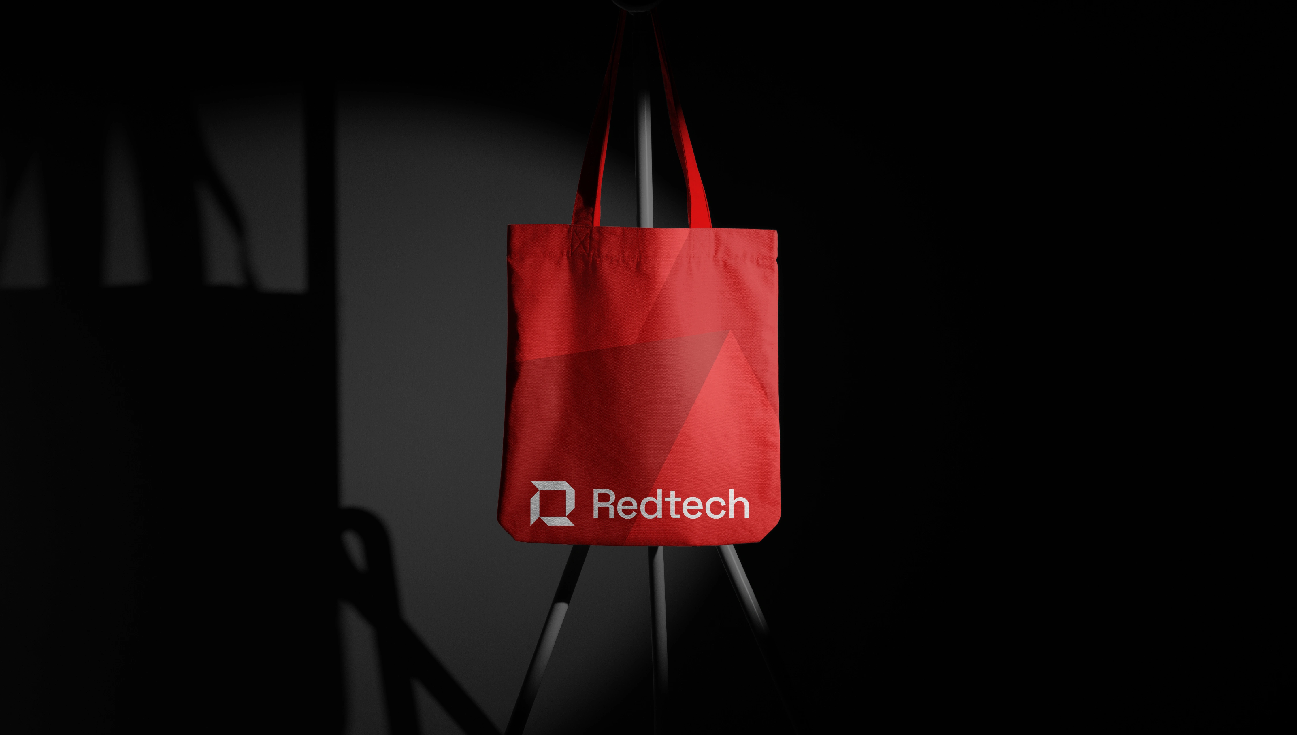
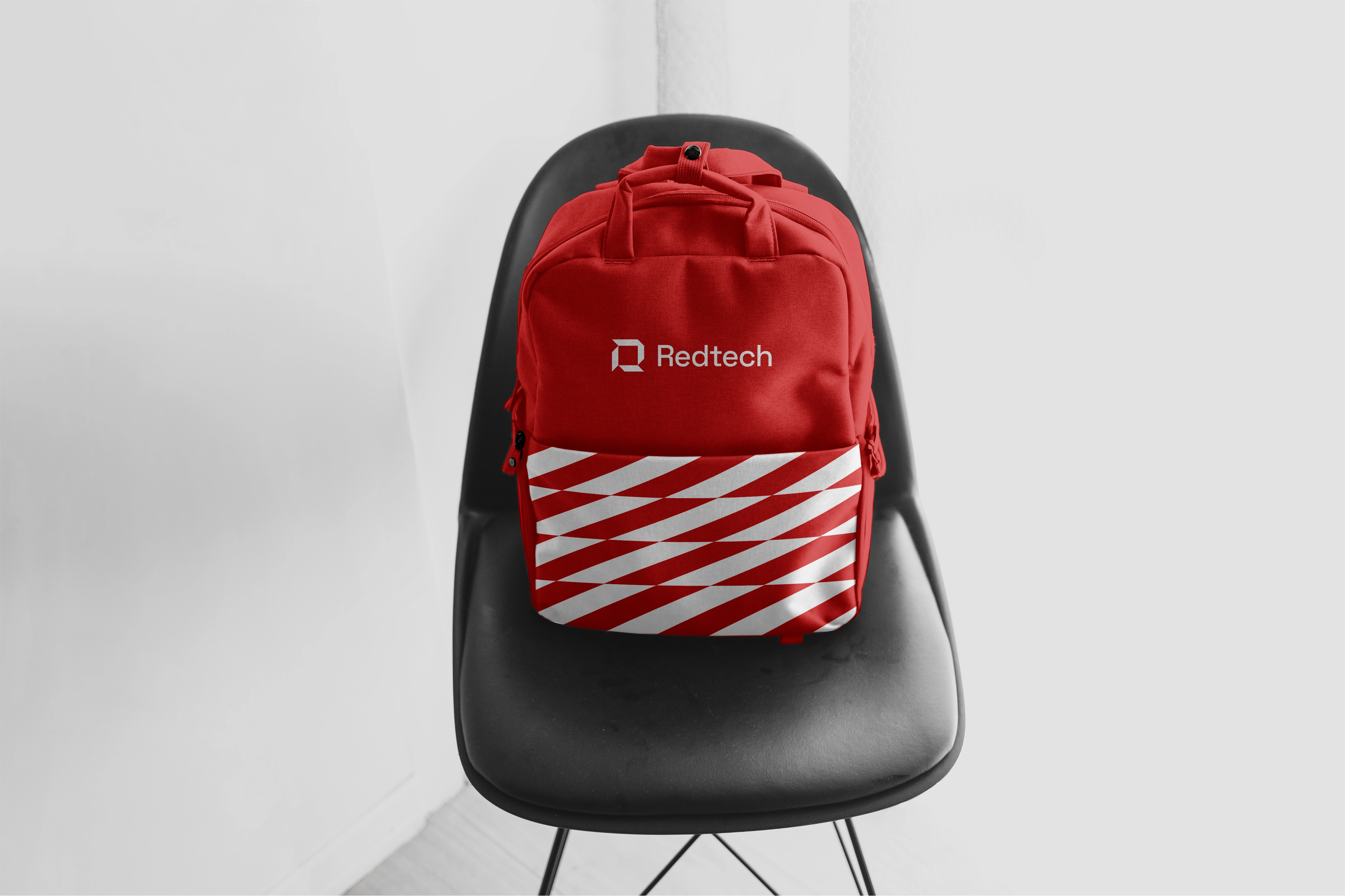
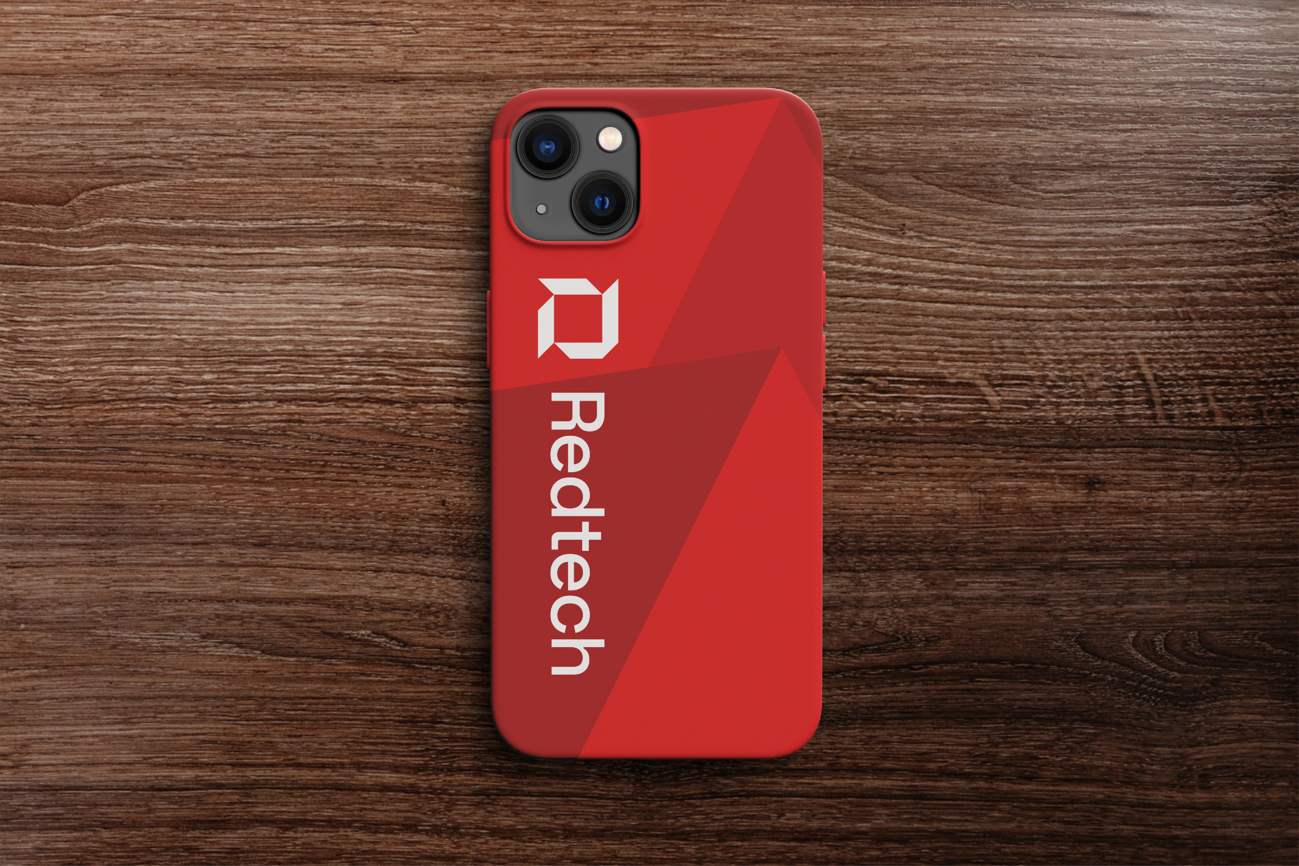
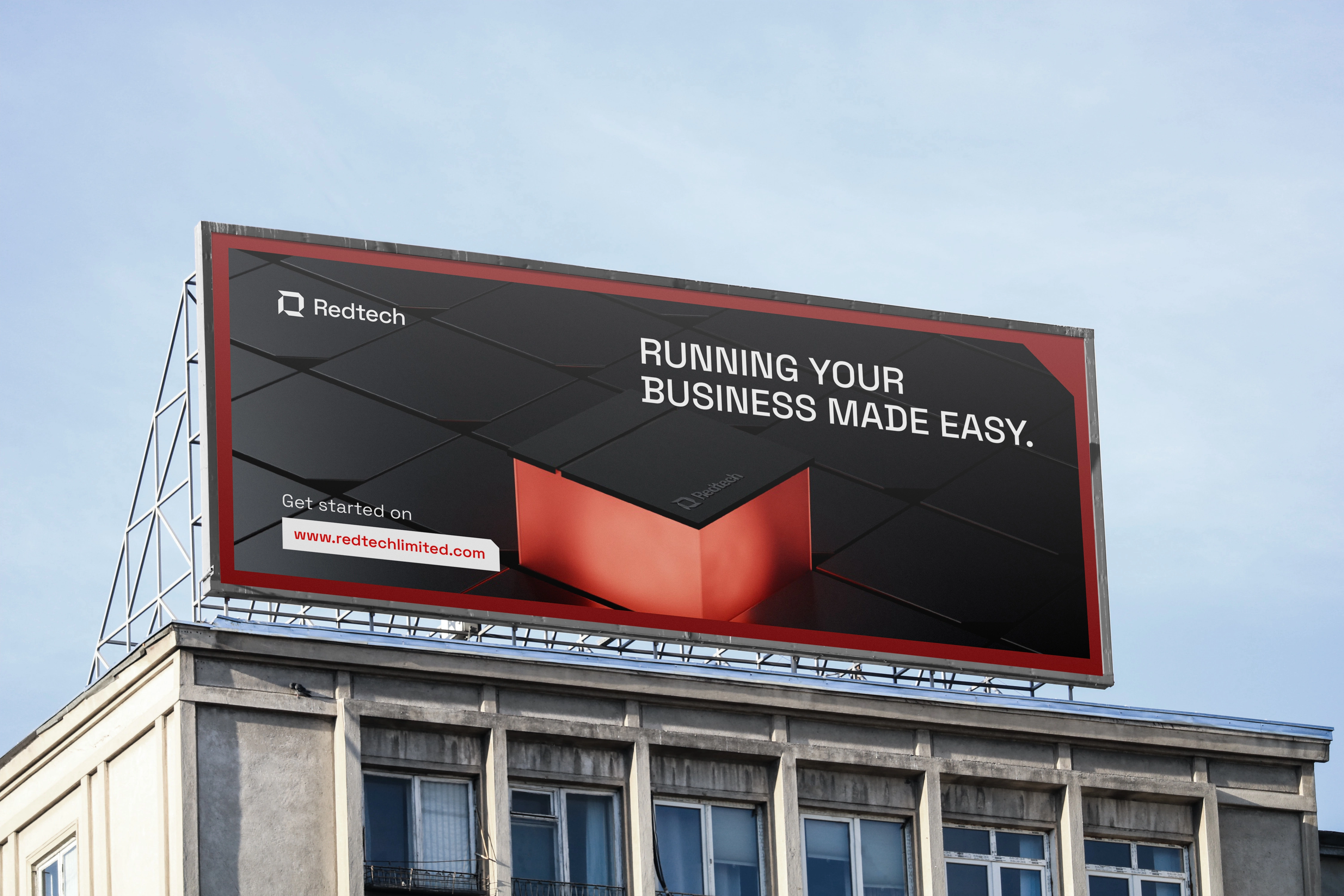
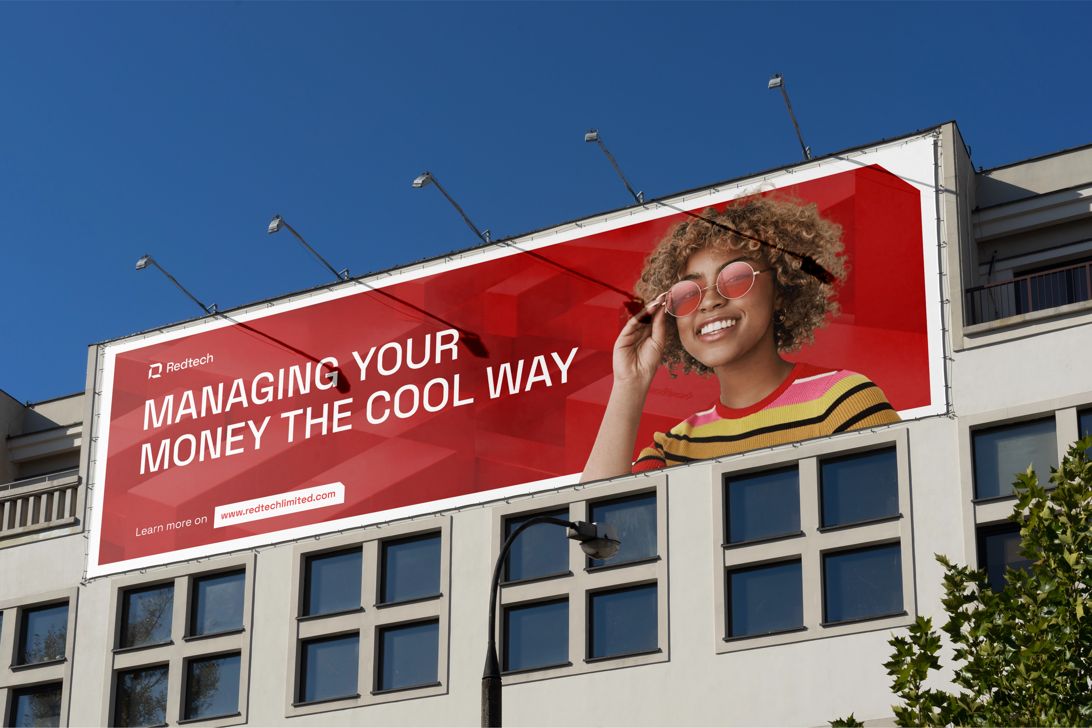
To extend the modular nature of the brand, we developed a visual language called “The Block.” Derived from the upper right arm of the logomark, The Block system is dynamic, versatile, and distinctly Redtech.
It acts as a framing device, layout tool, and image crop, adaptable across both print and digital media.
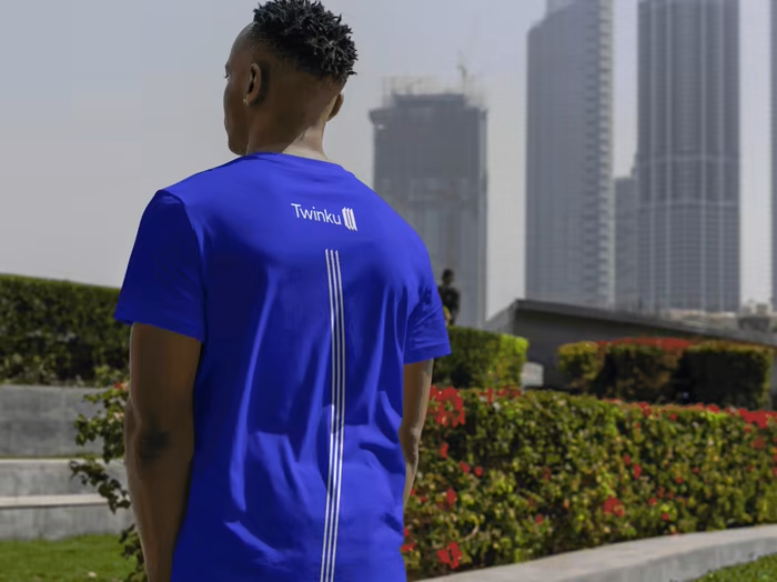
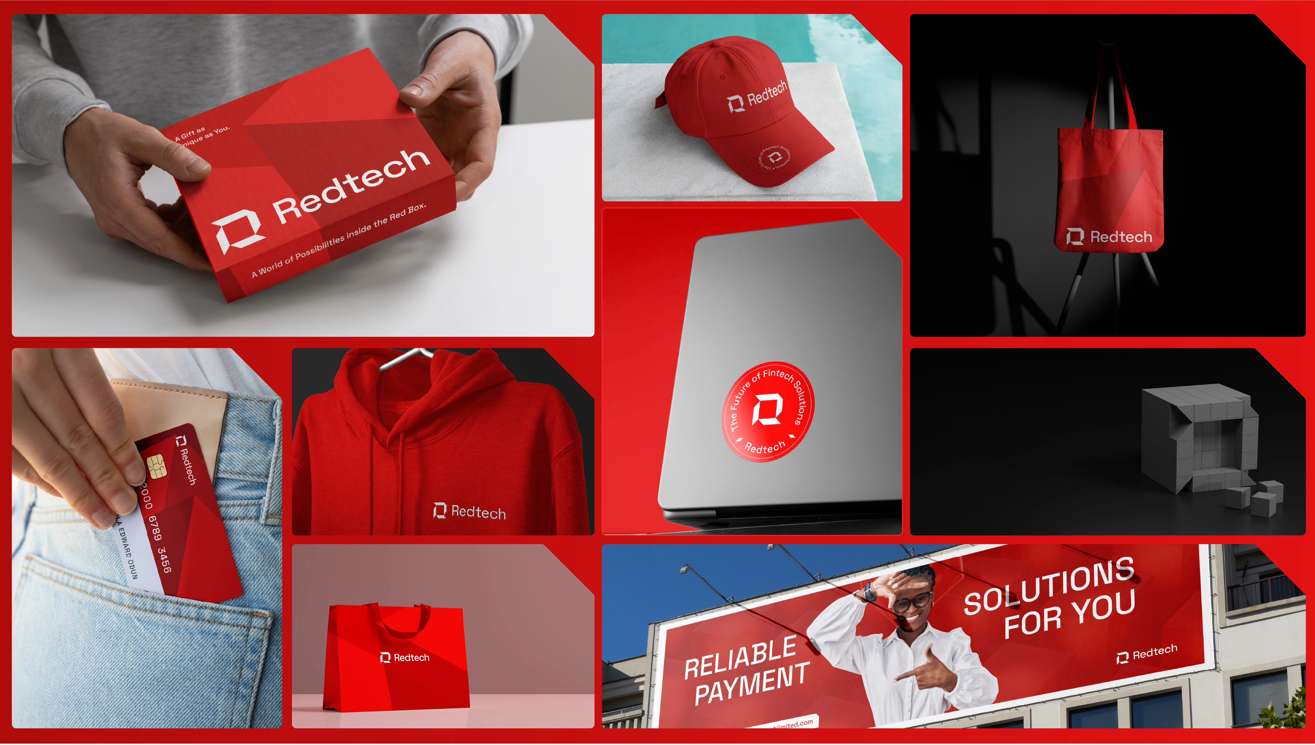
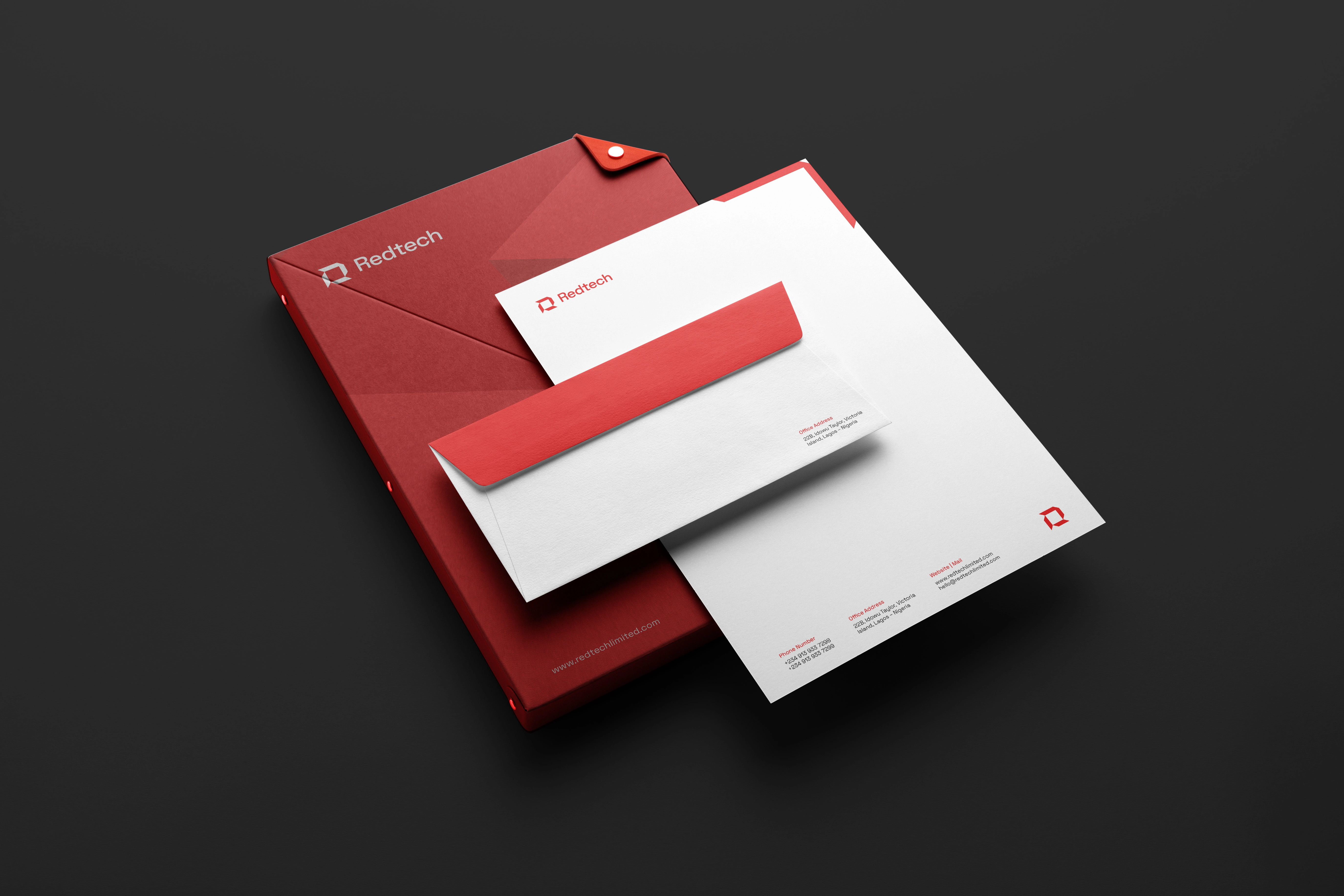
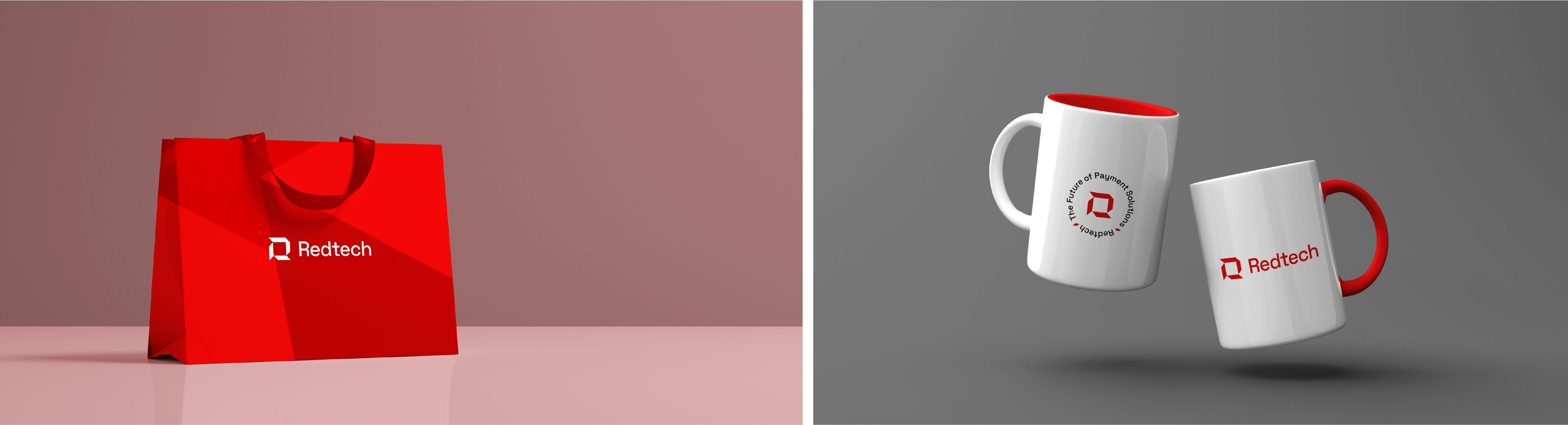
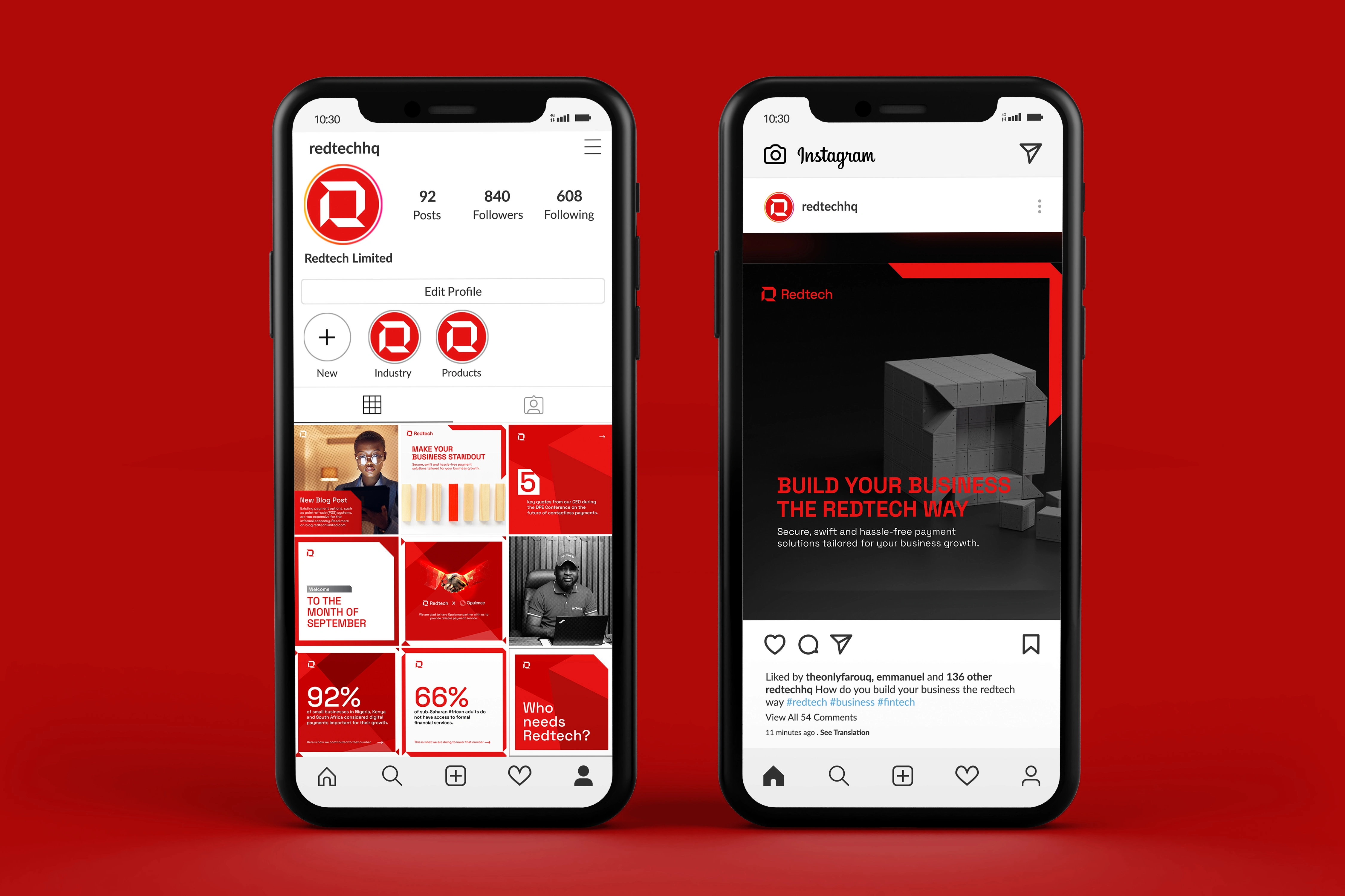
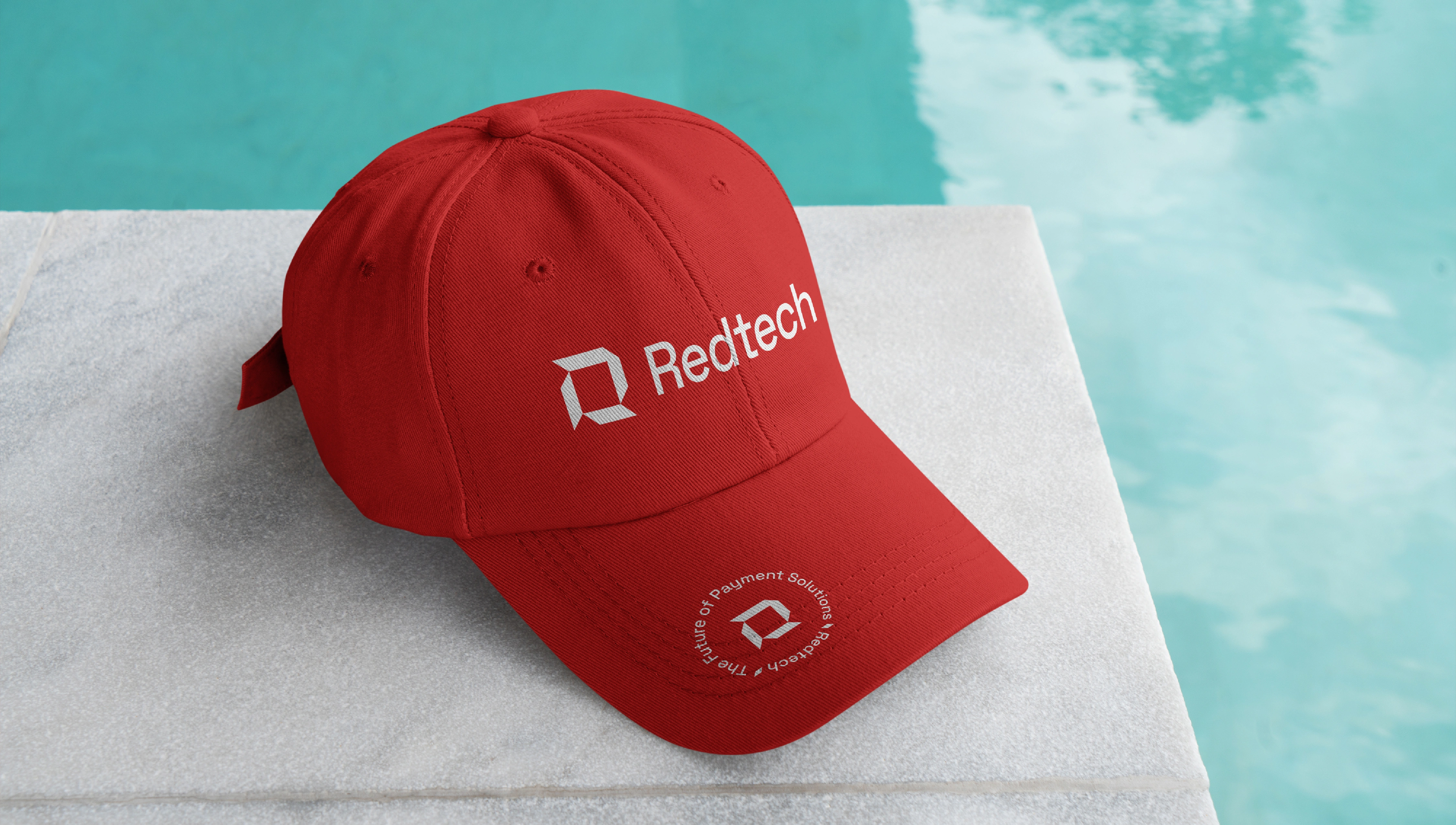
Modular System = Dynamic Application
From social cards to blog visuals, from infographics to layout accents, the Block unifies brand presence through repetition, rhythm, and spatial tension.
“The Block” isn’t just decoration, it’s part of a functional visual architecture.


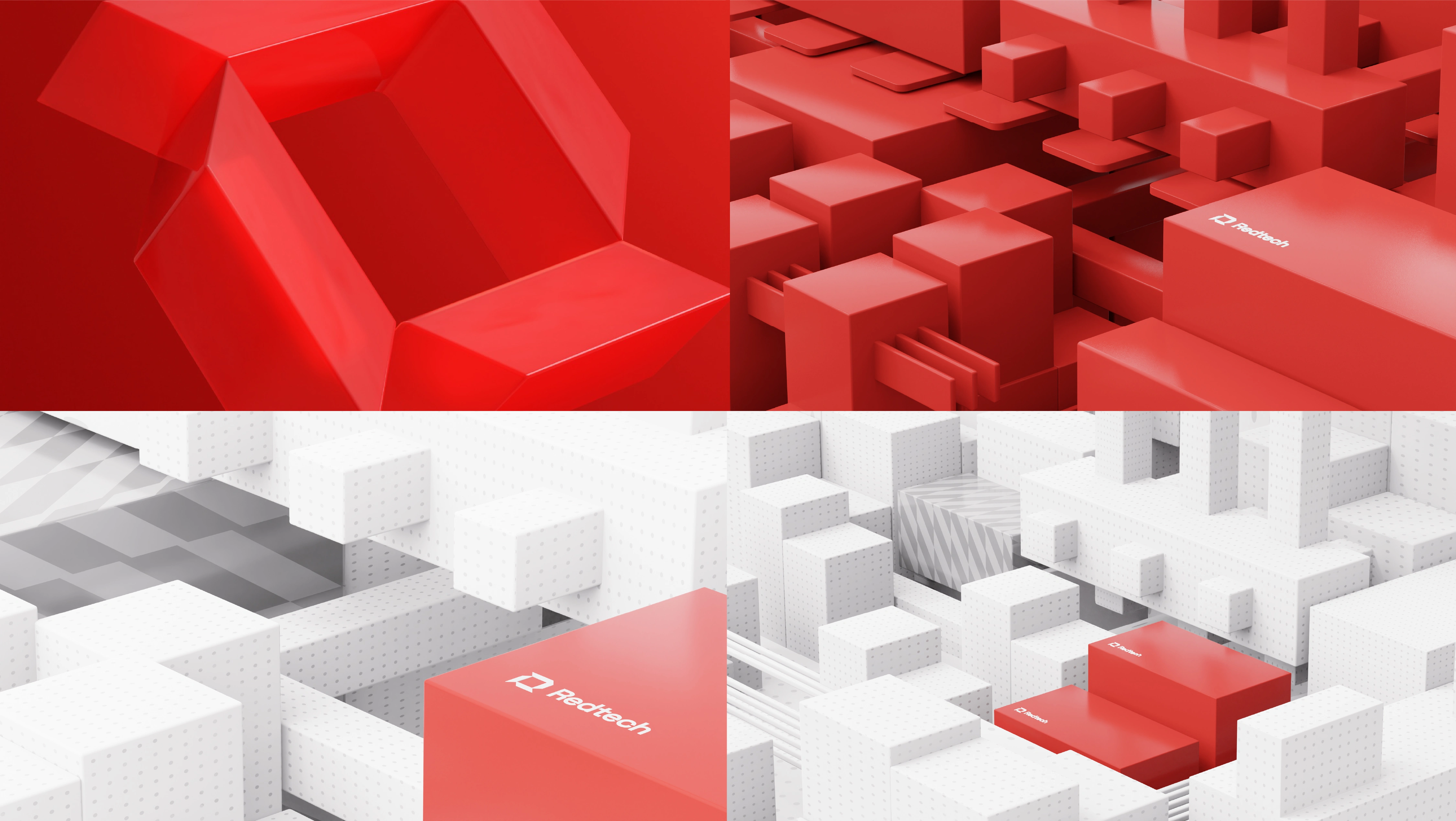
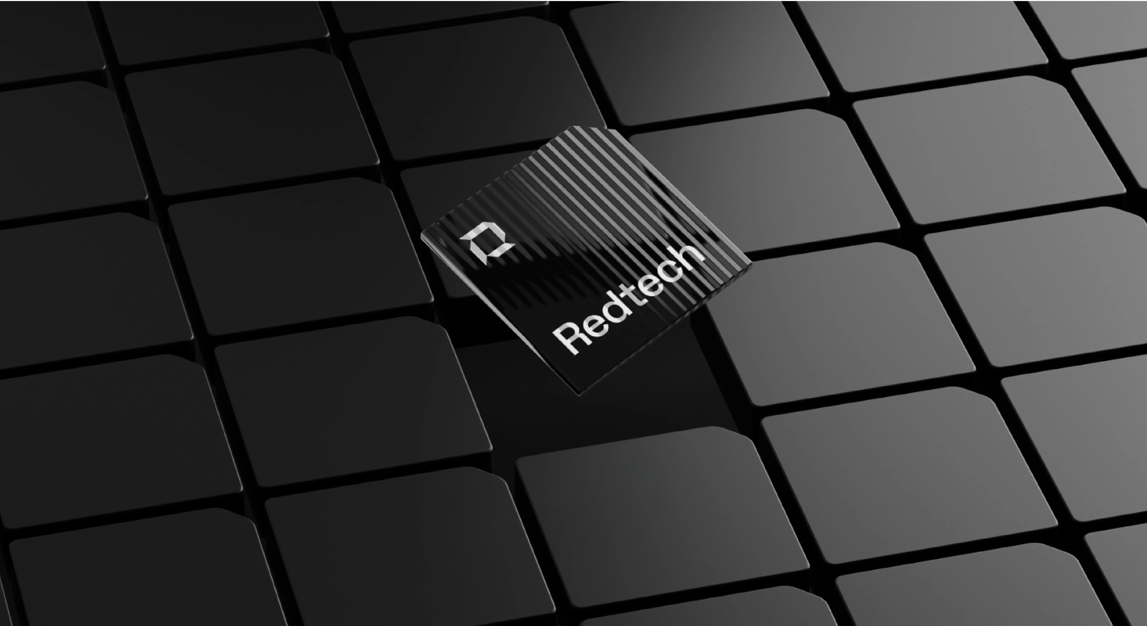
3D Exploration – Built to Scale
To further enhance the visual identity, we brought the modular system into 3D — transforming blocks into structured, architectural forms.
These explorations showcase:
A grid-like world where Redtech rises above the clutter
Highlight blocks symbolizing product excellence
A 3D logomark rotating in space, reinforcing dimensional presence
This direction will also extend into motion design, onboarding animations, and branded product visualizations.
Thank You!
PERTHEON
Brand Identity Design & Consultation - Farouq Osuolale
Creative Direction, Brand Strategy & Visual Identity - Farouq Osuolale
Logo Animation, Brand Video - Prince Ekeoma
3D Modelling - Joe Omeiza
Content Writing & Script Design - Oreoluwa Bello, Farouq Osuolale
Voice Over Artist - Oreoluwa Bello
Cinematography - Fikayo Oyetoro
Director: Fikayo Oyetoro
Art Director: Farouq Osuolale, Fikayo Oyetoro
------------------------------------------------------------------------------------------------
Want us to help you build brand recognition for your business, reach us via:
Email | Instagram | X
Website: www.pertheon.com
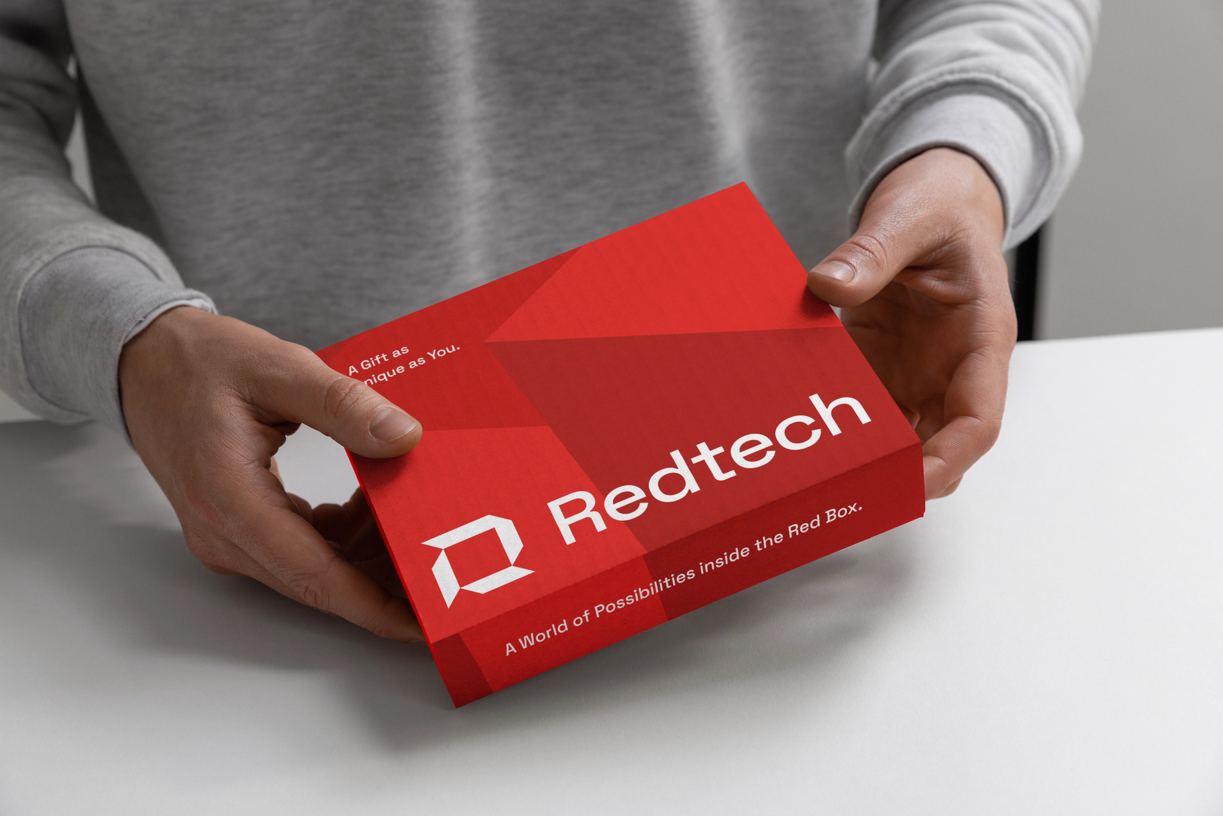
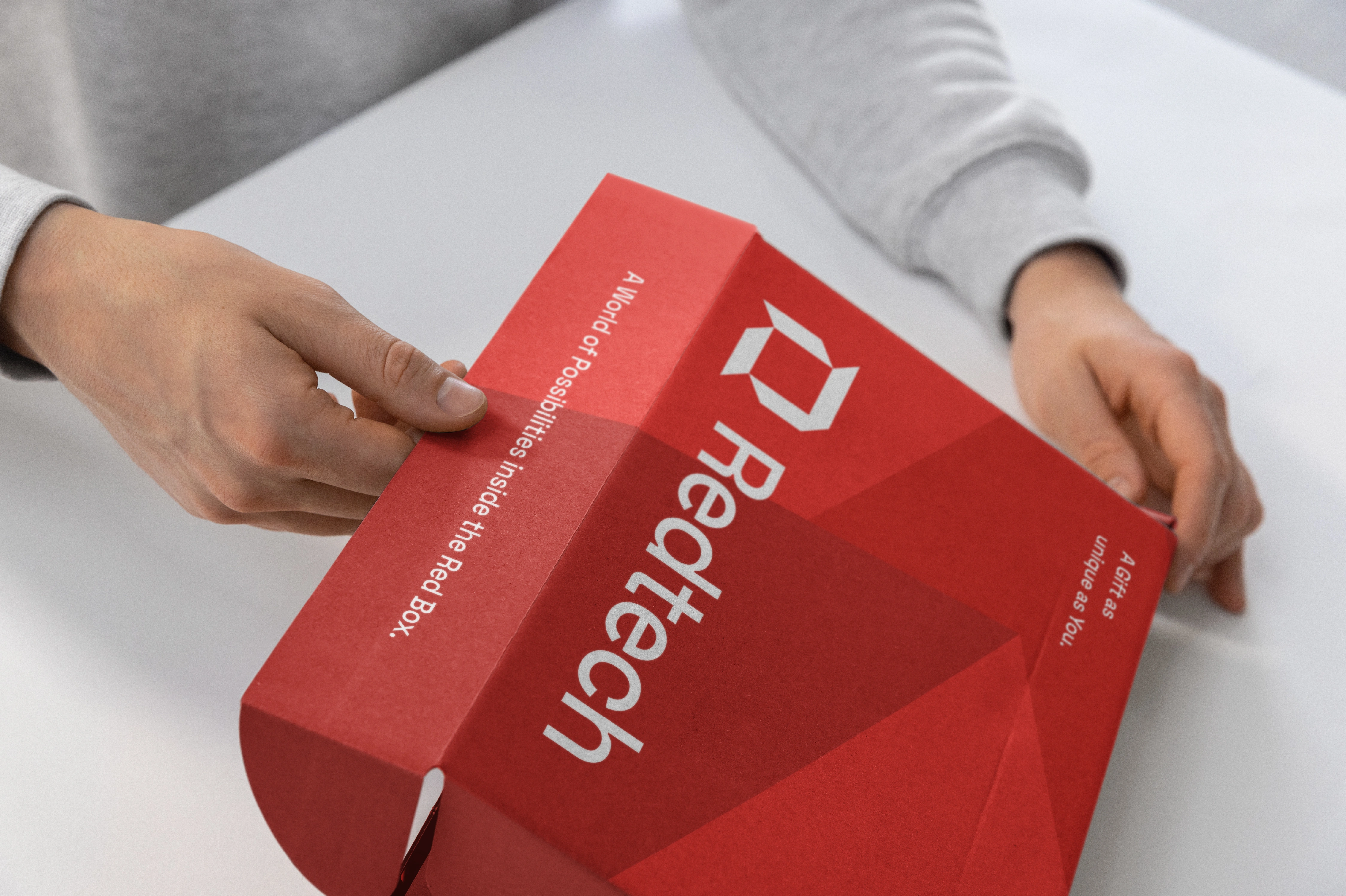
Although this concept wasn’t implemented, it represents the kind of intentional, scalable identity systems we believe in. The project was crafted to not only look bold, but behave boldly across channels. This unused direction reflects deep strategic thinking, a strong narrative, and adaptable assets for future-facing brands.
Like this project
Posted May 19, 2025
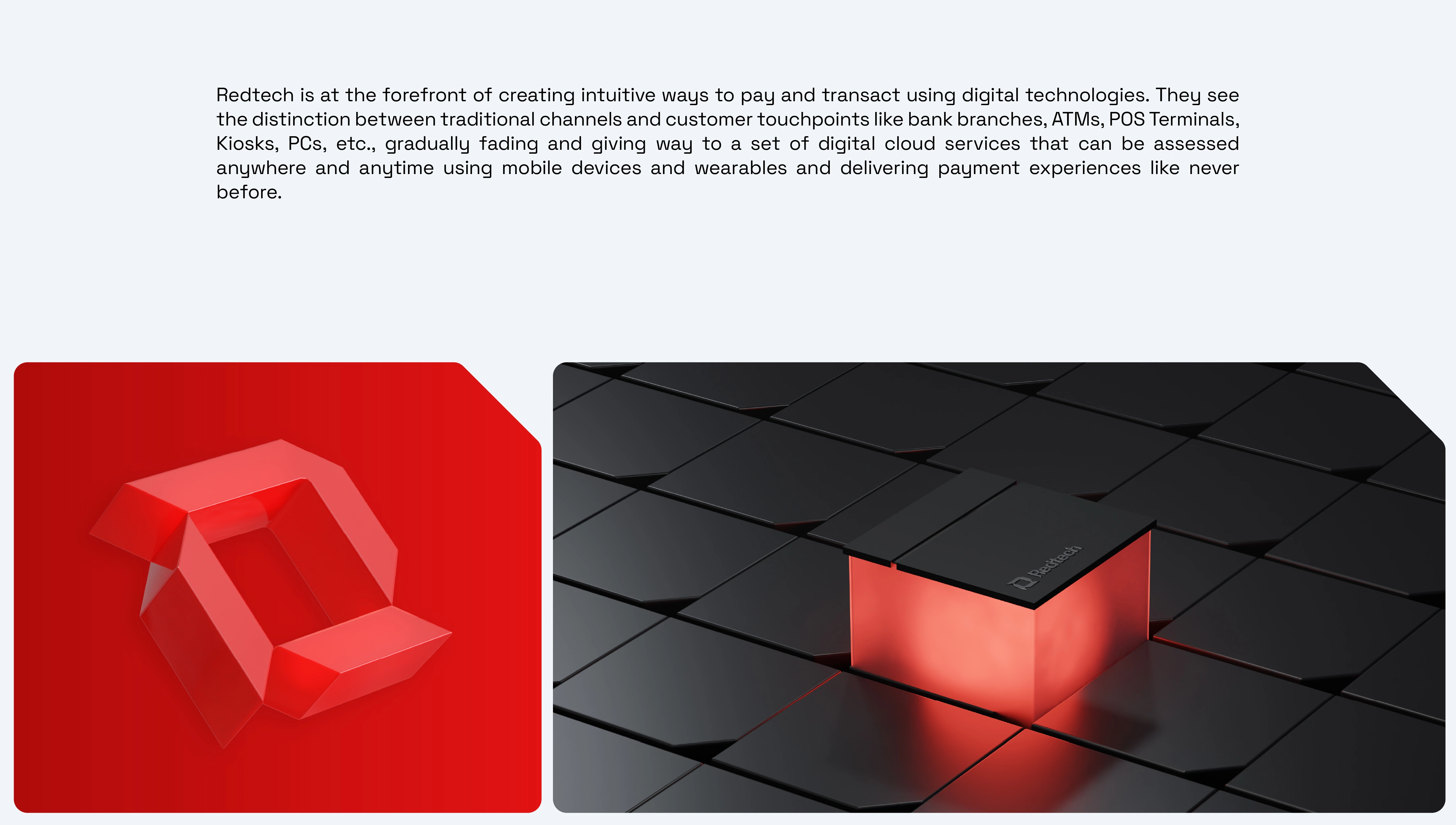
We were asked to craft an identity that portrays the innovative brand as the creator and innovator that they are.
Likes
1
Views
3
Clients
Redtech