Filtering redesign
Helena Bukovac
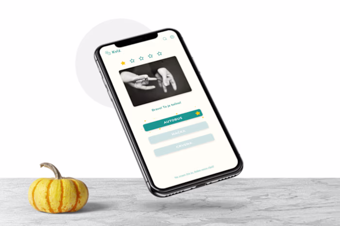
Example of the UI
Multilevel filtering
I worked on the project as a product designer cross-functionally to create an intuitive user experience. One of my biggest challenges was untangling an incredibly complicated multilevel filtering system. To do this, I conducted extensive UX research and created task flows to simplify the process. I also designed wireframes and conducted internal user testing to refine the design. Finally, I created prototypes to ensure the new filtering system was user-friendly and practical. It was a challenging project, but ultimately very rewarding to see the result.
The project's focus was finding a way to simplify four-level filtering in a video library, and I closely collaborated with a project manager and several engineers.
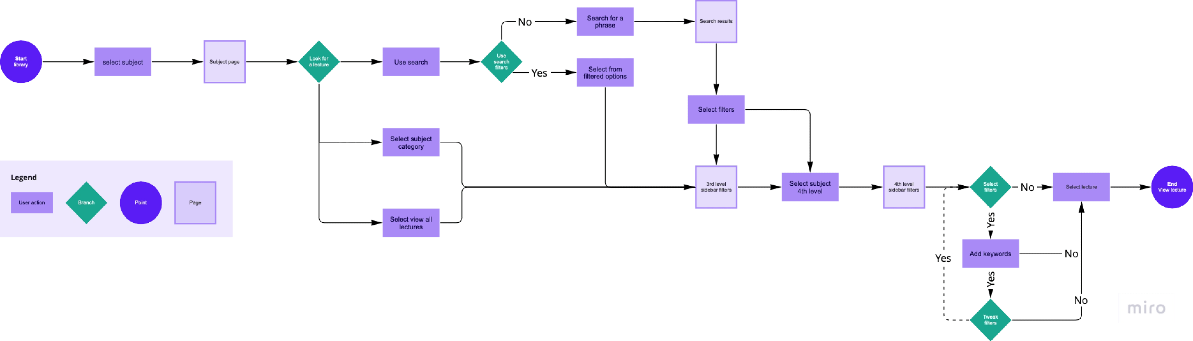
The task flow helped me figure out how to approach the design
After the task flow was approved, I moved into design. Working in a dated design system was a challenge, but I took the opportunity to refresh it with updated components. My UX research was guerilla testing my ideas on colleagues while digging deep into competition with extensive competition analysis and user flow comparison. Mobbin was a great tool here and helped me a lot.
Going into the filters
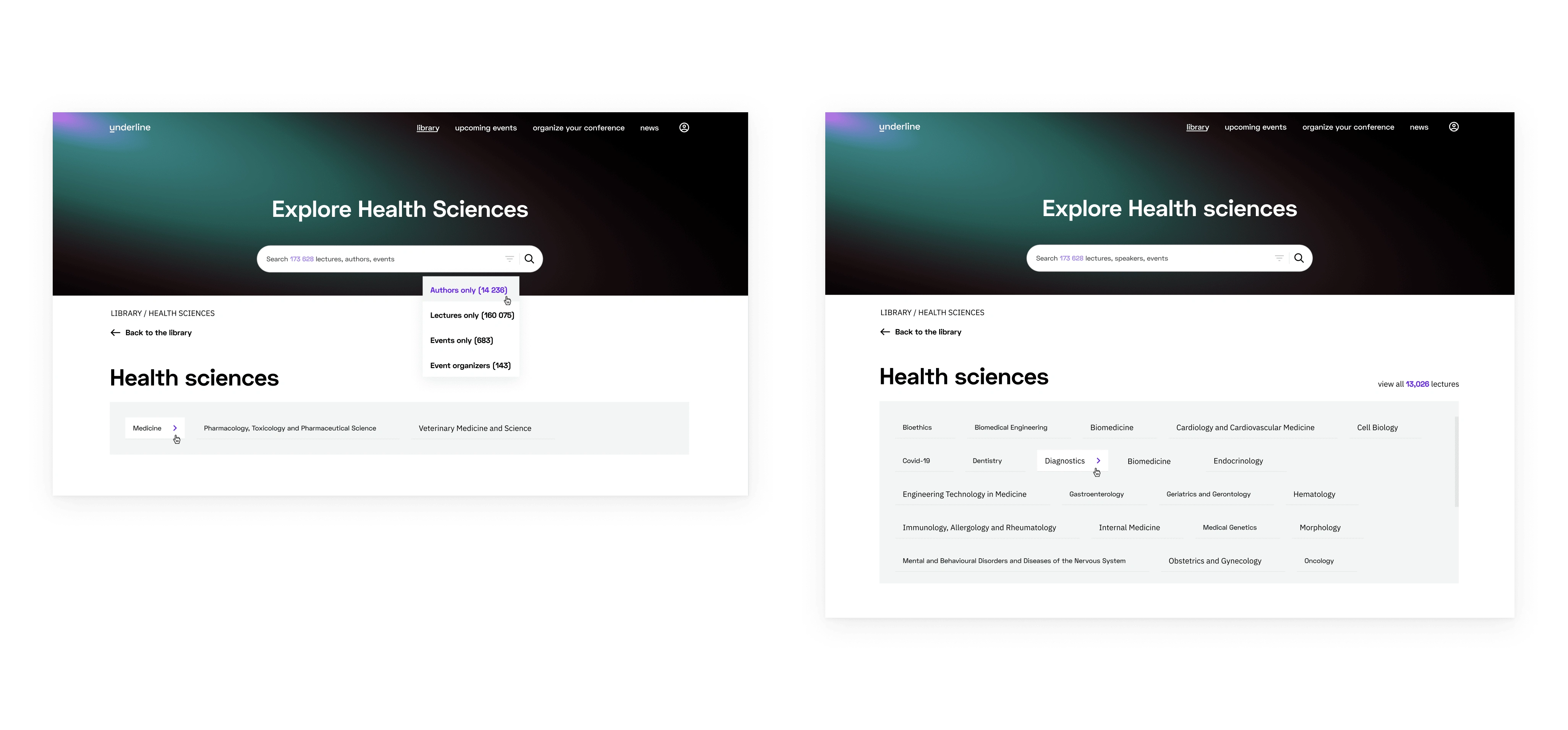
The first and second level
The first two levels were on the subject landing page. In reality, these were one level deeper. The user needs to select a subject out of four, then arrive on this page where they can use filtering. A separate project was redesigning the subject landing page, but the filtering is more interesting, so I will stick with this.
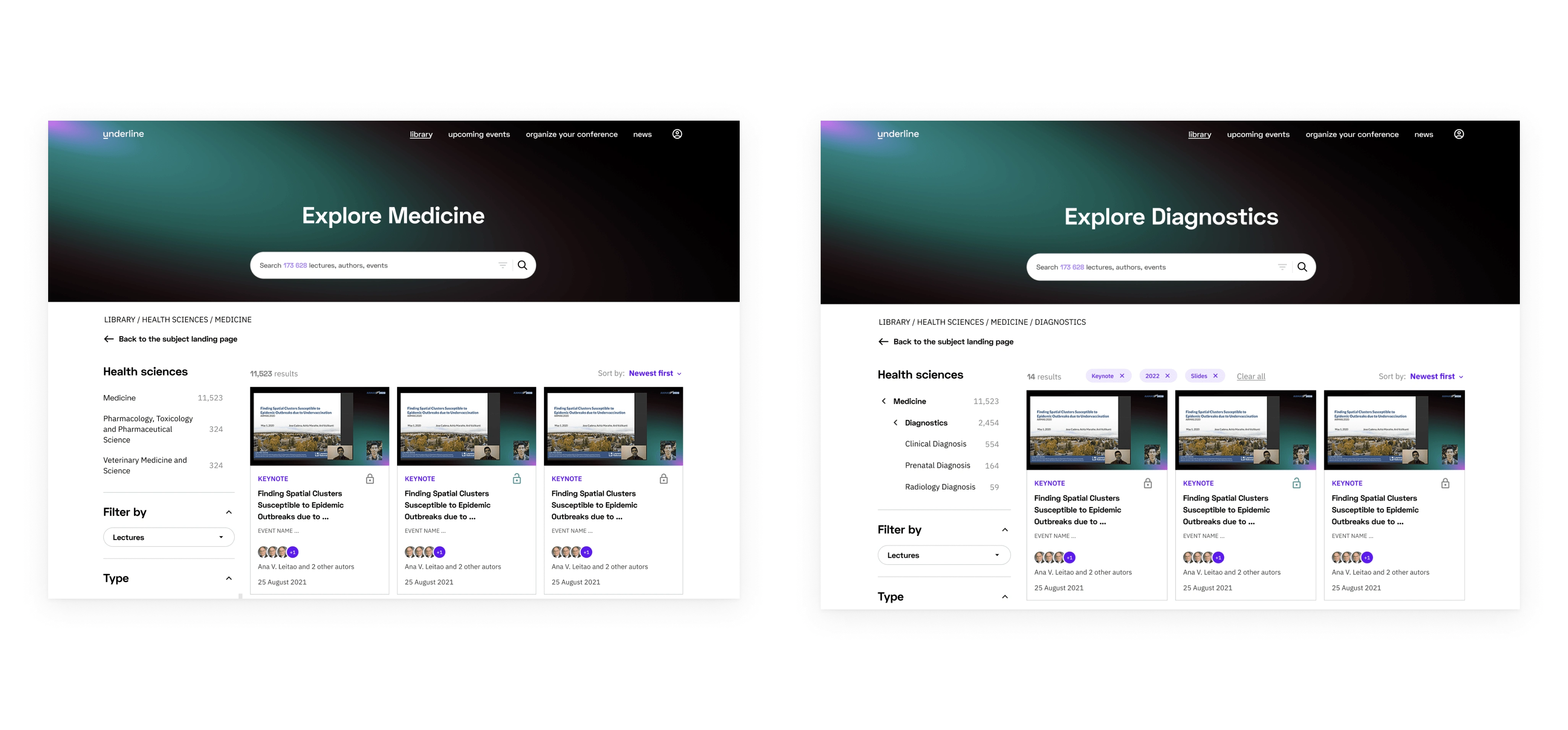
Third and fourth levels
On the third and fourth levels, filtering moved to the side, with the design decision that users wanted to see content at this stage. There were quite a few issues regarding which filters to include, how to show them, which ones are viable as an MVP stage, and which could come later. An interesting issue was how to show chips of applied filters, how many, and how to easily allow users to clear them all.
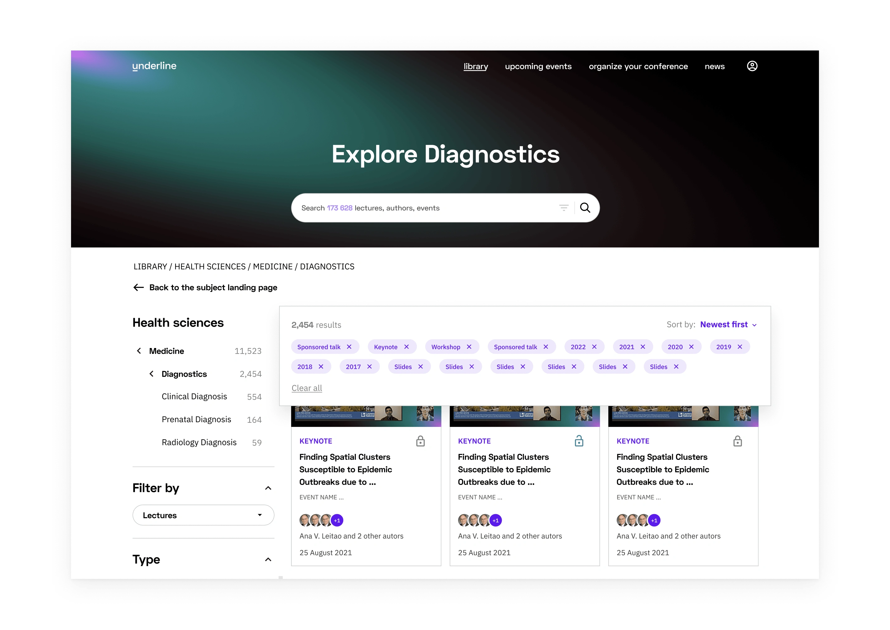
Applied filters shown as chips while scrolling the content
Result
The filtering allowed users to easily navigate through the desired topic while allowing them to lessen the cognitive load by funneling choices. It was a fun but challenging project to work on, and it required a lot of patience and exploration of established user patterns by mixing up something creative.
Like this project
Posted Aug 21, 2023
Simplified complex filters via UX research, task flows, wireframes, & prototyping for an intuitive user experience.