UX/UI Optimization for Nurtur

Krisha Zagura

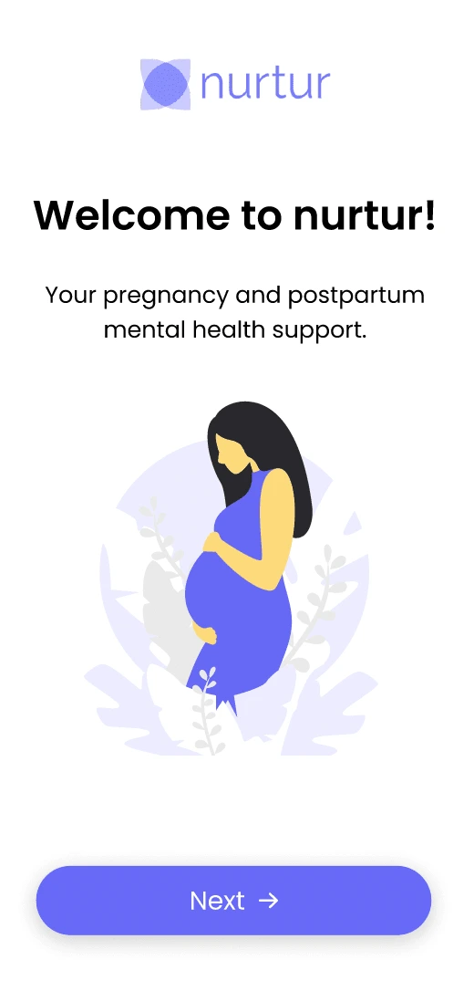
About: Nurtur is an early stage start-up focused on post-partum healthcare for new moms. Nurtur identifies post partum depression symptoms at the early onset from women and offers a treatment plan to help woman navigate this challenging time with personalized self-guided therapy, expert advice, and continuous care. Nurtur started out of the MIT Delta V Accelerator program and was part of Techstars 2024 Healthcare cohort.
UX/UI feedback and optimization: The focus at this early stage for Nurtur is onboarding users on to the platform and engaging on the platform to show product/market fit and continue to get traction from early stage investors. Nurtur uses AI for diagnosing and detecting PPD symptoms to give new moms the tools to manage their post partum depression. I provided Nurtur with UX/UI Optimization expertise and feedback in the Onboarding Experience and throughout the customer journey to retain customers and provide greater customer engagement.
Problem: Nurtur was looking for opportunities to reduce the friction in the customer funnel, onboard users with required surveys to match customers with therapists, and identify their post partum symptoms. The challenge was balancing the upfront needs of collecting the information needed to identify PPD markers in user funnel, completing the account creation and reducing the exit rates from too many onboarding steps.
2. Goals:
Increase Account Creation: Reduce dropoff rates during account creation.
Increase DAU: Increase engagement users after account creation
3. Summary: I looked at what was absolutely essential to make the user experience as frictionless as possible while focusing on reducing the number of pages in the onboarding funnel to increase account creation and subsequently user engagment. I made recommendations to consolidate survey pages which will be used for client matching and suggested permission prompt locations later in the funnel. The goal was to ensure we reduced the number of exits from users who were onboarding, while still collecting upfront information needed to match the customer with a suggested care provider. I went through multiple design iterations with nutur and recieved user feedback for the updates for the early stage-startup.
4. UX feedback:
I reviewed, assessed, and provided feedback for the onboarding flow, including consolidating all survey questions on to one page to reduce drop-off rates. The older version of the designs focused multiple pages of onboarding questions instead of consolidating the questions on to one page for ease of navigation and reduce dropoff.
I recommended adding visual steps (Step 1/6) into the user onboarding to provide users specific insight on the page by page onboarding flow. Visual cues help the user navigate the time spent and remaining steps required to onboard reducing the cognitive load.
I recommended asking for opt-ins and permissions at the time of context vs. serving as a blocker for onboarding. As a best practice, permissions and opt-ins are better served at the point in which the user is engaging with the product or feature as opposed to upfront when the user is starting their onboarding journey.
I recommended moving the second survey to the step after completing their account creation at nutur, ensuring that more users completed the account creation the flow. Too many upfront barriers to entry will prevent a user from completing the onboarding flow, a critical step to user acquisition.
I recommended offering greater user detail, surfacing the value of what users would get in return from inputting their details in the PPD survey. It is essential in user flows for users to understand what they are receiving in return for the value they are putting in. The greater the understanding, the more likely they are to complete a task.
5. Roadmapping Recommendations: User Engagement & Incentives
Beyond the account creation flow, one of the other key factors for bringing traction and success was ensuring that users were continuing to come back to the mobile application. Engagement after the account creation is crtical to keep the users active. I worked to identify new areas of features/functionality to bring greater traction to the app after the users completed the account creation.
Identify Stickiness Factors: Determine what incentives users want to keep them engaged long-term on the platform after signing up as a member. Including member chat, progress graphs, and journaling to keep the user engaged as a DAU. Nurtur is currently conducting UX research to determine where to invest for deeper customer engagement.
Emotional Tracking: Establish how users feel over time and what influences their emotional engagement. Provide deeper engagement with the user by prompting them to add additional details about their progress from therapy sessions. Users are more likely to come back to the application when they view their progress over time.
Gameification Appeal: Validate whether users genuinely find gameification appealing and what elements would bring them back. Giving rewards and incentives to users for engaging in the app will bring greater usage and stickiness to keep returning to the app. Action Item: UX research to dive into the greater needs of the user.
User Hypothesis Testing: Test assumptions with users to confirm if gameification aligns with their actual desires. Conduct a qualitative audit to understand if the solutions outlined meet user needs.
6. UX Research & MVP Prioritization
Critical UX Research: Conduct user research to identify key engagement drivers and prioritize MVP features accordingly to divide the high priority users needs into iterative sprints and commitments.
Mom-to-Mom Connection: Investigate whether moms explicitly want to connect with others in similar situations and how they envision this connection.
Anonymous Interaction: Explore whether moms prefer to stay anonymous while still engaging with a supportive community.
7. Engagement & Value Delivery
Engagement Triggers: Identify key engagement areas that address user pain points and enhance retention. Continue to reduce steps in the flow, auotfill forms, offer suggested options, reduce friction during the sign-up flow.
Time-to-Value Hurdle: Address the challenge of users needing to complete eight sessions before experiencing value—can we accelerate this? The goal is to reduce the TTV by offering engaging interactions between sessions.
Marketing & Testimonials
Leverage Testimonials: Feature recent testimonials on the website to build credibility, valuable case studies and attract new users.
Like this project
Posted Mar 26, 2025
I provided a UX Audit for Nutur's Onboarding Experience.These recommended improvements led to pre-seed funding for this early-stage start-up.
Likes
0
Views
12
Timeline
Aug 1, 2024 - Apr 5, 2025


Go2Bank Go To Market Strategy & SEO Optimization
Green Dot: New Go2Bank Mobile Application

Ticketmaster: UX Research, Storyboarding, & Design
Ticketmaster: Built Interactive Seatmap for Conversion Lift