KIA Logo Redesign for Clarity and Recognition
Rohit Shihora
1 collaborator
A KIA logo redesign concept that removes the KN confusion by transforming the ‘I’ into a piston symbol of engineering and innovation
The current wordmark presents two key challenges:
Ambiguous letterforms
The “A” lacks a crossbar, often causing the logo to be read as “KN.”
Over-connected geometry
The continuous stroke improves flow but reduces character distinction.
Lack of explicit automotive reference
The mark feels modern, but not inherently tied to engineering or performance.
Design Objective
Improve instant readability of “KIA”
Preserve connected, forward-moving geometry
Introduce a subtle mechanical cue
Maintain a modern, minimal aesthetic
Ensure adaptability across physical and digital applications
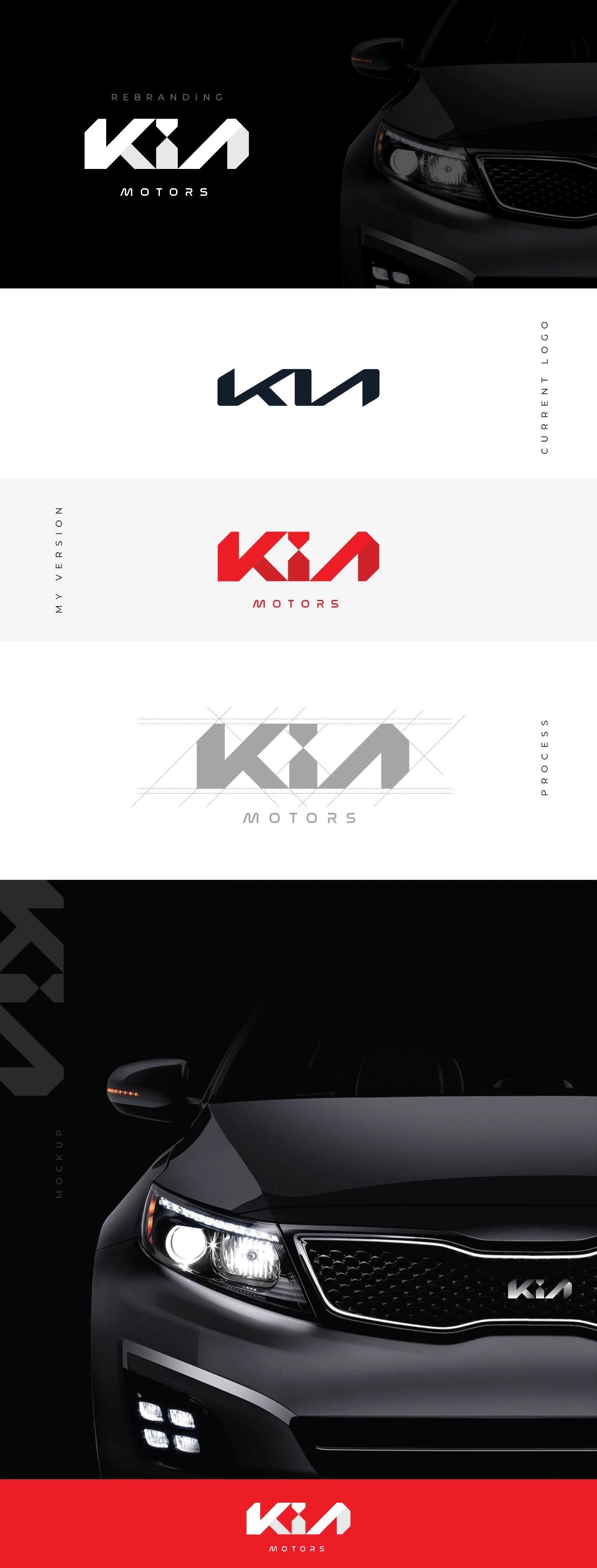
A bold new logo concept for KIA
Design Decisions
Continuity preserved, not removed
Full separation would improve clarity but weaken identity.
Minimal intervention approach
Only critical adjustments were made to avoid overcorrection.
Symbolism embedded, not added
The piston is integrated into the structure, not placed on top of it.
Application Considerations
The redesigned logo is built to function across:
Vehicle badging (metallic finishes, reflections)
Steering wheel embossing
Mobile interfaces and app icons
Digital branding and marketing assets
Special attention is given to:
Stroke weight for visibility at distance
Form clarity under motion
Scalability across sizes
Outcome
The final mark achieves a more balanced identity by:
Enhancing readability without losing distinctiveness
Introducing a functional automotive reference
Preserving the modern, progressive character of the brand
Like this project
Posted Mar 6, 2026
A KIA logo redesign concept that removes the KN confusion and introduces a piston inspired “I” to reflect innovation and modern automotive identity.
Likes
1
Views
7
Collaborators