
The Concept
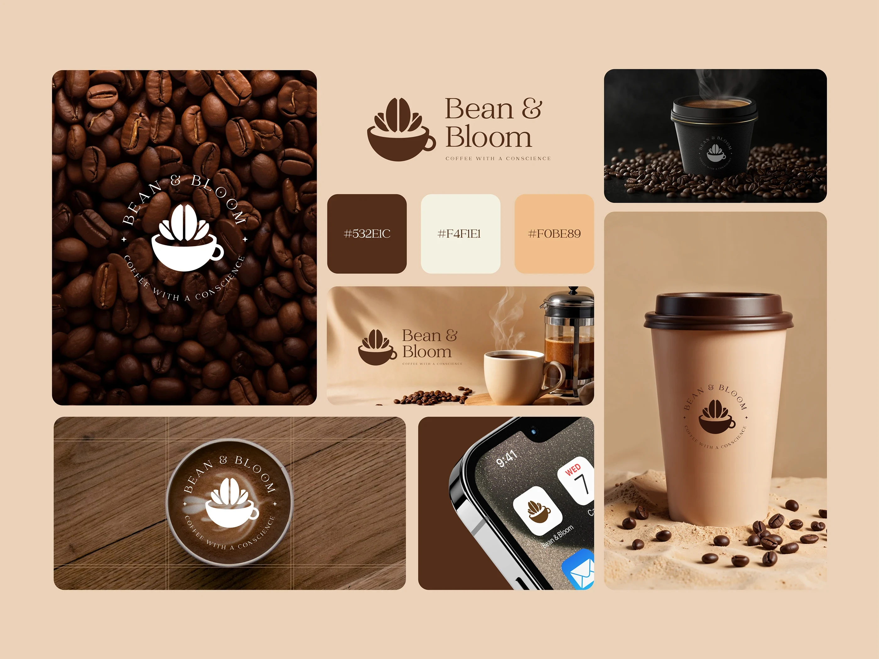
The logo combines two simple elements.
A coffee cup representing comfort and daily ritual.
A blooming coffee bean rising from the cup, symbolizing freshness, growth, and craft.
Together they form a mark that visually communicates the brand name: Bean & Bloom.
Relaxation - The experience and the feel
Color System
The palette was chosen to evoke warmth and authenticity commonly associated with specialty coffee spaces.
Deep Coffee Brown (#532E1C): Represents roasted beans, richness, and depth.
Cream Beige (#F4F1E1): Adds softness and balance to the brand.
Warm Caramel (#F0BE89): Introduces warmth and approachability.
These tones together create a calm and welcoming brand atmosphere.
Brand Applications
The identity was designed to work seamlessly across multiple touchpoints.
Coffee packaging
Takeaway cups
Mobile applications
In-store branding
Merchandise and stickers
The simplicity of the mark ensures strong visibility even at small sizes.
Coffee with a Conscience
1 like · 62 views · Mar 6, 2026
Designed a warm, minimal brand identity for Bean & Bloom, combining coffee culture with a symbol of growth, calm rituals, and conscious brewing.


