Built with Framer
Caro Health: Framer Website
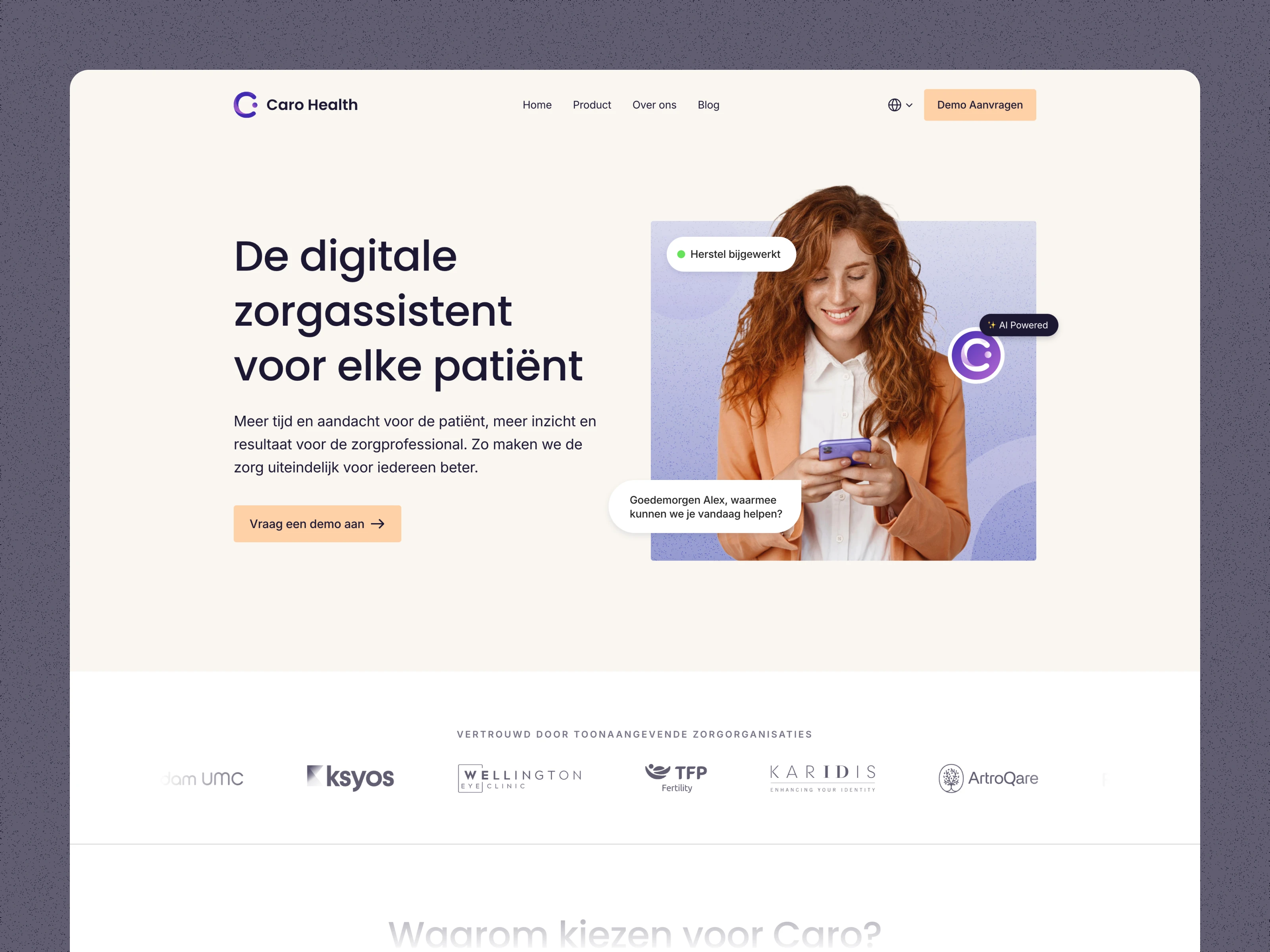
Home page
The Client
Caro Health approached me to redesign their existing website and move it over to Framer. Caro Health is a startup based in Amsterdam, NL that develops software for the health sector. Founded in 2019, they have a mobile and desktop. Most of their clientele are based in the Netherlands but others from elsewhere such as Northern Ireland.
Challenges
The proposal required numerous shots of the software. These were to be somewhat abstracted and more effective in conveying a sense of the product to the user. This would also simplify scalability, as there would be less risk of the visuals becoming outdated due to changes to the real-life product.
Another thing I quickly realised was that although most of the traffic would come from a Dutch-speaking audience, a decision had to be made about what language to use for the visuals. Should they be in English to accommodate an audience outside of the Netherlands and Belgium?
A solution to this was to make the visuals within Framer - this is a technique I had used on previous projects. This way, the visuals are built with HTML and CSS, allowing the content's language to switch in the browser depending on what is selected.
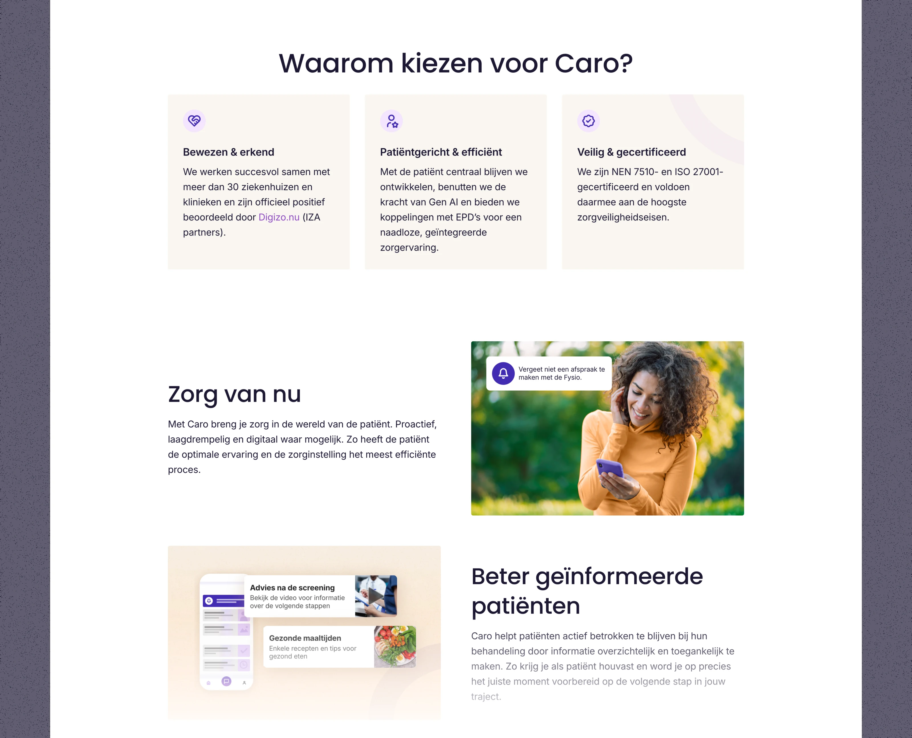
This ensures sharp resolution, and ease to bring in motion design. This process proved to be more time-consuming than creating the graphics in a more typical way of PNGs/SVGs. This is due to it not being able to scale down and requiring more constraints to be set for different device sizes, but I think the results were worth it.
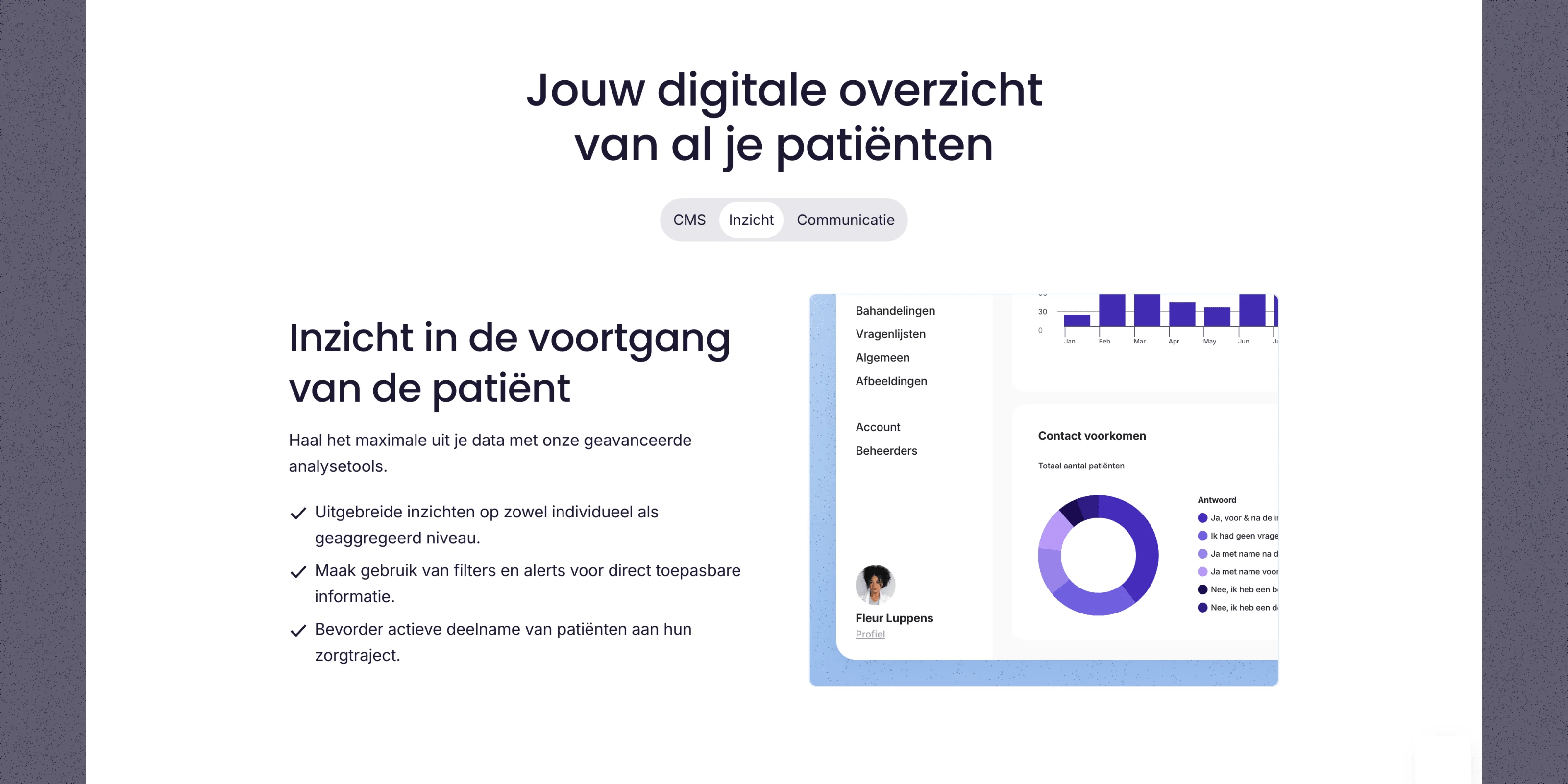
Feature section for the web app
Brand Identity
With the brand identity, it was a case of expanding and improving on what was there. You can view the style guide here.
Typography
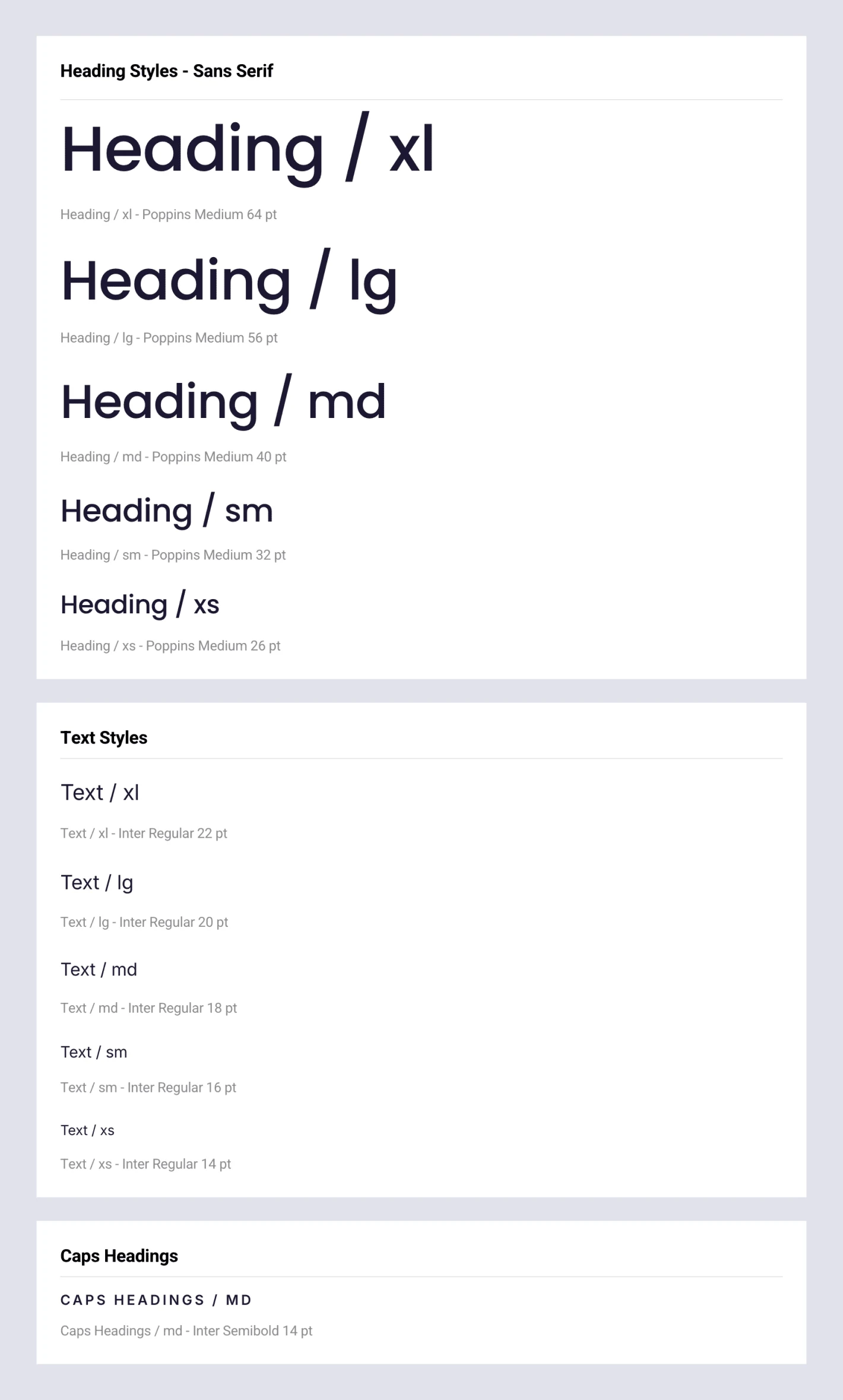
From a selection of 5-7 font pairings, the client chose Poppins for headings and Inter for the body text.
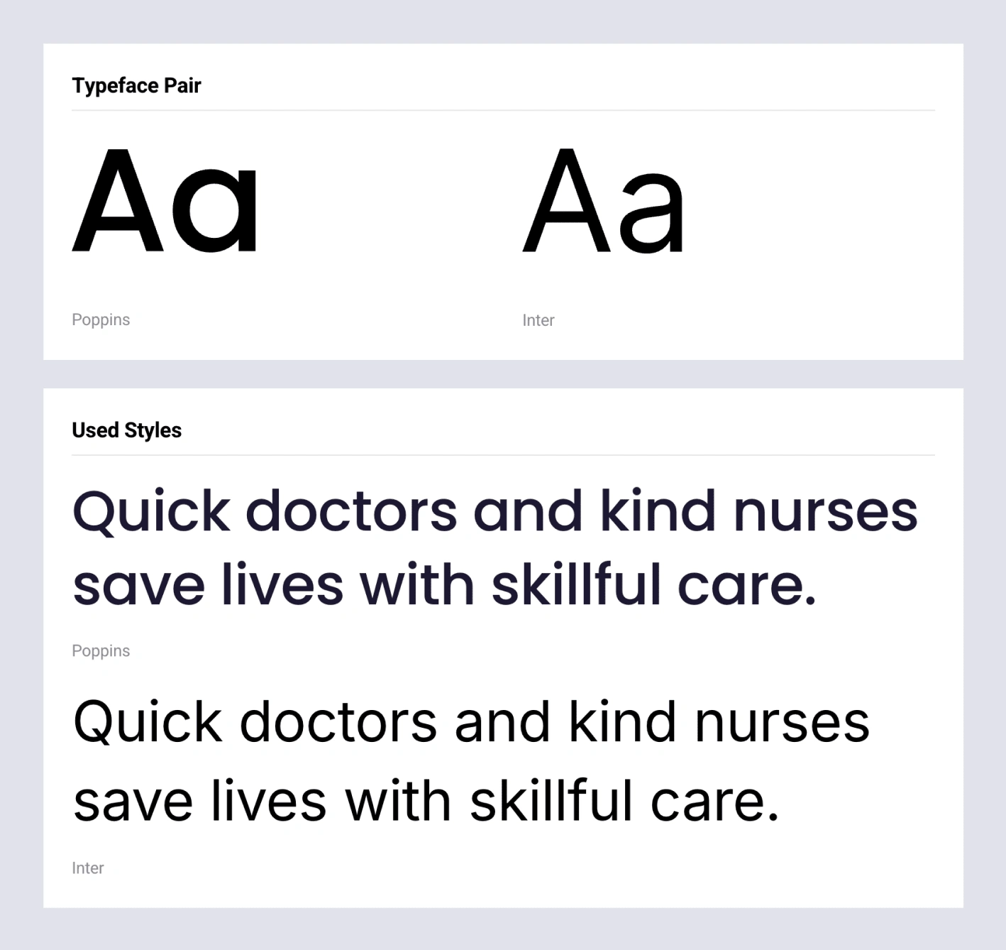
Type pairings
Poppins is a popular geometric sans-serif typeface. Its clean, contemporary feel, makes it a suitable choice for headings and logos. You can download Poppins here.
Inter is a widely used typeface - it has great balance and high legibility making it ideal for body text. It was also used for subheadings. You can find Inter here.
Colour Palette.
Caro Health had an existing brand colour of 2 purples. I came up with several variations of possible designs for the homepage. To make the CTA stand out I explored contrasting colours, of which a peach proved popular. This colour was used on the primary buttons throughout the website so that they are more noticeable.
A neutral off-white tone was also used on certain sections such as the hero section and containers to break up the design.
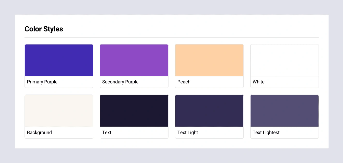
Caro Health's basic colour palette
Logos
Caro Health already had a logo in place, in fact, they had two; a Logomark and a Typemark with versions for light and dark backgrounds. The client favoured keeping the Logomark and pairing it with the new heading type, which made it more legible. Where suitable, the Logomark could also be used on its own.
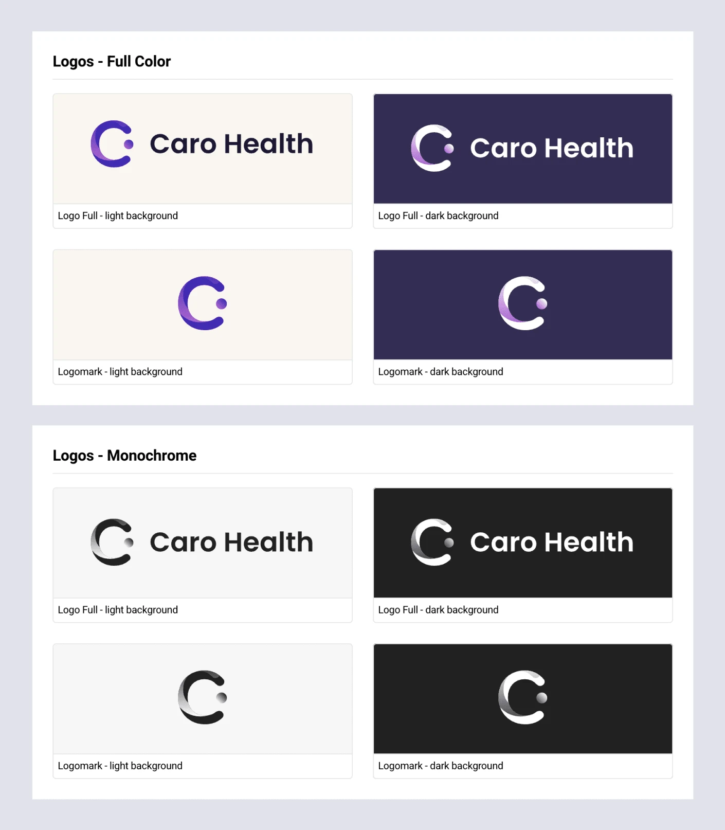
Logos
Image
Caro Health offers patient-centred care, therefore it made sense to bring images of people into the design.
I created several images of people from stock photos. I edited the photos, bringing in the brand colours to make them more cohesive with the website. Images of people are a good way of bringing a human element, and they can be used to direct the user's attention via the gaze principle. In the end, some of these were rejected as the client felt it was becoming too repetitive.

lllustration demonstrating the gaze principle
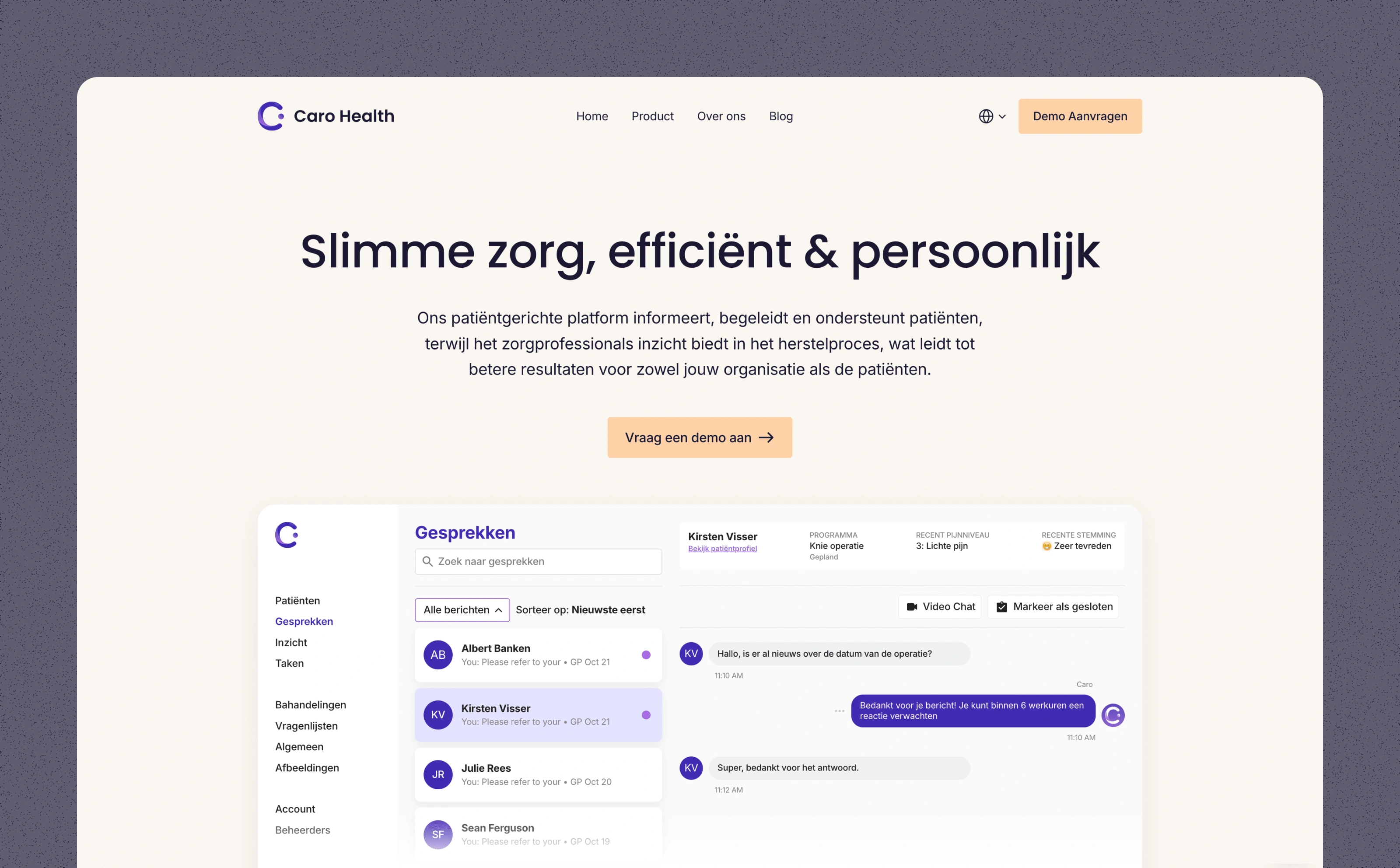
Product page
Thanks for reading this far!
If you are in need of a bespoke website, a prototype for an app, or are simply looking to collaborate, feel free to drop me a message...
Like this project
What the client had to say
George crushed it. Rebuilt our site in Framer - looks fresh, works great. 10/10 would work with again!
Thomas Goijarts
Nov 15, 2024, Client
Posted Jan 24, 2025
Redesign of Caro Health's website made with Framer. Caro Health is a startup that develops software for both patients and healthcare professionals.
Likes
3
Views
157
Timeline
Aug 20, 2024 - Nov 15, 2024
Clients
Caro Health

