Built with Framer
StoreDash: Landing Page
George Rowland
Landing page for a SaaS company
Category: 🥗 🥘 🥑 🚴 💨
Landing page design for a SaaS company. StoreDash develops software for rapid grocery delivery startups, allowing them to operate and deliver more efficiently. This is a personal project to explore ideas and showcase my skills.
You can view a demo of the website with the link below.
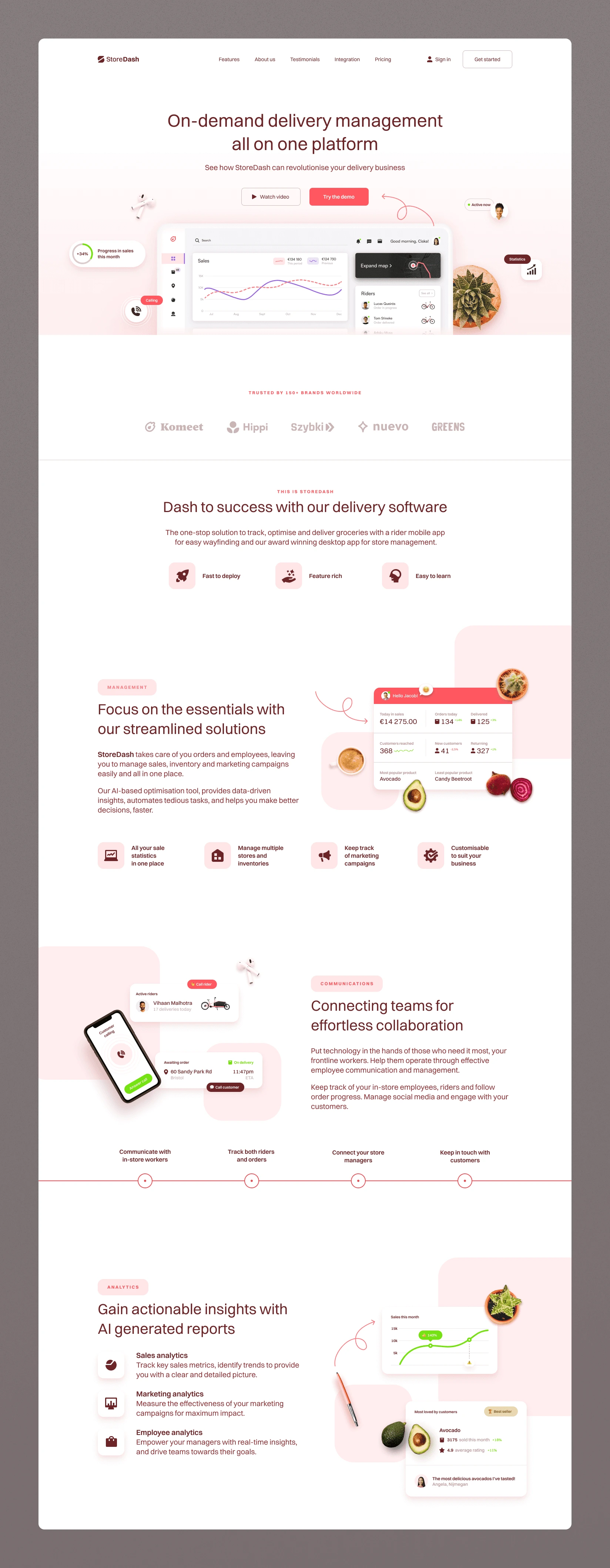
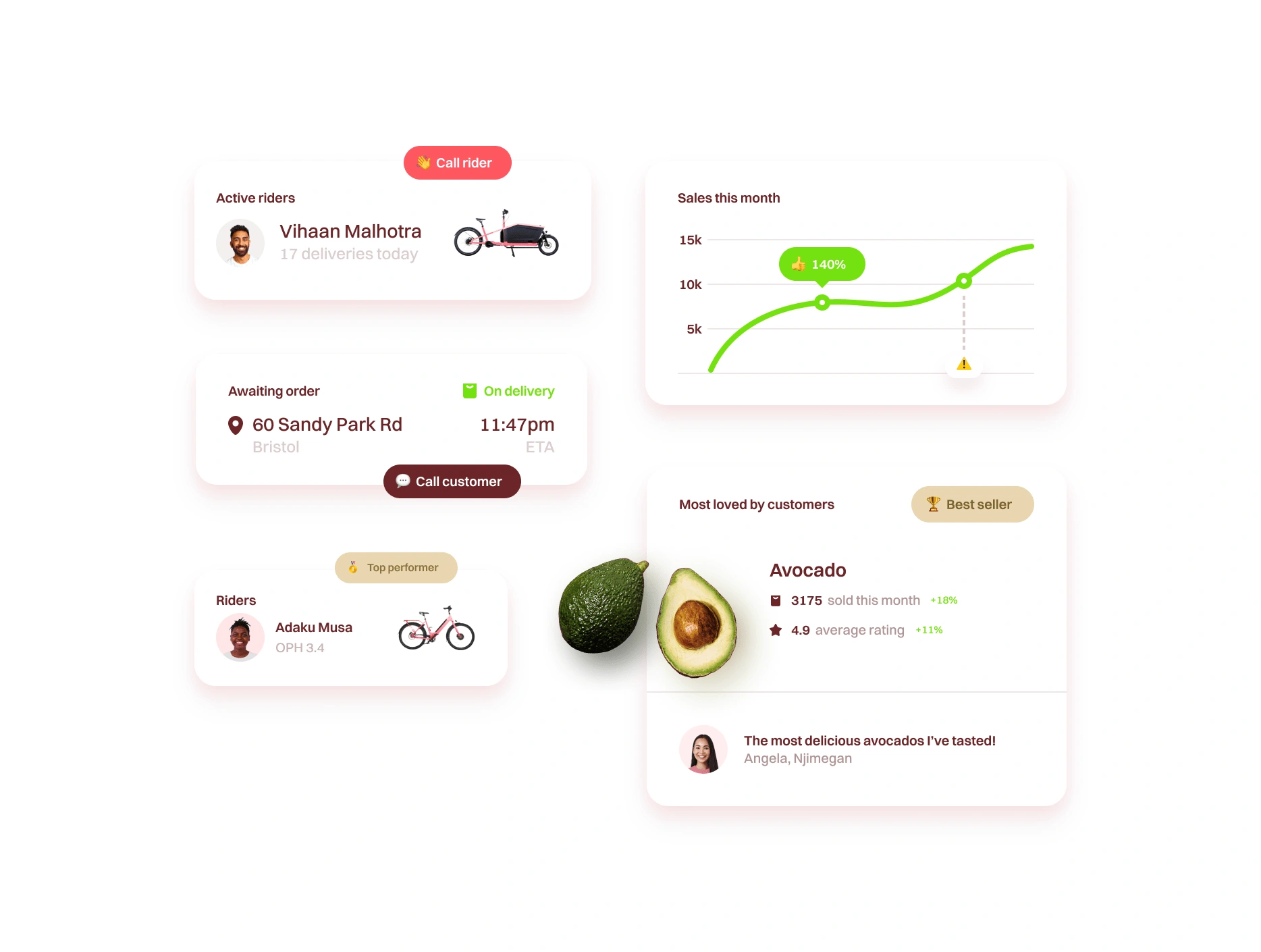
Top half of landing page
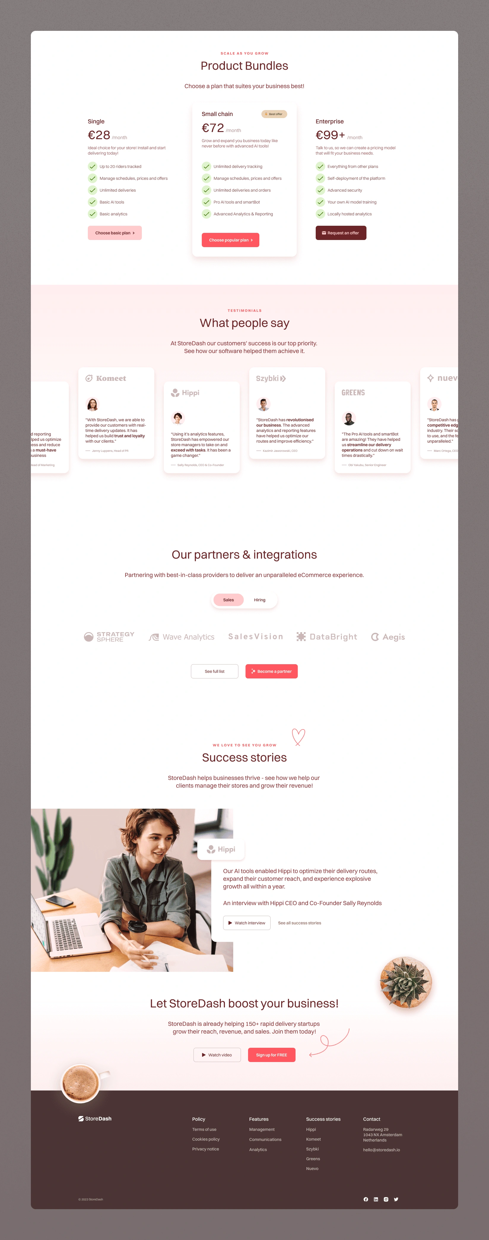
Bottom half of landing page
Brand Identity
I wanted to get away from the colours typically found on SaaS websites and try something that was inviting and organic.
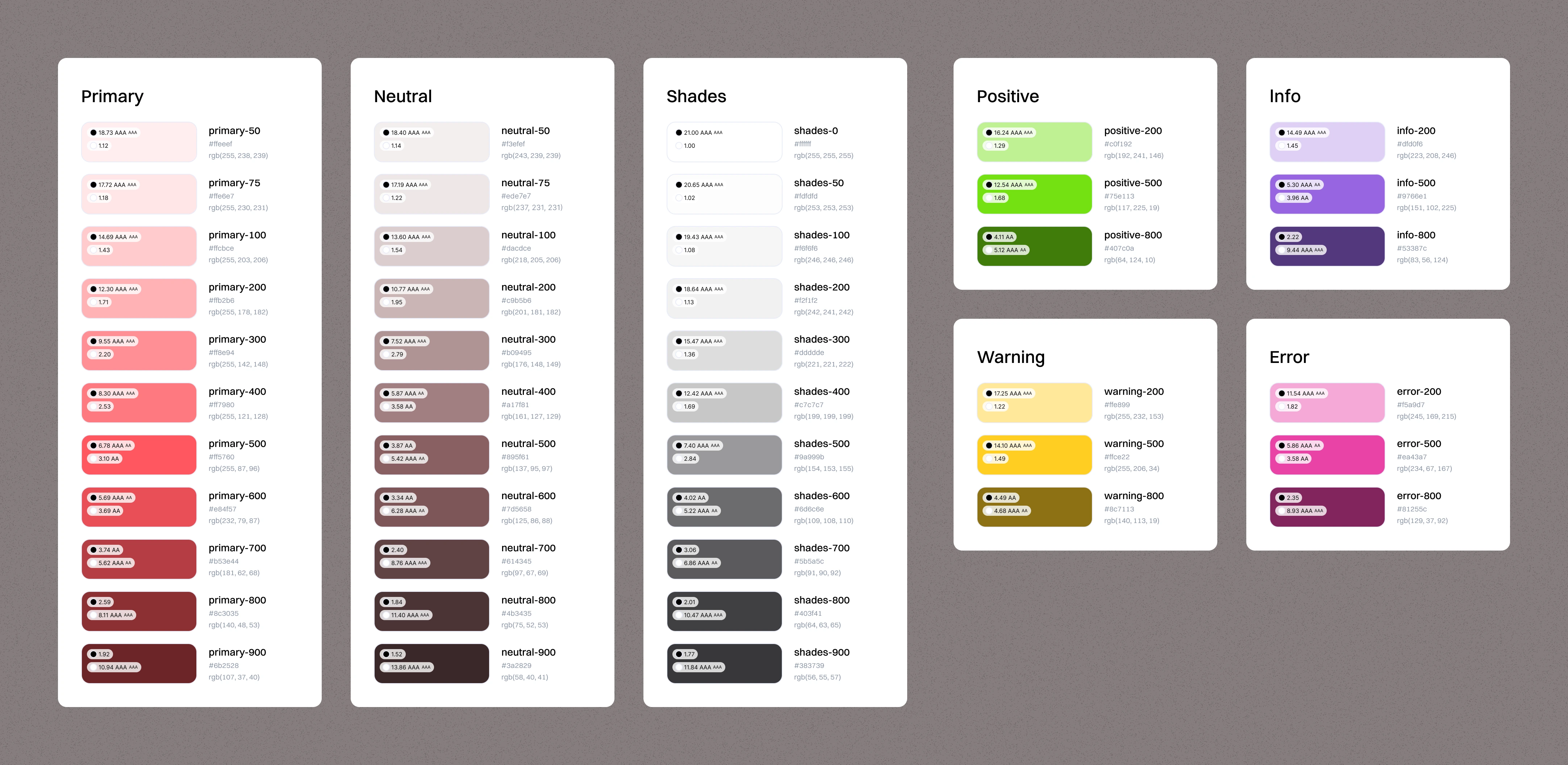
Colour palette
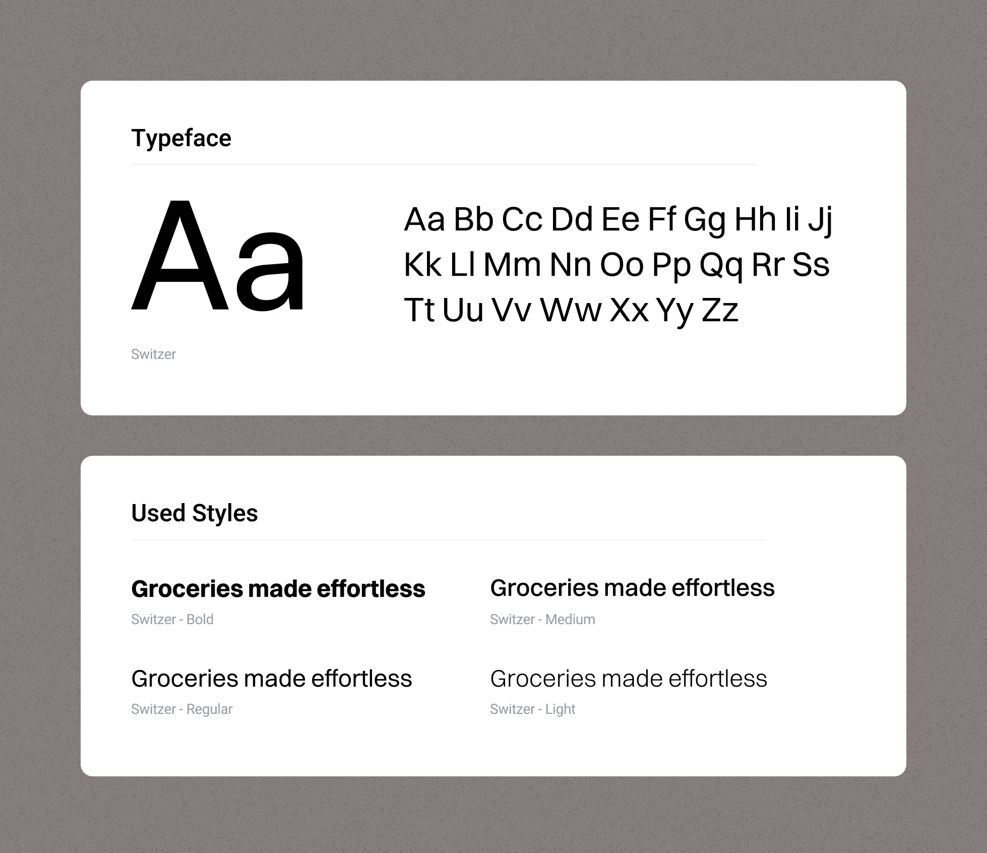
Typography
Switzer is a beautiful font family from Indian Font Foundry that feels timeless. The intention was to make the webpage feel light and spatial; to emphasise this, I avoided heavy styles, only using them for small subheaders. You can find the font here.
Logo & icon
The logo was kept sleek and minimal with the brand mark resembling an abstracted 'S'.
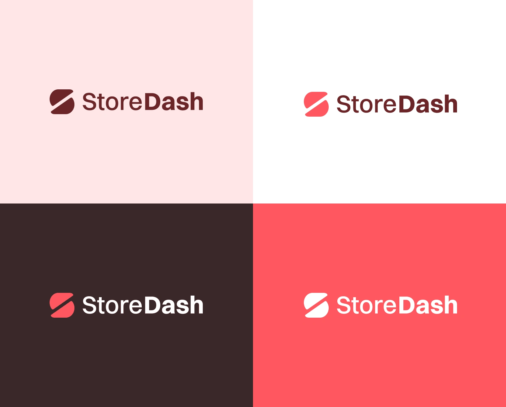
StoreDash logo
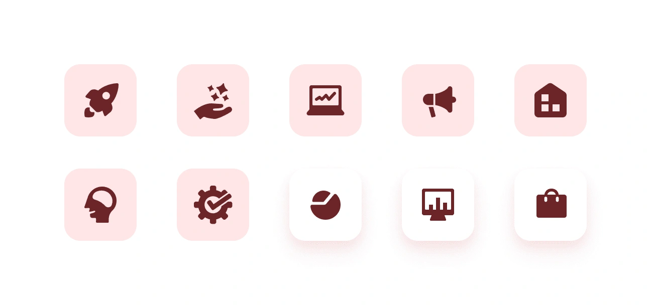
Icons were made to echo the qualities of the logo: simple, rounded and friendly.
Logos of associated brands and partners
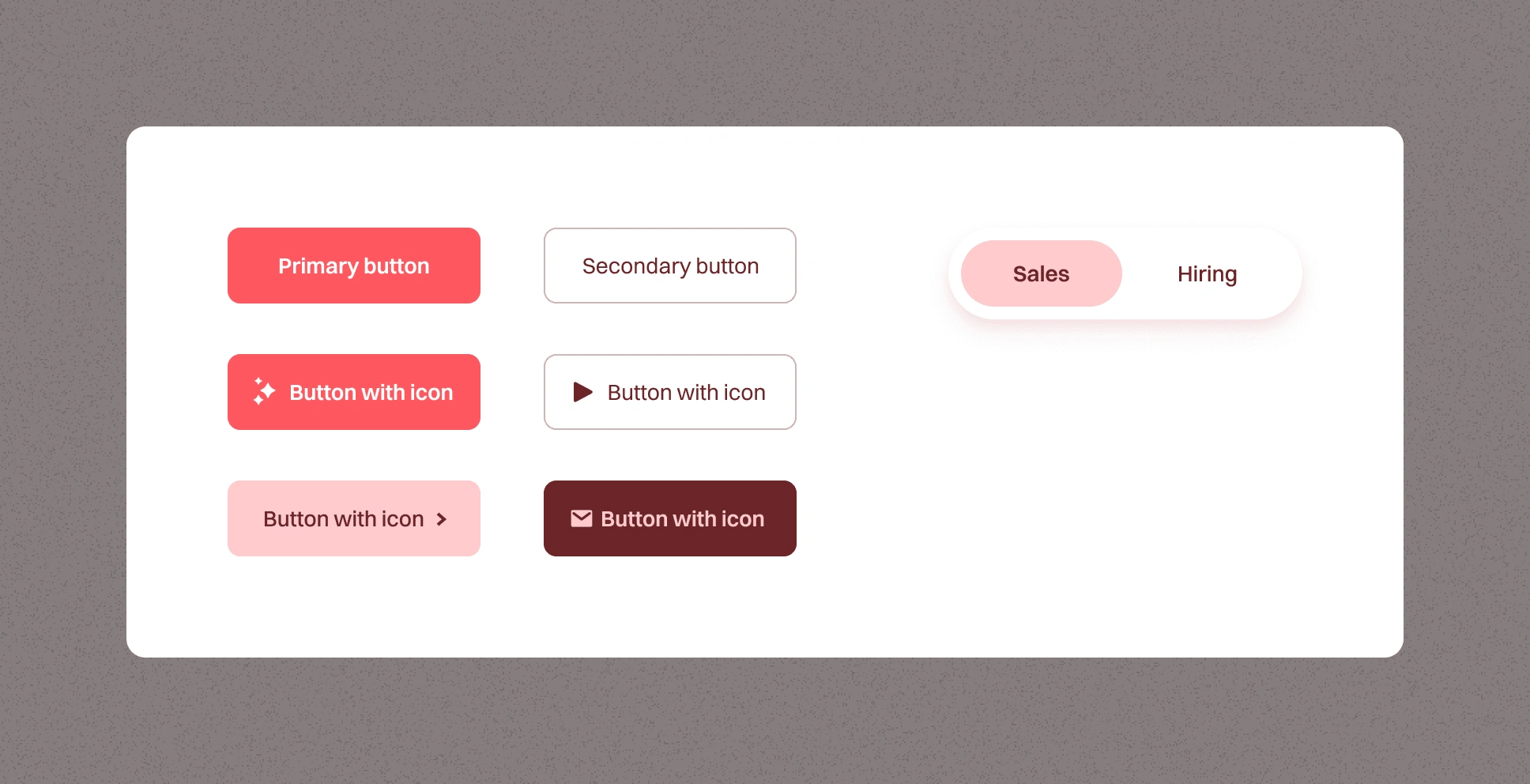
Buttons
Key Visuals
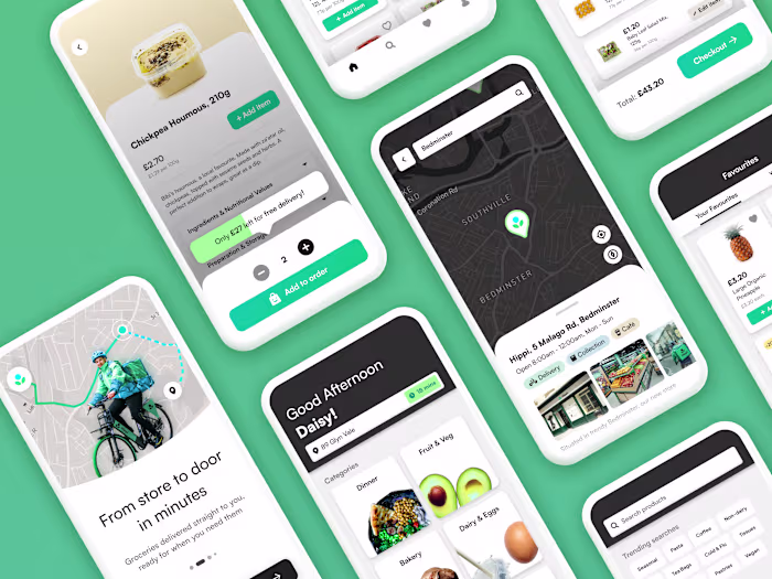
The visual design mixes floating graphics from the app with objects associated with potential users. A phone of a delivery rider calling the customer, the cups of coffee and plants found on a CEO's desk etc. The aim was to emphasise the app's efficiency and ease of use and show it how benefits a variety of roles in a company.
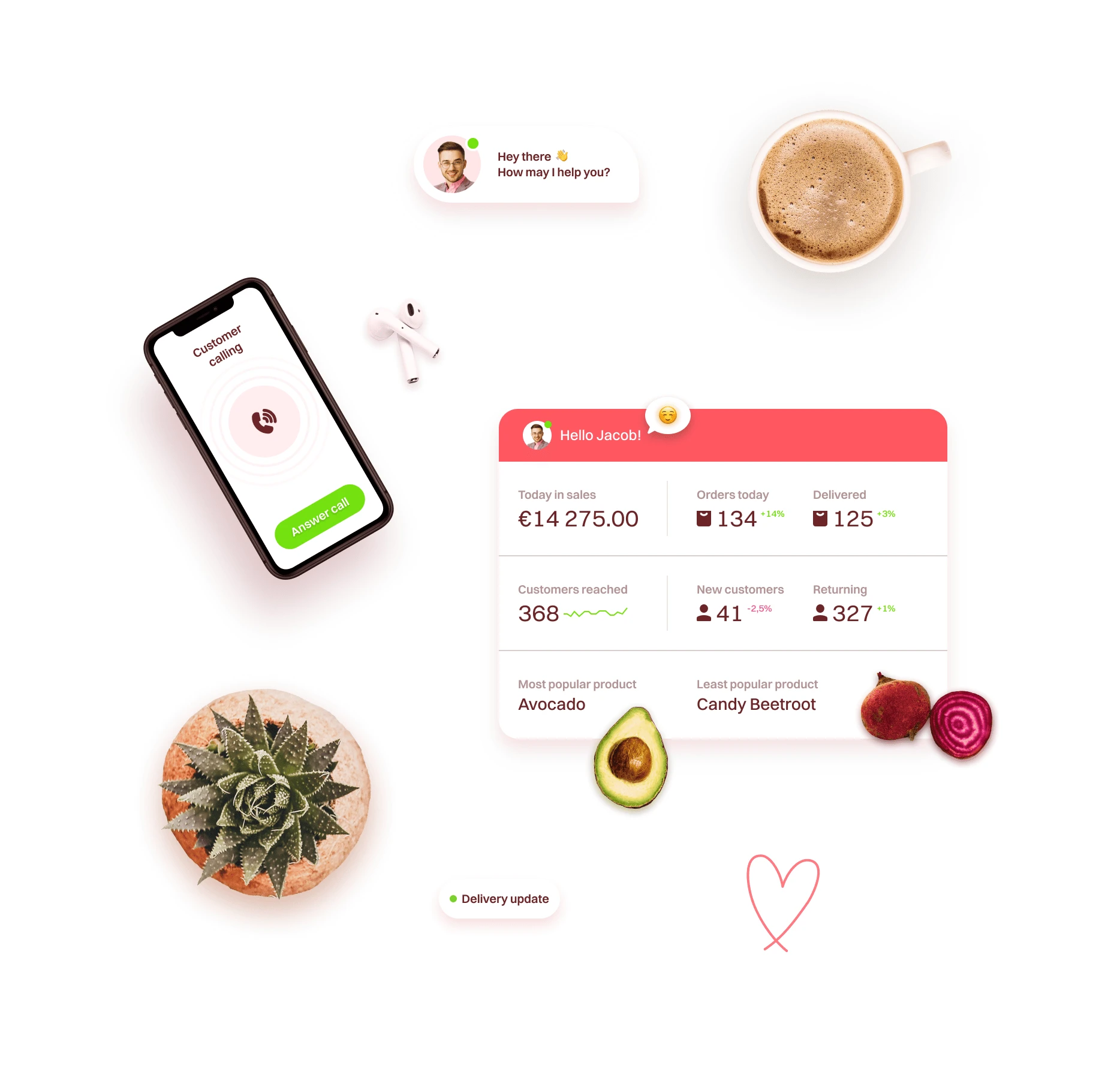

Image editing
Within the 'Success Stories' image, I removed a window and added more plants. I liked the idea that the floating visuals of cacti, pens and coffee cups seen throughout the website belong on this CEO's work desk. I also added the visual of the web app the their laptop screen.
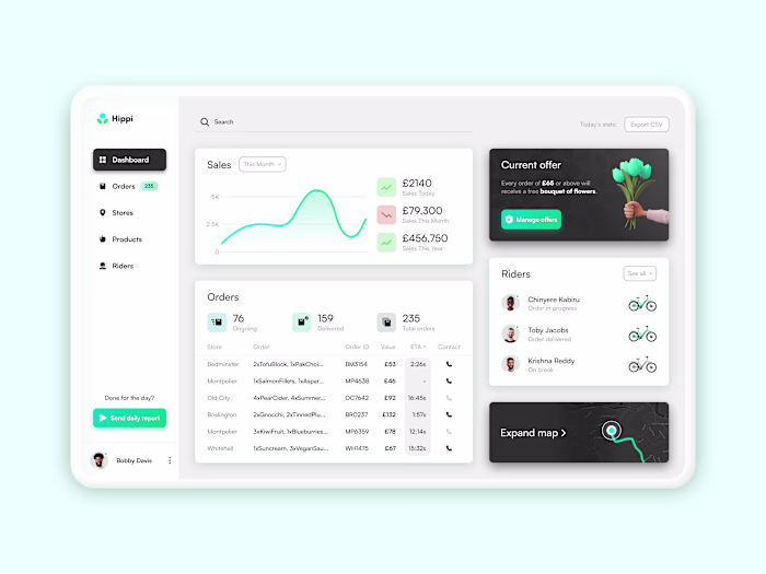
Key visual of SaaS product from the header section
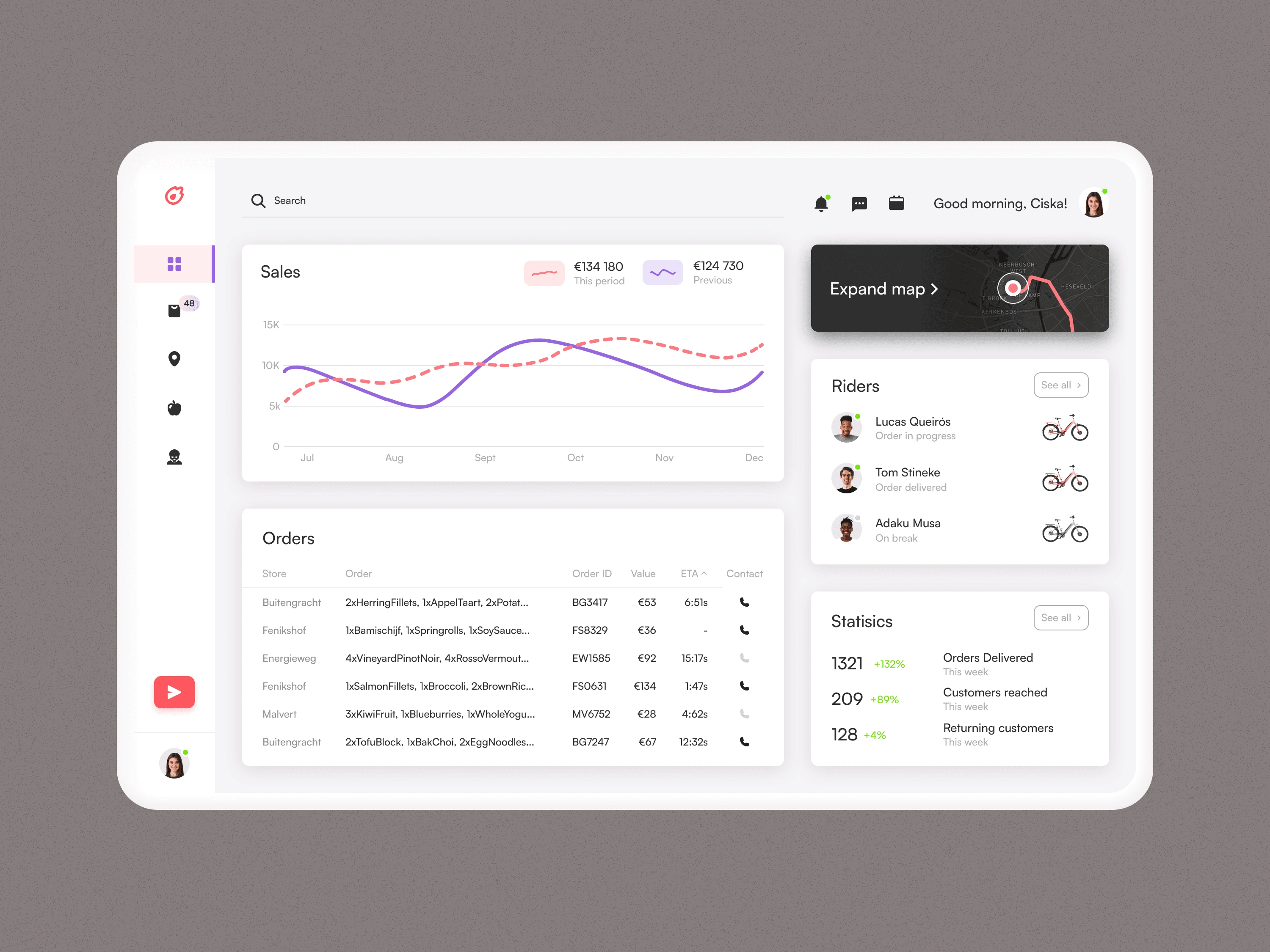
This is the dashboard screen of the delivery management tool that appears in the header of the website. It is a variation of the design of the Hippi web app and has a new colour scheme more in keeping with the landing page, as well as slight changes to the UI. The two user profiles were a deliberate choice so that the visual could be used in different layouts (e.g. emerging from below or from the right) whilst still having the profile image visible.
Alternative Headers
Variations of the headers explore different layouts and visuals. I wanted to experiment with other layouts and see what other possibilities were achievable. Which is your favourite?
Thanks for reading this far! If you are in need of a bespoke website, a prototype for an app or are simply looking to collaborate then I'd be more than happy to speak with you. You can reach me by hitting the button below 👇
Like this project
Posted Jun 27, 2023
Design for a landing page for StoreDash. StoreDash is a SaaS company that develops software for rapid grocery delivery startups.
Likes
2
Views
479