Skate Drop [ Logo, Creative Strategy, Social Media Marketing]
About
Skate Drop is the first skateboard shop in their city located in southern Ontario to offer on-demand skateboard products at the consumer's door. They have operated within a basement for a few years and want to take their brand to the next level by opening a physical location to better serve their consumers.
Objective:
Perform a full rebrand that unifies the Skate Drop brand with new company values and guidelines to become cohesive across various touch points to stand out in the market and attract new distributors to get new products.
Deliverables:
Logo
Brand Guidelines
Merchandise Designs
Social Media Posts
Moodboard
Logo
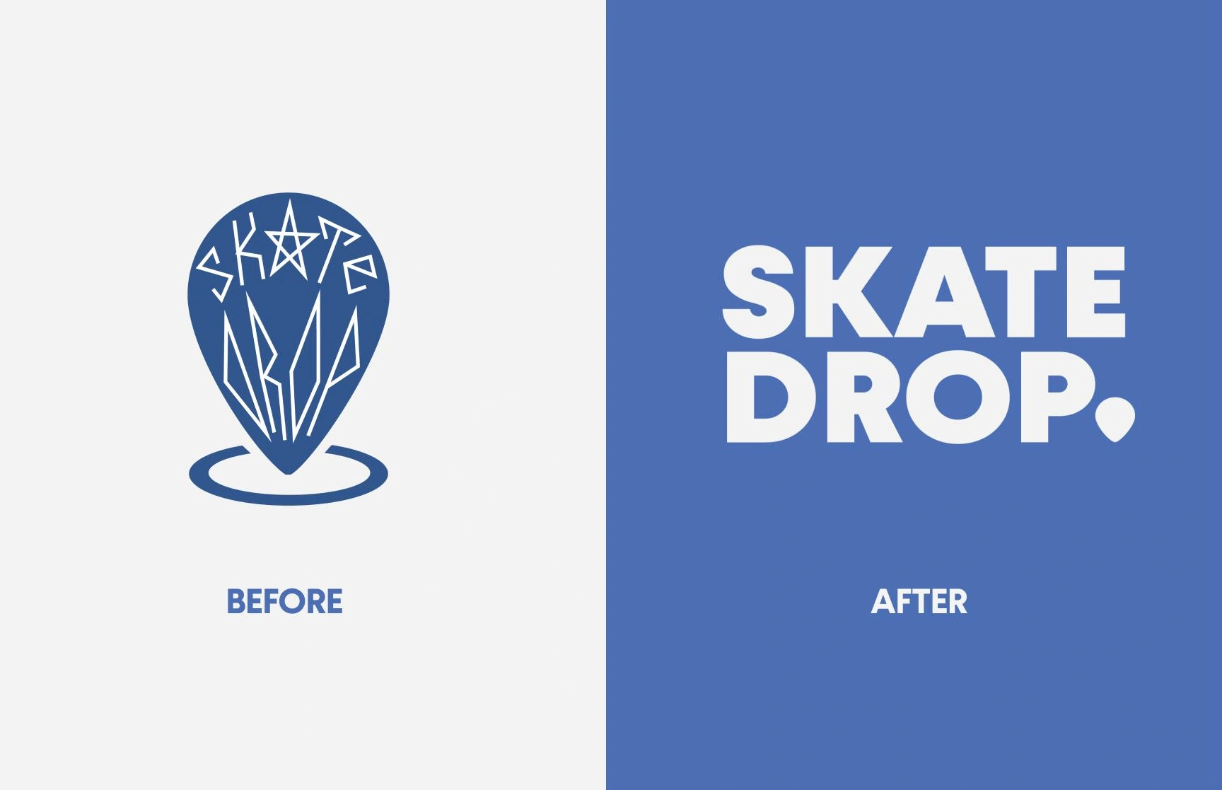
The logo before did not resonate with the brand's values of inclusiveness and approachability. The original logo is tough to read which becomes an issue when the consumer can't recognize the logo.
The new logo is bold, legible and utilizes the same pin drop drop motif to communicate the skateboard shop is mobile. The blue was slightly modified to follow recent design trends that favour bold pops of saturated colour.
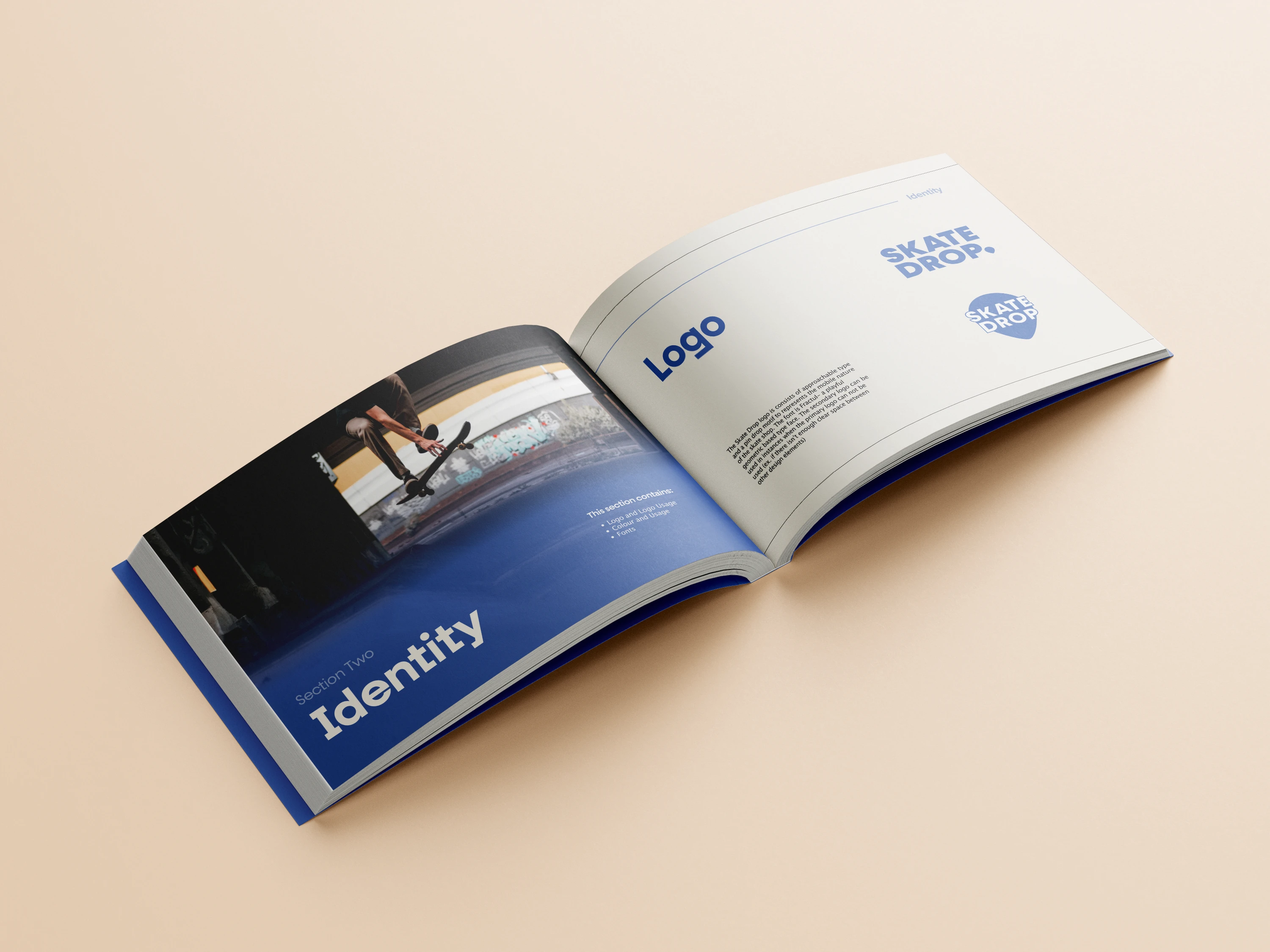
BrandBook
A comprehensive 26-page brand guidelines that feature brand values, mission and vision statements, logo usage, brand colours and fonts, and a robust social media strategy. Follow the link below to view the full brand book
Merchandise
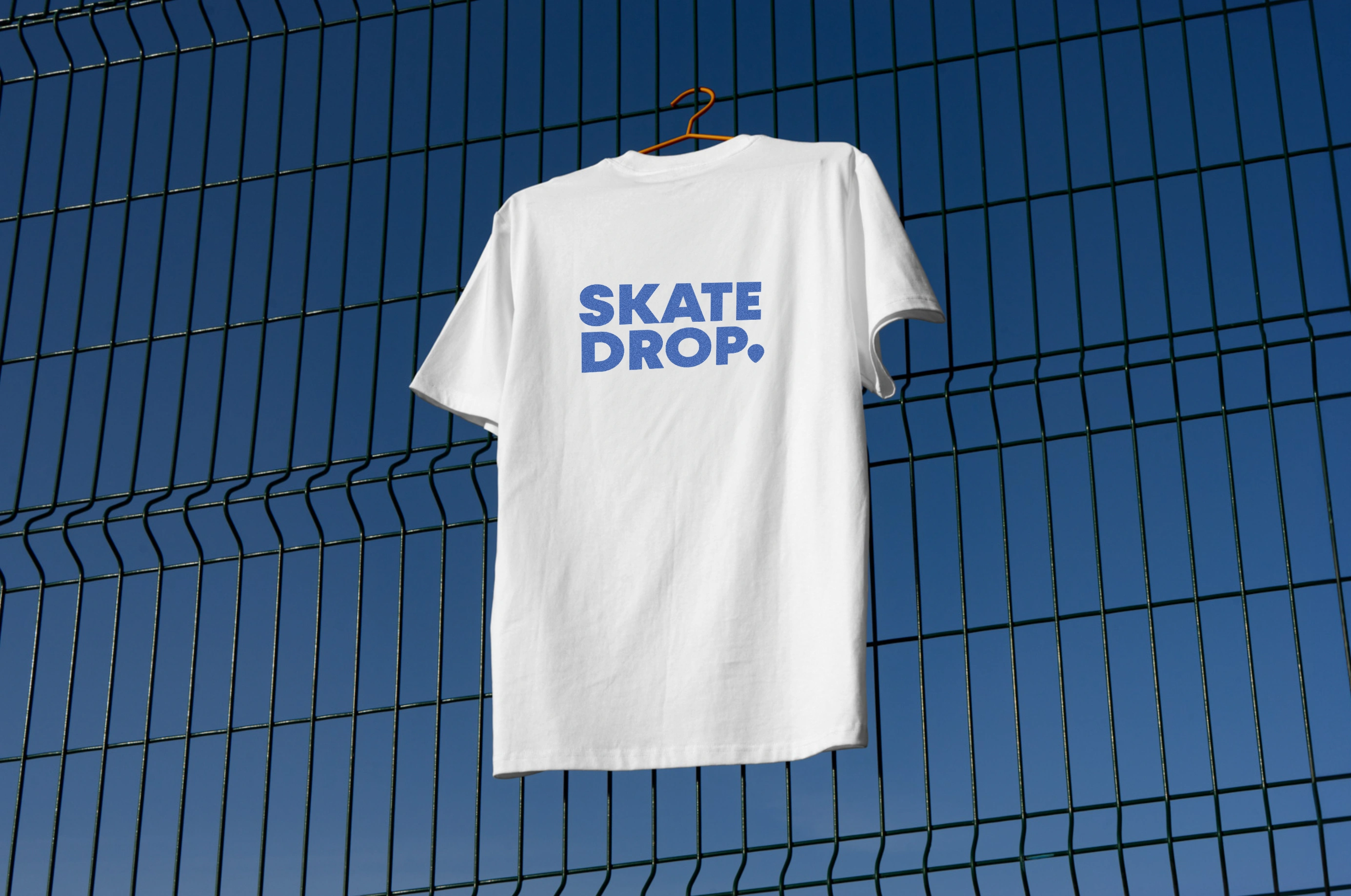
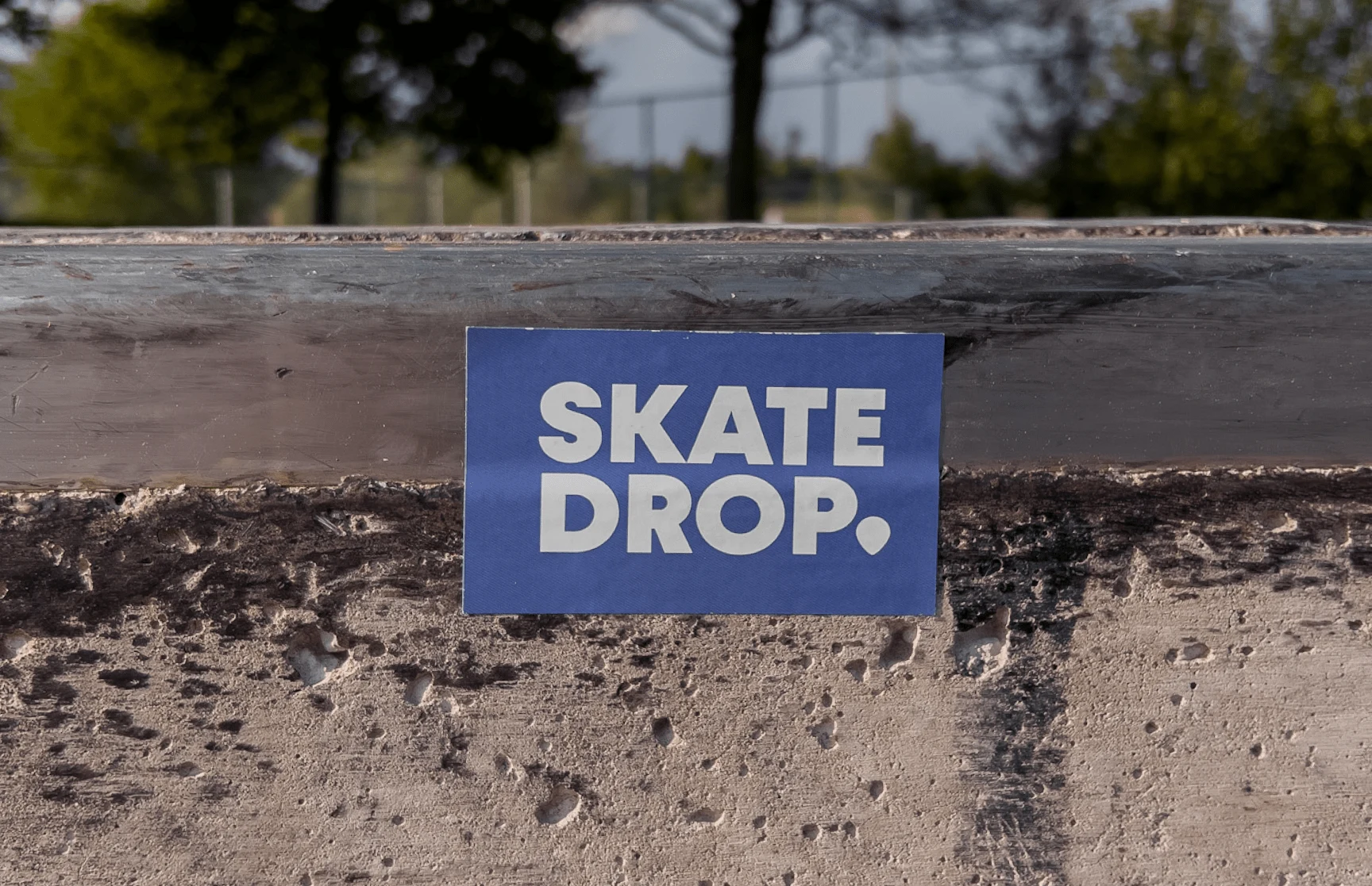
Social Media Posts
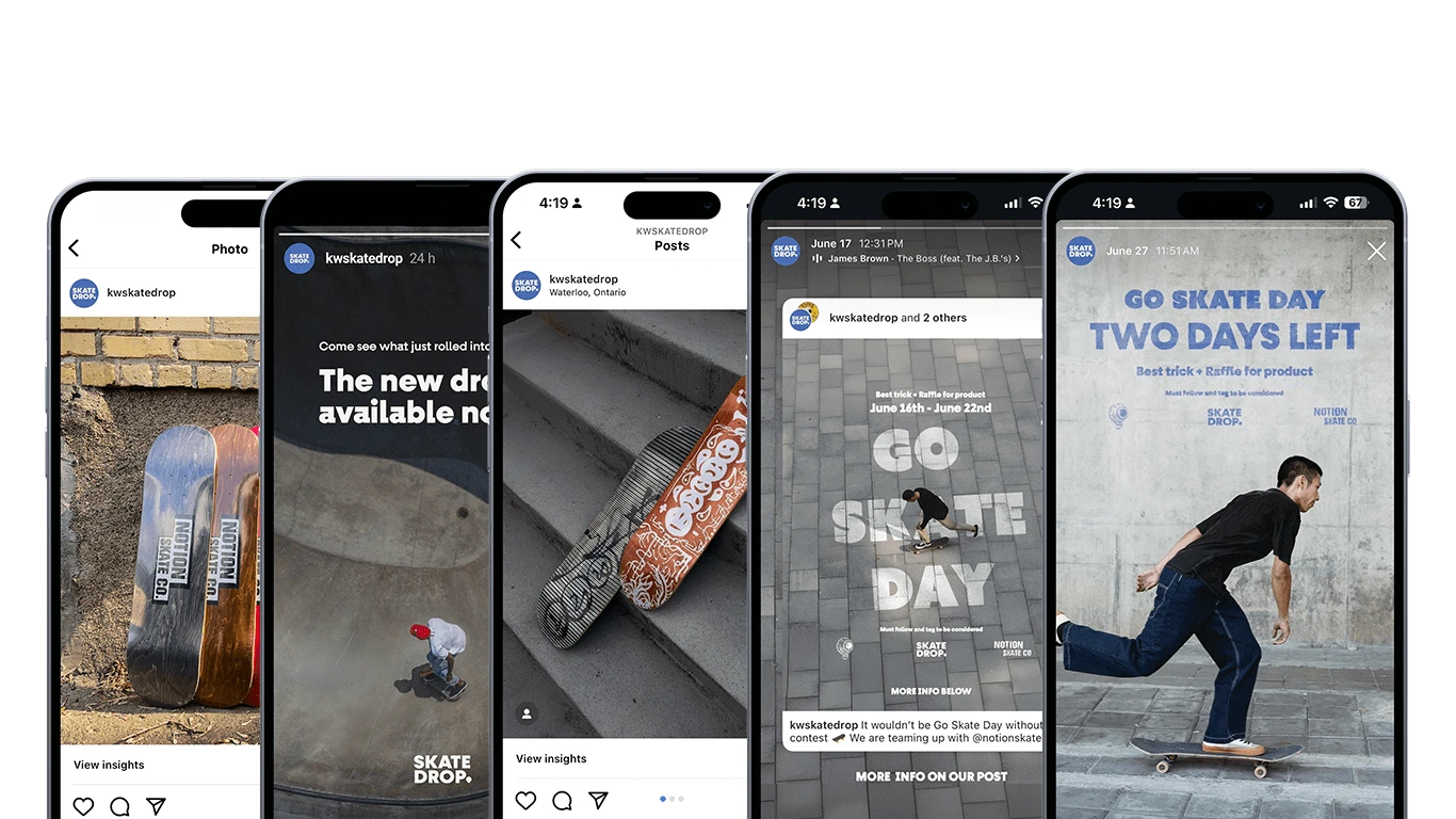
The social media strategy is to be as personable as possible while displaying products that the shop would like to highlight. All product photos are shot outside focusing on concrete as a backdrop. This adds dimension and texture to each post. Announcement posts utilize the lifestyle and culture of skateboarding to help the viewer focus more on the text than the aesthetics of the photo.
Like this project
Posted Jul 29, 2024
A full rebrand for a local skateboard shop that develops a cohesive brand voice and values across various touchpoints.

![Underworld Night Club [Branding, Print, Web, & Motion Graphics]](https://media.contra.com/image/upload/w_700,c_fill/vriqfcawx9qxccdlmwkg.avif)
![North Star Coffee Co. [ Logo, Brand Strategy, 3D]](https://media.contra.com/image/upload/w_700,c_fill/va8eiok8wxcfxbxyg4ee.avif)
![Conduit [ 3D, Branding, Print Design ]](https://media.contra.com/image/upload/w_700,c_fill/fxrq2fe3durq3cmydyao.avif)