North Star Coffee Co. [ Logo, Brand Strategy, 3D]
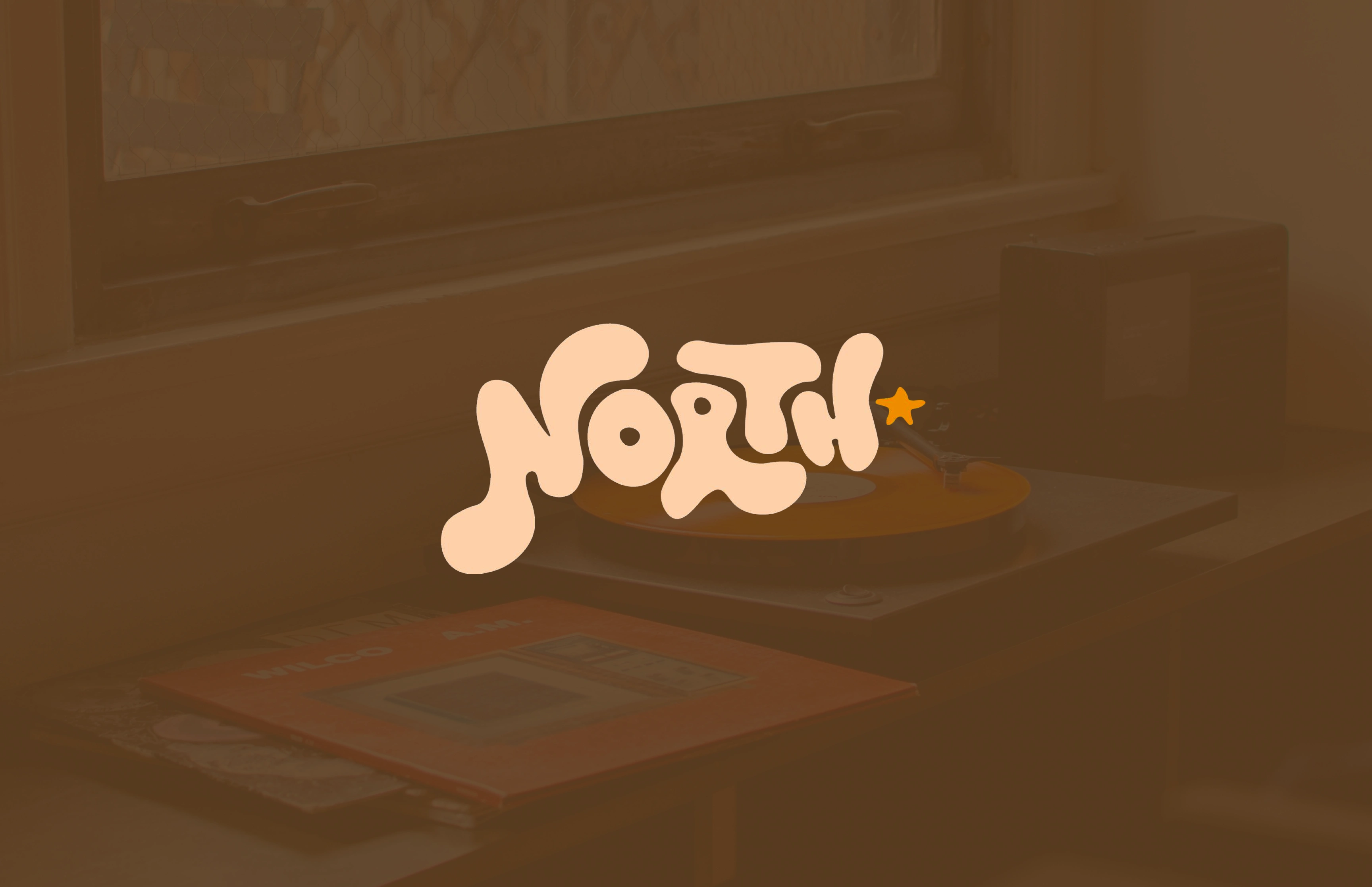
Logo for North Star Coffee Co.
About
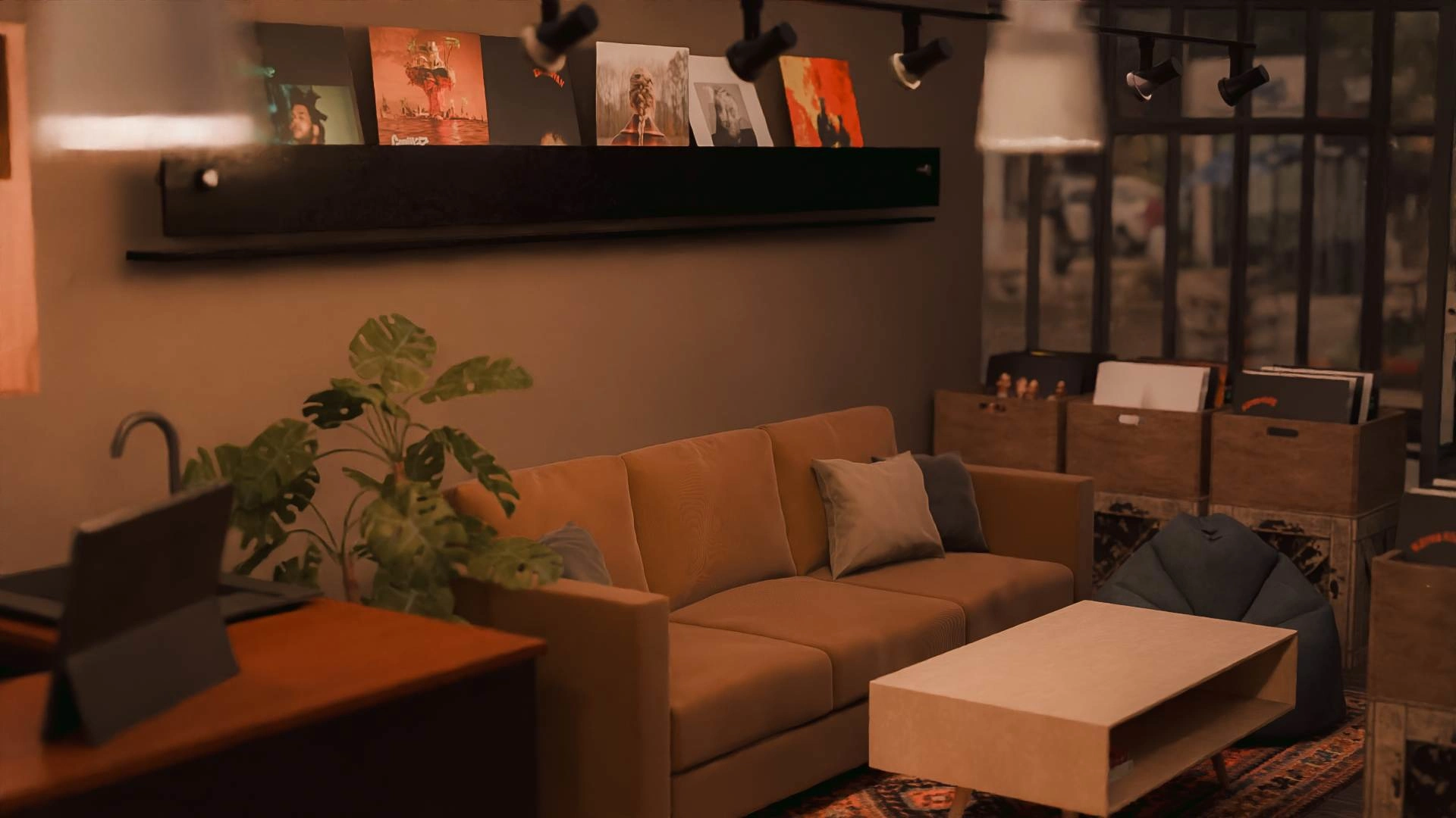
North Star is a conceptual coffee shop that prides itself on supporting the community in following their dreams one cup of coffee at a time. The name North Star represents a guiding light for creatives to their target audience, similar to a North Star to a lost traveller. North also represents the Canadian roots of the company and the star these artists can become with proper support and exposure to new audiences. North Star Coffee prides itself on supporting the arts, a selection of popular and obscure vinyls and a listening bar for those who need to focus or unwind while they drink their coffee.
Objective:
Develop robust branding with marketable deliverables and research to help position the coffee shop before they start to open their first shop.
Deliverables:
Logo (Wordmark and Mascot)
Brand Guidelines
Merchandise Designs
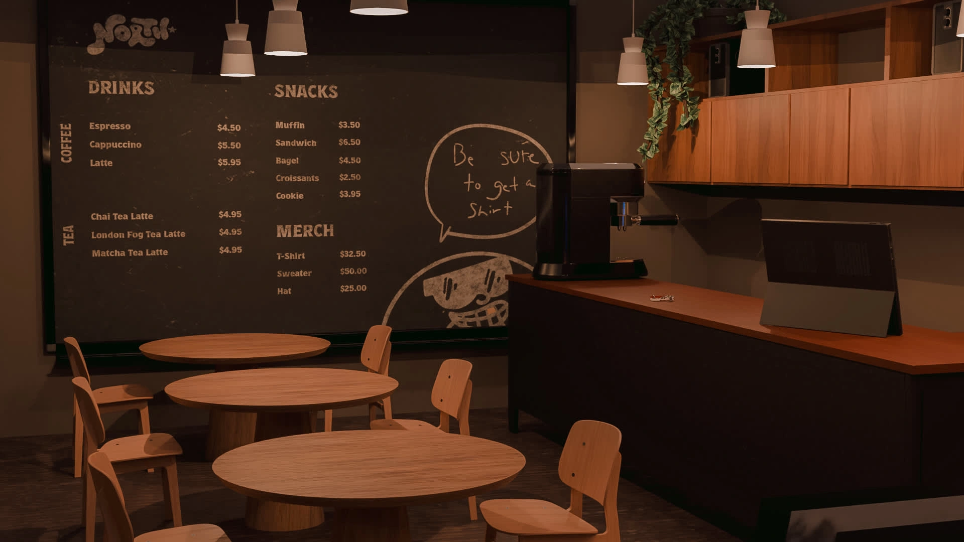
Shop Mockups created in 3D
Research
Understanding the competition is important when deciding the company's branding and brand position. I performed multiple SWOT analyses, and social media audits, and reviewed menu items, and store layouts to understand the local competition. I discovered key pain points within the local vinyl and coffee market.
While there are record stores locally that would be considered competition, their hours of operation vary. Some stores are open for less than 20 hours a week and often close before 5 pm. This means there's a gap in the market for record collectors to be able to purchase records after they finish their 9-5.
Furthermore, after analyzing each location it became apparent that there was a lack of seating in most coffee shops in the area. With the reduced amount of coffee shops in the area, seating becomes the main decision between staying and leaving entirely.
Target Audience
Middle-class 24-50 year-olds who enjoy supporting local shops, coffee, and music based locally within tri-cities. They care about community, pricepoint, and ambiance when selecting a coffee shop or vinyl store to visit and support.
Personas
Sarah is a 26-year-old psych student at the University of Waterloo. She recently moved to the city to start her post-secondary career and wants to meet people and find a new spot to spend her Saturday nights. She likes live music, late nights and being social.
Mark is an avid record collector who prides himself on the rare pressings of his favourite bands. He lives in Burlington and frequently calls the store to put records on hold since he lives out of town. Since he works a 9-5 out of town, he requires a shop that is open late to pick up his vinyls as soon as they are released.
Alex is a 34-year-old accountant who works from home. They realized that they didn’t leave their house for days in a row. They want to work outside of their home office to feel more social. They often come to the coffee shop to work, drink coffee, and enjoy the shop's ambiance.
Design Direction
Fewer shortcuts, more skill
Using hand-rendered fonts and visuals helps the brand stand out from the current sea of minimal visual designs, adds character emotion, and above all a human touch that will create a real impact with real people. AI has dominated the art space over the last year, and consumers crave something that has soul and skill.
Logo and Mascot Creation
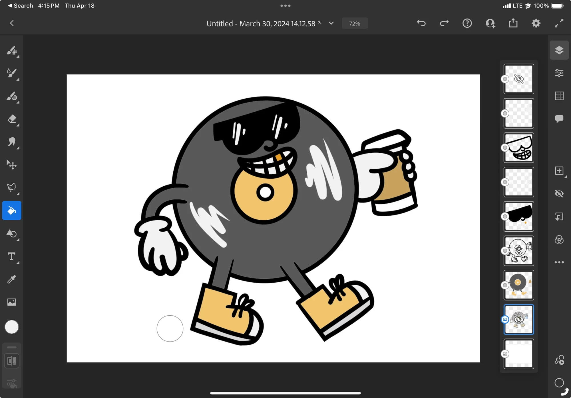
After researching Adobe Fresco, I decided that I was going to tackle the mascot Illustration first. I wanted the Illustration to feel hand-drawn to match the brands values, and I looked into alternatives to vectorize the Illustration. Adobe Fresco allows to user to create vector illustrations with the iPad and Apple Pencil. After creating the Vinny illustration in Adobe Fresco, I switched to creating the logo.
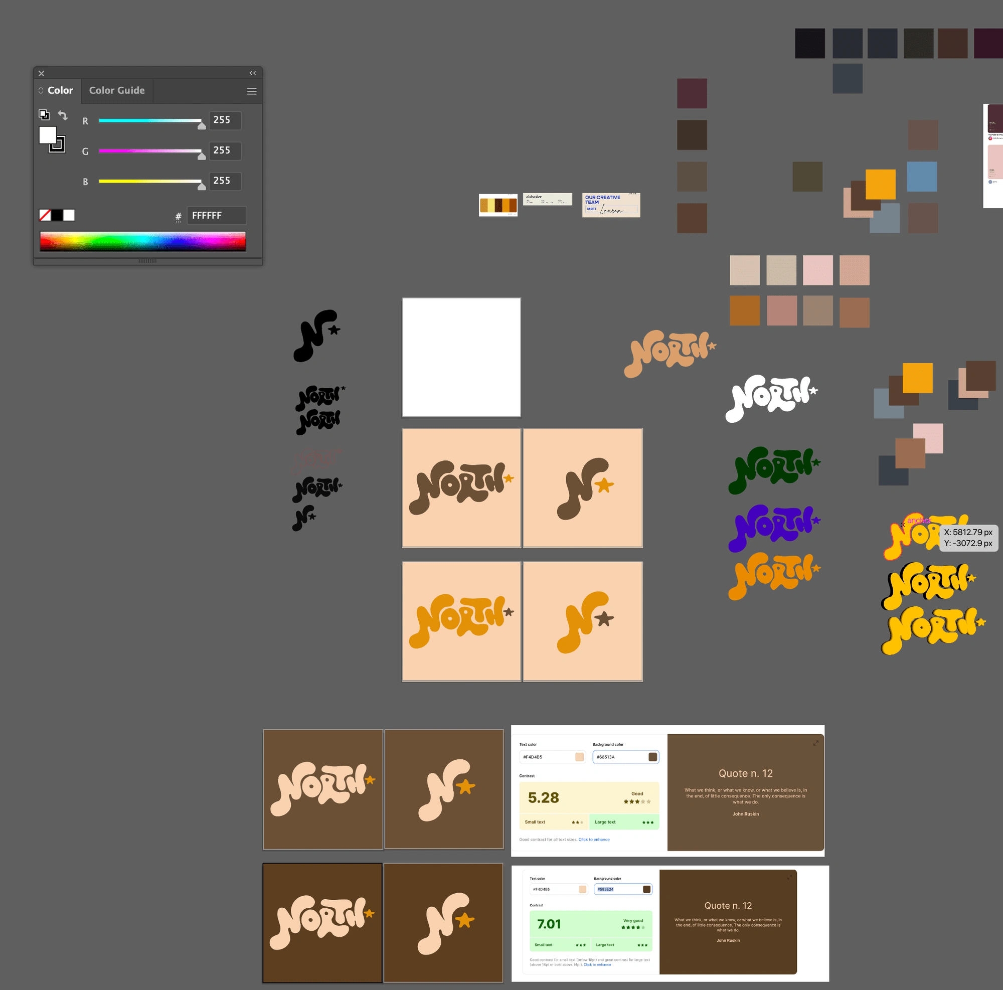
I originally wanted to create the logo in Adobe Fresco. However, I wanted to explore another method to create a similar effect within Illustrator without Adobe Fresco to increase flexibility. I drew the logo by hand and then used the pen tool and curvature tool to achieve the effect I was looking for.
After designing the logo I moved on to picking a colour palette. I realized it did not pass a contrast checker and I made the brown a darker shade to adhere to the guidelines set by WCAG. The colour palette is inspired by the colour of coffee when it has milk or cream in it, whereas the darker brown represents coffee that doesn’t have milk or cream in it. The yellow comes from a star and provides an accent colour across the rest of the branding.
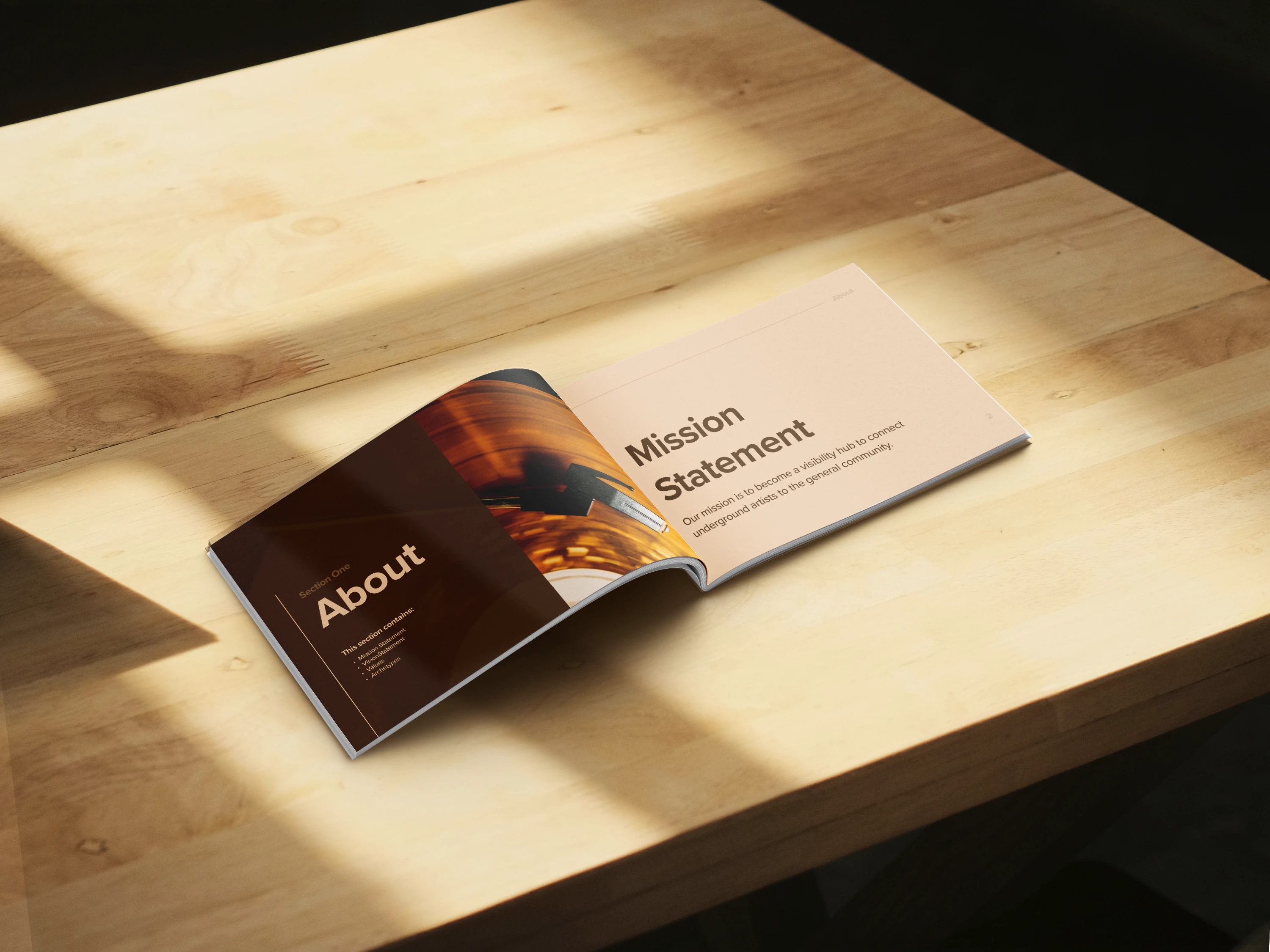
BrandBook
A comprehensive 30-page brand guidelines that feature brand values, mission and vision statements, logo usage, brand colours and fonts, and a robust social media strategy. Follow the link below to view the full brand book
Merchandise
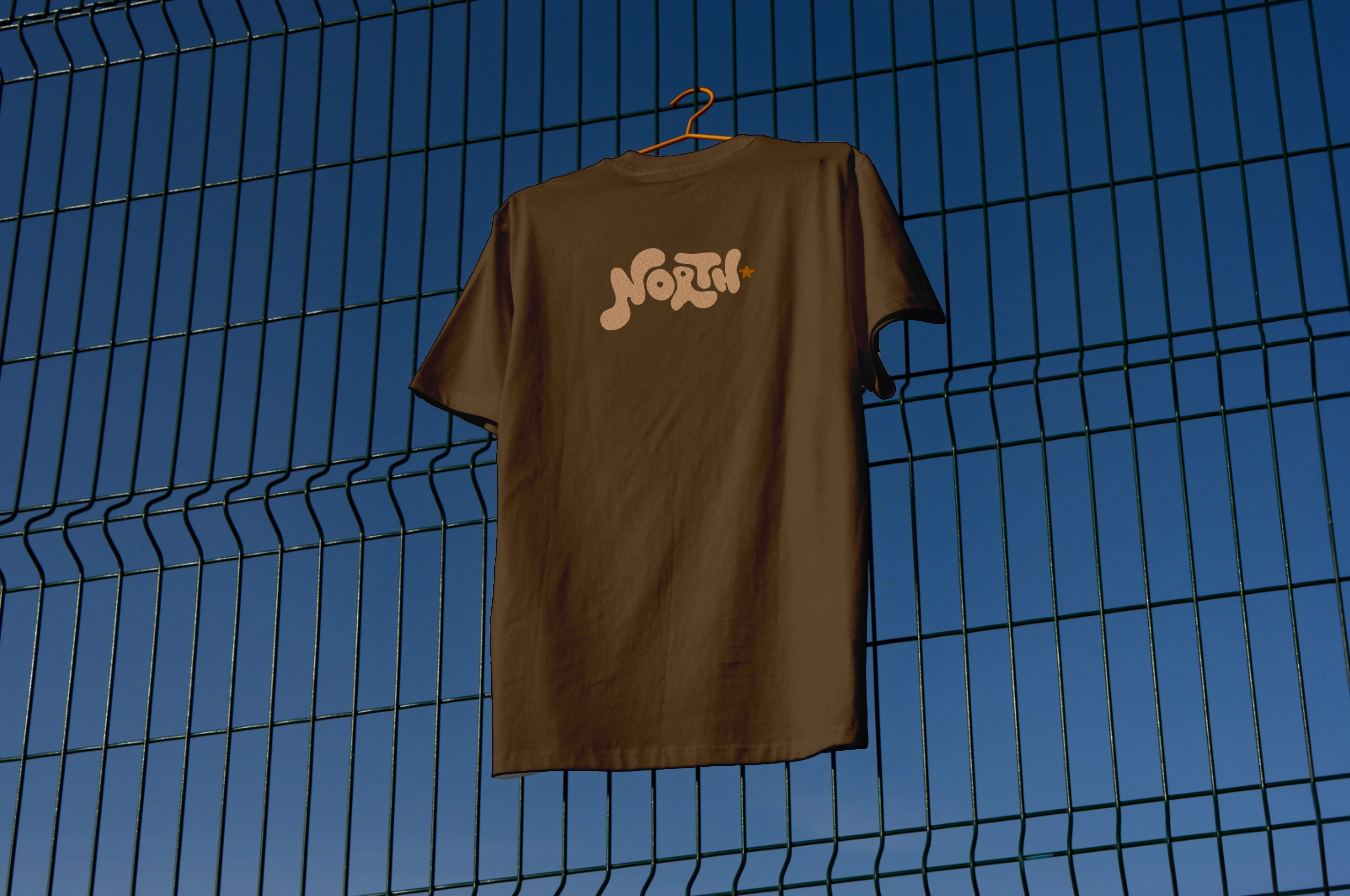
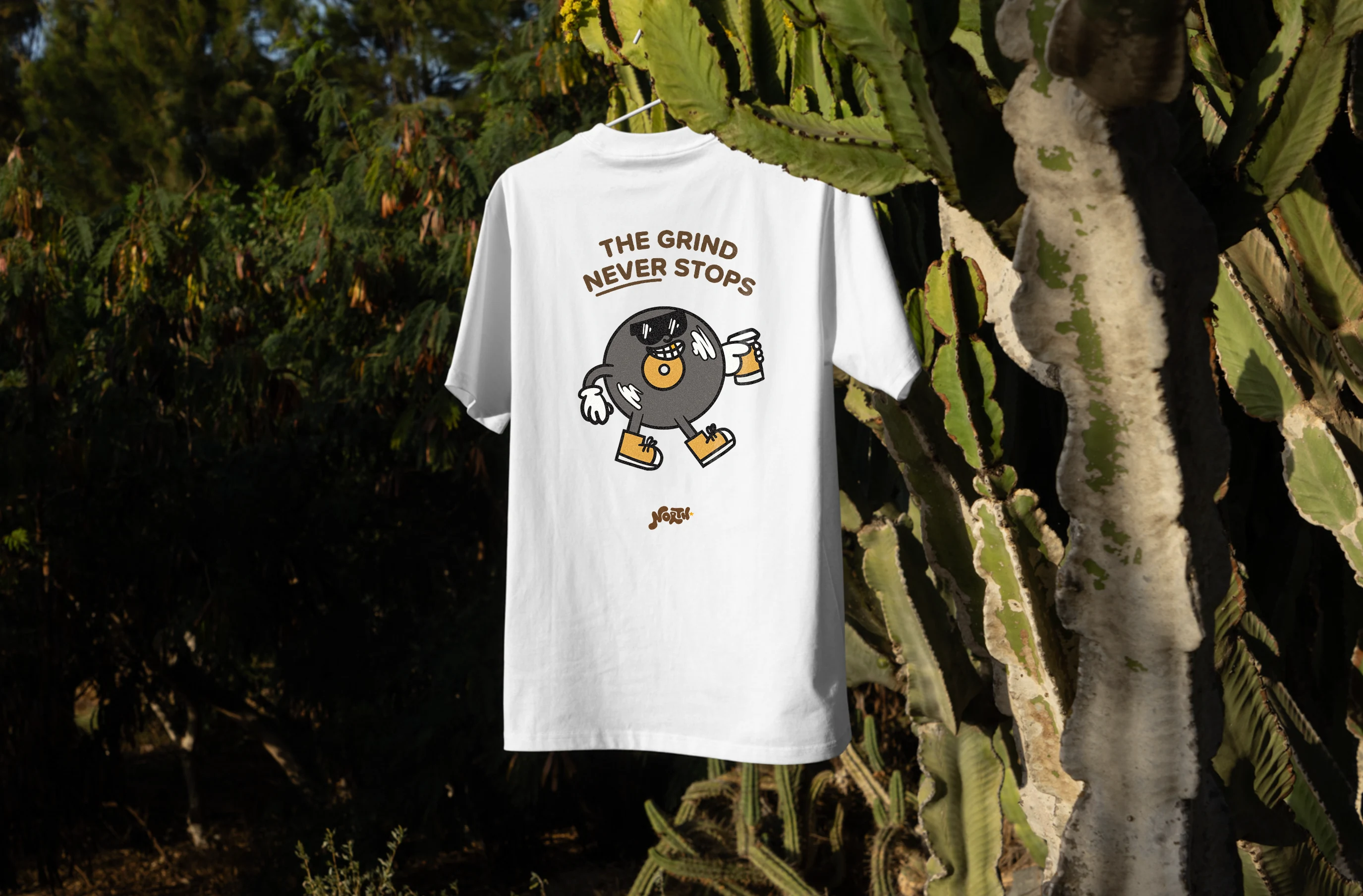
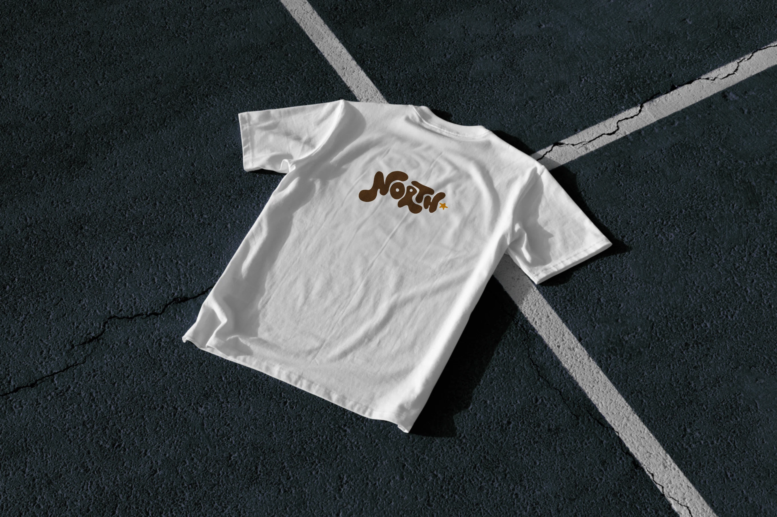
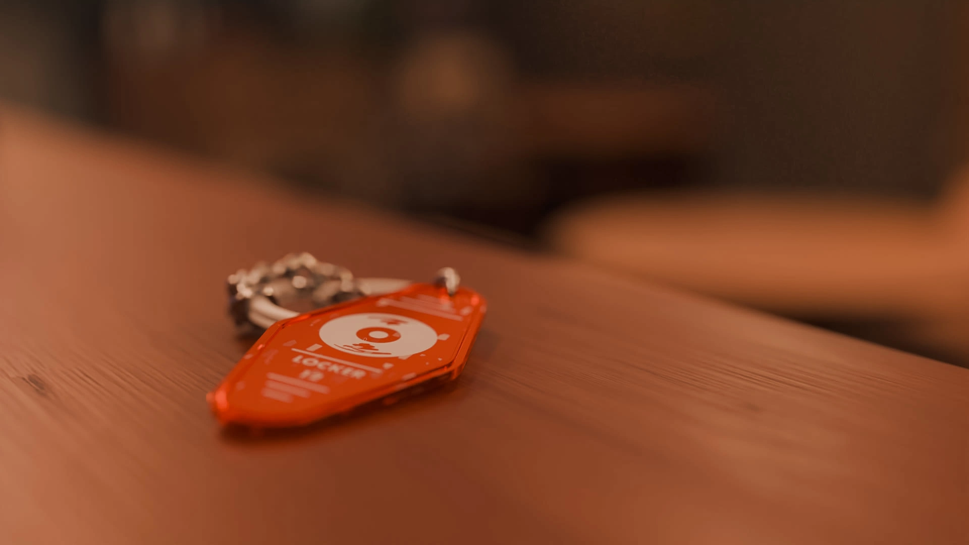
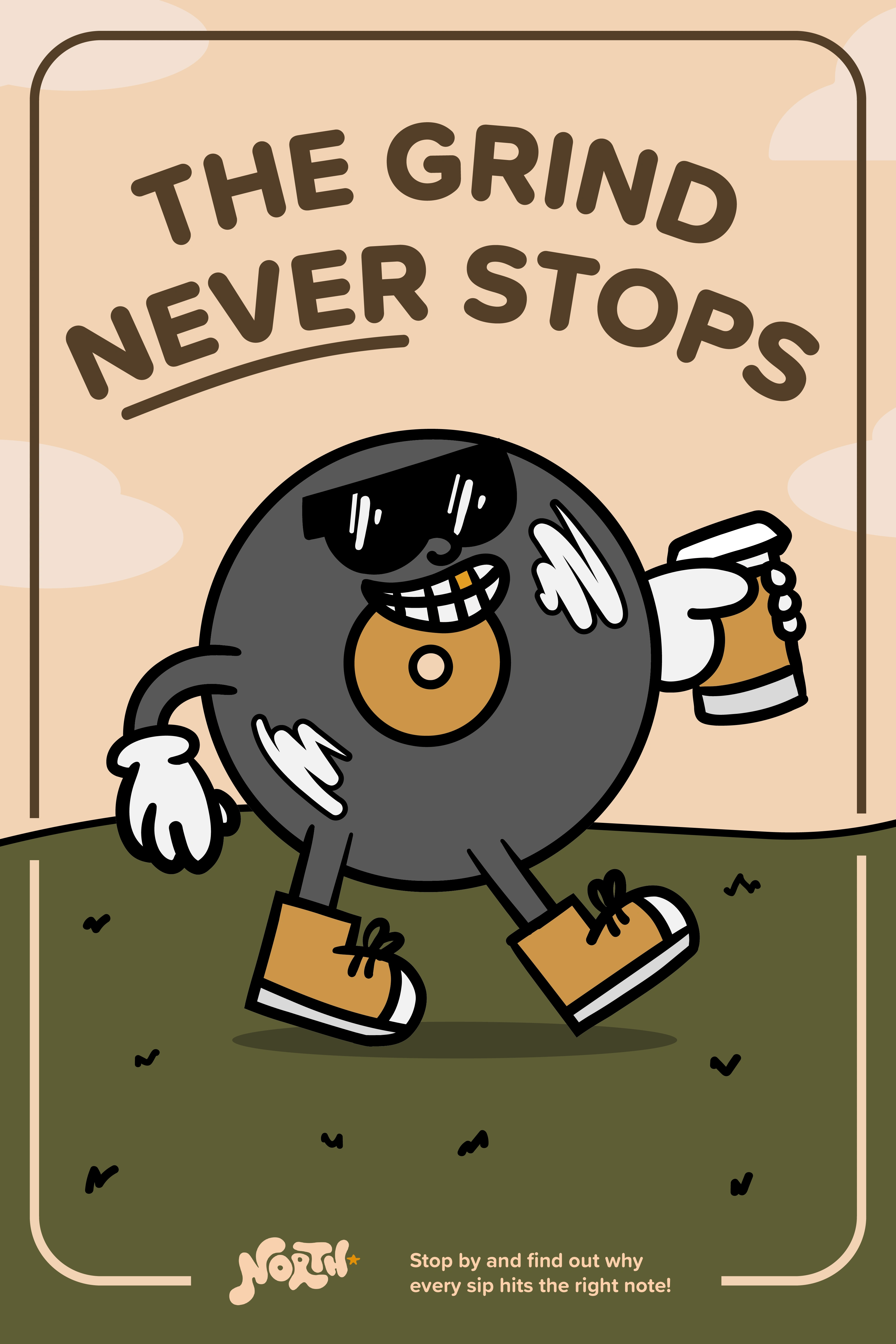
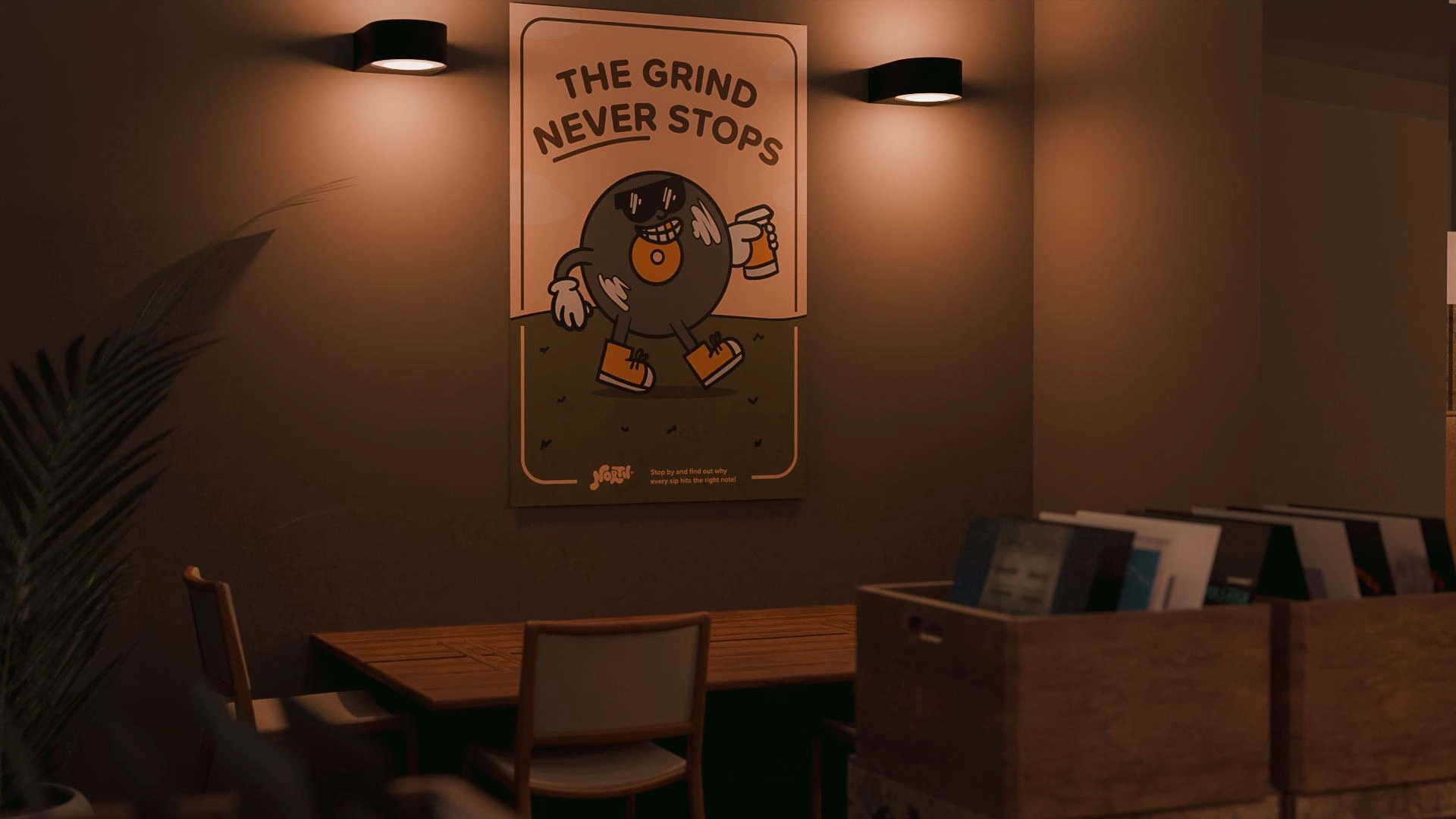
Various styles of merchandise were created to breathe personality into the shop. The merchandise deliverables include tote bags, posters, shirts, and a 3D-modelled keychain for membership perks.
3D Deliverables
A full 3-D render of the store was created in Blender. With some assistance from Aidan Marsh To create a Geo note system for the walls I was well on my way to furnishing the rest of the storefront. Models were provided by Blender Kit, a free add-on that enables the user to ream line finding CC0 Models to be used in their projects.
Like this project
Posted Jul 29, 2024
A conceptual and robust hand-rendered brand for a coffee shop that supports the local arts that features 3D renders, custom merchandise, and a full brand book.

![Conduit [ 3D, Branding, Print Design ]](https://media.contra.com/image/upload/w_700,c_fill/fxrq2fe3durq3cmydyao.avif)
![Skate Drop [ Logo, Creative Strategy, Social Media Marketing]](https://media.contra.com/image/upload/w_700,c_fill/gupxpzagivbs7em3foqd.avif)
![Underworld Night Club [Branding, Print, Web, & Motion Graphics]](https://media.contra.com/image/upload/w_700,c_fill/vriqfcawx9qxccdlmwkg.avif)
