Harisson & Wells Attorney | Brand & Web Design/Development
A full brand & web design & development for a Law Firm, Harisson & Wells
Harisson and Wells Attorneys is a premier law firm founded by two lifelong friends. They specialize in corporate law and high-net-worth individual advisory. The firm provides sophisticated solutions tailored to complex legal and business challenges.
While they focus on their clientele, I am focusing on rebranding their outdated brand and website into a modern, timeless, and sophisticated identity.
Goal: Demonstrate to their current and future clients that they are true experts in corporate law through a modern and timeless brand and website.
Super Goal: Expand internationally and increase their clientele with a brand and website that align with their vision and mission.

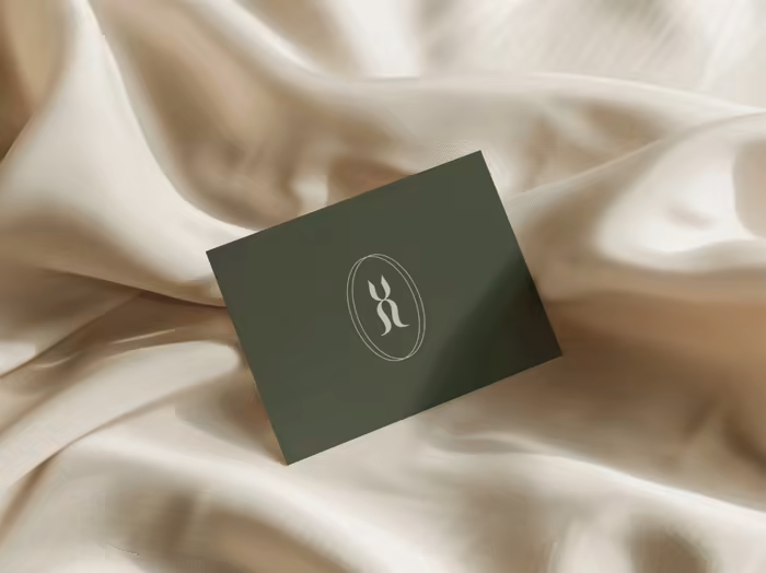
Harisson & Wells new logo
Strategy & Design Process
For this project, I gather all the information I had and did the market & target audience first. It was inspired by the London Bridge: the connection & her colors.
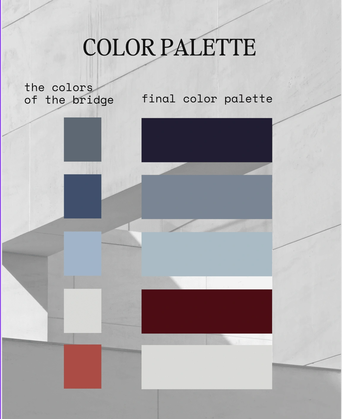
The first color palette is from the bridge, turned into a modern & trustworthy color palette
After finalizing the color palette, the typeface, the mood, the pattern& the logo, it was time for designing& developing the website.

included the H&W as well als the tall buildings of their clients in the logo
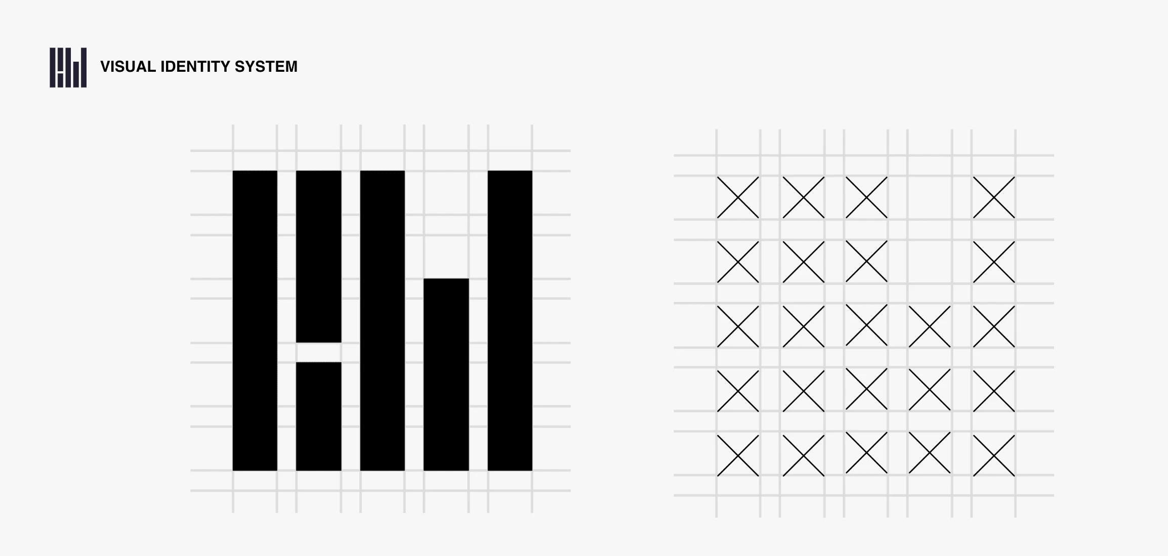
The grid system
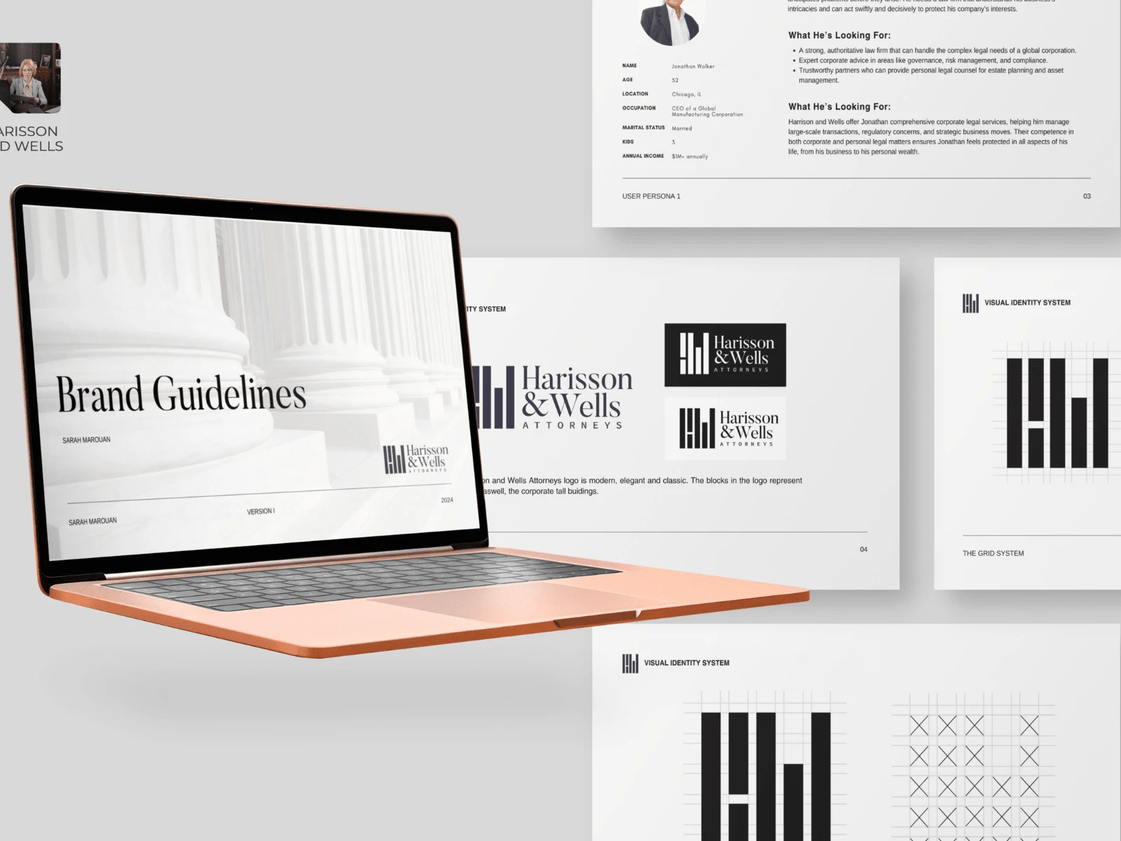
Brand Guideline with target audience research

Creative Direction for a Brand Photoshoot
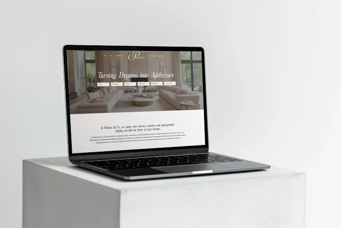
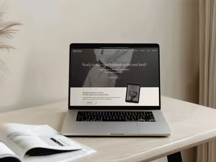
Web Design & Development process
After the brand was approved, it was time to design the website. When designing the website, it was important to ensure that clients could always reach them. To achieve this, a small phone button is consistently visible while scrolling on their website.
Since they aim to compete on an international level, I used trustworthy colors such as blue, complemented by a hint of seriousness with grey, and added a bold touch with dark red.
We began with wireframes, transitioned to Figma for design, and completed the development using WordPress and Showit.
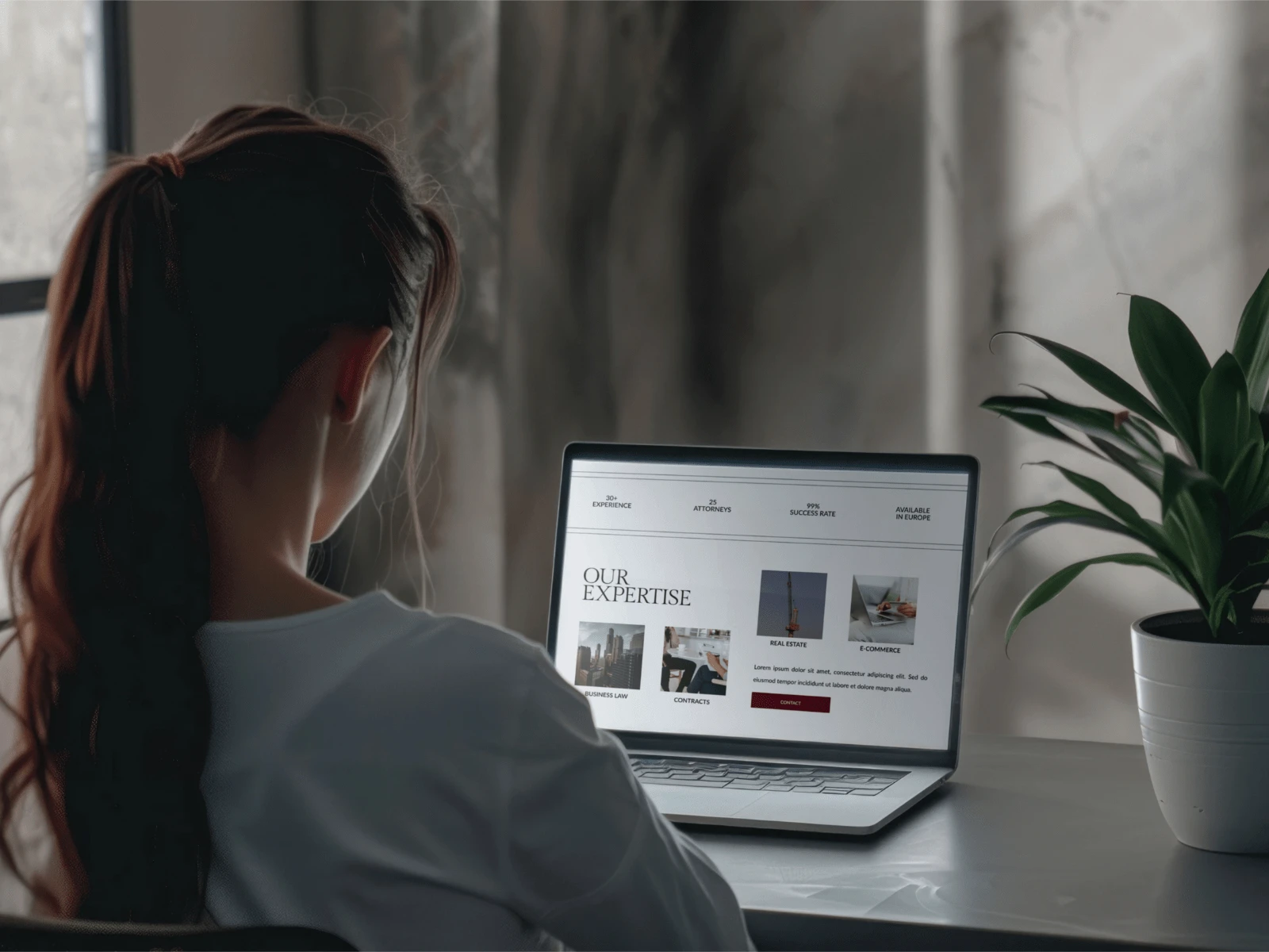
Our expertise section on the homepage
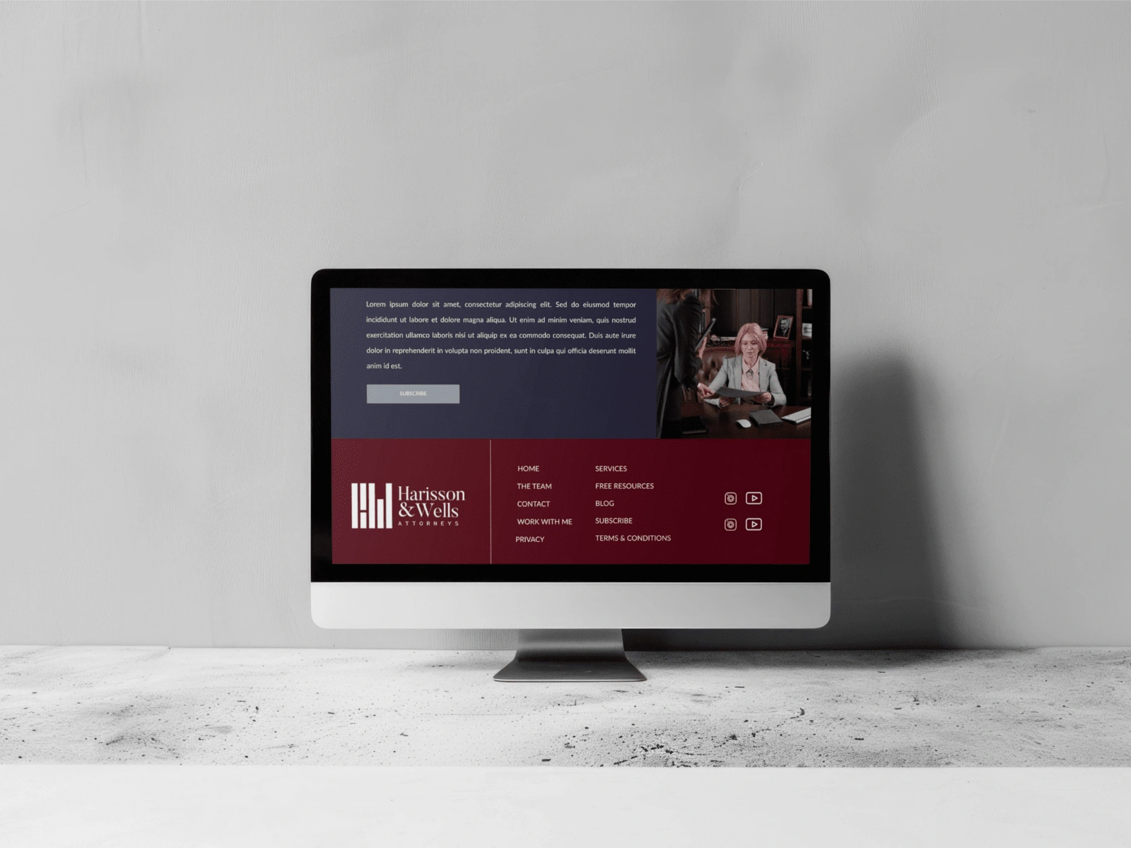
The footer
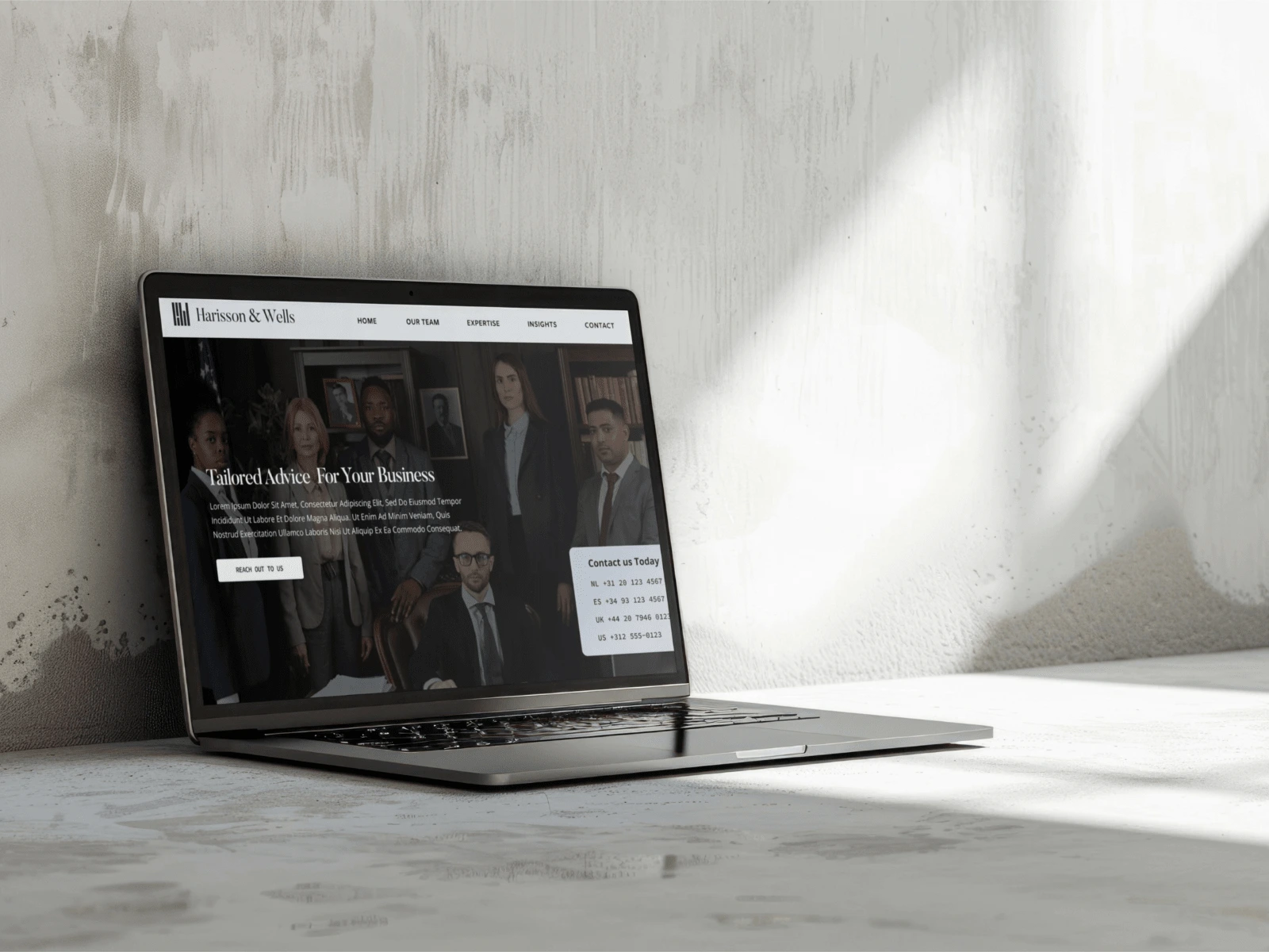
Hero section on the homepage
This Brand & Web Design & Development Experiences contained:
Brand Identity -> Visual identity System
Brand Guidelines
Brand Design: different logo variations, color palette, stationary, fonts, patterns
Wireframes
Web design in figma
Homepage
About us page
Our expertise
Contact
Blog & News
Case studies
Our Services
Web Development:
Google Analytics Integration
Multiple integrations (forms, newsletter, image compressor, etc.)
Custom Code
Integration with Showit.
Newsletter design & flow
Social Media templates
Like this project
Posted Nov 20, 2024
A full brand & web design experience for a law firm that needed a rebrand to attract high-end clients: logo, custom icons, brand guideline, web design.


