Kalotės Pušynas: Brand Identity and Website

Nikas Geisleris


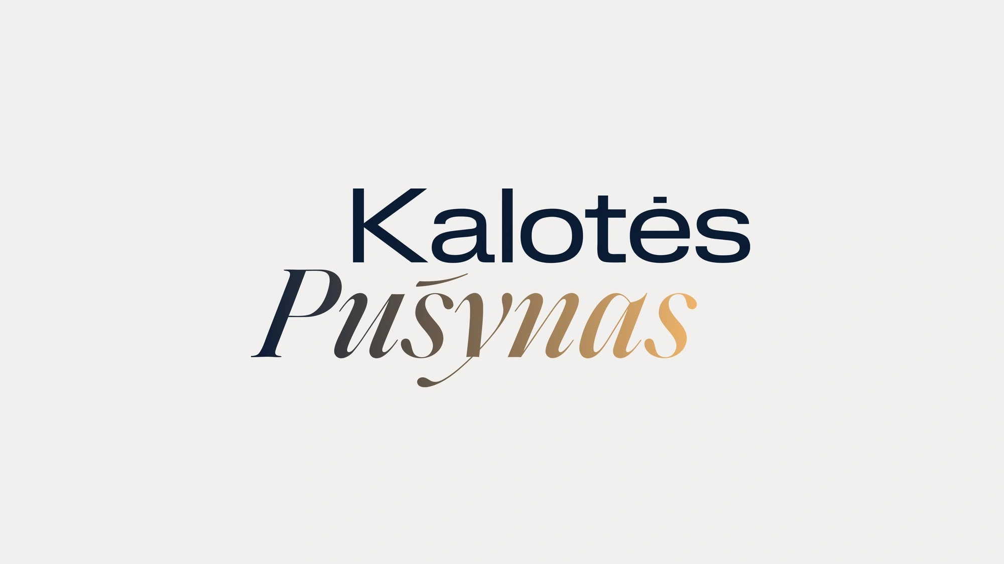
Kalotės Pušynas is a gated quarter of modern single storey houses among the pines in Kalotė, between Klaipėda and the sea, developed by Milansa. We created the identity and the website: a wordmark that joins modern and classic, a deep blue and gold palette with four signature steps, kalotespusynas.lt where buyers choose their house, and everything the sales team uses on site and online.
Wordmark
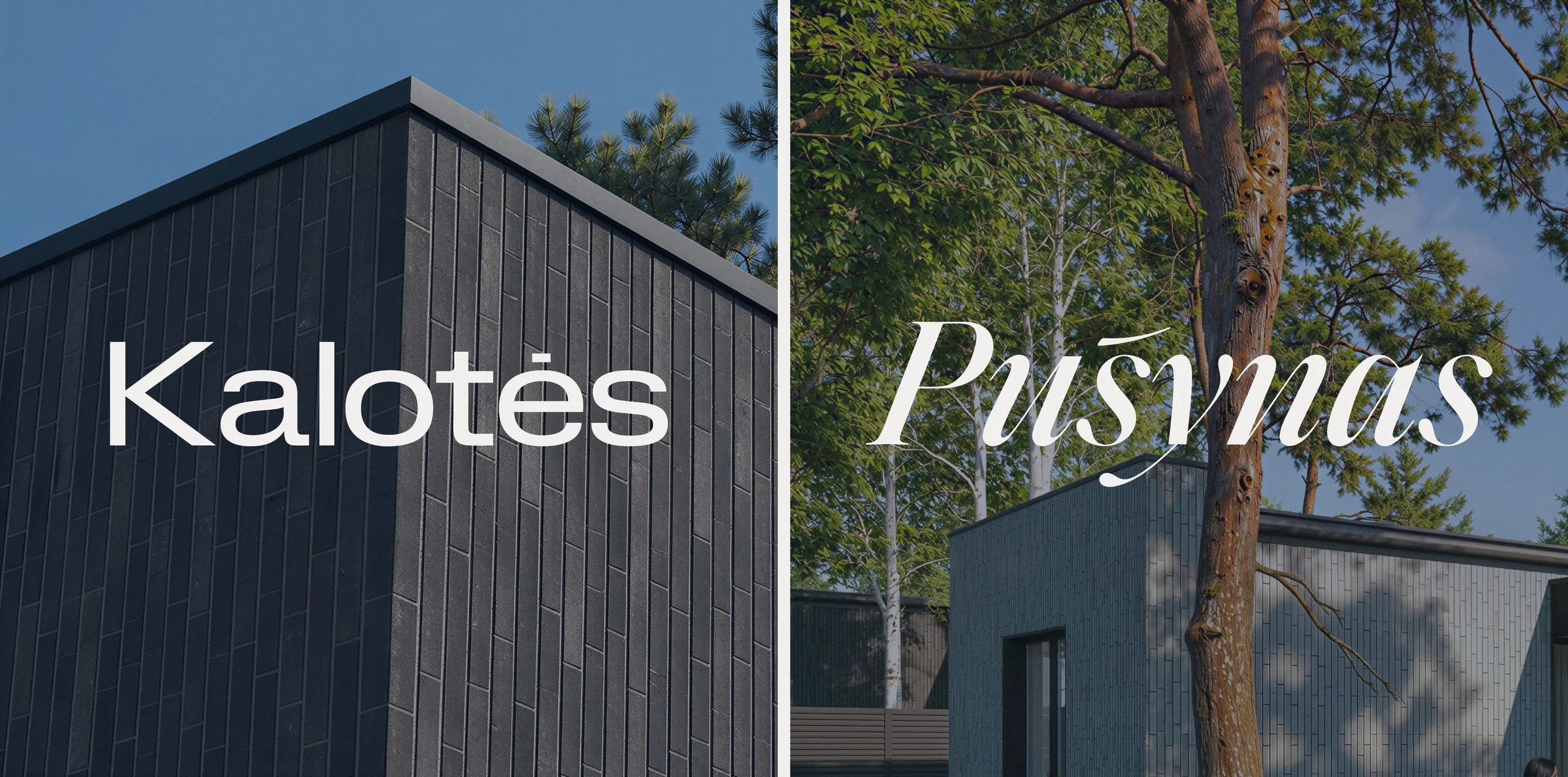
New architecture in an old pine forest, and the wordmark says the same. Kalotės, the place, is set in a calm, wide, modern grotesk. Pušynas, the forest, in a classic calligraphic italic. Two words, two eras, one mark.
Colours
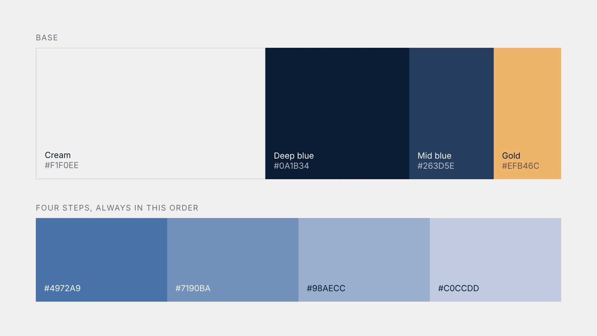
Cream and deep blue are the canvas, the light of day and the evening sky over the pines. Between dark and light the brand always steps through four clear shades of blue instead of a soft gradient. Gold, the warm light of the entrance sign, is the one warm colour, kept rare for buttons, actions and the italic.
Website
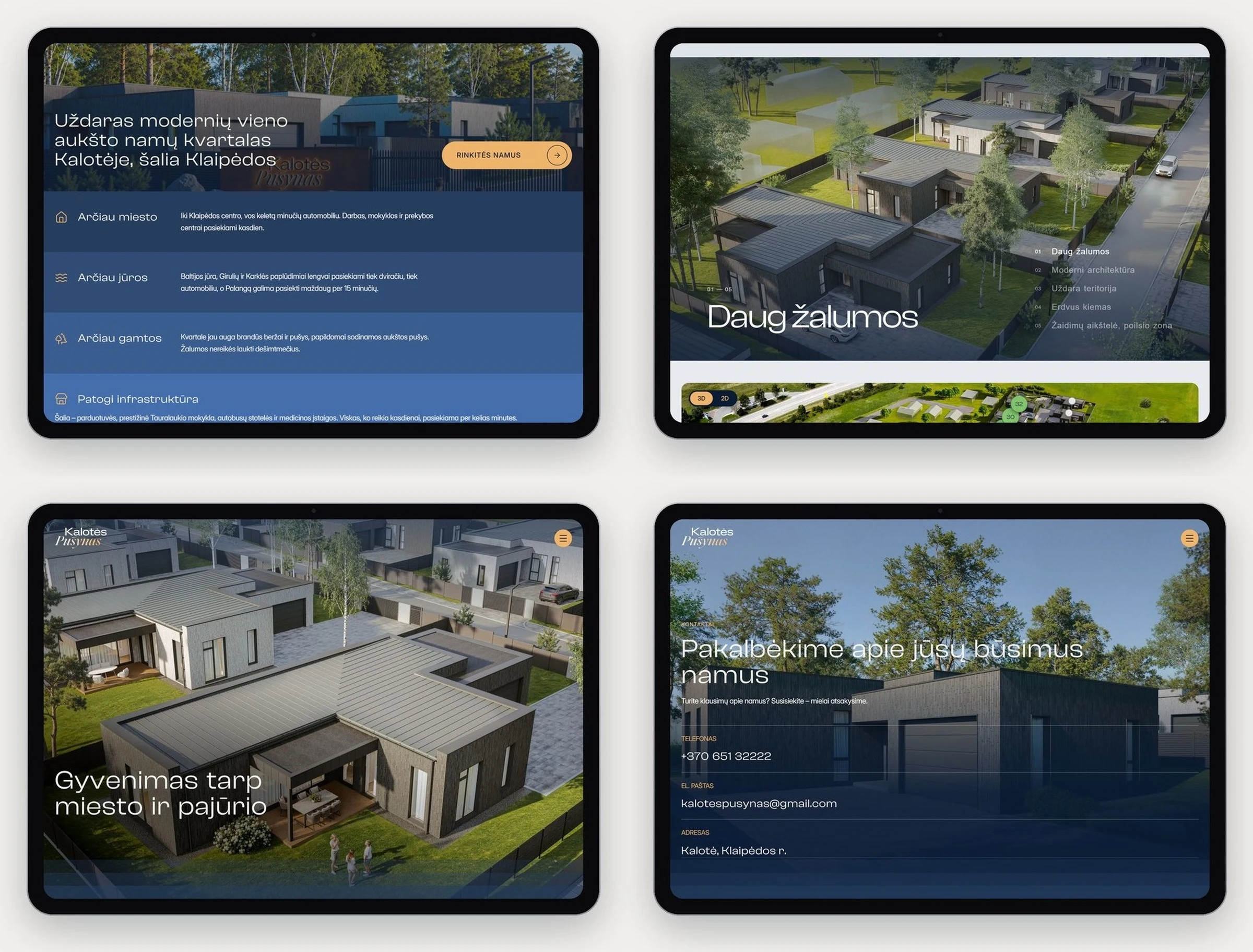
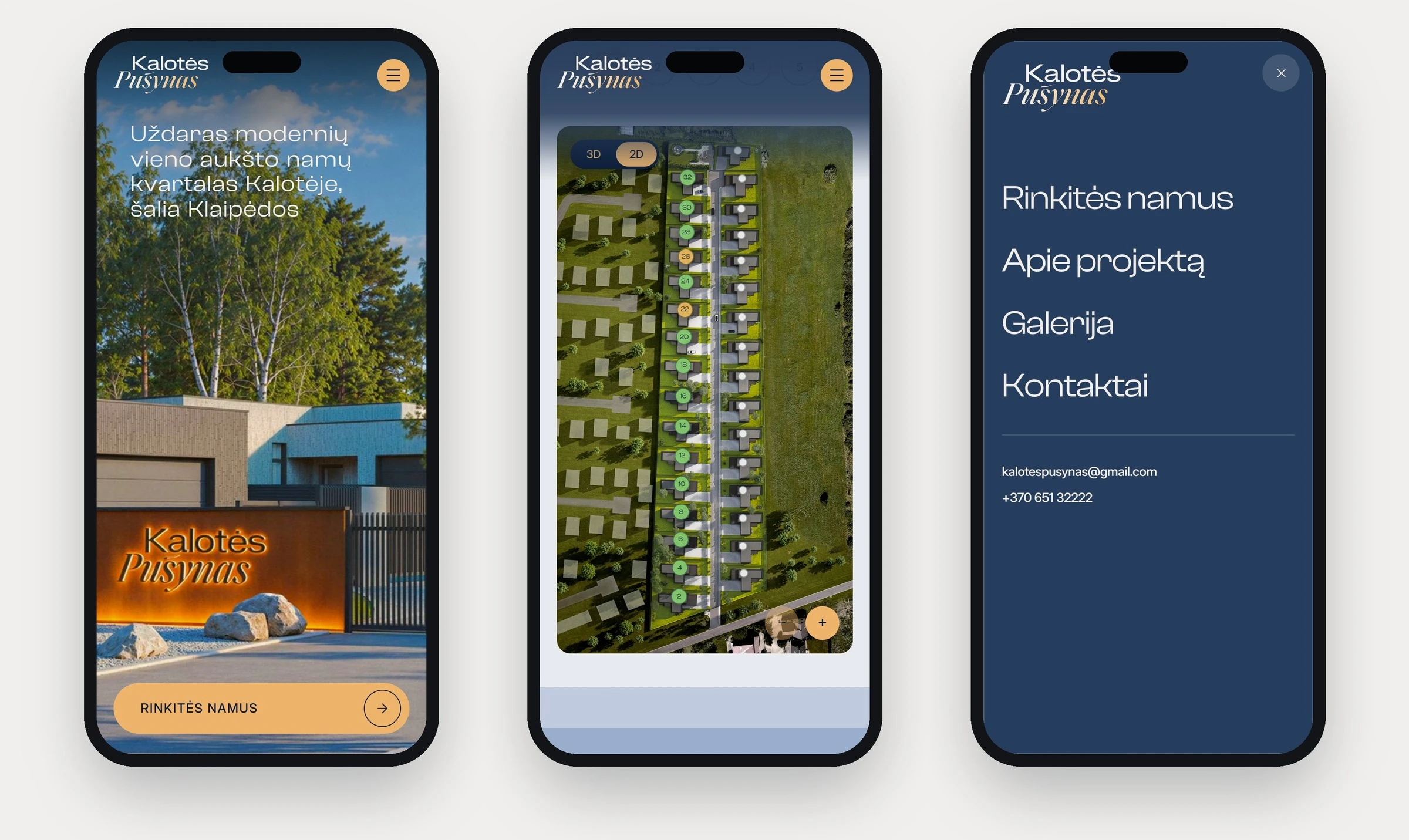
kalotespusynas.lt is where buyers choose their house. The first screen leads with the entrance and one gold call to action, followed by an interactive map of the plots, the area around and three house types.
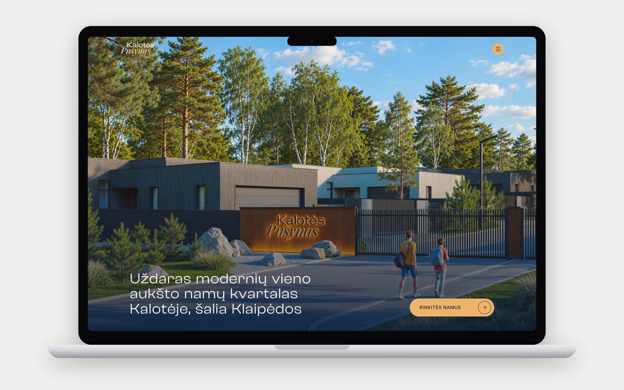
Choosing a house plot by plot: a click on a cottage zooms in and splits it into A and B, a card opens, then the house page.
The four blue steps carry the site from section to section, on tablet and on the phone, where most buyers start.
On the ground
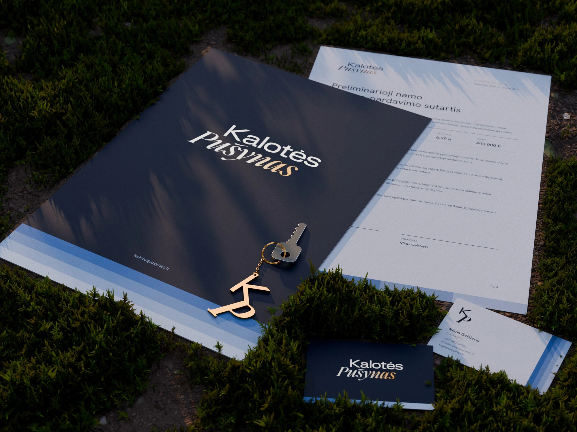
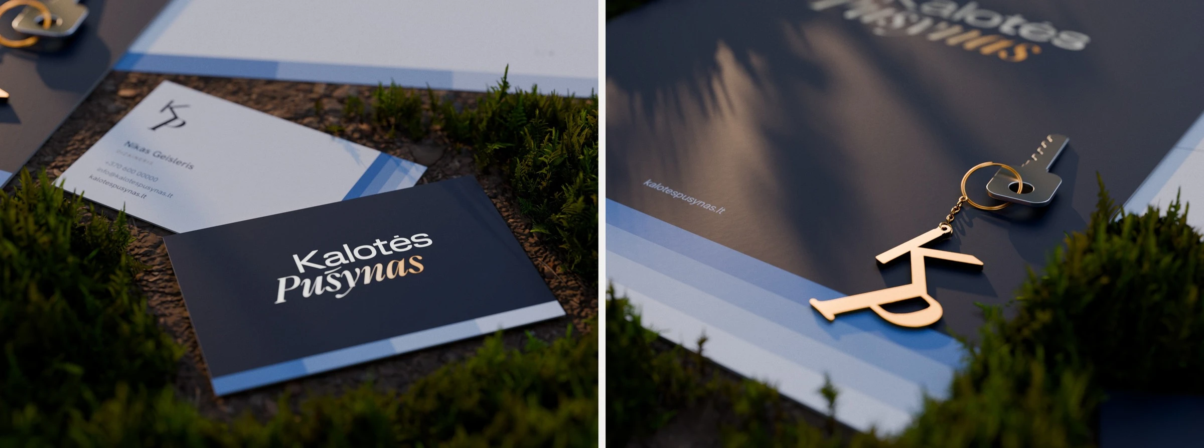
The same system follows buyers into the deal: a contract folder with the wordmark in silver foil that turns gold at the end of Pušynas, business cards with the same foil over the four steps, and a gold KP keychain handed over with the keys.
Social media
One system for every post: a visualisation, the wordmark or monogram, one headline and the four steps.
Architectural visualisations of the houses were supplied by the client.
Like this project
Posted Nov 2, 2026
Brand identity and website for Kalotės Pušynas, a gated quarter of modern houses among the pines near Klaipėda: wordmark, colours, web, print and social.