tash.cards – Brand Identity

Nikas Geisleris
Verified


tash.cards is a Y Combinator–backed platform that lets people invest in graded sports cards. We designed the identity from the strategy up: a heavy custom wordmark, a guilloche pattern built from its own letters, a holographic colour system with two custom Figma plugins to generate it, typography, guidelines and templates for cards and social. Created for baked.design, who led the brand strategy and moodboards.
Challenge
tash.cards turns graded sports cards into an asset people can invest in, with the structure of a regulated financial product. The brand had to sit between two worlds: the trust of an auction house and the ease of a modern app, the positioning baked.design summed up as Sotheby’s meets Apple. It also had to feel native to collectors, not like a bank.
Approach
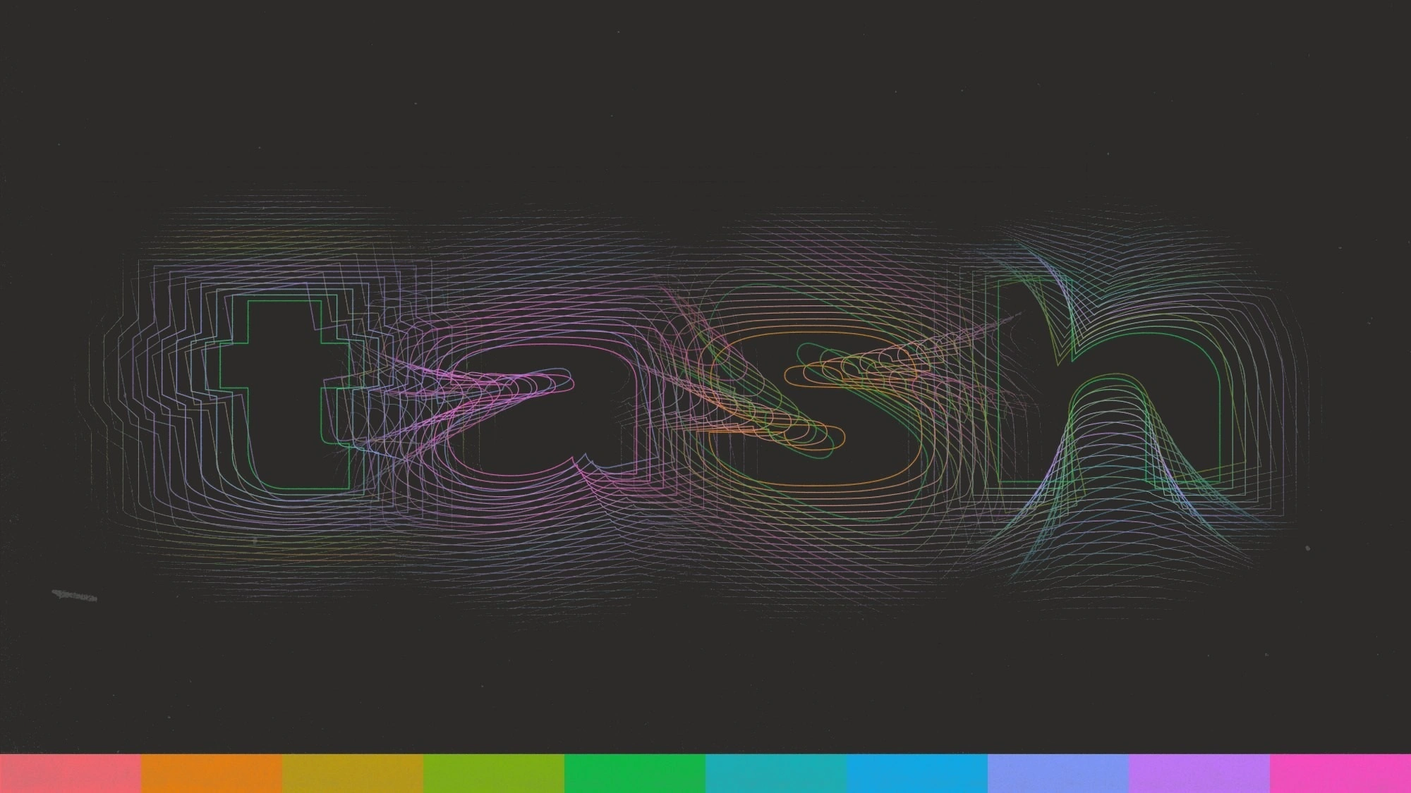
We drew a heavy, wide wordmark on a strict grid that holds in a platform header, on social and on merch, with the t as a compact mark. The graphic language comes from security printing: each letter of the wordmark is blended into a guilloche tile, like the engraving on certificates and banknotes, and tiles combine into endless patterns. Colour lives only in the pattern, as a holographic ten-hue spectrum over grayscale grounds. To keep it consistent, we built two Figma plugins: one grades any pattern through the locked spectrum, the other sets any word in pattern letters. PP Neue Montreal and Inter, guidelines, and templates for card listings and social complete the system.
Result
tash.cards launched with the new identity across its platform and social channels.
A custom wordmark, heavy and wide, built for screens first.
One wordmark, two versions: black on light, white on dark.
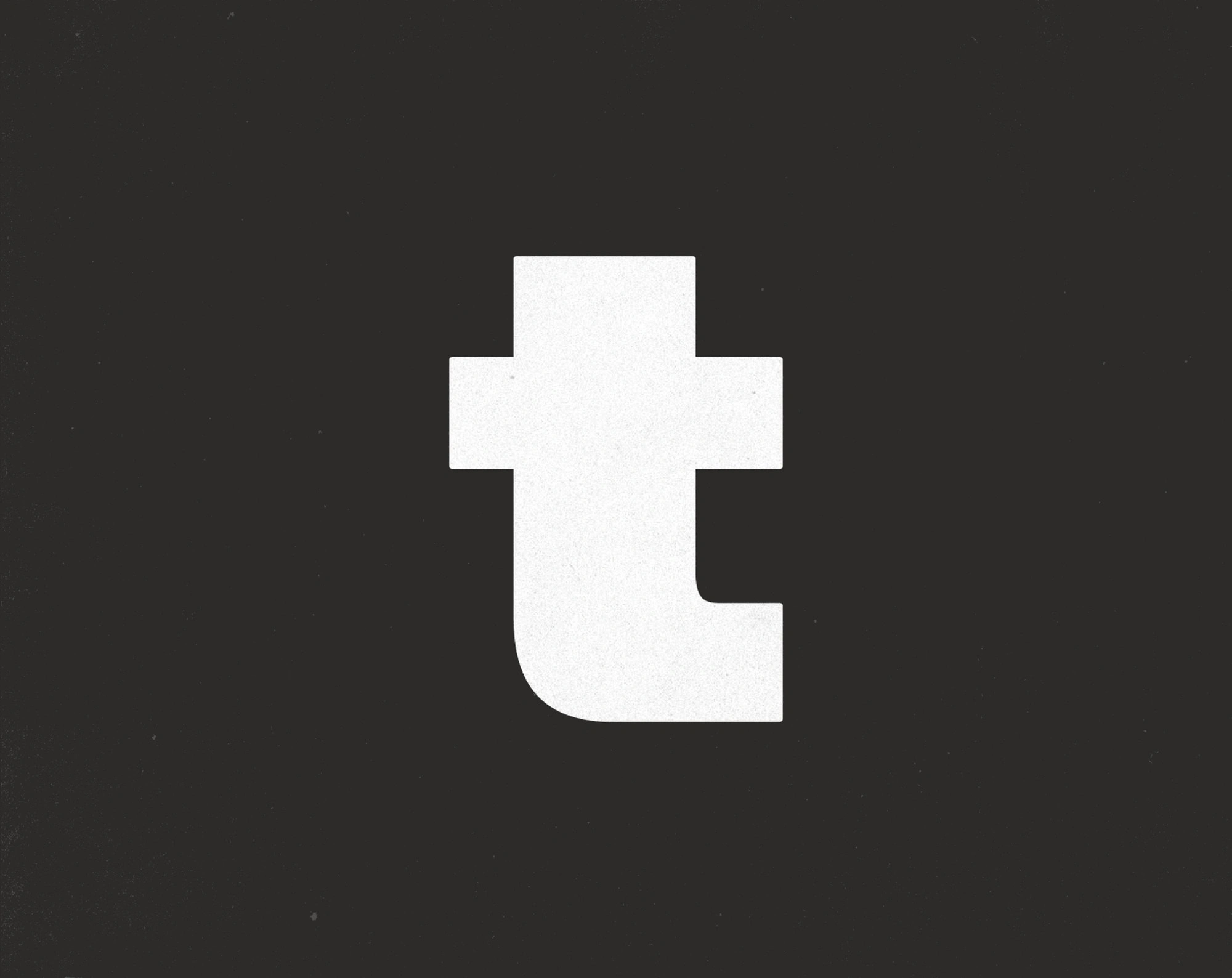
The t as a compact mark for small spaces.
Built on a strict grid of equal letter widths.
Core pattern
Every letter of the wordmark, blended out to its frame in 25 steps. Thirty-six tiles, a–z and 0–9, combined in twos and threes like the engraving on a banknote.
Up close: each tile ripples out from its letter, twenty-five steps to the frame.
Plugin 01: Pattern Colours
Colours any tile with the brand spectrum.
Pick: Choose a letter or number.
Colour: Set the gradient for layer 1.
Stack: Add layer 2, then rotate and scale it.
Ground: Pick a ground and the edge fade.
Save: Randomise, or download a PNG.

The holographic alphabet: every letter graded by the plugin, two passes, faded into the ground.
Plugin 02: Pattern Type
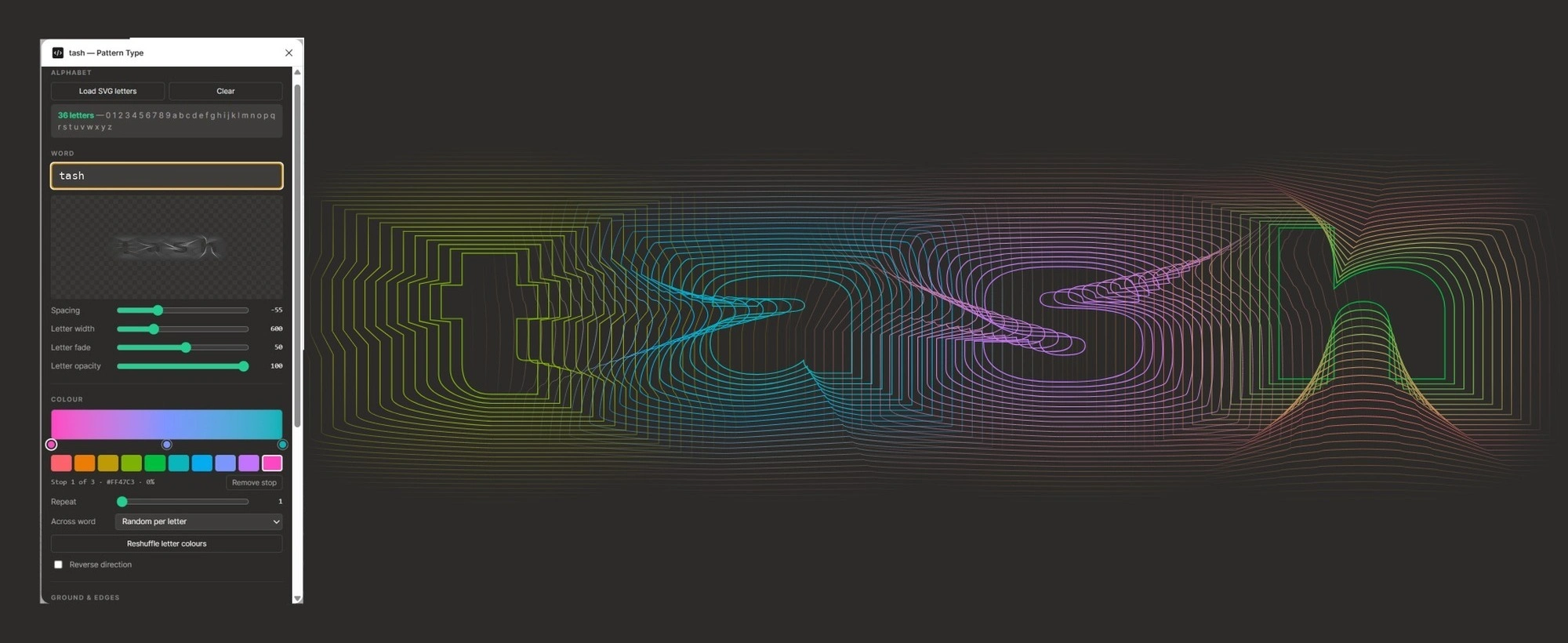
Sets any word in pattern letters.
Type: Write a word.
Space: Overlap the letters.
Colour: Per letter, or across the word.
Save: Download a PNG.
Packaging
Every graded card ships in a tash case.
Social
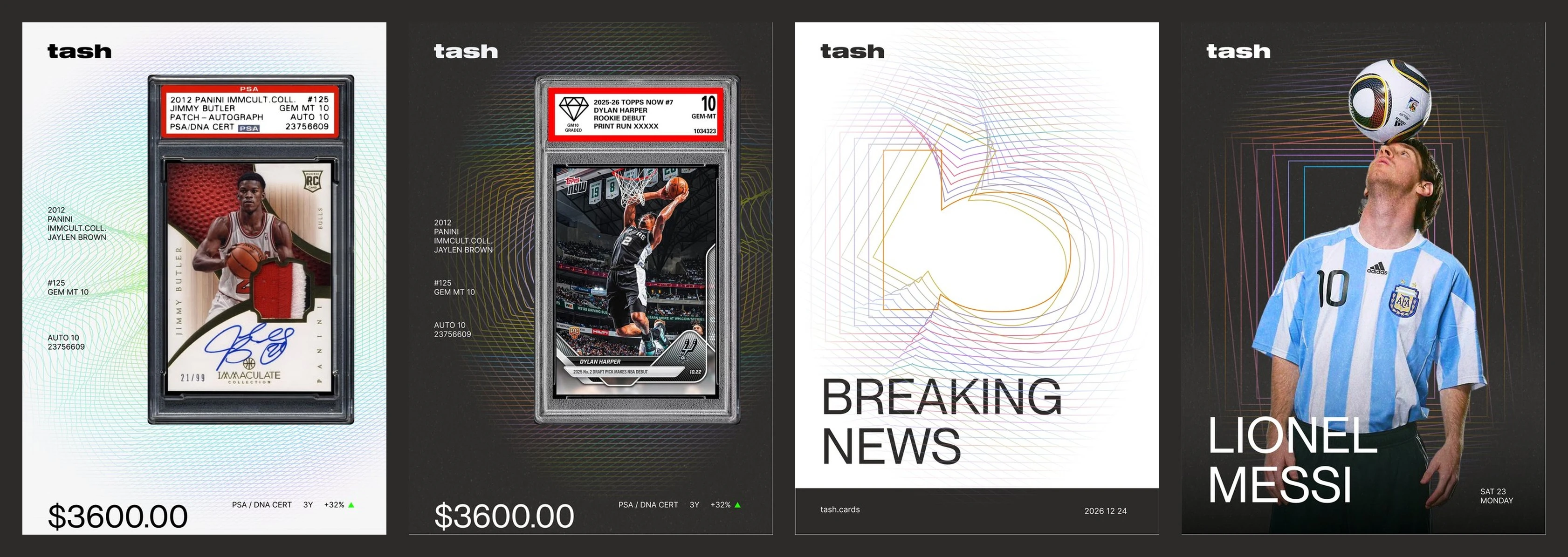
Card listings, athletes and news from one system.
Brand guidelines
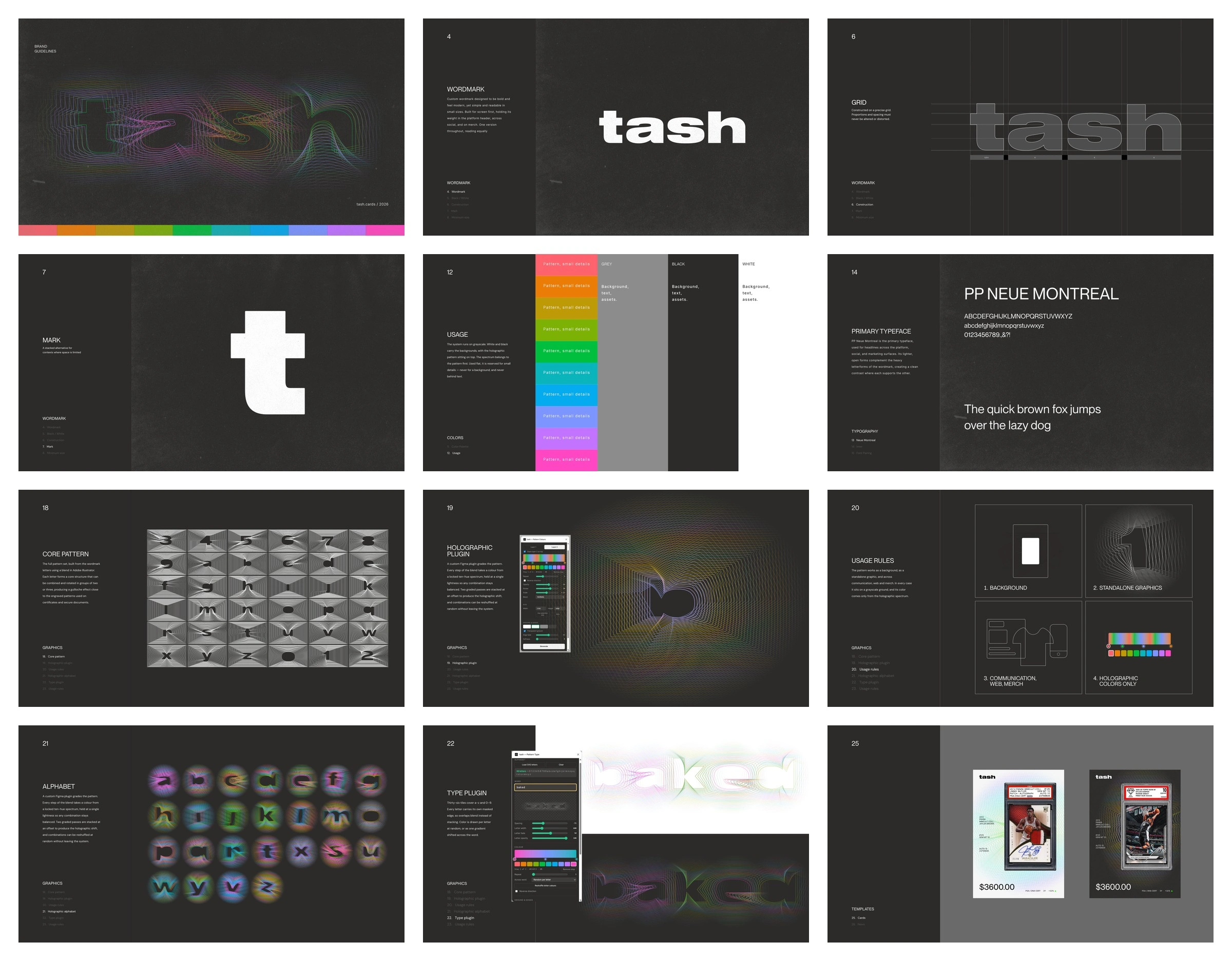
Wordmark, colour, type, pattern, plugins and templates, delivered as brand guidelines.
Like this project
Posted Oct 25, 2026
Identity for a Y Combinator–backed platform for investing in graded sports cards: wordmark, guilloche patterns, holographic colour and two Figma plugins.
Likes
1
Views
0
Clients
Baked Design