Scott Carver

Tanel August Lind


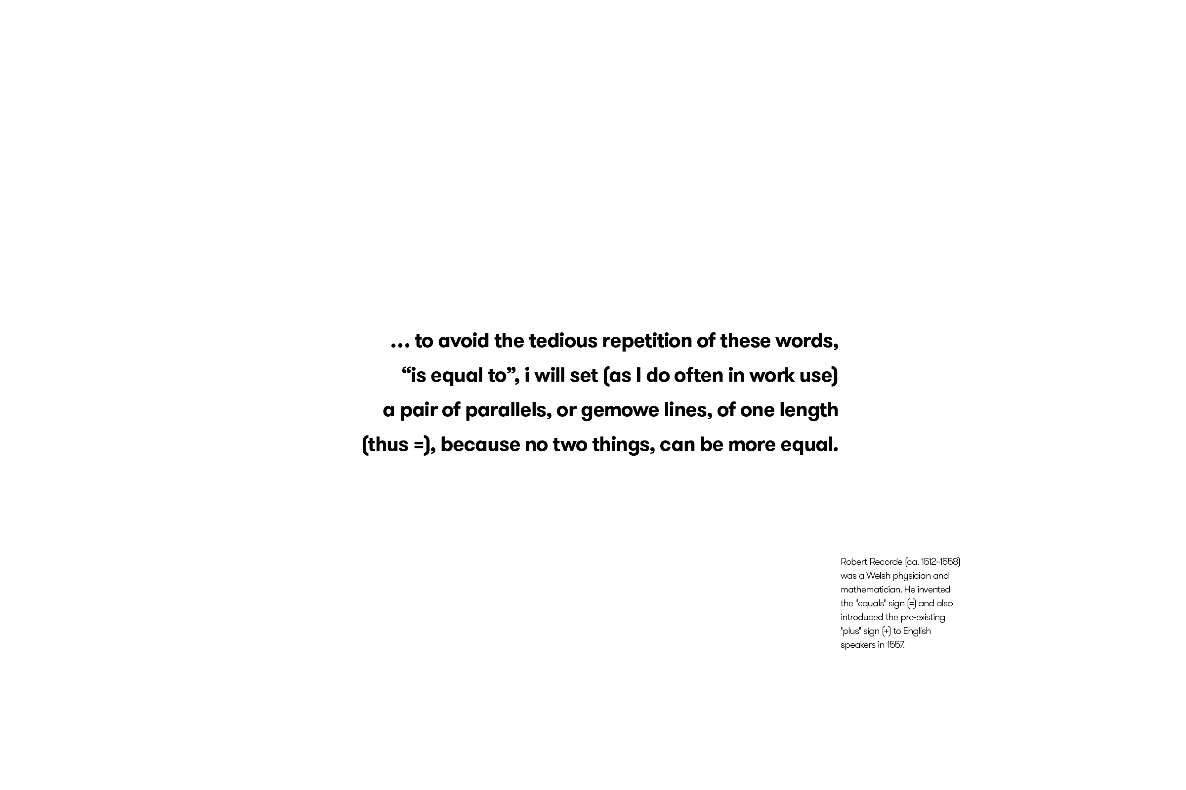
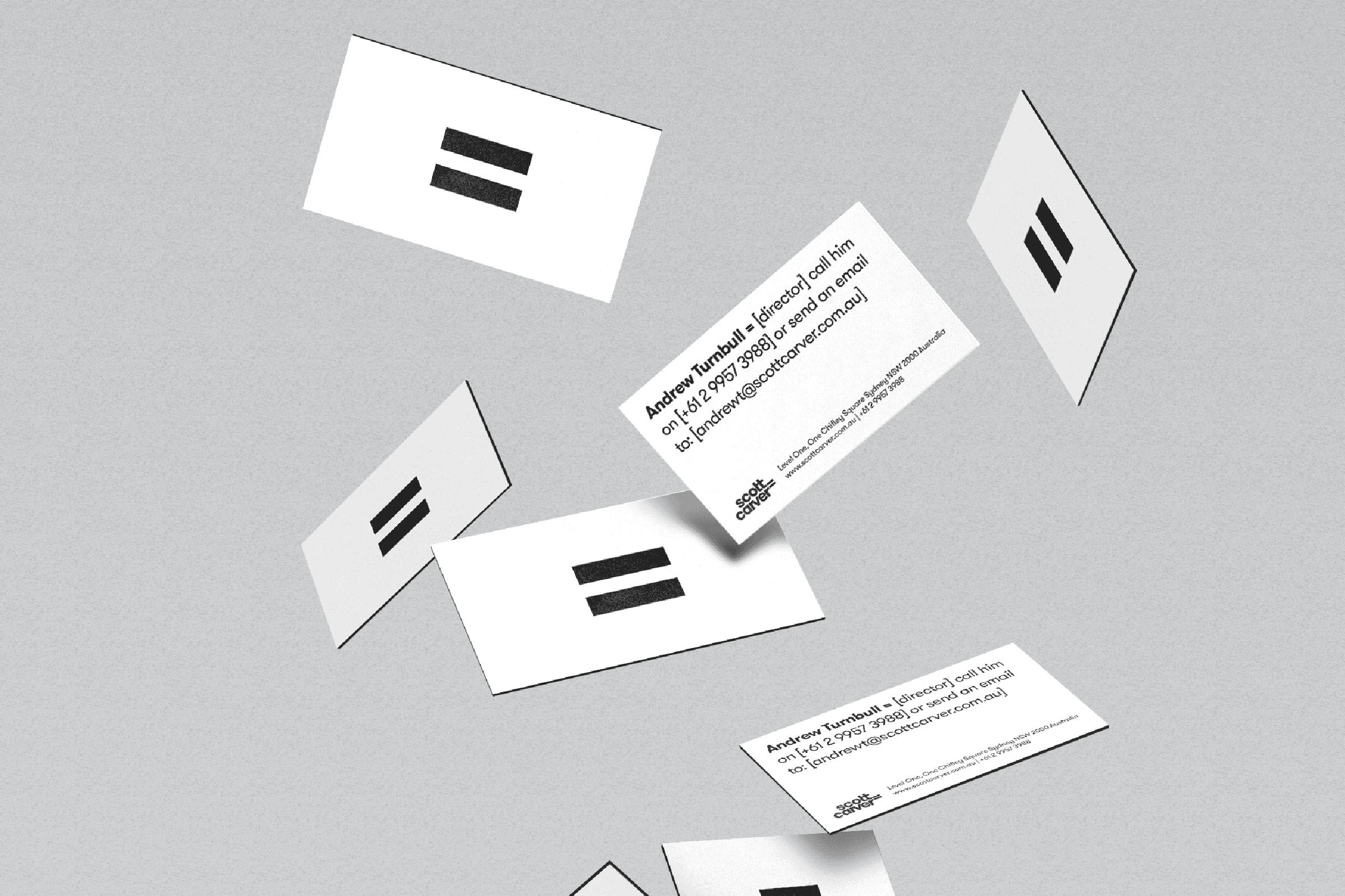
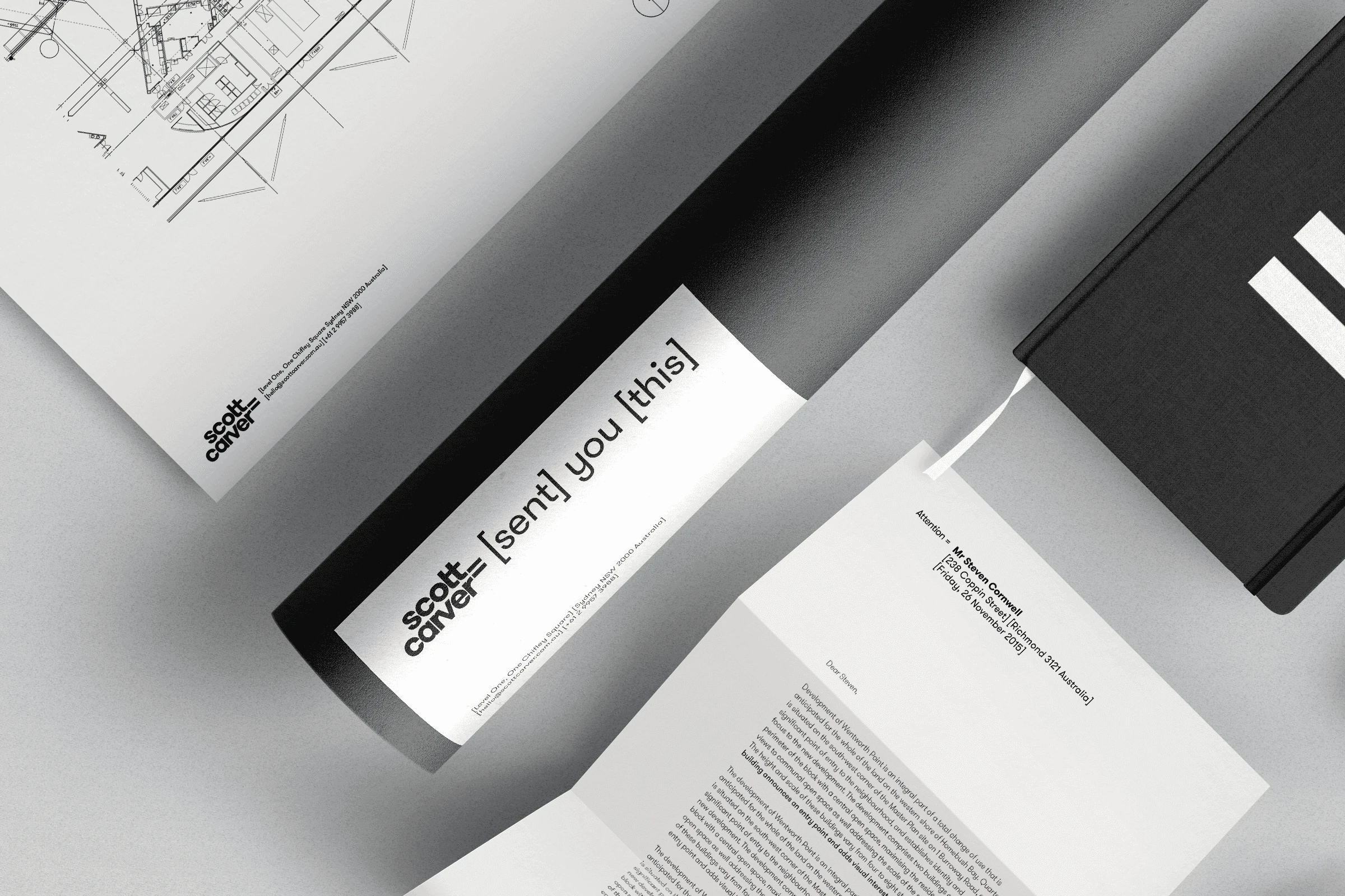
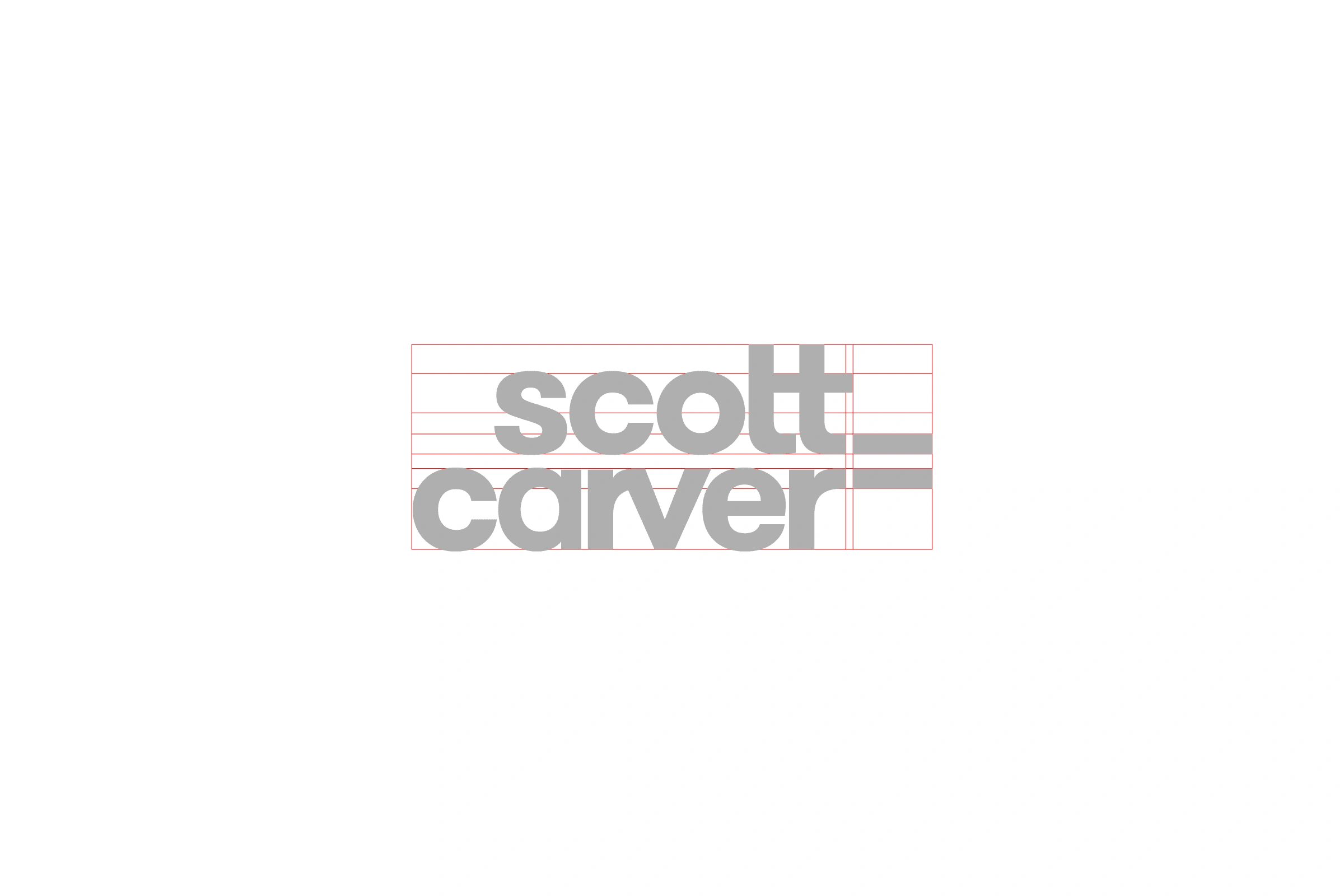
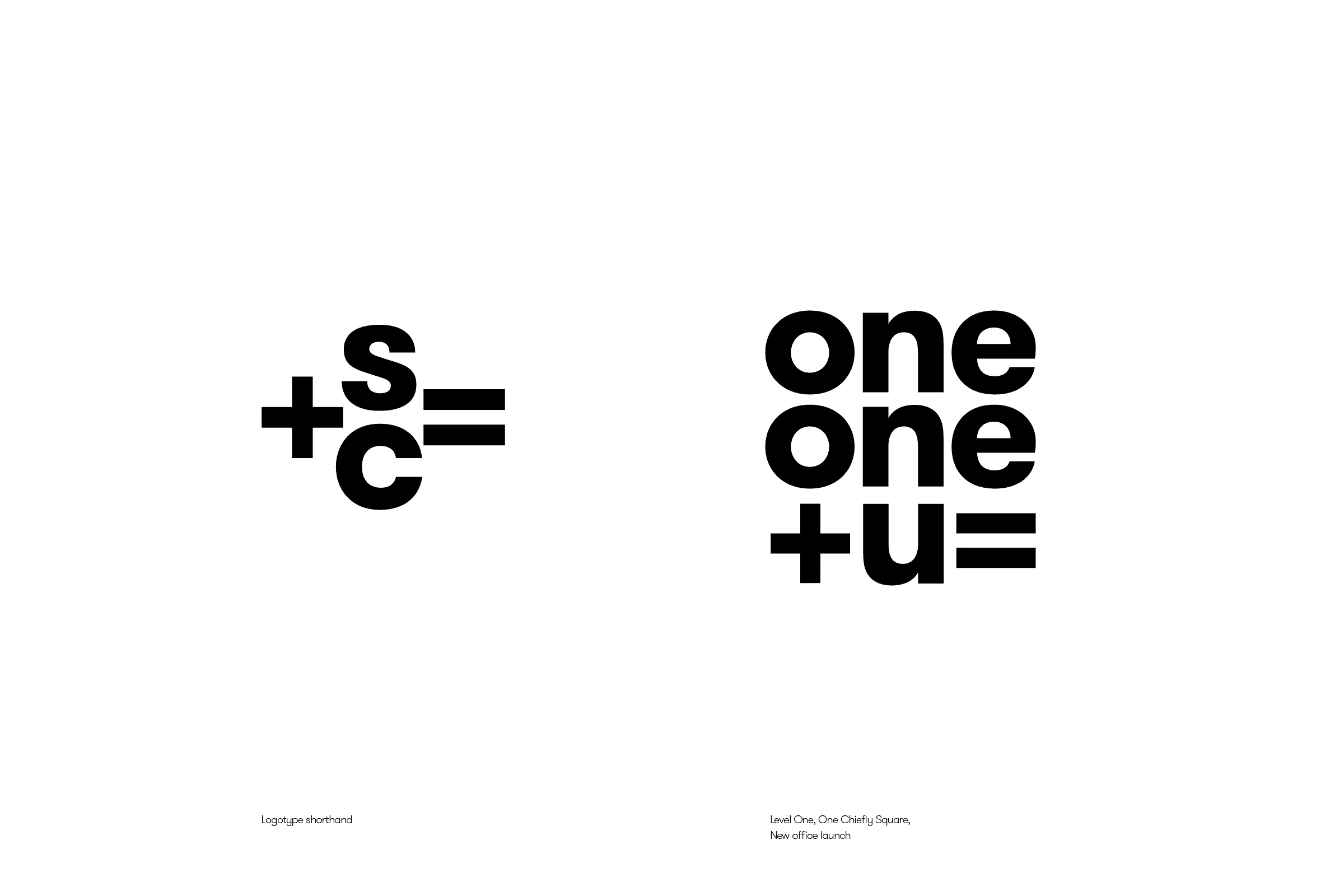
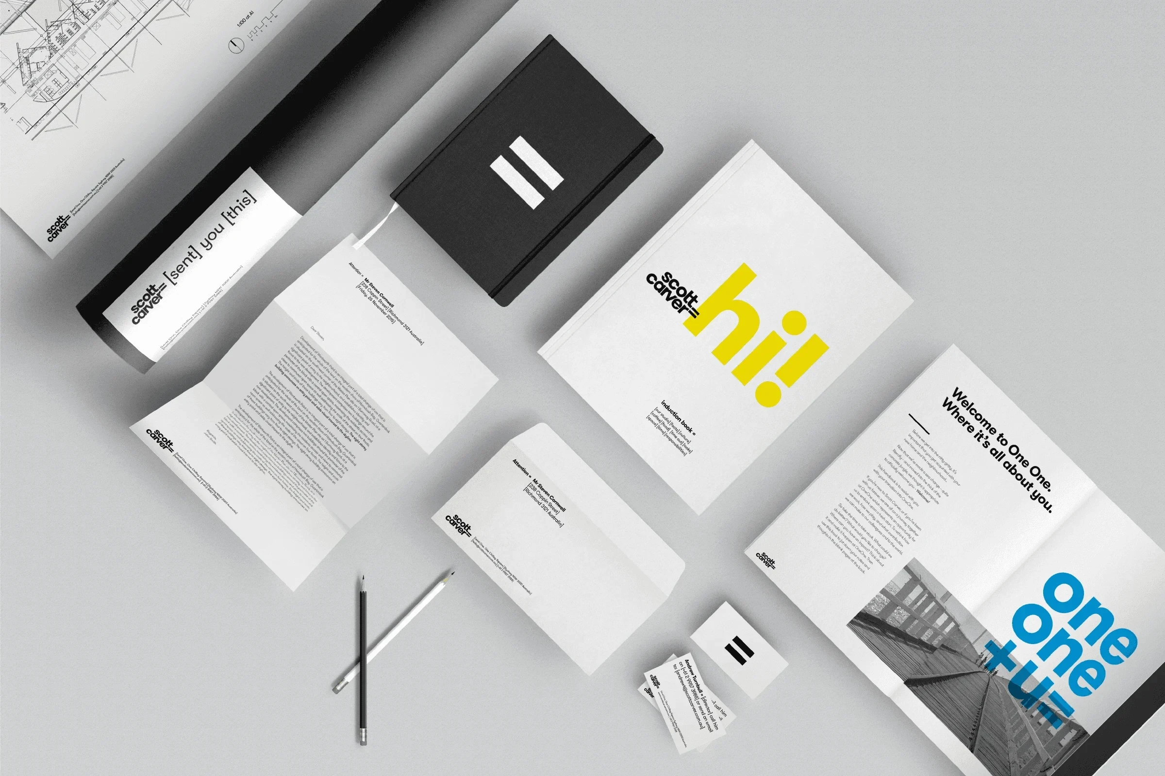
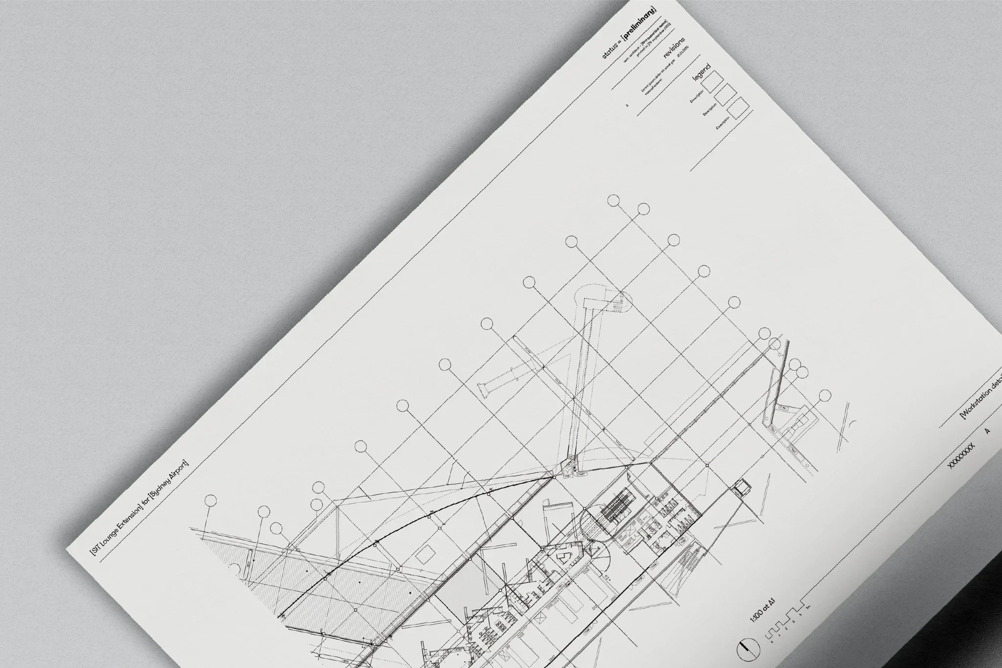
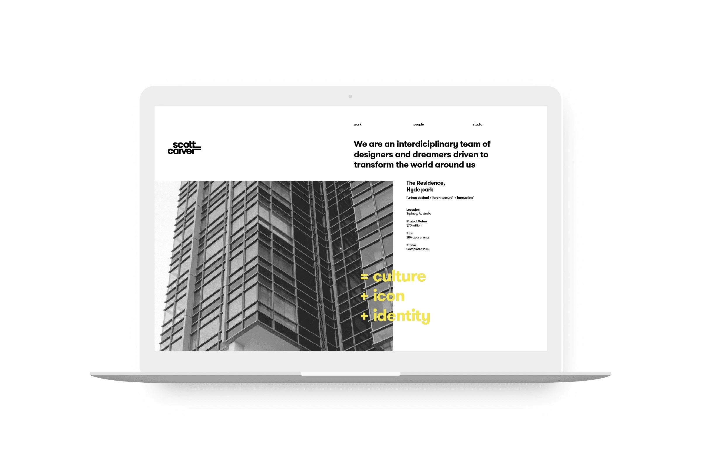
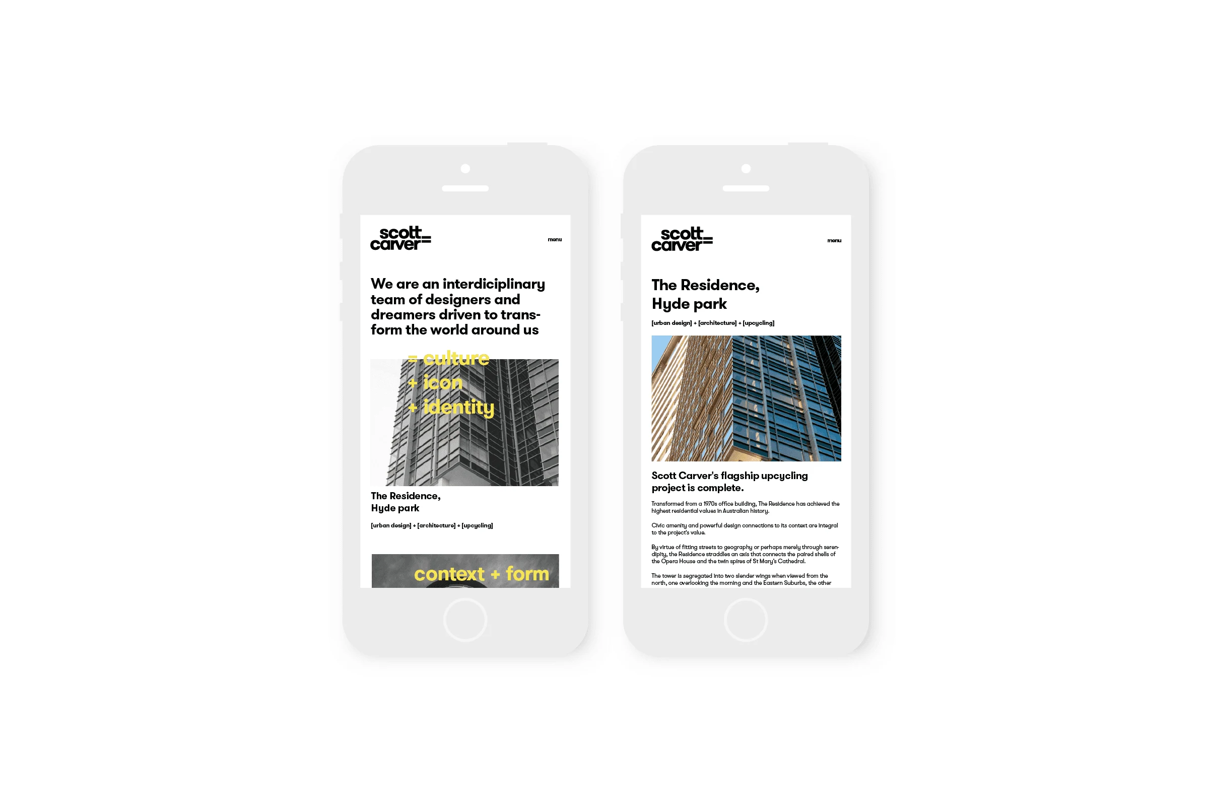
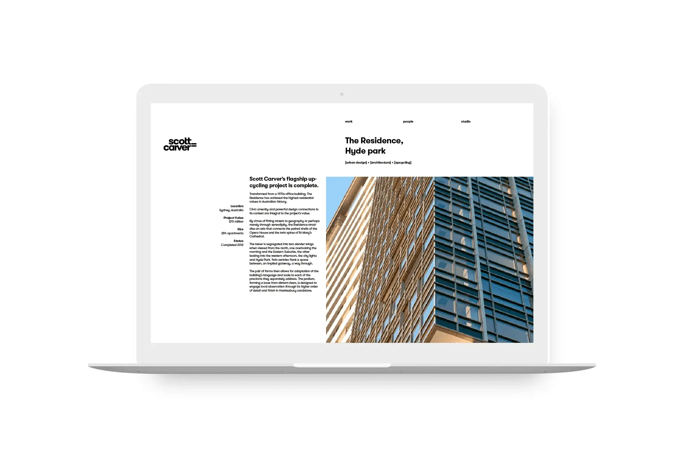
Scott Carver, an architecture and design practice in Sydney, needed an identity that made its thinking clear to clients, employees and future colleagues. At Alphabet, I contributed design and motion to the identity and visual system. The visual language was built around the equals sign, creating a shorthand for connecting ideas through words, numbers, symbols and images. It gave the identity a direct, adaptable form of expression suited to the practice’s character.
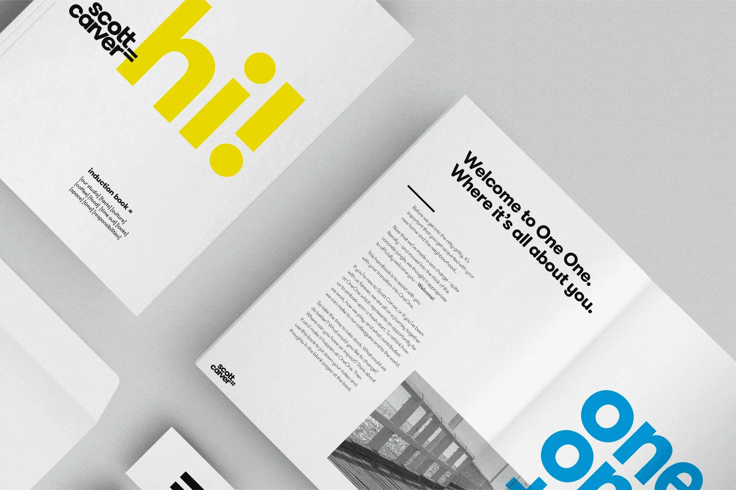
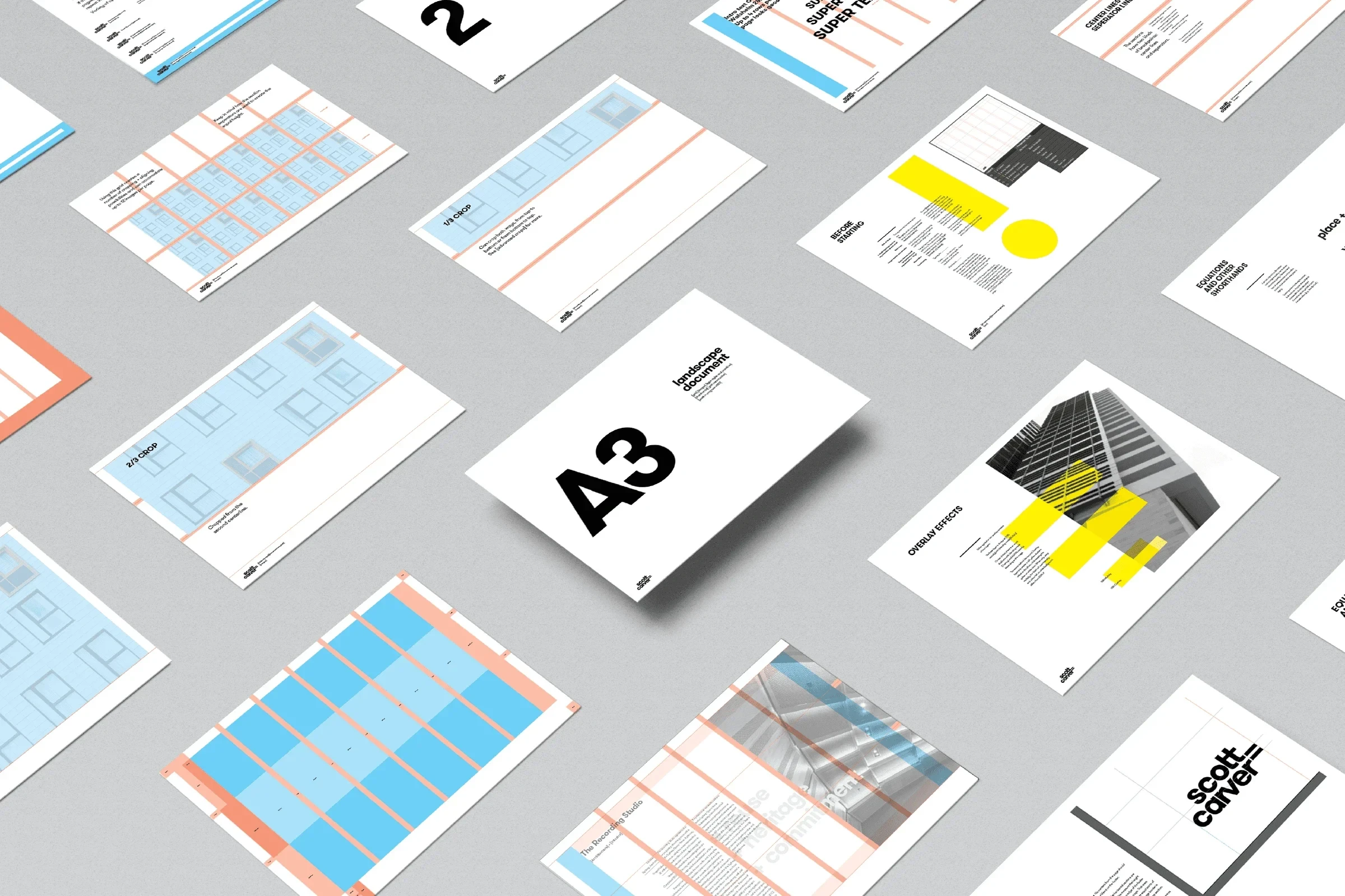
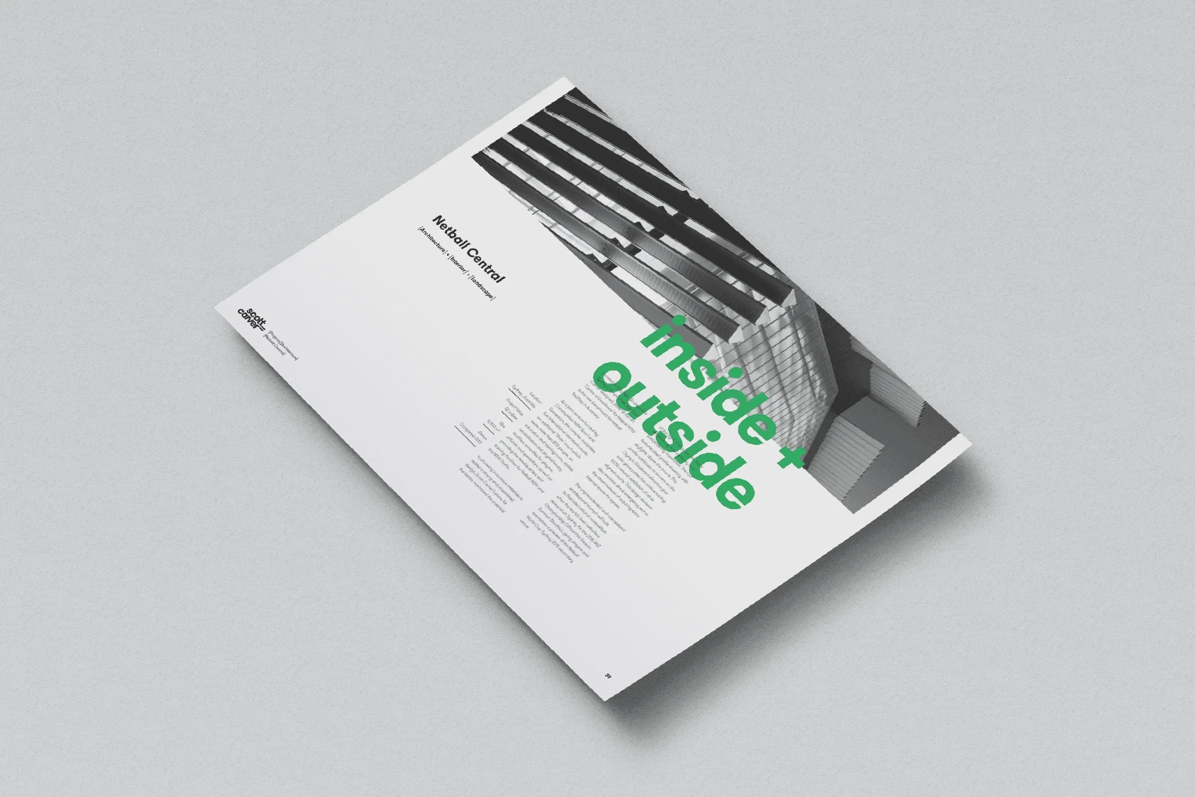
A predominantly black-and-white palette supported its textual character. Selective colour acted as punctuation, drawing attention to particular ideas and interactions, while an adaptable grid gave different kinds of content a consistent structure.
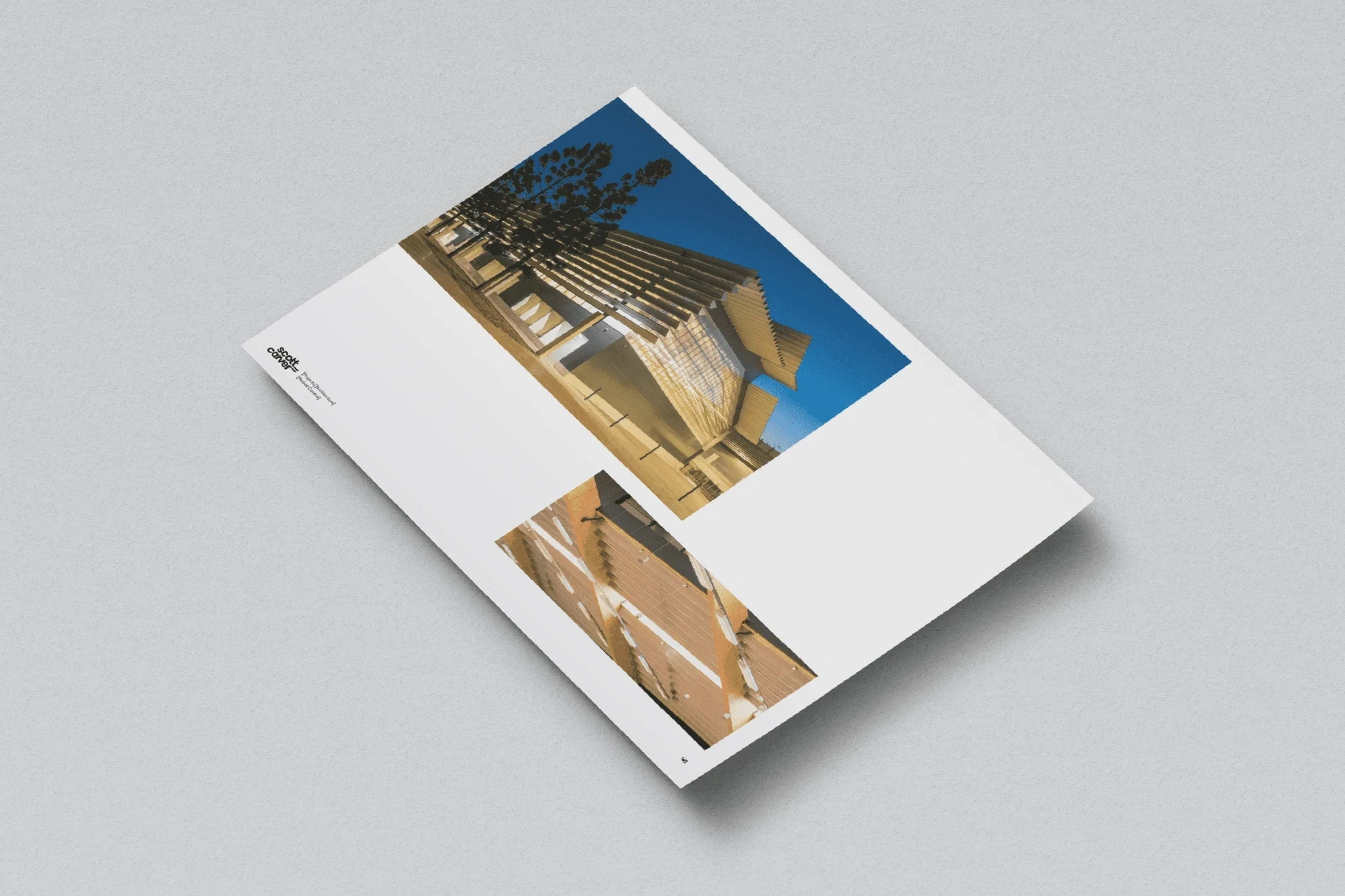
The system was designed for the architects and designers within the practice to use themselves. It gave them a shared framework for presenting projects, communicating their thinking and maintaining a recognisable voice across the organisation’s work. The identity remained in use from 2015 until the practice became Studio.SC in 2024.
Credits
Tanel August Lind – Design, Motion
Tim Kliendienst – Design
Penny Bowring – Strategy
Like this project
Posted Apr 1, 2025
Identity design and motion at Alphabet for Scott Carver: a distinctive visual system the practice could use itself, in use from 2015 to 2024.
Likes
1
Views
13
Timeline
Jan 1, 2015 - Jan 2, 2015
Clients
Scott Carver