Art & About Sydney

Tanel August Lind


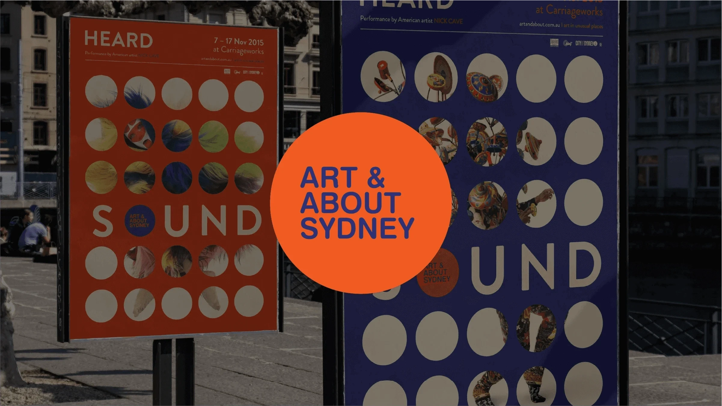
Art & About puts temporary art into Sydney’s public spaces. The programme changes through the year, so the identity had to give each event its own character while still making the whole thing recognisable.
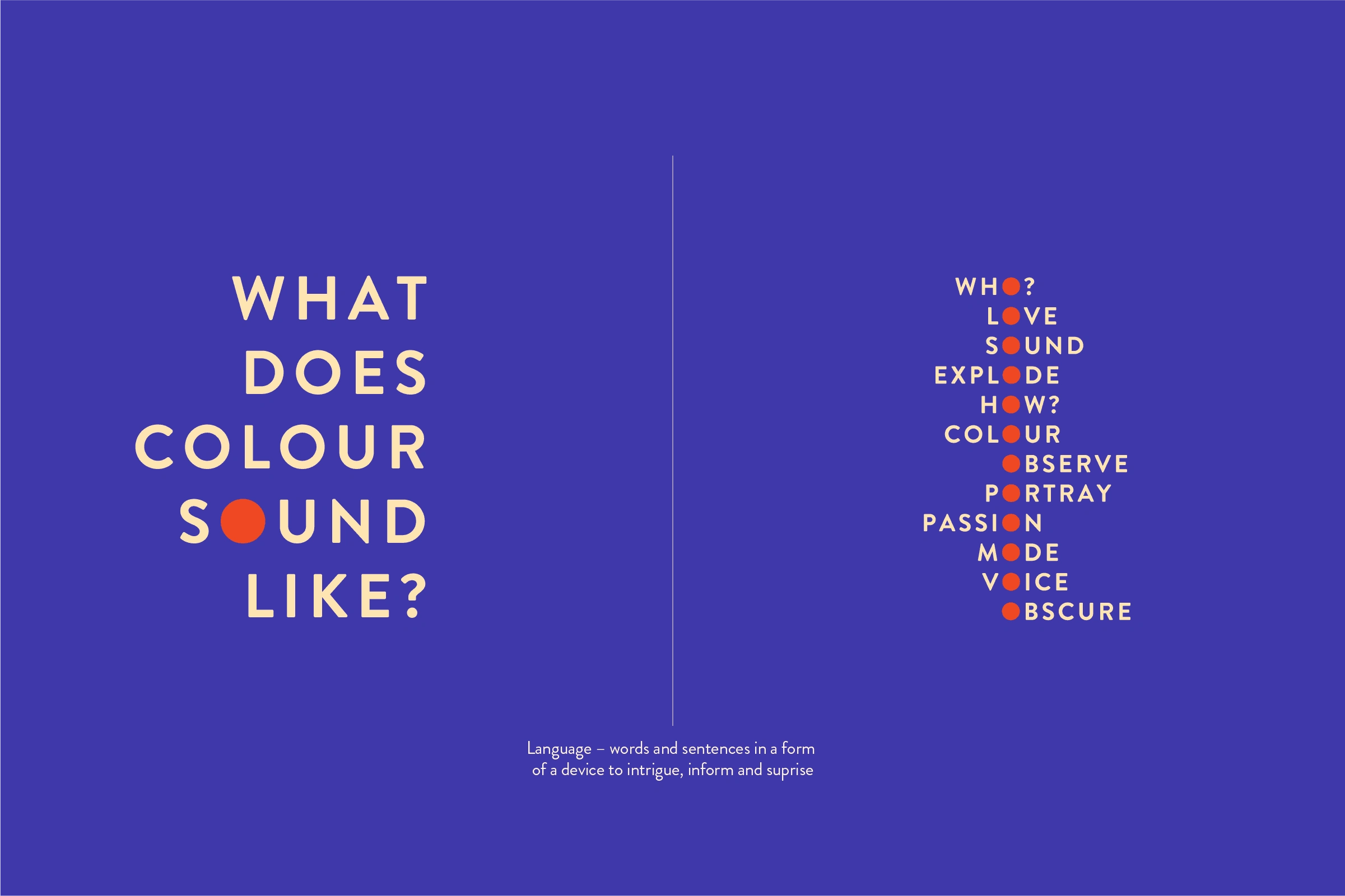
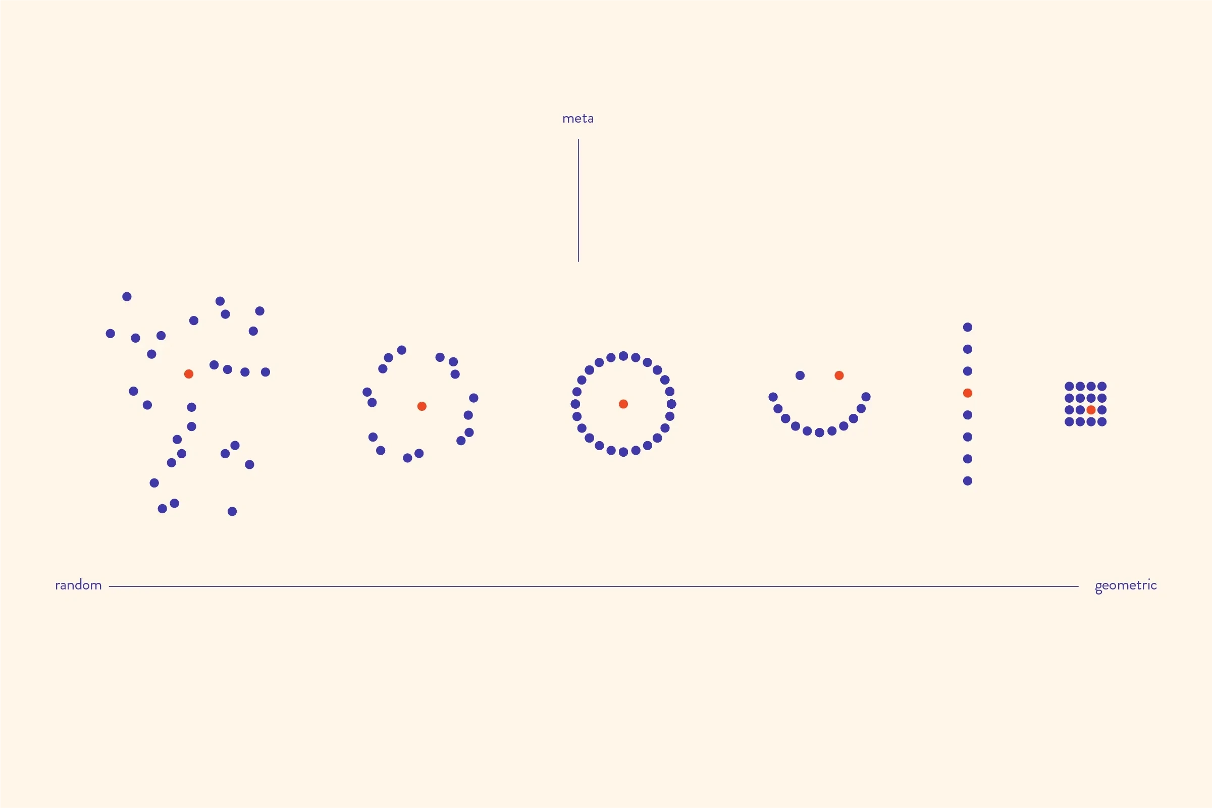
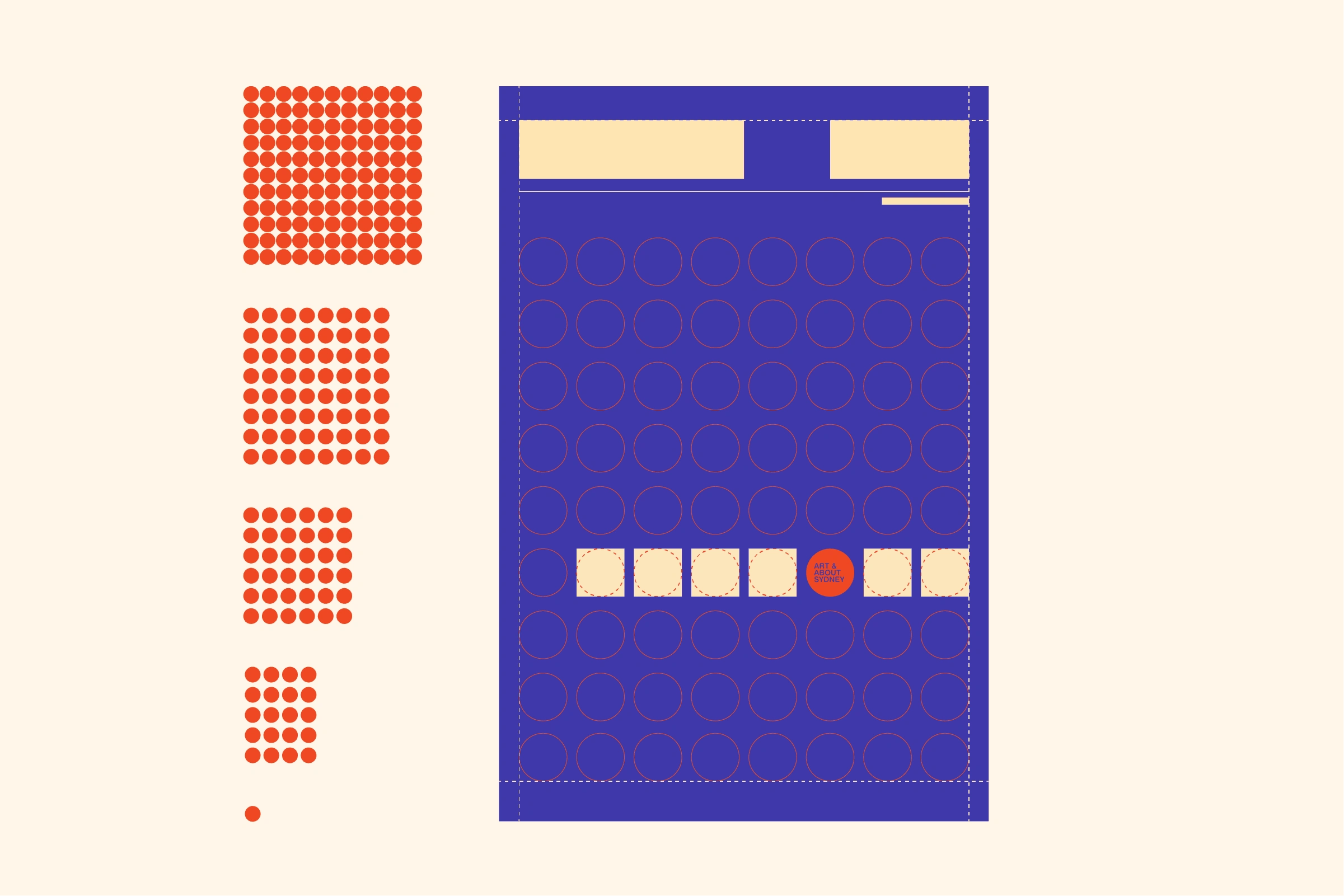
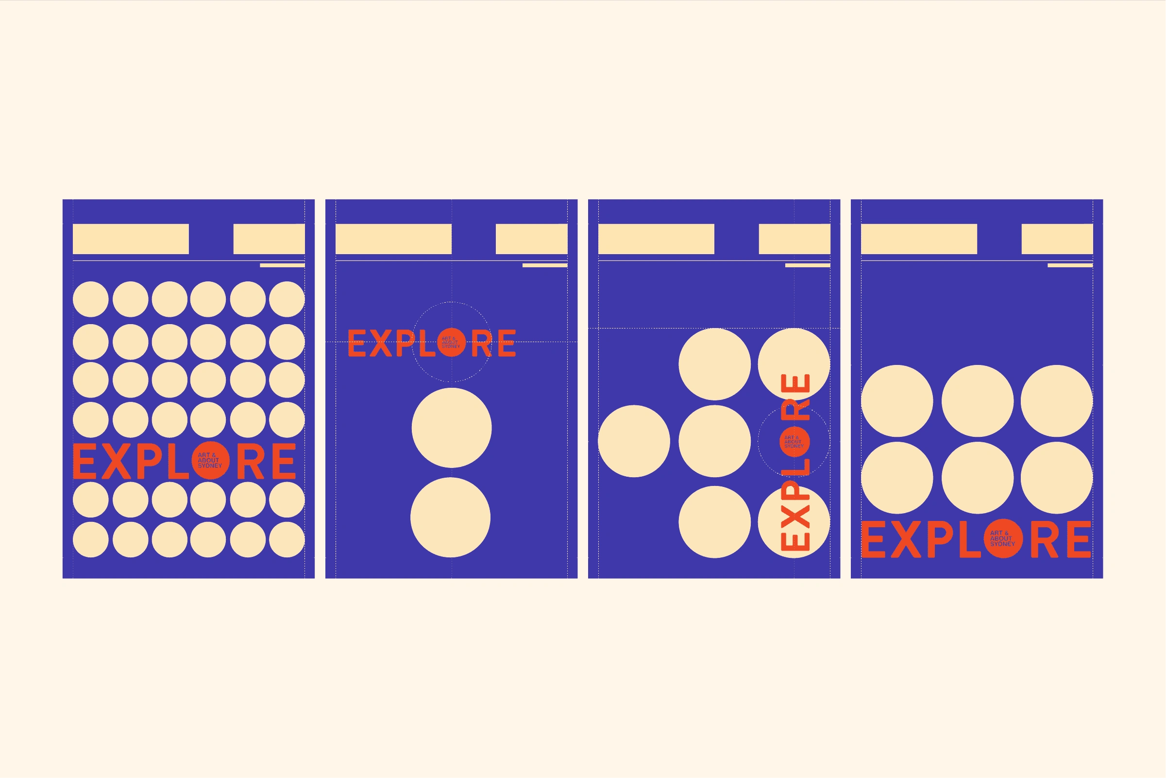
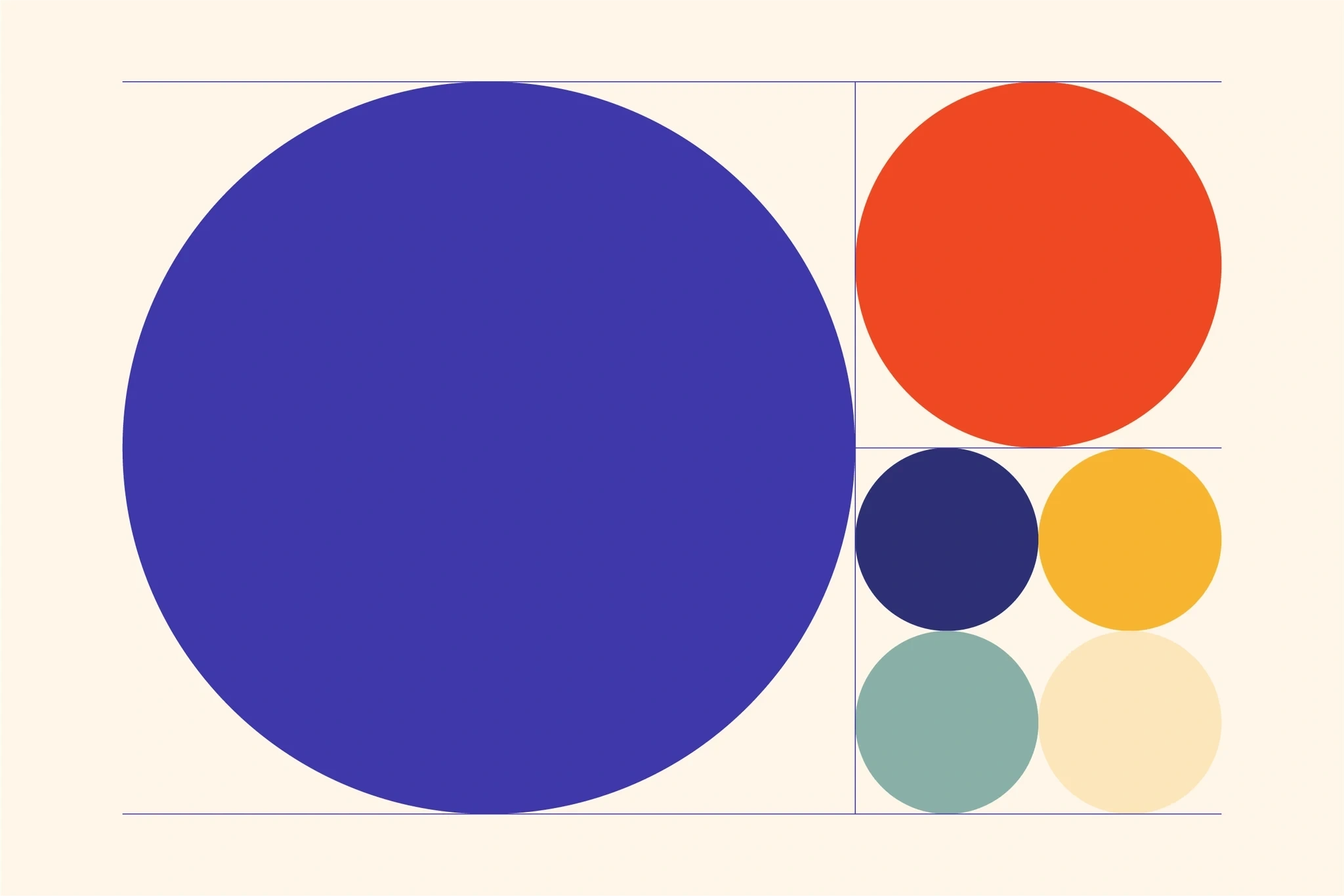
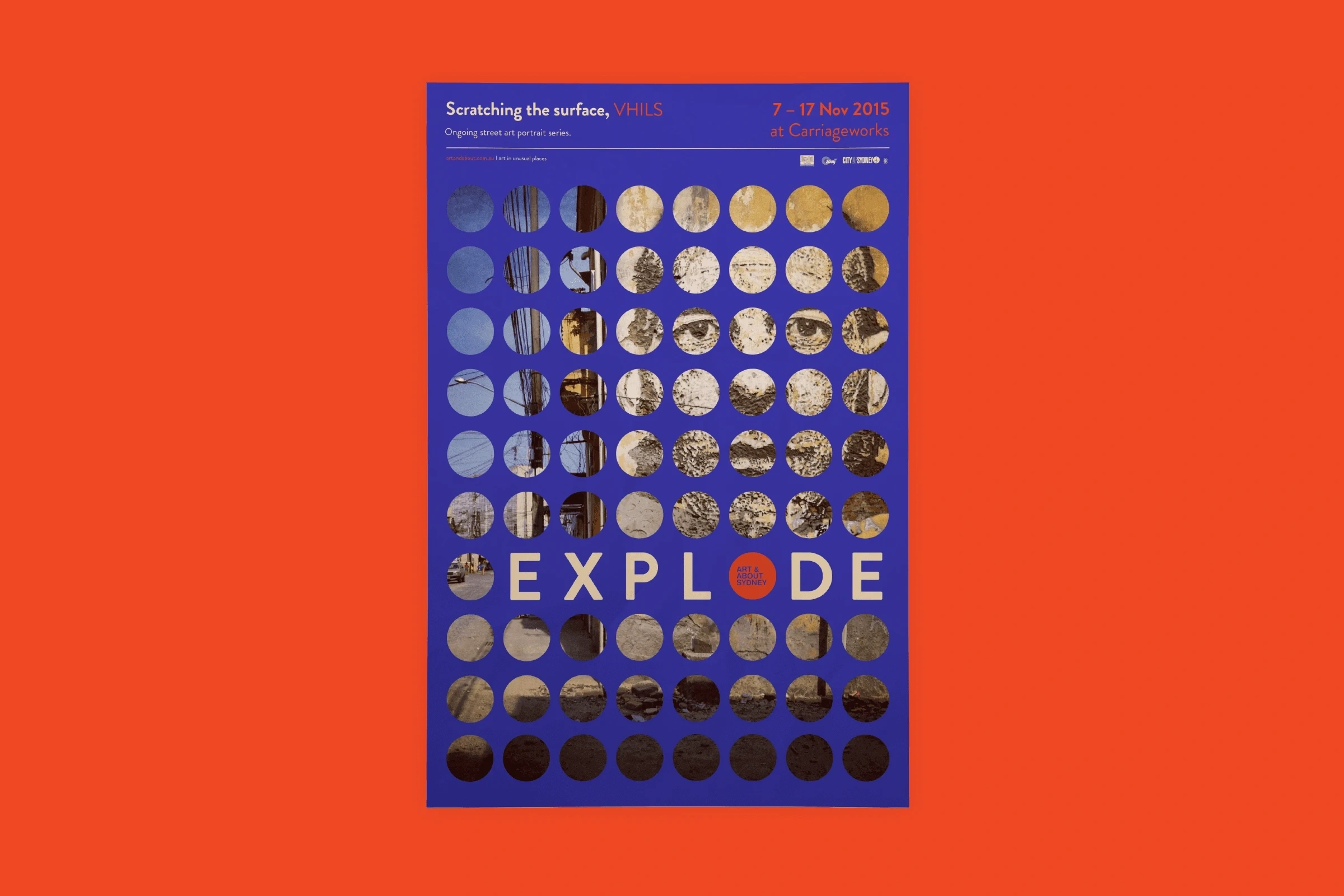
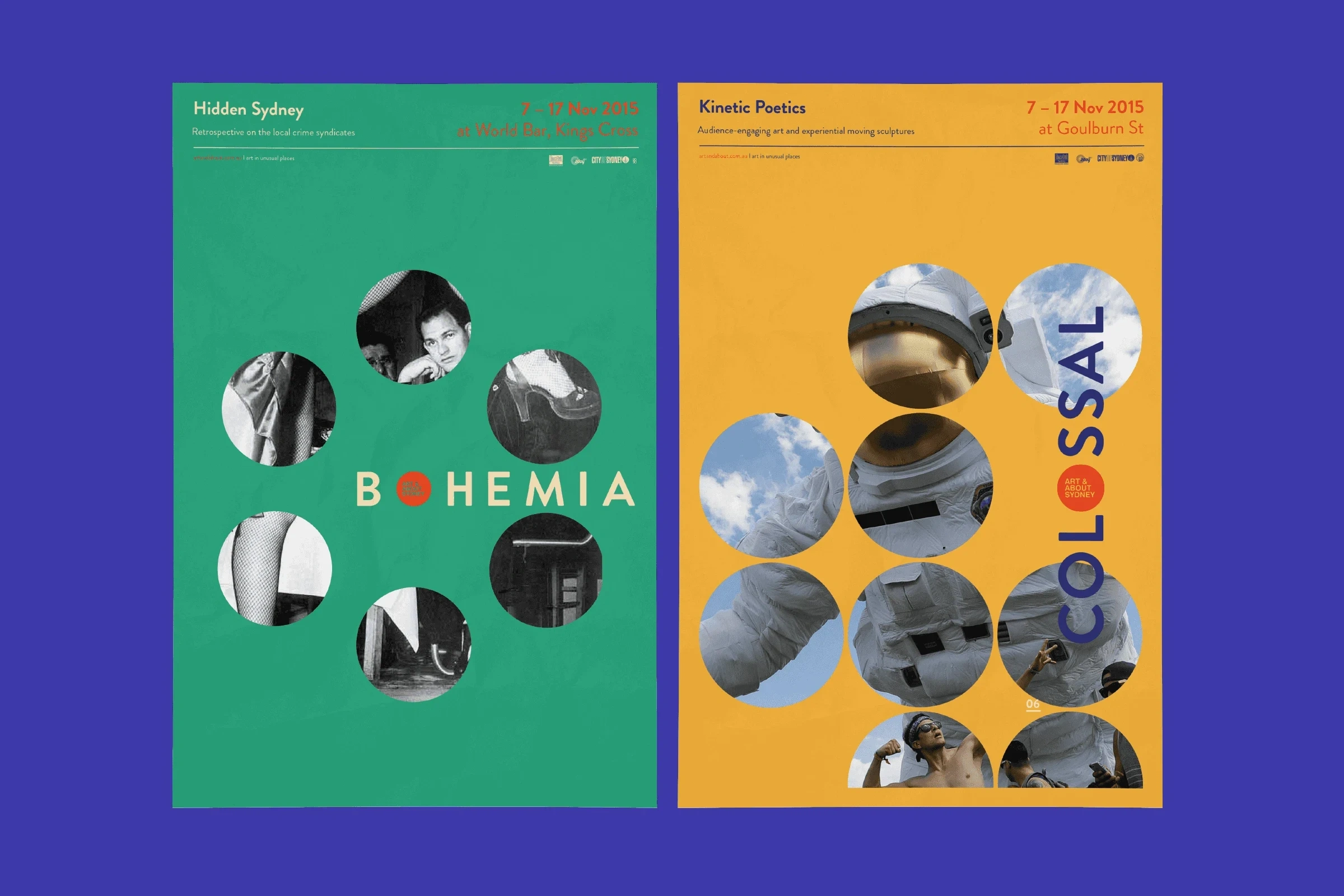
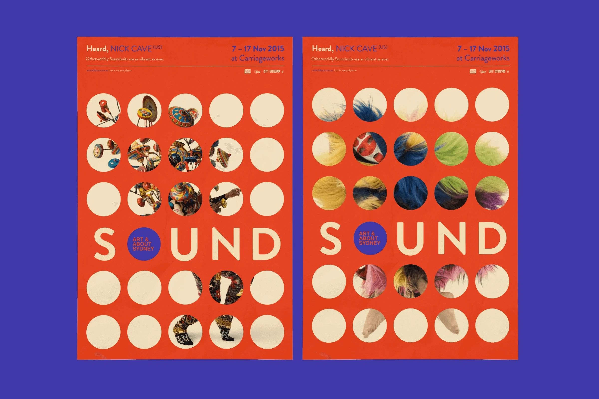
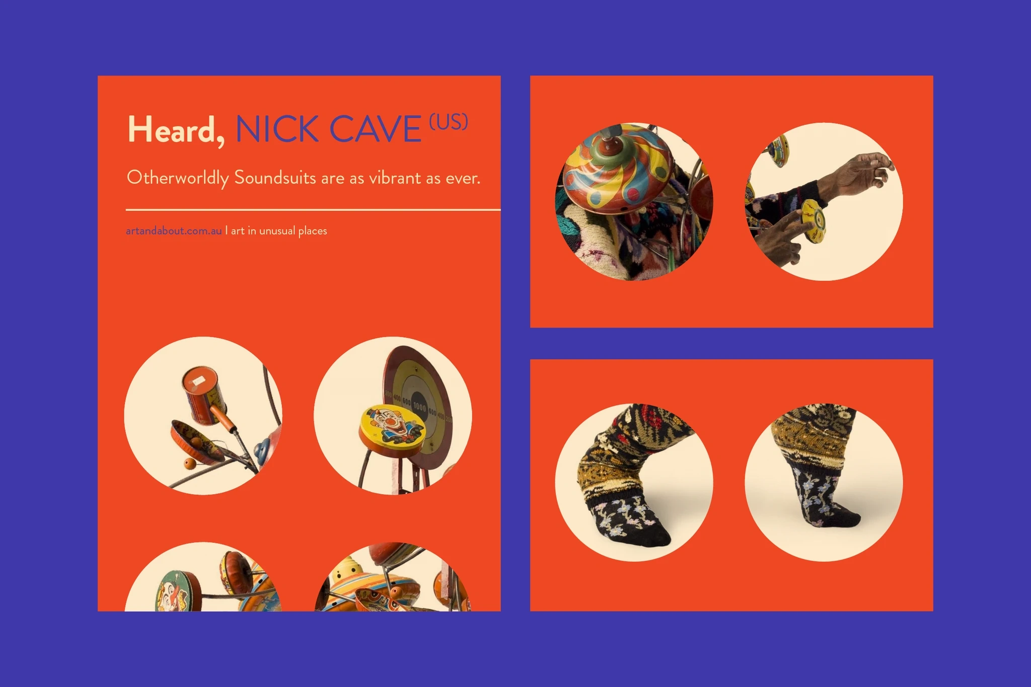
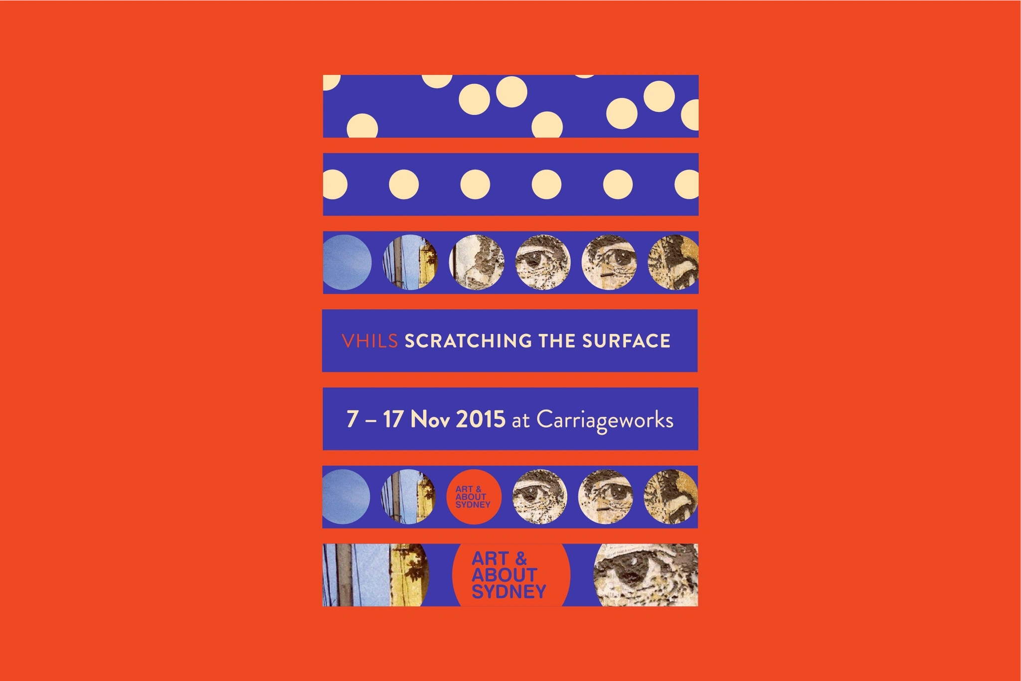
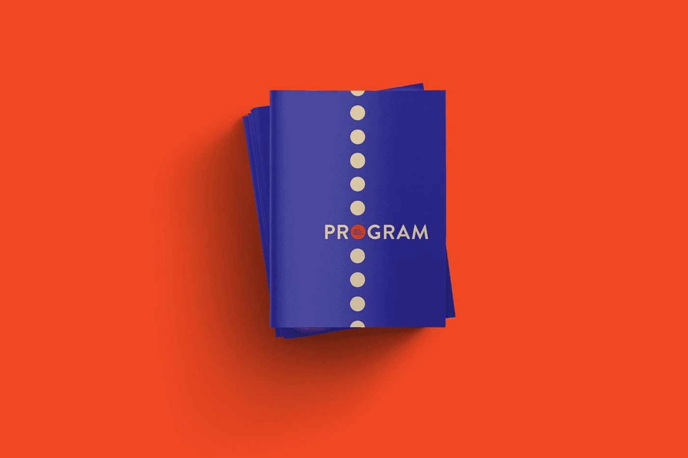
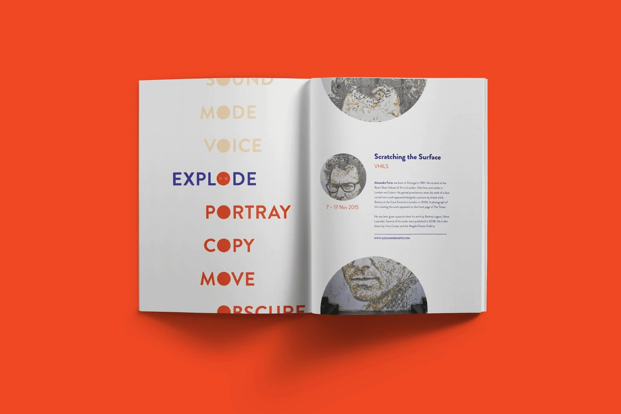
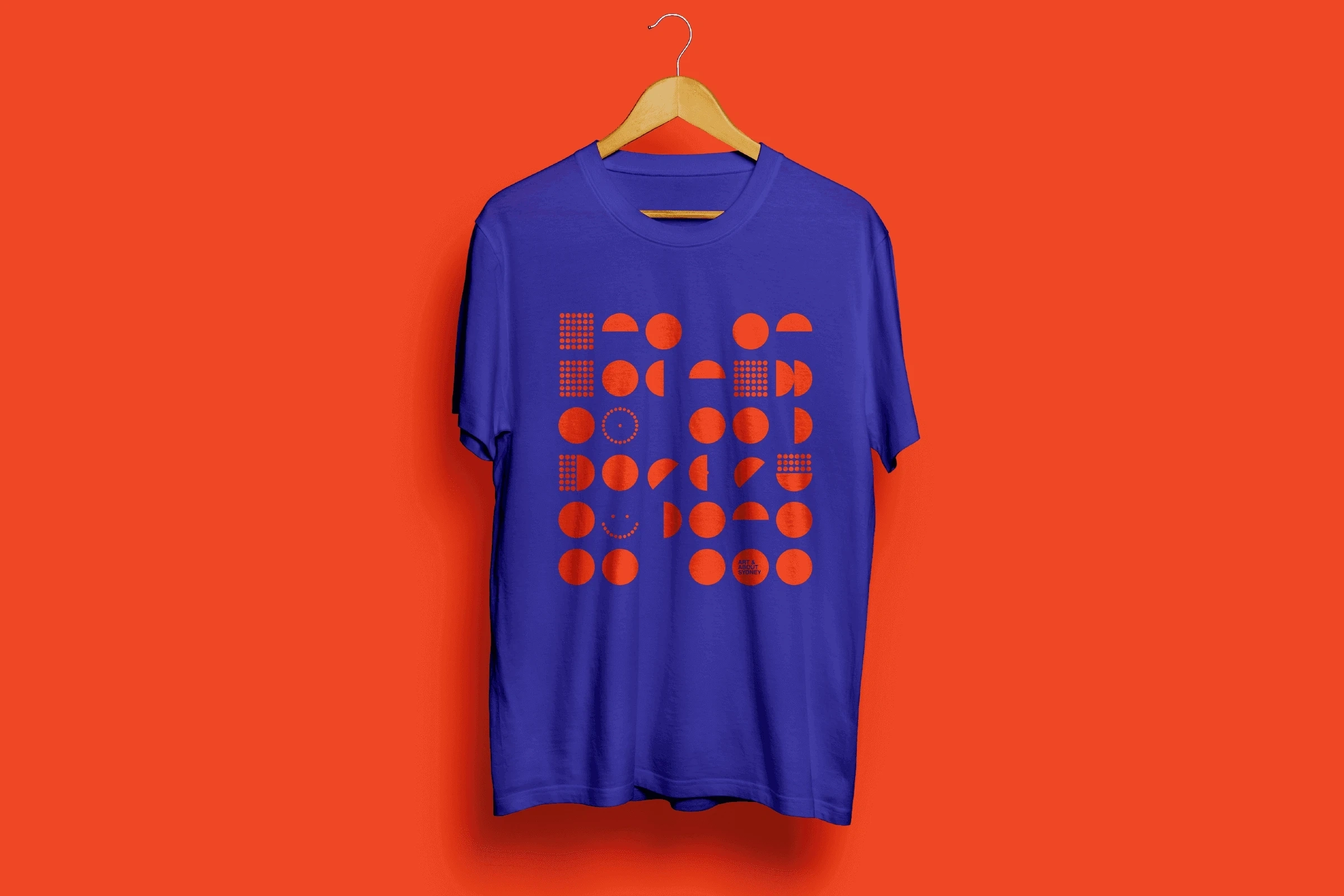
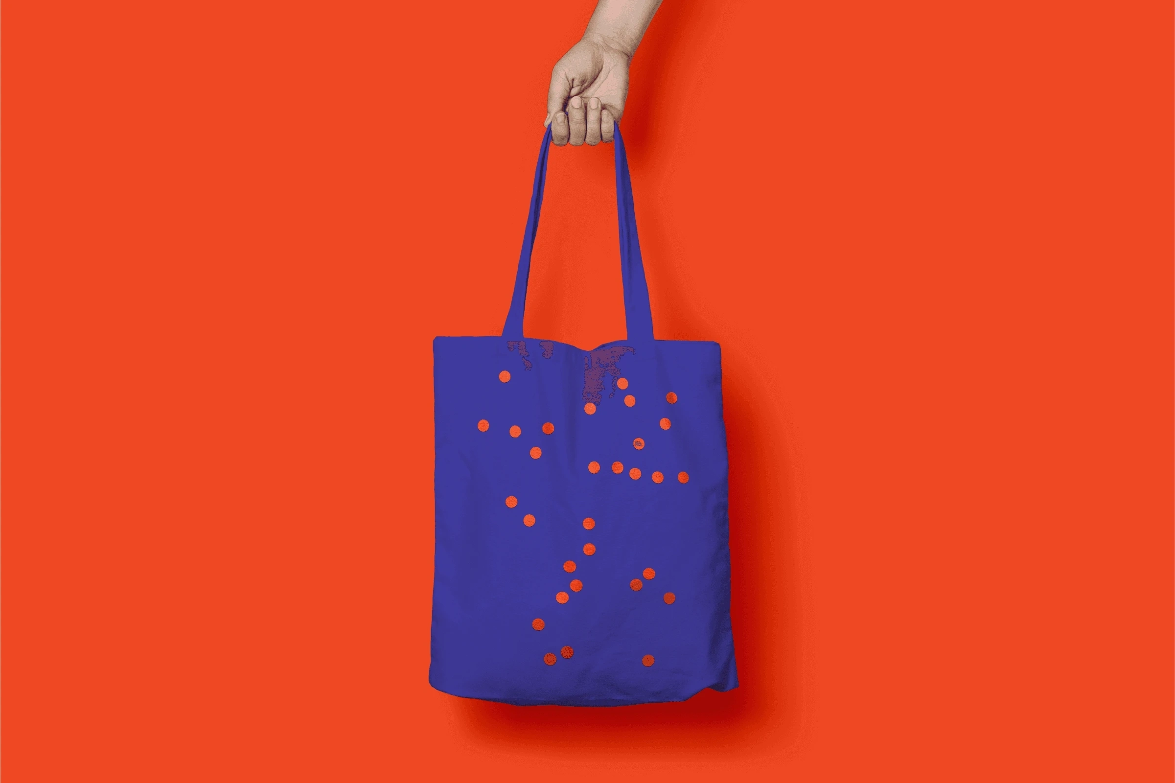
At Alphabet, we built on the existing mark and made a system that could flex with different artworks, images and tones. Language and circular forms became the two main tools.
The words did more than label things. They asked questions, introduced ideas and invited people in. Circles framed photographs, made patterns and helped organise content as the programme moved on.
It gave the team a small kit of parts they could reuse as new events arrived, with enough continuity to hold the programme together. I worked on the design and motion with Tim Kliendienst.
Credits
Tanel August Lind – Design, Motion
Tim Kliendienst – Design
Made at alphabetstudio.co
https://www.ta-lind.com/artabout
Like this project
Posted Apr 1, 2025
At Alphabet, I helped evolve Art & About’s identity for a changing public art programme, using language and circular elements to connect its events.
Likes
2
Views
14
Timeline
Jan 1, 2015 - Jan 2, 2015
Clients
City of Sydney