Terra Merita Product Label Design
The Story Behind
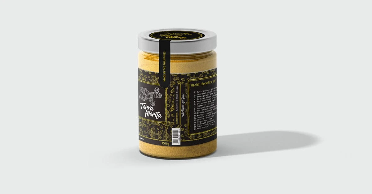
The challenge is to design a premium and elegant jar for Terra Merita, their new line of high-end culinary turmeric powder. The target audience is health-conscious individuals who appreciate high-quality ingredients and sophisticated aesthetics.
My objectives are as follows:
Reflect Terra Goodies' brand identity of understated elegance and premium quality.
Utilize a black and yellow color scheme, with black as the primary background.
Subtly reference the product's name, "Terra Merita" (meaning "meritorious earth") through design elements.
Maintain functionality for easy storage and use.
The Solution
The initial concept focused on a clean and sophisticated design. The primary color was black, creating a premium backdrop for the product. To introduce pops of yellow, the Terra Merita name was prominently displayed in a bold yellow font. However, the client felt the design lacked a touch of richness that would truly elevate it to a premium level.
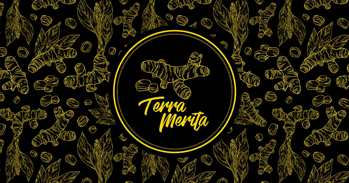
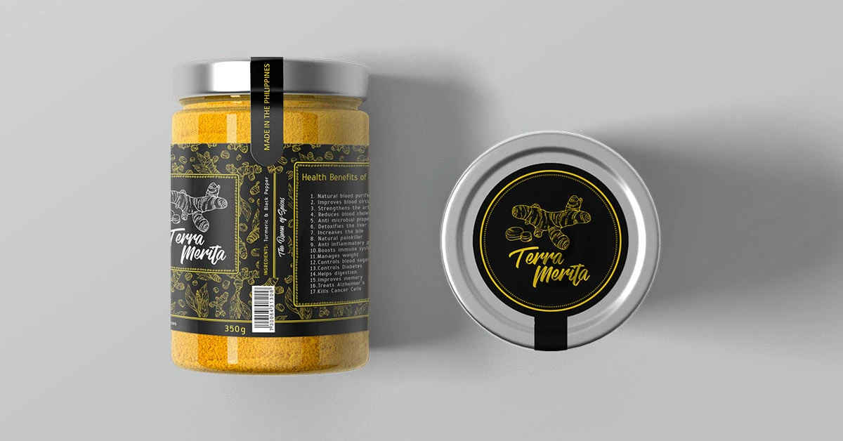
I explored incorporating a subtle gold turmeric art pattern throughout the black background. While initially hesitant about adding another element, I found that a delicate, almost transparent, gold pattern depicting stylized turmeric roots did indeed add a touch of luxury without overwhelming the overall elegance. This subtle pattern also subtly referenced the “meritorious earth” concept by visually tying the product to its natural origin.
The Result
The final design resonated perfectly with the client. The black background remained the dominant force, allowing the yellow branding and gold pattern to shine as sophisticated accents. The final jar exuded a sense of understated elegance that perfectly aligned with Terra Goodies’ brand identity while conveying the premium quality of the Terra Merita turmeric powder.
Like this project
Posted May 26, 2024
Terra Goodies seeks a design for Terra Merita, their new turmeric powder line, symbolizing "meritorious earth" and reflecting turmeric's rich color.

