Oaten Brand Identity and Packaging Design
Aliza Munir
About Oaten
Oaten is a modern oat based brand designed to make healthy mornings feel exciting, bold, and full of energy. The brand brings together clean ingredients and strong flavour combinations with a visual identity that feels fresh and contemporary.
At its core, Oaten is about starting the day feeling good, fuelled, and ready.

The Challenge
The goal for Oaten was to create a brand identity that stands out in the health food space while still communicating simplicity and quality.
The challenge was to:
• Create a bold, eye catching identity that feels energetic but still clean
• Build a system that works across multiple flavours and product formats
• Design packaging that feels modern, fun, and instantly recognisable on shelf
The Solution
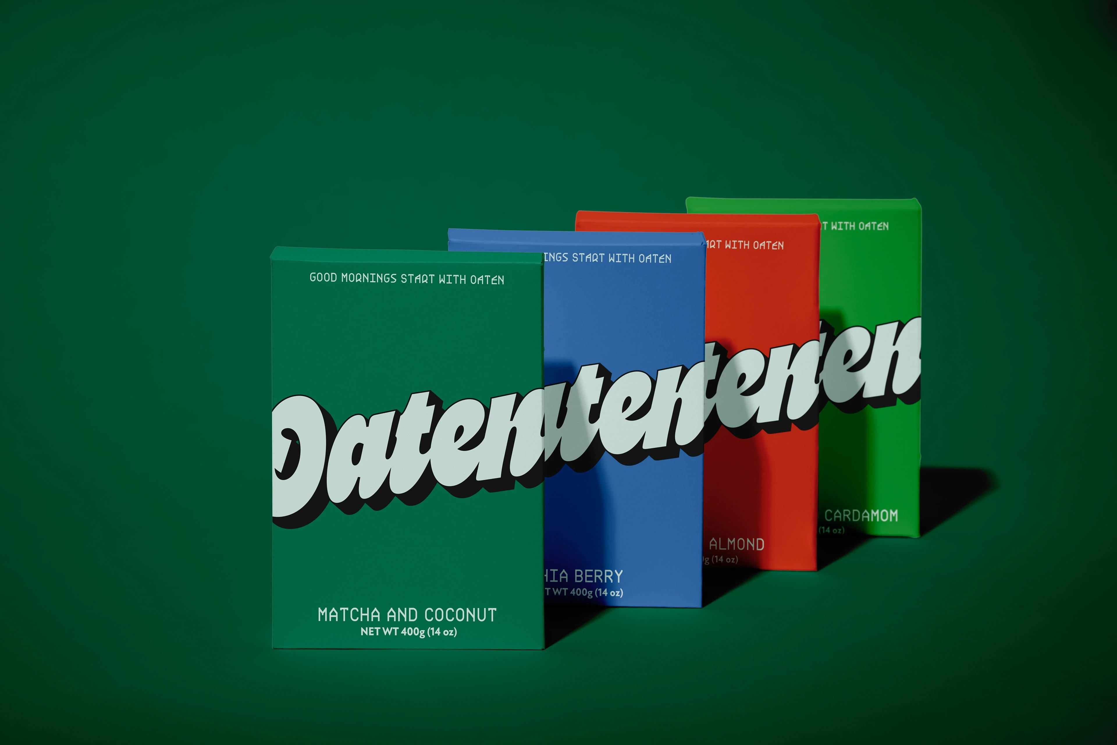
The identity for Oaten was built around strong typography, vibrant colour blocking, and a confident, contemporary layout system.
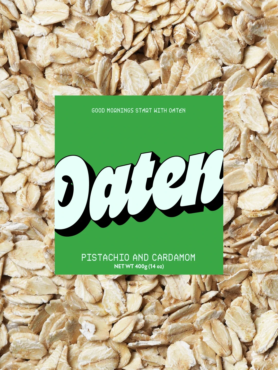
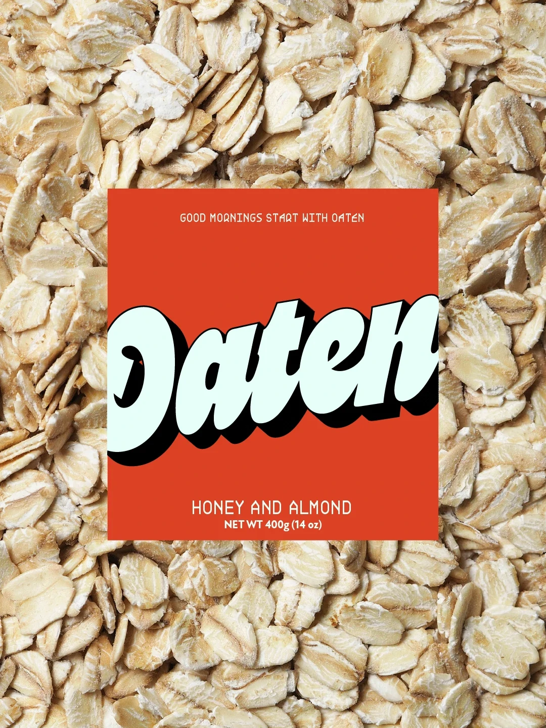
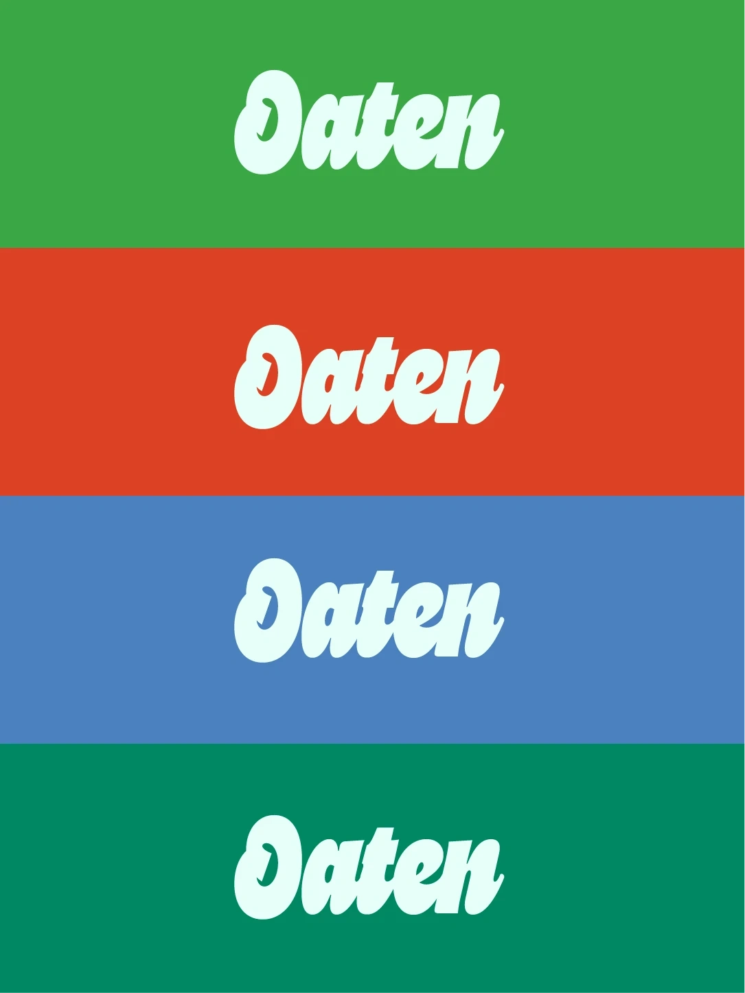
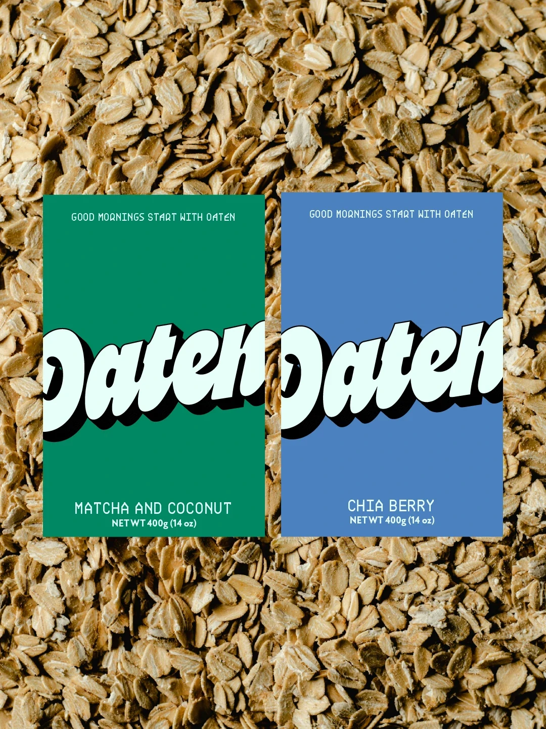
The logotype uses thick, rounded letterforms paired with a bold drop shadow, giving the brand a sense of depth, movement, and personality. This makes the name highly recognisable and impactful from a distance.
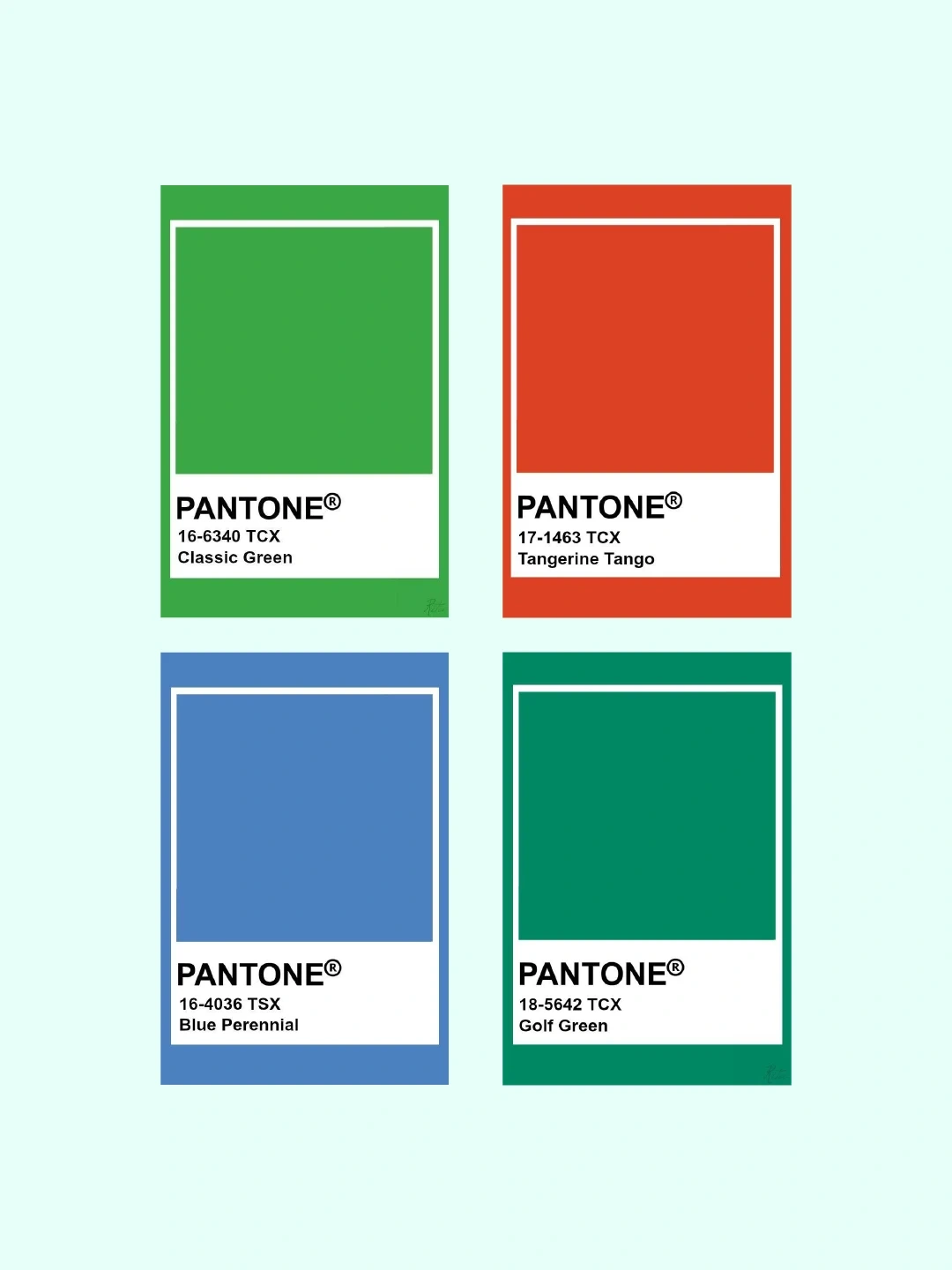
The colour palette uses bright greens, rich blues, and warm orange tones to differentiate flavours while maintaining a cohesive system. These colours reflect freshness, energy, and variety.
Clean, minimal text layouts allow product names and flavour combinations to remain clear and easy to read, balancing the bold visual style with clarity and function.
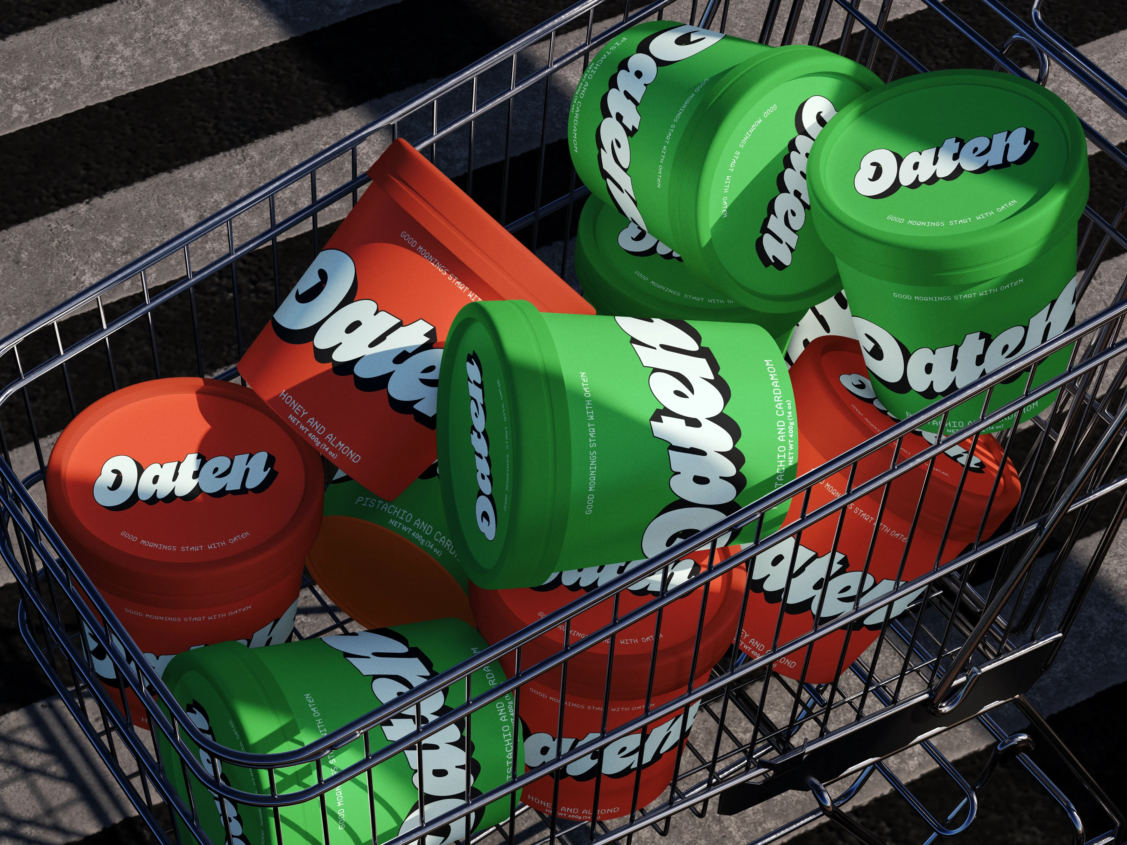
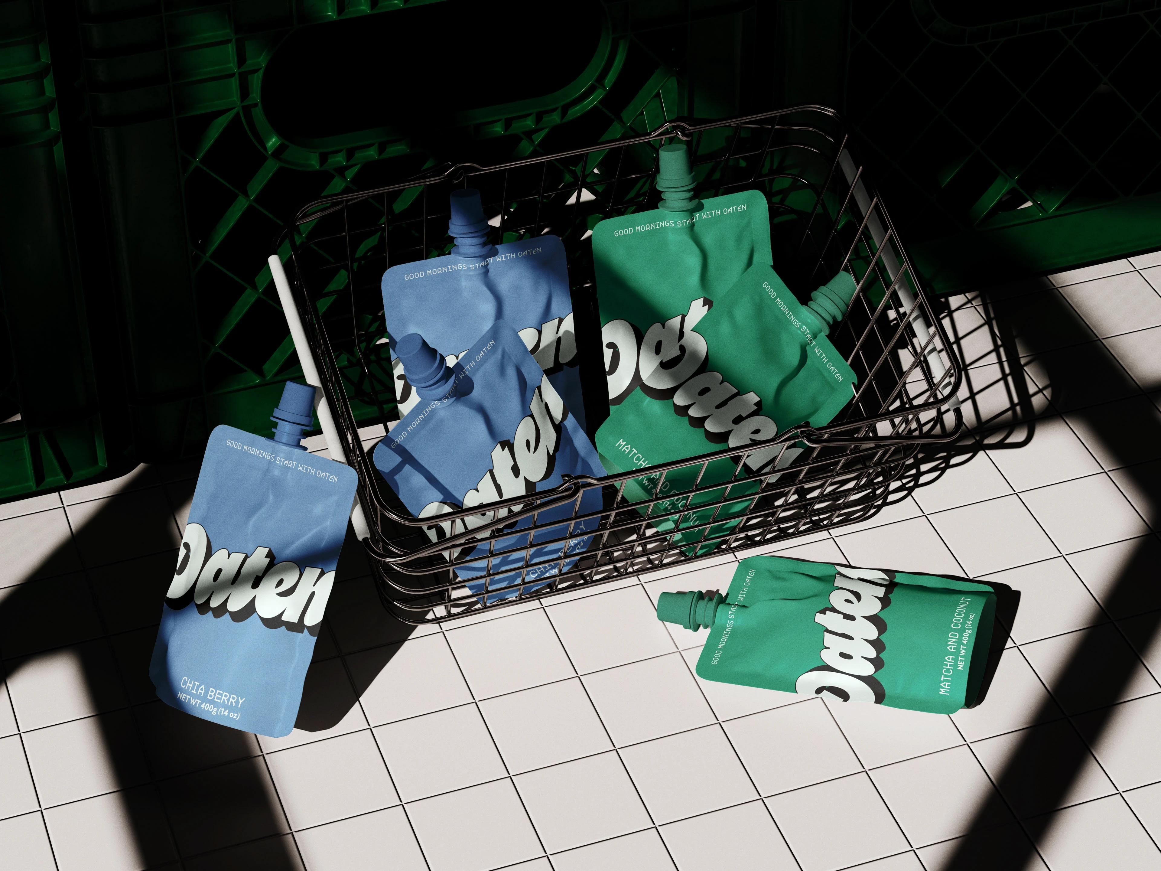
Packaging and Brand Experience
The packaging system for Oaten is designed to be flexible, bold, and retail ready.
Each flavour uses a distinct colour block paired with consistent typography and layout, making the range easy to navigate while still feeling visually exciting. The system works across pouches, boxes, and retail displays without losing consistency.
From shelf presence to product handling, every touchpoint reinforces the same energetic and modern brand experience.
Final Thoughts
Oaten transforms a simple breakfast staple into a bold, feel good brand that stands out in a crowded category.
If you are looking to build a brand that feels this strong and commercially ready, feel free to reach out.
Like this project
Posted Feb 27, 2026
I designed a bold oat brand for Oaten with vibrant packaging, strong typography, and a modern identity built around energy, flavour, and feel good mornings.
Likes
1
Views
3