Morrow Cereal Brand Identity and Packaging Design
Aliza Munir
About Morrow Cereal
Morrow Cereal is a playful breakfast brand designed to make mornings feel lighter, brighter, and more enjoyable. The brand combines feel good nutrition with a fun, energetic personality that turns a simple bowl of cereal into something to look forward to.
At its core, Morrow is about starting the day with positivity, colour, and a sense of ease.
The Challenge
The goal for Morrow Cereal was to create a bold, recognisable brand that stands out on shelves while still communicating health and simplicity.
The challenge was to:
• Build a vibrant identity that feels playful and energetic without looking childish
• Create packaging that is instantly recognisable from a distance
• Develop a flexible system that works across multiple flavours, retail formats, and brand touchpoints
The Solution
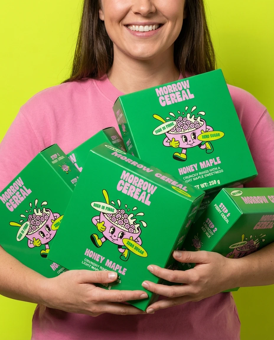
The identity for Morrow Cereal was crafted around strong colour contrast, friendly typography, and a character driven visual system.
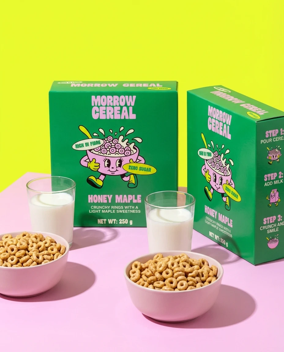
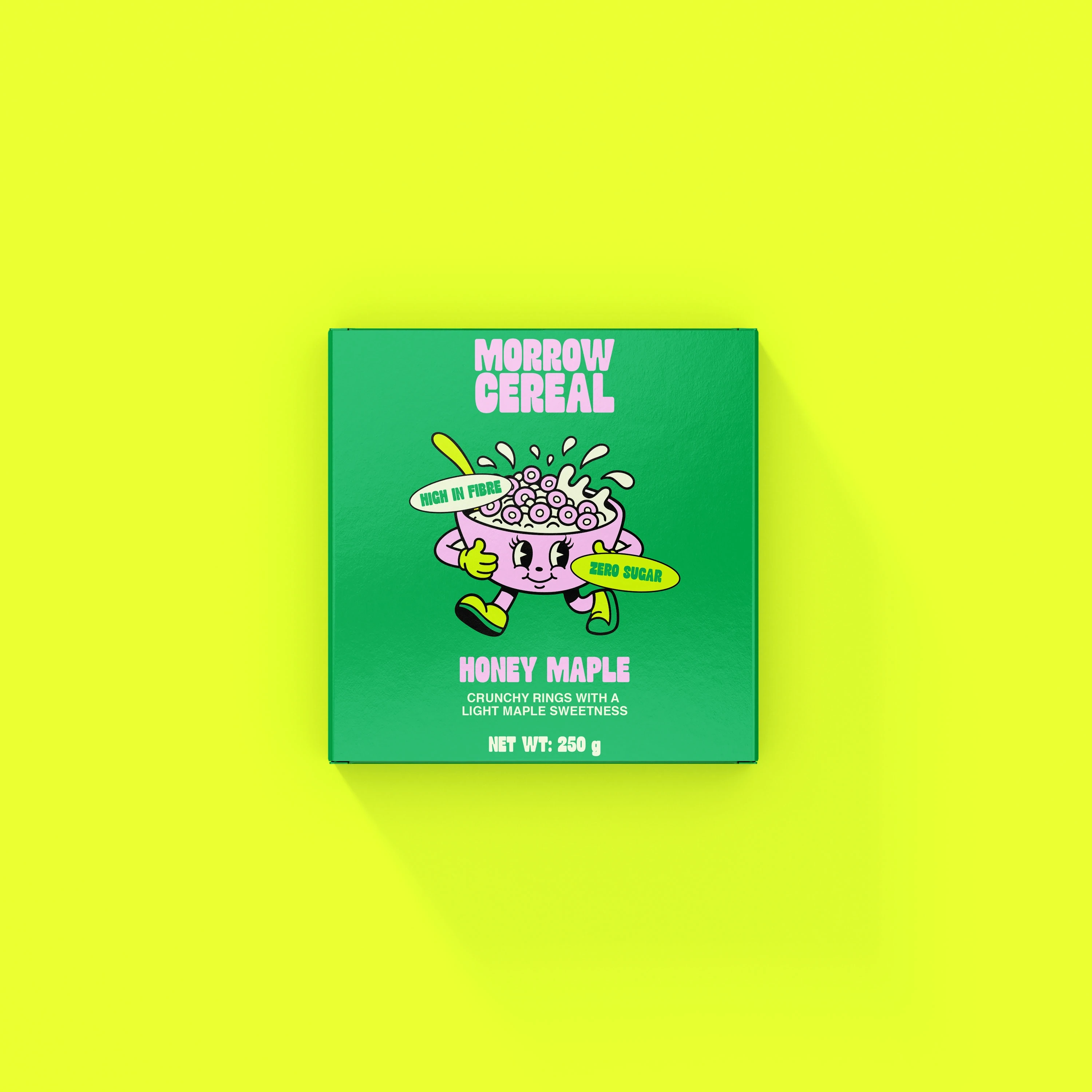
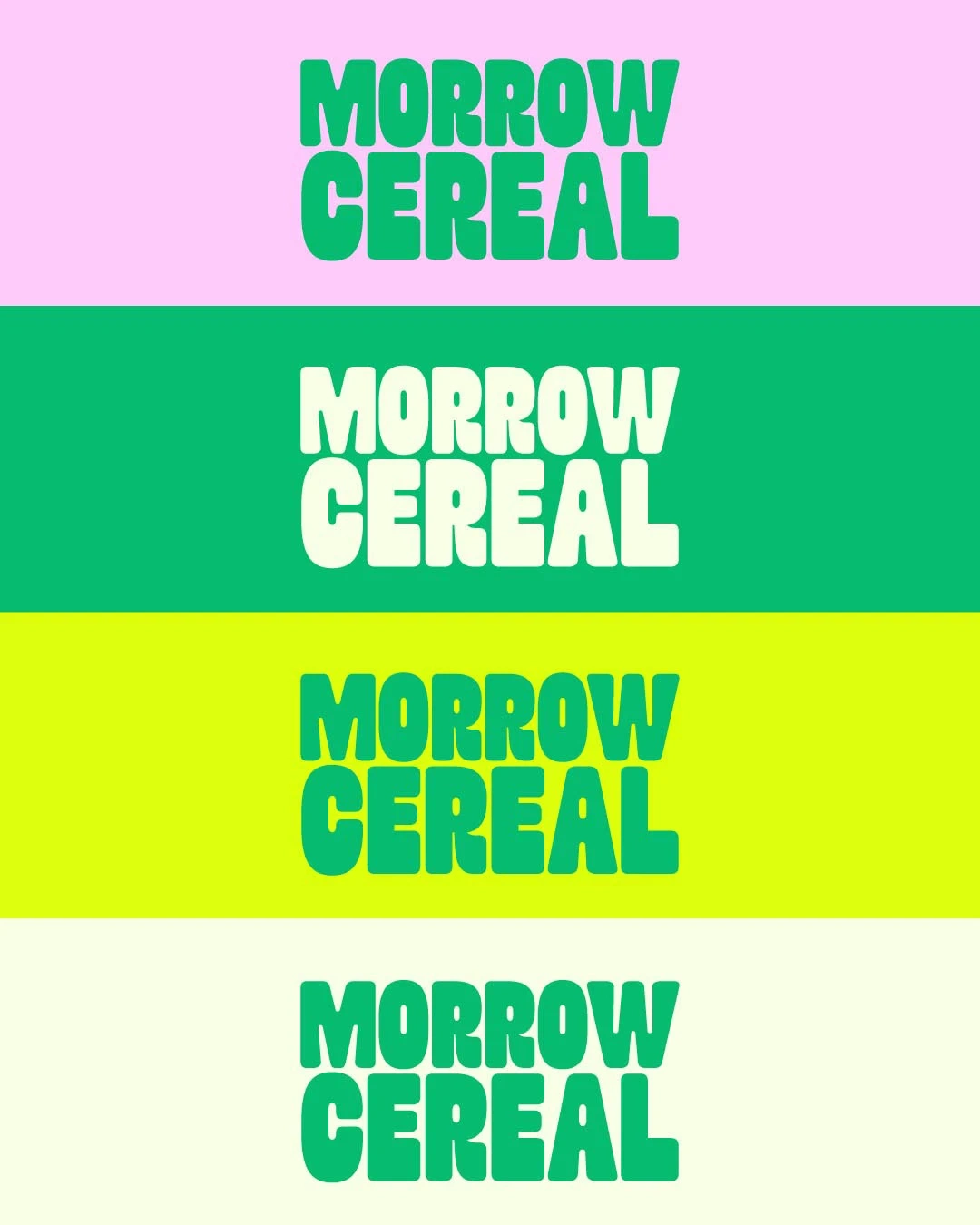
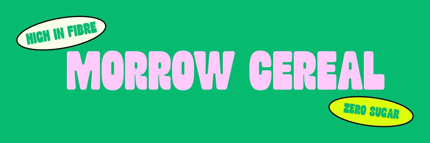
The logo uses bold rounded letterforms that feel confident, approachable, and highly legible in retail settings. The oversized type makes the brand name the hero while keeping the design clean and impactful.
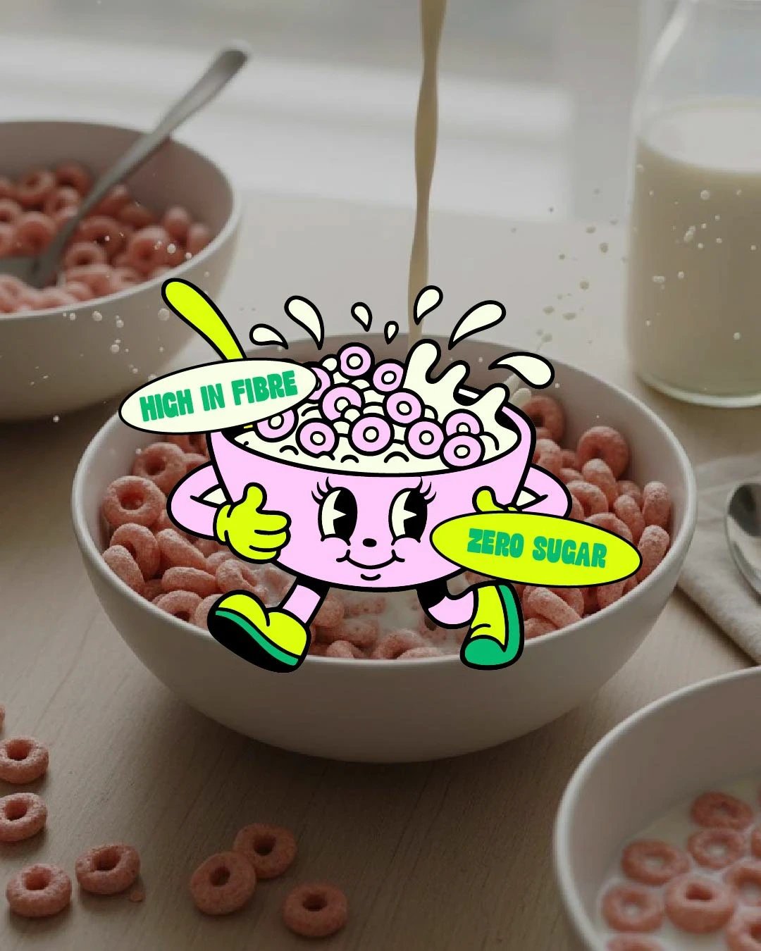
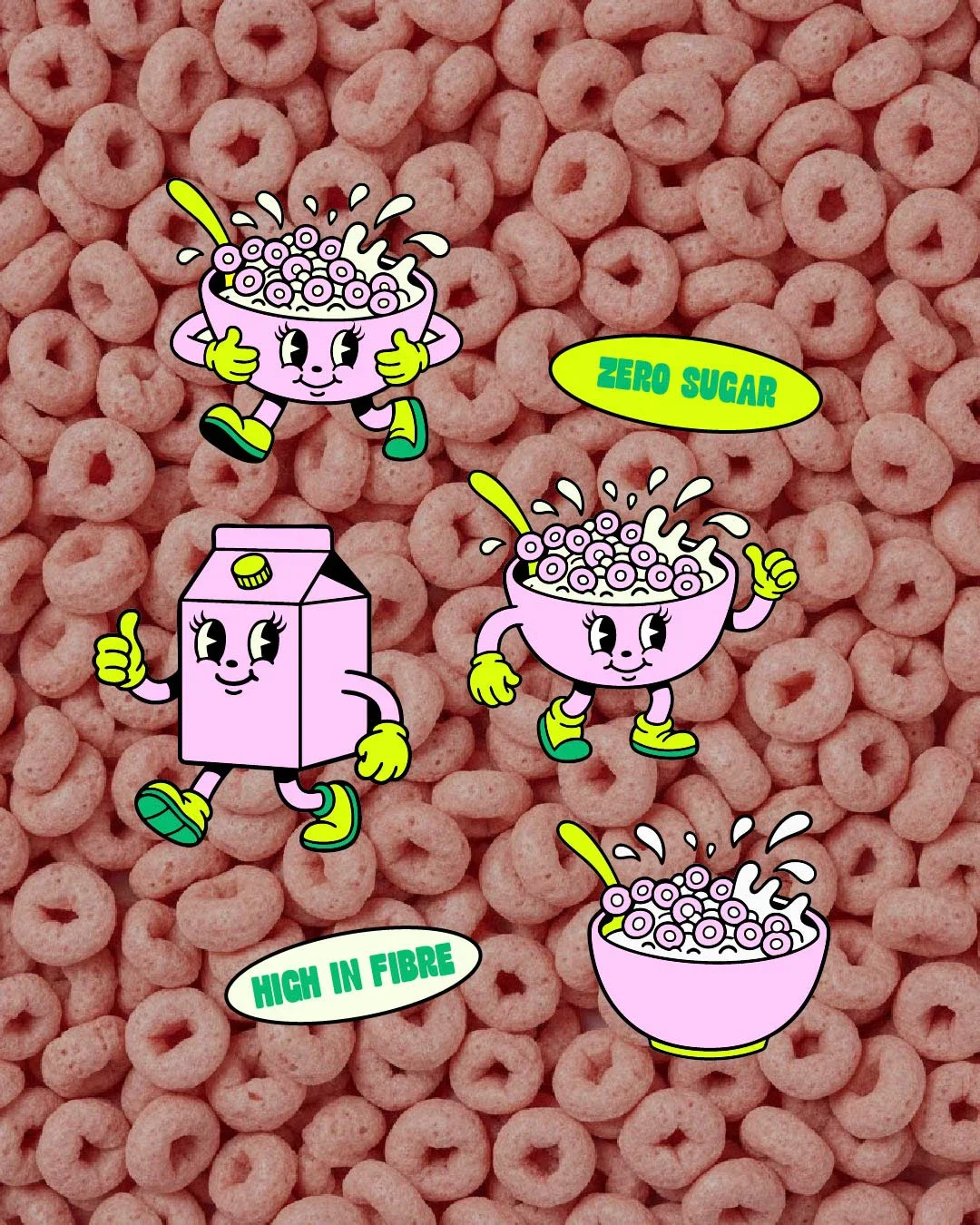
A custom illustrated cereal bowl character adds personality and movement to the brand. This mascot communicates energy and fun while reinforcing the idea of an enjoyable morning routine.
The colour palette combines rich greens with soft pinks and high energy yellow accents. This mix creates a fresh, modern look that stands out on shelf while still feeling clean and uplifting.
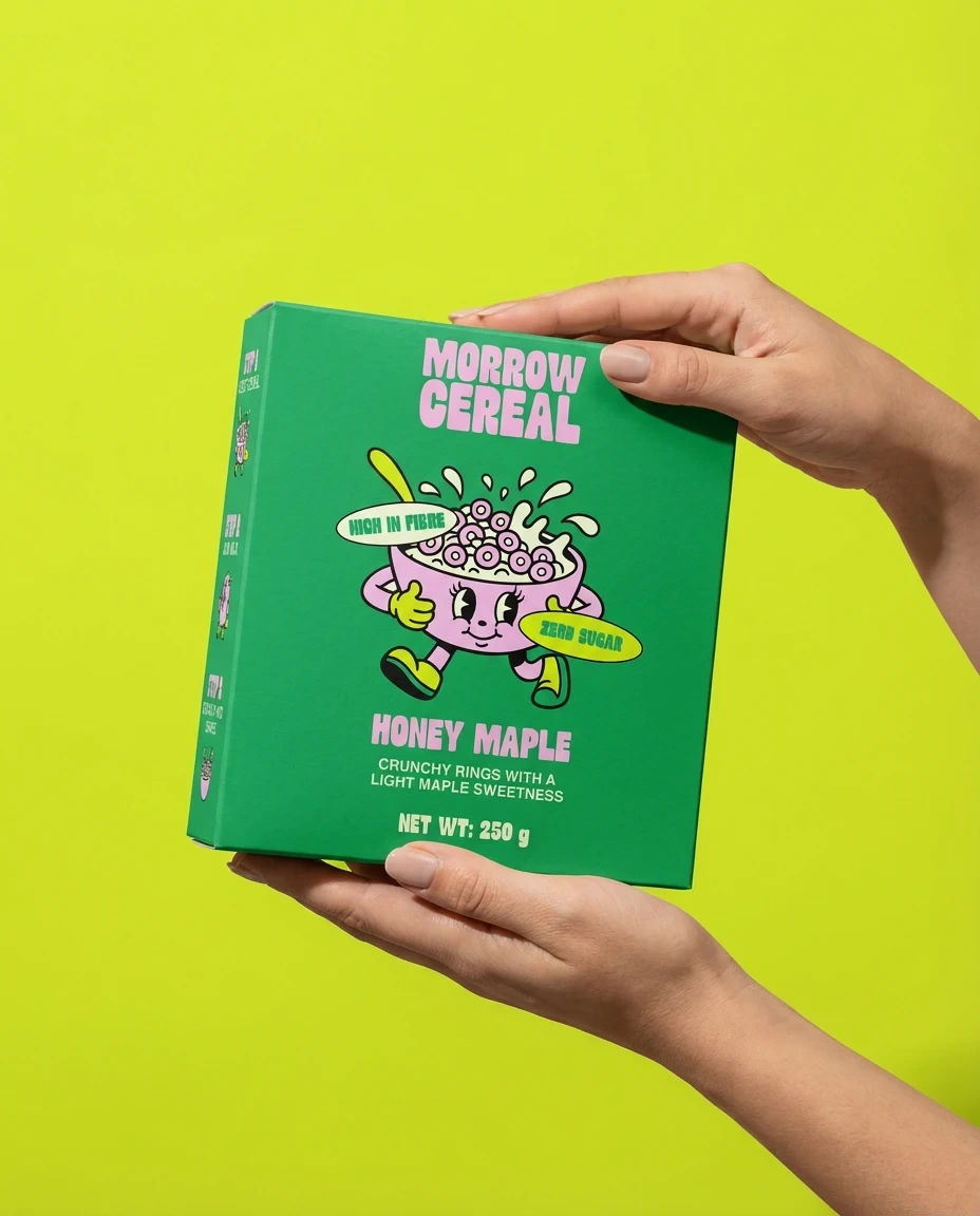
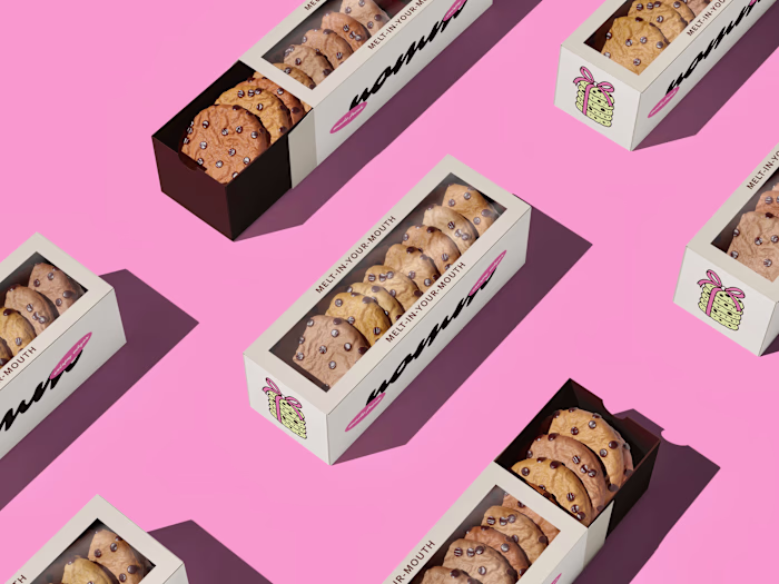
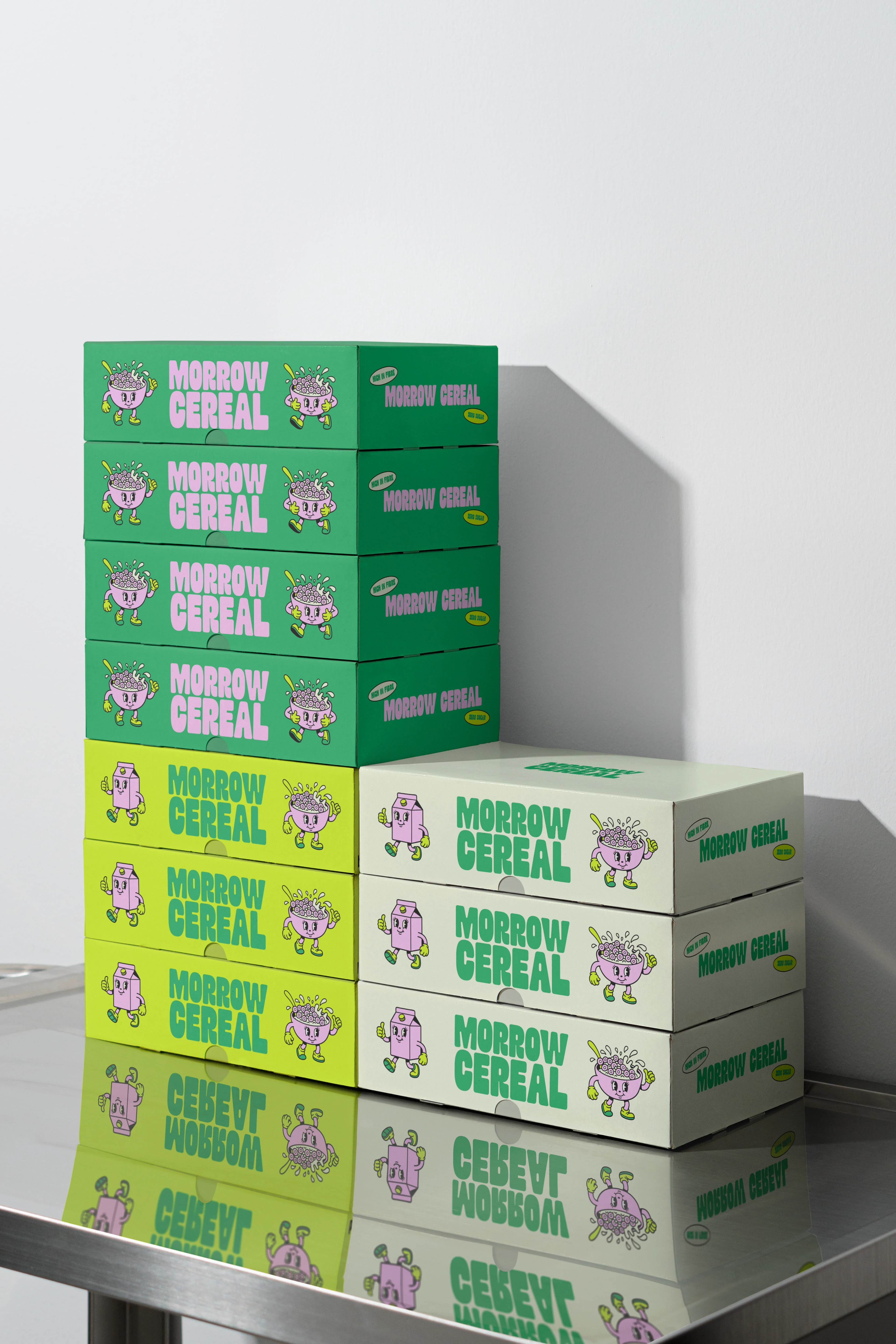
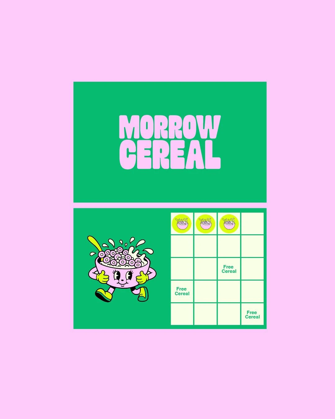
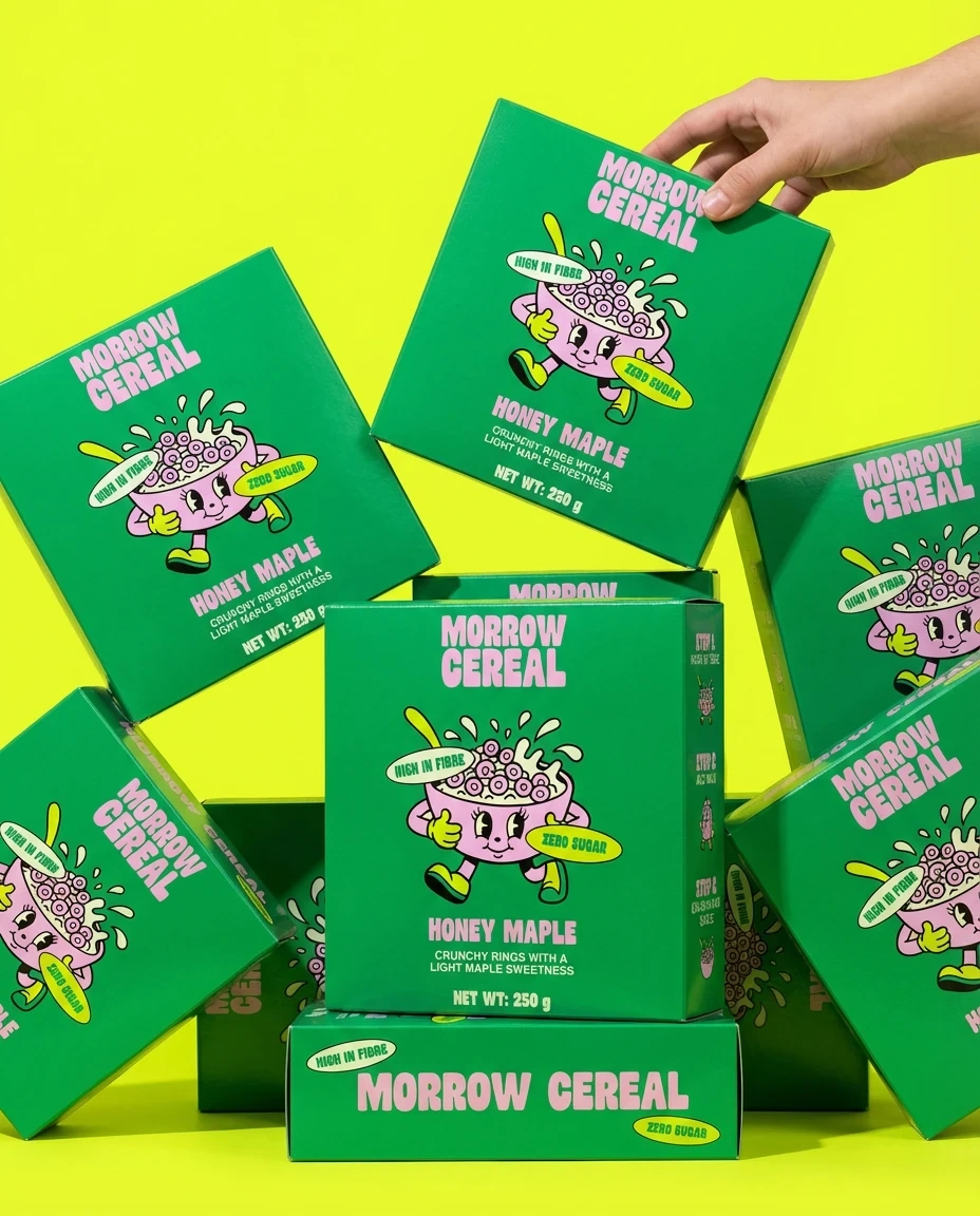
Packaging and Brand Experience
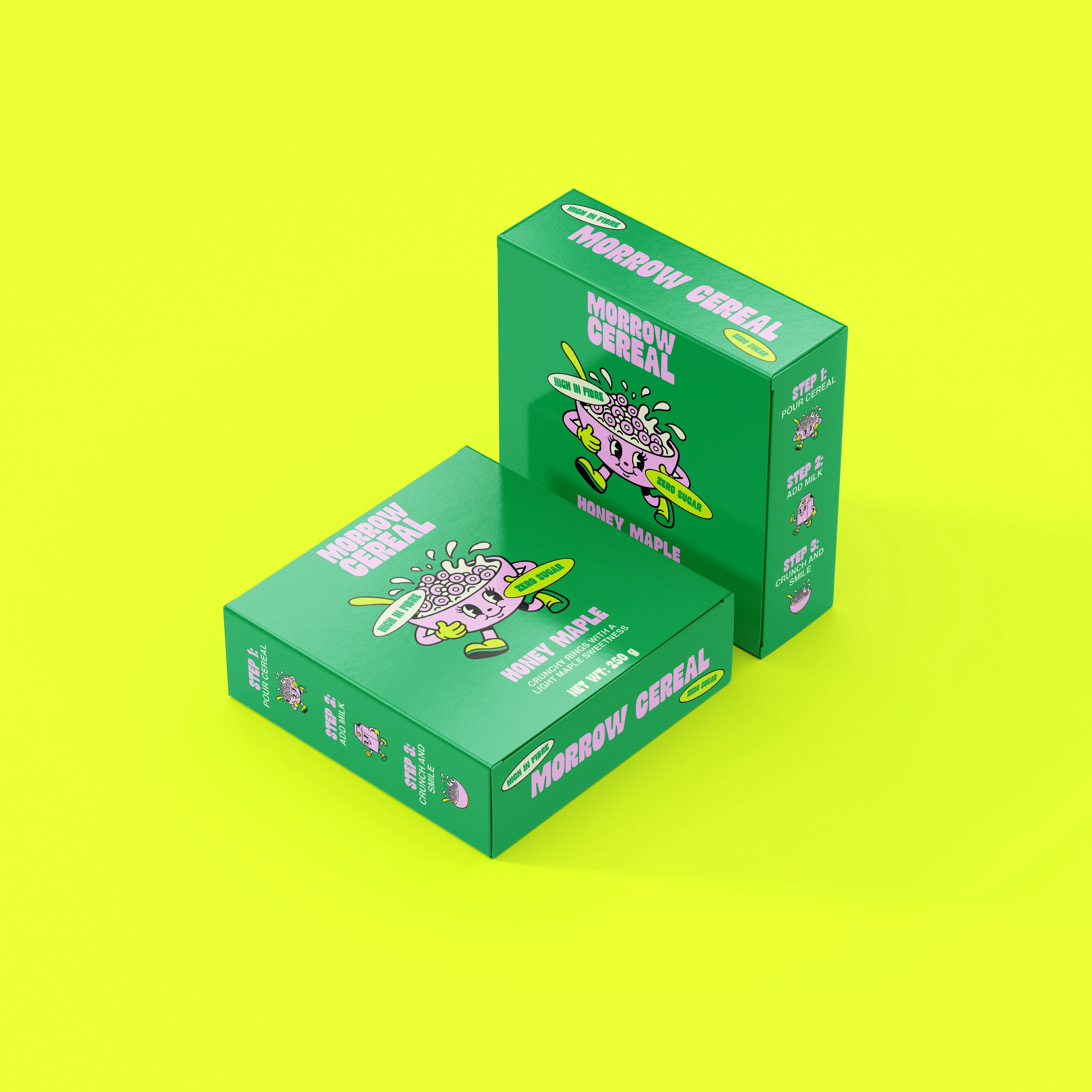
The packaging system for Morrow Cereal is designed to be clear, bold, and consistent across every format.
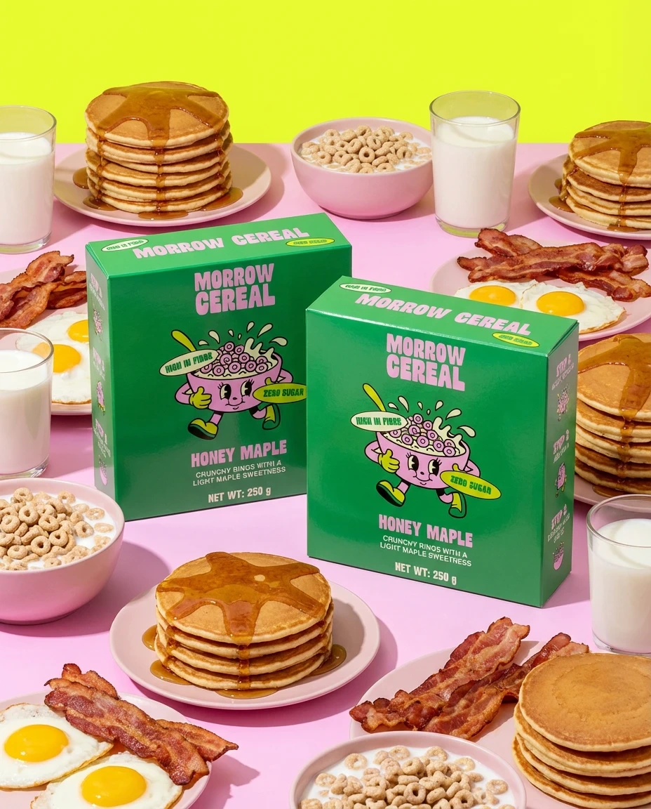
Each box features the central mascot, clear flavour naming, and benefit callouts such as high fibre and zero sugar. The layout remains consistent across variations, making the range easy to navigate while still feeling visually exciting.
The system extends across shipping boxes, promotional materials, and in store displays, ensuring a cohesive brand experience from shelf to home.
Final Thoughts
Morrow Cereal transforms a daily routine into a bright, enjoyable moment that customers can look forward to every morning.
If you are looking to create a brand that feels this bold and memorable, feel free to reach out.
Like this project
Posted Feb 27, 2026
I designed a playful cereal brand for Morrow Cereal with bold packaging, bright colours, and a character led identity built around energy and fun mornings.