Nocci Packaging and Visual Design
Aliza Munir
The Challenge
The challenge was to design a biscuit-based dessert brand that could stand out in a saturated market while avoiding the extremes of being either overly playful or overly premium. The brand needed to feel indulgent and comforting, yet visually distinctive enough to capture attention on shelves and across digital platforms. It was important to create something that balanced nostalgia with a modern edge, appealing to consumers who value both familiarity and aesthetic appeal.
The Solution
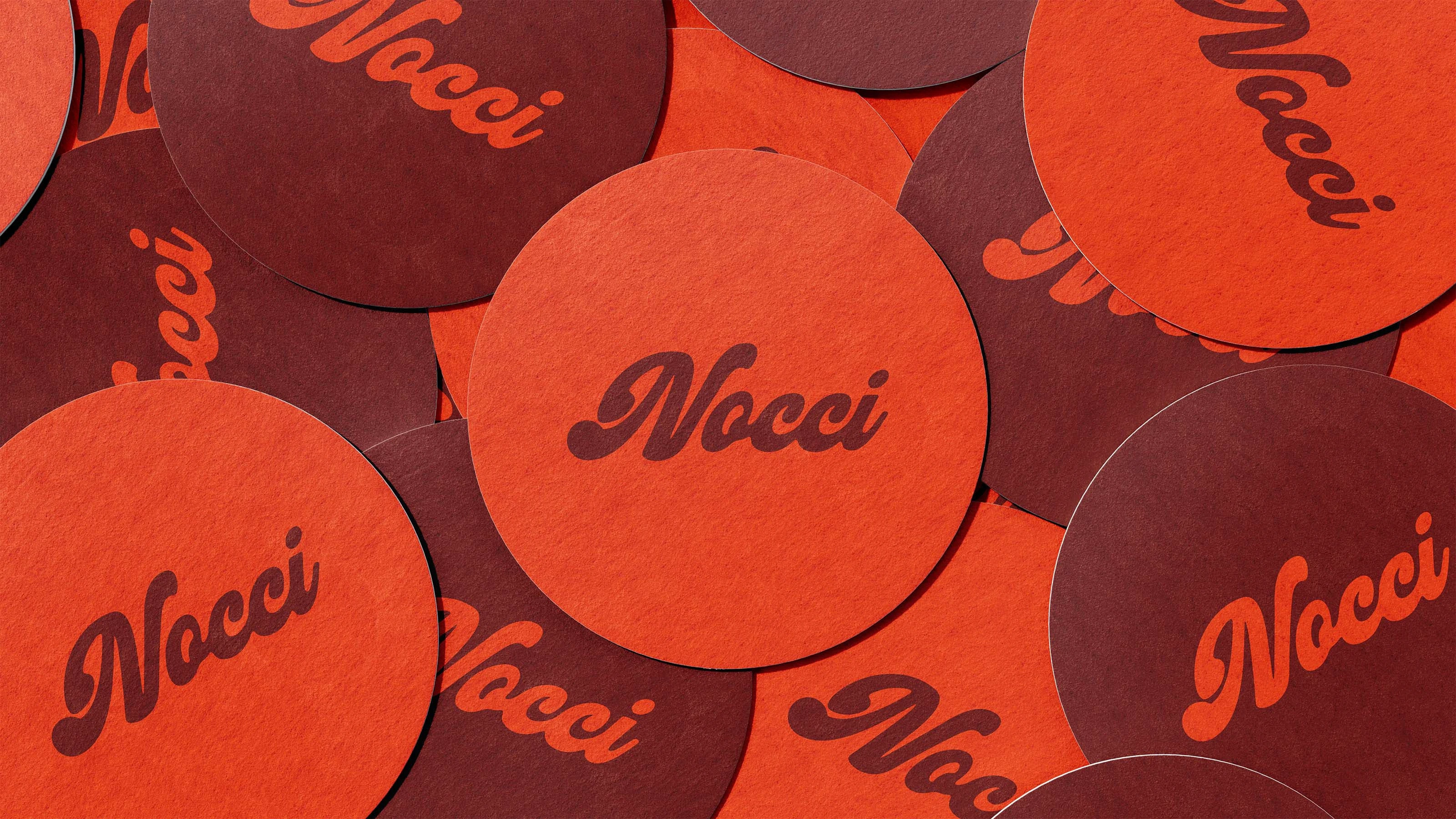
The solution was Nocci, a brand built around warmth, simplicity, and sensory indulgence. The concept focuses on elevating everyday biscuit treats into a more refined, giftable experience without losing their comforting essence. By combining a bold visual identity with clear, minimal communication, the brand achieves both memorability and clarity. The system extends seamlessly across tubs, boxes, and secondary elements, ensuring consistency while maintaining strong visual impact in both single-product and repeated compositions.
Packaging & Design Decisions
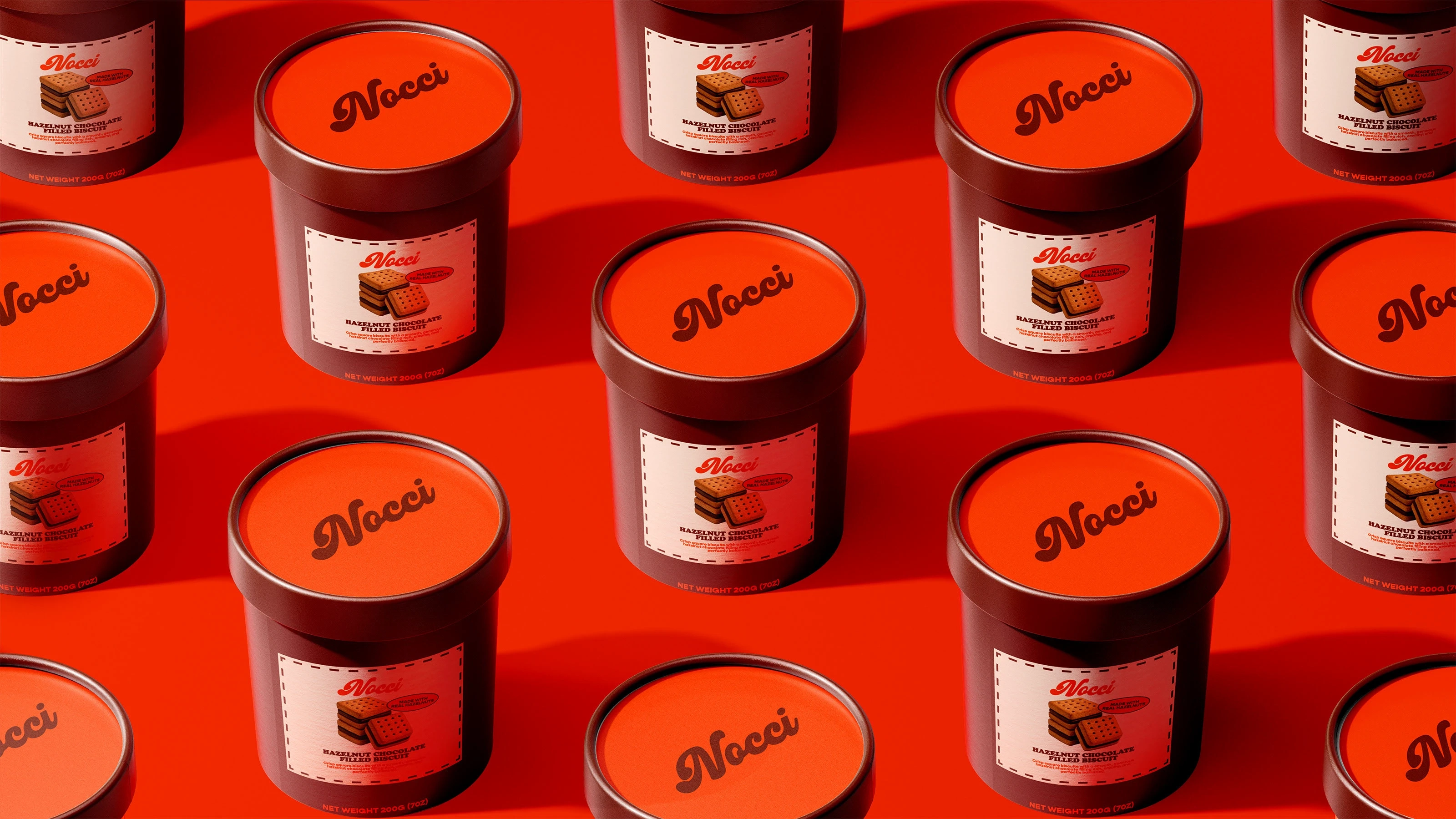
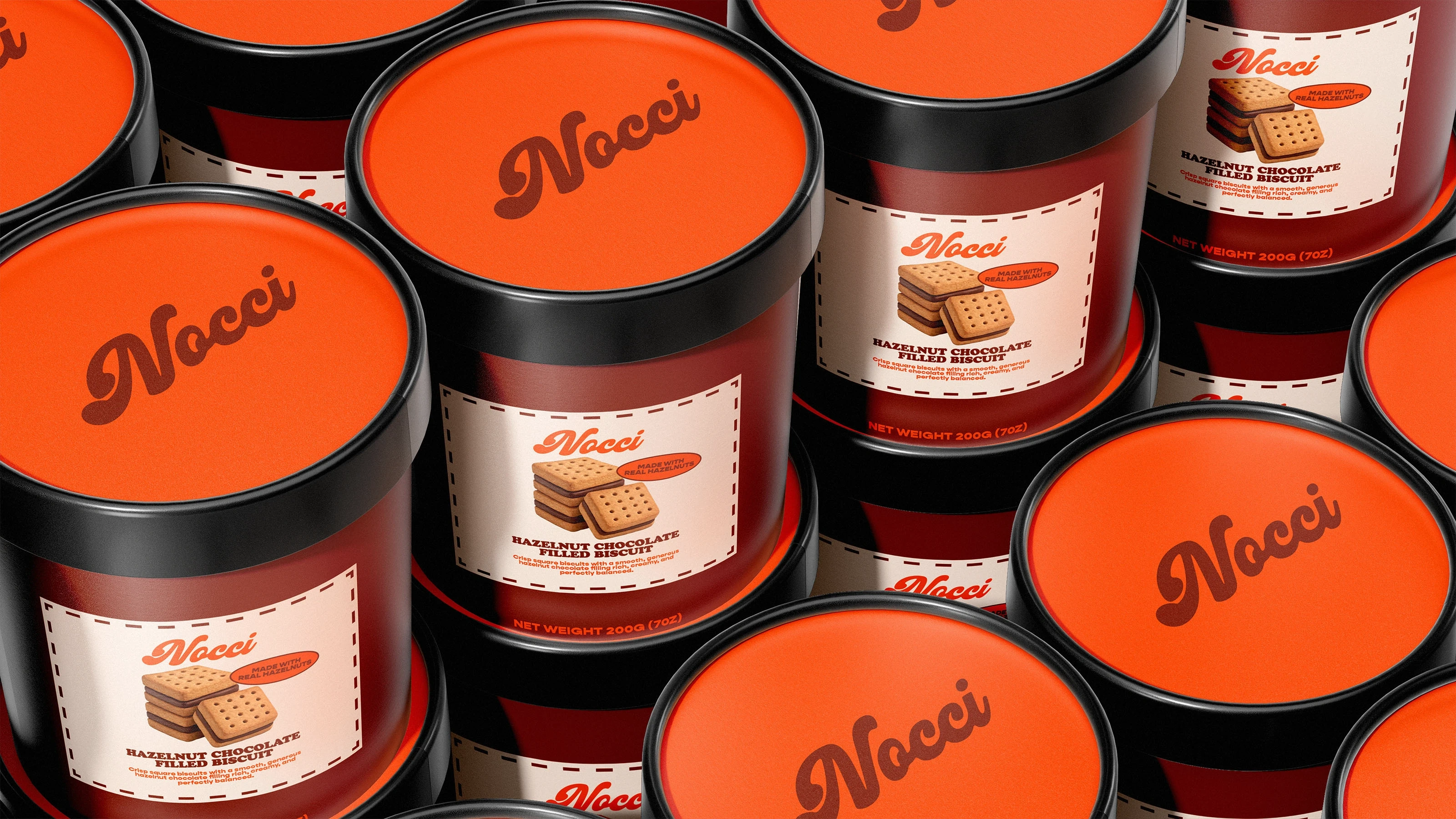
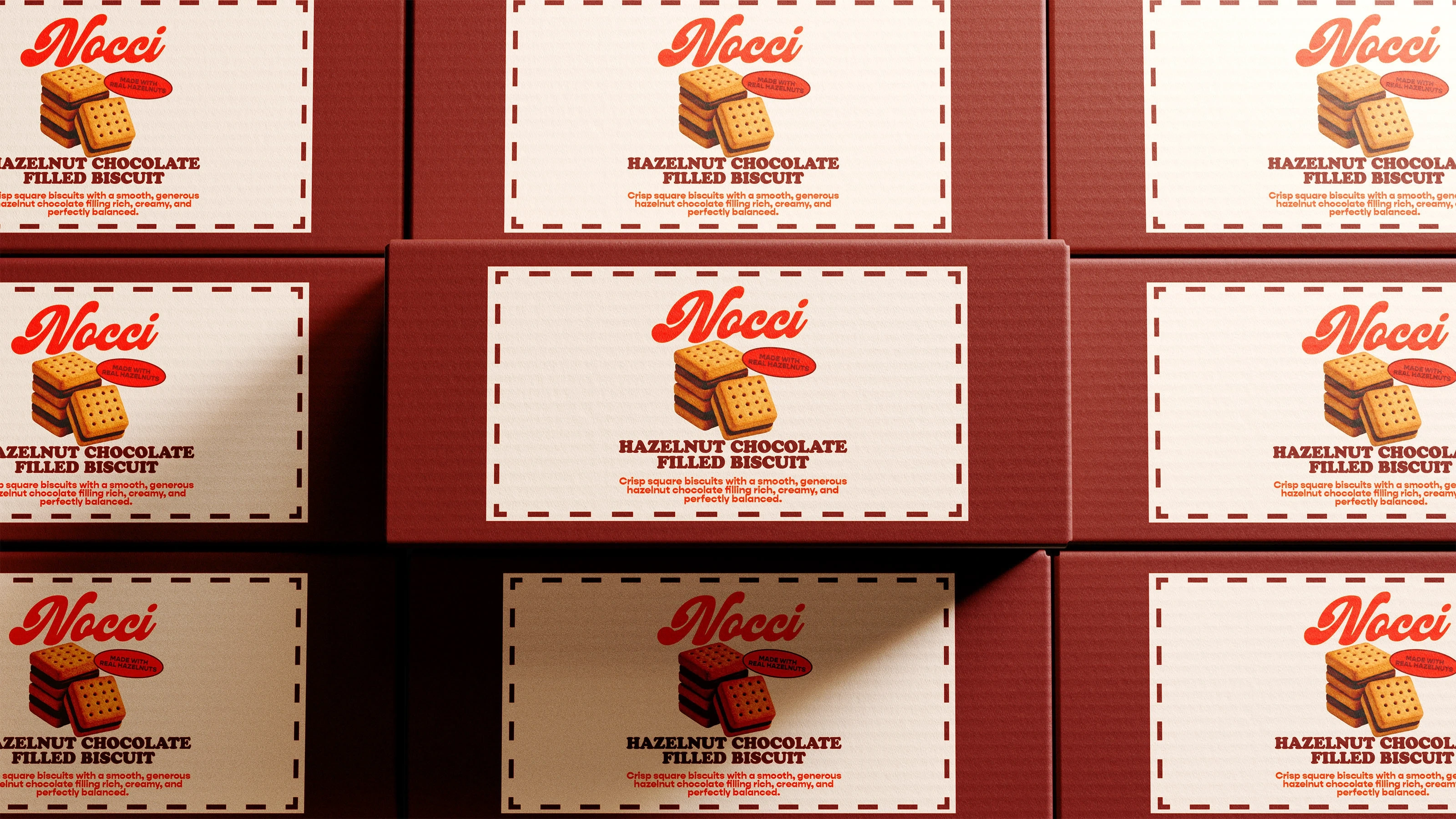
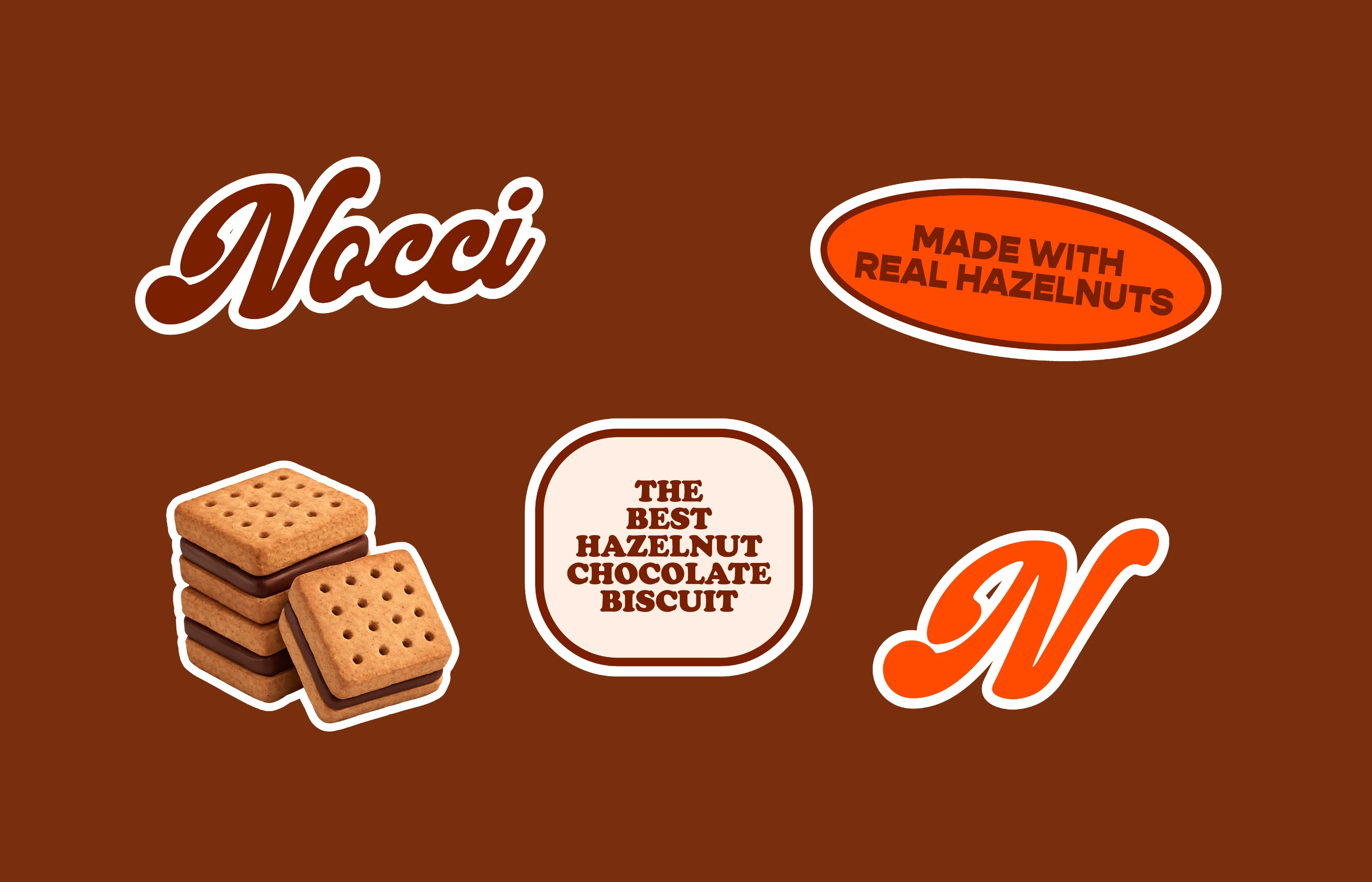
The packaging design uses a rich palette of deep cocoa brown and vibrant orange to reflect hazelnut chocolate flavours while creating strong visual contrast and shelf presence. A retro-inspired script logo was chosen to evoke a sense of nostalgia and warmth, reinforcing a homemade and trustworthy feel. This is balanced with clean, minimal typography to maintain a premium and structured look. The stitched-border label detail adds a subtle handcrafted touch, enhancing the perception of quality and care. The cylindrical tub format was selected for its practicality, stackability, and elevated feel, making the product appear more indulgent and gift-worthy. Each design decision from colour to typography to form was intentionally made to create a cohesive, memorable brand identity.
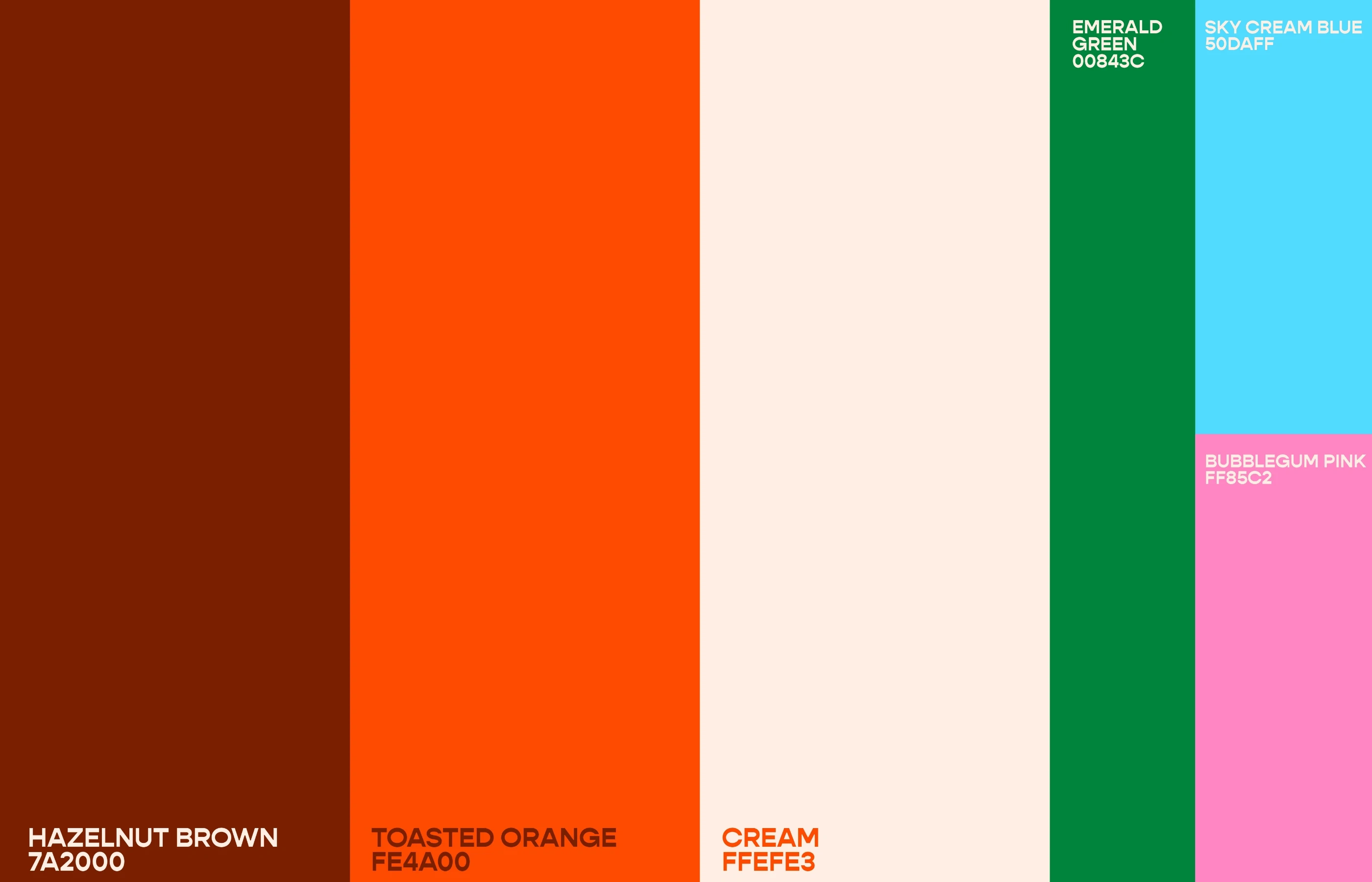
To allow for future expansion, the brand was designed with flexibility in mind, introducing additional colour variations for new product lines while maintaining the core identity. These extended palettes build on the original warm tones, enabling each flavour to feel distinct yet cohesive within the Nocci system. This approach ensures strong shelf differentiation across products while preserving brand recognition and consistency.
Like this project
Posted Mar 23, 2026
Designed a distinct biscuit-based dessert brand, Nocci, emphasizing warmth and simplicity.