Website Rebuild + Copy (Vertical Gardens Brand)
Veronica Di Polo
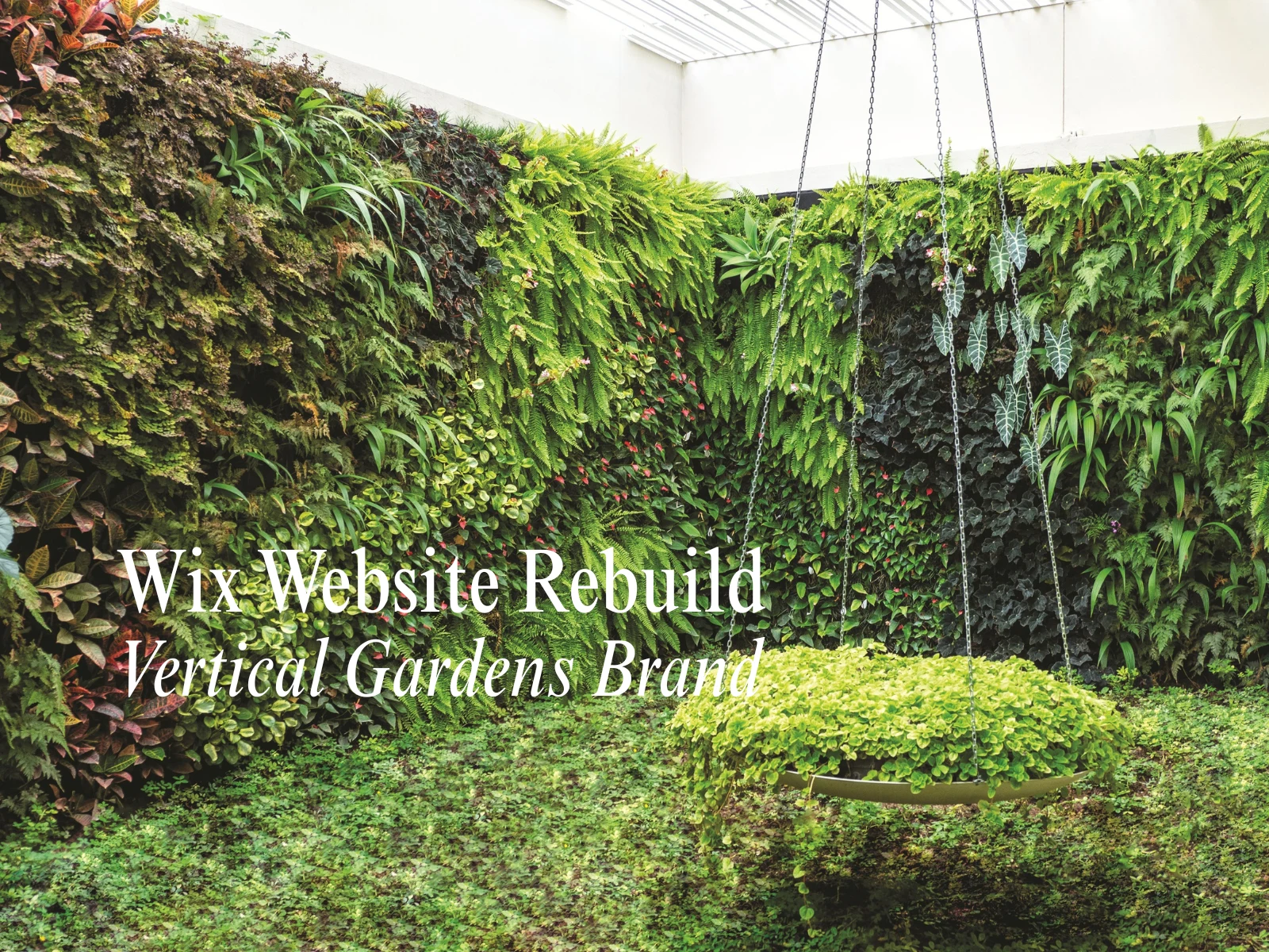
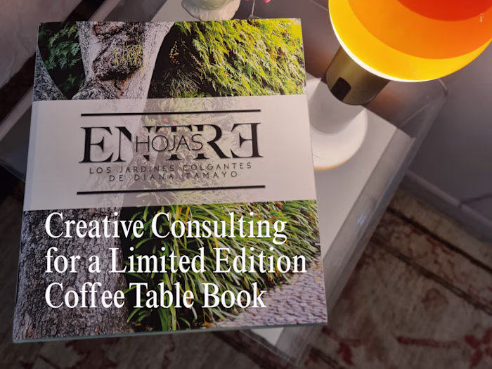
Wix Website Build for a Vertical Gardens Brand
This website started as a WordPress blog. It did its job until it didn’t. WordPress felt tight, slow, and overly “this is how websites are supposed to be,” and I needed the opposite: a site that could show projects, sell services, feature the book, and grow a blog without the platform fighting back.
So I moved the domain to Wix and rebuilt the site from scratch. I already run my own site there, and Wix lets me design fast, see the final result while I’m building it, and use sections and effects without turning the whole thing into a six-month project.
This site isn’t “just a website.” It’s the gateway. It’s where someone lands, understands what we do, sees proof, and takes the next step. And it has movement on purpose, plants breathe, sections shift, it feels alive, because the work is alive.
What the name needed to feel like
EntreHojas means “between leaves.” The site had to feel like that: fresh, layered, light, alive. The core brand is black and white, but I intentionally pushed in vibrant color so it didn’t feel sterile. Green is the protagonist, always, but the site still needed contrast and movement so it didn’t look like every other garden page on the internet.
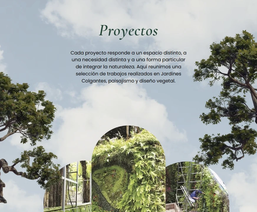
Home page
What the website needed to do
Show projects in a way that feels premium, not like a random photo dump
Explain services clearly enough that people don’t need to “ask what this is”
Make it easy to inquire, without friction
Feature the book as credibility and story, not as a side note
Set up the blog as the start of an ecosystem, not “tips for the algorithm”
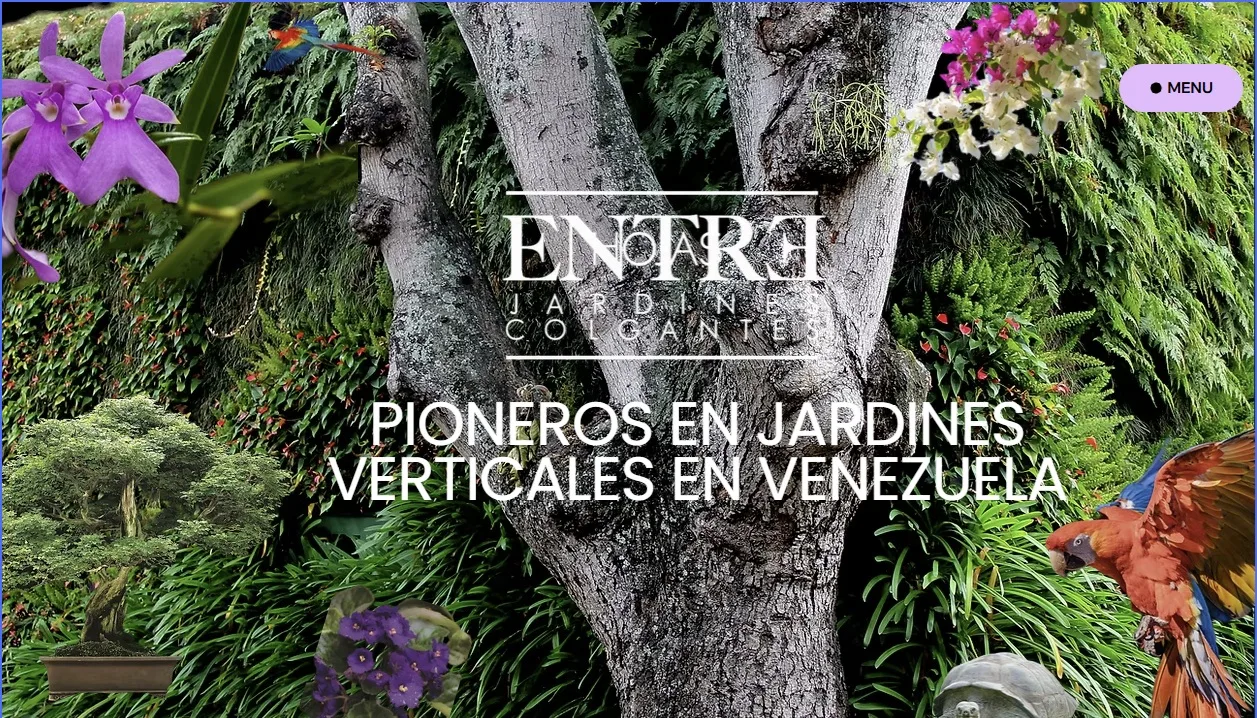
Homepage hero banner, it has movement
What I built (in Wix)
Site structure + design direction
Each menu section has its own layout and feel on purpose. Gardening is not one vibe, projects aren’t one vibe, and a site that looks the same on every page feels flat. This was designed to feel editorial and alive, while still being easy to navigate.
All website copy
I wrote all the copy. The goal was simple: make the work easy to understand, and make the next step easy to take.
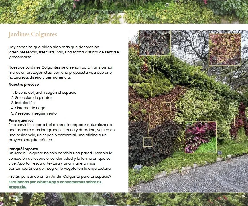
Projects as proof
Projects are the front door. People need to see real installations and immediately understand the level, the environments, and what’s possible.
Proyects page
Services as a buying path
Services aren’t written like “we do gardens.” They’re written like: this is what it is, when it makes sense, what’s included, how it works, and what to do next.
Service page
Book + blog as the ecosystem
The book is featured as premium credibility, not hidden like an afterthought. The blog is where the world expands over time, so the website doesn’t sit there frozen.
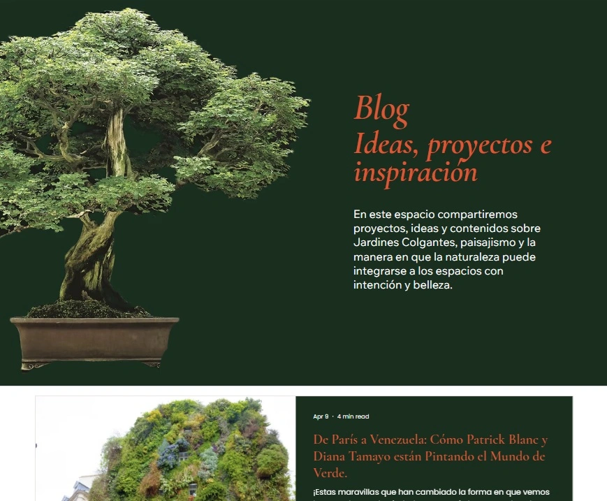
And we’re also using our Instagram Reels to reinforce the site. If we publish a reel about a project, that reel shows up inside the site too, on projects, services, and the book, so what we produce becomes part of the website. It stays current without constantly redesigning anything.
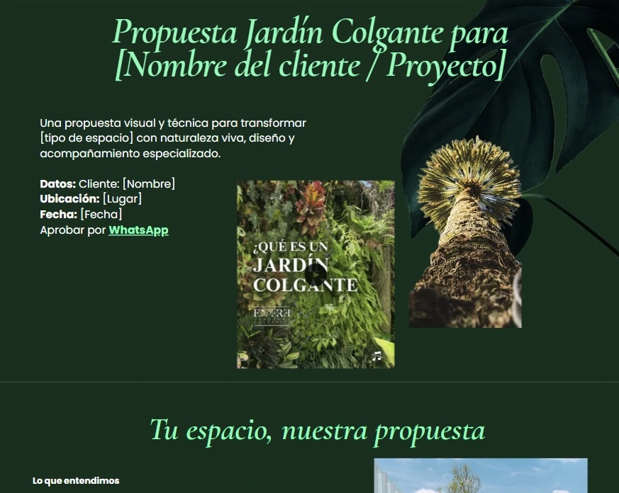
The part I’m most excited about
We’re building private, invisible pages for prospects. A space clients can return to while we’re building their proposal. It’s the digital version of a “client room,” with videos, images, and a simplified version of the proposal in web form. Less back-and-forth, less lost files, more confidence and clarity while the project is moving.
The final result
A Wix website that feels premium and alive, with clear service pages, project proof, book placement, and blog structure, built to generate inquiries, not just look nice.
If you want this kind of work
This is the same kind of work I do inside Website That Sells (3 pages), when a good business has a site that looks fine… but doesn’t explain, doesn’t sell, and doesn’t get the right people to take the next step.
Like this project
Posted Jun 3, 2026
Rebuilt the site in Wix Studio, rewrote every page, and turned projects + services into a clear “yes path,” not a pretty gallery.