Alison - photographe d'amour :: Behance
Julie Savin
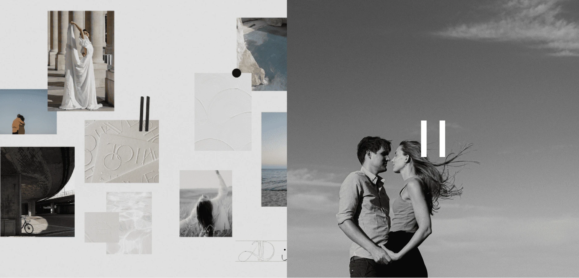
The vision : A daily life rooted in reality, both revealing and timeless.
Alison has a passion for human relationships and a craft for capturing their essence. It's the details of a sensitive daily life, the threads of emotion that weave through time: the friend, the lover, the colleague, the neighbor... as well as the soft, boisterous feelings between family members. A need to position herself with a high-end clientele aware of the added value of a photographer in terms of aesthetics, and in search of the original.

Objective : attracting an offbeat, conscious clientele.
Collaboration begins with an essential stage of introspection, closely linked to the branding process. The aim is to gain an in-depth understanding of the "what", the "why" and the "how". This phase of work is of paramount importance, as it clarifies the brand's vision and raison d'être, as well as determining how it positions itself in its market and coexists with its audience through its message and identity. So we started by developing the brand strategy, then putting words and meaning to it.
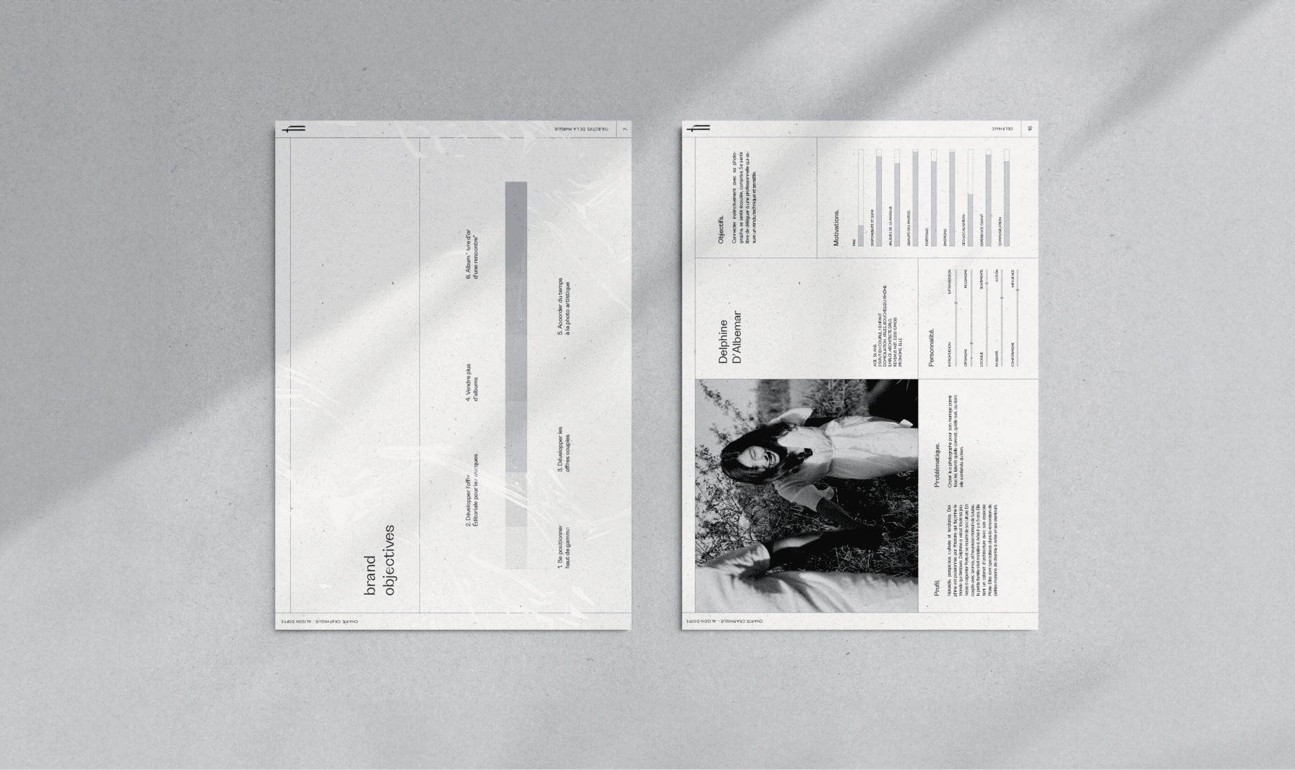
Insight results : Guiding clients towards an intimate reflection of their own universe and revealing their story.
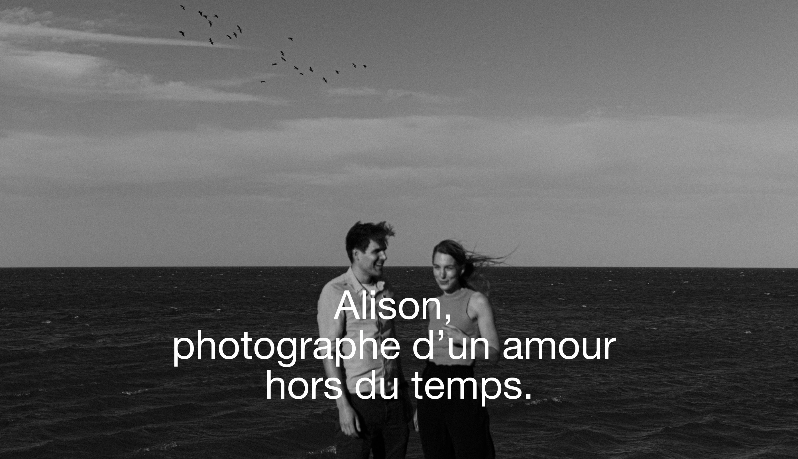
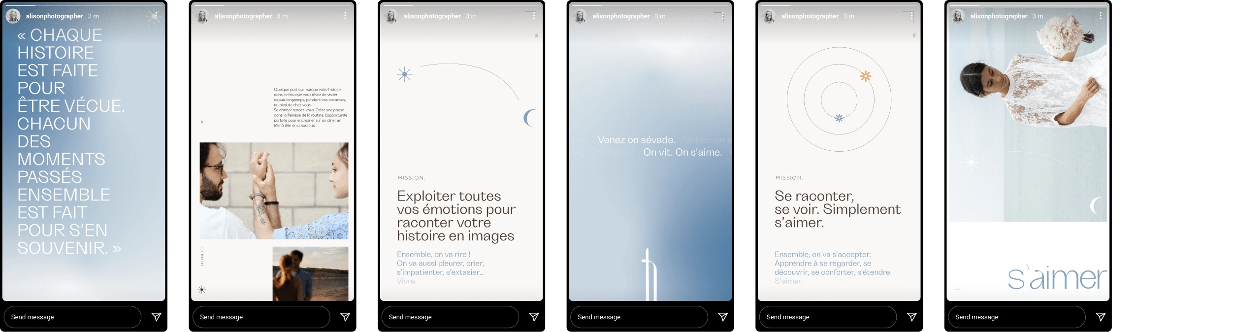
Alison shares stories, moments in life, a break from the daily grind that overwhelms us. Her expertise, seasoned sensitivity and quirky sense of humor immortalize the most beautiful thing on earth: love. Love is the deep and meaningful connection between two solitary entities, which come together to form an emotional, affective and intimate union. Love is at the heart of Alison's raison d'être, and it takes on its full meaning through this identity.
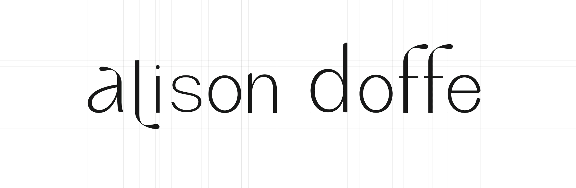
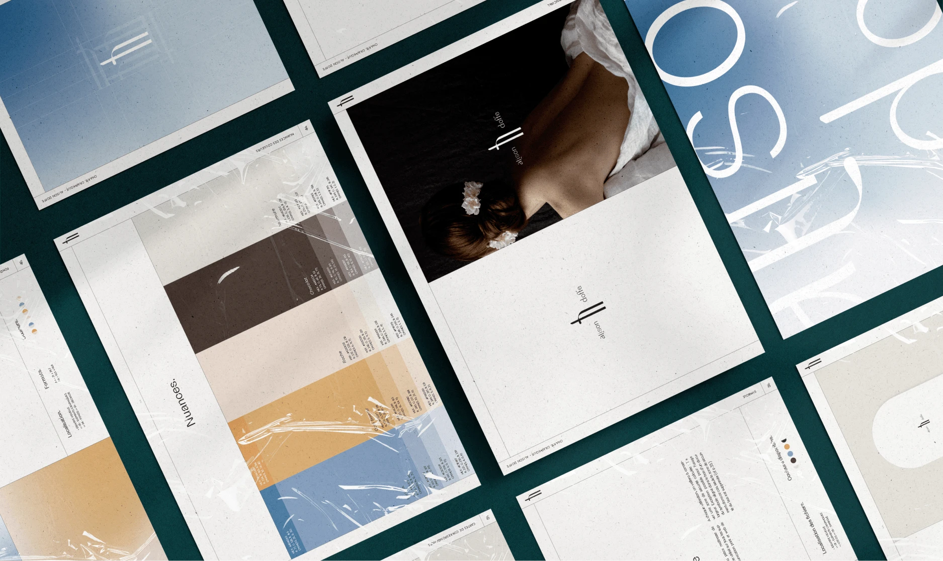
Graphic research : A melodious logotype, and a strong symbol.
Reassuring, familiar curves that take on a particular shape in the upper leg of the "f" and are geometrically echoed in the loop of the "l" and the tail of the "a". These shapes evoke windy hair, frozen in a captivating pose. This logo is intended to be warm, to establish a strong link with the target audience. The roundness of the curves brings a certain calm, while certain geometric details add originality and personality, positioning the brand as upscale while respecting the proximity and authenticity of Alison. The symbol recalls the pause. It also shows 2 lovers embracing, reassured by the gentle presence of their other half.
Modern, soothing and quirky
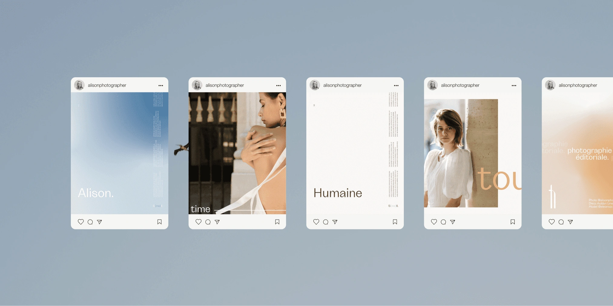
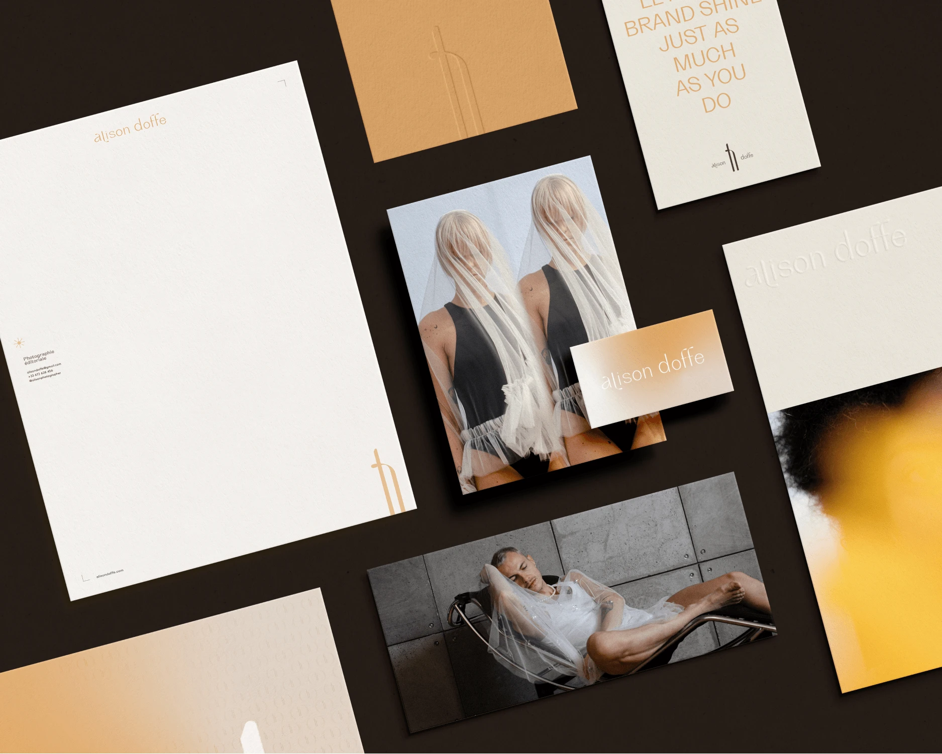
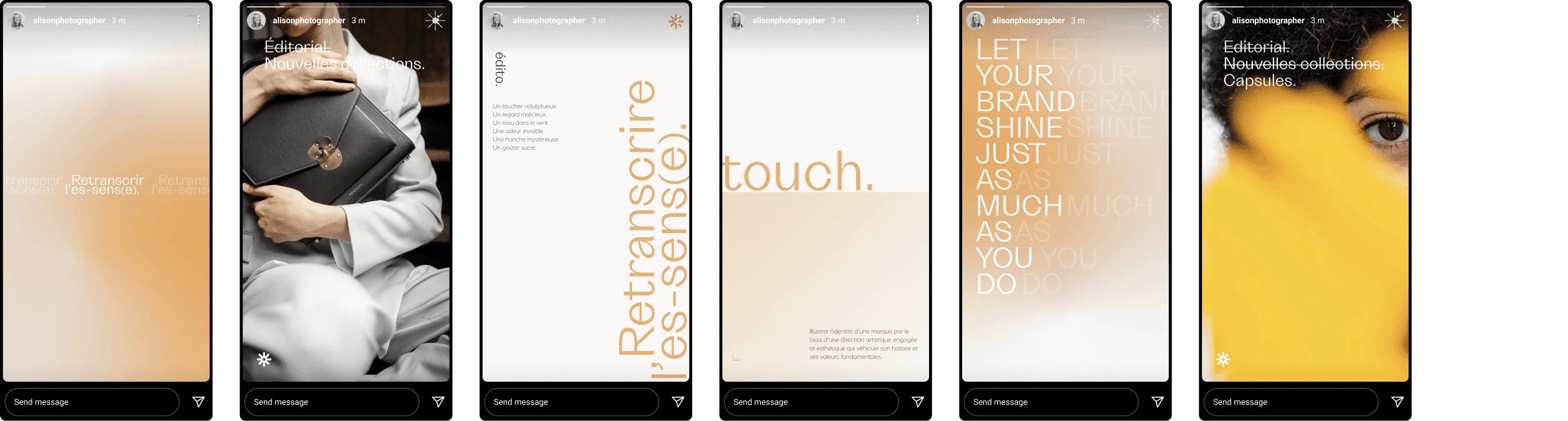
An identity that has character and stands out from the overly chintzy, sober worlds regularly seen among wedding photographers. The identity takes on its full meaning when applied to different communication media, from print to social networks, for harmonized visual communication, thought out down to the smallest detail.
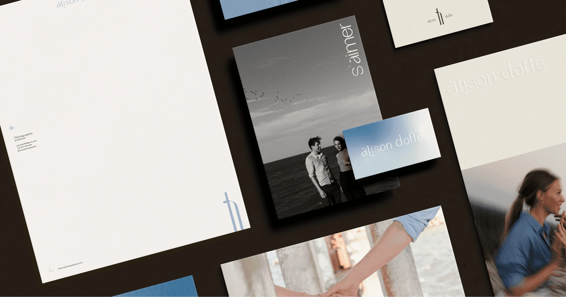
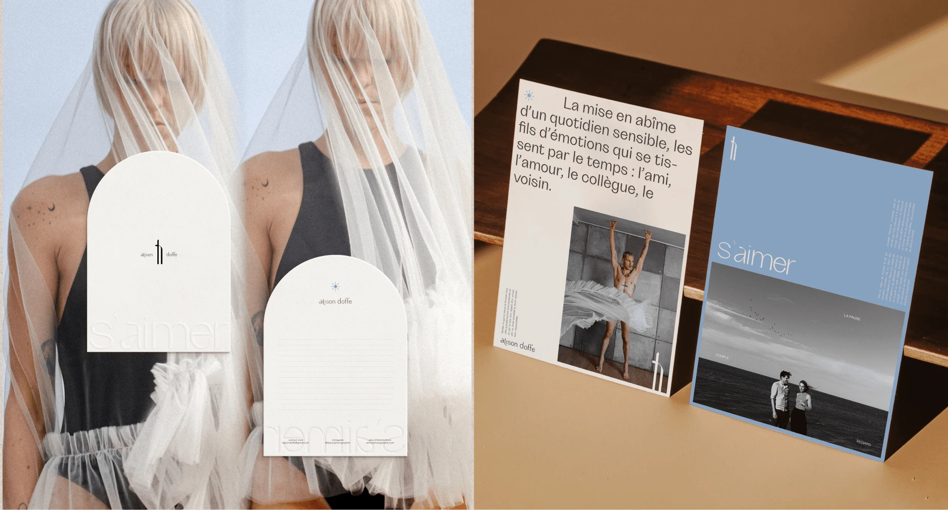
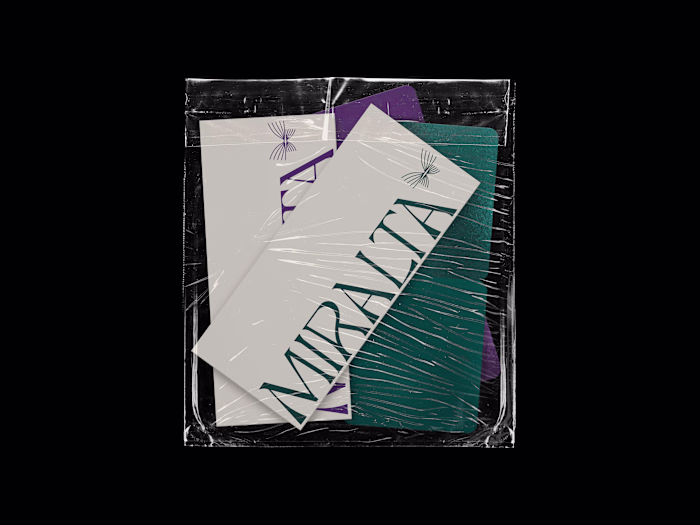
Alison believes in reconnecting with reality. Mailing was therefore an obvious need to perfect her communication.
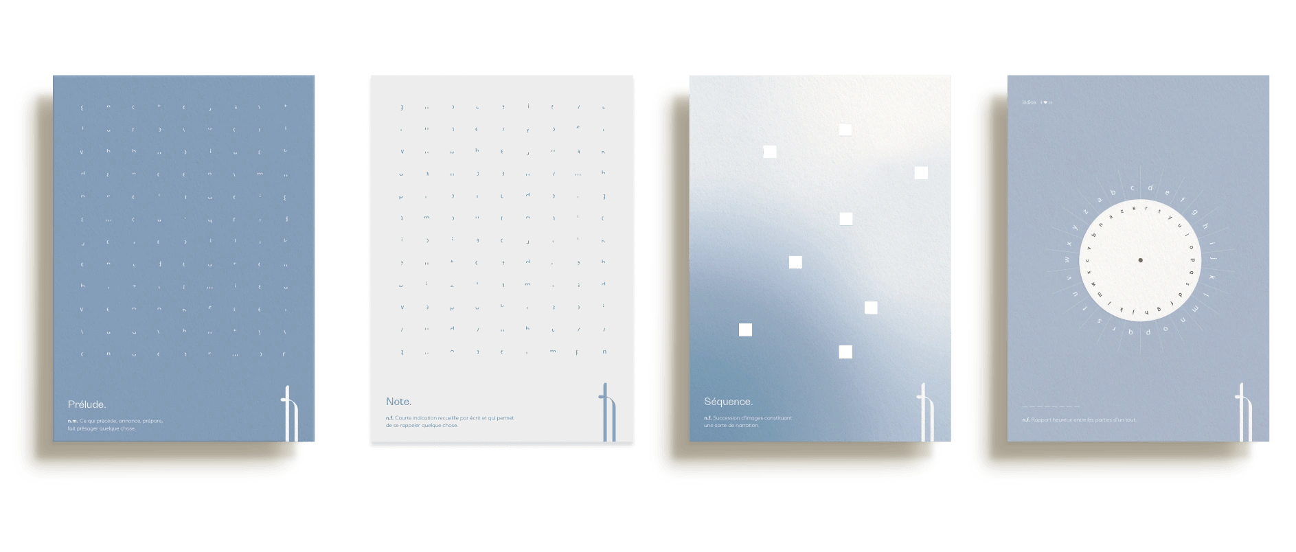
So the studio came up with a unique deck of cards that comes to life as the collaboration progresses, revealing deep thoughts and magnifying sensations. Comprising four cards, each received at a specific moment in the collaboration, they appear mysterious and meaningless individually. It's only when the fourth and final card is received and they overlap that meaning is revealed. At once playful, creative and symbolic, this game is in perfect synergy with the strategy developed for Alison and her quirky personality.
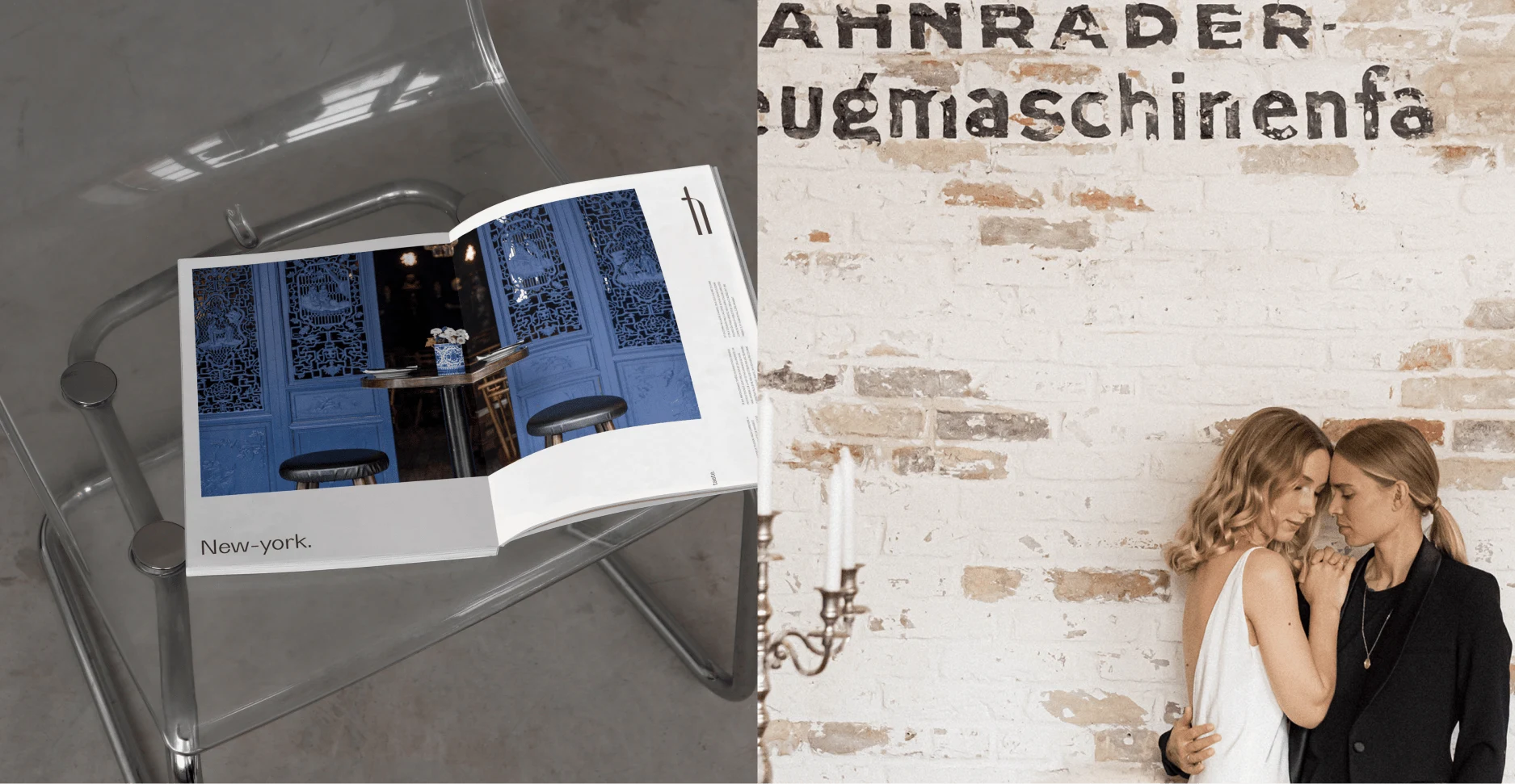
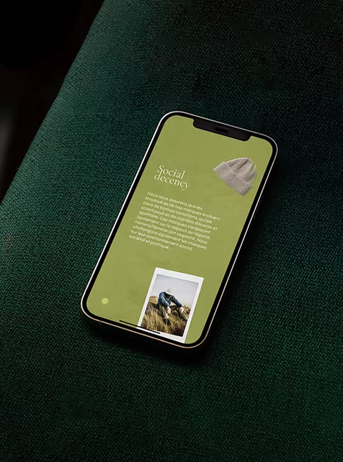
Editorial declination : The identity created for love photography was later adapted for editorial use, to facilitate collaboration with ethical brands.
Like this project
Posted Feb 15, 2024
Assistance with repositioning and creation of a customized strategy-based visual universe for a unique photographer.