Miralta - Brand & strategy
Julie Savin
Field of activity. Editorial agency | Services. Brand strategy, visual identity, instagram pack, print | Release date. June 2023
Miralta's Vision.
To build a community around literary creativity, to bring together the voices that aspire to make a difference.
Behind Miralta is Marion, an editor who decided to go freelance in January 2021, and who took off a year later, gathering over 200,000 subscribers on Tiktok. Marion contacted the studio in January 2023 to help her make the transition from freelancer to editorial agency, establishing a need to reposition herself and, above all, to set her brand with an identity that is both professional and, at the same time, does not lose its core essence. Miralta is Marion, and Marion is Miralta.

Repositioning Miralta : from freelance to editorial agency.
Collaboration begins with an essential stage of introspection, closely linked to the branding process. This involves gaining an in-depth understanding of the "what", the "why" and the "how". This phase is of paramount importance, as it clarifies the brand's vision and raison d'être, as well as determining how it positions itself in its market and coexists with its audience through its message and identity.
Embodying a modern accessible and inclusive literary world
Miralta promotes the unique and precious essence that lies within each and every one of us. Her aim is to make literature accessible by demystifying a closed, elitist world. With a refreshing approach, imbued with subtle and intelligent humor, Miralta aspires to create and influence the awakening of beauty, dreams and audacity.
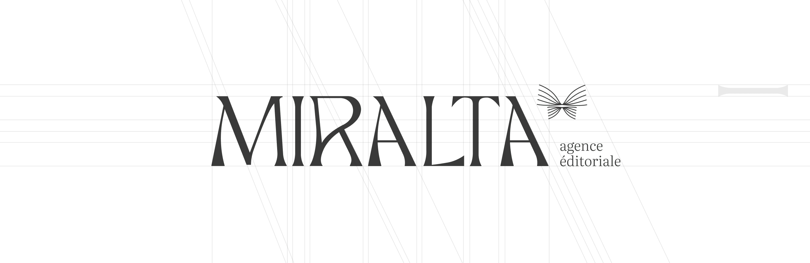
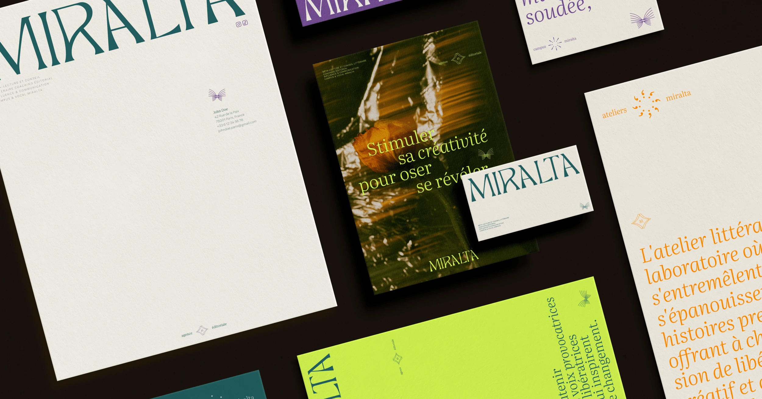
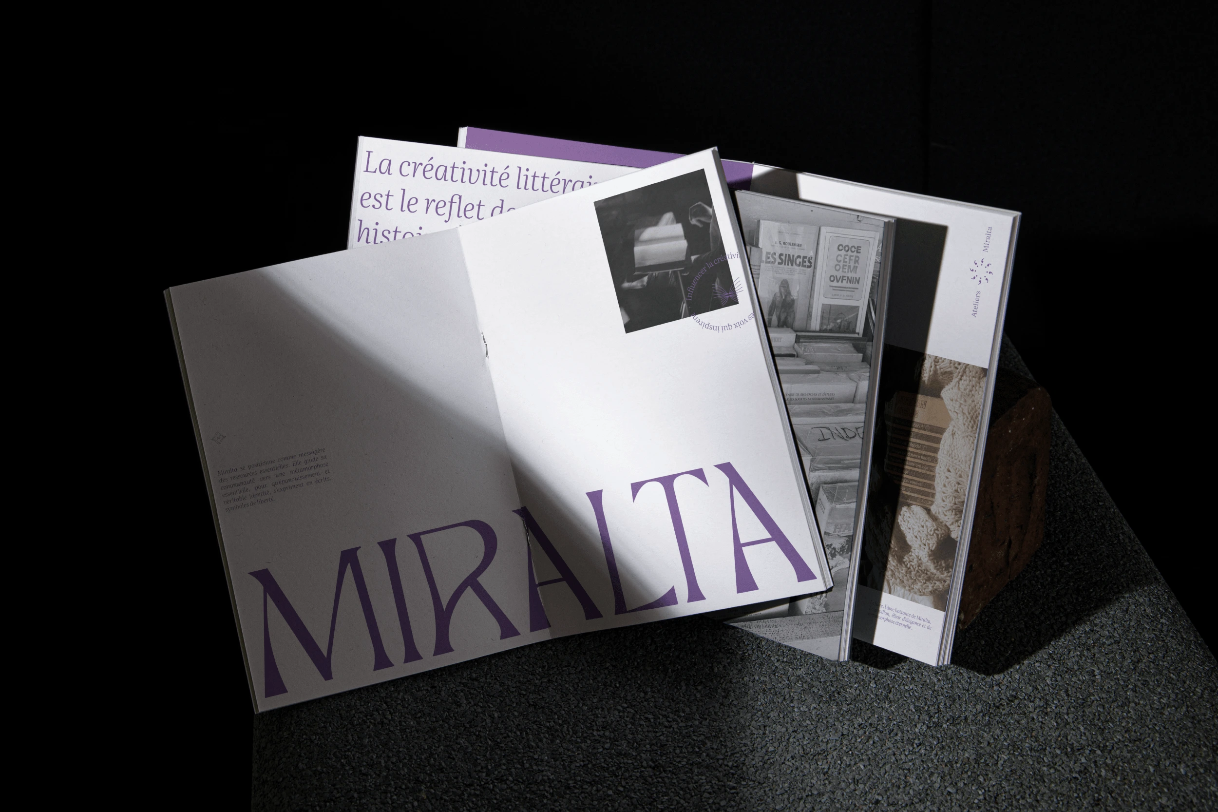
Custom-made, hand-drawn typography.
With its elegance, presence and originality, the typographic combo introduces the quality of the services offered by the brand, and reinforces its upmarket positioning.
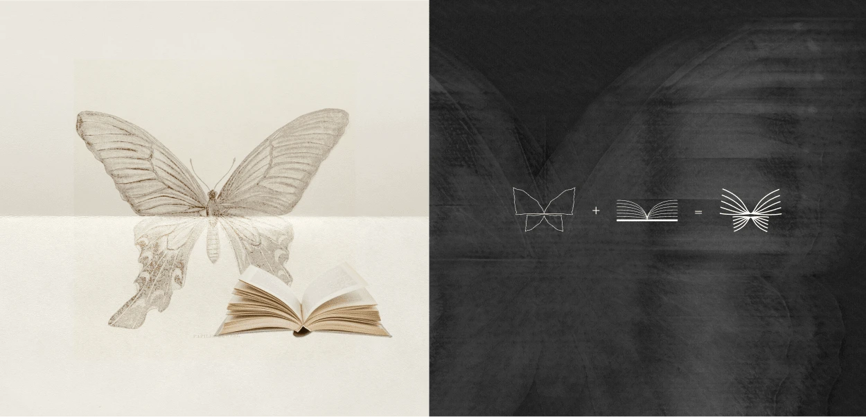
Subtly, a unique and powerful symbol is added. The psychedelic butterfly is delicately placed. It adds a more accessible, community-inspiring aspect to the presence of the typography. A second glance reveals the butterfly's hidden symbolism: a book laid down, its pages shimmering in the wind.
Modern, elegant and disruptive.
Miralta's identity stands out from the literary world, positioning the brand as non-conformist.
A subtle blend of elegance and disruption. To perfect the identity, we opted for a light, unique typography: Literata.
The colors, too, oscillate with surprising contrasts. The main colors are blue and violet, enhanced by brighter, more dynamic colors.
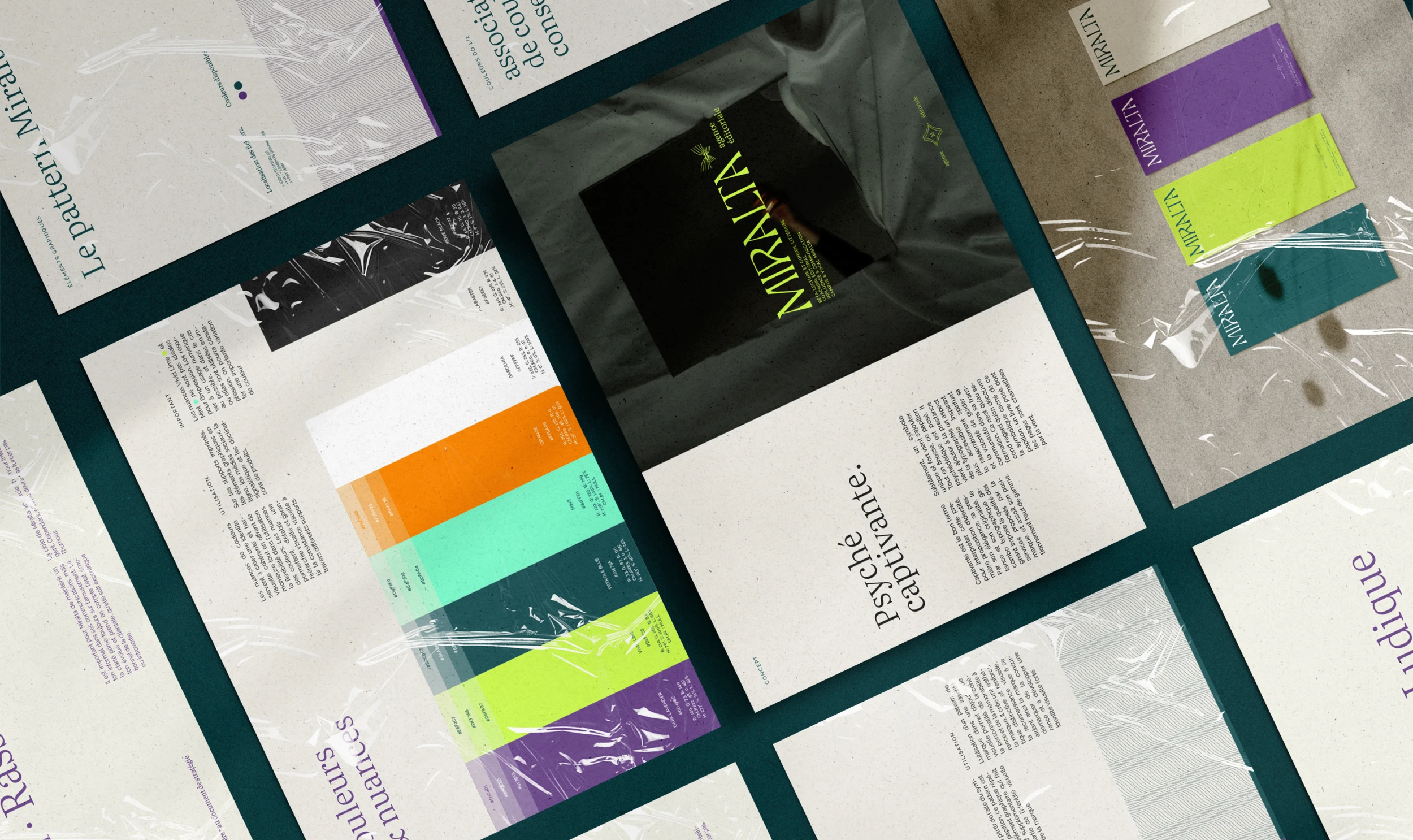
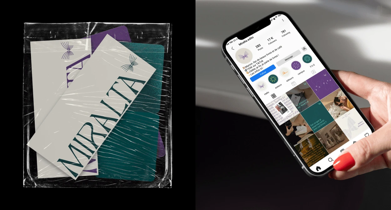
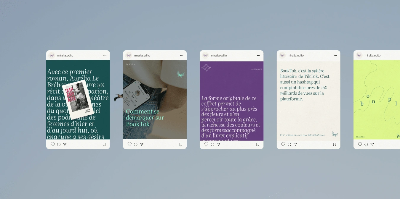
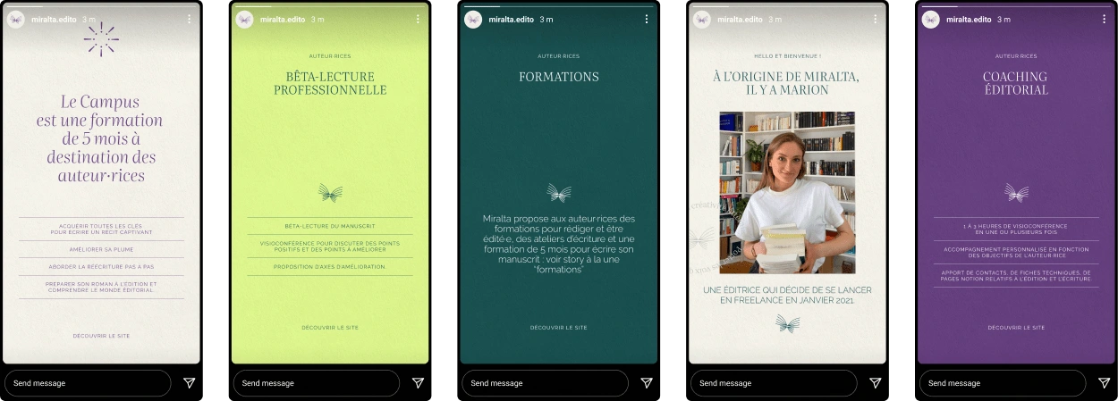
Harmonized communication across all print and digital media
Miralta's strong presence on the networks meant that the identity had to be developed in a harmonious way to facilitate the team's communication. A grid system with templates for instagram posts was created, as well as the headline stories for the Miralta account.
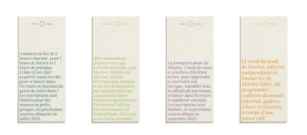
Create a distinctive visual system for each of Miralta's services.
A pictogram has been created for each of the agency's departments. The symbols follow a pattern of repeated punctuation in the French language. Miralta Campus, Miralta Workshops and Miralta Vocal each have their own identity.


"Hesji Studio helped me create the new identity for my Miralta editorial agency. Julie is a good listener, attentive, sensitive and boundlessly creative. She quickly understood my expectations and what I was looking for. A big THANK YOU, I'm so happy to have placed my trust in you!"
Marion, Miralta.
Like this project
Posted Feb 7, 2024
Assistance with repositioning and creation of a customized strategy-based visual universe for a unique client.