Carbex Premium Sports Lifestyle Brand Concept

Mcnove Pineda


Carbex — Premium Sports Lifestyle Brand Evolution
Independent proposal concept created for the Carbex brand evolution project
Project Overview
Carbex is preparing to evolve from a performance-focused sports brand into a more premium sports lifestyle brand.
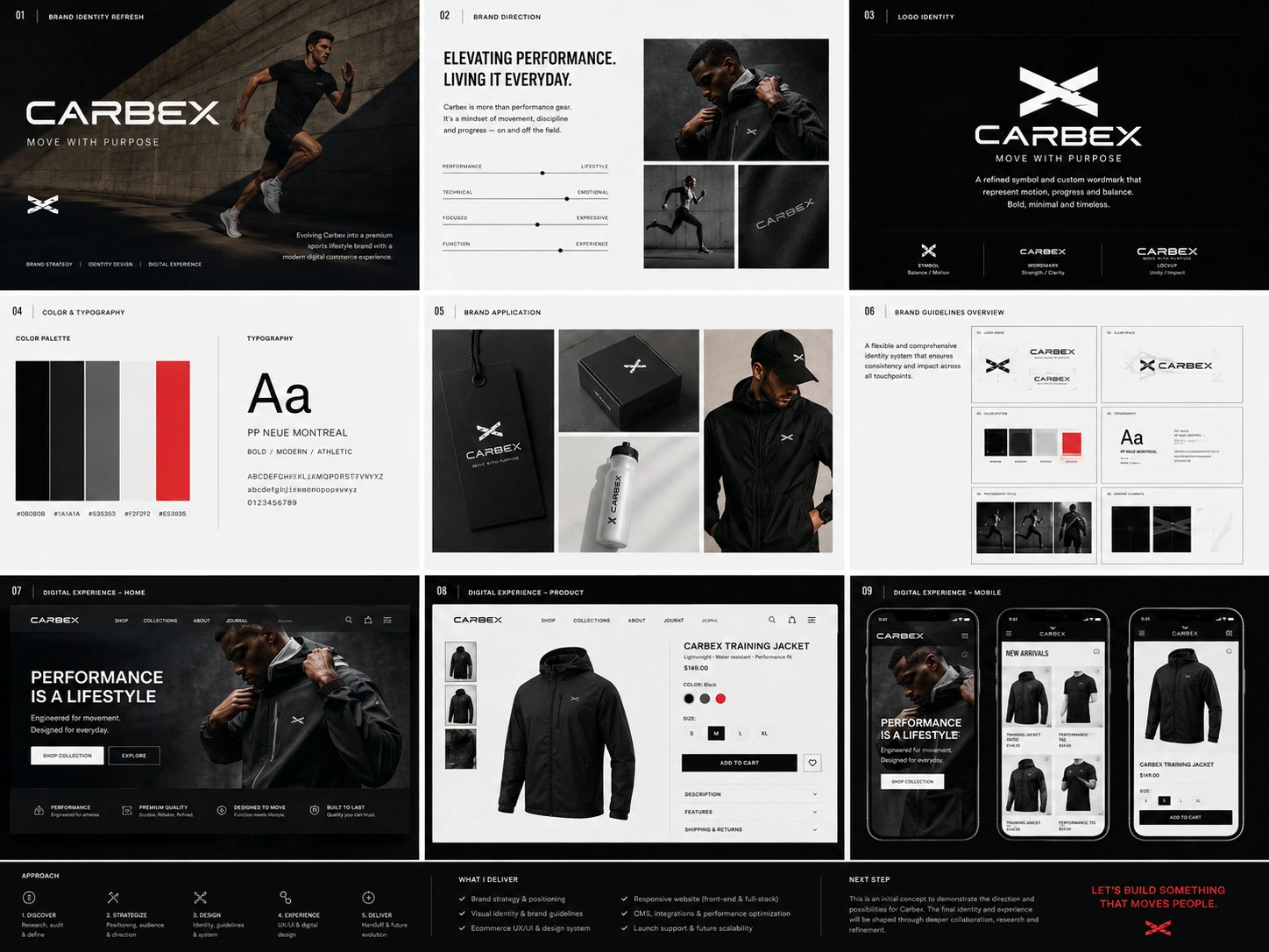
To demonstrate how I would approach this transformation, I developed an independent brand identity concept that explores how Carbex could retain its performance credibility while building a more refined, aspirational, and lifestyle-oriented presence.
This concept was created specifically to show my strategic thinking, creative direction, brand design capabilities, and ability to translate a business objective into a complete visual identity system.
The Opportunity
Carbex already has an existing logo, visual identity, and presence within the performance sports market. However, the current brand direction does not fully communicate the company’s future ambitions.
The opportunity is not simply to redesign the logo. It is to build a stronger brand foundation that can support:
Premium market positioning
Direct-to-consumer growth
Lifestyle-oriented storytelling
Product expansion
Ecommerce and digital experiences
Consistent communication across all customer touchpoints
My goal would be to evolve Carbex without losing the recognition and credibility it has already established.
My Strategic Direction
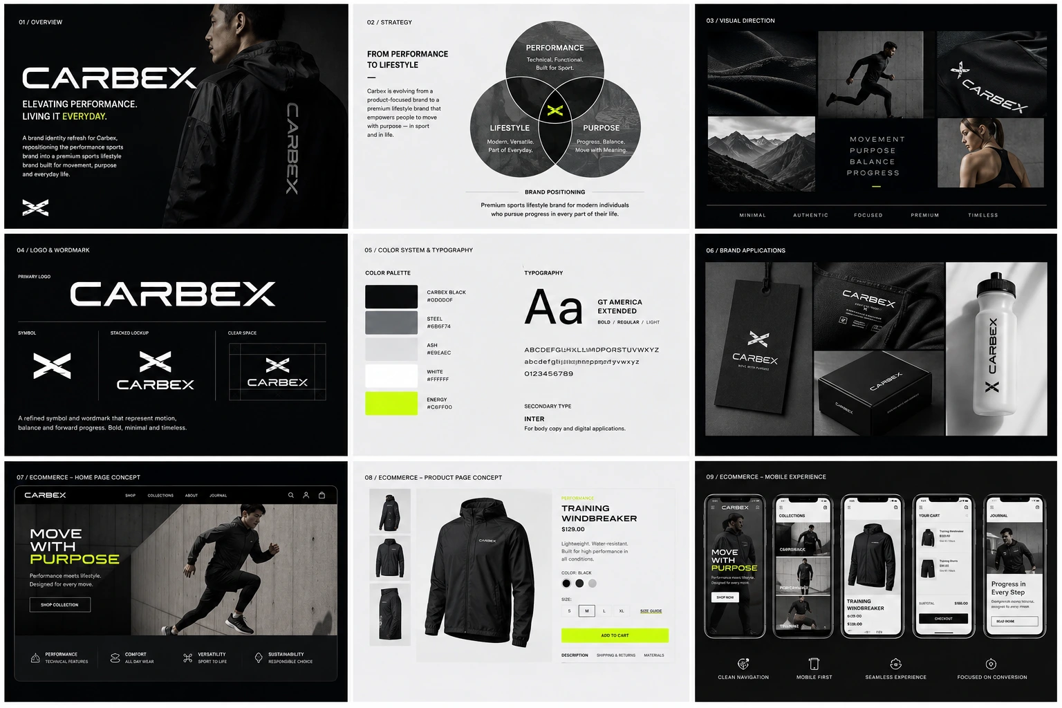
The concept is based on the idea of Move With Purpose.
This direction reflects the discipline, balance, progress, and intentional movement behind athletic performance. It also allows Carbex to communicate beyond competitive sport and connect with customers who see movement as part of their everyday lifestyle.
The proposed positioning combines three core qualities:
Performance
Technical credibility, durability, function, and movement.
Lifestyle
Versatility, confidence, modern culture, and everyday relevance.
Purpose
Progress, balance, discipline, and meaningful personal growth.
Together, these qualities create a more distinctive foundation for a premium sports lifestyle brand.
Visual Identity Approach
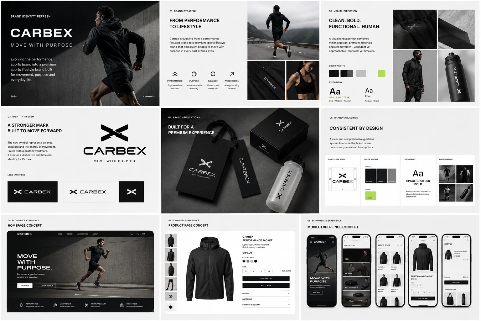
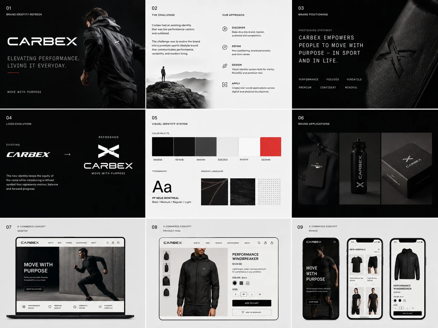
I created a visual direction that feels clean, bold, controlled, and modern.
Instead of relying on aggressive sports graphics or overly complex visual effects, the identity uses a restrained system that communicates confidence and premium quality.
The proposed identity includes:
Refined Carbex wordmark
Distinctive movement-inspired brand symbol
Primary and secondary logo variations
Premium monochrome colour foundation
High-energy accent colour
Modern typography system
Graphic patterns and directional elements
Performance and lifestyle photography direction
Product and packaging applications
Initial brand guideline structure
Logo Evolution
The proposed identity retains the strength of the Carbex name while introducing a more recognisable symbol.
The symbol is inspired by movement, balance, compression, and forward progression. Its flexible form can be used independently across apparel, product labels, accessories, packaging, social media, and digital interfaces.
The objective is to create a mark that feels recognisable at both large and small sizes while giving Carbex a stronger visual asset beyond the wordmark.
Colour and Typography
The colour system uses black, charcoal, steel grey, warm white, and a controlled high-energy accent.
The darker neutral palette communicates technical performance and premium quality, while the accent colour introduces energy and recognisability when needed.
The typography combines a strong display typeface with a highly readable supporting font. This gives Carbex the flexibility to present bold campaign messages, product information, editorial content, and digital interfaces within one consistent system.
Art Direction
The photography direction focuses on real movement, preparation, texture, discipline, recovery, and everyday performance.
Rather than relying only on traditional sports action photography, I would show the complete lifestyle surrounding performance.
This allows Carbex to communicate both technical product value and emotional brand storytelling.
The visual direction would combine:
Dynamic movement
Strong architectural environments
Close product details
Premium materials
Natural human moments
Controlled lighting
Editorial compositions
Minimal but confident styling
Brand Applications
To demonstrate how the identity could work in practice, I explored the visual system across:
Sportswear and lifestyle apparel
Product labels and hangtags
Packaging
Water bottles and accessories
Campaign imagery
Social media content
Brand guidelines
Ecommerce interface concepts
These applications demonstrate that the proposed identity is not only visually attractive but also flexible enough to support Carbex across physical and digital environments.
How I Would Structure the Full Project
1. Discovery and Brand Audit
I would begin by reviewing the existing Carbex identity, product range, customer base, distributor relationships, competitors, target markets, and future business goals.
This phase would help determine which existing brand elements should be retained, refined, or replaced.
2. Brand Strategy
I would define the target audience, brand positioning, value proposition, personality, differentiators, messaging principles, and creative direction.
This ensures that every design decision is connected to a clear strategic purpose.
3. Identity Exploration
I would develop several creative directions covering logo evolution, typography, colour, imagery, graphic language, and brand applications.
The strongest direction would then be refined collaboratively with the Carbex team.
4. Brand Identity Development
The selected direction would be expanded into a complete and flexible identity system across physical and digital touchpoints.
5. Brand Guidelines
I would create clear guidelines covering logo usage, colour, typography, photography, layouts, graphic elements, and practical examples.
This would help Carbex maintain consistency as the brand grows.
What I Would Own
I can take full responsibility for:
Brand research and audit
Brand strategy
Brand positioning
Creative direction
Logo and visual identity
Typography and colour systems
Graphic language
Art direction
Brand applications
Brand guidelines
UX/UI design
Ecommerce website design
Front-end and full-stack development
Managing the brand and digital experience under one creative direction would help ensure that Carbex’s positioning is communicated consistently from the identity system through to the final customer experience.
Why This Approach Matters
A successful premium repositioning requires more than polished visuals.
The identity must clearly communicate what Carbex stands for, why it is different, and how customers should feel when interacting with the brand.
My approach connects strategy, visual design, user experience, and technical execution. This allows the brand direction to remain consistent from the first strategic decision through to the final digital product.
Proposed Outcome
The goal would be to establish Carbex as a confident premium sports lifestyle brand with:
Stronger market differentiation
A more memorable identity
Greater lifestyle relevance
Consistent brand communication
A scalable visual system
A stronger foundation for direct-to-consumer growth
A clear direction for future ecommerce development
Project Disclosure
This is an independent proposal concept created to demonstrate how I would approach the Carbex brand evolution project.
It is not commissioned, approved, or published work for Carbex. All concepts would be reviewed, validated, and developed collaboratively if selected for the engagement.
Like this project
Posted Aug 4, 2026
Independent Carbex brand refresh concept combining premium sports positioning, visual identity, art direction, and scalable brand guidelines.
Likes
1
Views
21
Clients
Carbex