THE LOCAL CUP
A comprehensive brand style guide for a neighborhood cafe with a hipster flare.
Scope
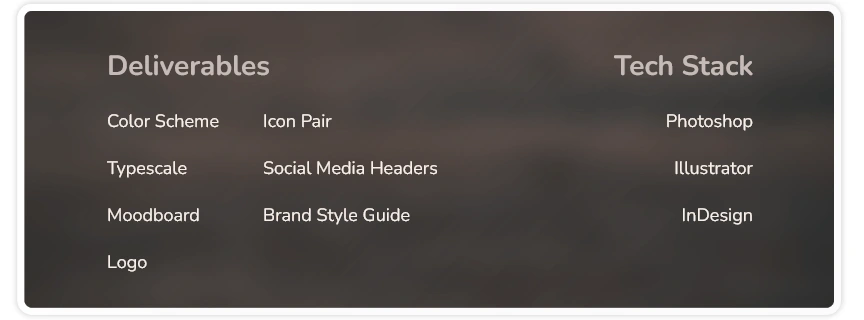
I created a comprehensive brand identity for The Local Cup. The final deliverables included a target audience profile, a color scheme, a typescale, brand imagery, a logo, an icon pair and social media headers.
All of these elements were brought together in a brand style guide to make sure that The Local Cup’s brand identity will be consistently presented.
Role
Being the lead designer, I collaborated with the budding owner of The Local Cup to nail down the brand’s personality and mission.
OVERVIEW
The Local Cup, by Karla Kahvi and her crew, will be the newest shop to open (and the first to offer beverages) in a popular neighborhood. They needed help with branding to establish that the cafe’s identity was consistent and reflected the right tone for the trade.
The project consisted of creating a color scheme, a typescale, brand imagery, a logo, an icon pair, social media headers, and a complete brand style guide to inspire design decisions in the future. These assets will confirm that The Local Cup has a solid brand identity to build trust and familiarity with their customers from the get-go.
Problem
Owner Karla Kahvi wanted The Local Cup to make a resounding, name-recalling first impression on the neighborhood. She was aware their brand’s look and feel would be the welcoming hand to get customers stepping into the cafe. This is the reason Karla wanted to make sure the cafe’s identity was consistent and set the proper mood.
GOALS
Working with Karla, I determined the personality, the audience profile, and the mission of The Local Cup. This information guided my design decisions as I created the cafe’s brand identity. We agreed on a three-month timeline for the project, a roomy window for Karla to implement the designs into the store signage, online presence, and printed materials before the grand opening.
DESIGN PROCESS
Color Scheme
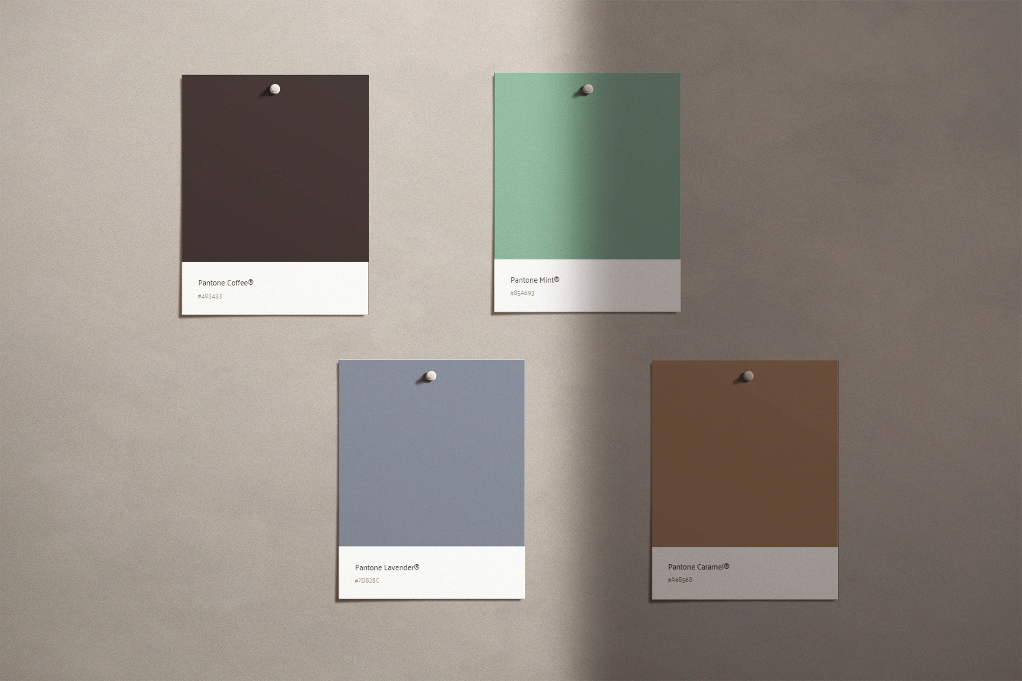
I went with colors that supported the calm creative ambiance that Karla wanted to attain. The final color scheme was a neutral, organic palette in coffee, lavender and mint to remind customers of the witty comfort they would relish when they start their day with The Local Cup.
Typescale
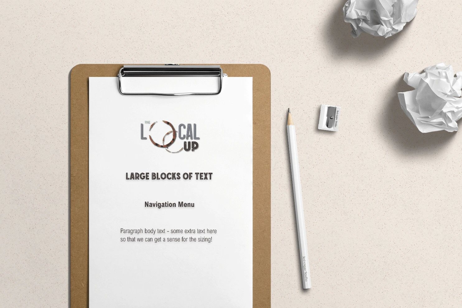
I discovered typefaces that would represent a calm, chic and contemporary tone to support The Local Cup’s personality. I chose Espresso Vintage and Mocha Vintage for the main brand fonts. These vintage display types look trendy yet simple. Mocha Inline Rounded can be used for large headings and Arial Nova Condensed Bold for navigation links.
I figured the sans serif font Arial Nova would fit well for large paragraph text sections such as descriptions and body text. This clean, classy font will be an easy read while conveying an uncomplicated tone.
Logo
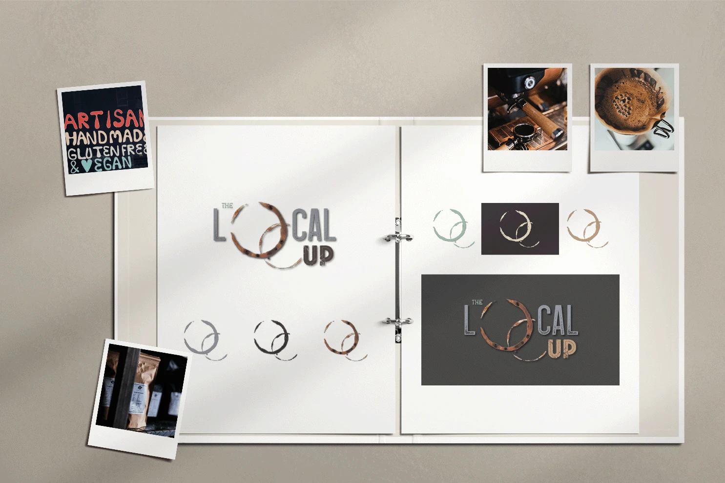
Understandably, the logo is the most identifying asset of a brand. Drawing inspiration from the colors and typefaces picked out, the logo ideas manifested through a few sketches of which I finally settled on a design of a couple of detailed intertwined coffee ring stains to represent that The Local Cup has a lot of texture and character.
I used Adobe Fresco and Illustrator to recreate the stains in a vector version that scales to various sizes without losing quality. I also created variations for different use cases, such as a single-color version for coffee cups or shirts.
Icon Pair
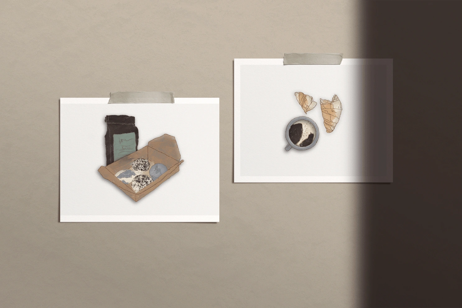
I created an icon pair in Fresco and Illustrator for the cafe’s website and menu. I picked out a flat lay of a coffee cup and a broken croissant to represent their menu selection and imply that The Local Cup doesn’t just serve drinks but treats as well. The product icon is a pack of coffee and a box of donuts. I chose these to show that the cafe also offers merch that customers can purchase off the shelves. Both icons use a consistent style and color palette with the logo to coordinate with the brand theme.
Social Media Headers
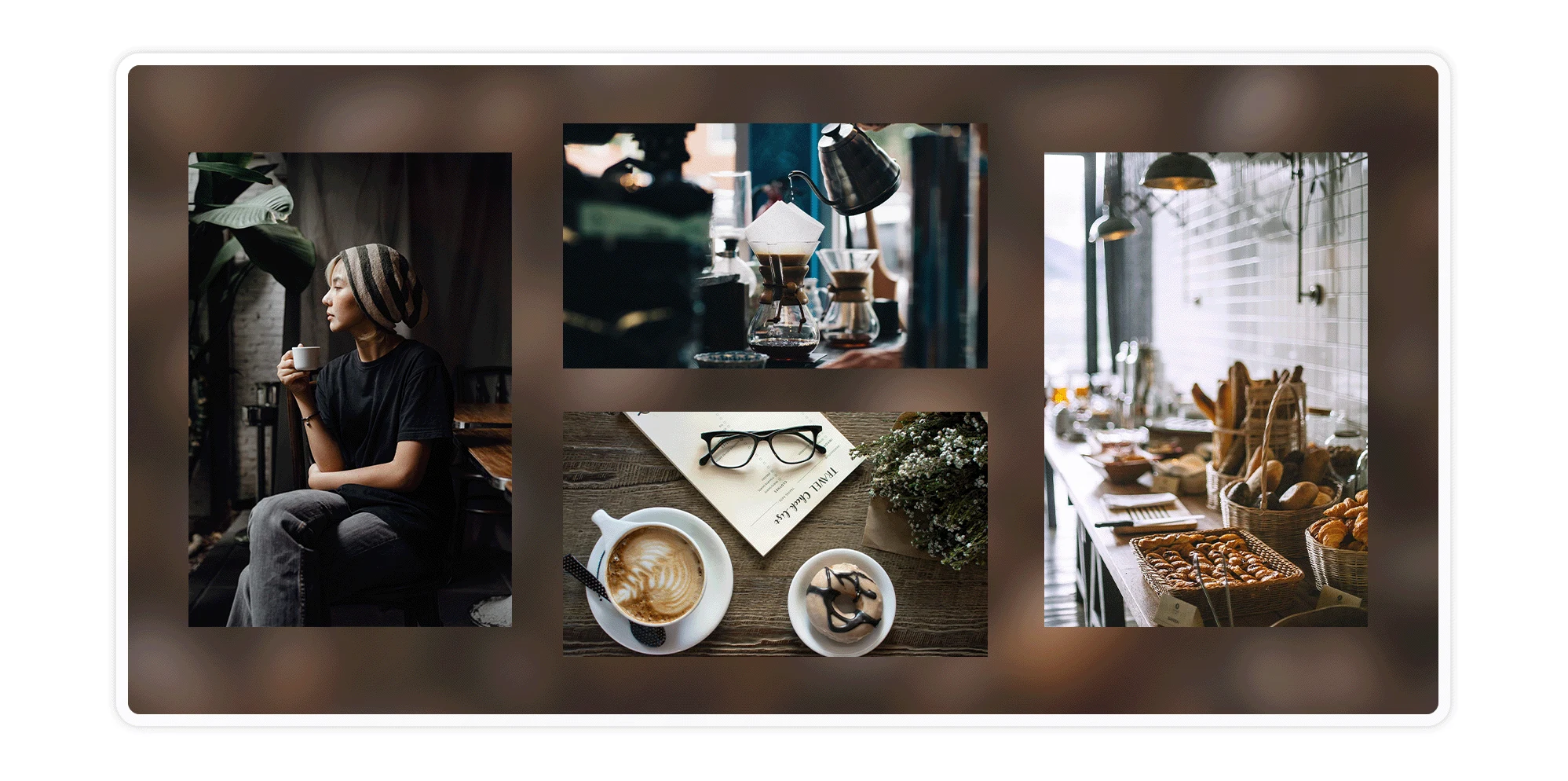
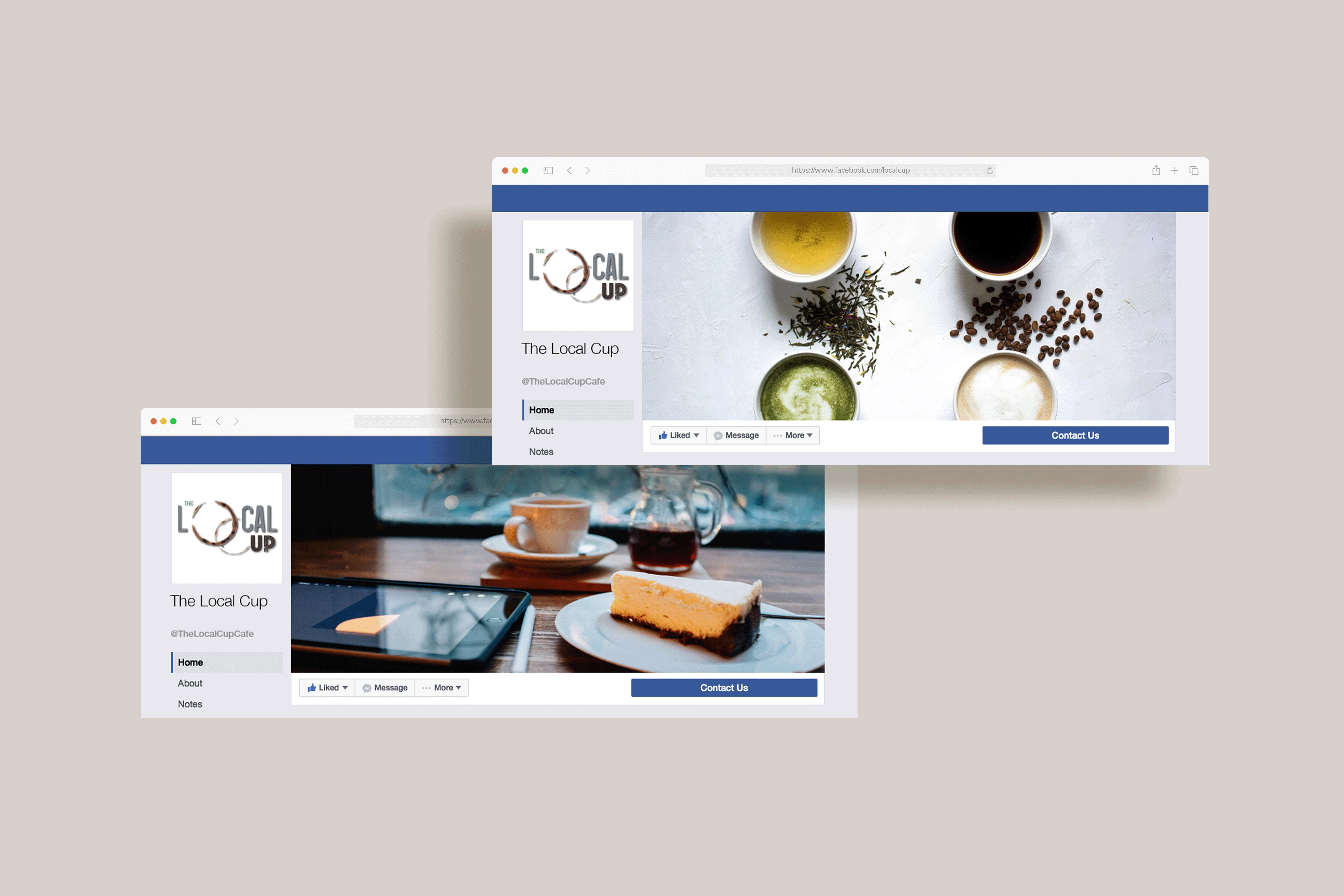
The owner also required social media headers to promote the cafe as they prepared for their grand opening. I collected a trove of images that displayed the colors and personality of The Local Cup and created different versions to use interchangeably on their social media platforms.
The headers featured coffee, tea and other hot drinks, or sweet treats prominently to tie with the logo. I used Adobe Photoshop to create the headers and mockups like Facebook cover photos.
FINAL DESIGN
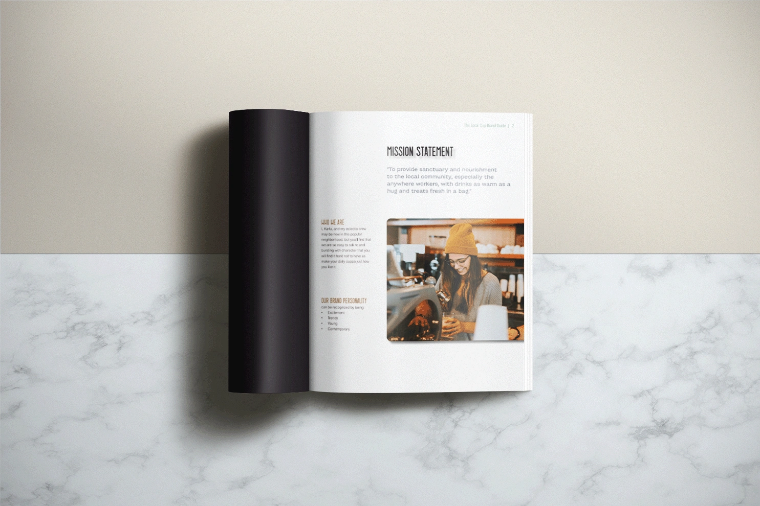
Brand Style Guide
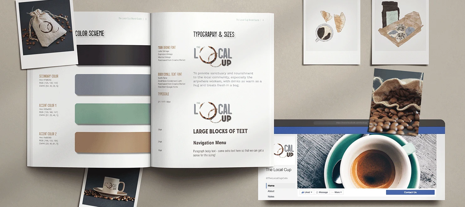
The Local Cup’s comprehensive brand style guide was the final element that brought all the other elements with clear guidelines for their respective usage together.
I created the style guide in Adobe InDesign with the look and feel customized to match The Local Cup’s typography and colors. The cafe’s mission, personality, color scheme, and typescale are included in the style guide, as well as the logo with variations and usage guidelines, icon pair, social media headers and imagery.
The comprehensive package will allow The Local Cup to keep a consistent brand identity across all formats, both virtual and physical.
Check out the pages below.
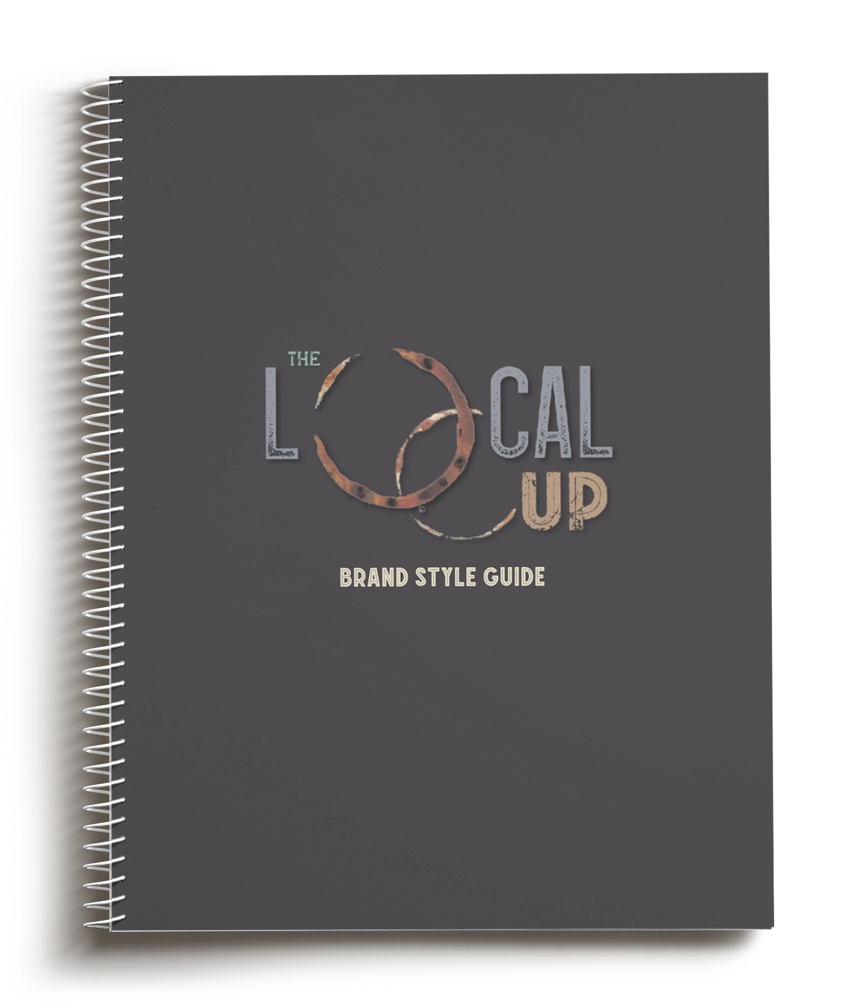
Final Clickable Product
Care to view the style guide in InDesign?
CHALLENGES
Perhaps the most challenging part of the project was the logo design. I wanted the representation of the coffee to be something out-of-the-box.
In the wild, I always happen on logos for cafes to be resembled cups or something quite similar and I figured, The Local Cup needed to break the mold.
I created a few funny drafts in the process, also taking into account the hipster-y personality of the brand. I finally settled on the stains and I knew I was getting somewhere.
I knew one of the reasons Karla chose me as her designer was for my unpredictable shots, nevertheless, she did provide constructive feedback to make the logo even more top-notch. I loved the feedback because it validated that Karla liked where the project was going and I learn a lot from iterations.
I probably would have felt more unsettled had she said nothing!
And indeed, after working with her detailed feedback, the changes elevated the logo design as one that we both were proud of.

TAKEAWAYS
Karla had a firm 3-month deadline for the completion of the branding package to grant her and her crew enough time to integrate all the assets into the setup of the brick-and-mortar store and their grand opening’s online promotion. It was crucial for Karla and me to stay looped in so that the branding complimented the cafe’s personality and targeted her ideal customers. We met every two weeks during the project’s course, discussing and approving each element. I shared my designs and incorporated her feedback to get the final look and feel.
Because of this project, I was able to work across multiple design programs - namely, Photoshop, Fresco, Illustrator, and InDesign - to create consistent designs. I learned to be flexible and to use the best software and tools for the tasks, from creating scaleable vector images to implementing the style guide’s layout. Furthermore, I learned to include a buffer for client feedback so that updating for changes didn’t impact the project’s overall timeline.

PROJECT CONCLUSION
Upon completion, The Local Cup was finally armed with a comprehensive branding package to help them establish their distinct identity. The package included a color scheme, a typescale, a logo with variations, an icon pair, imagery, and social media headers. A comprehensive style guide compiled all the assets together with included guidelines for each.
Having the assets created prior to the cafe’s opening allowed Karla and her crew to start strong with a solid identity even before their doorstep got busy. The Local Cup was also able to stir up some excitement for their opening on social media platforms and website. Karla’s crew prominently featured their logos, icon pair and colors online as they were reflected in their physical cafe. This has built a sense of familiarity and recognition despite the cafe just opening for the first time ever.
Like this project
Posted Aug 26, 2023
A comprehensive brand style guide for a neighborhood cafe with a hipster flare.
