HYGGE PORTFOLIO
A personal portfolio web design that displays my proficiency with my design tech stack.
Scope
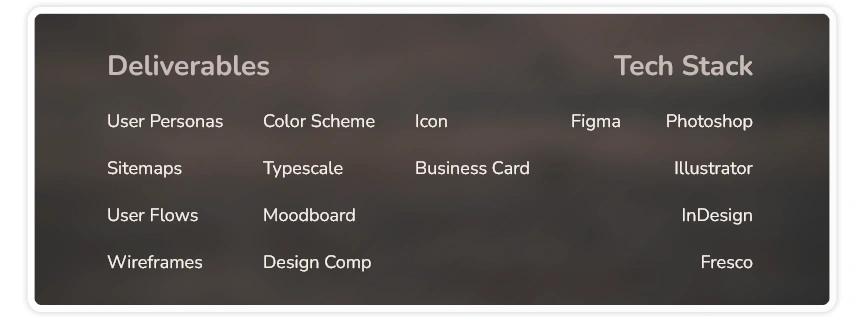
As you may notice, I went for a builder to manifest the portfolio site you are currently navigating. And to show that I’m equally adept at designing from scratch, I created a personal portfolio design comp with custom-tailored assets. The final deliverables include a couple of user personas, sitemaps, user flows, wireframes, a color scheme, a typescale, a moodboard, a design comp, an icon and a business card.
Role
As this was my own portfolio study, I maintained full ownership as the visual designer to display my skills in branding and web design which I aim to ultimately help me snag client gigs or design jobs.
OVERVIEW
Indeed a strong, well-thought-out portfolio is a necessity for a digital designer. I wanted to tell my story, my personal brand, first and foremost, before I can efficiently help others with their own stories. With my portfolio work, I aim to be consistent across all of my online profiles, and to actually live my brand.
The project comprised identifying who my ideal users are, creating a personal brand and supporting look and feel, designing my site's user interface and design assets, and finalizing and packaging a design comp.
Problem
As an emerging designer, I needed my personal brand to be developed and presented that would leave an impression that stands out among my contemporaries. I am also mindful that my portfolio site should have a relatable theme with an engaging interface and convenient user experience.
GOALS
I wanted to share with the world that I am finally ready to take on more design projects with my new skills, all the while expressing my personality and how that relates to my work. I wanted my audience to clearly know what it is I do, how to find samples of my work, and to understand who I am as an individual.
I wanted to connect with future clients as well as startups and employers that I find most appealing and whose advocacies I support.
DESIGN PROCESS
User Personas
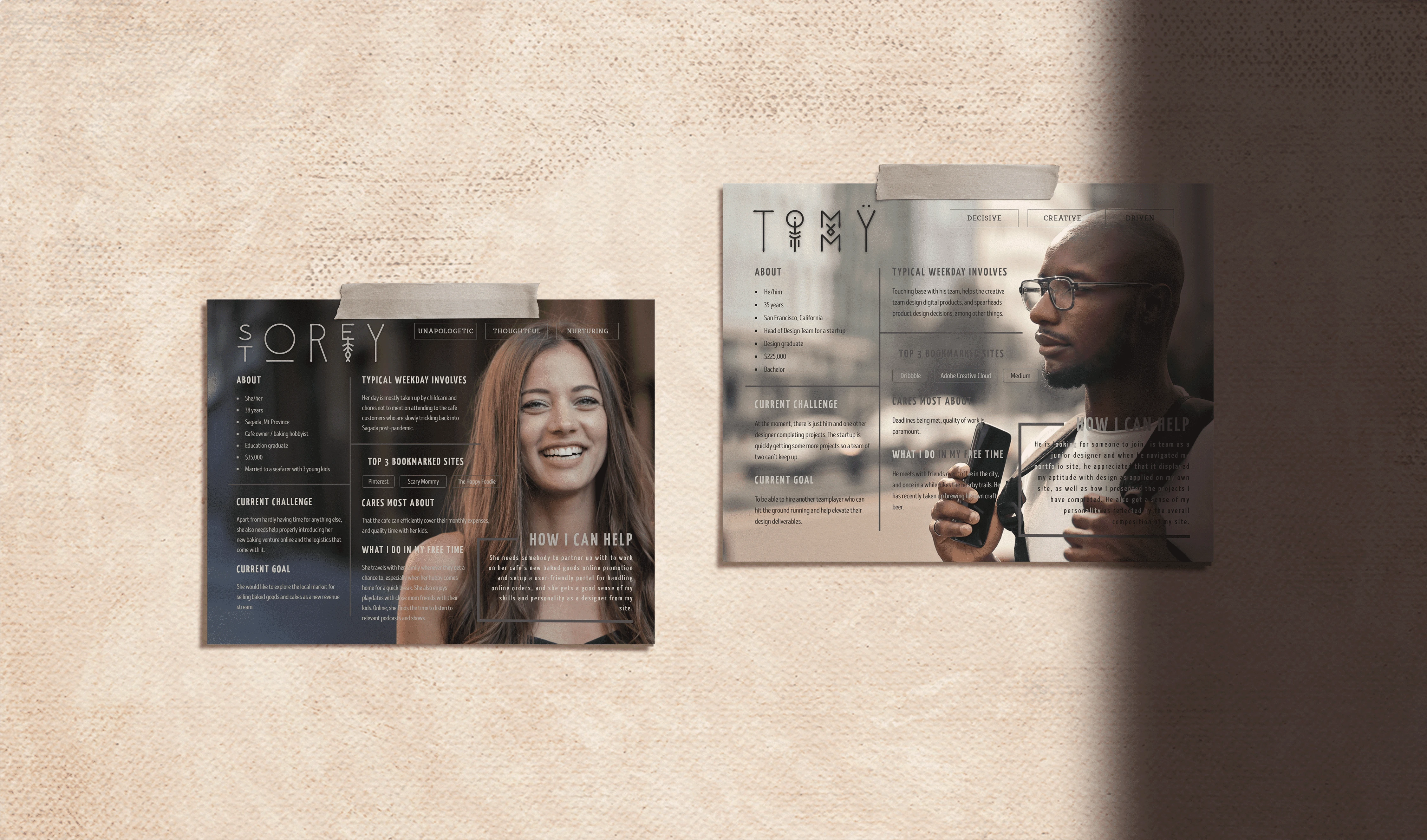
I created a couple of user personas to help me figure out exactly who my site is for and figure out their specific needs and interests. That way, I would be able to make sure that my site delivers on those needs.
The details I included were their locations, genders, ages, careers, educational levels, family status, income, as well as their interests and hobbies. I also listed their traits, goals, challenges, and how I can help each of them. Most importantly, I created the personas with as much objectivity as possible.
Sitemap
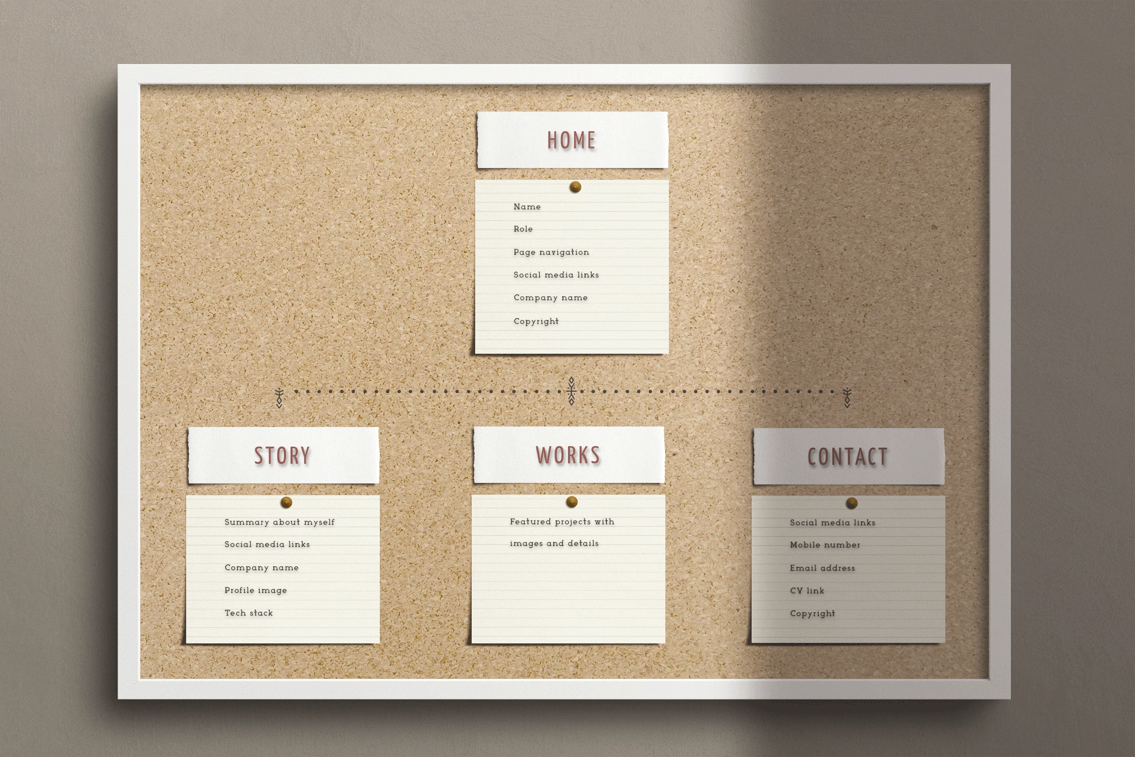
Now that I've figured out who I wanted to connect with, the next step was to know for whom I can build a site with their needs in mind. So I made a simple, intuitive sitemap for my website design to help organize it so that the most important content is easily accessible to the user. And mapping out my site helped me plan the ideal path my users will take to visit each section.
Since my website is a simple design, my sitemap displayed sections instead of main pages. Even though this was the case, I figured a sitemap was still helpful because it provided a visual structure showing the sections, each of which linked from my main navigation.
User Flows
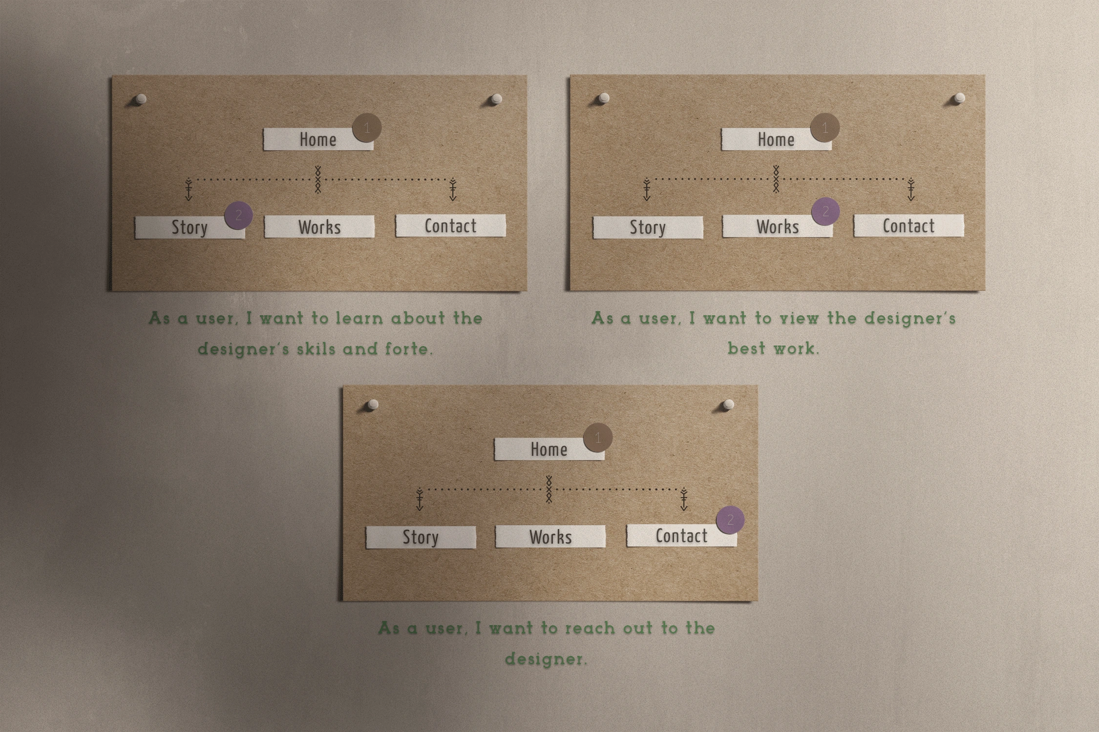
Having sketched the sitemap, it was time for me to plan out the path my users will take to get from Point A to Point B. I built a storyboard format to anticipate all the steps my users will take to get from one place to another, catch any problem areas before I start designing, and make sure my site's structure matched its goals.
Wireframes
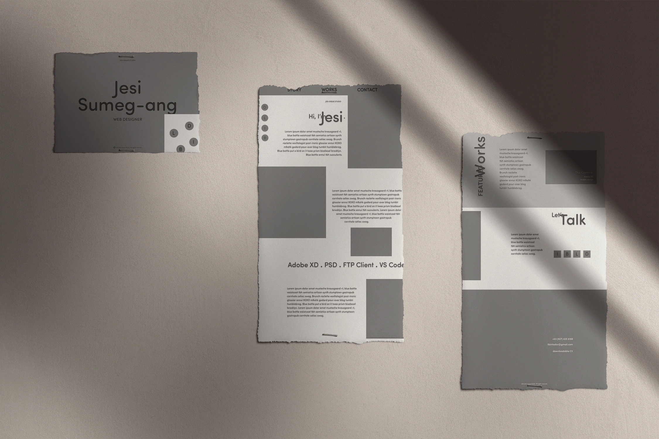
To get started on my portfolio's layout, I started sketching out my wireframes by hand to include the key contents such as my page title, navigation menu, images, icons, body text, and section headings. I also made sure that my new wireframes supported all the UX work I've done so far that included my project goals, sitemap and user flow.
I then created a digital wireframe based on my sketches using Figma. This was where my site's structure, content and features all came together. For now, I utilized placeholders and lorem ipsum-generated copy to help me visualize where everything went and the spaces they required.
Color Scheme
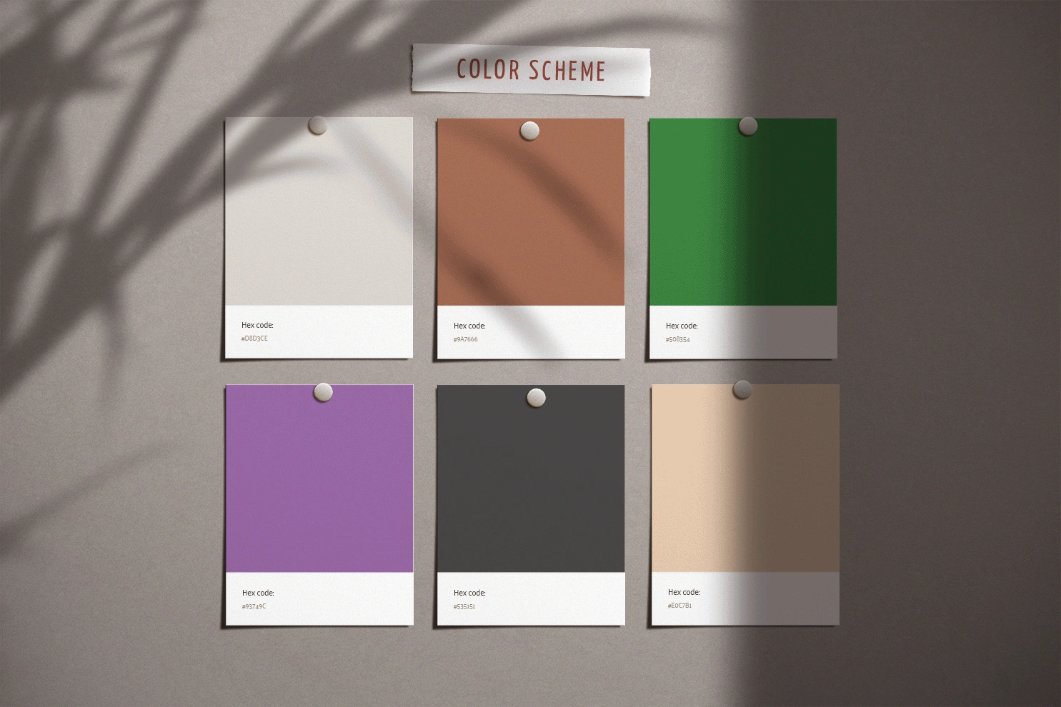
For my portfolio project, I selected colors that supported the earthy hygge theme that I was going for. To break away from my fascination with the dark UI trend, I decided to create a light, cozy theme. The final color scheme was a vibrant palette of flesh, charcoal, lavender, grass, bark, and grey sky to fully paint a picture of the elements when the users enter the world within the website.
Typescale
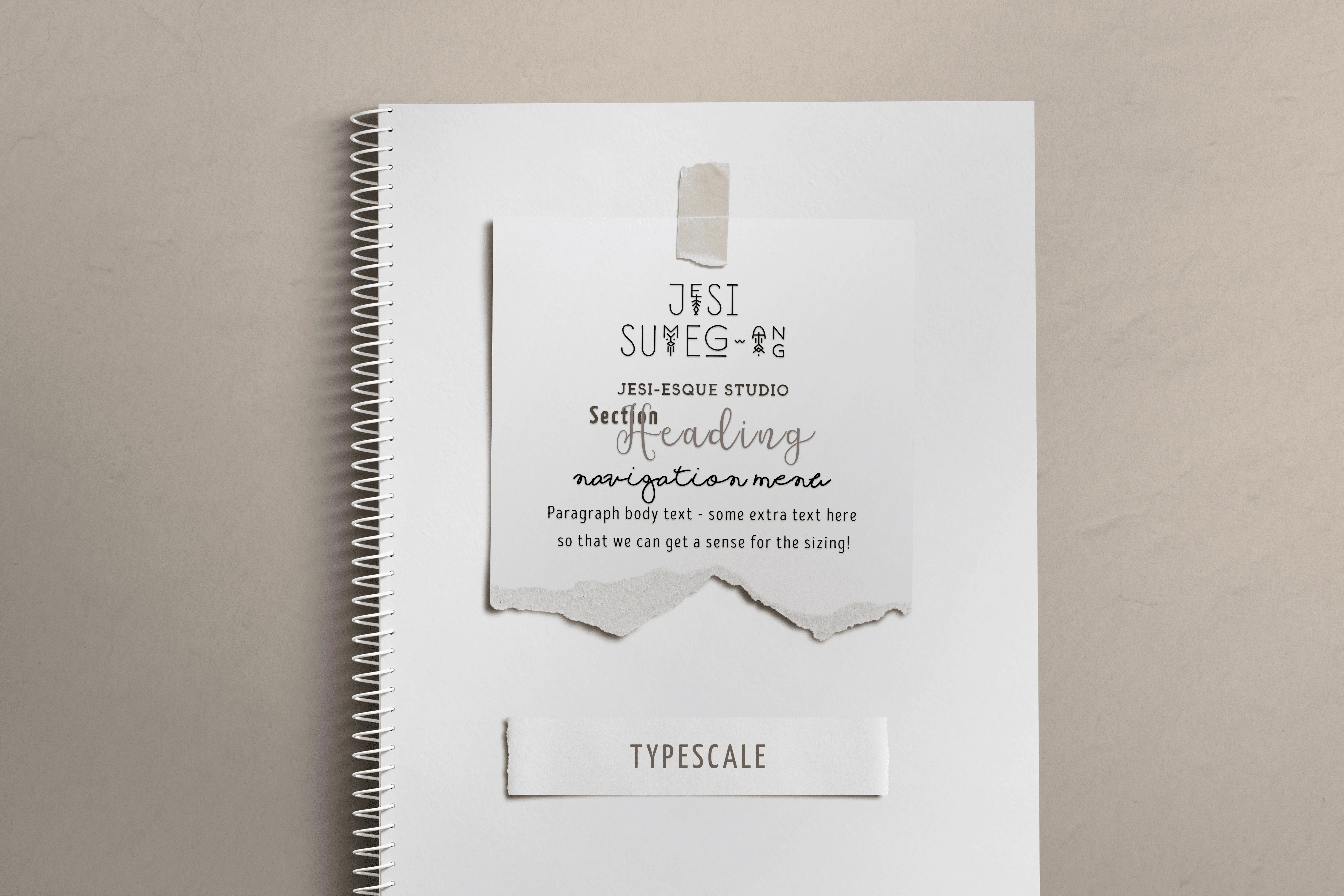
I found typefaces that characterized the cozy tone to depict the personality of my hygge portfolio. I selected the thin line geometric font Runista Decorative for the title, its folk style, lowercase typeface decorated with geometric elements. This along with its symbol version complimented the hipster look and feel of the comp. I used the Intro Head R font for the paragraph text because this sans serif typeface is clean and straightforward. Shorelines Script Bold was perfect for the navigation, a cursive font with imbalanced heights and spacing giving the comp a natural and handwritten look. I went with Arctic, a slab serif typeface featuring sharp edges, for my company name. And finally, my section headings are combinations of Yanone Kaffeesatz Bold, which is reminiscent of 1920s coffee house typography, and Notulen, a serif display typeface that is inspired by classic typography with a modern serif nuance.
Moodboard
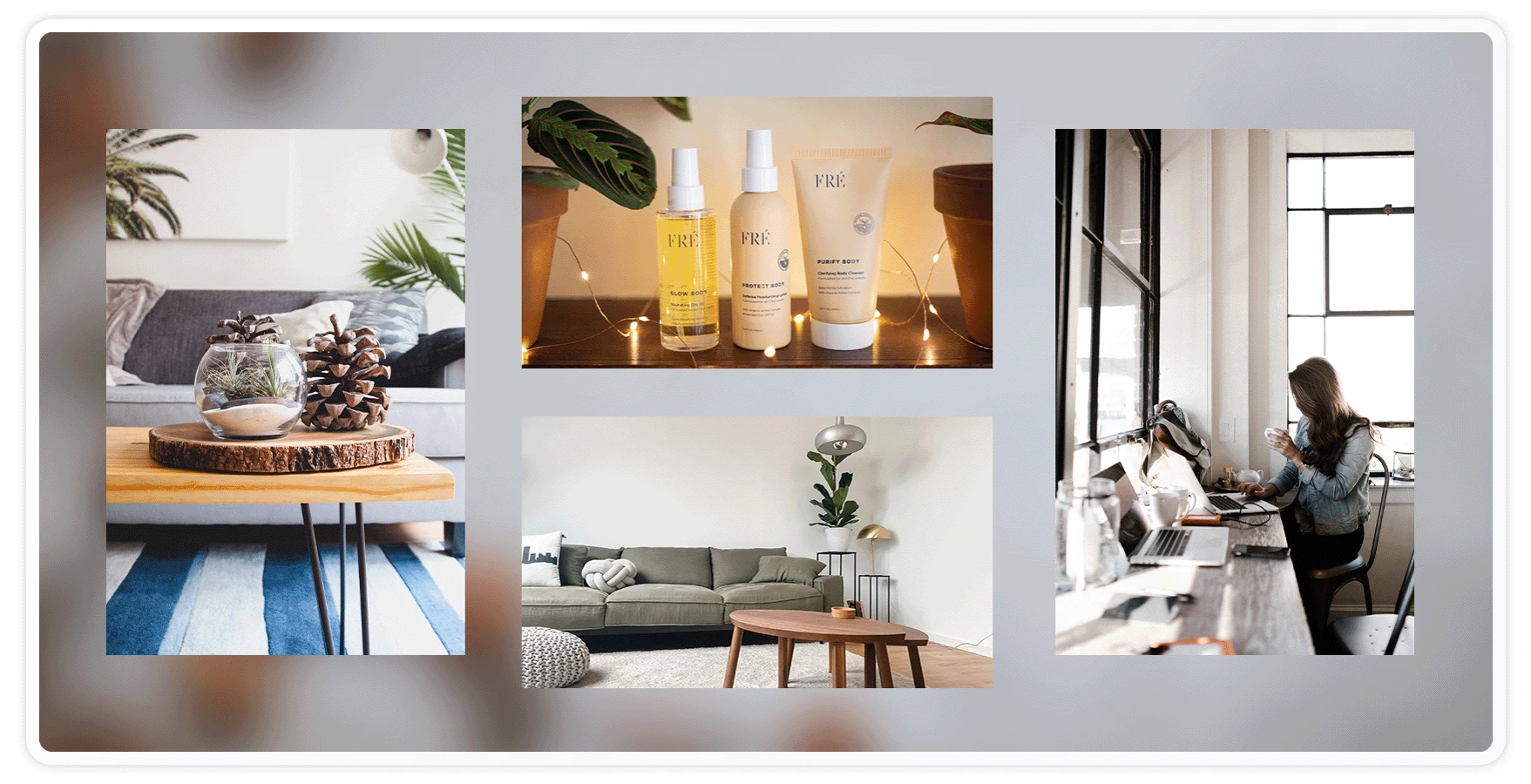
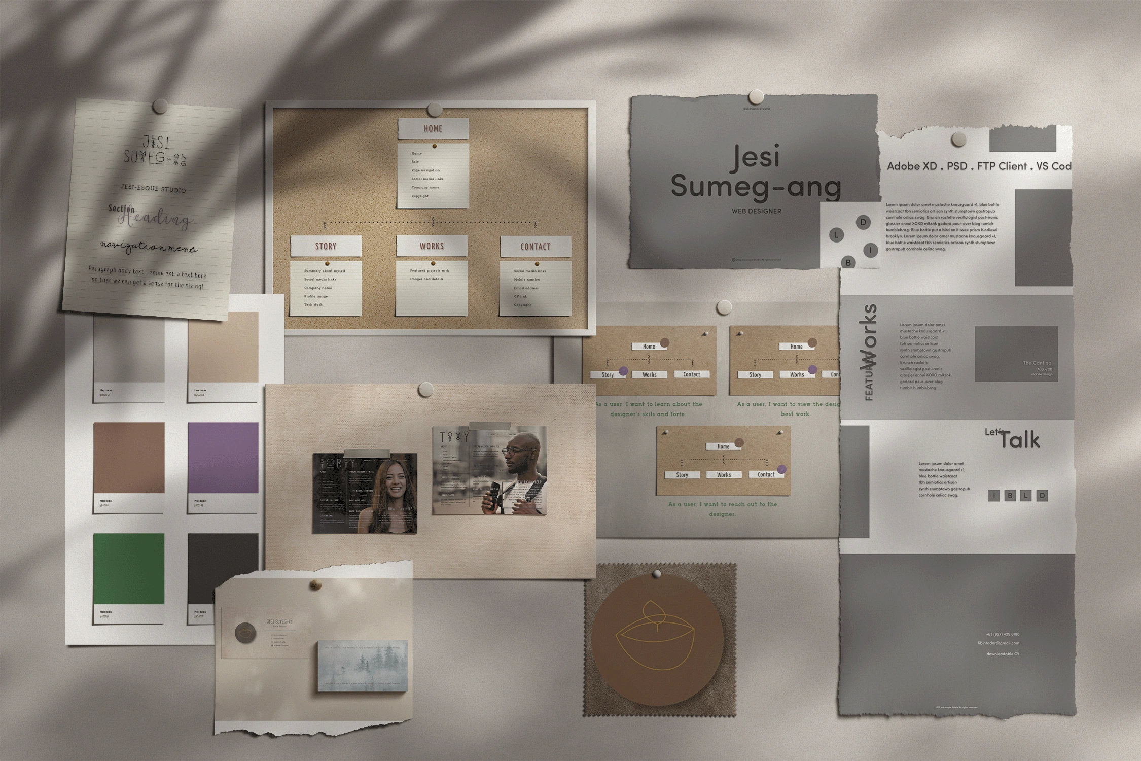
Crafting the moodboard was one of the first steps in the project. But the reason I positioned it here is that this was how it was finally realized after all the iterations and updates. I began with keywords that described the project, what my brand's values were, and the emotions I wanted to evoke from users. In it I included the color palettes, typefaces, imagery and other graphical elements. Working with a moodboard helped me explore ideas and kill the ones that didn't work.
Design Comp
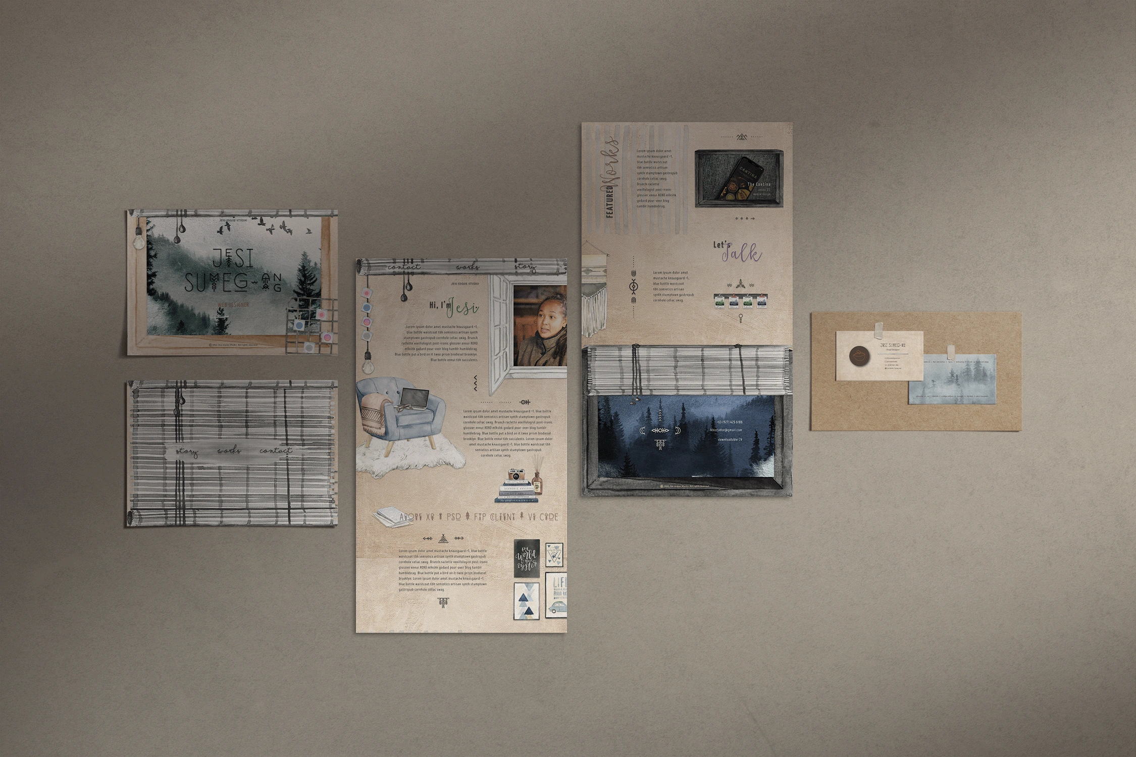
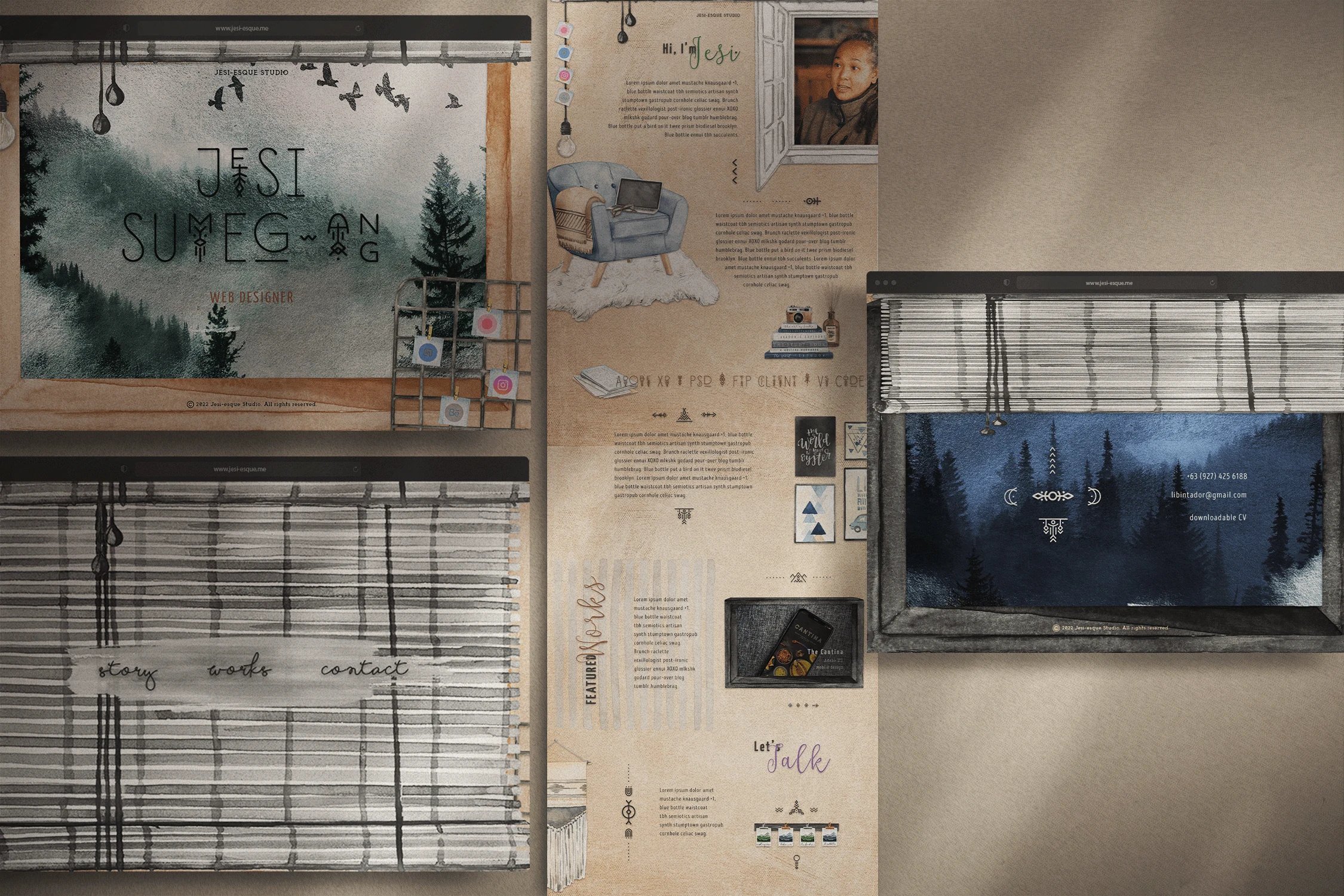
With all the elements in order, I imported the images I chose for the project. After creating the wireframes in Figma, I figured that Photoshop would be best for this phase of the comp's design. I selected watercolor landscape illustrations for the hero and contact sections. They had that dreamy appeal that reflected how it looks outside my window in my mountain hometown. I then added foreground design elements, with a suspended bulb to draw the blinds down and reveal the navigation and a wire memo board with notes showing individual social media icons. I have also added the typescale and color scheme throughout the design comp.
Transitioning to the next page where all the sections are, I affixed the social media icons on the left sidebar of the topmost section, and horizontal just above the contact section's full spread. In the about section, my profile image I framed within a window looking in. Augmented by Runista symbols, I positioned a plump armchair complete with a lush throw, specs, a laptop, and a sheepskin rug, with a pile of books, a camera, and bottled incense sticks not too far away. I used a pale canvas as the background that ties everything together. My design tech stack is detailed above the last paragraph and the accenting wall art assets.
I chose to showcase my featured projects in the works section with a drag effect and using the arrow buttons, with half the spread fixed while the other half was laid out as a carousel. I added the framed project images with a gradient to make the title details more legible.
Coming to the contact section, I accented it with a macrame wall ornament and laid out the social media icons like polaroids clamped to a wooden stud. It felt fitting that I went with the blinds positioned half drawn and utilizing white space as I did with contact details and CV link.
Icon
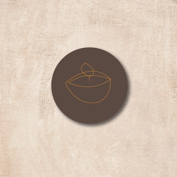
I created an icon in Illustrator that went with my portfolio website. I chose to go with an outline of a scented candle to represent the Danish trend keeping it simple and using colors within the scheme. I opted to create the icon circular with a line illustration to keep to the theme.
Business Card
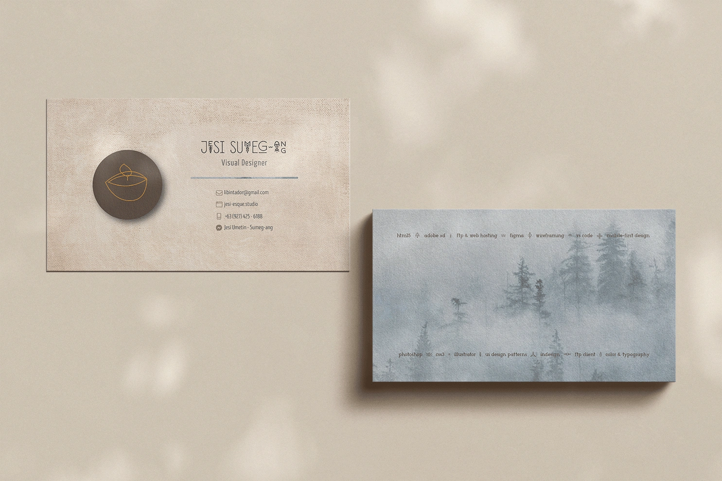
My portfolio project won’t be complete without a business card, so I went and created one using InDesign. I utilized the icon I created in Illustrator and included relevant contact information so that people would know how to reach me.
Like the portfolio site, the business card fashioned a light canvas background that went with the hygge theme, along with the typescale and color scheme. Then I added a dividing line between my role and email address to distinguish the primary (my name and role) and secondary (the rest of my details) sections. However, instead of just a standard flat line, I made it by masking the background image of the card’s back part.
Apart from the misty pine forest background that mirrored the portfolio site’s hero and contact images, the back of the business card also listed my design tech stack and skill set.
FINAL DESIGN
Digital Portfolio with Business Card
As a natural storyteller, I felt compelled to approach my portfolio project with an engaging story beyond simply laying out my credentials. And as it is technically my virtual workspace, I wanted it to reflect my tangible office. Such is why I chose the hygge theme which is conducive to productivity.
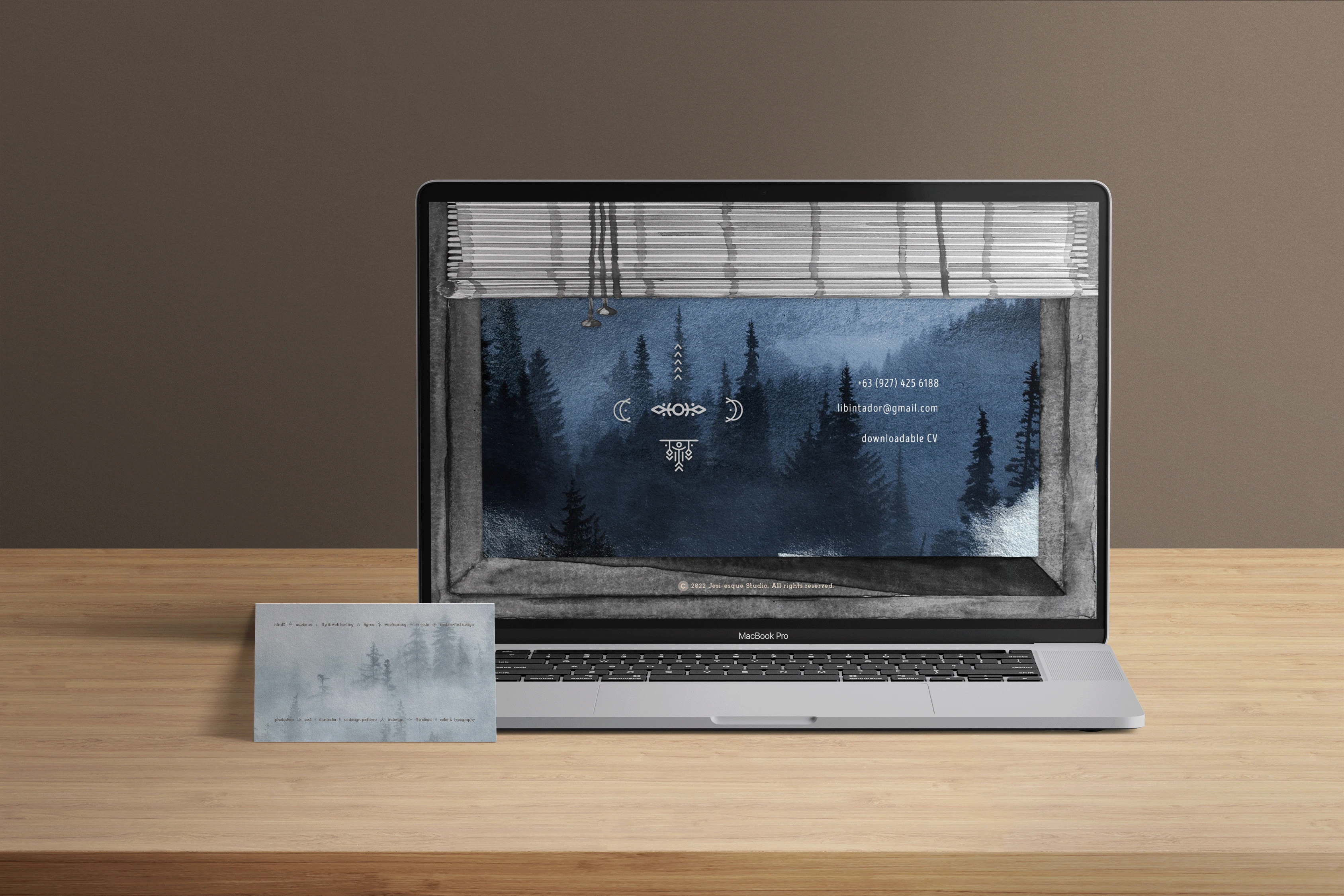
My portfolio website opens with a framed view of a misty pine mountainside as the homepage. It sets the user in a sublime location for an open mindset. And as the user taps on the suspended bulb on the top left corner, the blinds are drawn to reveal the navigation. When a section choice is tapped, the blinds pull back up to display the next page which would then be the hygge office interior. Within that page, the user finds design elements that complement the theme all the while showing my skills and forte. When the user gets to the contact section, they are brought to another window with the blinds halfway down and showing the falling night, the perfect closure.
The business card in the same theme extends that story, and the set allows me to stay consistent with my personal branding.
You are welcome to check out the images in the carousel below.
Final Clickable Product
Care to view the prototype in Adobe XD?
CHALLENGES
One notable challenge I encountered was when I initially fancied designing the portfolio with a horizontal scroll layout. I wanted something different and, at the time, I was intrigued by how that kind of flow mimics reading books.
However, a mentor advised that from a UX perspective, there are a lot of potential controversial opinions and downfalls on the horizontal scroll layout's user-friendliness, despite looking cool and trendy. I ruminated on her points extensively and decided that I needed my portfolio to be accessible and easy for my users to navigate. I cannot forfeit that for the sake of aesthetics. So I redid my design in the vertical scroll layout and did it in such a way that I was still able to tell a great story through my portfolio proficiently.
Marrying the landscape illustrations and the hygge-themed interior elements was another challenge that I grappled with. To be truthful, I initially didn't know what to do! But I was sure that I wanted these elements included. Inspiration and approaching the project with a fresh perspective solved the conundrum beautifully.
Lastly, given that Photoshop was not as interactive for prototyping as XD, I wasn't sure how to present my design comp's fun features such as the navigation blind's animation. Thankfully, I was able to make it work with just a few uncomplicated clicks. Nothing is impossible with a good enough workaround.
TAKEAWAYS
This project had me using the most popular tools of the trade - Adobe Photoshop, Illustrator, InDesign, and Figma. I was able to fully understand the design process and workflow, and appreciate the invisible workings of personas, sitemaps and user flows.
It was fascinating to learn about UI design patterns and trends, however, it takes to be mindful about which ones would be appropriate for my project. Just as when I learned which of the Adobe Design Trifecta to use at which parts of the design stage. It entailed how I had to set up my workspaces, and use the properties and features within the tools.
To realize my portfolio website design and business card, I gave myself a month's deadline to maintain a sense of urgency. Shipping my comp and design files was as essential as the rest of the process and indeed felt like the apt closure for a project.
As a result of this project, I learned to be open to constructive feedback, even if it meant making a major revision. Taking a step back from my screen and going for a walk healed me from a design block and ultimately inspired my work.

CONCLUSION
After the dust has settled, I ended up with a portfolio website design that thoroughly reflected my personal brand, with a matching fancy business card! The whole set comprised of a typescale, a color scheme, an icon, a business card and a high-fidelity design comp.
With these in my arsenal, I feel validated as a digital designer and primed to start applying for client gigs and covetable agency roles. I can now go through reputable listing sites knowing that I have a consistent and engaging personal brand established by my design assets. Furthermore, I would also be able to hand out my stunning business cards to in-person contacts and prospects during onsite gatherings and events.
Like this project
Posted Aug 26, 2023
A personal portfolio web design that displays my proficiency with my design tech stack.
