CANTINA
A mobile web design that incorporates a local taco shop's new needs due to the pandemic.
Scope
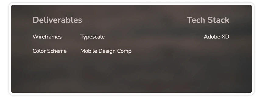
This project comprised building a multi-page, scrollable mobile web design. The final deliverables are made up of a refined design comp, a color scheme, a typescale and design assets prepared for a developer handoff.
Role
As the project designer, I worked with Jessica to understand their family's goals for the Cantina's mobile site and implement them into a polished final design. I was the UI/UX and mobile web designer.
OVERVIEW
Jessica Villa got in touch with me to create a web design for their family's taco shop business. They also requested that I make it only in a mobile version since their customers are mostly smartphone users and include an interactive map to show the users where to find their new location.
Problem
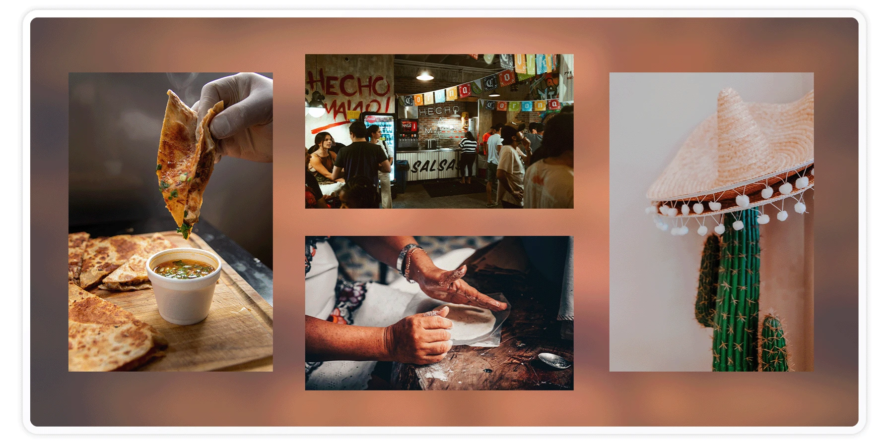
The Cantina had been thriving pre-COVID. When the pandemic upended life and forced people into the new normal, Jessica and her family decided to adapt to the changes instead of closing up shop like everybody else. They were using a Facebook page to share photos of their menu, but as their food gained more online orders, they needed a more professional platform to spread the word about their growing menu and handle orders.
GOALS
At the end of the project, the Cantina will have a multi-page mobile web design to showcase their menu and add new dishes as they build their offerings. It will include a page to provide their origin story, photos of the chef who happens to be Jessica's younger brother, and their new location. There will also be a separate page with their contact details and an interactive map.
DESIGN PROCESS
Design Research
To better understand the Cantina's goals for their mobile site, I provided Jessica with a questionnaire to find out their vision. They also provided me with their logo, dish images, pricing and descriptions, shop backstory, and contact details. They also gave me the common questions and answers for the FAQ section.
Wireframe Sketches
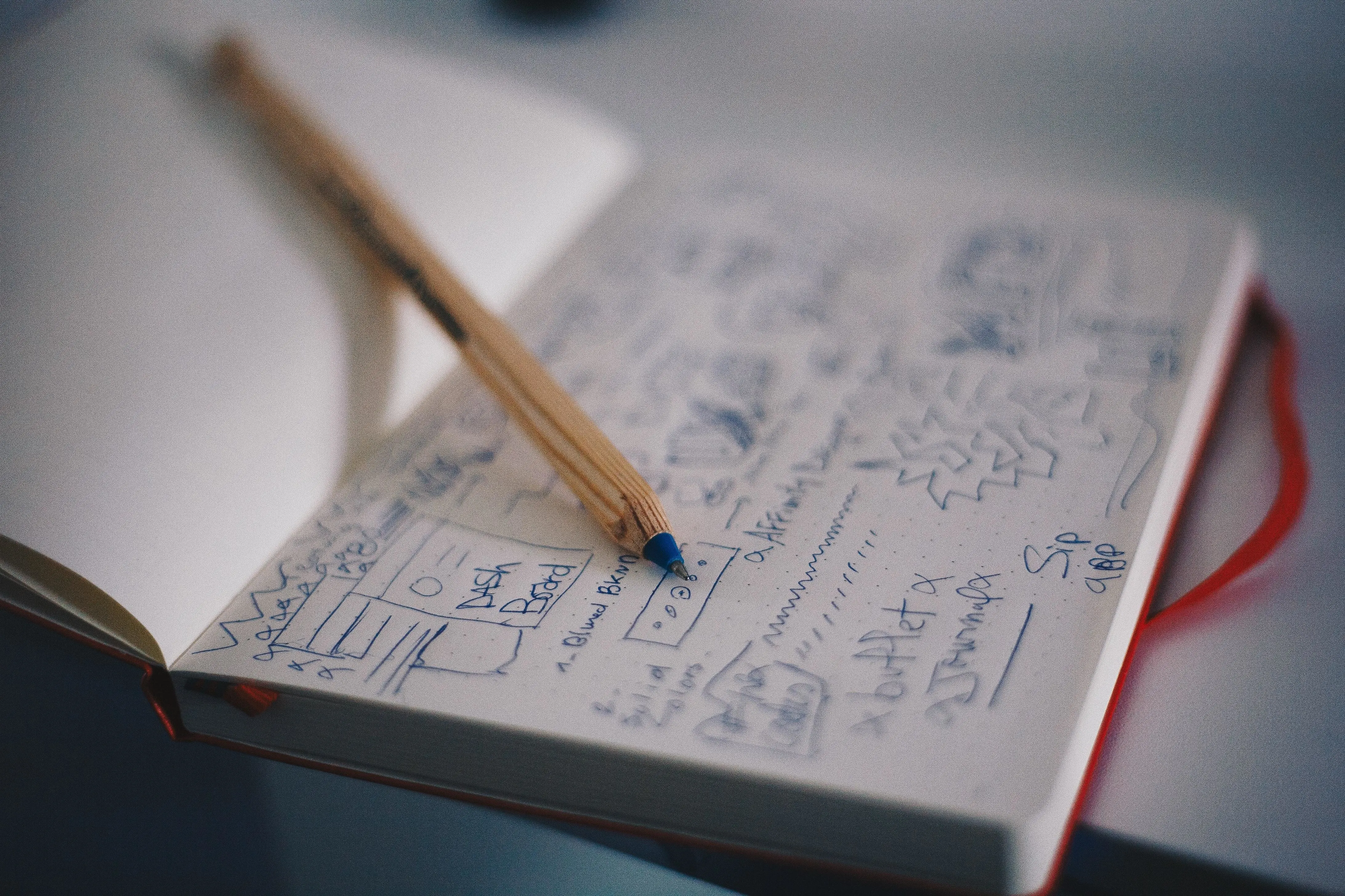
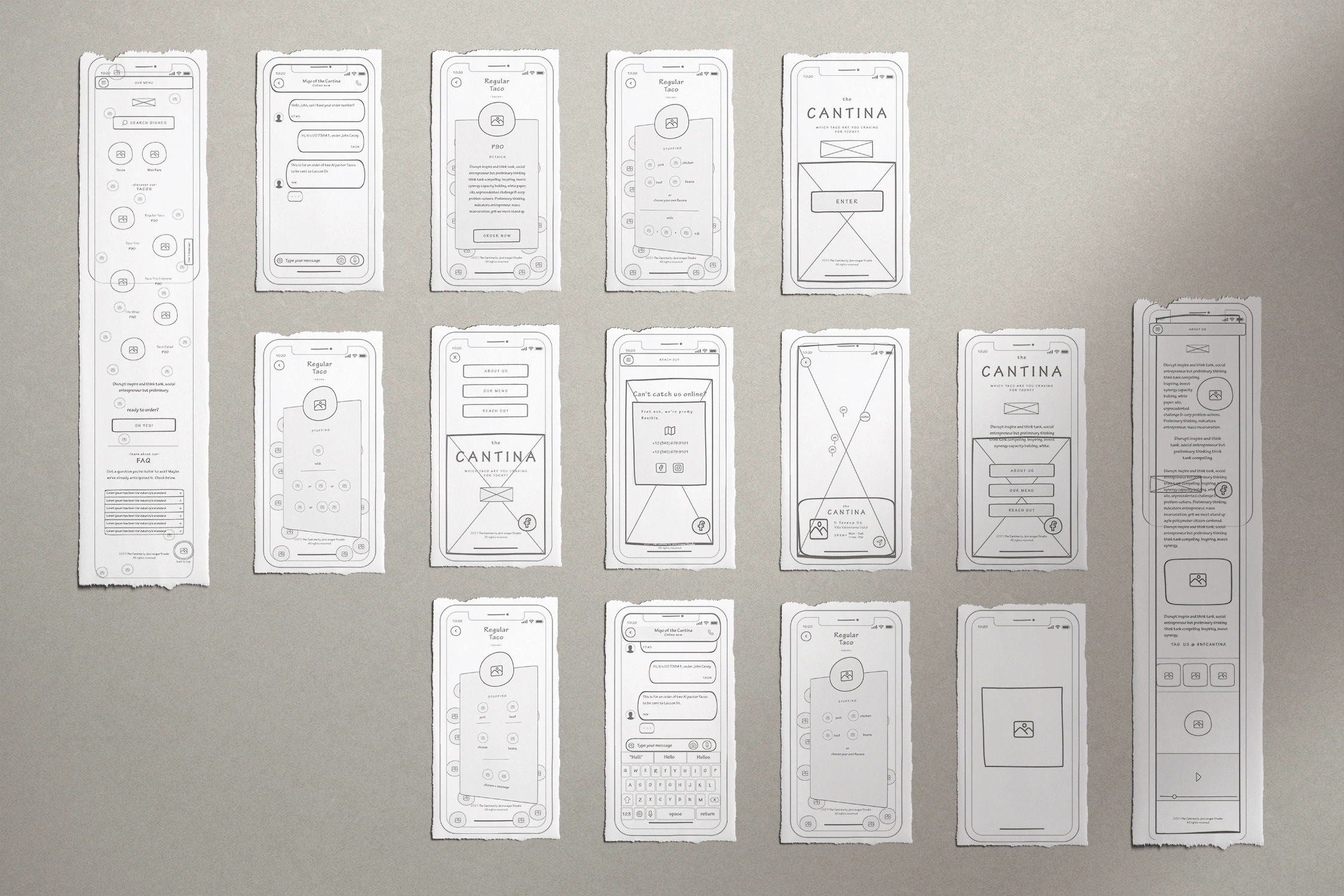
With the Cantina's goals in mind, I drew rough sketches of the site on paper to determine the layouts. I went with a button navigation design on the menu pages and a hamburger button on the About, Menu and Contact pages. I placed the brand name and logo prominently centered on the homepage and in the three main pages, I retained the logo at the top just below the menu bar. I used a placeholder for the hero image to pull in the viewer's attention. I also included a quote to entice users to access the main pages.
The Menu page would highlight the Cantina's selection of menu offerings. I placed a menu bar and a search box, wedging a smaller logo in between. I planned to position the menu categories high in a slider, with the respective dishes below arranged semi-randomly along with small assets in the background. The dishes would also include their names and pricing, with the option to tap on them to transition to individual dish pages. For those pages, I wanted to include each dish description, the ingredients and an order button.
In addition to the offerings in the Menu page, I added a sidebar chat button in the top frame so that it would be convenient for the user. There is another chat-to-order button further down the page. At the bottom of the page, I incorporated an accordion-style FAQ section and a back-to-top button.
After learning about their dishes, it made sense to provide more information about the taco shop with their backstory and images. Since they are also active on Instagram, I created an image carousel under their Insta handle with a few of their most popular samples. Below that, I placed a lone design asset and a short clip of a customer enjoying a taco to encourage users to place orders.
The Contact page would have the contact information and social media links as well as a link to Google Maps directed towards the Cantina's new location. I created an interactive map complete with markers and nearby landmarks. The Cantina's contact label on the map includes an image, the address and the shop hours.
Digital Wireframe
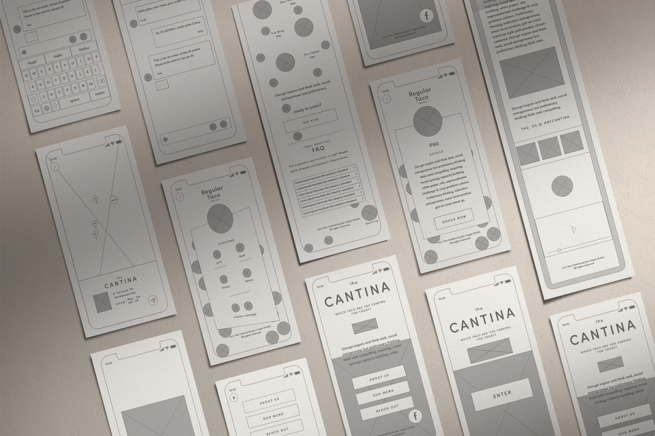
Now that I had rough drafts of the site layouts, I brought the sketches into Adobe XD to build the design in a digital format. I inserted the Cantina's text to visualize how much space each section of the copy would need. To make sure that I could focus on the overall spacing and layout, I postponed adding the colors and typefaces until I was satisfied with the basic design. At this point, I made sure that copy is playful and relevant to the ambiance that the taco shop wanted to express. It was also when I created all the dish pages for all their menu offerings.
Color Scheme
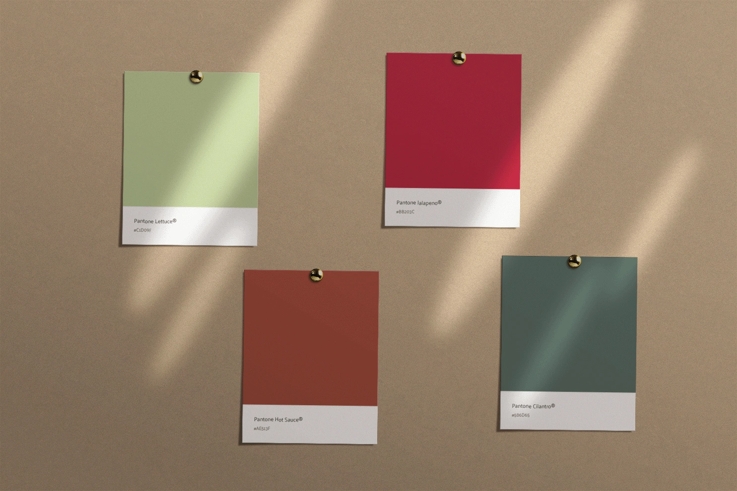
Looking through the Cantina's images, I wanted to choose a color scheme that would complement the vibrant colors of their dishes, and I went with a dark UI theme to frame the design with a grunge, urban appeal.
I selected a pale lettuce green (#C1D09F), a bright jalapeno red (#BB203C), a deep hot sauce brown (#AE513F), and a dark cilantro green (#586D65) that would pop against the dark background.
Typescale
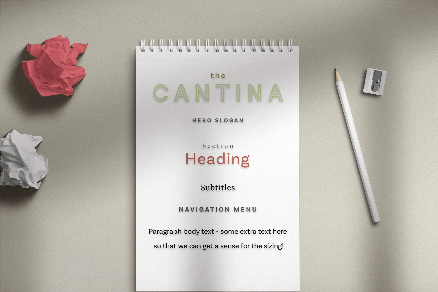
For the typefaces, I wanted something striking but clean and stylish. I went with the powerful combination of slab serif Yrsa with Basic Sans Bold that highlighted the stylistic contrast between each other, and used this combo for the section headings. By themselves, I utilized Yrsa for the subtitles, and Basic Sans for the navigation, body text and hero slogan. I selected the Continuo display typeface for the title because of its mesmerizing appeal. The result was a clean and stylish typescale that was easy to roll out on mobile or anywhere the Cantina would need to reach users.
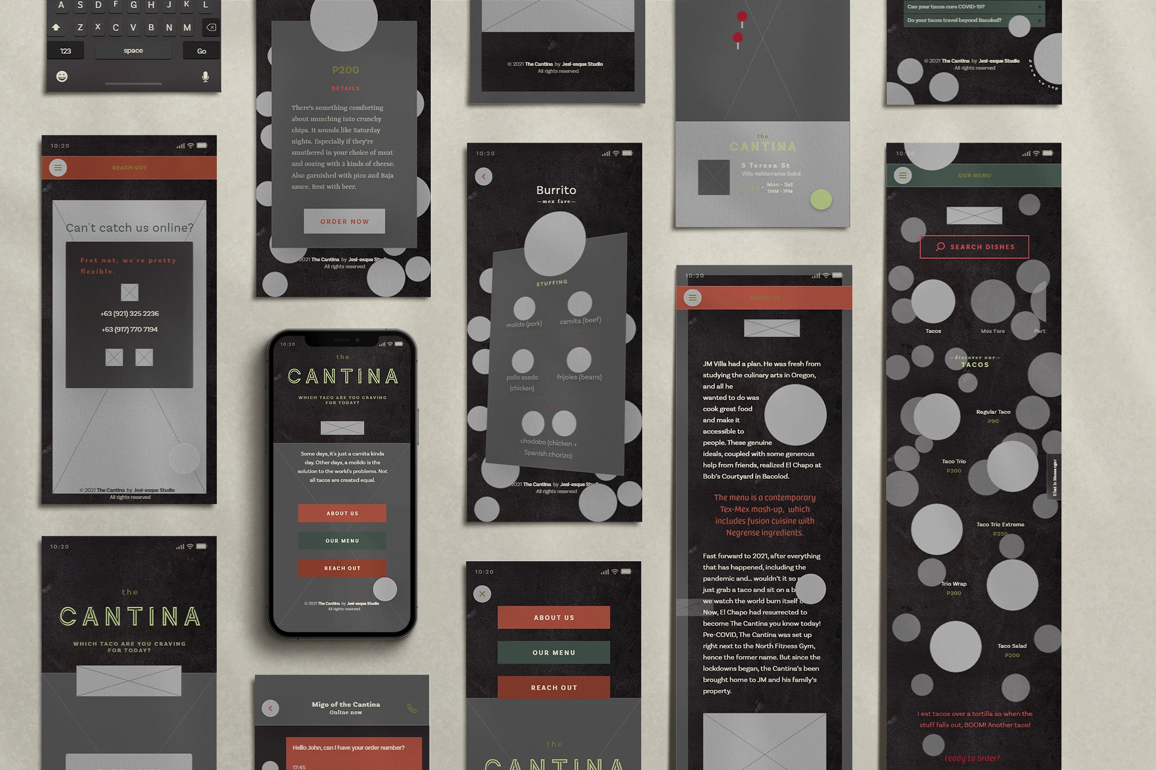
Lo-Fi Comp
I brought the colors and typefaces into the wireframes to confirm that they work within the context of the layouts. I used the bright hues sparingly to ensure that they wouldn't pull focus from the dish images. I used the darker hues to add more character to the design.
Design Comp
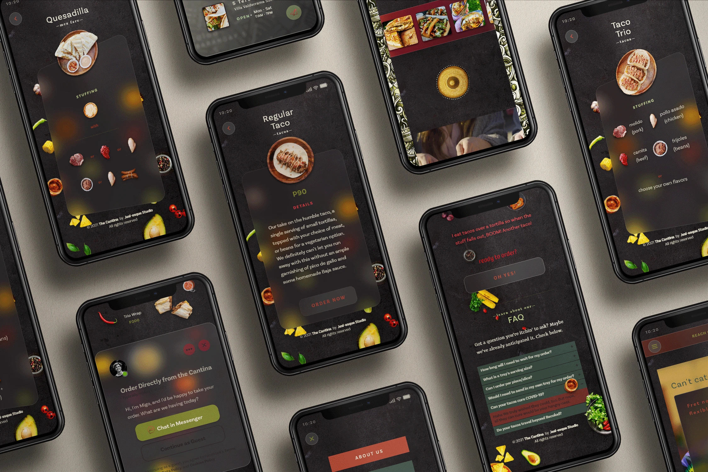
With everything else in place, I brought in the images that Jessica provided and supplemented premium stock photos for the remaining design accents. I have also started to introduce micro-interactions and glassmorphism into the comp's overall theme.
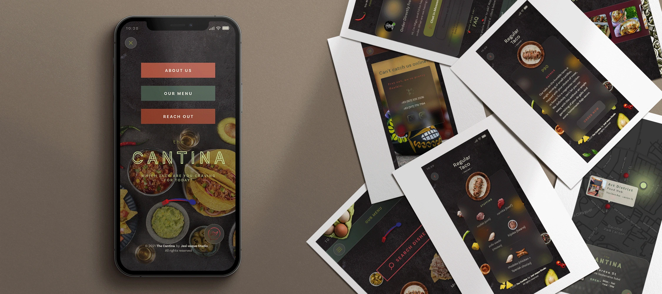
With the Home Screen, I used the time and tap triggers to animate the hero image, navigation buttons, logo, brand name, tagline, intro quote and chat button. I also darkened the hero image slightly to enhance the design details on the foreground.
For the Menu page, I added a gradient on the menu bar to infuse more contrast to the text which is similar with the About and Contact pages. The search box was then animated, and the menu categories were placed in a horizontal scroll group with a darkened gradient for the icons and text that are not selected. I kept the dish images fixed for the selected category, and accented the section with smaller assets with a darkened gradient. Given that I was designing a mobile site, I steered clear of using hover effects except for the said assets since they were not expected to transition to a different page. I animated the chat buttons with the glass effect expanding to a full-width and linked to the messenger page. For the FAQ's accordion feature, each field can expand to reveal the answers to the user's common questions, and the back-to-top button has been disguised as a plate of greens and chilies.
I figured that a card flip effect in the individual Dish pages would make it a fun experience for the users to check out their descriptions and ingredients. I used the glass effect on the cards and blurred the assets in the background.
I created a variation for the About page's background using a green taco-inspired illustration. And for the Instagram slider, I used the horizontal scroll group effect, and an overlay effect for each of the Instagram images. I also applied a gradient on the slider box.
Finally, aside from the glass effect on the Contact page card details, I made it interactive with a time effect and created a fancy transition via the map icon to a dark-themed interactive map. The Cantina's marker had a glowing green effect and the glass detail card collapses by tapping on the card itself or the marker. Lastly, the back button on the top left corner has the pull-down transition to the Contact main page.
FINAL DESIGN
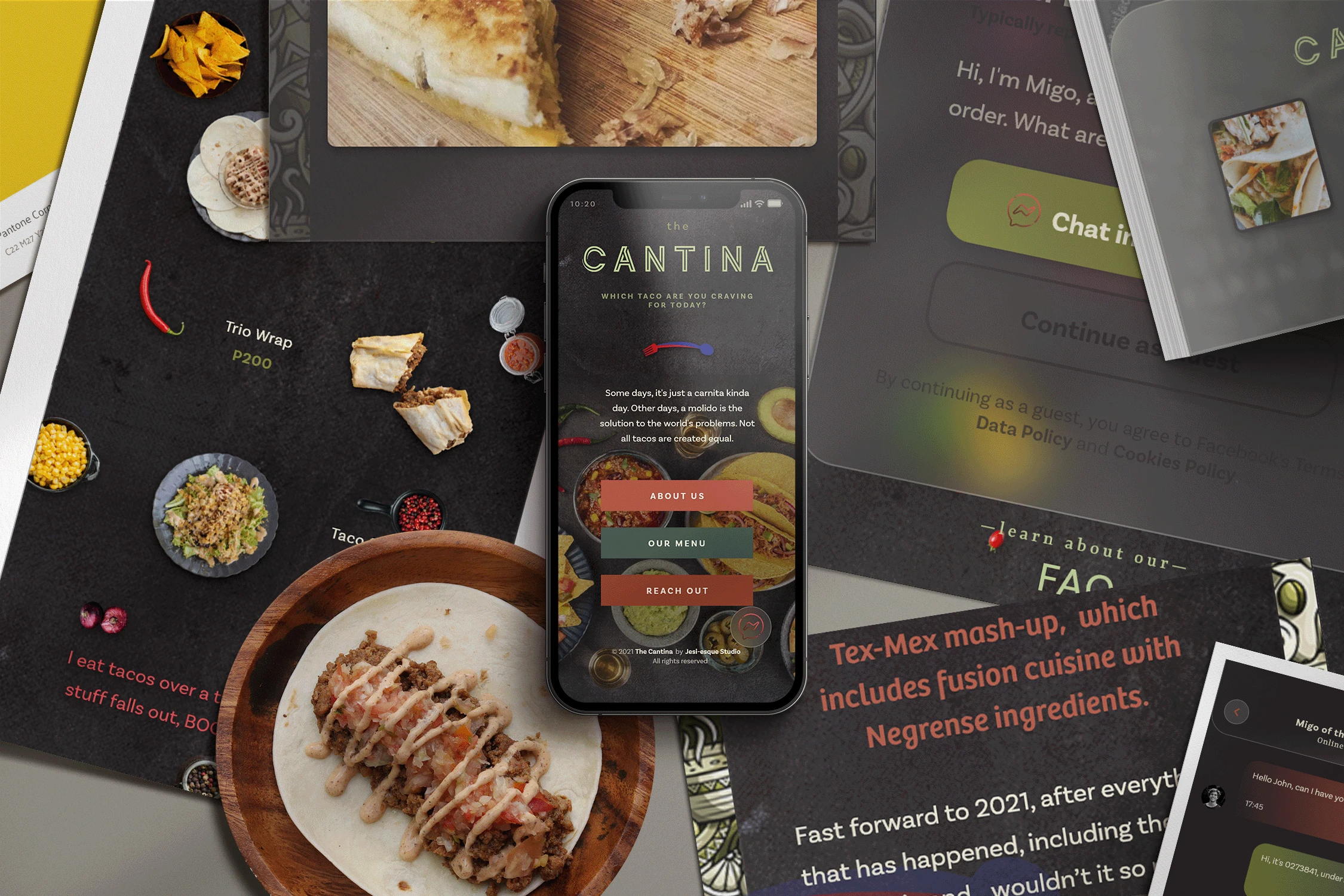
Mobile Web Design
The Cantina's mobile web design had been an awesome exercise as it motivated me to think out of the box. It encouraged me to study design trends and patterns that would help elevate the comp over what is considered average. I was able to realize Jessica's family's goals and requirements with all the design elements I brought together and created.
With their mobile web design, the Cantina should be able to increase their online customer base, efficiently handle their orders, and conveniently direct their customers to their new location.
Check out the prototype below.
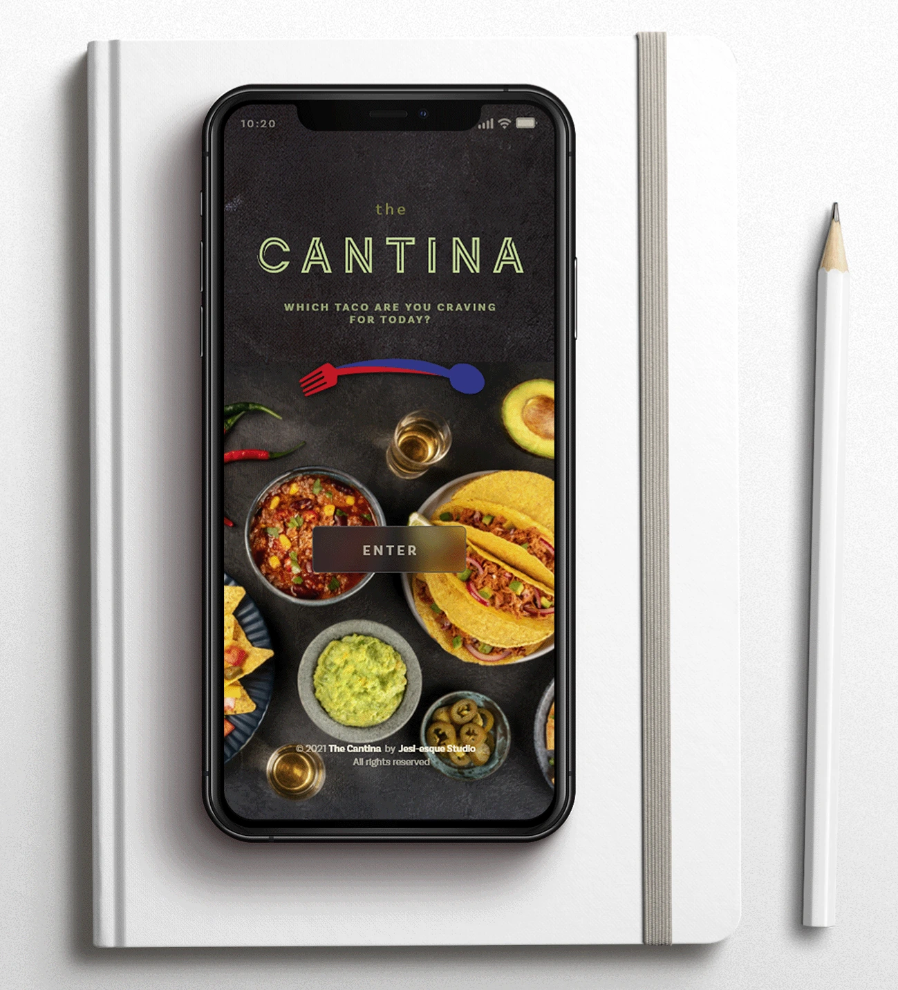
Final Clickable Product
Care to view the prototype in Adobe XD?
CHALLENGES
In retrospect, accessibility was one of the most challenging parts of working on this project. Specifically, I had to improve my copy's readability in the dish pages against the dark background. Furthermore, I increased the blur effect to give off the additional distance between the elements.
Another challenge that I encountered was applying the micro-interactions. They were as much intensive homework as they were fun to navigate. But I deemed them necessary to keep users engaged as they navigate the mobile site.
Lastly, the interactive map was initially daunting. But just like the micro-interactions, studying and researching beyond my blueprint rewarded me with the skill to recreate the interactive map that suited the whole design.
TAKEAWAYS
Jessica had a flexible deadline for the completion of the mobile web design to grant them and their family enough time to adjust online to their new location and updated ordering process.
I kept Jessica in the loop so that the design reflected the taco shop's personality and targeted their ideal customers. We communicated regularly during the project's course, going over the design elements. They offered their feedback so that we can nail the final look and feel.
I was able to work in Adobe XD to create the design stunningly because of this project. I learned to think beyond conventions and to use premium tools and resources for the tasks.
PROJECT CONCLUSION
I was able to create an engaging, trendy design for the Cantina to showcase their delectable menu. The multi-page mobile website focused on their menu offerings, the story of how the Cantina came to be, and their contact information. Because they want to expand their menu, I made sure that the design would allow for additional dish options to fit seamlessly into the layouts.
The Cantina was provided the final design, which included the color scheme, the typescale, and exported assets to make coding the design easier for the developer.
Like this project
Posted Aug 26, 2023
A mobile web design that incorporates a local taco shop's new needs due to the pandemic.
Likes
0
Views
14
