Oatly Goes Luxury: Oatly Rebrand
Chanel Mülhaupt
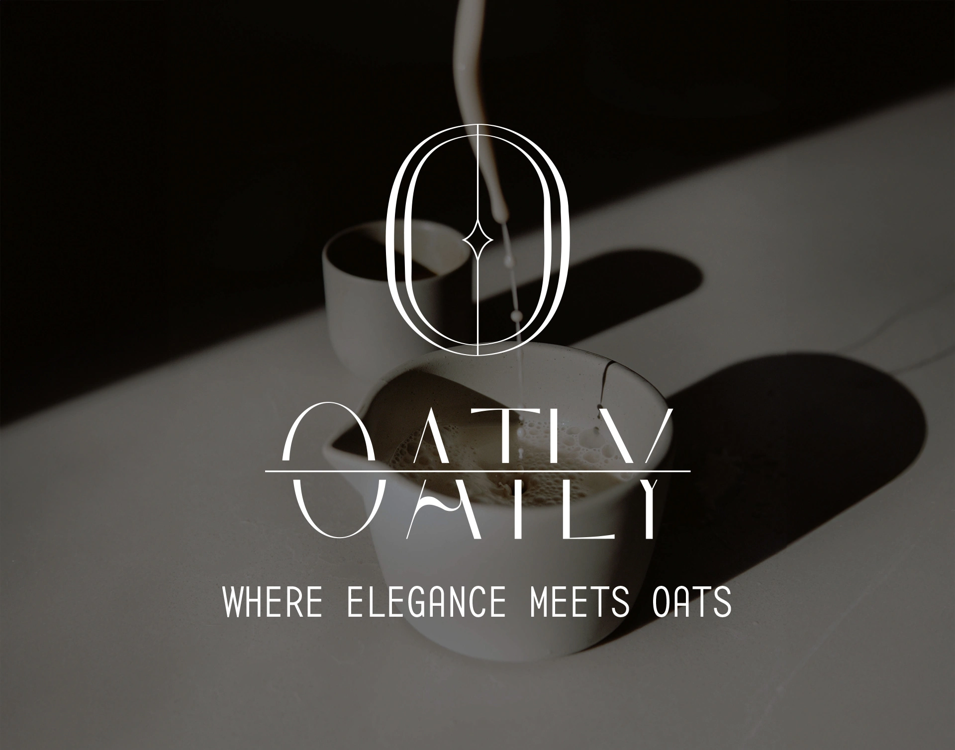
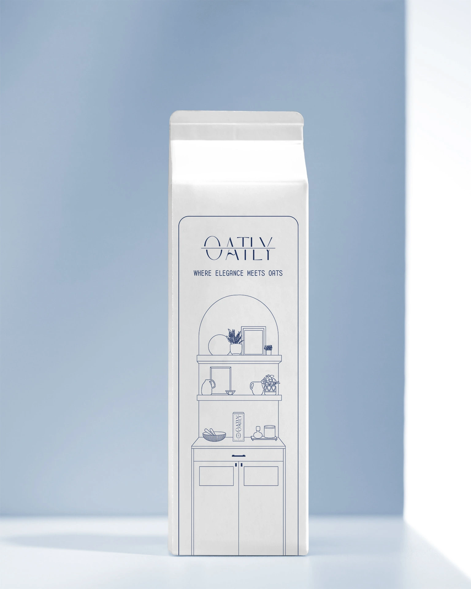
«Introducing Oatly: Redefining oat milk luxury»
Ever wondered how Oatly would rock a touch of luxury? Wonder no more. This project takes Oatly into posh territory, where sophistication meets oat milk. Picture a crowd who adores top-notch stuff in everything they do.
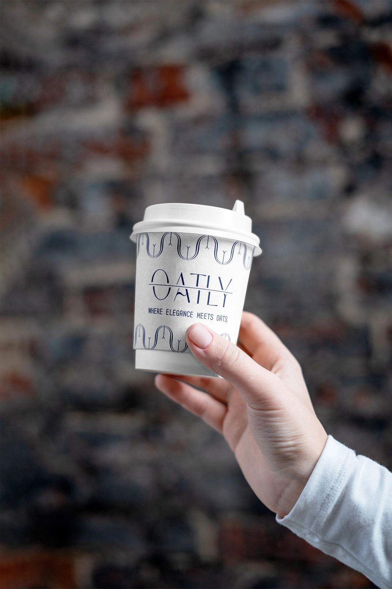
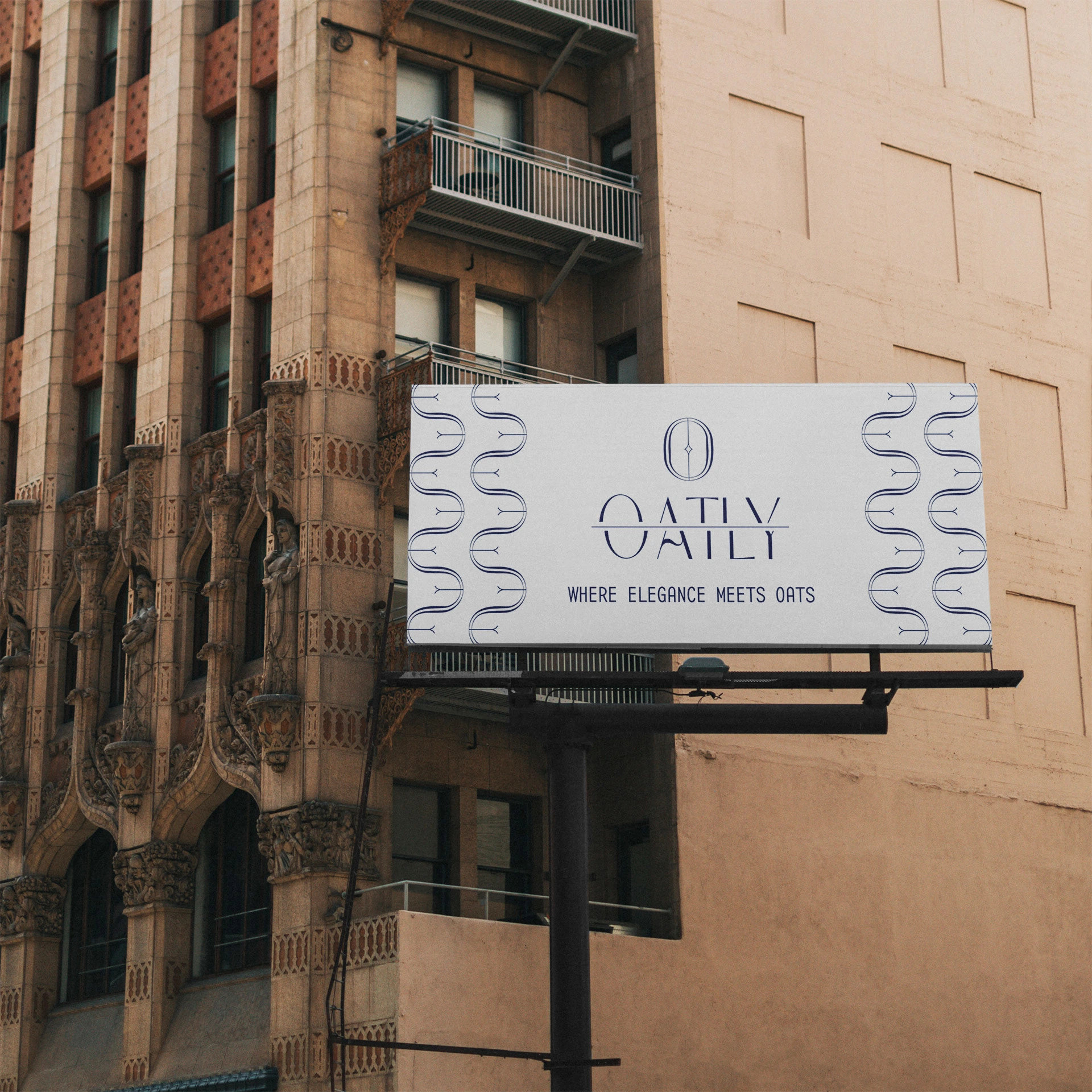
The logo's the star, mixing a fancy font with a sprinkle of oat grain and the letter 'O' for good measure. Packaging? It's all about that clean, artsy vibe – no excess words, just minimalist cool. Look closely and you'll spot a hand-drawn kitchen, giving you a peek into the life of the luxury lovers who'd sip this.
To get here, I went through logo drafts till the 'aha' moment hit. The packaging? I flipped the script, keeping it sleek. And because reading's cool, a snappy blurb about this luxury oat milk is on there too.
The result? Four logo variations and a whole packaging redesign that whispers 'fancy' in every sip.
Like this project
Posted Aug 26, 2023
Ever wondered how Oatly would rock a touch of luxury? Wonder no more. This projects explores the idea of a luxury oat milk brand.