Pulley: Fintech Website Design to Launch

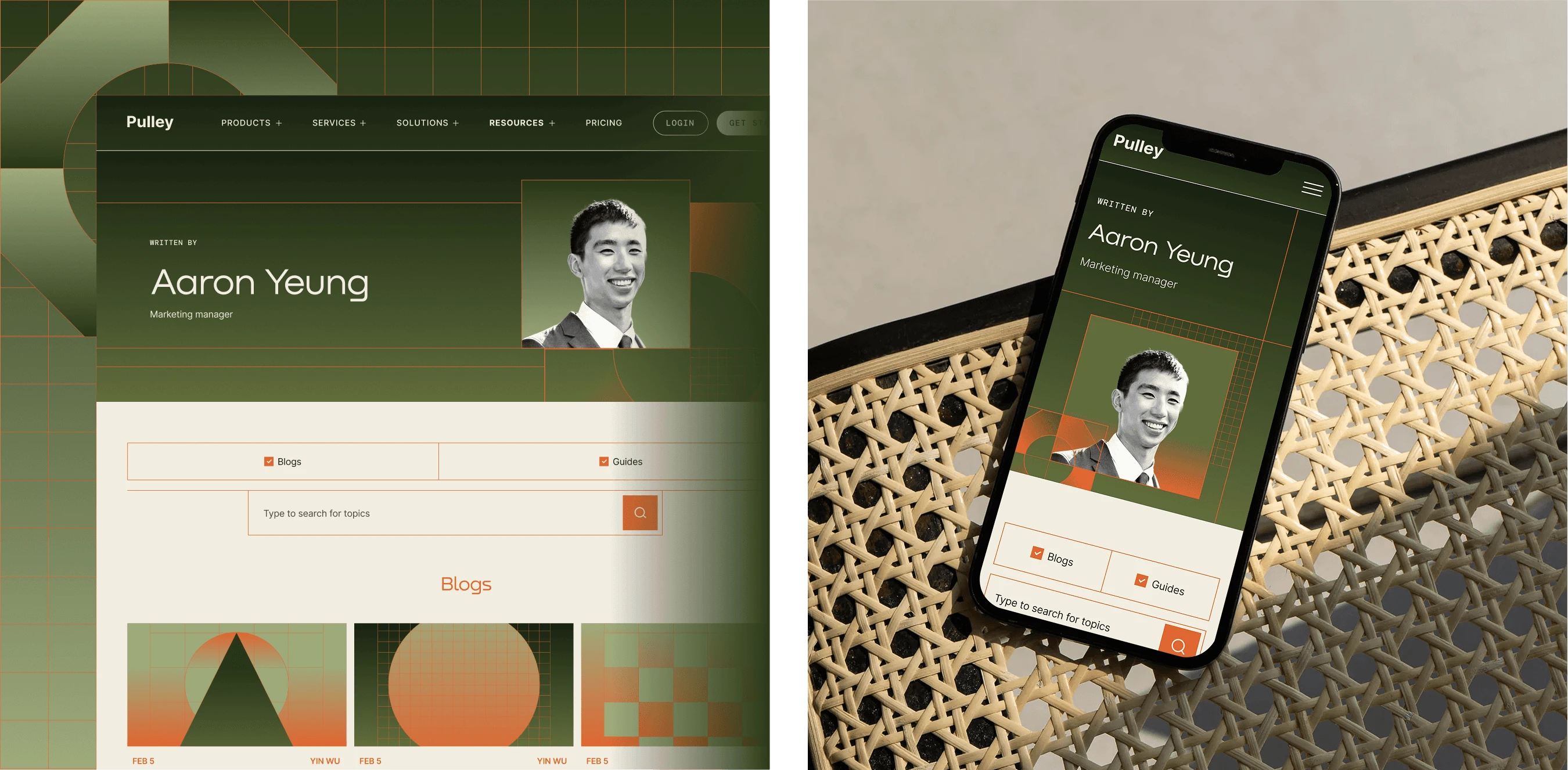
Bringing a complex fintech website from design to launch.
Role: Lead UI Designer. Timeline: ~3 months. Platform: UX / UI Design, Design System, Dev Handoff & QA. Team: Juan Pablo, Mafer Lopez, Camila Candia, Maciej Zelaznowski, Laura Misuraca, Julieta Rubio.
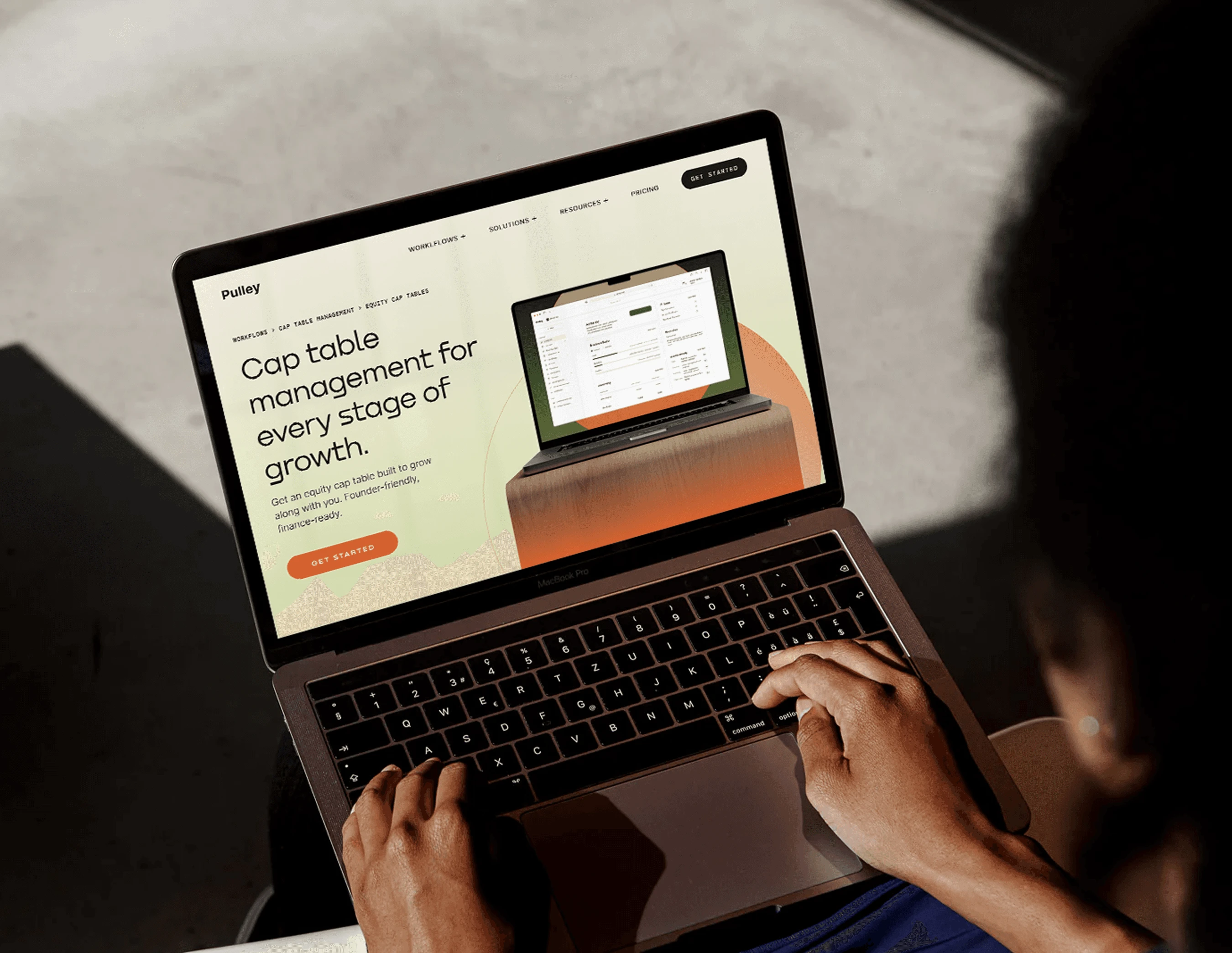
Pulley helps founders manage equity and cap tables, but its website needed to communicate the sophistication of its product while making the offering accessible to a broad audience. I joined midway through development as the lead UI designer, taking ownership of the remaining designs, responsive layouts, and development QA. Alongside completing the website, I built a shared design system to improve consistency and support future work.
Overview
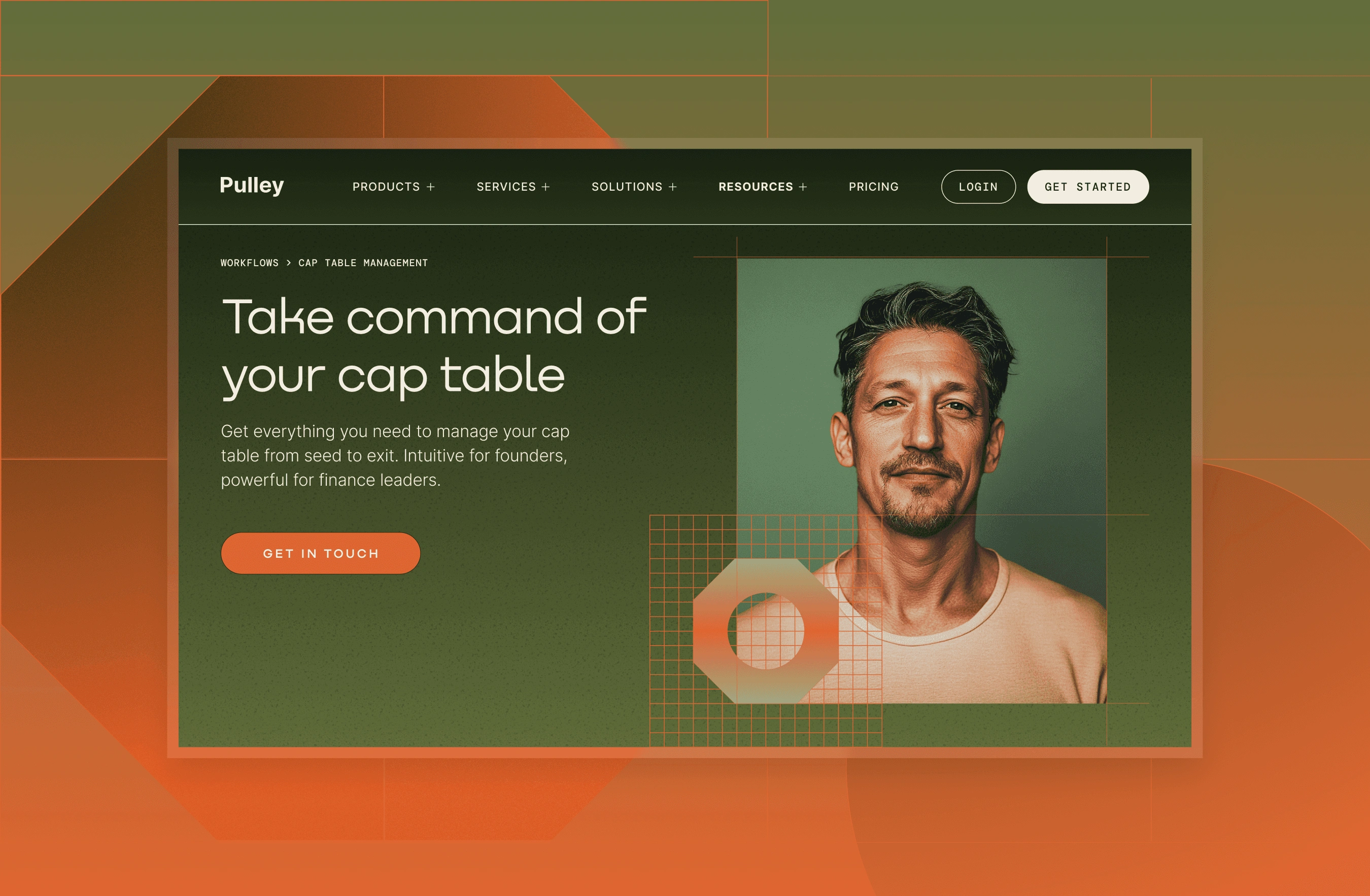
Pulley simplifies equity and cap table management for founders and investors. Its website needed to clearly communicate the platform's value, establish trust, and help visitors understand whether the product met their needs.
I joined the project after the desktop designs were largely complete and development was well underway. My focus was bringing the remaining pieces together, from mobile layouts and additional pages to the design system and final development QA.
User goal: Understand Pulley's equity management offering and confidently determine whether it meets their company's needs.
Business goal: Clearly communicate Pulley's value proposition, build trust with founders and institutional investors, and make conversion as frictionless as possible.
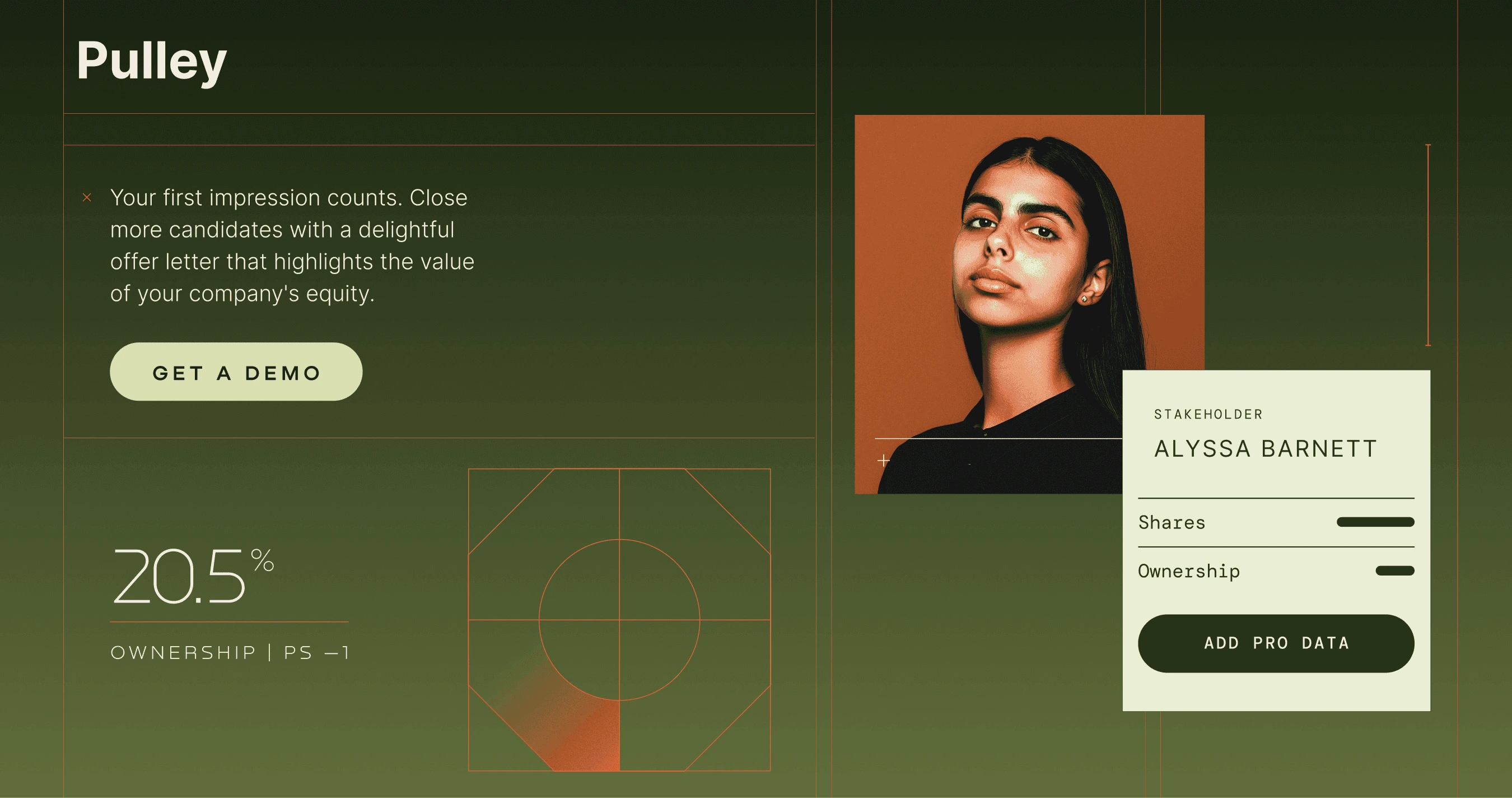
The client provided detailed, text-heavy documents and wanted to communicate a lot of information across every page. Our challenge was to make that content feel clear and digestible without losing the depth of information. We used the brand's visual elements, including lines, gradients and textures, alongside imagery, icons and considered scroll interactions and animations to create visual hierarchy, guide users through the content, and make the experience more engaging.
Challenge
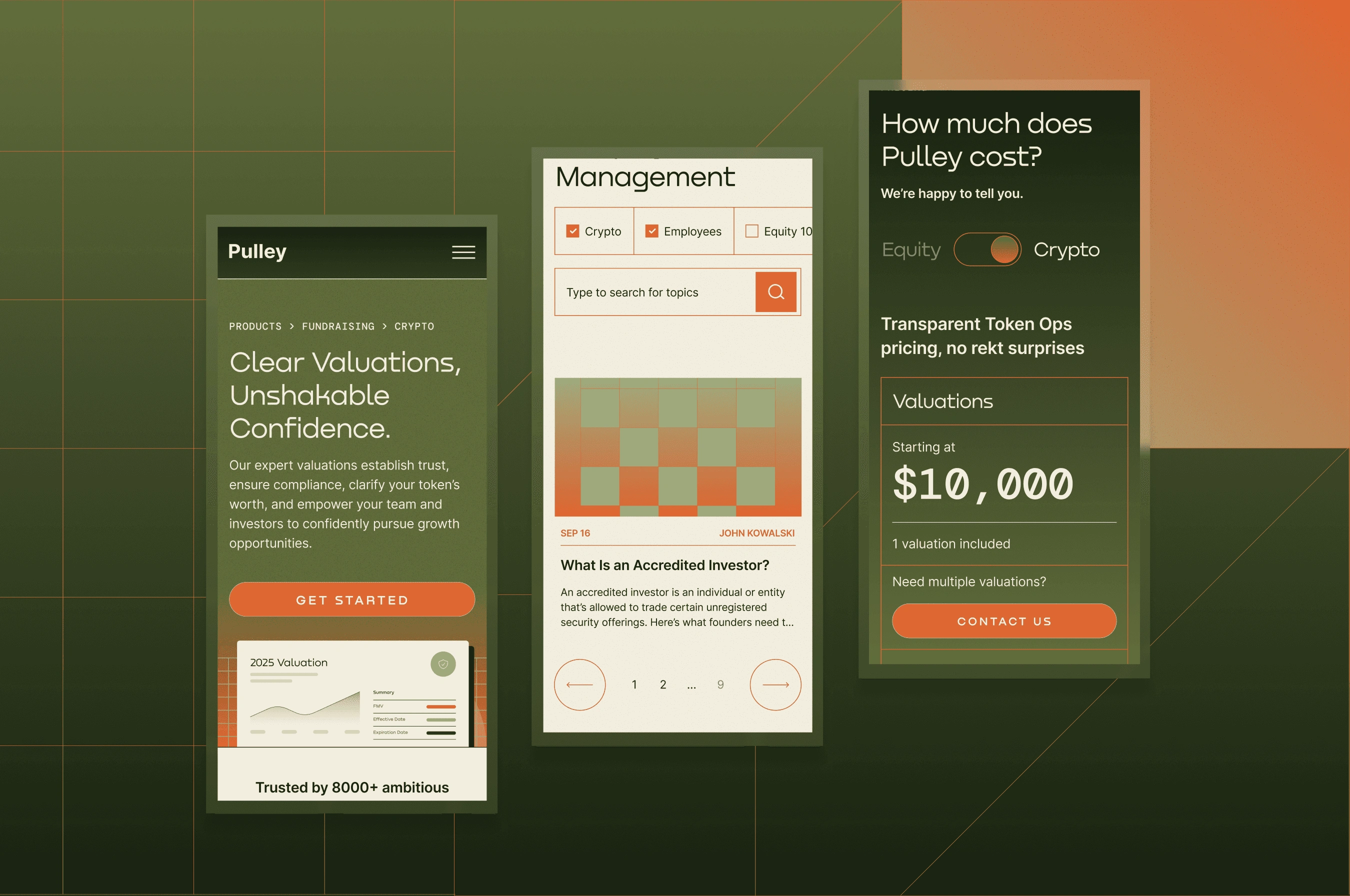
When I joined, approximately 32 desktop pages had already been designed, but the mobile experience was largely outstanding. Development was progressing in parallel, and the existing Figma files needed additional structure to support consistent implementation.
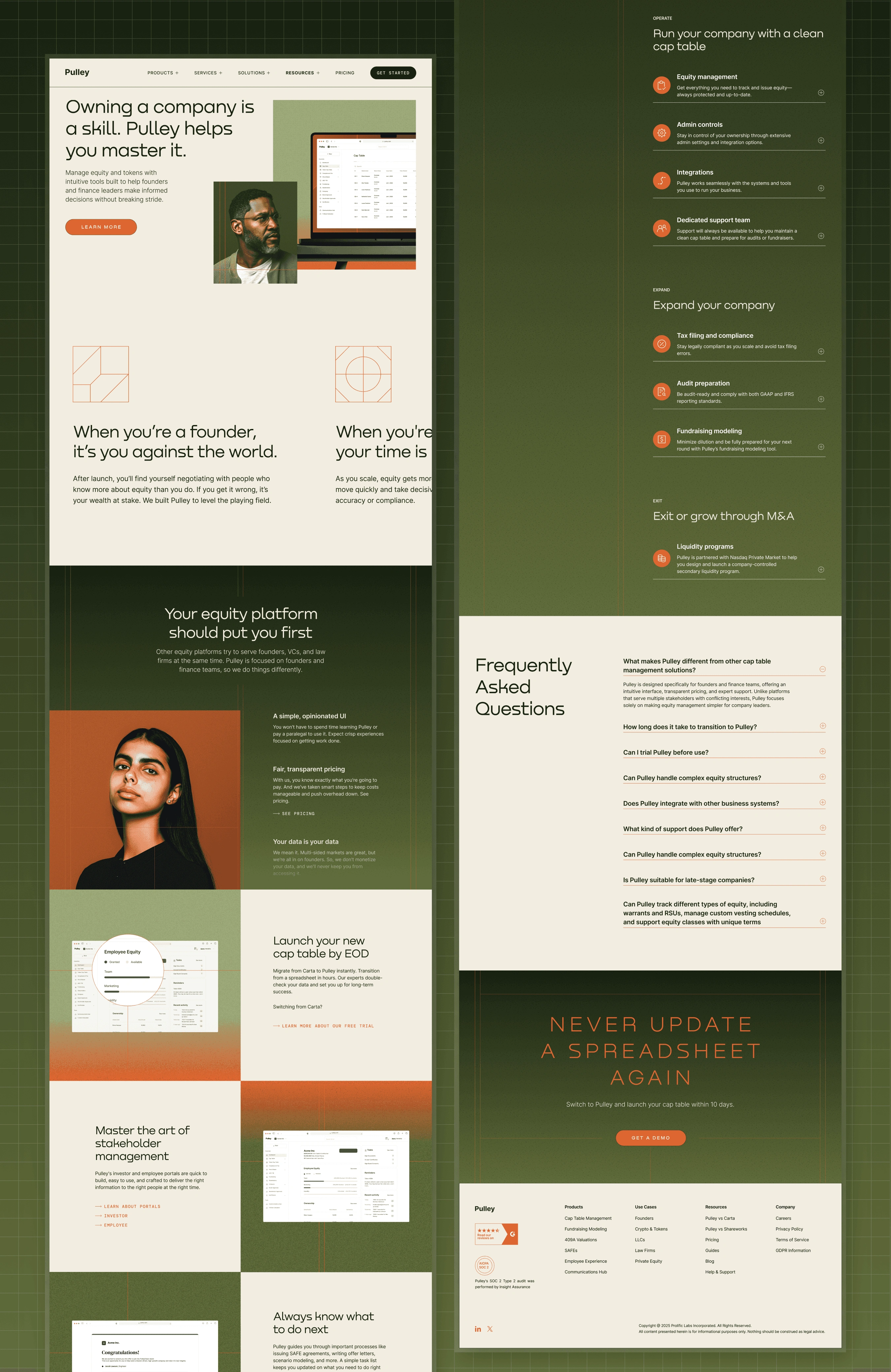
The scope quickly extended beyond reviewing the live website. I needed to complete the remaining responsive designs, create another 20–30 pages, coordinate outstanding visual assets, and establish a reusable UI foundation, all while keeping development on schedule.
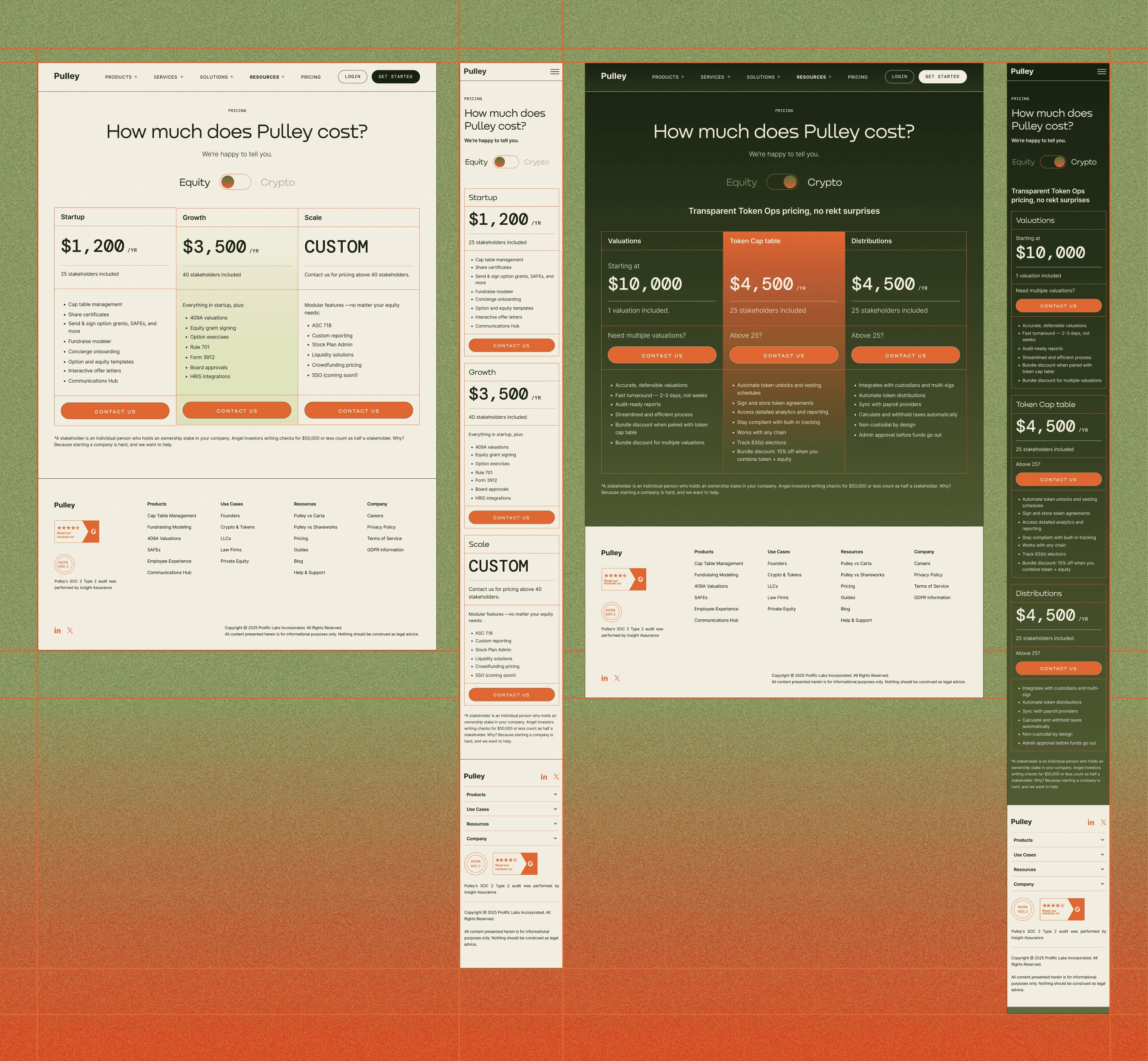
Responsive design: The desktop designs were complete, but the mobile layouts remained unfinished.
Design consistency: The files lacked reusable components, design tokens, and consistent auto layout.
Development momentum: Development was already underway, so design decisions and fixes had to be resolved quickly to keep things moving.
Discovery
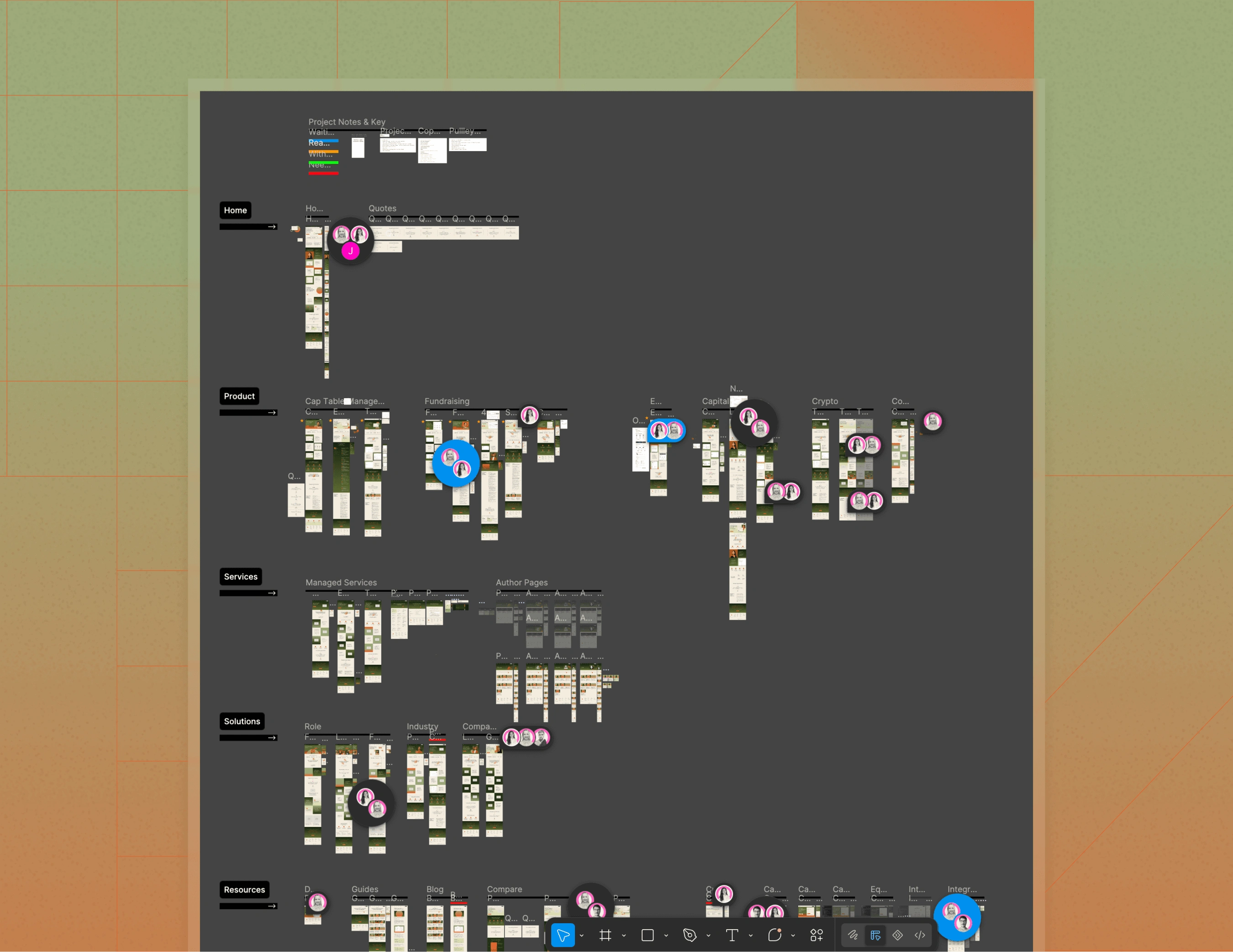
I started by reviewing the existing Figma files to understand what had been completed, where inconsistencies remained, and what was needed to support the developer. The project had an established brand identity, but no shared UI system. Components, spacing, and layout behaviour needed to be standardised across the existing pages, while the remaining designs needed to be prepared for implementation.
I recognised that the agency was moving towards an ongoing marketing retainer with Pulley. With this in mind, there was an opportunity to build a more comprehensive system that could support future website updates and marketing materials.
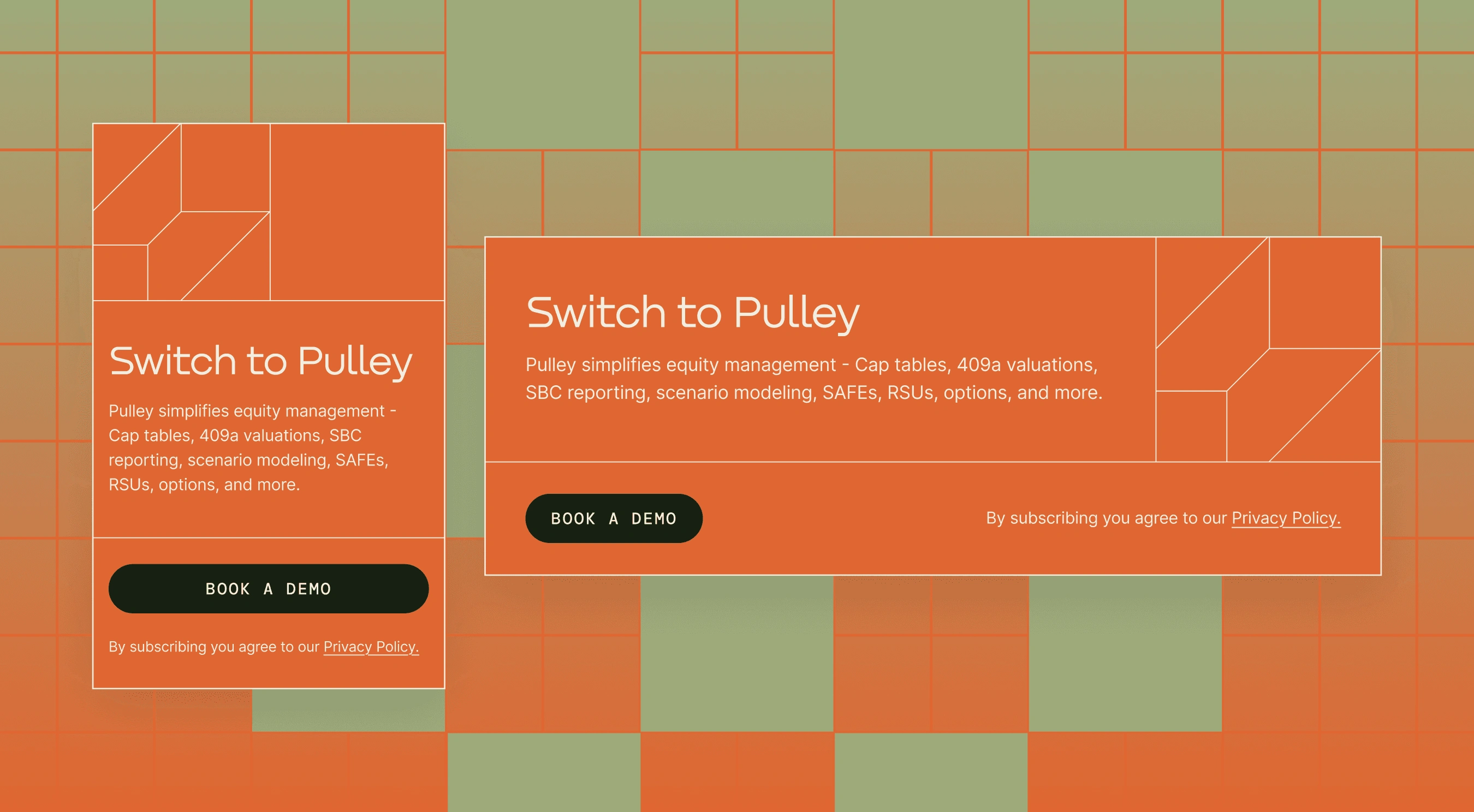
Existing foundations: I consolidated existing styles into reusable components.
Implementation readiness: I standardised layouts and components for consistency.
Future scalability: I expanded the UI kit into a scalable design system for future work.
Exploration
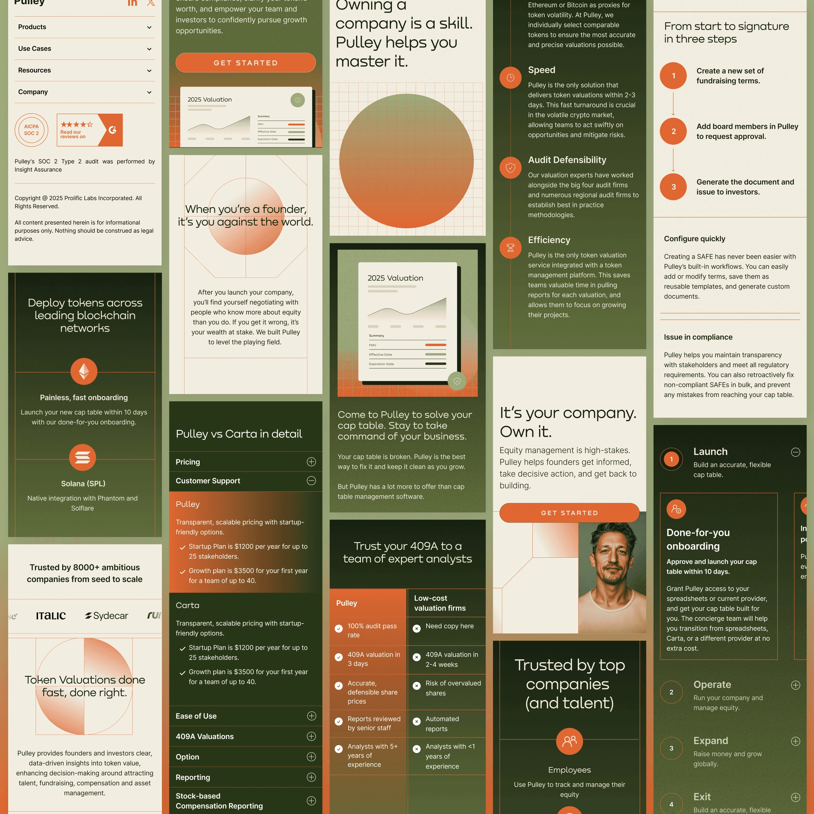
With development already underway, completing every mobile design before implementation continued wasn't practical. Instead, we worked iteratively, allowing the developer to progress where the intended layout was clear and flagging sections that needed further design input. I addressed those sections as they arose, refining layouts, clarifying interactions, and providing prototypes where necessary.
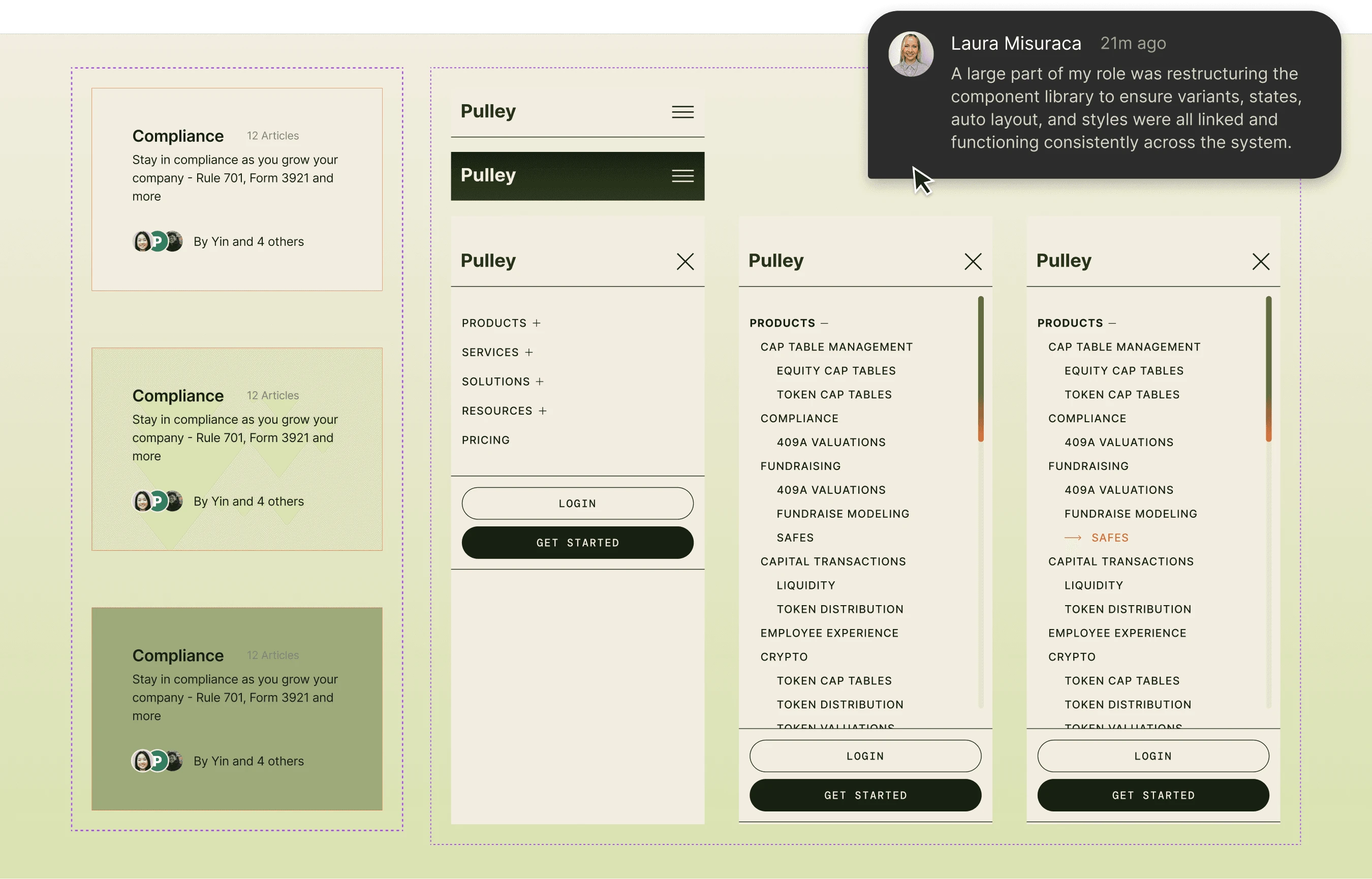
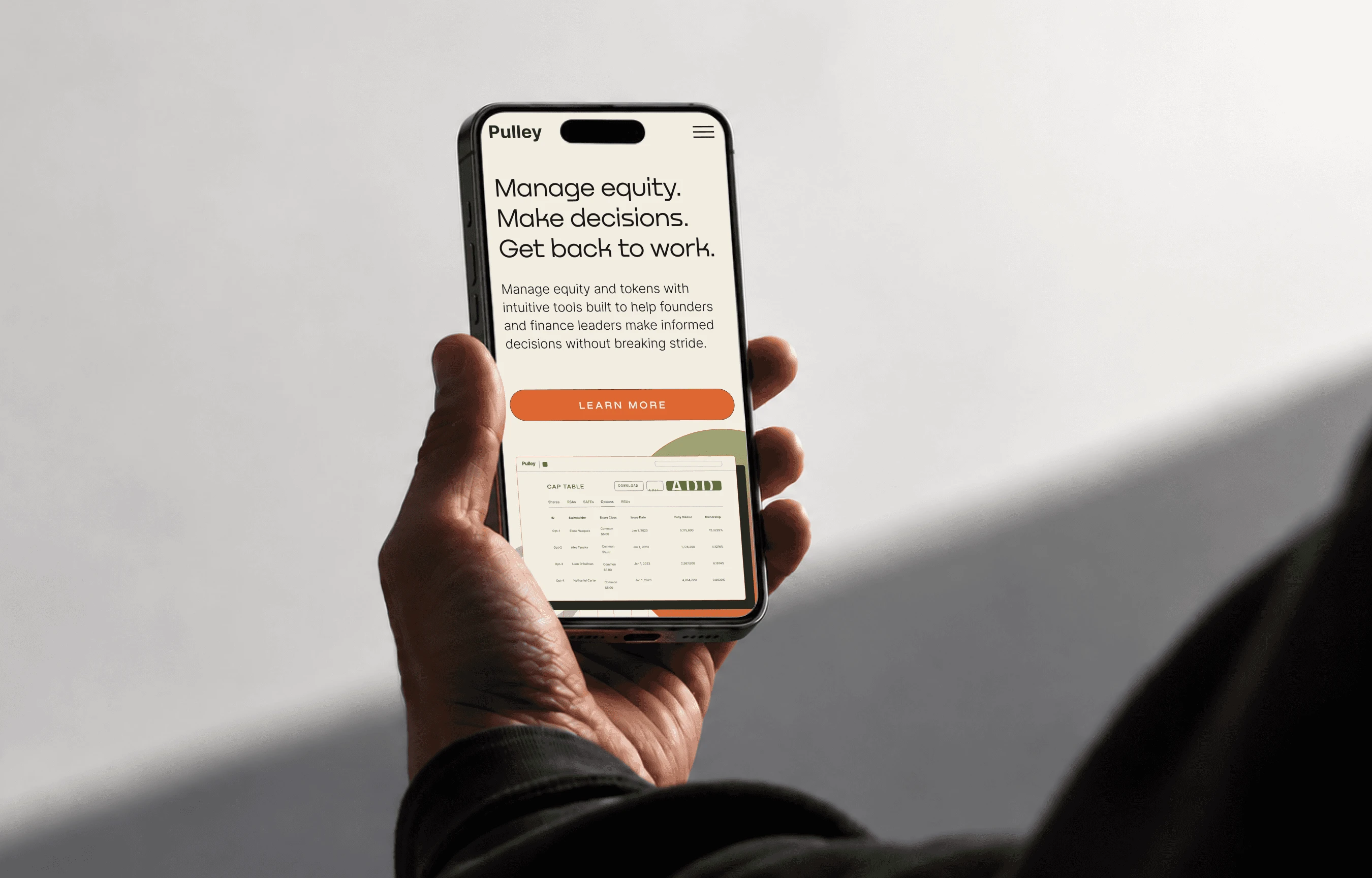
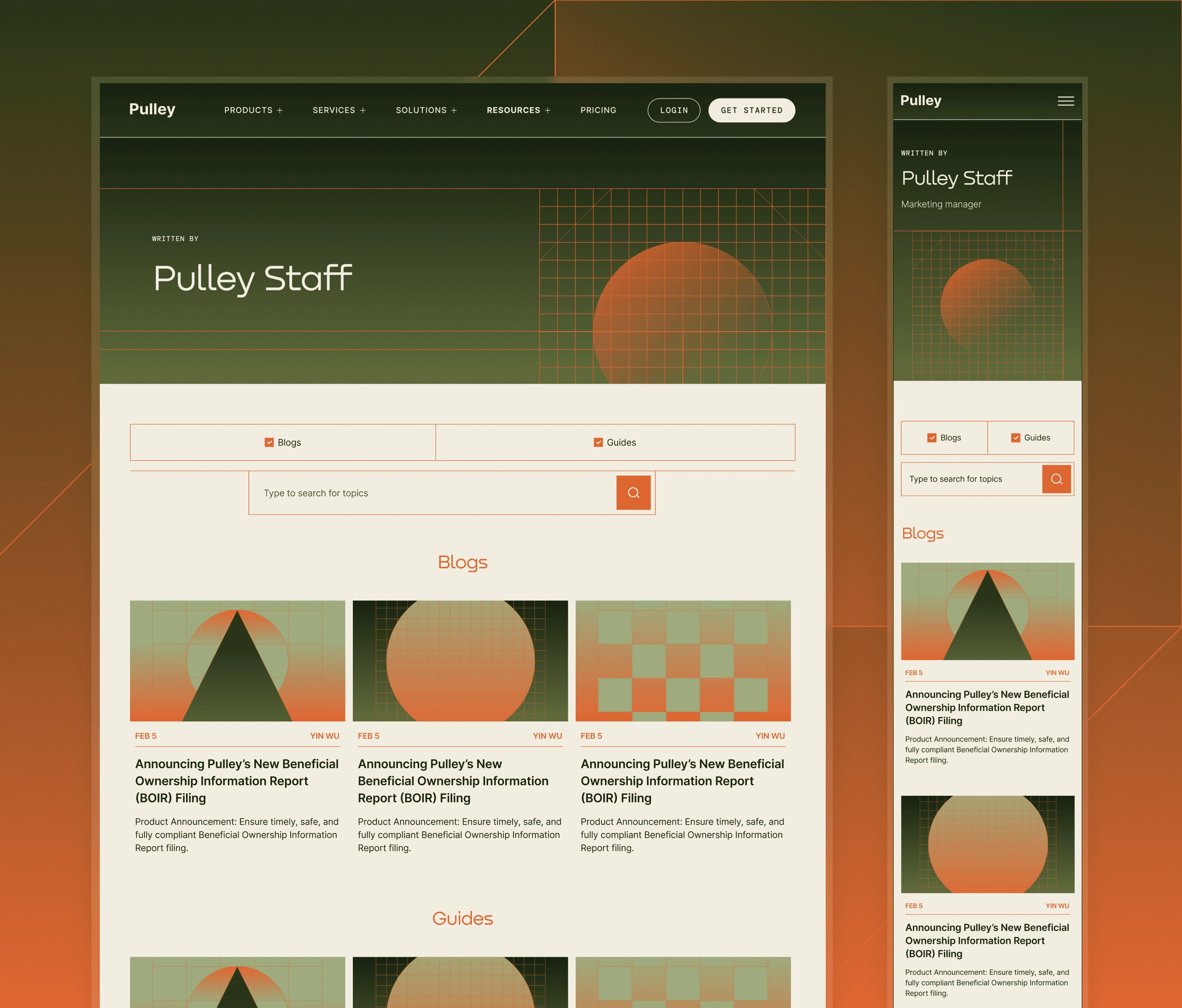
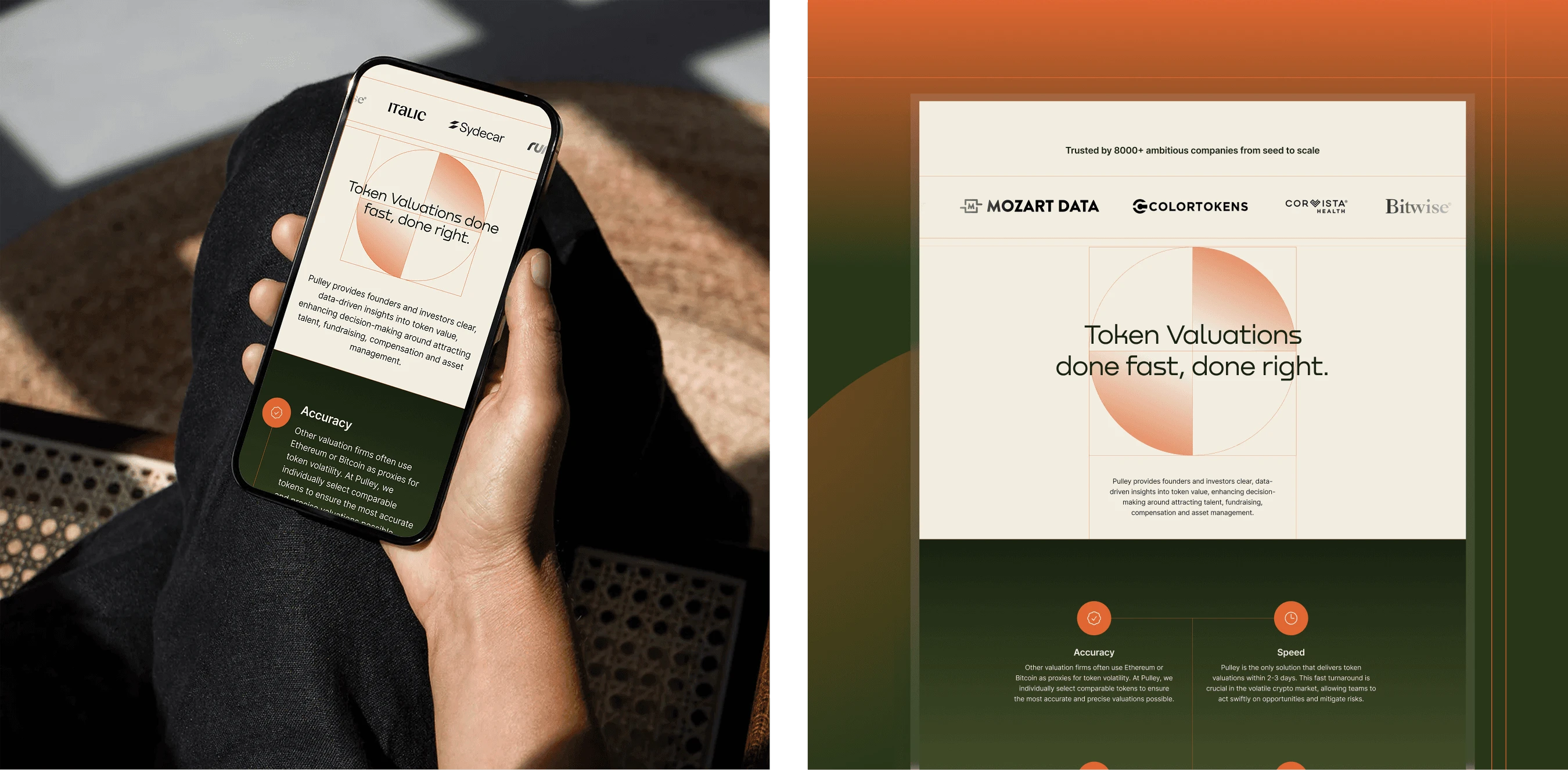
The mobile work wasn't simply about stacking desktop elements vertically. Some sections relied on specific relationships between images and copy, and those relationships needed to remain clear on smaller screens. I refined spacing, typography, navigation, and content hierarchy to ensure the mobile experience felt intentional rather than compressed. For more complex sections and scroll-based interactions, I created design references and prototypes to clarify behaviour for the developer. Throughout the process, I maintained close communication with the developer and project manager, flagging risks early and prioritising tasks to keep the project on schedule.
Design
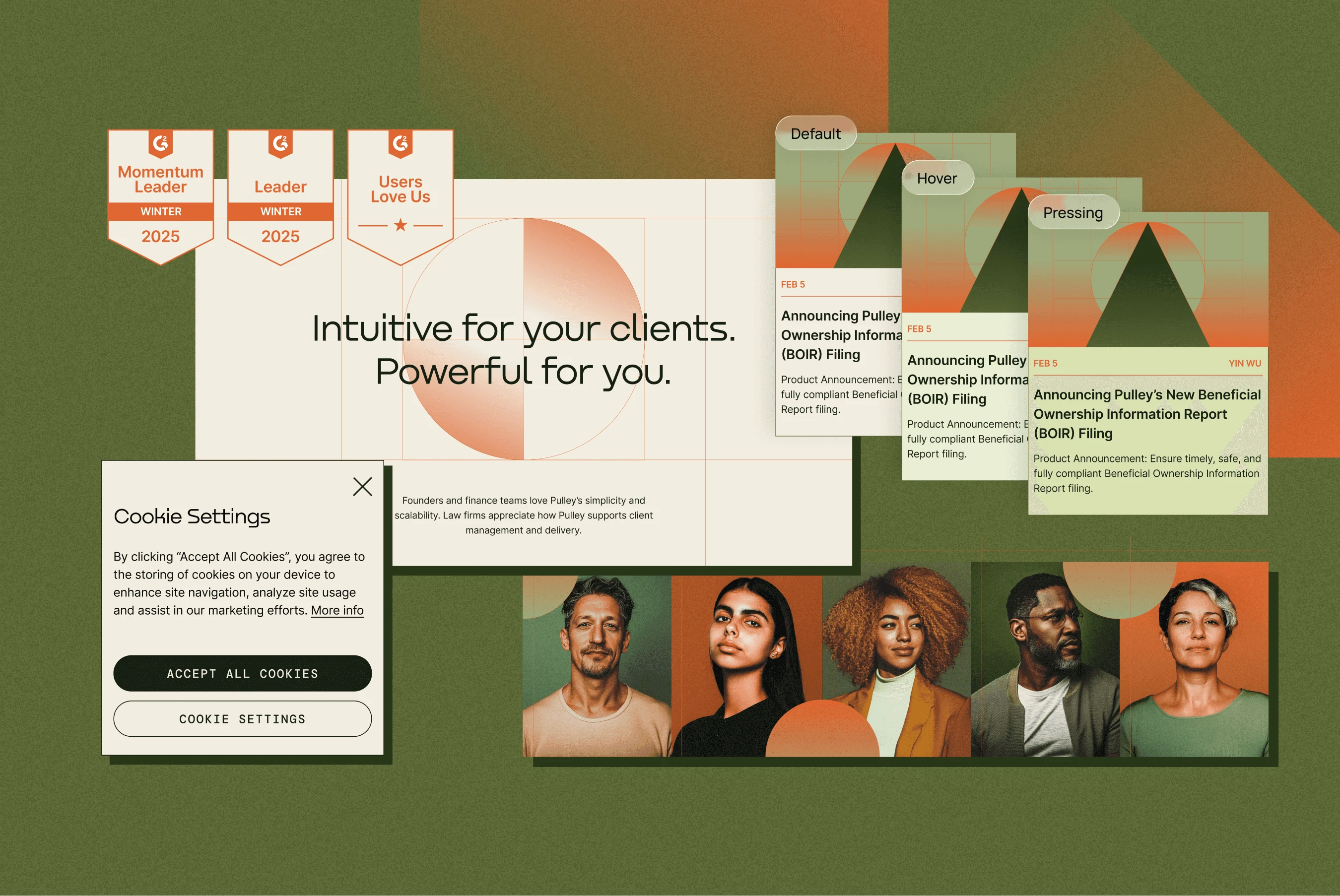
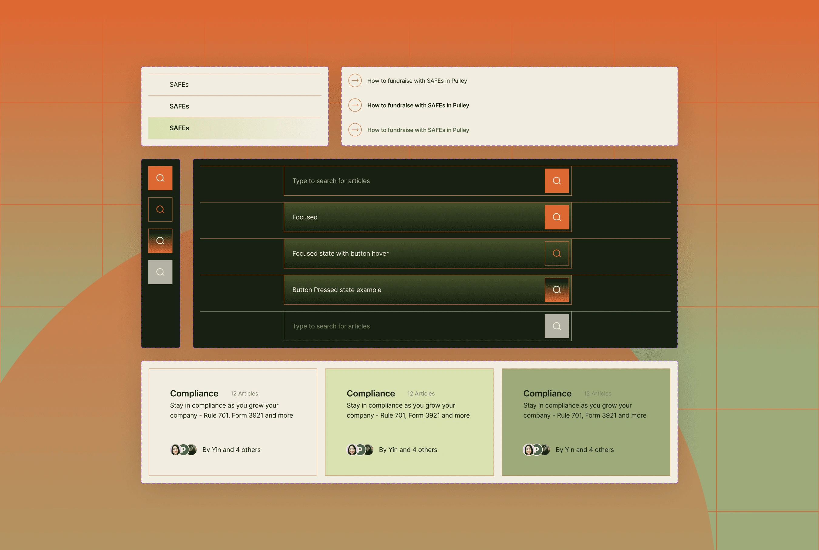
The original brief included a UI kit, but I expanded this into a shared design system to make the website easier to maintain and provide a foundation for future work. I created a central Figma library containing typography, colour, spacing tokens, reusable components, and interaction states. I then applied the system throughout the existing files, replacing inconsistent elements and establishing a more consistent approach to new designs.
Components: Reusable buttons, forms, navigation, cards, and other interface elements.
Design tokens: Standardised colour, typography, and spacing variables to maintain consistency across pages.
Interaction states: Component variants for different states, including validation and error handling.
Responsive layouts: Desktop and mobile components organised within a shared library.
Alongside the system, I completed the mobile experience and designed an additional 20–30 pages. I also reviewed the existing layouts to ensure auto layout was applied consistently, making the designs more adaptable and reducing the amount of manual adjustment required when content changed. The shared components were used by the developer during implementation and provided a useful reference for the marketing team as the client relationship continued.
Outcome
The website launched on time, despite the additional design system work and the volume of responsive design and QA required. The client responded positively to the finished experience, which remains live today with a design that is largely unchanged from launch. The engagement also transitioned into an ongoing marketing retainer, extending the relationship beyond the original website project.
The website launched on schedule, with the responsive designs and development QA completed. I established a reusable design system to improve consistency and support future updates, which also proved useful as the client transitioned into an ongoing marketing retainer with the agency.
Reflection
The biggest challenge wasn't any single page. It was balancing design quality, implementation requirements, and an expanding scope while development was already underway. Taking ownership midway through the project meant quickly understanding the existing work, identifying gaps, and establishing a workflow that worked for both design and development.
Building the design system was an important part of that process. It went beyond the immediate deliverables, but created a more maintainable foundation for the website and anticipated the needs of the ongoing client relationship. The project reinforced the value of looking beyond the screen itself. Good UI design also means creating systems that are practical to implement, easy to maintain, and clear enough for other people to work with.
0 likes · 2 views · Nov 2, 2026
Lead UI designer who joined Pulley's website mid-build, finished the responsive layouts and built a shared Figma design system. Launched on schedule.