Grizzle: B2B Website Design with a B2C Feel

Designing a B2B website in a B2C style.
Role: Lead UI Designer. Timeline: ~4 months. Platform: Figma. Team: Juan Pablo, Mandy Arocha, Denis Dallo, Laura Misuraca, Hector Salazar, Usman Raza.
Grizzle was moving upmarket and needed a website that could communicate greater authority without losing the personality that set it apart. I translated its new brand into a distinctive digital experience across UX, UI, and responsive design.
Overview
Grizzle is a London-based organic growth agency working with B2B and SaaS brands. After nearly a decade with the same identity, the company was repositioning towards larger clients and needed a website that reflected that shift.
I joined the project as the brand sprint was wrapping up, taking the new identity into the digital experience across the site's structure, UI, responsive layouts, and component system. The brief was simple: make B2B feel less predictable without sacrificing credibility.
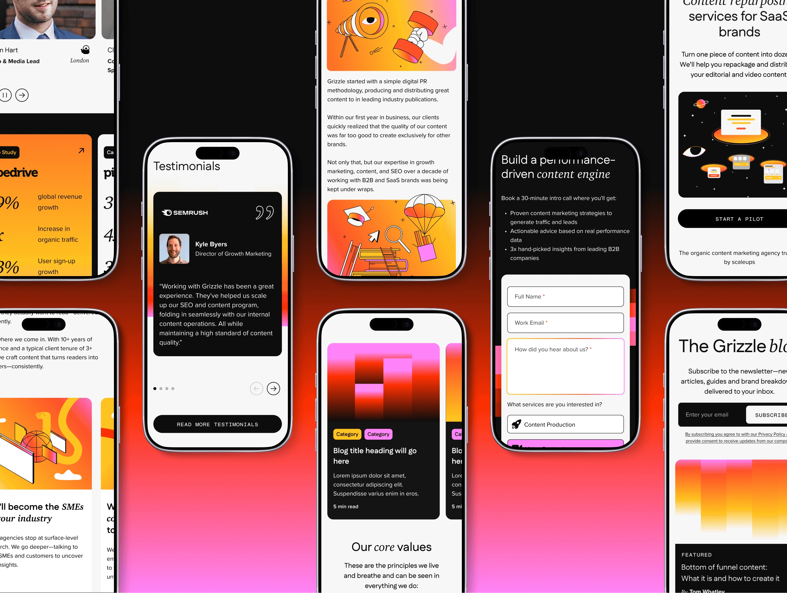
Challenge
Grizzle's target audience was changing. The business was moving towards VP, Director, and CMO-level buyers at post-Series A companies, but its existing website wasn't communicating the authority needed to reach them. At the same time, the competitive landscape was visually conservative. Most agencies in the category relied on similar clean, minimal approaches.
The new brand took a different direction: B2C-inspired, expressive, and deliberately less predictable. The challenge was turning that personality into a website that still felt clear and credible.
Positioning: The existing website wasn't communicating the level of expertise or authority expected by Grizzle's new target audience.
Differentiation: Competitors largely followed the same clean, conservative visual language. Grizzle needed to stand apart without losing credibility.
Conversion: The website needed a clearer structure and flow to move visitors towards pilot enquiries.
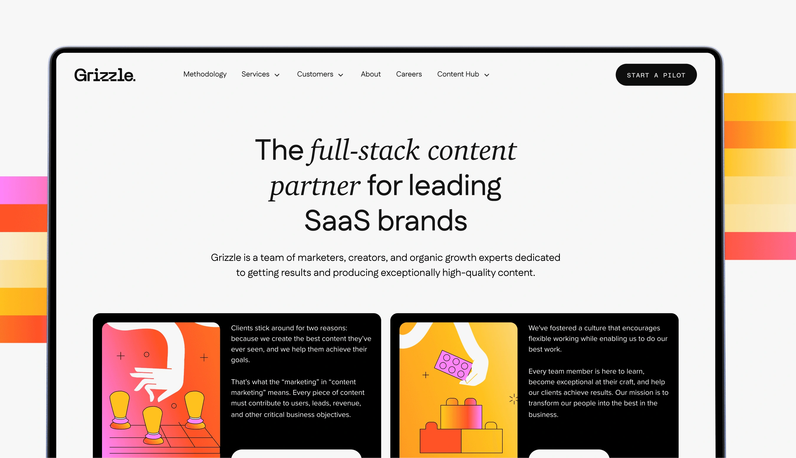
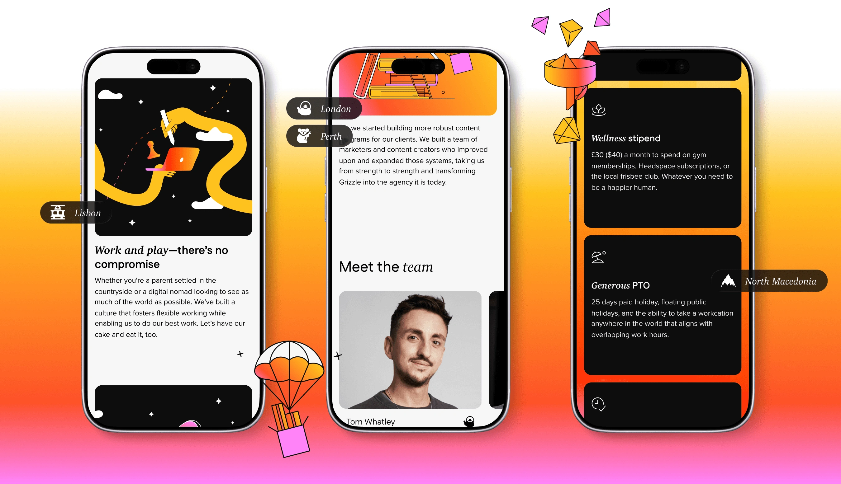
Discovery
I came into the project at the wireframing stage, with the brand sprint nearing completion. Before designing, I reviewed the kick-off questionnaire, ICP documentation, brand guidelines, and the visual references the client had provided.
The brand already had a strong point of view: a vivid colour palette, distinctive illustrations, and a more playful approach to B2B. The challenge wasn't creating another visual language. It was understanding how much of that language the website could carry without compromising hierarchy or readability.
Focused system: The project didn't include a full design system, so I needed to establish a lightweight UI kit that could support the website.
Strong colour: The palette was deliberately bold, requiring careful control of colour density across different sections.
Flexible structure: The information architecture was still open, giving the design process room to restructure pages around what best supported the user journey.
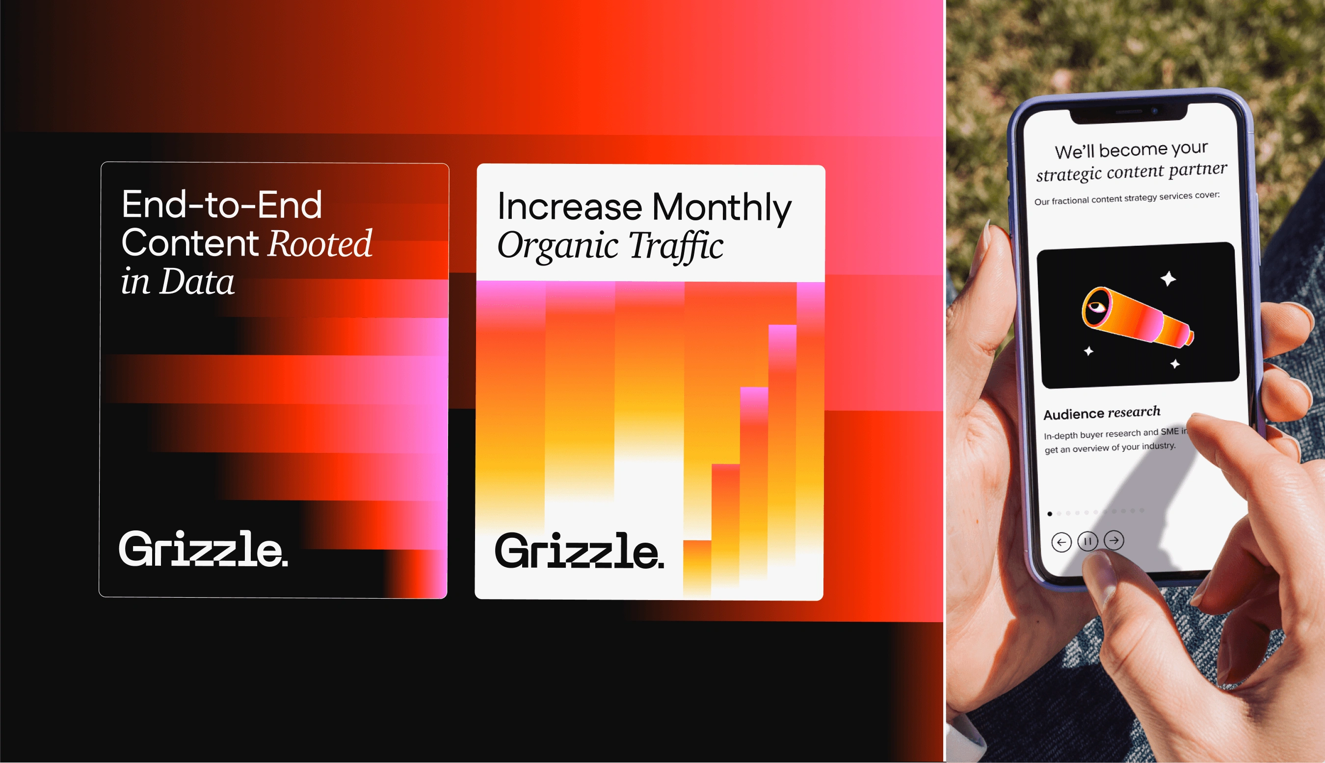
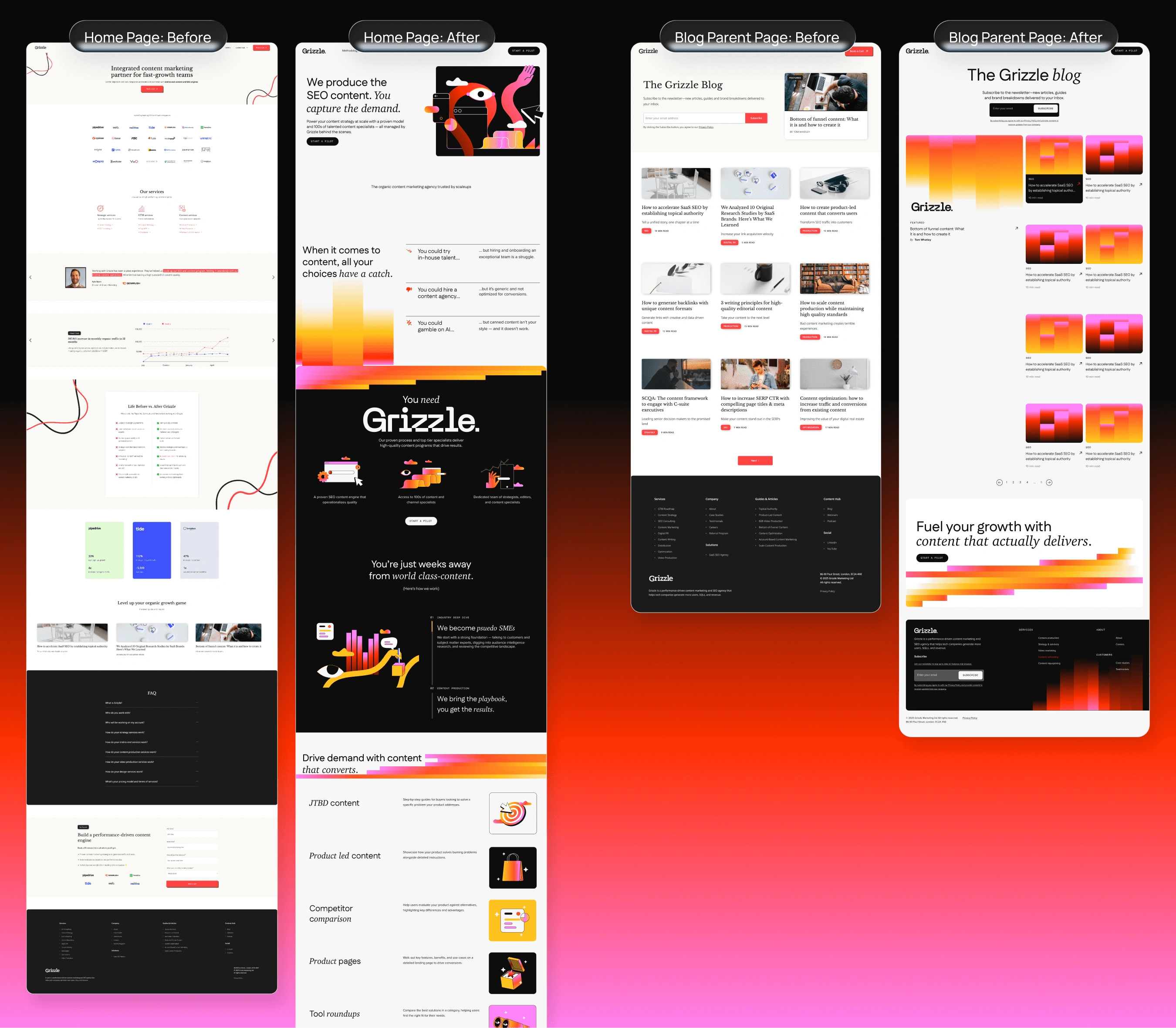
Exploration
The wireframes were high-fidelity from the beginning, with desktop and mobile designed together throughout the process. I worked in weekly batches of three to four pages, using each round to test hierarchy, flow, and how the brand translated into different content types.
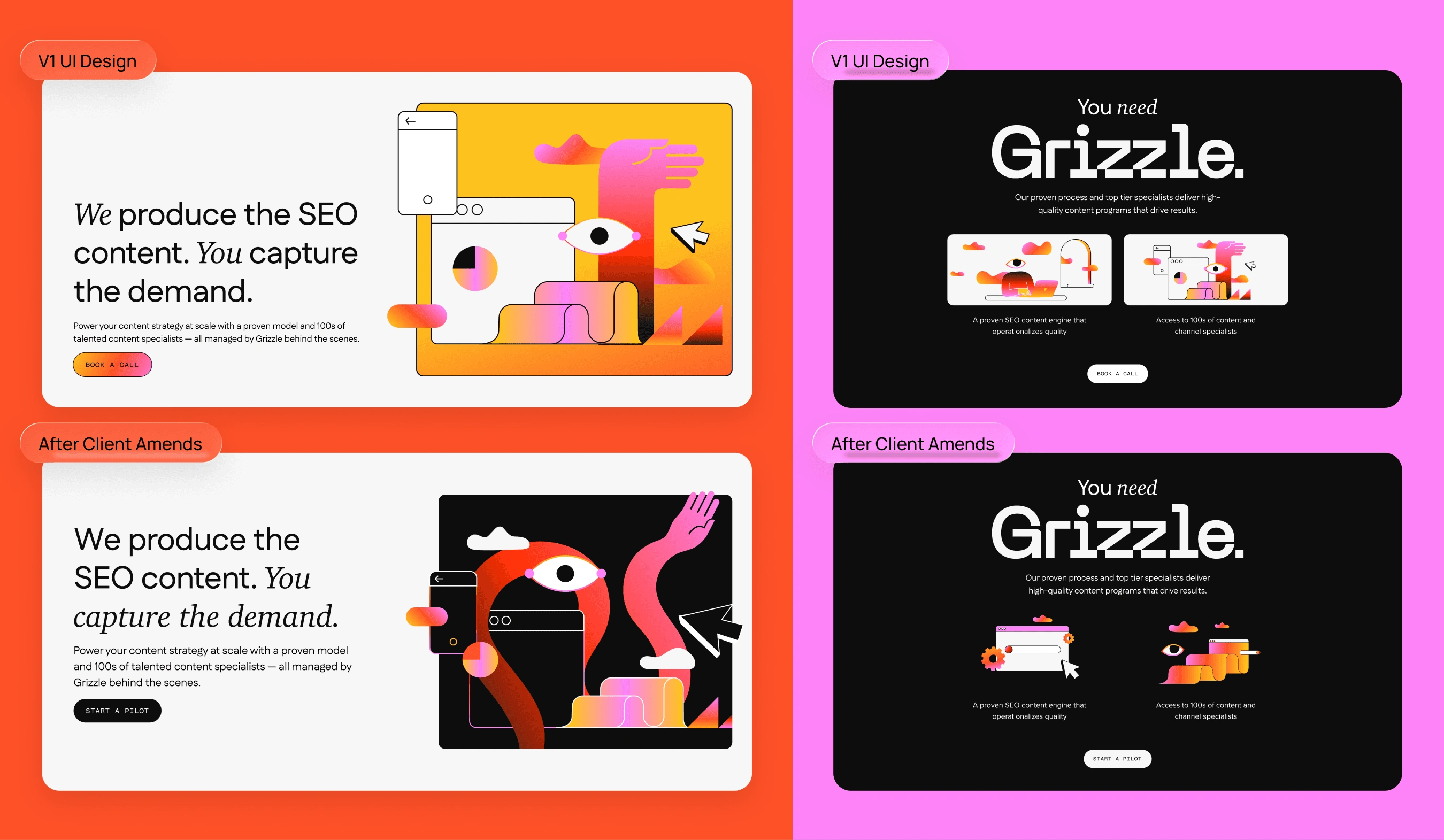
The biggest visual question was colour. The brand was expressive enough that using every element at full intensity would quickly become overwhelming. I tested different levels of colour density and gradually established a more controlled approach. Black became an anchor across sections where gradients competed with the content, while colour was reserved for moments where it could create emphasis.
Colour: Bold gradients and vivid colours were used selectively to create hierarchy rather than fill every section.
Illustration: The existing illustration direction was extended across different web contexts and content types.
Typography: Type hierarchy was kept clear and functional to balance the more expressive visual language.
Layout: Structured grids and generous spacing gave the visual identity enough room to stand out without becoming chaotic.
Design
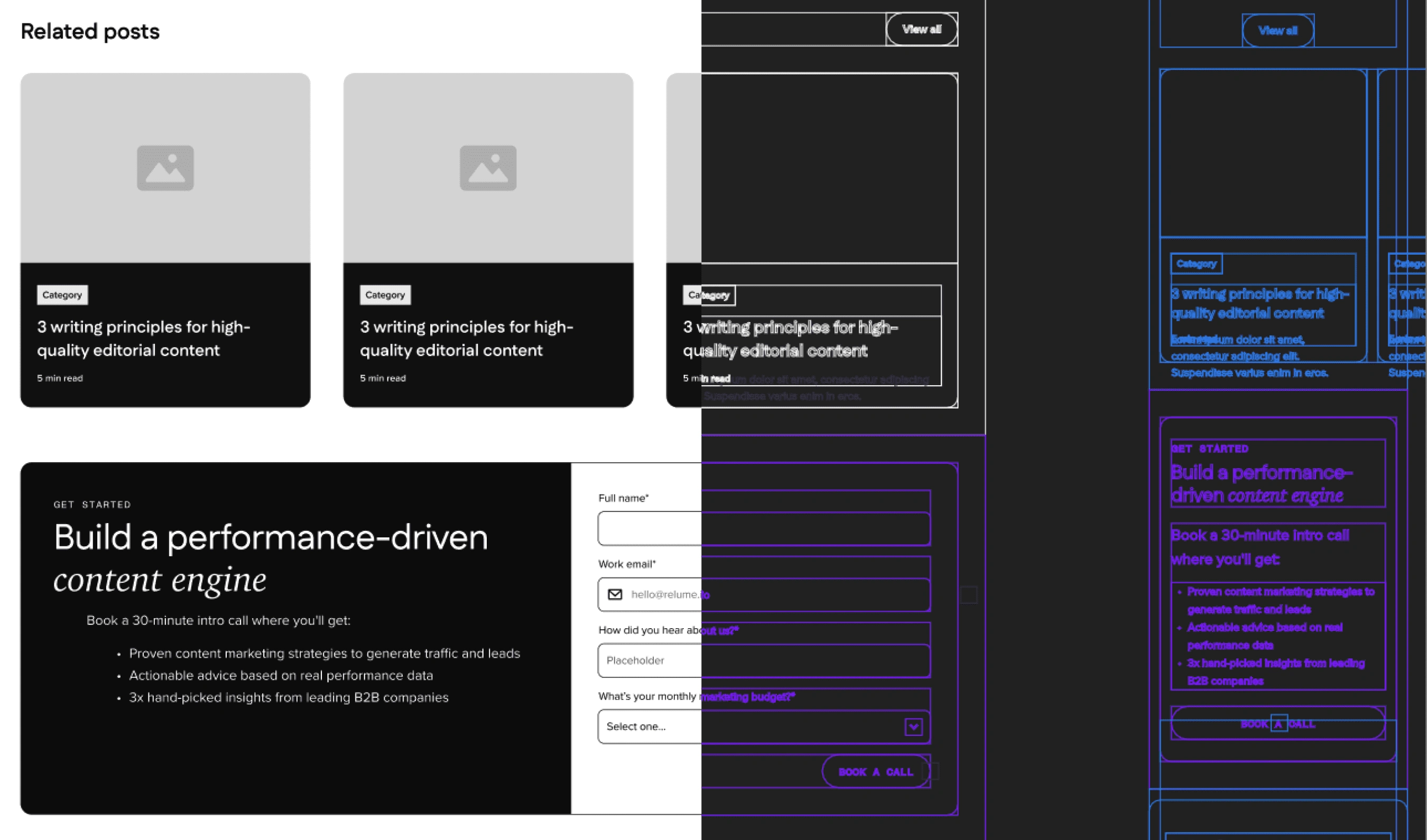
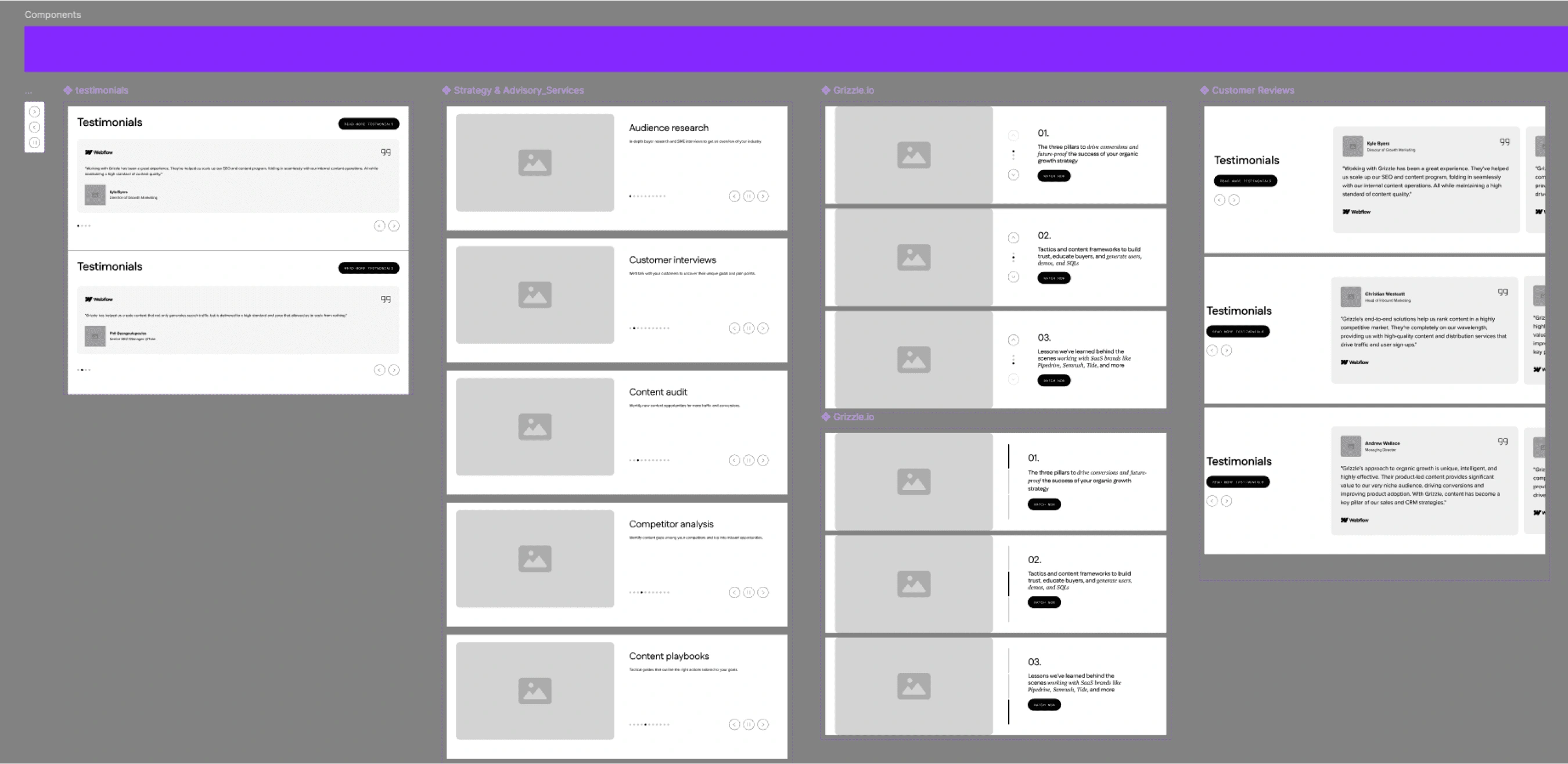
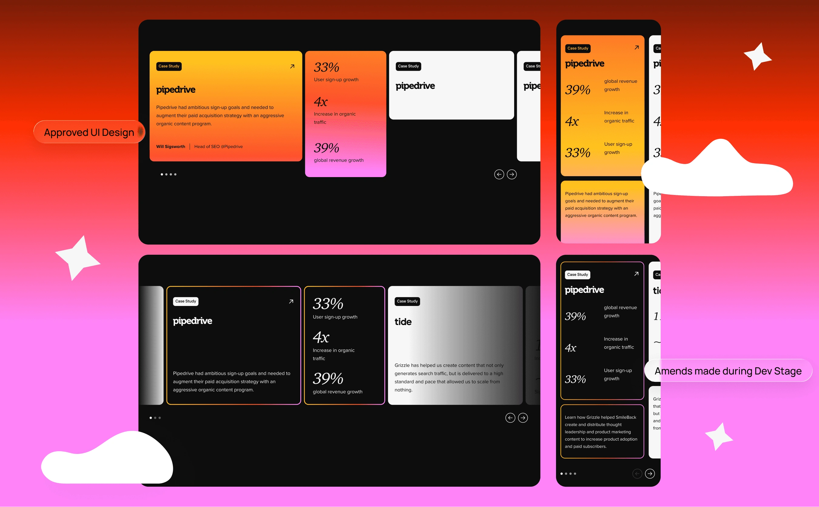
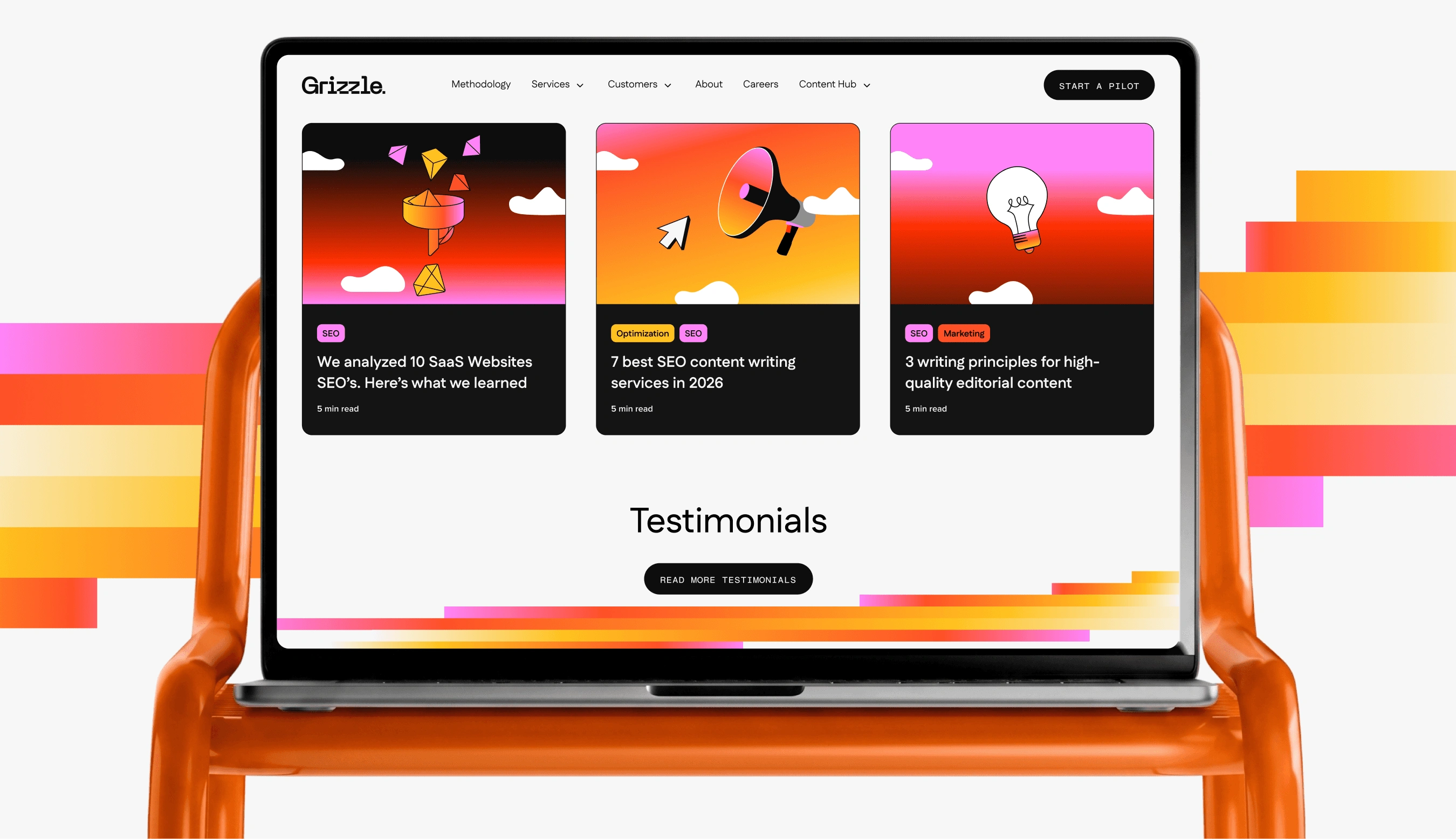
Once the visual direction was established, I applied it across the wider website while keeping the underlying structure consistent. Repeated elements such as navigation, footers, CTAs, case studies, and testimonials were built as reusable components from the wireframe stage. This meant changes could be made once and propagated across the site, while keeping the UI consistent as the number of pages increased.
The final layouts were deliberately allowed to evolve from the wireframes. Applying the colour and illustration system changed how certain sections needed to breathe, so spacing, proportions, and component treatments were refined throughout the UI phase.
Components: Reusable patterns reduced repeated design work.
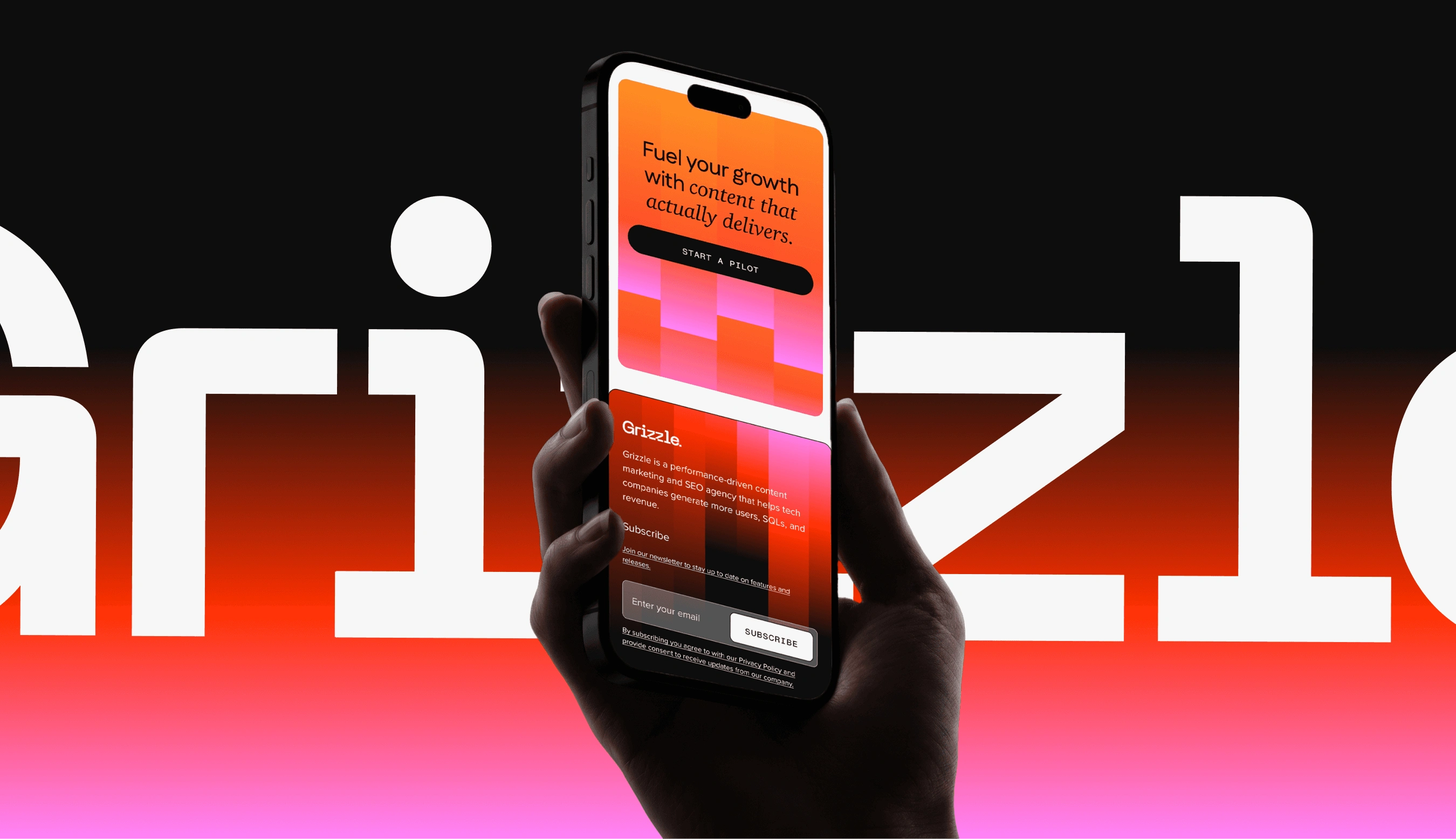
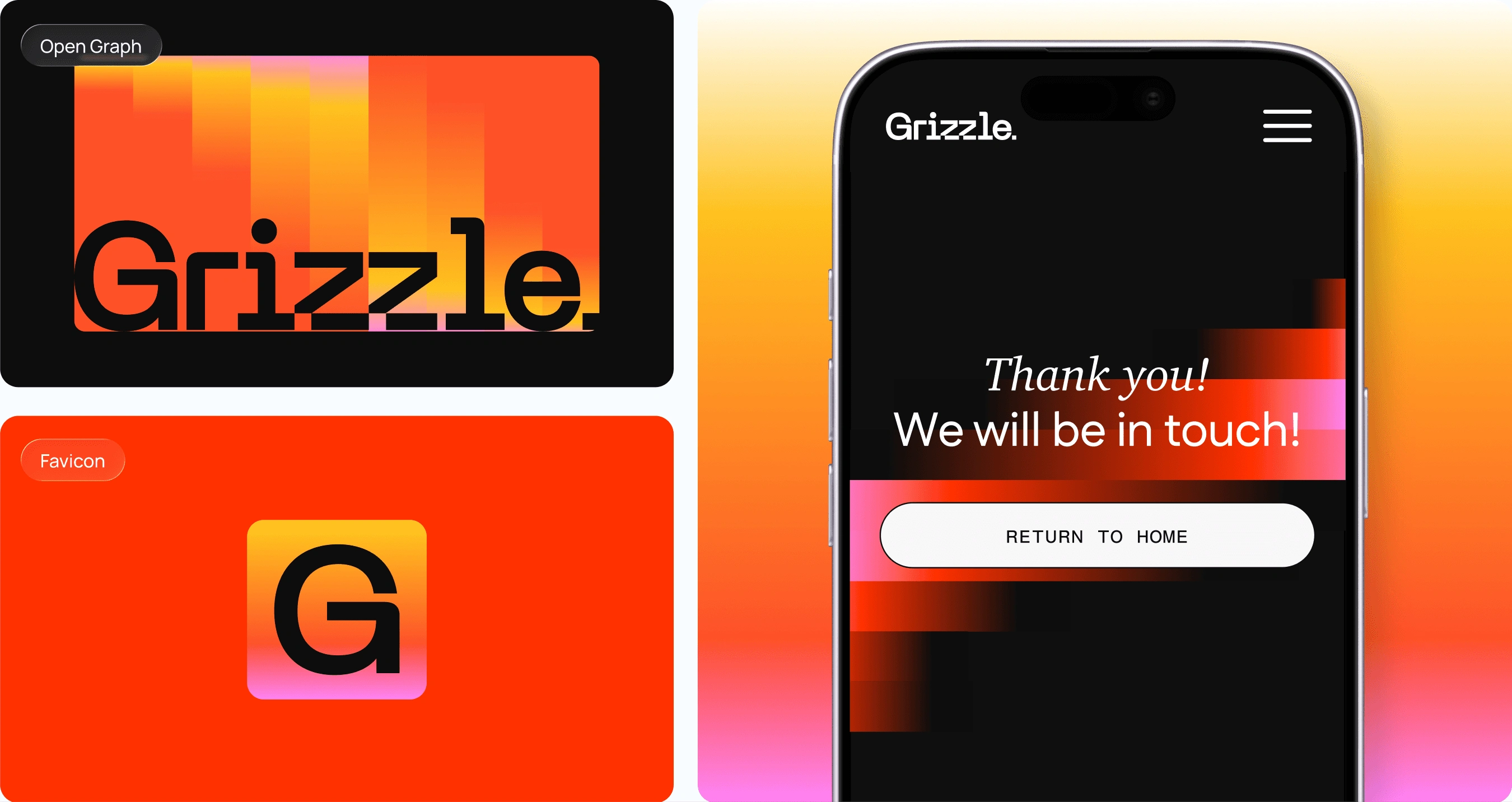
Responsive layouts: Desktop and mobile behaviours were defined together.
Prototypes: Non-obvious interactions were demonstrated before development.
QA: Design was reviewed against staging throughout implementation.
Outcome
The website launched with strong reception from the client and wider design community. The CEO shared the project publicly, highlighting its B2C-inspired approach to B2B. The project was also submitted for ADC award consideration, including a dedicated case study video. Motion Design: Thomas Girometti.
There were no conversion metrics available from the engagement because it was a fixed-scope brand and website project rather than an ongoing retainer with performance reporting.
Strong stakeholder response: Most pages were approved in the first round with only minor revisions.
High visibility: The case study became one of the agency's most-shared pieces of social content.
Award submission: The project was submitted for ADC award consideration.
The biggest challenge wasn't making the website distinctive. The brand already did that. It was knowing when to let it lead and when to pull it back. Building components early, designing mobile alongside desktop, and working closely with development made it possible to keep that balance across the site. The final experience feels unmistakably Grizzle without sacrificing the clarity expected from a B2B website.
0 likes · 1 view · Nov 2, 2026
Lead UI designer on Grizzle's B2B website, turning a bold B2C-style rebrand into a clear, credible site for VP and CMO buyers. ADC award submission.