Mixmax: Reimagining a Sales Platform for an AI-First Future

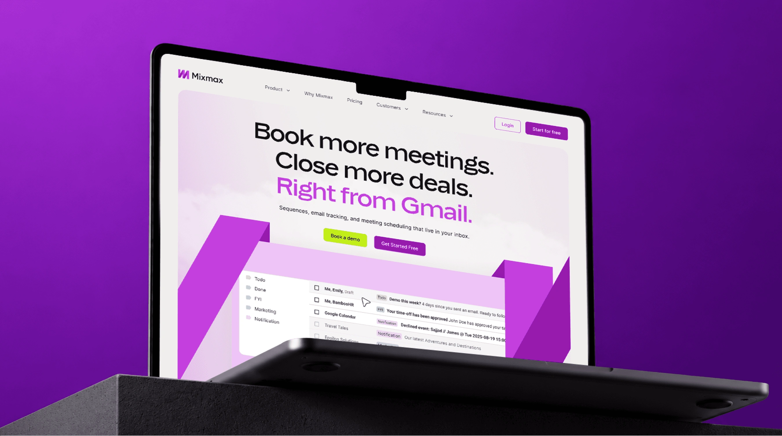
Reimagining a sales platform for its AI-first future.
Role: Lead UI Designer. Timeline: ~6 months. Platform: UX / UI Design, Design System, Dev Handoff & QA. Team: Juan Pablo, Mafer Lopez, Yuliia Olomska, Laura Misuraca, Stanislav Tsvek.
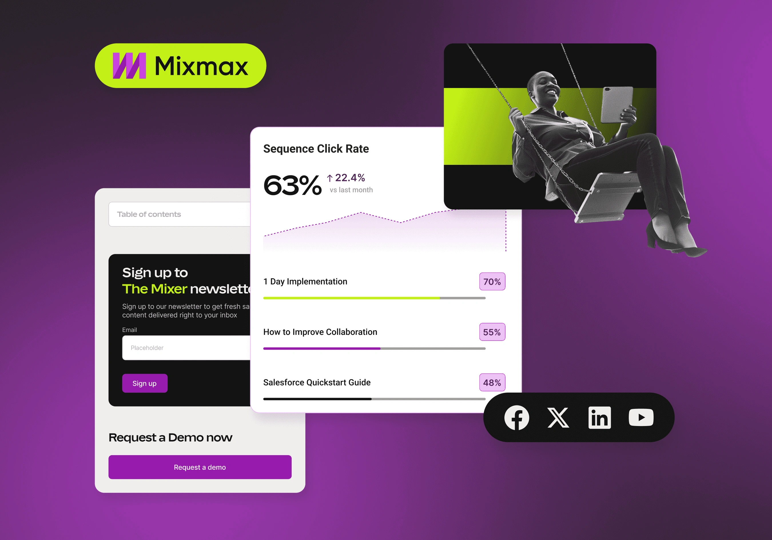
Mixmax was evolving from a sales engagement platform into a broader AI-powered sales solution. I helped translate that shift into a new digital experience across the website, designing a flexible UI system and more than 40 pages.
Overview
Mixmax had been building sales engagement software for more than a decade. As the product expanded and the company shifted its positioning towards AI, the website needed to evolve with it. I joined the project following a brand refresh and worked across the website's core pages, product marketing, pricing, and supporting experiences.
The goal was to create a digital system that felt distinctly Mixmax while making a growing product easier to understand.
Challenge
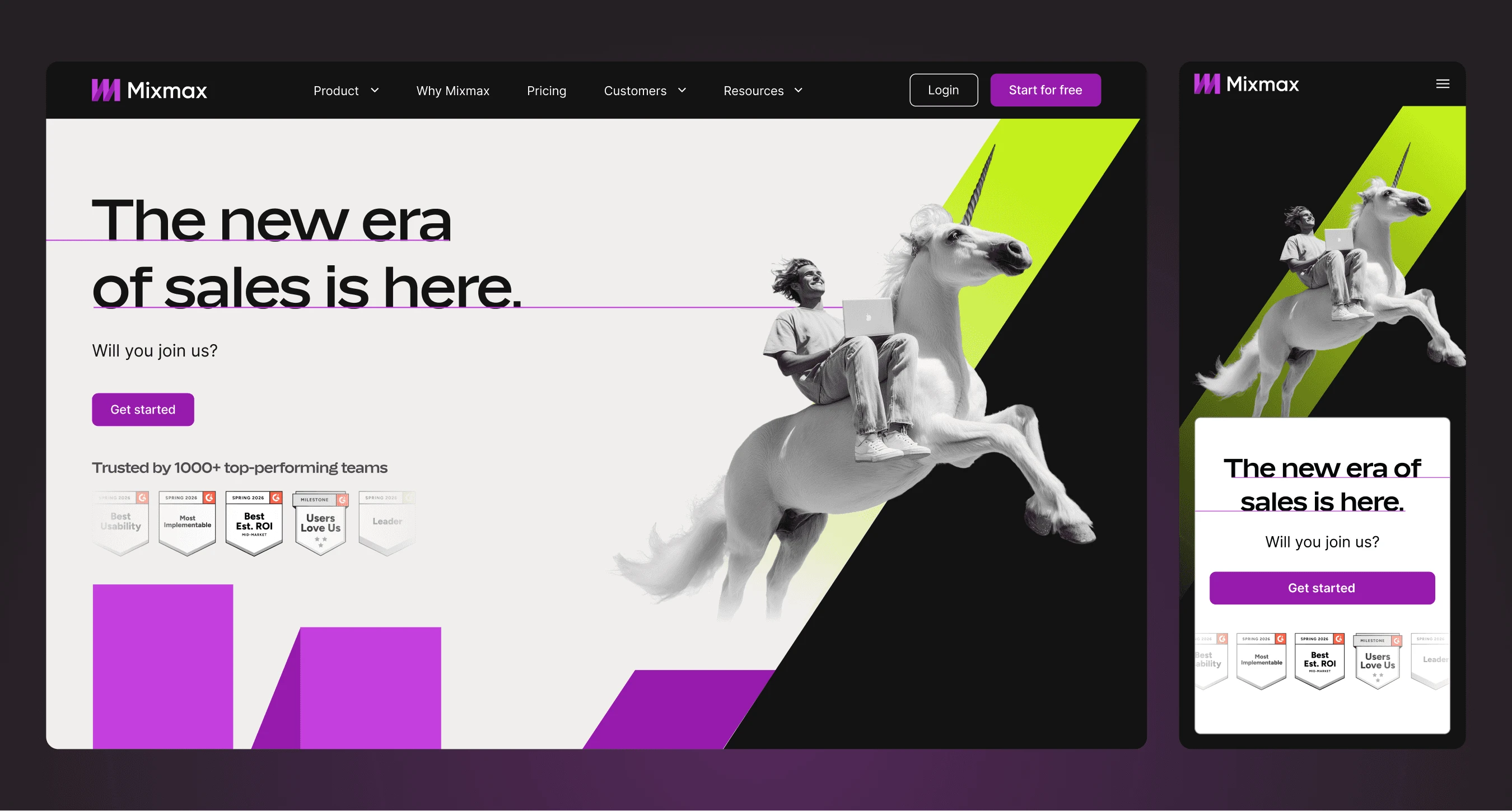
The new positioning introduced more products, more capabilities, and more ways for customers to engage with Mixmax. The website needed to communicate this breadth without becoming difficult to navigate. Rather than treating each page as a standalone design exercise, I focused on building a consistent system that could handle different content types while maintaining a clear visual hierarchy.
Product complexity: Multiple products and plans needed to be understood quickly without overwhelming prospective customers.
New positioning: The website needed to communicate Mixmax's shift from sales engagement software to an AI-native platform.
Conversion: The experience needed to guide users towards the right product and ultimately towards starting a free trial.
System
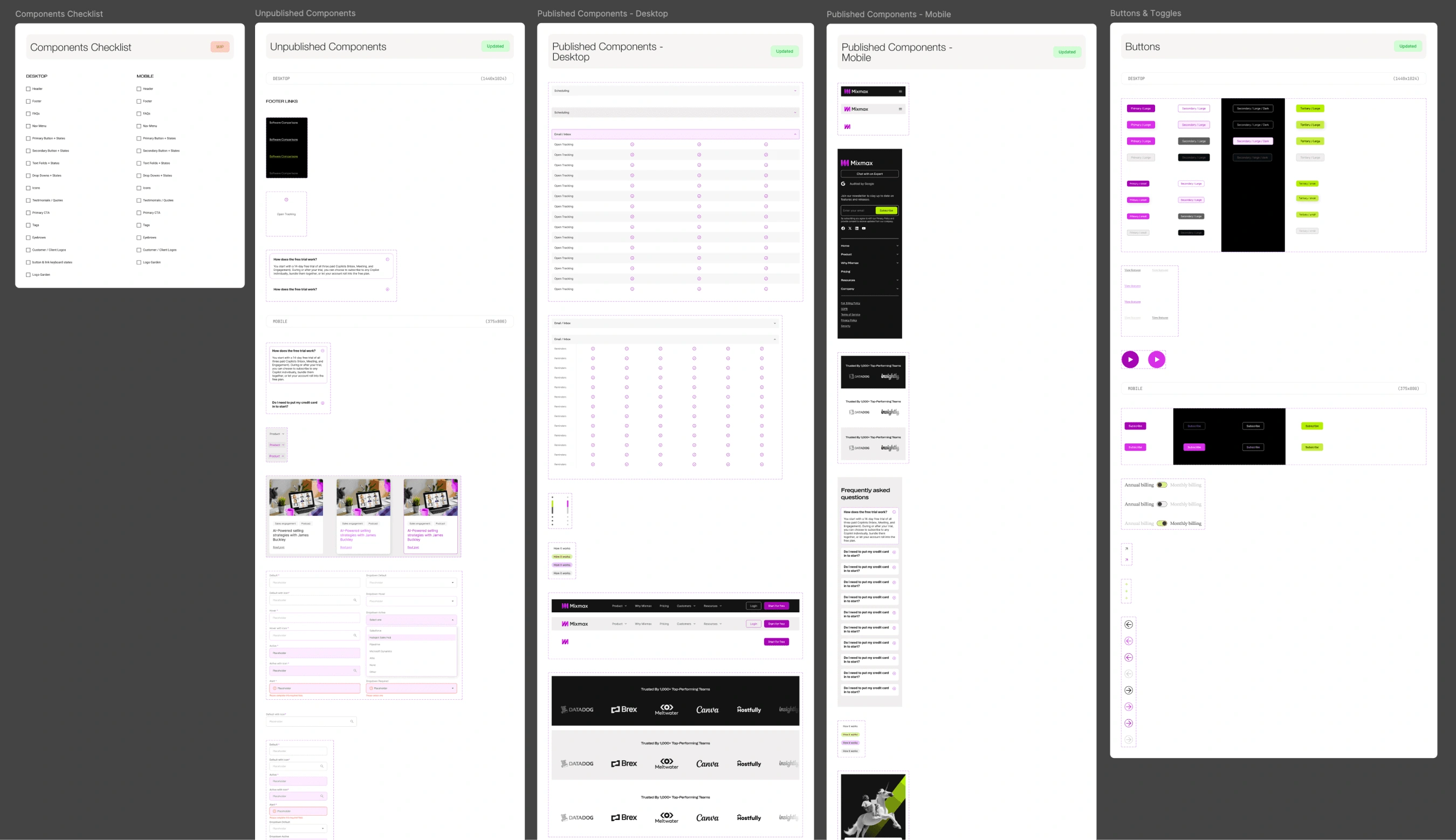
I developed the website's UI system alongside the page designs, creating reusable components, interaction states, and tokens for colour, typography, spacing, and other core properties. Rather than building a page-by-page collection of layouts, I established patterns that could be reused across the site and adapted to different content requirements. This allowed the system to scale across more than 40 pages while keeping the experience consistent.
Product
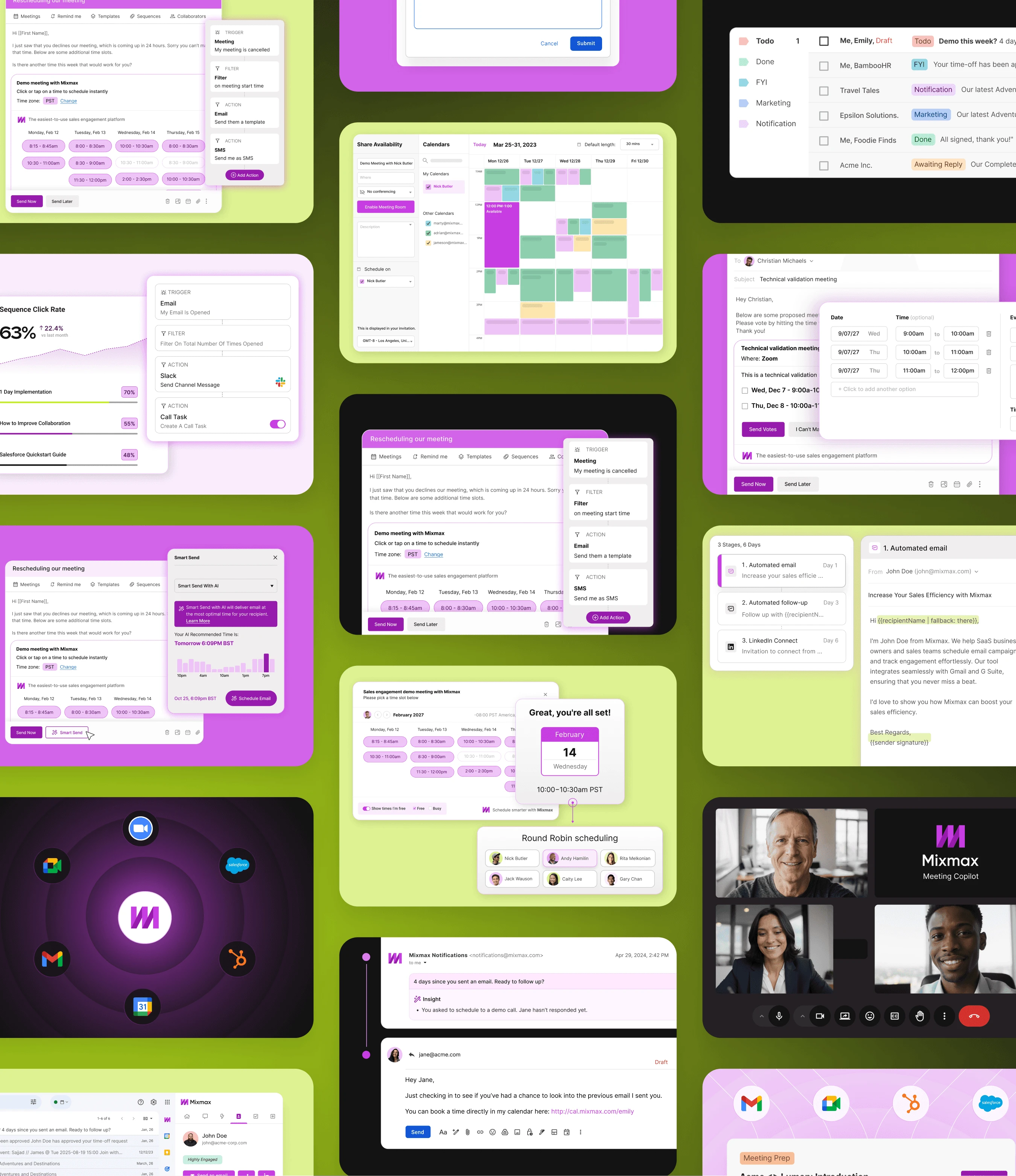
The website relied on more than static marketing sections to explain Mixmax. Interactive product demonstrations were used to show how the platform worked within a real sales workflow. The homepage introduced the product through progressive storytelling, while product pages gave users more detail as they moved deeper into the experience.
The aim was to make the product easier to understand through interaction rather than relying entirely on written explanation.

Exploration
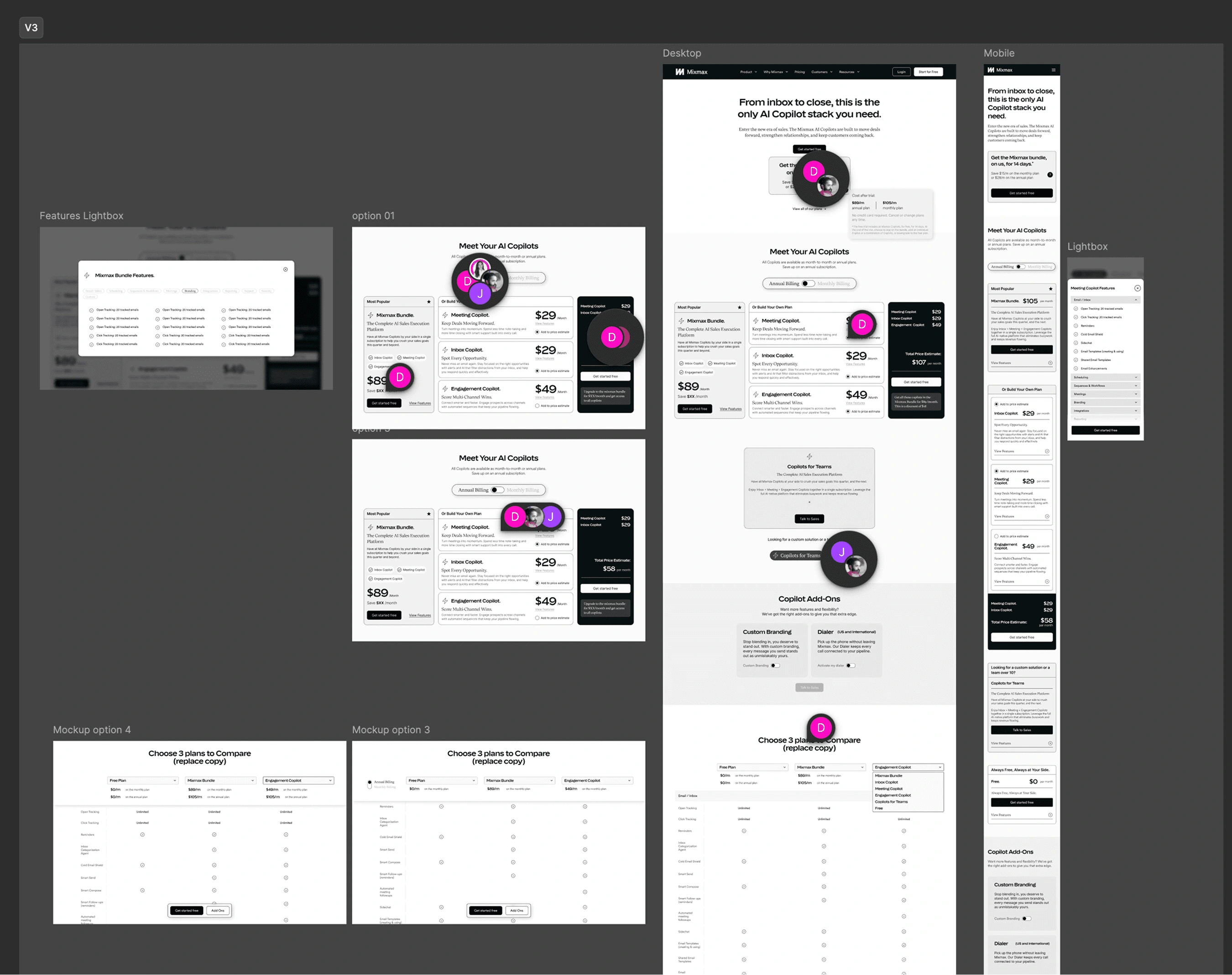
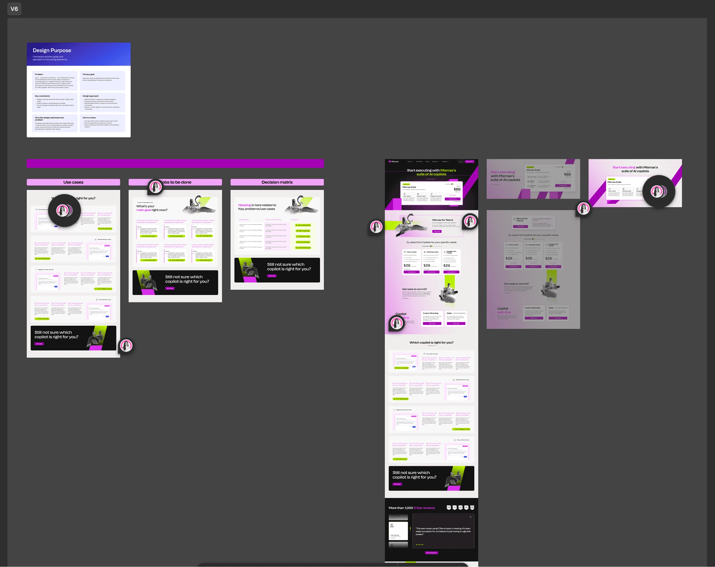
One of the more complex pages was the pricing experience. Mixmax had several products and plans, including individual AI Copilots, a Suite, Free, and Team options. Presenting these with equal visual weight made the decision harder to navigate.
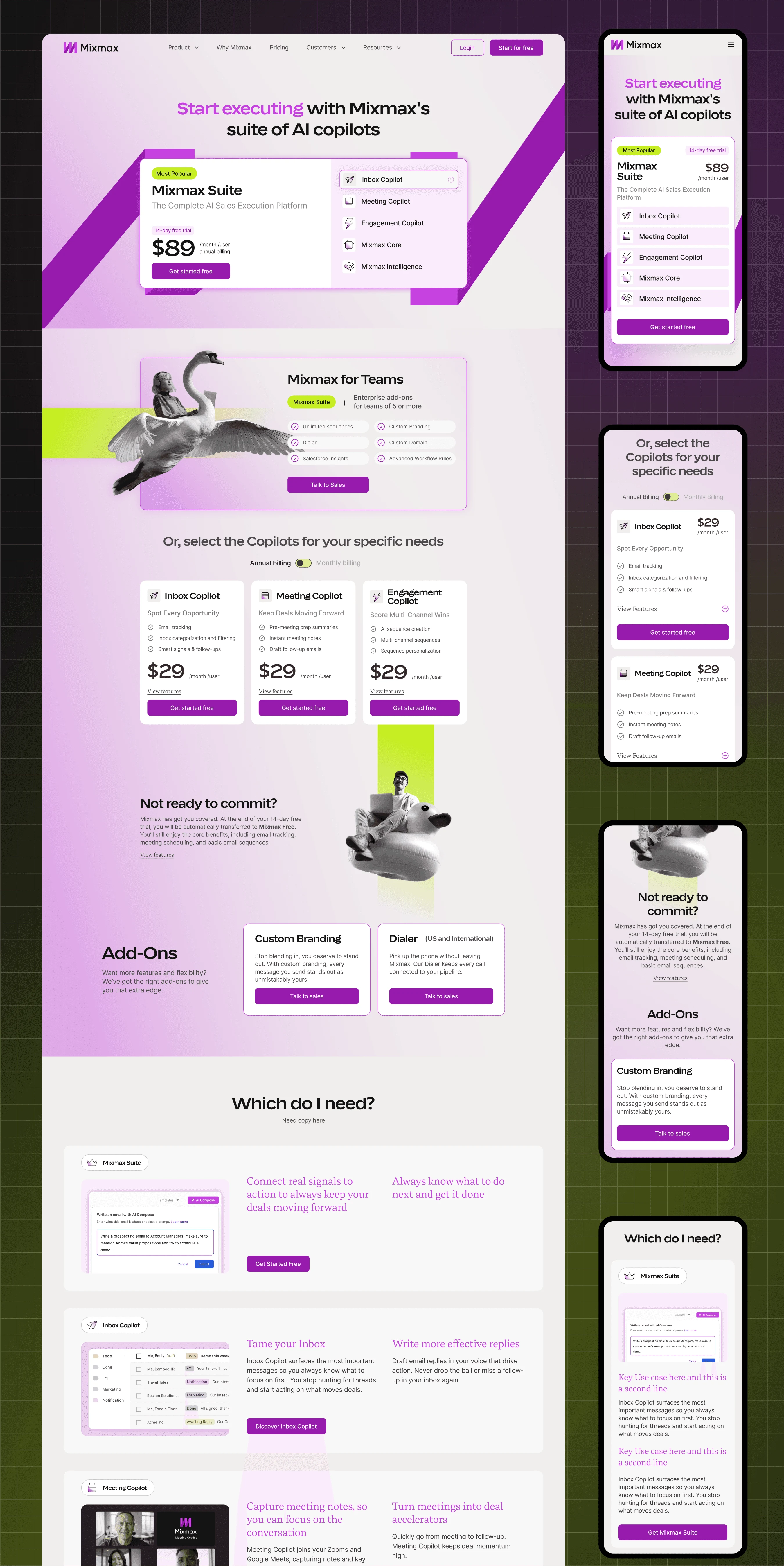
Suite: The central option for customers looking across the full Mixmax offering.
Copilots: Individual products positioned for more specific use cases.
Mixmax for teams: A separate path for larger organisations requiring a sales conversation.
Free: A lower-friction entry point for users wanting to try Mixmax.
I explored multiple structures before reorganising the page around the primary buying decision. The Suite became the central option, while individual Copilots were positioned as alternatives for more specific needs. Mixmax for teams was separated into a clearer sales path. This gave the page a stronger hierarchy without removing the flexibility of the underlying pricing model.
Design
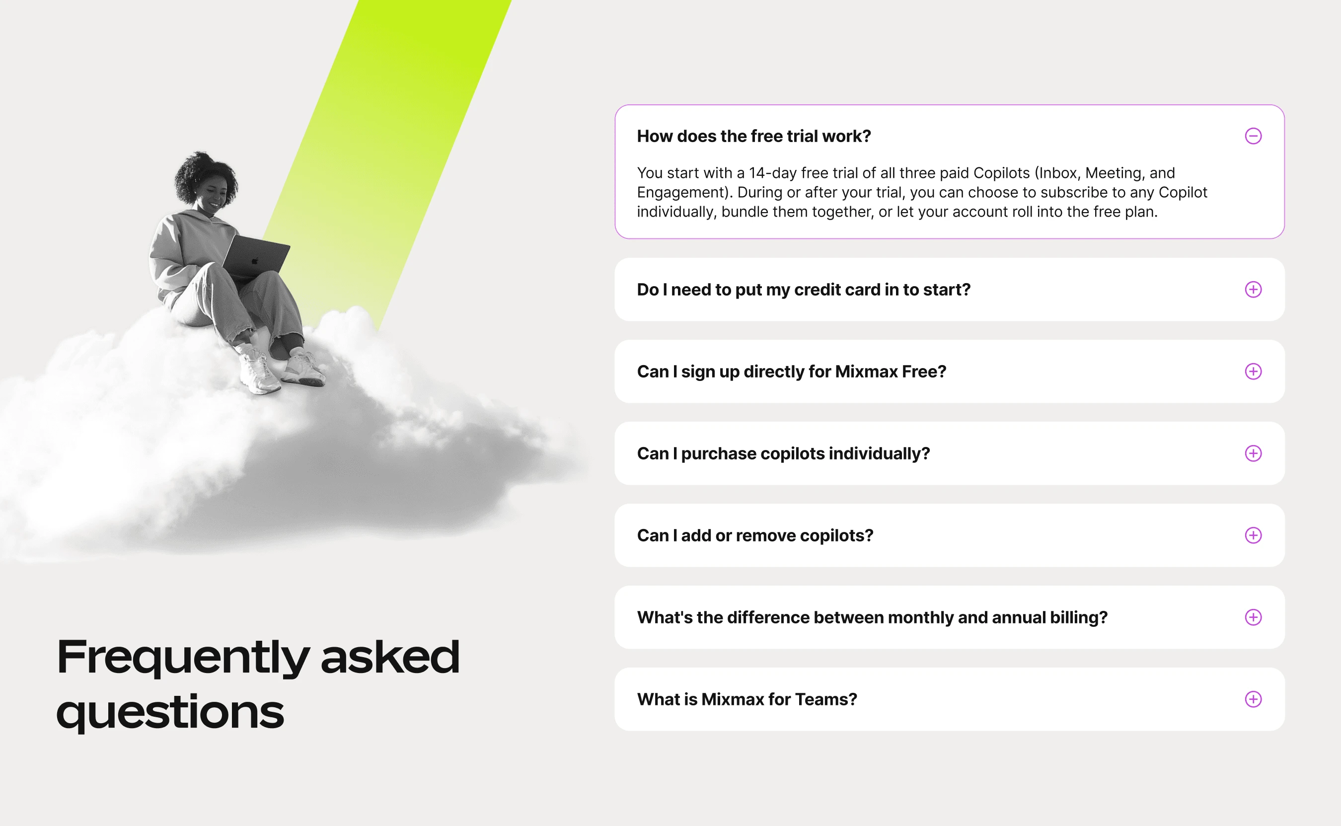
With the underlying system established, the same principles could be applied across the wider site. Layouts, navigation, CTAs, product sections, cards, pricing elements, and other recurring patterns were designed to feel like part of the same experience while still allowing individual pages to have their own hierarchy. I worked closely with development throughout implementation and QA, resolving visual and responsive issues as the site came together.
Outcome
The new website brought the refreshed brand and AI positioning into a cohesive digital experience.
40+ pages: A new website experience spanning core marketing and product pages.
300K+ monthly visitors: The site continues to expand since launch.
Ongoing system: A reusable design foundation for continued website development.
Expanded scope: The initial engagement developed into an ongoing design partnership.
The initial website engagement developed into an ongoing retainer, covering additional website experiences and marketing work as Mixmax's product and positioning continued to evolve.
Reflection
The project required designing for a business that was still evolving its product, positioning, and website at the same time. Building the system alongside the pages made it possible to respond to that change without compromising consistency.
The pricing work was one example of a broader approach I used throughout the project: understand the complexity first, then use hierarchy, structure, and interaction to make it easier to navigate.
0 likes · 0 views · Nov 2, 2026
Lead UI designer on Mixmax's 40+ page website overhaul, repositioning a sales platform for AI. The project became an ongoing design retainer.