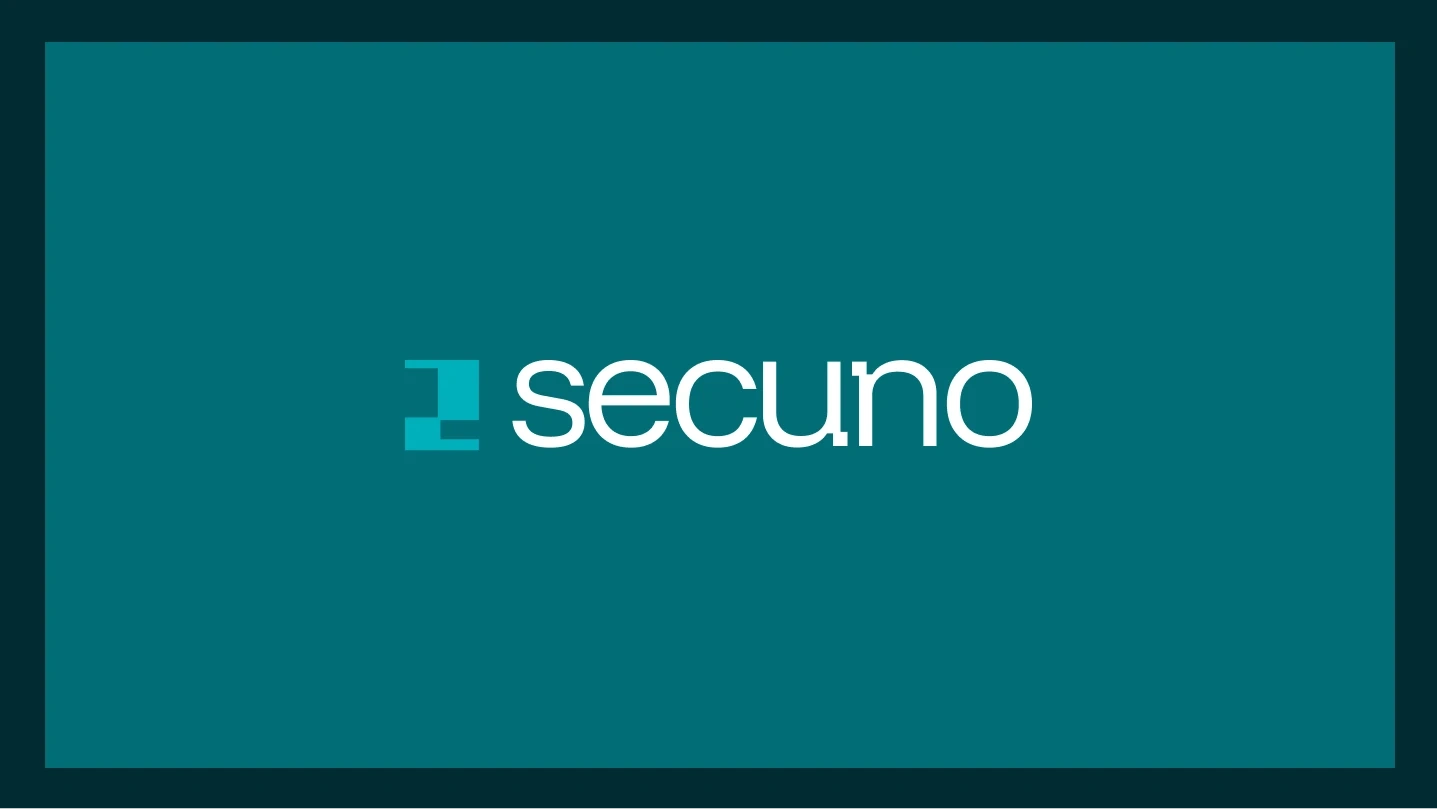
SECUNO — Venture Firm Brand Identity
Zazzy
Introduction
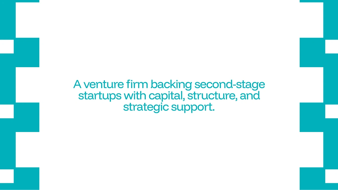
SECUNO is a venture firm focused on companies entering their second stage of growth — the critical transition between early traction and sustainable scale.
While many investors focus on the excitement of early ideas, SECUNO positions itself at a more delicate moment in a company's lifecycle: the moment where structure becomes more important than momentum.
The brand needed to communicate discipline, maturity, and operational clarity rather than hype.
This identity explores what branding looks like when its job is not to attract attention — but to signal readiness.
The Challenge
The biggest challenge was avoiding the visual clichés commonly associated with venture firms and startups.
Many financial and tech brands rely on the same visual language:
arrows representing growth
flashy gradients
abstract tech symbols
But SECUNO required something different.
The brand needed to communicate:
confidence
structure
precision
credibility
This meant creating a visual system that felt institutional and strategic, rather than trendy.
The Idea
The core idea behind the identity comes from “phase two.”
SECUNO focuses on companies that have already proven their concept and are now preparing for scale.
The brand therefore needed to visually express:
transition
alignment
structural readiness
Instead of symbols that represent speed or disruption, the identity focuses on order and construction.
Growth is not portrayed as chaos — it is portrayed as structure forming.
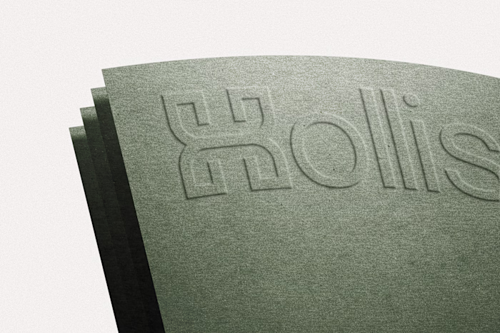
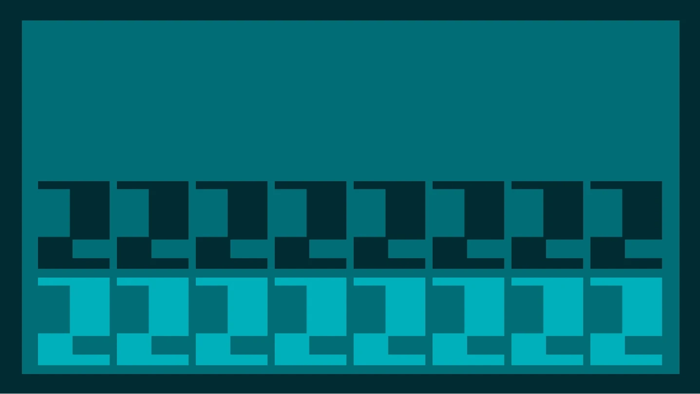
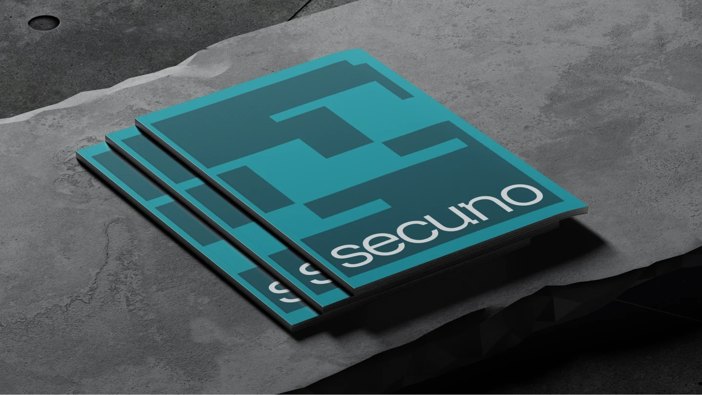
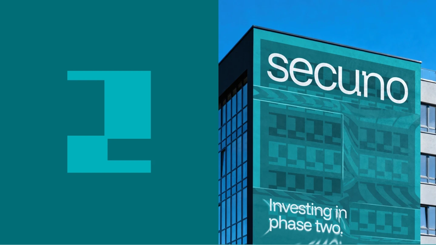
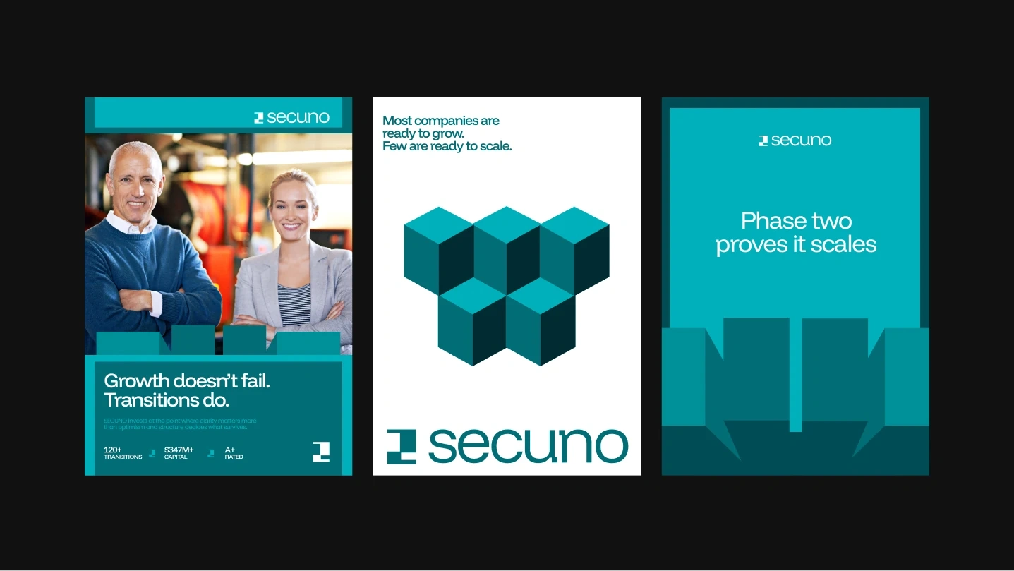
Logo Concept
The SECUNO logo is inspired by the number two, representing the second phase of a company’s growth journey.
Using block-based geometry, the mark expresses:
alignment
structure
modular thinking
The shapes are intentionally simple and architectural, creating a symbol that feels constructed rather than drawn.
This approach reinforces the idea that SECUNO operates where businesses move from experimentation to operational maturity.

Visual Language
The broader visual system extends this idea of structure.
Design decisions were guided by three principles:
1 — Geometry
All forms are built from clean blocks and precise alignment, reinforcing clarity and control.
2 — Negative Space
Generous spacing creates a sense of calm authority and allows the system to breathe.
3 — Consistency
Every visual element follows the same logic, turning the identity into a repeatable system rather than isolated graphics.
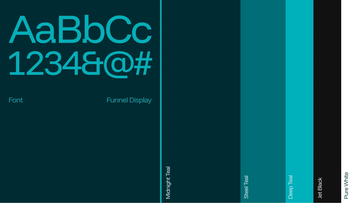
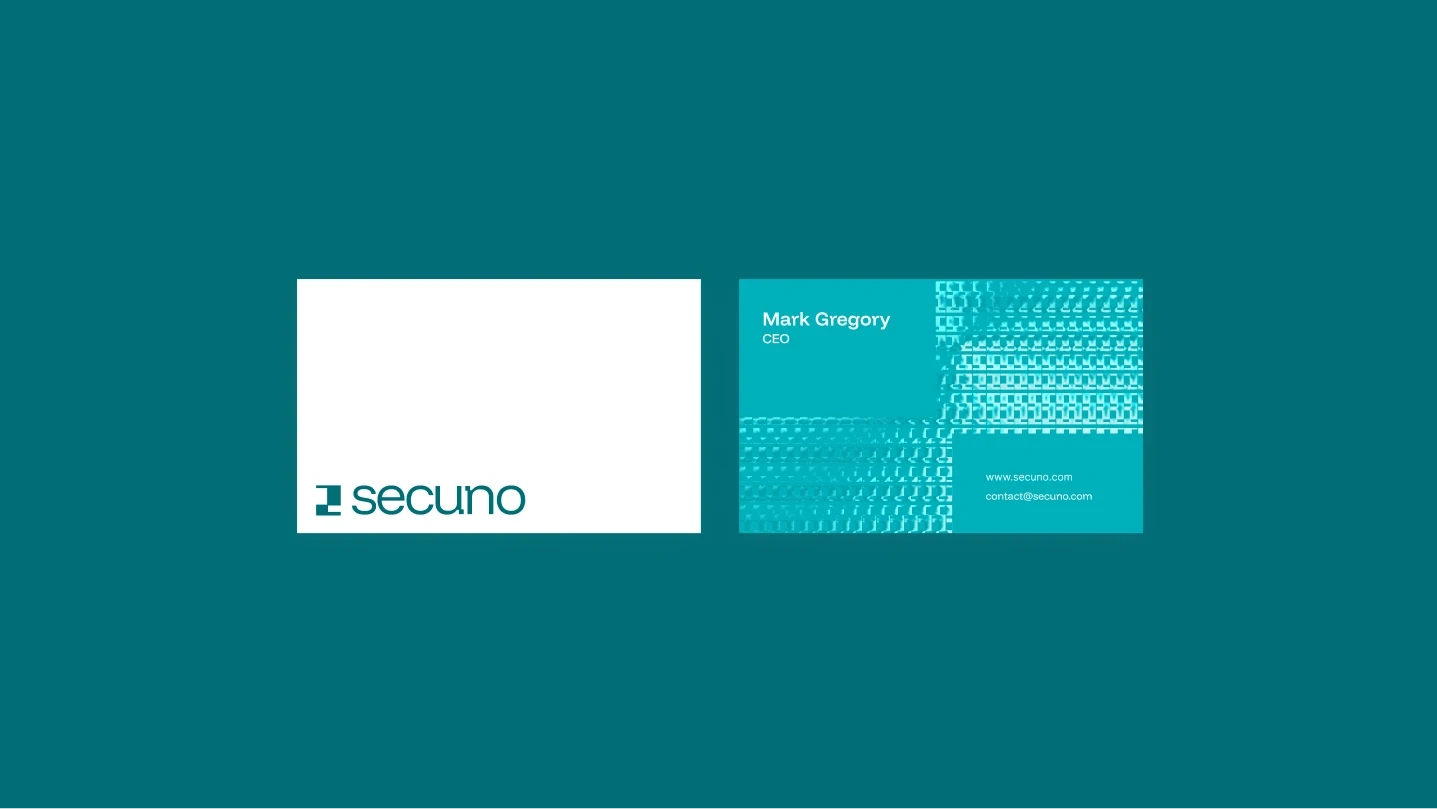
Color System
The color palette was chosen to communicate stability and clarity.
Deep tones establish authority, while controlled accent colors introduce contrast without overwhelming the composition.
The result is a palette that feels:
professional
restrained
institutional
This reinforces the positioning of SECUNO as a firm focused on long-term thinking rather than short-term excitement.
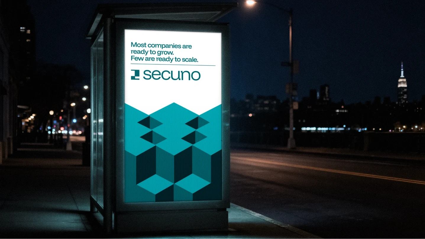
Brand Expression
The identity system allows the brand to exist across multiple contexts:
investor presentations
digital platforms
venture communications
brand campaigns
Rather than relying on decorative visuals, the system uses structured compositions and modular elements that reflect the brand’s strategic approach.
Outcome
The final identity positions SECUNO as a venture firm built for the transition moment in a company’s life.
It communicates a sense of stability and clarity, signaling that the firm operates where growth becomes structured.
The project demonstrates how branding can function not just as visual expression, but as a signal of credibility.
Closing Thought
In venture capital, perception matters.
A company that appears prepared is often treated differently than one that appears uncertain.
Good branding does not just attract attention.
It reduces doubt.

Like this project
Posted Feb 19, 2026
SECUNO is a venture firm focused on companies entering their second stage of growth, the transition from validation to scale.
Likes
1
Views
36