Built with Ideogram
Hollis — Interior Design Studio Branding
Zazzy
Project Overview
Hollis is a conceptual brand identity for a boutique interior design studio focused on creating calm, considered spaces. The project explores what an interior brand looks like when decisions are driven by restraint, structure, and spatial thinking rather than trend-led aesthetics.
This was a personal exploration aimed at designing an interior brand that feels architectural, grounded, and timeless. The goal was to create an identity that prioritizes how spaces are experienced, not how loudly they are presented.
The Challenge
Many interior brands today rely heavily on visual noise. Decorative graphics, trend-driven palettes, and overly styled imagery often take precedence over the space itself. While visually striking, these approaches can distract from the core purpose of interior design.
With Hollis, the challenge was to design a brand that feels confident without being loud. A brand that supports the interior rather than competing with it. The central question became: what does quiet luxury look like when applied consistently across brand identity, imagery, and system?
Brand Intent
Hollis is positioned as a boutique interior practice working across residential and small-scale commercial spaces. The brand is built for clients who value longevity over trends, calm over visual excess, and thoughtful decisions rooted in proportion and material.
Rather than selling decoration, Hollis sells clarity, balance, and spatial confidence.
Design Philosophy
At its core, Hollis is built on the belief that good interiors are not immediately loud. They reveal themselves slowly through use, light, and movement.
The studio’s approach is guided by proportion, alignment, material honesty, and spatial flow. These principles informed every part of the identity, from the construction of the logo to the imagery direction and tone of voice.
The aim was not to impress instantly, but to create a brand that feels resolved and intentional.
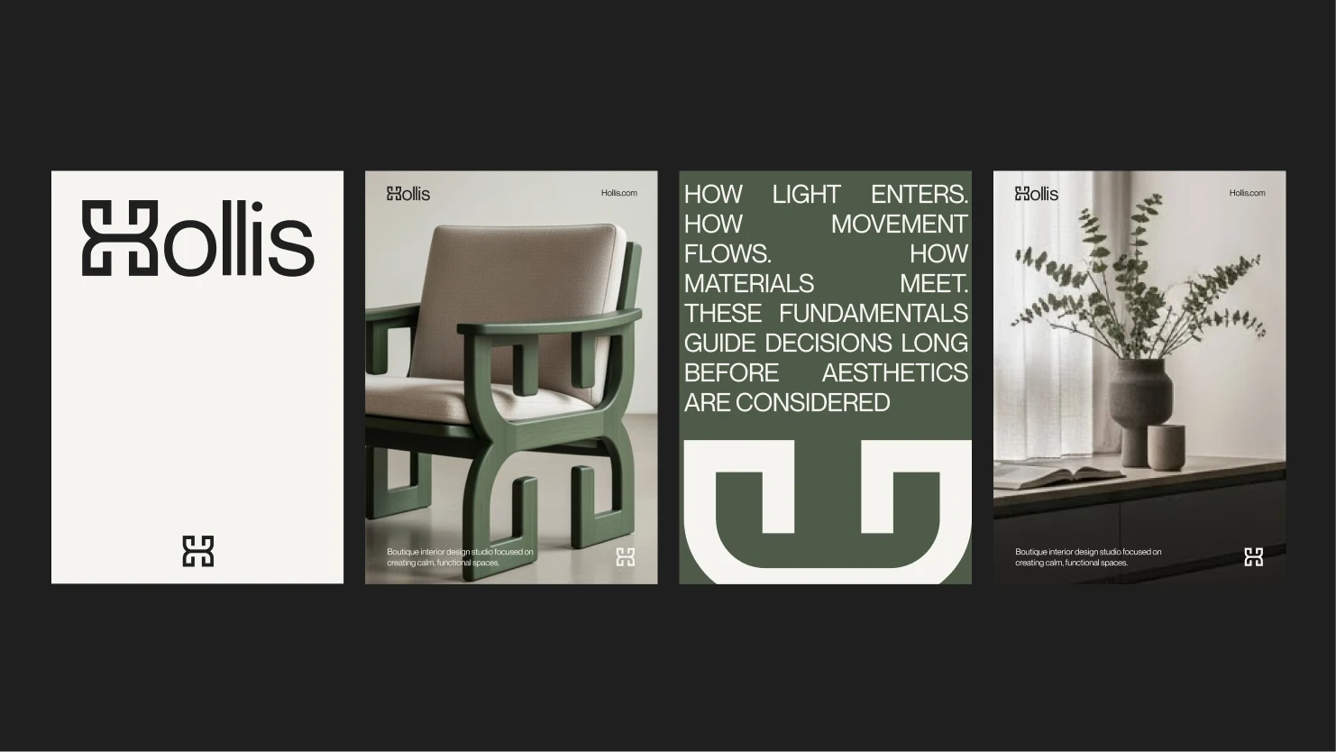
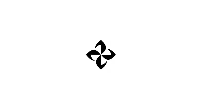
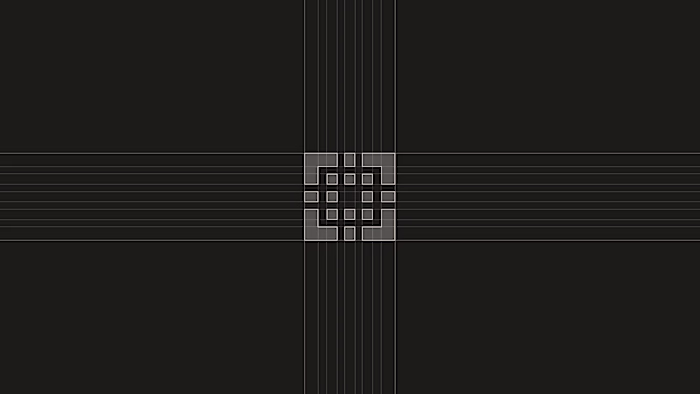
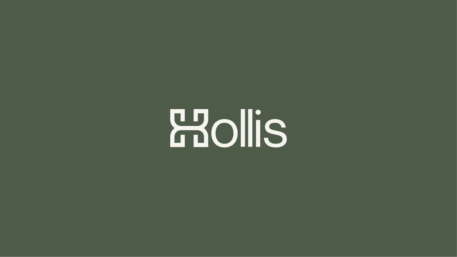
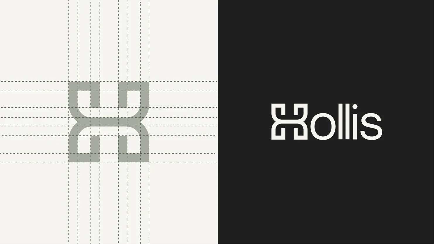
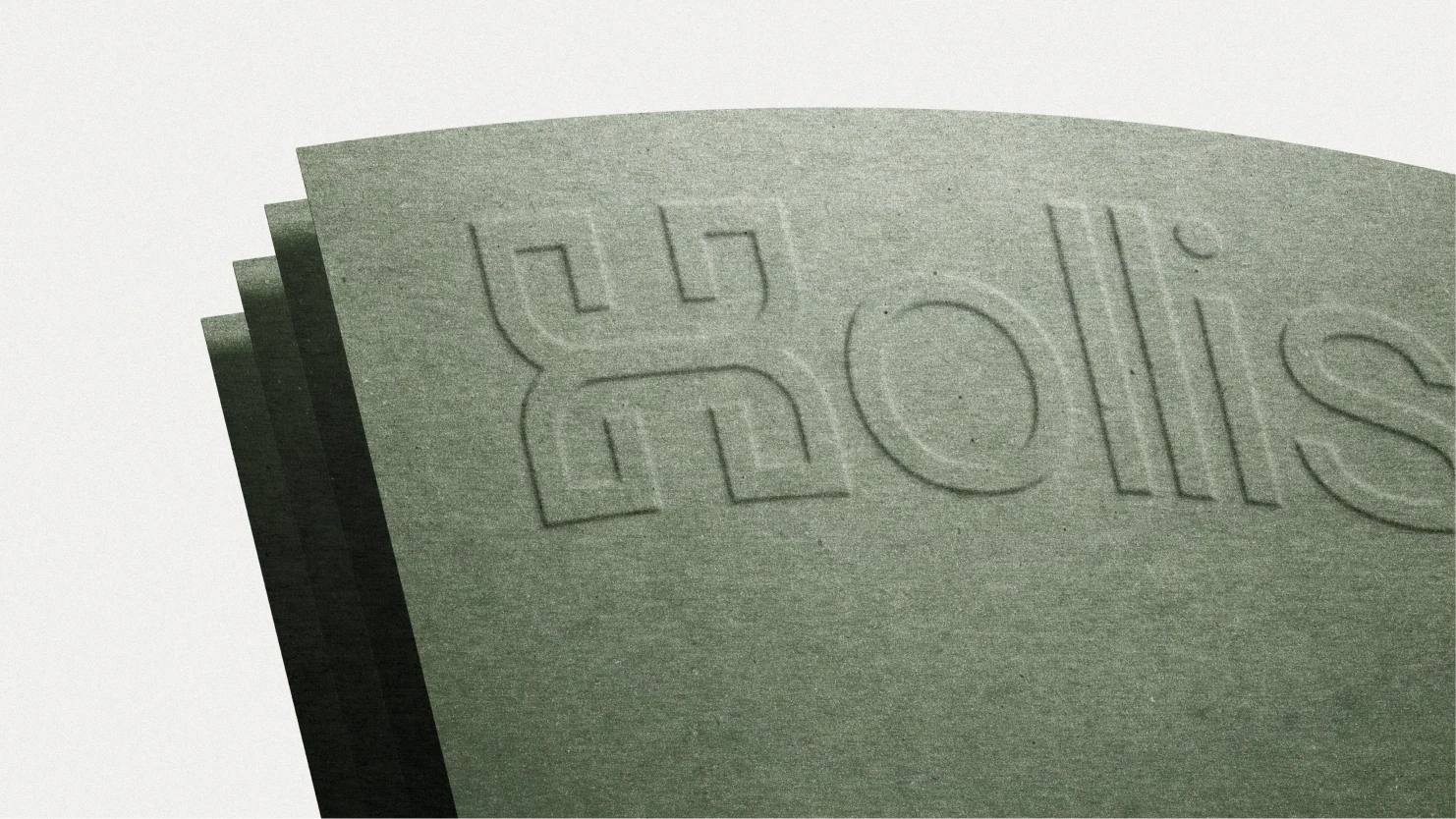
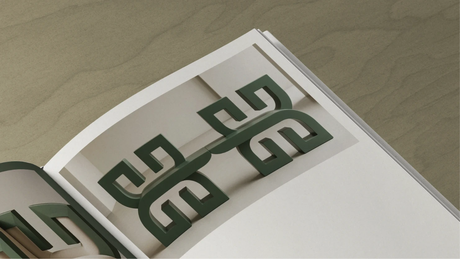
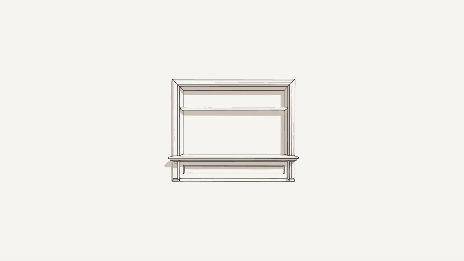
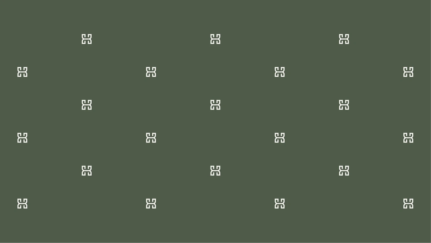
Logo Concept and Construction
The Hollis mark was designed to feel less like a graphic symbol and more like an interior object. Instead of abstract symbolism, the logo references architectural joinery and structural components. These are the quiet elements that hold spaces together but are rarely noticed.
The mark is symmetrical, balanced, and grounded, reflecting how interior design relies on order and proportion. It is intentionally minimal, with no excess detail. This allows the logo to exist naturally within physical spaces such as walls, materials, garments, and print, without demanding attention.
The intention was to design a logo that could live inside an interior, not sit on top of it.
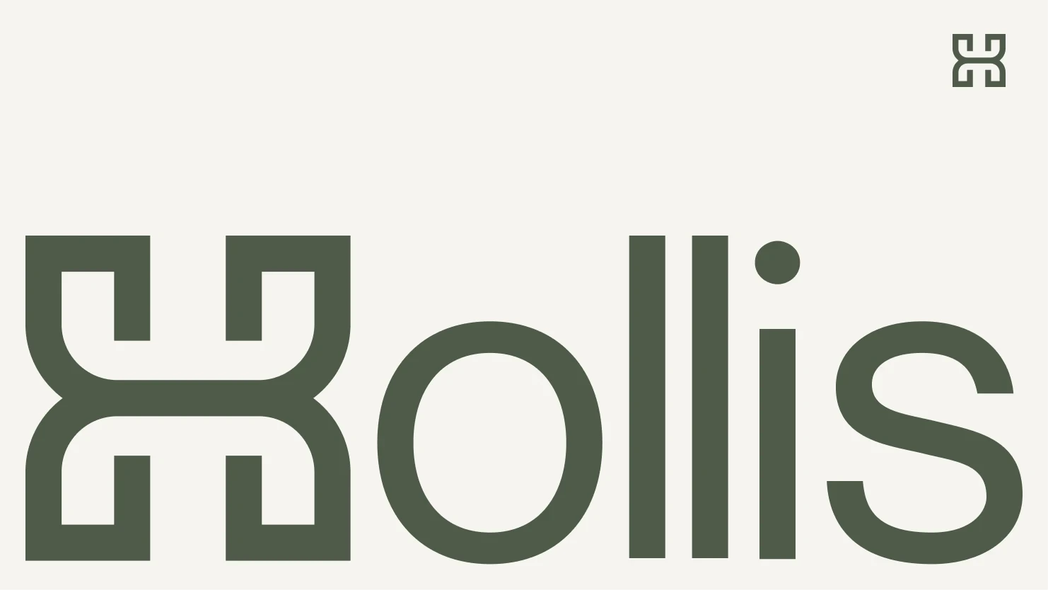
Typography
Typography was chosen to feel contemporary yet restrained. The primary typeface is neutral and architectural in tone, prioritizing clarity and structure over expression.
Type is used sparingly, with careful attention to spacing and hierarchy. It supports the brand quietly, allowing space and imagery to lead rather than compete for attention.
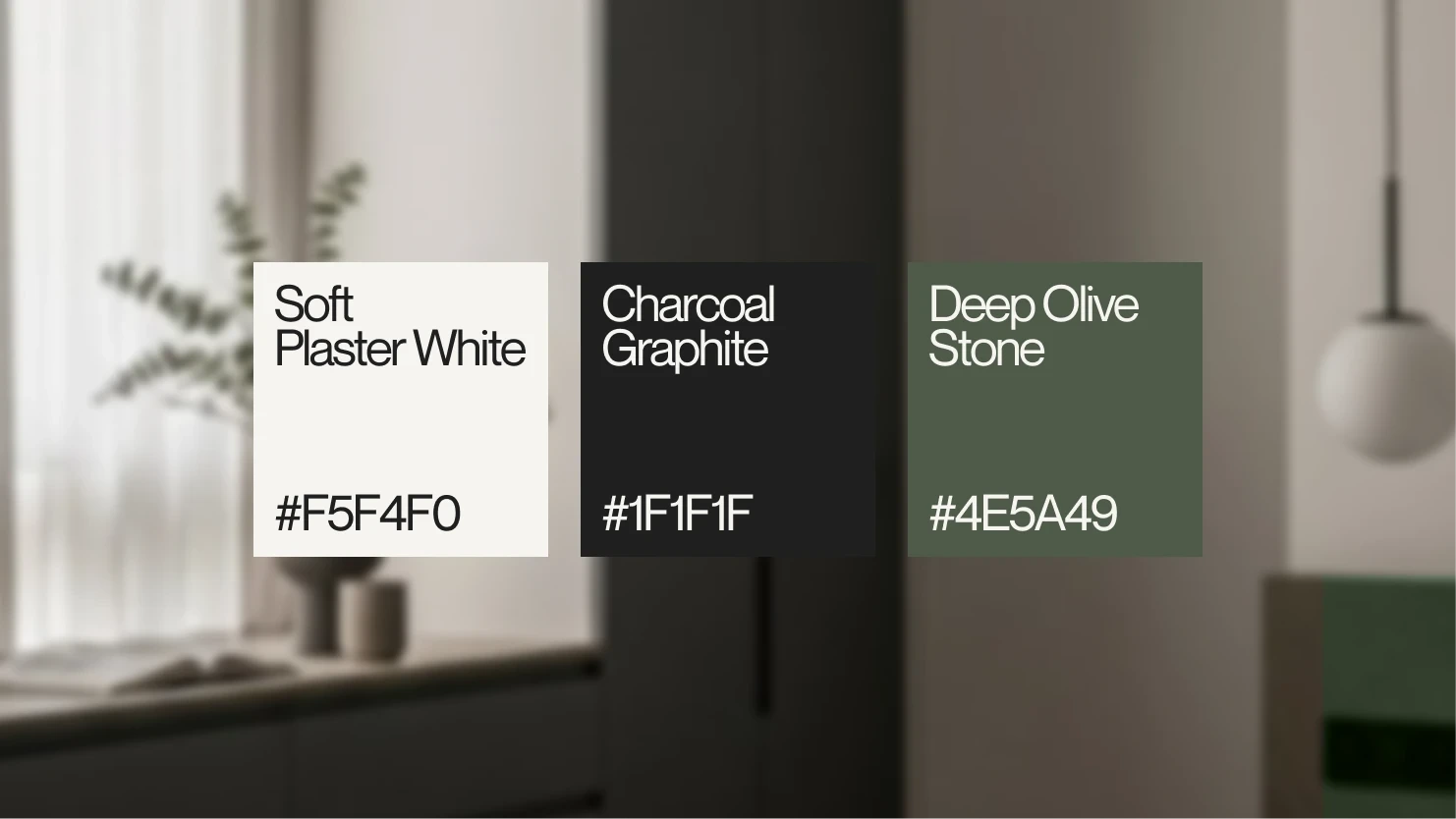
Color Palette
The color palette draws directly from interior materials rather than digital trends. Soft plaster white is inspired by gallery walls and lime plaster finishes. Charcoal graphite acts as an architectural near-black, grounding the system and providing contrast. Deep olive stone introduces an earthy accent that references natural materials and patina.
The palette is intentionally limited to maintain restraint and ensure that interiors, materials, and light remain the focus.
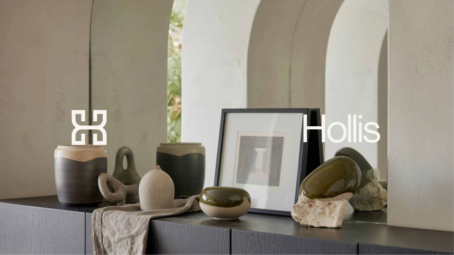
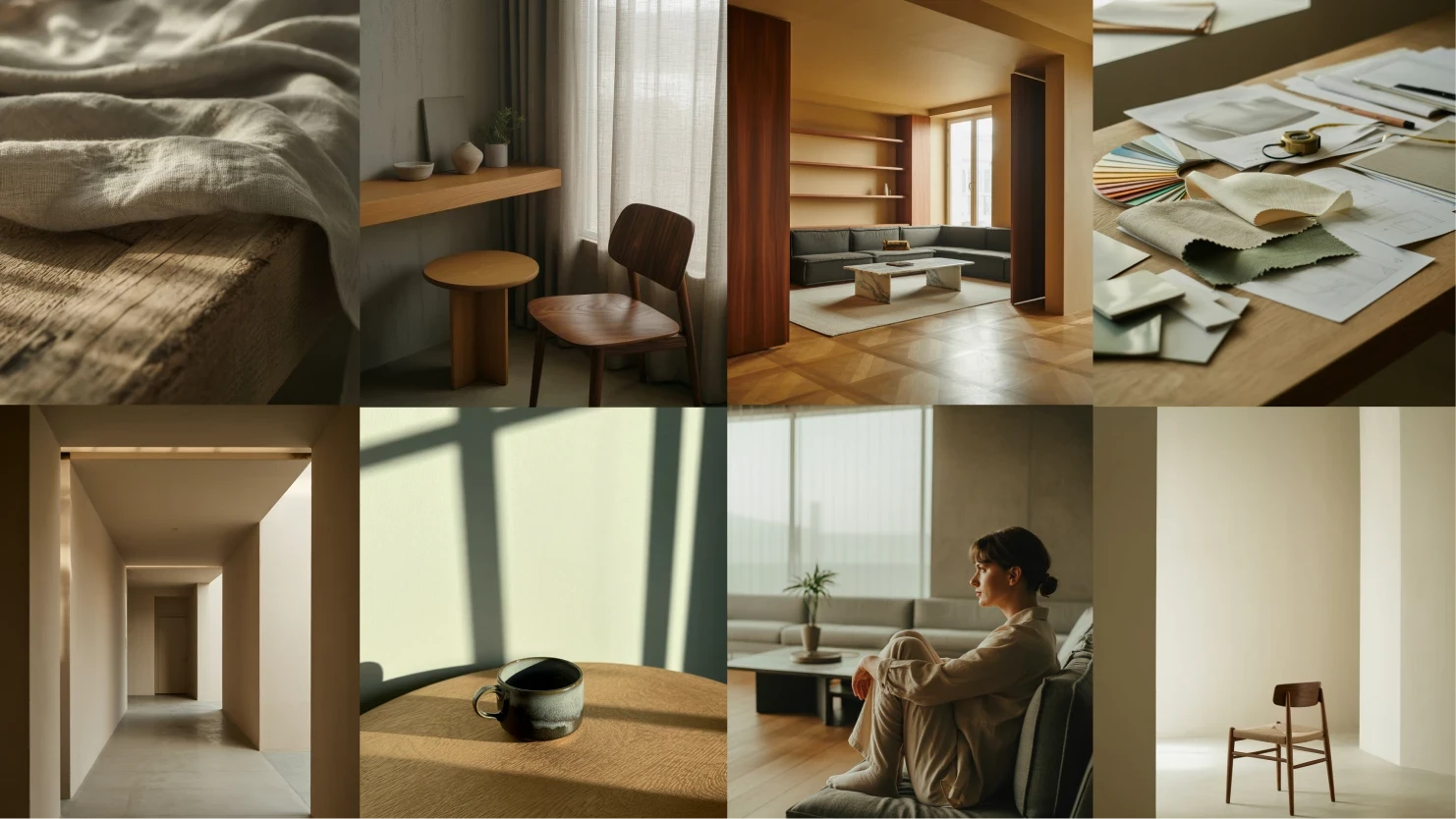
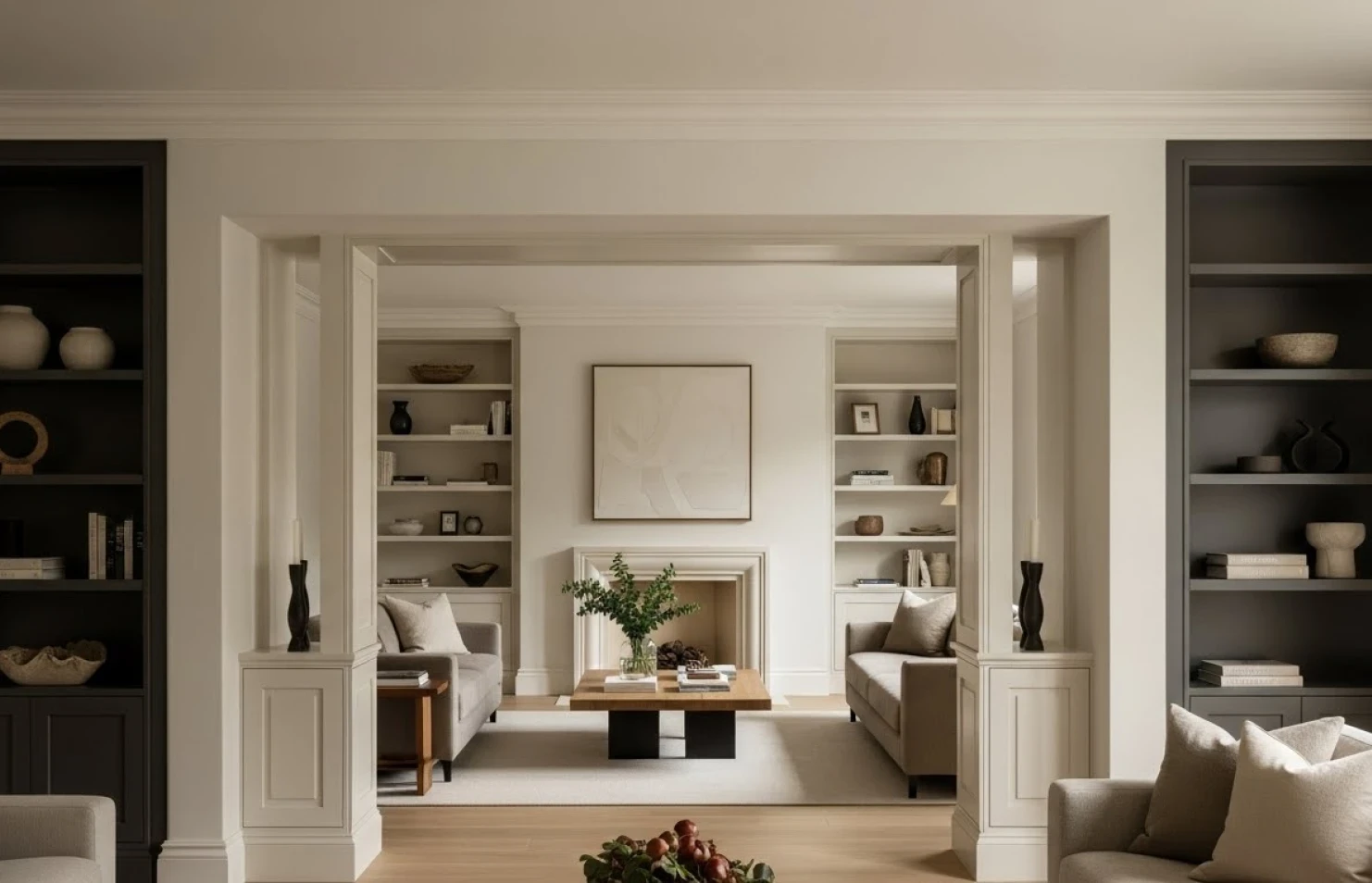
Imagery Direction
Imagery plays a central role in the Hollis brand. Rather than highly styled or promotional visuals, the imagery focuses on observation.
Wide shots are used to establish atmosphere and spatial balance. Medium and close-up shots highlight material, texture, and detail. Transitional spaces emphasize flow and movement. Human presence is used sparingly to suggest life rather than performance.
All imagery follows a muted, editorial tone. Calm, moody, and lived-in, reinforcing the brand’s quiet confidence.
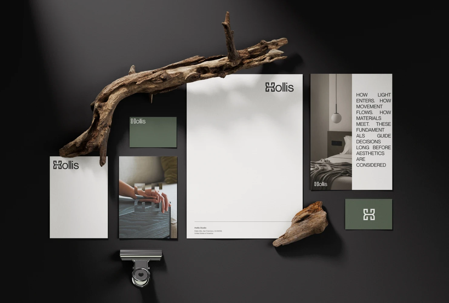
Applications
The identity was tested across multiple touchpoints to ensure flexibility and realism. These include editorial imagery, studio workwear, subtle merchandise, printed materials, and digital placements such as Instagram and presentation layouts.
Across all applications, the brand maintains restraint, clarity, and consistency, reinforcing the same design philosophy throughout.
Outcome
Hollis exists as a brand that values discipline and longevity. It is intentionally quiet, confident enough to step back and let the space speak.
The identity reflects an interior practice that designs for real life rather than visual performance.
Reflection
This project served as an exploration into designing brands that prioritize feeling over attention. Hollis demonstrates how minimalism, when guided by intention rather than trends, can create identities that feel grounded, mature, and enduring.
Final Thought
Hollis designs calm, considered interiors through structure, proportion, and restraint.
Like this project
Posted Dec 30, 2025
A conceptual brand identity for a boutique interior design studio focused on calm, considered spaces shaped by proportion, material, and restraint.
Likes
2
Views
54