Trailink — Connected Digital Pathway Brand Identity
Zazzy
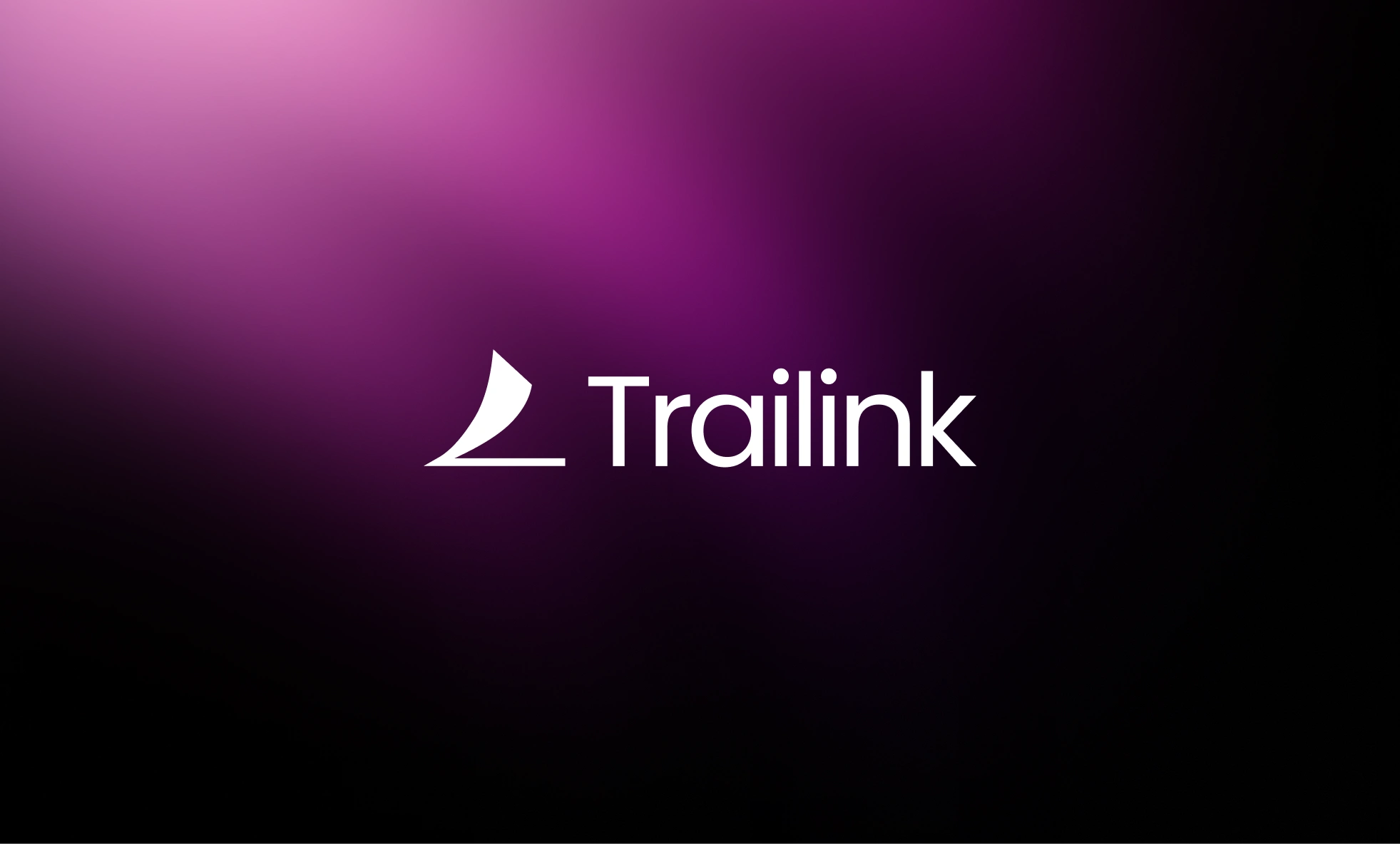
Trailink — Building a Connected Digital Pathway
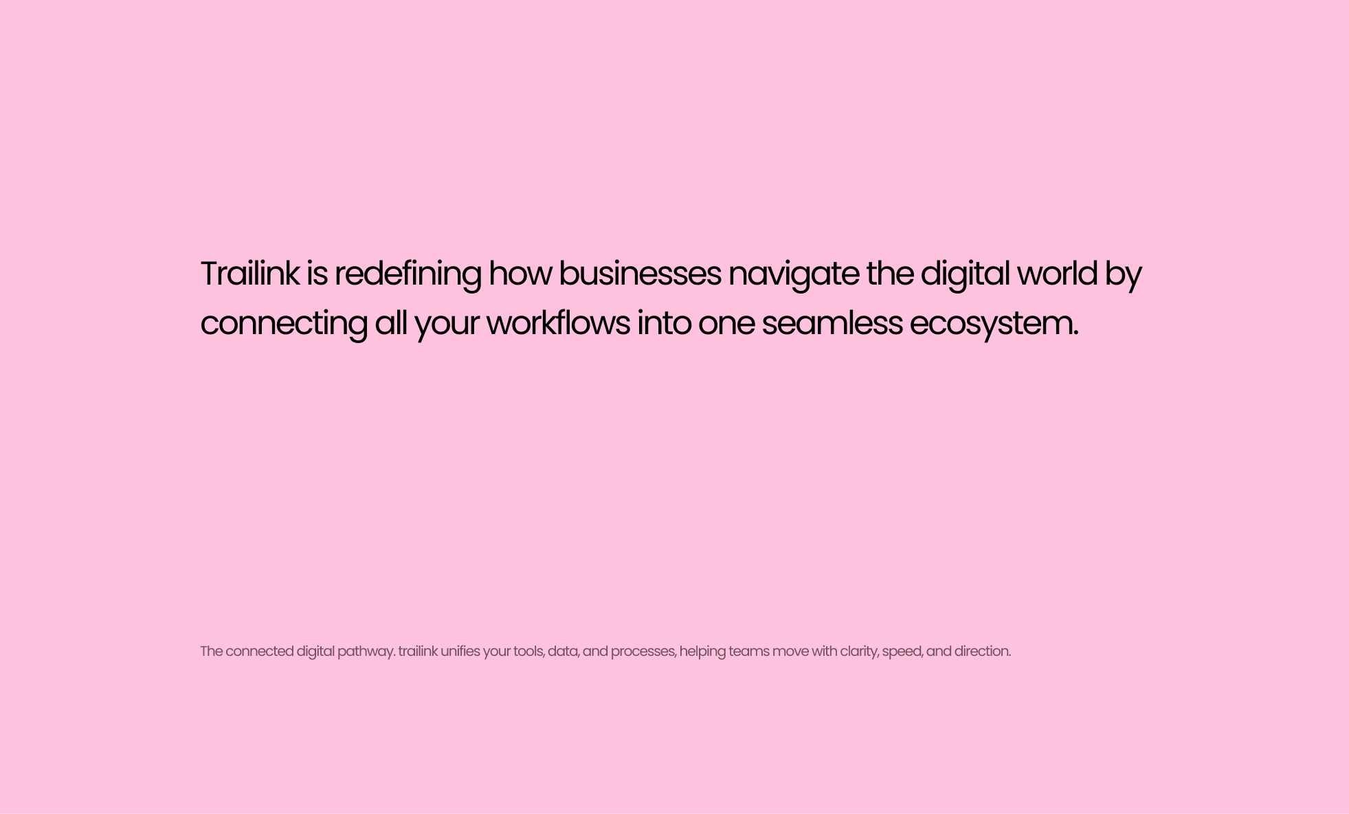
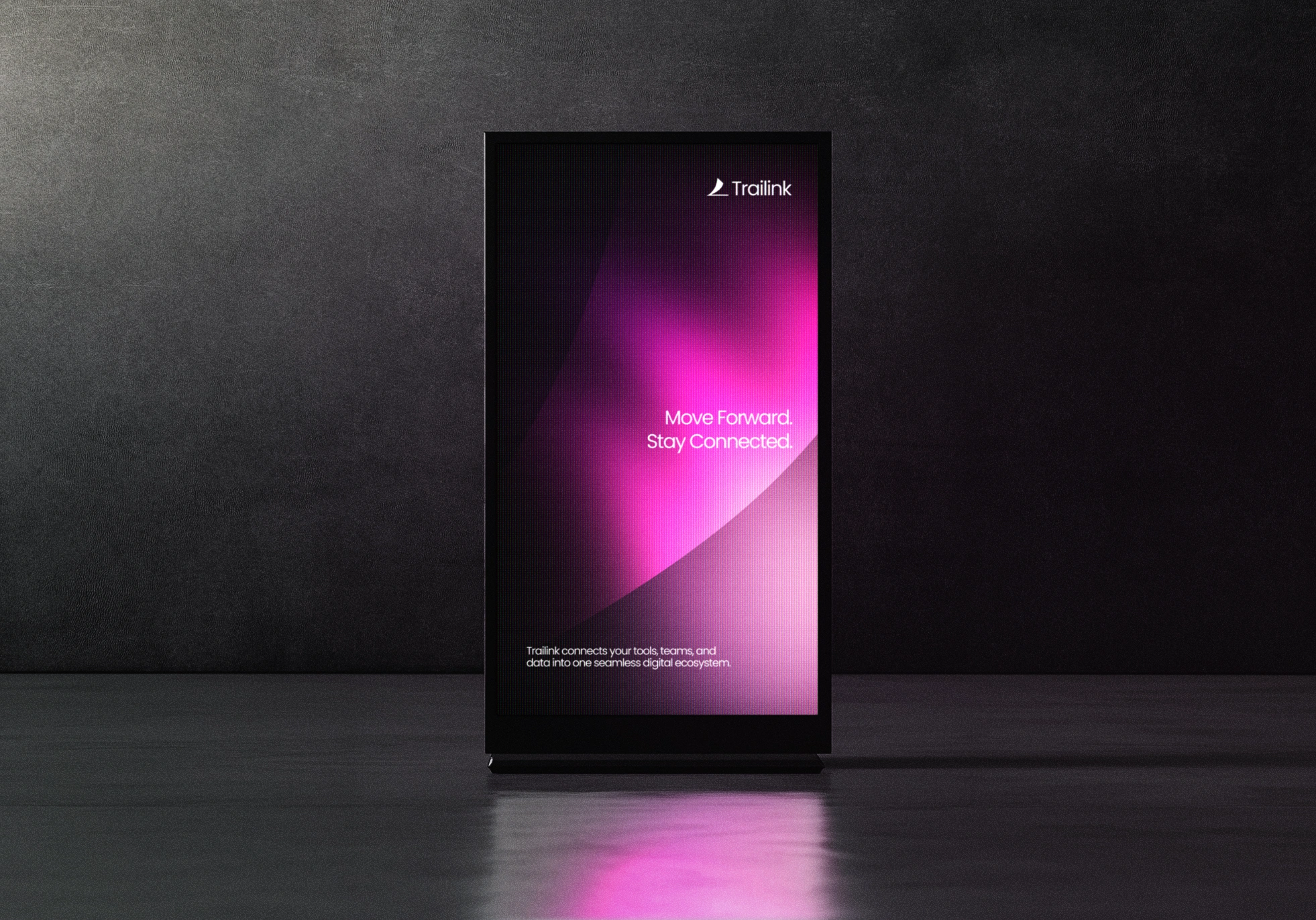
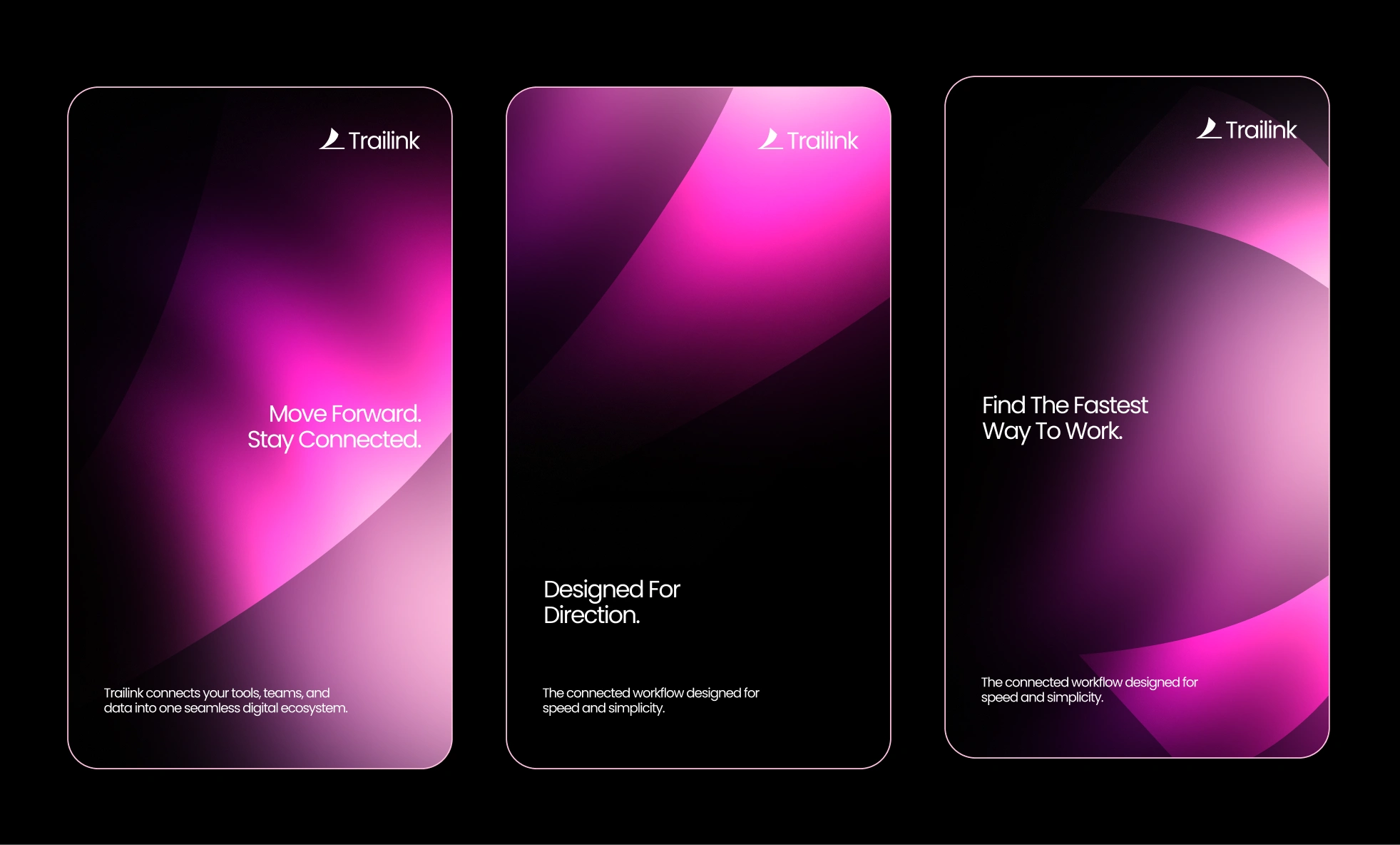
Trailink is a modern digital solutions brand created to help businesses navigate complexity with clarity, direction, and speed. The identity explores the power of movement, connection, and intelligent workflow design, brought to life through a bold geometric visual system that feels energetic, minimal, and future forward.
This project documents the complete development of Trailink from early conceptual sketches to a refined identity system designed for clarity, cohesion, and digital precision. The goal was simple: create a brand that visually represents how Trailink connects people, tools, and processes into one seamless ecosystem. Every design decision reflects the brand’s promise that every path should lead forward.
Brand Strategy and Direction
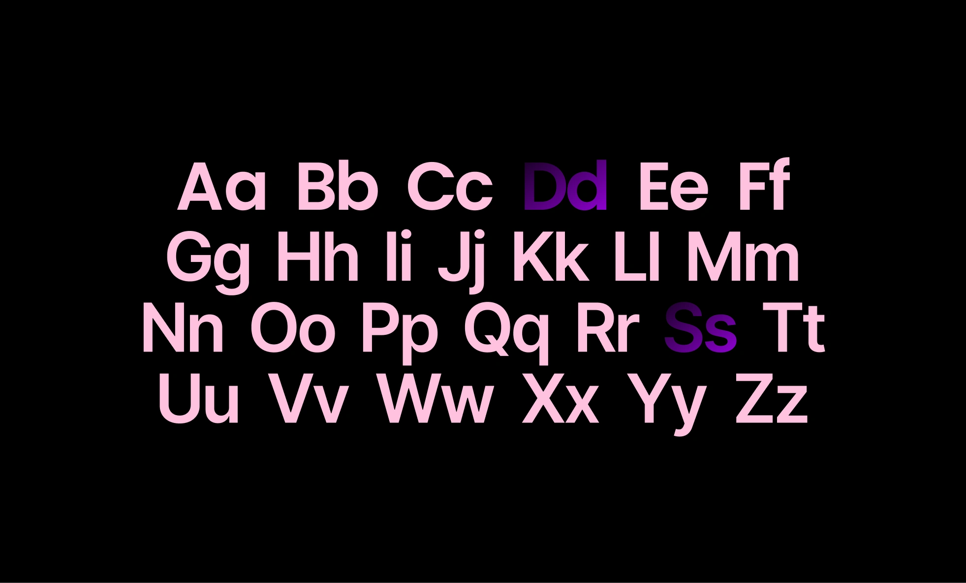
The foundation of Trailink’s identity is rooted in themes of direction, clarity, connection, and innovation. Through strategic positioning, the brand takes on a personality that is confident yet minimal, expressive yet intentional. This foundation guides the visual tone, color choices, typography, and overall creative direction.
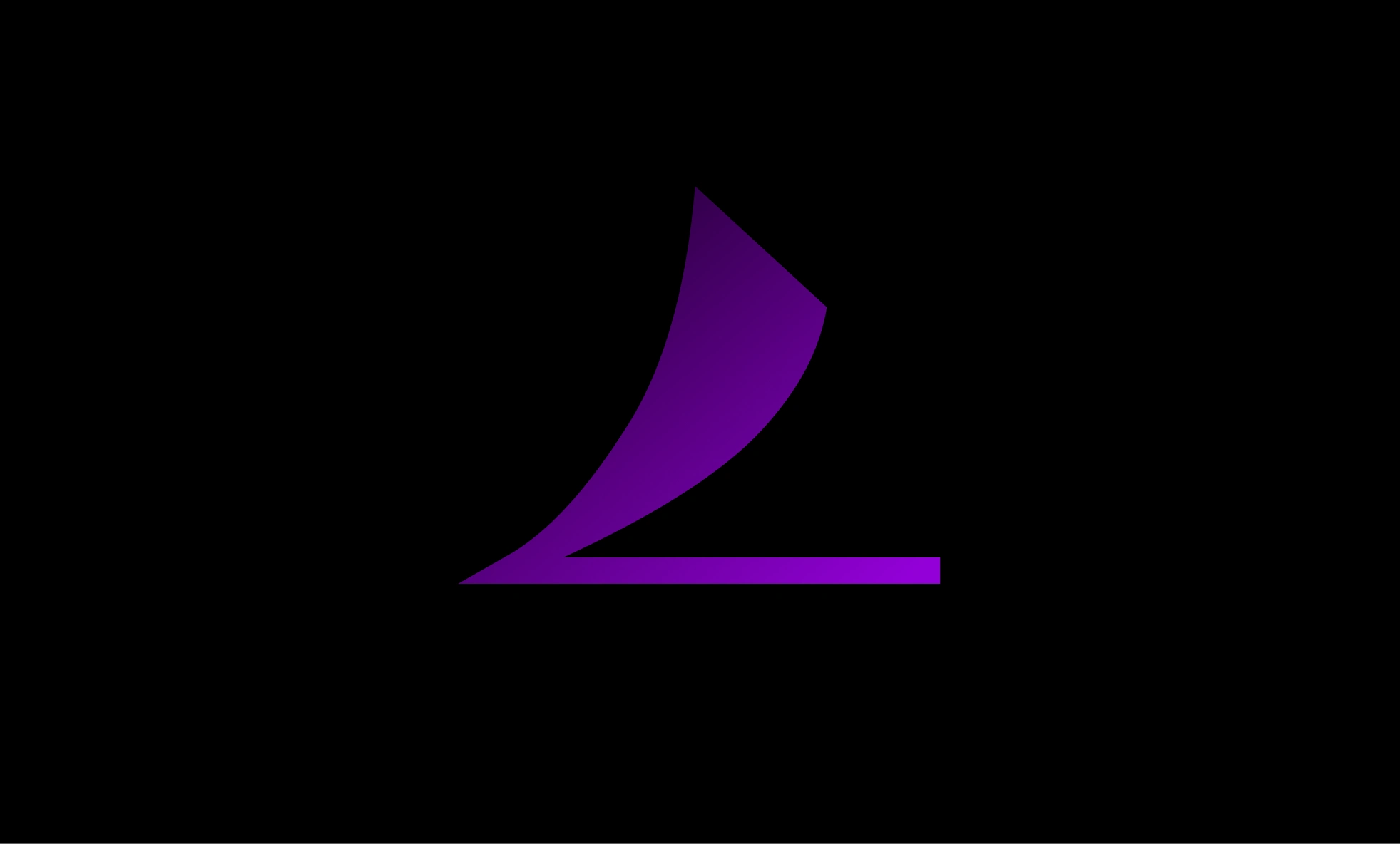
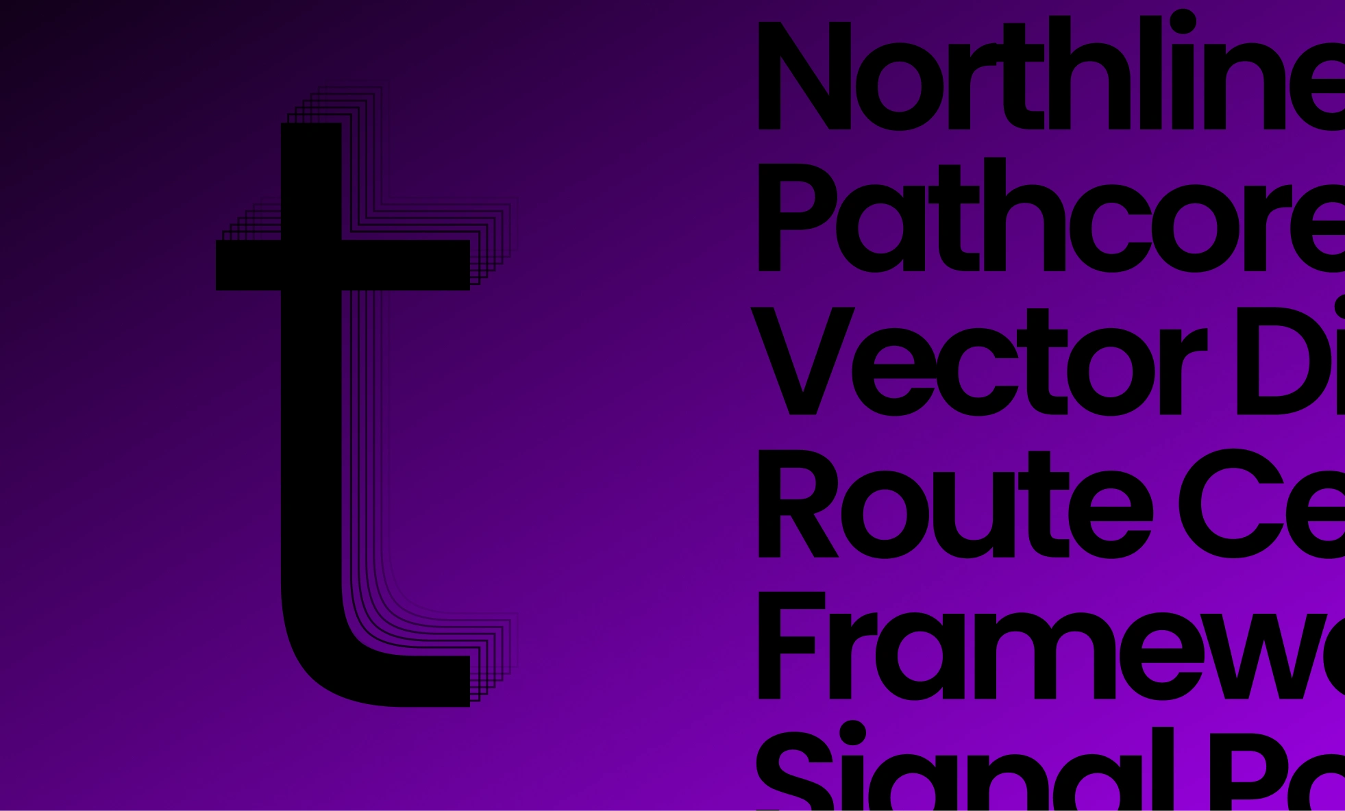
Logo Identity and Symbolism
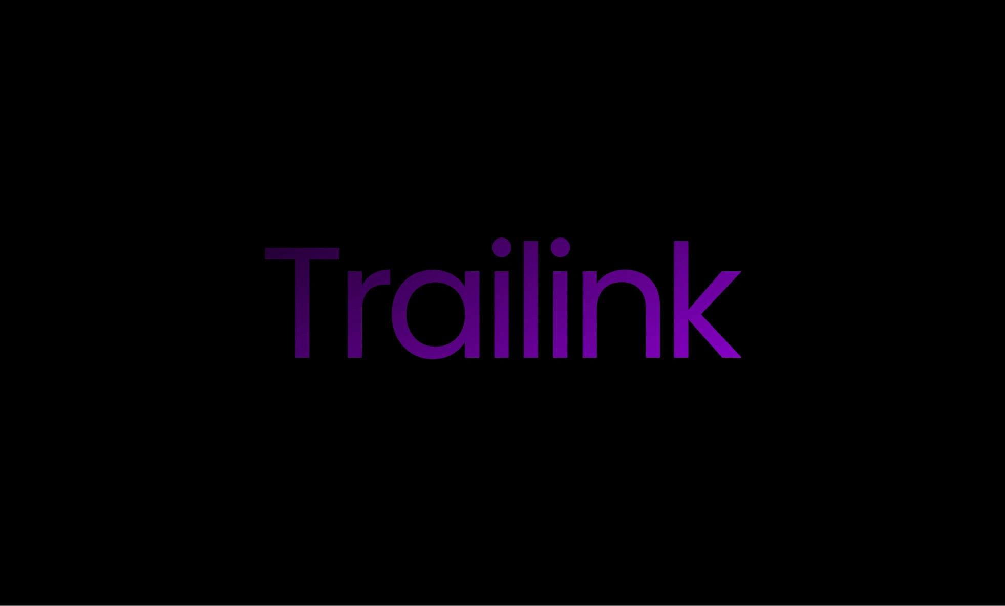
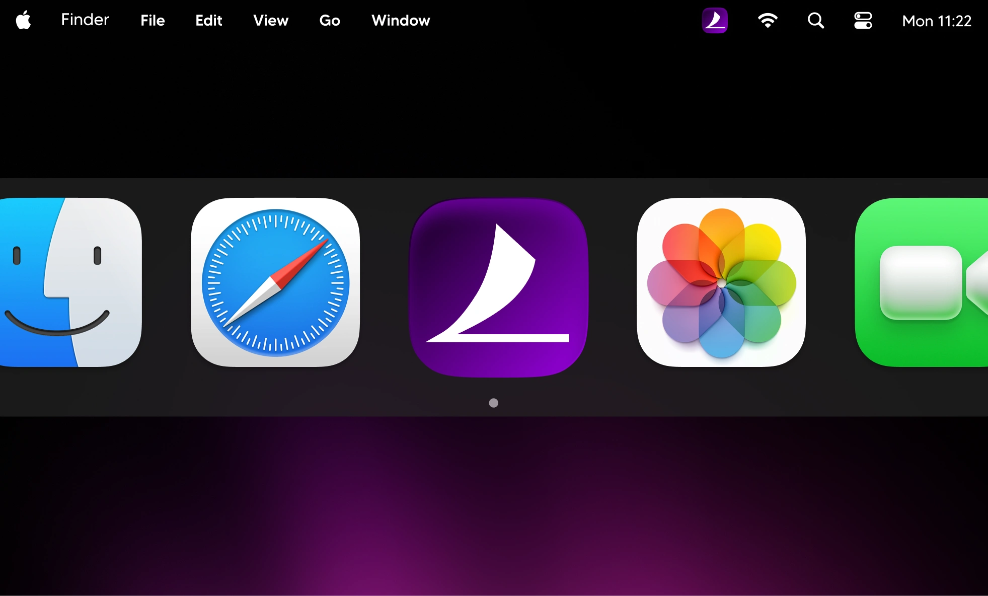
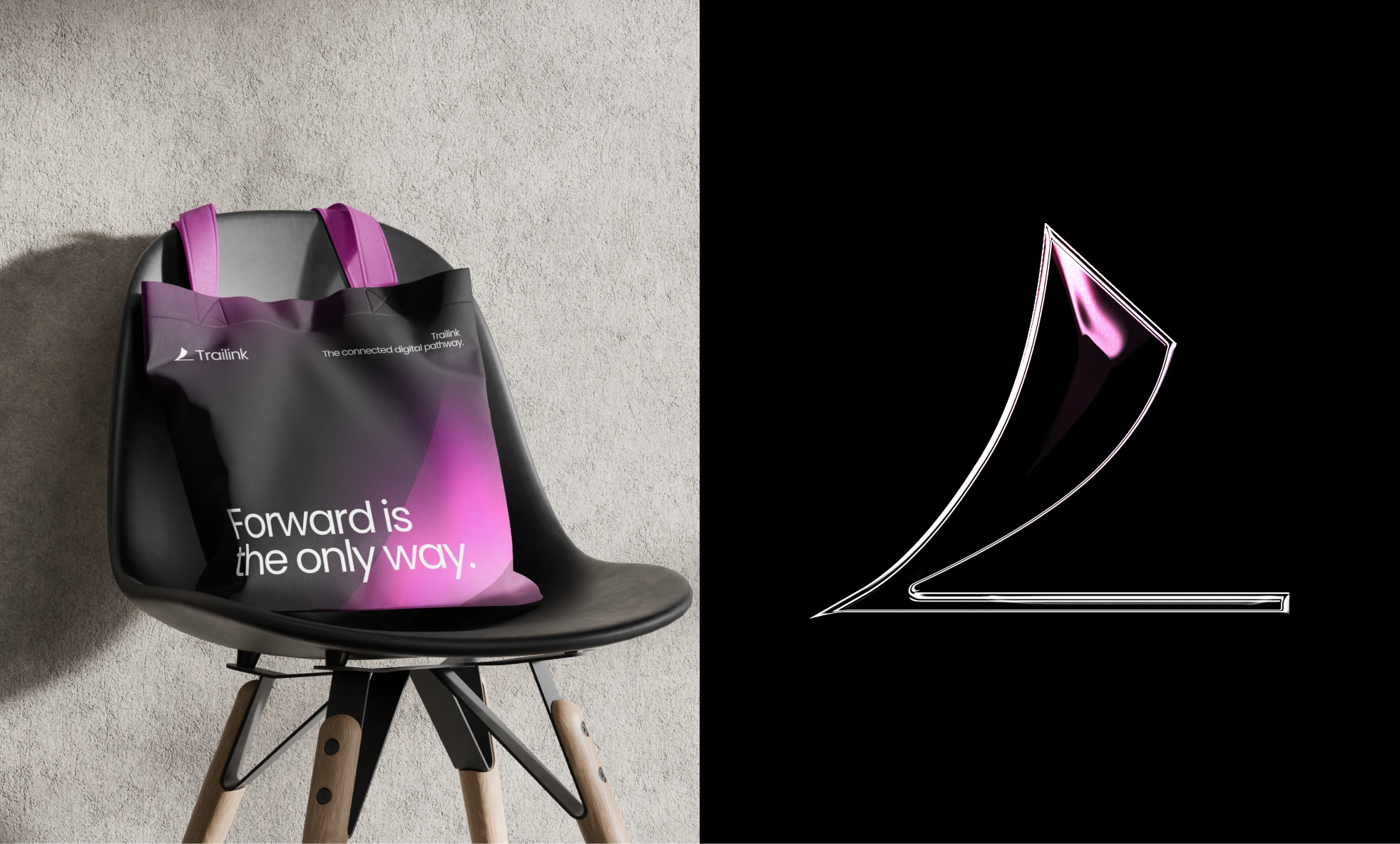
The Trailink logo mark is built from geometric shapes inspired by connected paths and directional vectors. Constructed on a strict grid, it represents forward motion, alignment, and digital flow. The customized wordmark reinforces balance, simplicity, and a modern sense of movement. Together, they form a flexible system that performs beautifully across digital interfaces and physical applications.
Like this project
Posted Dec 1, 2025
A futuristic identity system for Trailink, built on geometric precision, vibrant gradients, and a clear sense of digital movement.
Likes
2
Views
56