SMASH — Fast Food Brand Identity (Concept)

Shakil Hosen


Visual Brand Identity & Packaging
© September 2025
ABOUT SMASH
SMASH is a self-initiated fast-food identity and packaging concept built around an expressive, high-energy personality. The design challenge is to make a short name feel distinctive across a wordmark and takeaway applications without relying on food photography alone.
LETTERING AS THE MAIN INGREDIENT
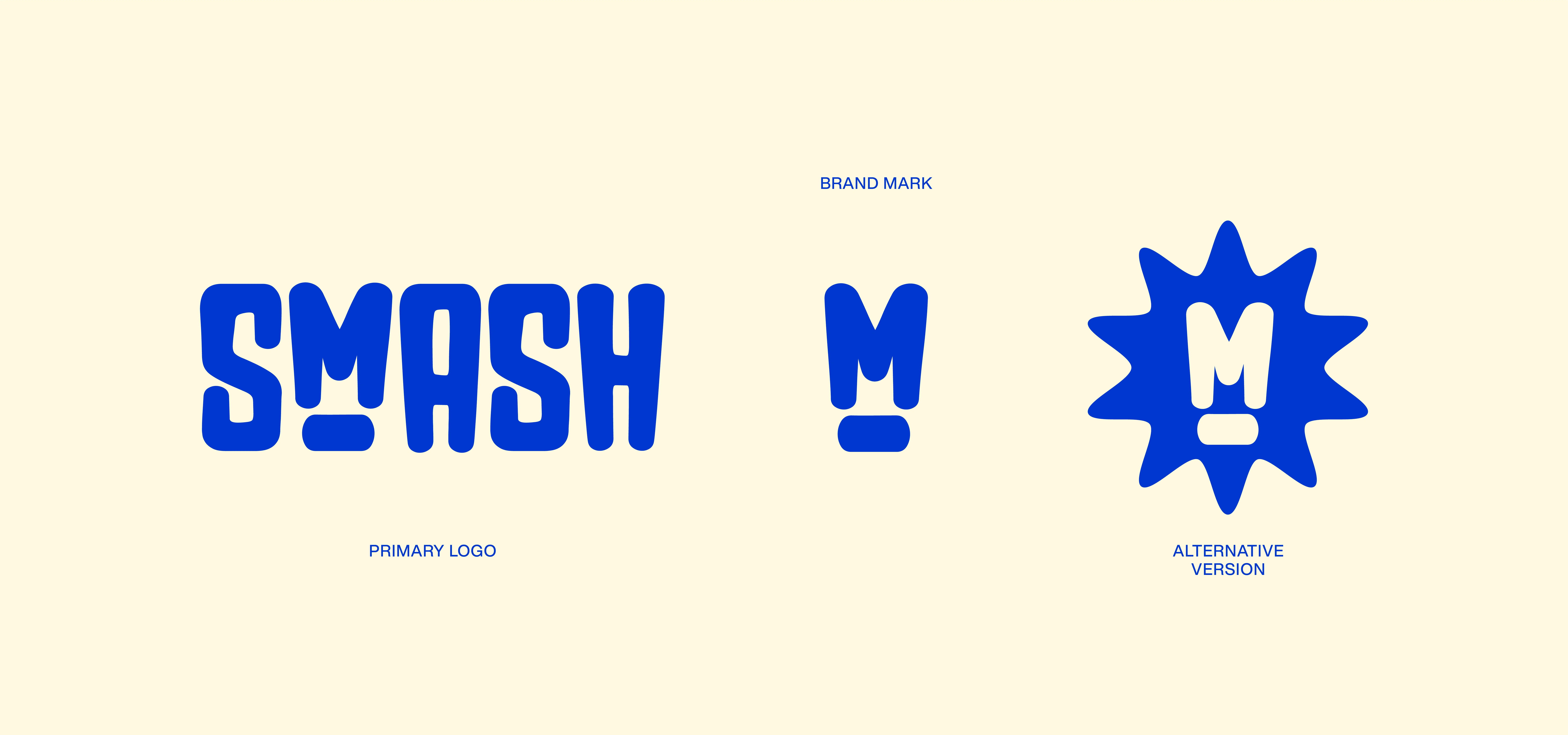
The heavy, condensed letterforms give the name a strong silhouette. Soft corners and the unusual construction around the M introduce a playful interruption, keeping the wordmark from feeling purely industrial. The name becomes the primary graphic asset, rather than a label added to the packaging.
COLOUR AND RECOGNITION
A saturated blue-violet against pale cream creates a sharp contrast. The restrained pairing gives the expressive lettering room to stand out and provides a repeatable visual signature across the presentation. The effect is bold and playful without needing many competing colours.
FROM WORDMARK TO PACKAGING
The packaging presentation extends the same lettering and colour language into a recognisable family. The design question is consistency: can a customer connect different branded items at a glance? Repetition of the wordmark and palette provides that visual link.
CONCEPT OUTCOME
A fast-food brand direction in which typography carries the personality and packaging carries it into everyday touchpoints. This is a visual concept, with no claim of a restaurant launch or measured sales results.
Designed by @FIEONART
Like this project
Posted Oct 16, 2026
A fast-food branding concept using expressive condensed lettering and blue-violet/cream contrast to connect the wordmark with packaging.