Mapple | HR Platform Interface Design
Taras Oliinyk
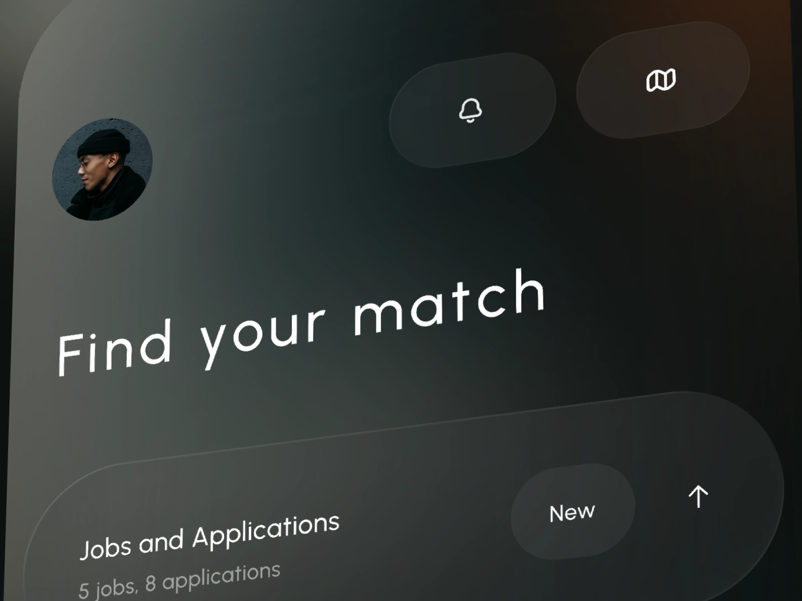
Mapple is an HR intelligence platform built around a single view that most workforce tools bury three clicks deep: where your people actually are. We designed a clean, dark web interface that puts talent distribution on the map — literally — and makes it fast to explore, filter, and act on.
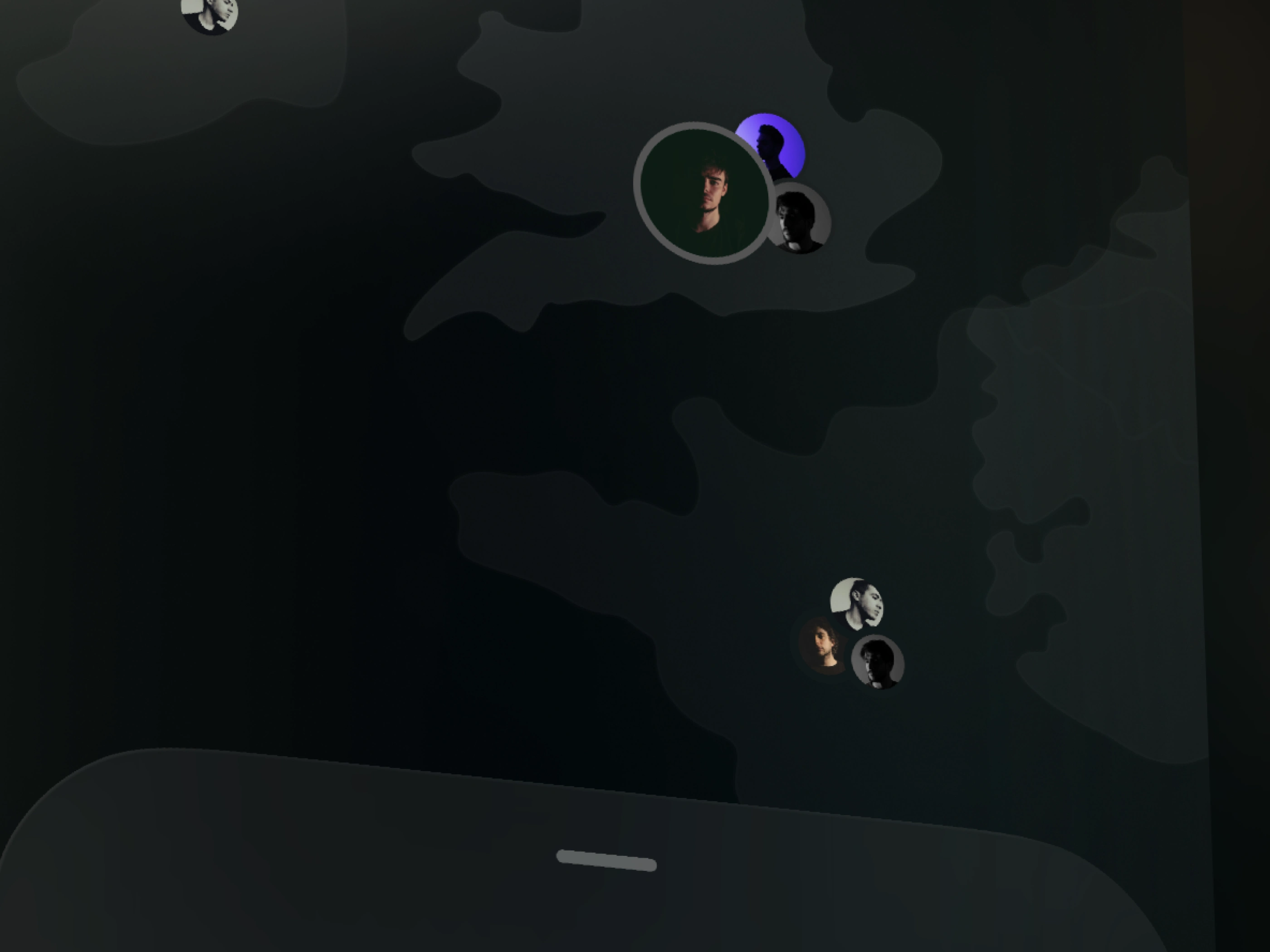
The visual language is precise and restrained. Deep charcoal surfaces, near-black backgrounds, and a purple accent system that marks hierarchy without noise. Purple was chosen deliberately — authoritative enough for enterprise, distinct enough to own the category. It appears on active states, data points, and key interactions. Everywhere else, the interface steps back.
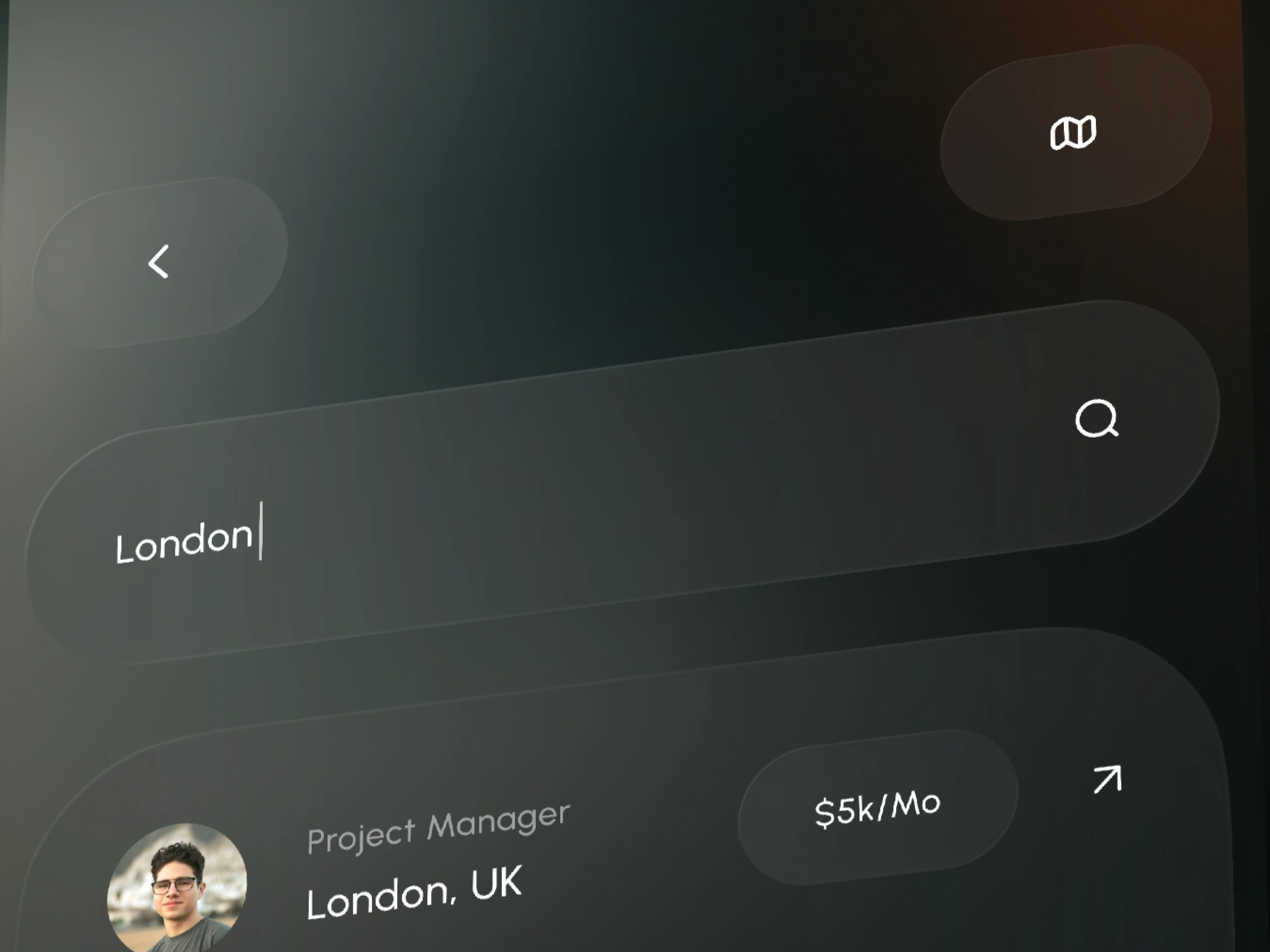
The core experience is the map canvas. Clusters of talent expand on hover, resolve into individual profiles on click, and filter by role, seniority, department, or office in real time. No page reloads. No modal stacks. The data moves with you.
Around the map, a minimal sidebar carries the numbers that matter — headcount by region, open roles, recent hires, team density. Cards are compact and scannable. Labels are short. The interface assumes you know what you're looking at and gets out of the way.
Search lives at the top and works the way people actually think: by name, by skill, by city, by team. Results surface on the map in context, not in a list disconnected from the geography.
Mapple doesn't replace your HRIS. It makes it legible. For the first time, a VP of People can walk into a board meeting and show — not tell — where the organisation lives, grows, and where the gaps are.
Like this project
Posted Apr 28, 2026
Designed a map-based HR intelligence platform interface for Mapple, helping teams visualize data and people-related insights in a clear and interactive way.
Likes
0
Views
10
Timeline
Feb 3, 2026 - Mar 25, 2026